10+ CSS Social Share Buttons: Free Examples & Code Snippets
Social share buttons provide a compact, recognizable way for users to distribute content across platforms. Well-designed share buttons balance brand identity with consistent interaction patterns.
- Brand colors are managed through CSS Custom Properties referenced via data-attribute selectors, keeping brand values centralized and maintainable across the component library.
- Tooltip labels appear on hover using a ::after pseudo-element with content: attr(data-label) and a translateY() slide-in animation on the compositor thread.
- Responsive wrapping uses flex-wrap: wrap with gap on the container, preventing button overlap on narrow viewports without per-breakpoint media queries.
Browse this collection of CSS social share buttons to master brand-aware sharing components that integrate seamlessly into article footers and sidebar widgets.
Table of Contents:
Examples

Responsive Modal Popup Box
A responsive share modal pop-up that appears from the bottom on mobile devices and centers on the screen on desktop. The display logic is entirely tied to toggling the .show-modal class using vanilla JS.
See the Pen Responsive Modal Popup Box.
Expanding Social Share Button
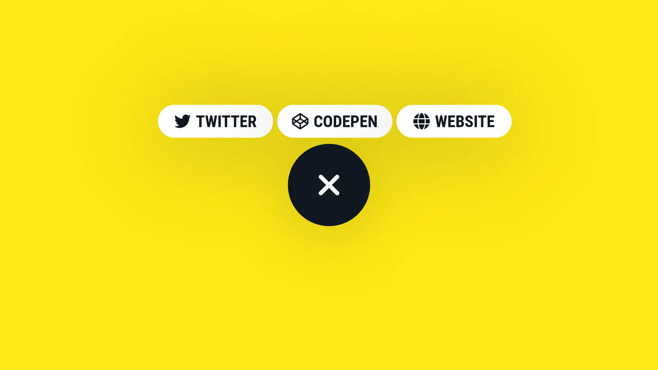
A smooth, morphing circular button that expands on click to reveal three link items, utilizing complex CSS transitions, transition-delay, and a Pug template structure for dynamic content generation.
See the Pen Expanding Social Share Button.
Simple Share Button
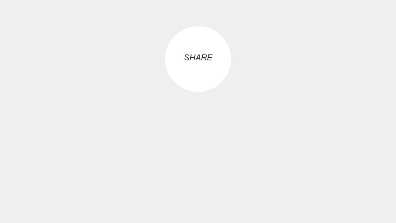
A “split-button” effect in pure CSS where two social media buttons, hidden outside a circular container with overflow: hidden, slide in on hover of their common parent. An ::after pseudo-element displays default text, which is then overlapped by the buttons with a higher z-index, creating a smooth UI transition.
See the Pen Simple Share Button.

Slide-Out Social Buttons
A compact social share widget built with pure CSS, featuring a slide-out effect managed entirely by hover states. The animation triggers the horizontal translation of the text panel when the primary icon button is hovered.
See the Pen Slide-Out Social Buttons.

Social Share Button
A 3D button that smoothly reveals social media icons on hover. This UI component leverages CSS 3D transforms (rotateX, rotateY) and staggered transition delays to create a dynamic and space-saving share panel.
See the Pen Social Share Button.
Social Share Button
An interactive social media share widget built with SCSS and JavaScript for dynamic expansion. The component smoothly transforms from a text-based button into a set of rounded, hover-animated social icons, offering an elegant and compact solution for sharing functionalities.
See the Pen Social Share Button.

CSS Share Icons
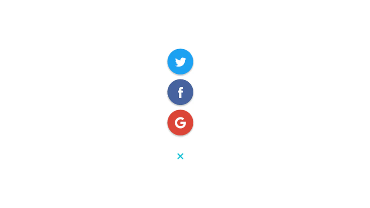
This interactive UI component is a “Share” button that smoothly expands into a vertical social media menu. Built with SCSS, it leverages the “checkbox hack” and complex CSS animations to provide dynamic icon reveals and 3D hover effects, all without JavaScript.
See the Pen CSS Share Icons.
Share Button
An interactive “Share” component featuring a 3D flip animation that smoothly reveals social media icons on hover. Built with pure CSS, utilizing perspective and transform-style, this widget provides a dynamic, staggered appearance of social links for a compact UI solution.
See the Pen Share Button.

Social Media Icons Share
A set of interactive social media share buttons built with SCSS, leveraging flexible loops for animation control. On hover, the main button smoothly expands to reveal a menu of social icons that appear with staggered delays, creating a dynamic and functional sharing widget.
See the Pen Social Media Icons Share.
Facebook/Instagram Share Button
Interactive social media buttons featuring a dynamic hover animation. This UI component utilizes CSS transitions to smoothly slide the icon and fade out the text, while simultaneously scaling up and changing the button’s background.
See the Pen Facebook/Instagram Share Button.
Social Share Button
An interactive “Share” button that smoothly reveals social media icons with a scaled and staggered animation on hover. The component utilizes CSS transforms and transition-delay to create a dynamic widget where the text slides out and icons appear sequentially, providing an engaging user experience.
See the Pen Social Share Button.

Social Share Button UI
An interactive “Share” button that expands to reveal social media icons upon click. The component leverages JavaScript for state management and staggered CSS animations for the smooth appearance and disappearance of Facebook, Twitter, and Instagram icons, providing a dynamic and responsive user experience.
See the Pen Social Share Button UI.
Hover Me Pill Button
This interactive SCSS-powered hover button smoothly transforms to reveal a row of social media icons upon mouseover. The UI component utilizes pseudo-elements for dynamic background transitions and a “bounce” animation for the icons.
See the Pen Hover Me Pill Button.
Share Button Float Icon
An interactive pure CSS share button that reveals social links on hover. Inside an overflow-masked container, the main text and icon translate vertically upward out of view via translateY(-55px). Concurrently, hidden social icons slide up into place using a cascading, staggered transition delay timeline.
See the Pen Share Button Float Icon.