20+ CSS Speech Bubbles
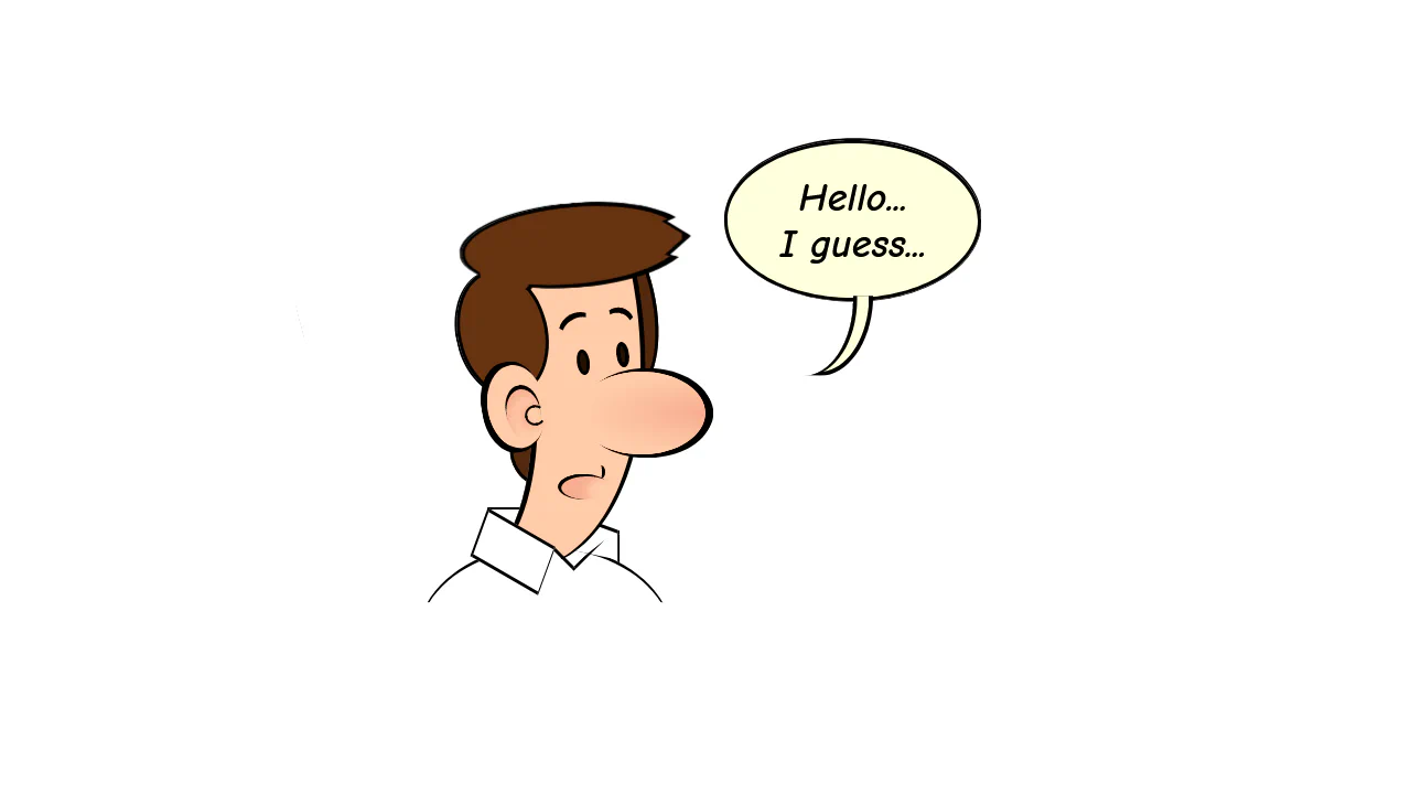
Chat interfaces demand absolute clarity. CSS speech bubbles remove visual barriers between human conversation and the screen. This updated collection provides raw, structural components for modern UI design. Utilizing these curated snippets strips away graphical noise. Focus remains strictly on message delivery without bloated image assets.
These examples rely on precise geometric calculation. The code utilizes clip-path and pseudo-elements (::before, ::after) to construct sharp, responsive dialogue pointers. Animation states leverage hardware acceleration, targeting properties like transform: scale and opacity. This ensures a 60fps frame rate without layout reflows. The HTML structure remains strictly semantic, maintaining high layout stability and fast rendering.
Every free demo is fully responsive and cross-browser compatible. Users can instantly download the raw code or fork a layout on CodePen.
Examples
Responsive Speech Bubbles using CSS Container Queries
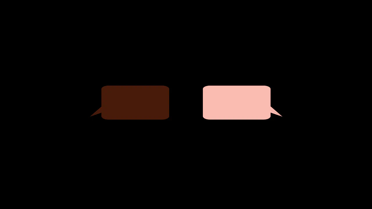
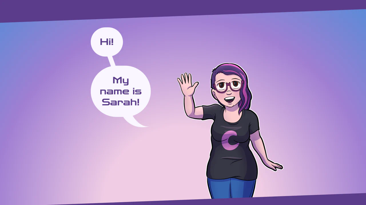
A stylish, pure CSS solution for creating speech bubbles with custom tails using the :after pseudo-element and the advanced clip-path: polygon() property to give the content frame a unique, angled edge shape.
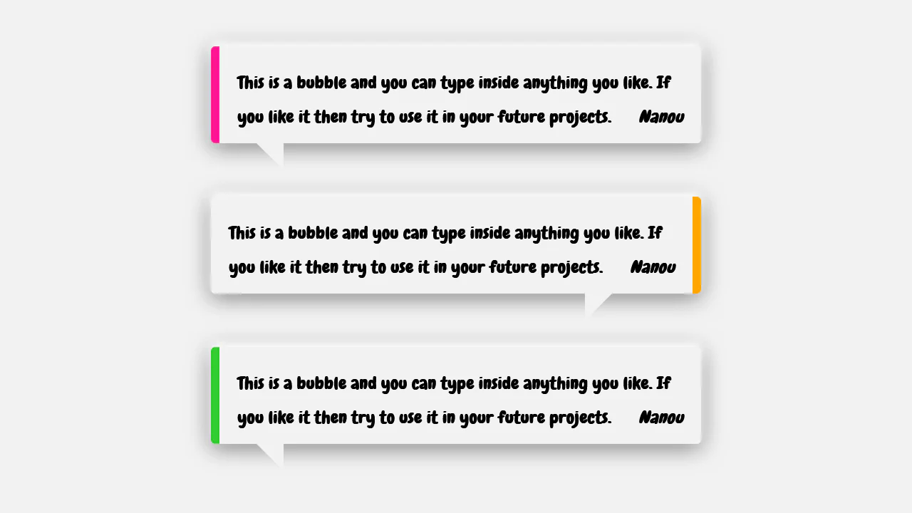
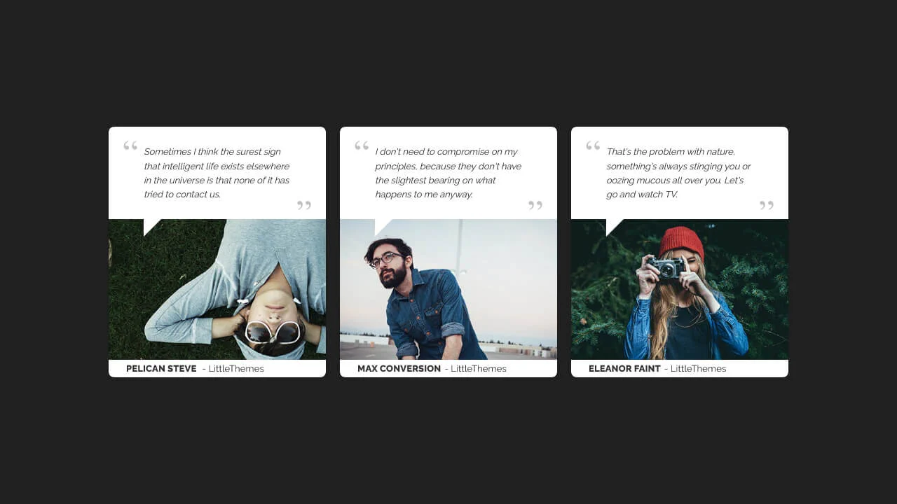
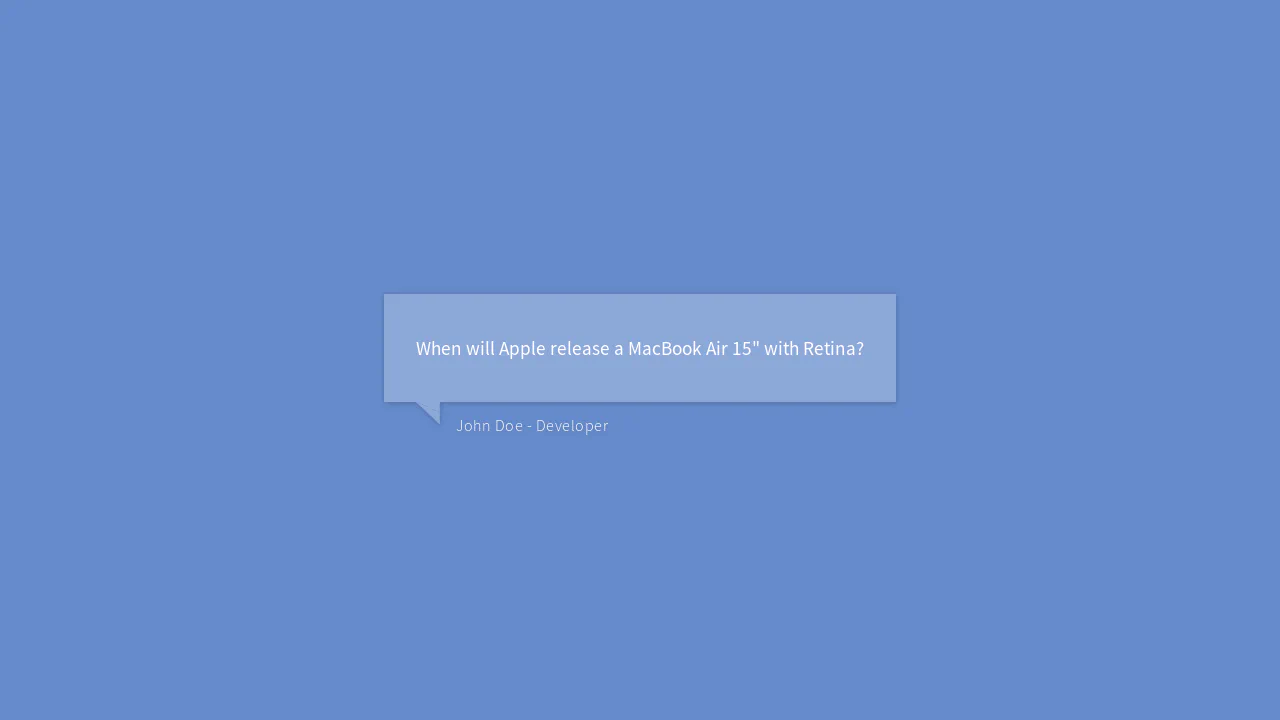
A speech-bubble style testimonial card constructed using absolute positioning for layout layering.
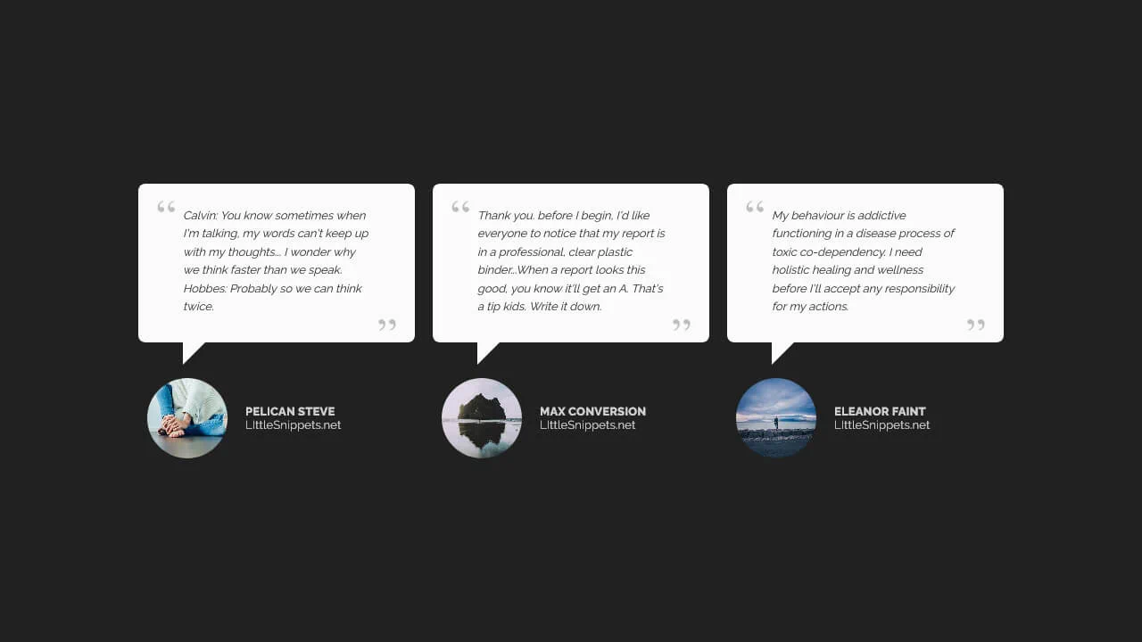
A conversational testimonial card styled as a speech bubble, leveraging the CSS border hack to generate the geometric pointer.
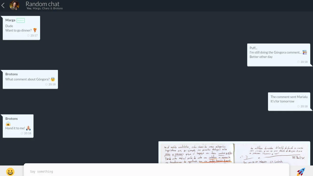
Chat UI 2.0
A responsive group chat interface modeled after modern messaging apps, utilizing Flexbox for message alignment and CSS pseudo-elements to craft speech bubbles.
See the Pen Chat UI 2.0.
Single-element 3D Speech Bubble
A modular “speech bubble” component where the common shape is defined via @extend, and the tail is created with the classic CSS trick of layering two border triangles. Color variations are procedurally generated with an SCSS @each loop, making the code scalable and DRY.
See the Pen Single-element 3D Speech Bubble.
Comic Director Splash Animation
A dynamic splash screen where the layer reveal choreography is built on transform and transition-delay, applied to each element via :nth-child. The final layer “explodes” spectacularly using @keyframes and a custom cubic-bezier function, with the entire animation optimized for hardware acceleration.
See the Pen Comic Director Splash Animation.
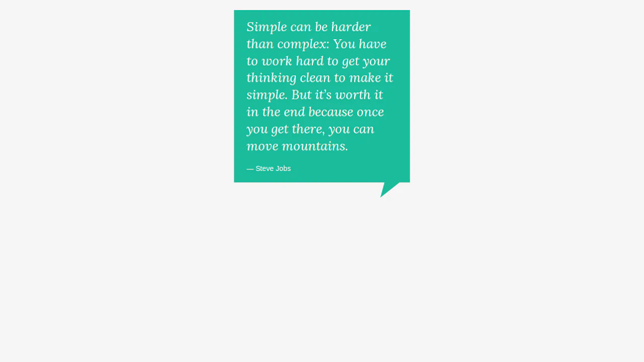
Quote block with decorative corner. :after pseudo-element with skew transform (skewX) creates bottom-right protrusion. Borders form triangle, color matches quote background.

Speech bubble with 3D rotation. Main element skewed via rotateY, background layer (:after) creates depth effect. Tail (:before) formed by borders and transforms. Layer colors inverted.

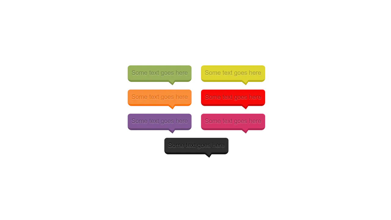
Alternating speech bubbles with left/right tails. Even items have left border and tail, odd — right. Border color cycles via nth-child. Pseudo-elements form triangles via borders.
Speech bubbles via scalable SVG backgrounds. Three types: regular, whisper (dotted), electric (jagged). Sizes set via padding to maintain proportions. Text adapts to bubble shape.
Two bubble types: speech (triangular tail) and thought (round bubbles). Speech uses borders for triangle, thought uses rounded pseudo-elements. Border colors match frame and background.
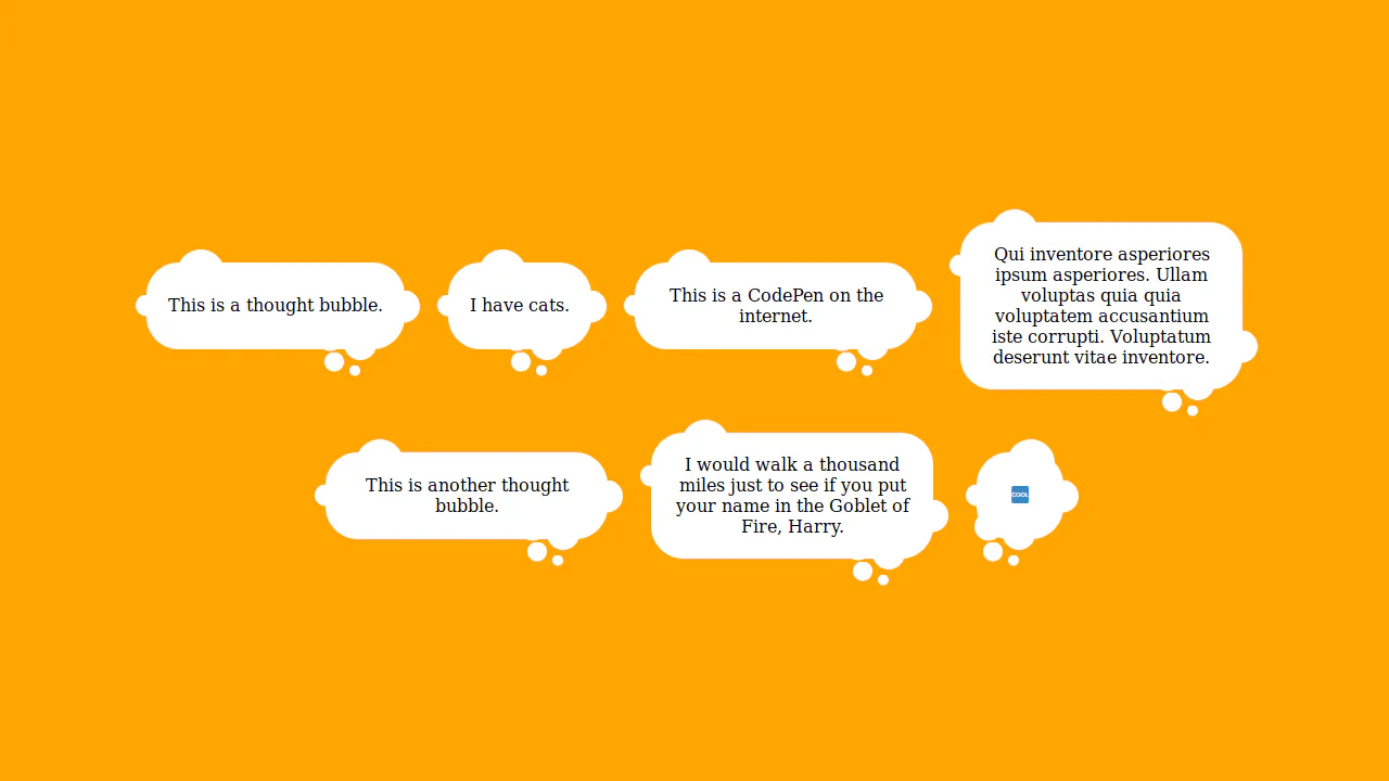
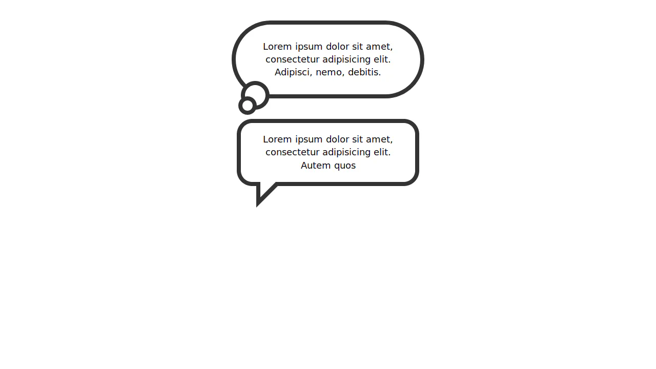
Thought bubble with trail of bubbles. Main element — rounded rectangle, pseudo-elements create chain of circles via offset box-shadow. Shadows inherit background color, forming bubble trail.

Speech bubble with shadow via blurred duplicate. Main element — rounded rectangle with square tail rotated 45°. Blurred gray layer underneath creates shadow effect.