10+ CSS Spheres: Free Code Snippets & Examples
Spheres bring organic geometry to interface design — they soften the rigid rectangular grid of the web with volumetric curves that suggest depth and mass. CSS spheres achieve this through gradient shading and 3D transforms that create the illusion of a solid form.
- Each sphere uses
radial-gradientwith a shifted focal point (radial-gradient(circle at 35% 35%, ...)) to create the illusion of directional lighting, producing a 3D appearance on a flat circular element. - The rotation animation uses
transform: rotate3d()on the sphere container, with layeredbox-shadowfor depth, creating the impression of a solid object turning in 3D space on the GPU compositor thread. - Responsive spheres use
aspect-ratio: 1andborder-radius: 50%withclamp()for diameter, maintaining perfect circular geometry at any viewport size.
Browse the collection to find a sphere implementation that fits your visual style — from simple gradient orbs for loading states to complex layered spheres with atmospheric glow and rotation effects.
Table of Contents:
Examples

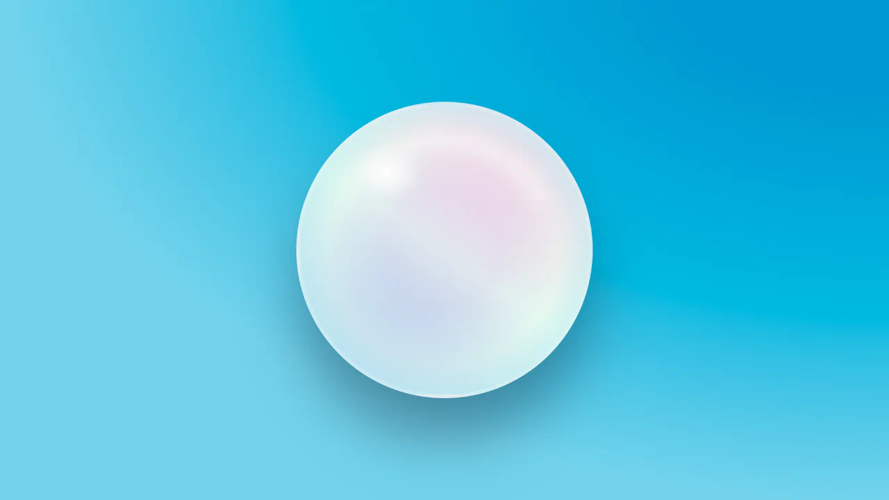
3D Sphere with Dynamic Shadow
This demo shows how to create a realistic 3D sphere effect using pure CSS, without SVG or 3D transformations. The effect is achieved through gradients (radial-gradient), shadows (box-shadow), pseudo-elements (::before, ::after) for highlights and shadows, and dynamic variables (@property) for animation.
See the Pen 3D Sphere with Dynamic Shadow.
3D Glowing Bottle
This demo showcases advanced CSS techniques like synchronized transform: rotate() animations and the filter: drop-shadow() property to achieve a visually striking glowing liquid effect within a transparent container.
See the Pen 3D Glowing Bottle.
CSS 3D Sphere Animation
A 3D sphere where an SCSS @for loop calculates the transform for each ring, and the entire animation and structure, built on perspective and transform-style: preserve-3d, are fully configurable via variables.
See the Pen CSS 3D Sphere Animation.
Pure CSS Wobble-Rotating Sphere
3D sphere from meridians and parallels in CSS. 36 meridians — circles rotated on X-axis in 10° steps. Latitudes — concentric circles shifted on Z-axis. Two rotation axes. Whole structure rotates in 3D.
See the Pen Pure CSS Wobble-Rotating Sphere.

Spheres but Not Spheres
Glowing spheres created by layering gradients and blend modes. Radial gradient background forms grid of circles, linear gradients at various angles add color. background-blend-mode and mix-blend-mode combine layers for glow effect.
See the Pen Spheres but Not Spheres.
CSS Light Sphere Animation #21
3D sphere from 21 concentric rings. Each ring — div with rotateX(90deg) and Z translation. Sizes and animation delays controlled via CSS variables. Rings pulse, changing color via hue-rotate. Rotation pauses on hover.
See the Pen CSS Light Sphere Animation #21.

CSS Shaded Sphere Using Only Arithmetic
Interactive disc with “lens” effect. Two masks follow cursor, revealing/concealing striped background. Bottom shadow adjusts height and width based on mouse position. JavaScript clamps movement within circle bounds.
See the Pen CSS Shaded Sphere Using Only Arithmetic.
Icosphere of Spheres in Pure CSS
3D icosahedron from points in CSS. Pug generates polyhedron vertices and intermediate sphere points, each represented by .vx element. Points positioned via translate3d with CSS variables --v0, --v1, --v2. Radial gradients create glow effect.
See the Pen Icosphere of Spheres in Pure CSS.
CSS Math Globe Animation
3D globe from horizontal rings. Pug generates rings with varying vertical offset via CSS variable --dp. Ring width calculated via circle formula. flash animation travels through rings with delay, creating running light effect.
See the Pen CSS Math Globe Animation.
Gradient Circle with CSS
3D sphere with simulated highlights and depth via layered gradients. Radial gradients create light spot and depth, linear adds color transition. Pseudo-element forms reflected highlight on surface.
See the Pen Gradient Circle with CSS.
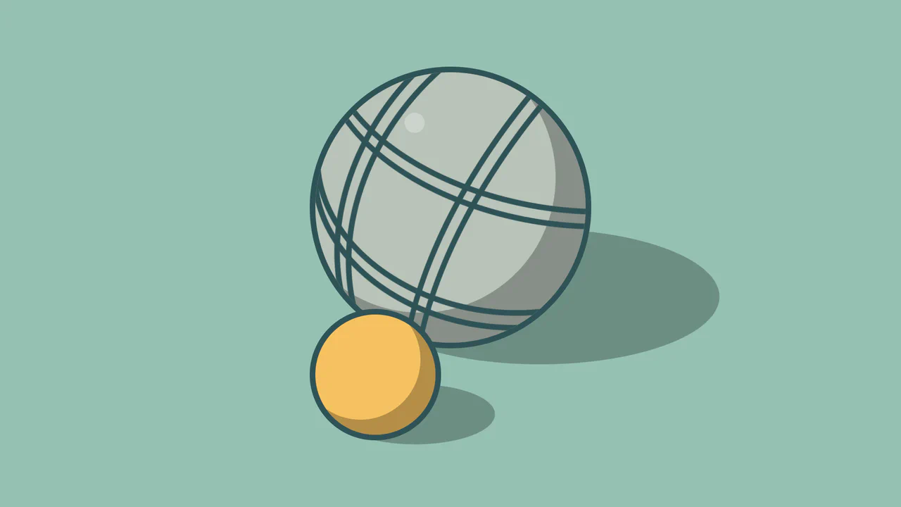
Pétanque: Spheres in CSS
Petanque ball simulation with decorative grooves. Main ball — circle with shadow and border. Nested ellipses create engraved line effect. Small ball — simplified version. Highlight via pseudo-element.
See the Pen Pétanque: Spheres in CSS.