150+ CSS Spinners
Waiting creates friction. CSS Spinners bridge the gap between anticipation and data retrieval. This updated collection delivers raw, minimalist loading indicators for modern UI design. Utilizing these curated snippets removes the visual noise of heavy GIF files. Focus remains strictly on the interface structure.
These examples rely on single-element architecture. The code utilizes border manipulation and pseudo-elements to construct sharp geometry. Animation logic leverages strict hardware acceleration, targeting transform: rotate and opacity. This ensures a 60fps frame rate on the GPU without layout reflows. The HTML markup remains strictly semantic, maintaining high layout stability and rapid processing.
Every free demo is fully responsive and cross-browser compatible. Users can instantly download the raw code or fork a loader on CodePen.
Examples

Sci-Fi Glowing Triangle Loader
This is a Sci-Fi Glowing Triangle Loader. It animates three spheres along the edges of a neon-lit geometric path while rotating in 3D space. Its function is to serve as a high-fidelity visual placeholder during asynchronous data fetching, establishing a strong thematic aesthetic immediately upon application launch.
 Chrome 104+
 Edge 104+
 Firefox 104+
 Safari 14.1+
See the Pen Sci-Fi Glowing Triangle Loader.

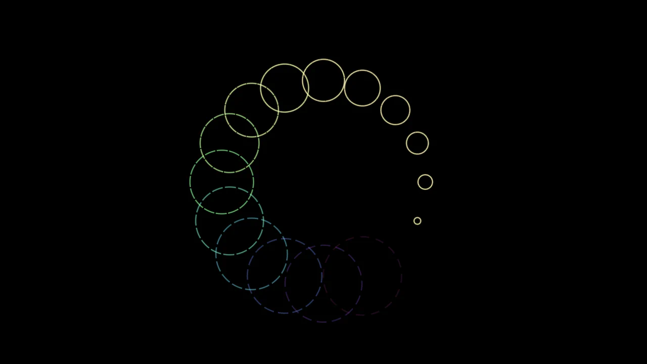
Glowing Chasing Squares CSS Loader
This is a Glowing Chasing Squares CSS Loader. It visually communicates background system processes through continuous, cyclic motion. Its function is to reduce perceived wait times by providing a predictable, rhythmic focal point during data fetching.
Chrome 53+
Edge 79+
Firefox 35+
Safari 9+
See the Pen Glowing Chasing Squares CSS Loader.

Snake Game Preloader
A nostalgic, infinite animation of the classic Snake game in a pixel-art style, running entirely on CSS/SVG without scripts.
See the Pen Snake Game Preloader.

Infinite Loader on Top
A pure CSS infinity loader relying on SVG <use> for geometry reuse. Movement is driven by stroke-dashoffset, while synchronized opacity animations simulate 3D depth at the crossover.
See the Pen Infinite Loader on Top.

Kinetic CSS Loader
A smooth, rhythmic, and mesmerizing loader that looks complex but is implemented simply and efficiently.
See the Pen Kinetic CSS Loader.

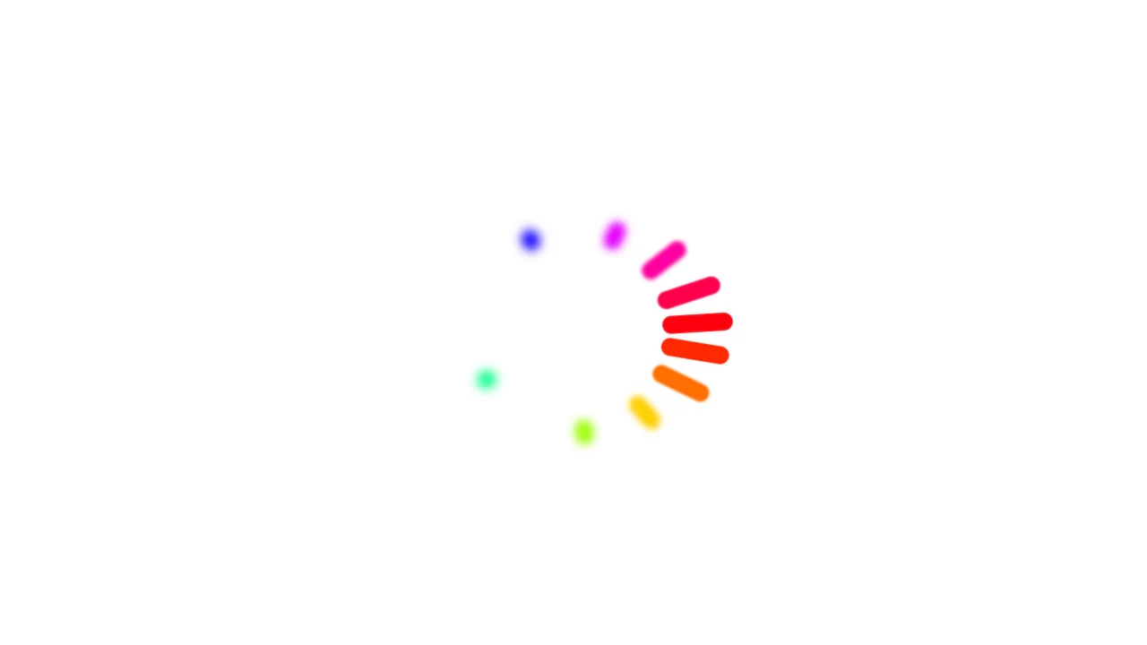
RGB Dot Preloader
A hypnotic, kaleidoscopic loader where white dots decompose into their RGB constituents during motion, generating a sensation of energy and complexity.
See the Pen RGB Dot Preloader.

Pure CSS Loader #10/2020 - No SVG Arcs
An elegant loader built purely with CSS/SASS that leverages CSS Houdini’s @property to define and smoothly animate custom numeric properties, enabling a high-performance rotation and hue-shifting loop.
See the Pen Pure CSS Loader #10/2020 - No SVG Arcs.
Pure CSS Loader #11/2020 - Ripples
Spectacular animated ring loader built on the advanced capabilities of CSS Houdini to define and smoothly transition custom properties, enabling complex and dynamically changing geometry via conic and radial gradients.
See the Pen Pure CSS Loader #11/2020 - Ripples.
Color Wheel Loader using Animated Custom Properties
Advanced CSS animation utilizing ten-point delays (nth-child) to create a ripple effect and showcasing CSS Houdini capabilities for animating length and angle values.
See the Pen Color Wheel Loader using Animated Custom Properties.
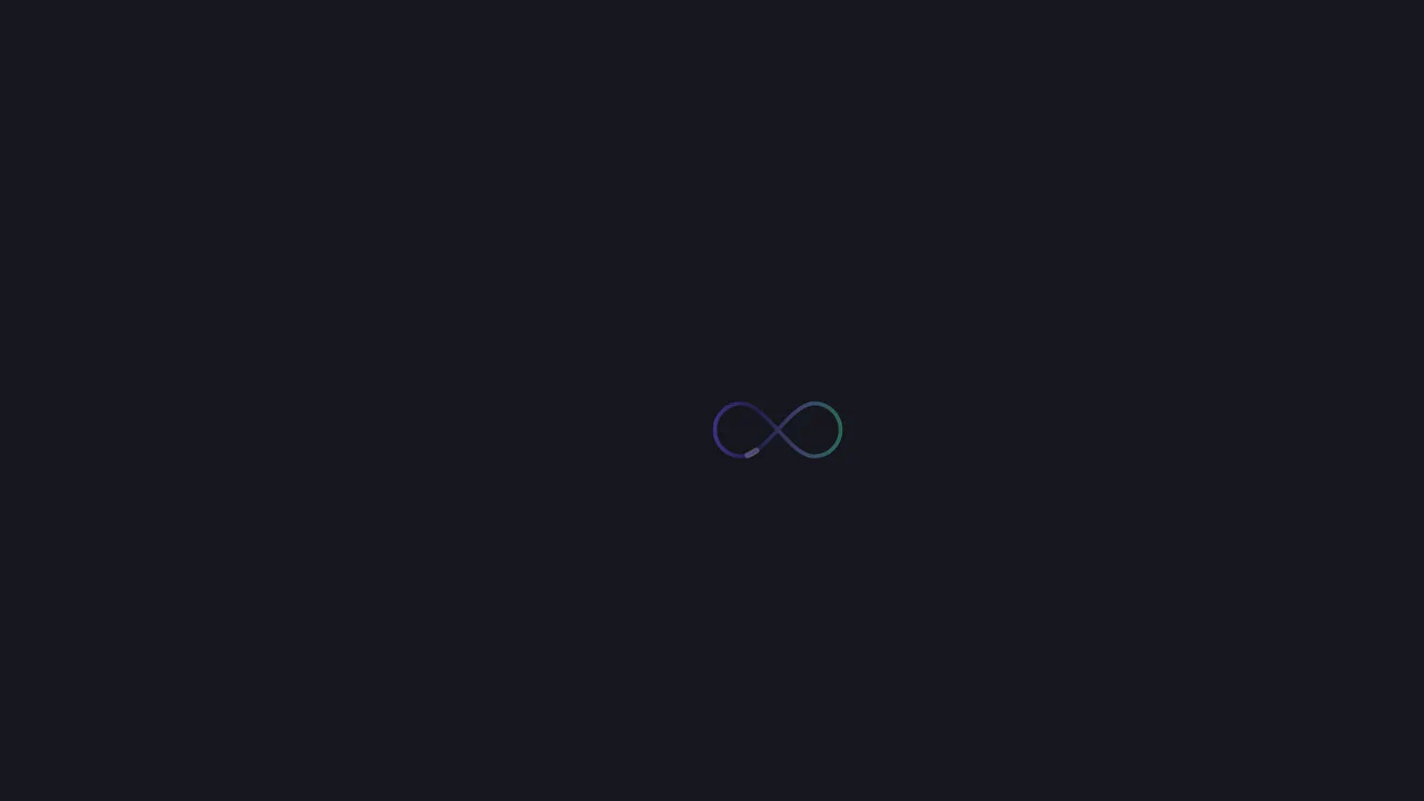
Infinity SVG Spinner with CSS Animation
An elegant and minimalistic CSS spinner built purely with SVG, where the core motion effect (drawing and erasing) is achieved by animating the stroke-dasharray and stroke-dashoffset properties within the @keyframes dash rule.
See the Pen Infinity SVG Spinner with CSS Animation.
Animated five-point star with flicker effect. Each branch appears with delay via CSS variables --i and --dur. --flickIn animation simulates flicker with steps. Respects prefers-reduced-motion settings.
Rotating star particles in CSS. 14 span elements positioned in circle via transform: rotate. FontAwesome icons animated with scale and rotation changes. Pseudo-elements create additional particles with scatter effect. Cyclic hue shift via hue-rotate.
Loader from two overlapping blocks. Pseudo-elements move along perimeter via inset property, creating “squeeze” effect. One element has animation delay, creating opposite phase. Whole structure slowly rotates.
CSS loading animations made with single element.
Neon loader with gradient ring and multiple shadows. Inner circle rotates and blends via mix-blend-mode: color-burn. Layered shadows create 3D glass effect.
Cube Grid (Pure CSS)
Isometric cube grid with Z-axis compression animation. CSS variables control each cube’s position in grid and its color based on row. Pseudo-elements form visible faces through transforms and color-mix.
See the Pen Cube Grid (Pure CSS).