10+ CSS Stacked Cards: Free Code Snippets & Examples
Stacked cards solve the problem of content density — presenting multiple items in a compact vertical stack that users can peel through one by one. This pattern preserves the browsing context while giving each card its moment of visual focus, ideal for mobile interfaces where screen real estate is at a premium.
- Each card is positioned using absolute positioning within a relative parent, with each subsequent card in the stack offset via
toportransform: translateY()to create the signature cascading overlap. - The stacking depth is controlled by managing
z-indexvalues through CSS custom properties, allowing the active card to be promoted above the rest with a smoothtransitionon the scale and shadow properties. - Semantic HTML with proper heading hierarchy ensures that screen readers interpret the cards as a logical sequence, while
aria-labelon each card surface clarifies its interactive purpose.
Browse the collection to find a stacking pattern that fits your content — from cascading card decks for article previews to accordion-like stacks for FAQ sections.
Table of Contents:
Examples
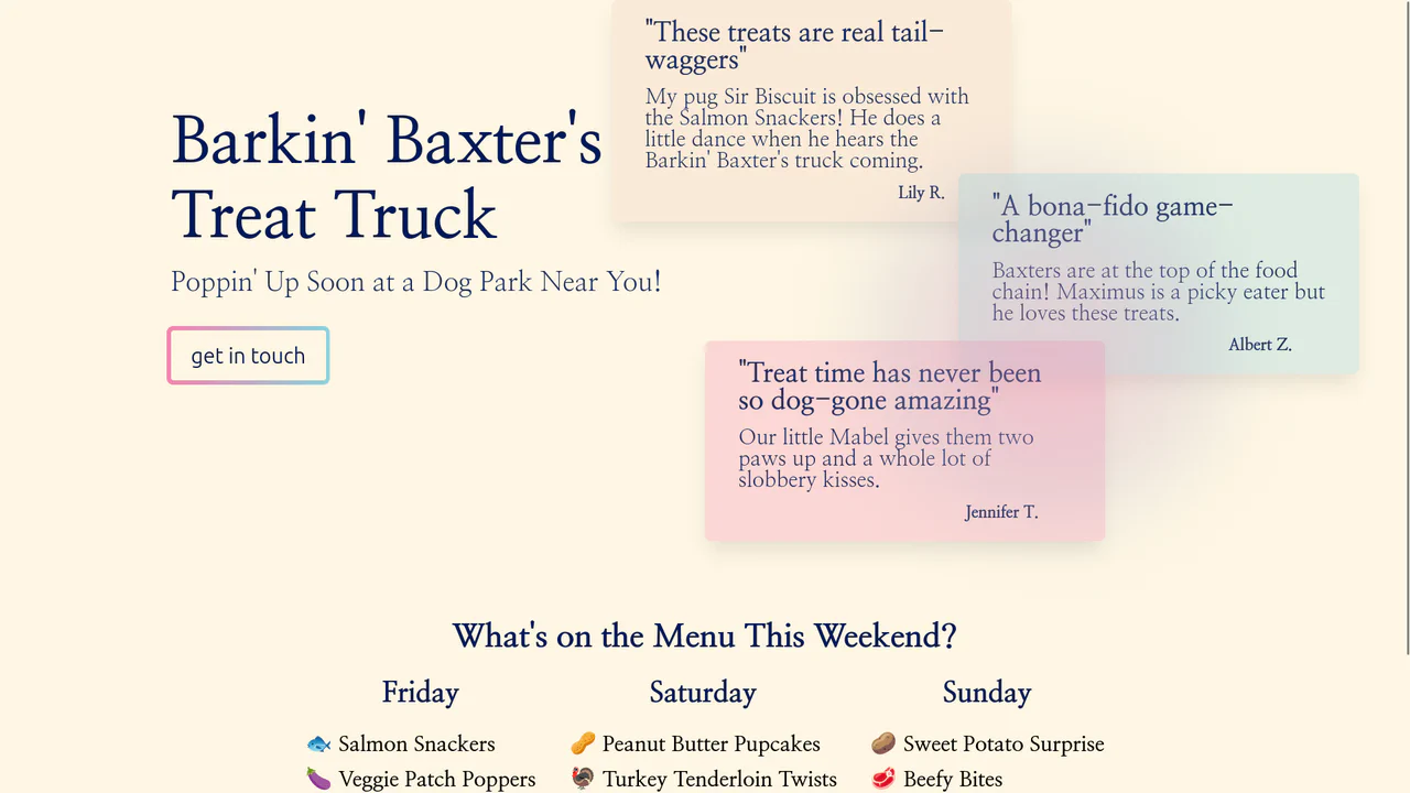
Grainy Gradient Interactive Landing Page
This interface features layered testimonial cards that float dynamically above an organic background. Using semantic span elements structured inside a grid container, the glassmorphism review cards apply a frosted blur to isolate customer feedback. Below, an active gradient glow tracks mouse movement to subtly highlight each blockquote, focusing user attention on positive social proof without cluttering the layout.
 Chrome 76+
 Edge 79+
 Firefox 70+
 Safari 13+
See the Pen Grainy Gradient Interactive Landing Page.

Layered Dynamic Card Swiper
This is a Layered Dynamic Card Swiper. It replaces linear carousels with a 3D-stacked deck logic. Its function is to provide a high-fidelity interaction for decision-based interfaces (like discovery or voting), utilizing data attributes to trigger complex spatial transitions between card groups.
Chrome 88+
Edge 88+
Firefox 89+
Safari 15+
See the Pen Layered Dynamic Card Swiper.

Interactive Radial Image Carousel
This is an Interactive Radial CSS Image Carousel. It arranges a deck of image cards into a curved, fan-like layout. Its function is to provide an engaging, space-saving gallery interface where hovering over a card gracefully shifts its neighbors away along a circular path, bringing the focused item into clear view without relying on JavaScript math.
Chrome 119+
Edge 119+
Firefox (partial)
Safari 26.2+
See the Pen Interactive Radial Image Carousel.

CSS 3D Stacking Card List Effect
This 3D Stacking Card List Effect transforms a standard vertical list into an immersive, layered user interface. By leveraging CSS 3D transforms and focal blur filters, it simulates a physical deck of cards where background items appear distant and out of focus, settling into a clear layout only upon interaction.
Chrome 84+
Edge 84+
Firefox 63+
Safari 14.1+
See the Pen CSS 3D Stacking Card List Effect.

Rotating Navigation
An interactive card stack that fans out into a deck-like display upon toggling. JavaScript handles the state transition by toggling classes, triggering CSS cubic-bezier transitions that rotate and translate the cards from a bottom-center origin, creating a smooth, elastic opening animation accompanied by a rotating navigation button.
See the Pen Rotating Navigation.
CSS Image Stack Cycle
An exceptionally complex image slider/stack UI component, fully implemented via CSS custom properties and CSS Houdini to allow the animation of abstract numerical values; the system uses complex mathematics to control the 3D stacking order, the “fly-out” effect, and random rotation, creating a looping, cascading stack with smooth transitions.
See the Pen CSS Image Stack Cycle.
Shuffling Effect in Pure CSS
Efficient layout using CSS Grid to stack cards on top of each other, with dynamic layer control via z-index and the :has() selector to determine the position of the next element; the image animation includes movement and straightening of the rotation upon selection.
See the Pen Shuffling Effect in Pure CSS.
Stacked Poetic Cards
A dynamic card carousel/stack technically driven entirely by CSS custom properties and the :has() selector; interactivity is achieved via the “Radio Button Hack” (hidden input[type="radio"]), where selecting one card recalculates variables for all others, creating a smooth 3D transformation effect and dynamic stacking order; a decorative dotted background and a responsive grid layout complement the functionality.
See the Pen Stacked Poetic Cards.
CSS Cards
This snippet toggles between two card states using hidden radio buttons and the :checked pseudo-class. Transform properties (rotate, translate) create a stacked, fan‑like interaction. Layout relies on absolute positioning and a fixed card width defined by a variable. Media queries scale the base font size responsively.
See the Pen CSS Cards.
Stacked Cards Hover Effects
The effect relies on pseudo-elements (:before, :after) positioned absolutely behind the card. On hover, the card and its pseudo-elements shift in opposite directions, creating a stacked illusion. Colors are generated via a Sass function with clamped ranges, while the layout switches from single column to two columns using a min-width media query.
See the Pen Stacked Cards Hover Effects.
CSS-Tricks Card Carousel
Cards overlap using negative margin-left, forming a stacked deck. On hover, the targeted card lifts up (translateY) while subsequent cards shift right via the ~ combinator. Secondary animations—filling the bar and drawing the circle—are triggered by transitioning width and stroke-dashoffset.
See the Pen CSS-Tricks Card Carousel.
Stacked Rainbow Cards
This card creates depth by stacking multiple box-shadow layers, each shifted diagonally and tinted via CSS custom properties. On hover, the shadow-wave animation cycles through border and shadow colors, producing a ripple effect. The technique relies on precise offsets and negative spread to simulate layered paper without extra elements.
See the Pen Stacked Rainbow Cards.
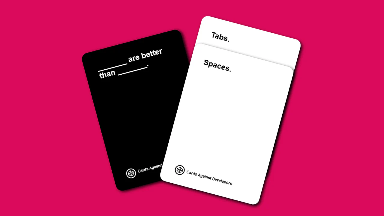
Cards Against Developer Vol. 2
Two stacked cards are toggled via hidden radio buttons. Checking an option shifts the corresponding card forward (translate/rotate) and updates the scene’s background color. Card dimensions scale with viewport size using vmin units, clamped by min-width/max-width for consistent layout.
See the Pen Cards Against Developer Vol. 2.
Overlapping Sushi Cards
Two cards overlap using negative margins and swing based on hidden radio button state. CSS custom properties (--swing, --overlap) control the translation distances, while keyframe animations swap z-index and scale. The visible toggle button changes depending on which radio is checked, keeping the UI clear.
See the Pen Overlapping Sushi Cards.
Rainbow Stacked Accordion Animation
Multiple box-shadow layers with negative spread create the illusion of stacked paper. On hover, the card shifts diagonally while shadows collapse to zero offset — the layers appear to align. CSS custom properties keep the color scheme maintainable.
See the Pen Rainbow Stacked Accordion Animation.
Stacked Cards
Three cards overlap using negative margins to create a stacked deck. On hover, the targeted card scales up and its z-index increases, bringing it to the front. A pseudo‑element on the container adds a subtle background sheet, while an SVG scatters decorative shapes around the layout.
See the Pen Stacked Cards.
Stacking Cards
Stacking Cards piles items as you scroll. It uses position: sticky to keep cards at the top. The scroll-timeline API shrinks cards as they get covered. This creates a depth effect without JavaScript. The code is clean and runs fast. It shows how CSS handles complex scroll effects natively. Pure, declarative, and efficient. It uses animation-timeline to sync motion.
See the Pen Stacking Cards.