20+ CSS Tables
Data demands absolute clarity. Native HTML tables often break on smaller screens, creating friction between the user and the information. This updated collection of Pure CSS Table Examples provides structural logic for modern UI design. Utilizing these curated snippets transforms rigid grids into fluid, readable formats without relying on heavy JavaScript workarounds.
Technically, these examples rely on CSS Grid, Flexbox, or media queries that redefine display properties (e.g., converting td to block) for mobile views. Hover states leverage hardware acceleration, animating properties like background-color or opacity to maintain 60fps performance without triggering layout reflows. The semantic structure guarantees high layout stability and immediate data parsing by the browser.
Every free demo is fully responsive and cross-browser compatible. Users can instantly download the raw code or fork a specific layout on CodePen.
Examples

Responsive Pricing Cards
A pleasant and responsive tariff selection interface where the user’s attention is focused on the viewed option through color accents and animation.
See the Pen Responsive Pricing Cards.
Scroll Mask Indicators
A modern and clean way to indicate scrollability: the “fade-to-mist” effect is implemented using mask-image and linear-gradient, while key parameters of the fade phase are precisely tuned using @property.
See the Pen Scroll Mask Indicators.
A high-performance table with smooth UX that reacts instantly to cursor movement and theme changes, leveraging native browser capabilities instead of heavy JS calculations.
An editable table row gains focus, blurring all others. Theme and accent color are controlled via Tweakpane — changes transition smoothly with the View Transition API. Colors adapt to the theme using light-dark() and color-mix. Minimal classes, maximum modern CSS.

A responsive table with zero JavaScript. On narrow screens, each cell becomes a block labelled via data-title; headers are hidden. On wider screens, it reverts to a standard table with fixed columns. All switching is handled by media queries and data attributes. Simple, predictable, works everywhere.
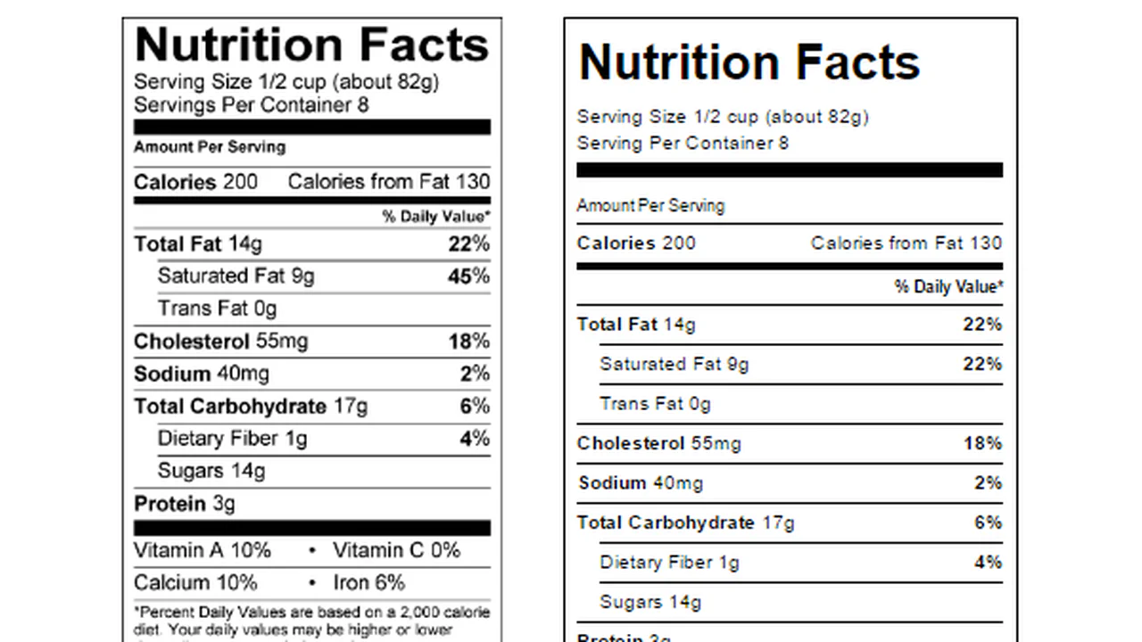
The markup faithfully replicates the standard US Nutrition Facts panel — from thick borders to footnotes. Code stays minimal: classes follow BEM, tables extend base styles with @extend. No JavaScript, just semantic HTML and tidy CSS.
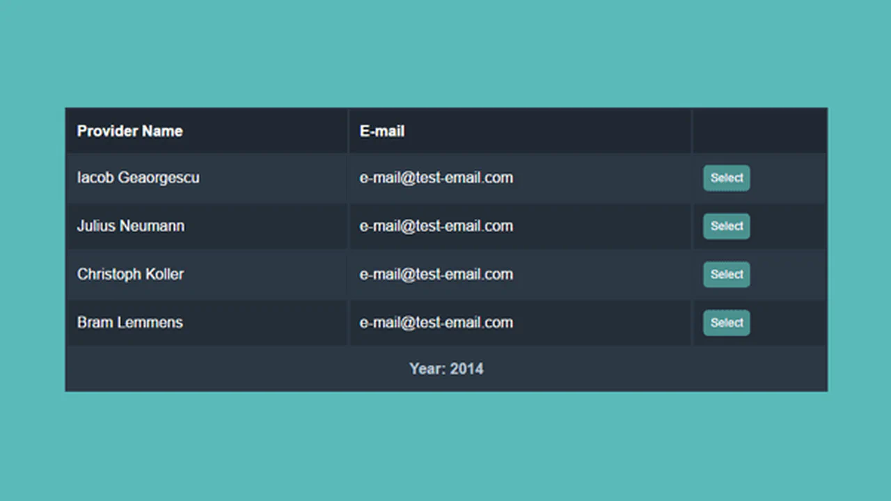
The table adapts to screen width: on narrow screens cells stack vertically with labels pulled from data-title; on wider screens it reverts to a standard table layout. The detail view slides in from the left using CSS transforms — jQuery only toggles a class. Minimal scripting, all presentation logic lives in the styles.
Rows expand on hover to reveal prize‑pool details. A colored left border identifies the sport and shifts hue on hover. A few rows use CSS animations to demonstrate fade‑in, fade‑out, and data updates. JavaScript is currently unused.

A responsive table with zero JavaScript: on narrow screens each cell becomes a block labeled via the data-th attribute; headers are hidden. On wider screens it reverts to a standard table. Mobile-first approach, a media query toggles modes, all functionality is pure CSS.
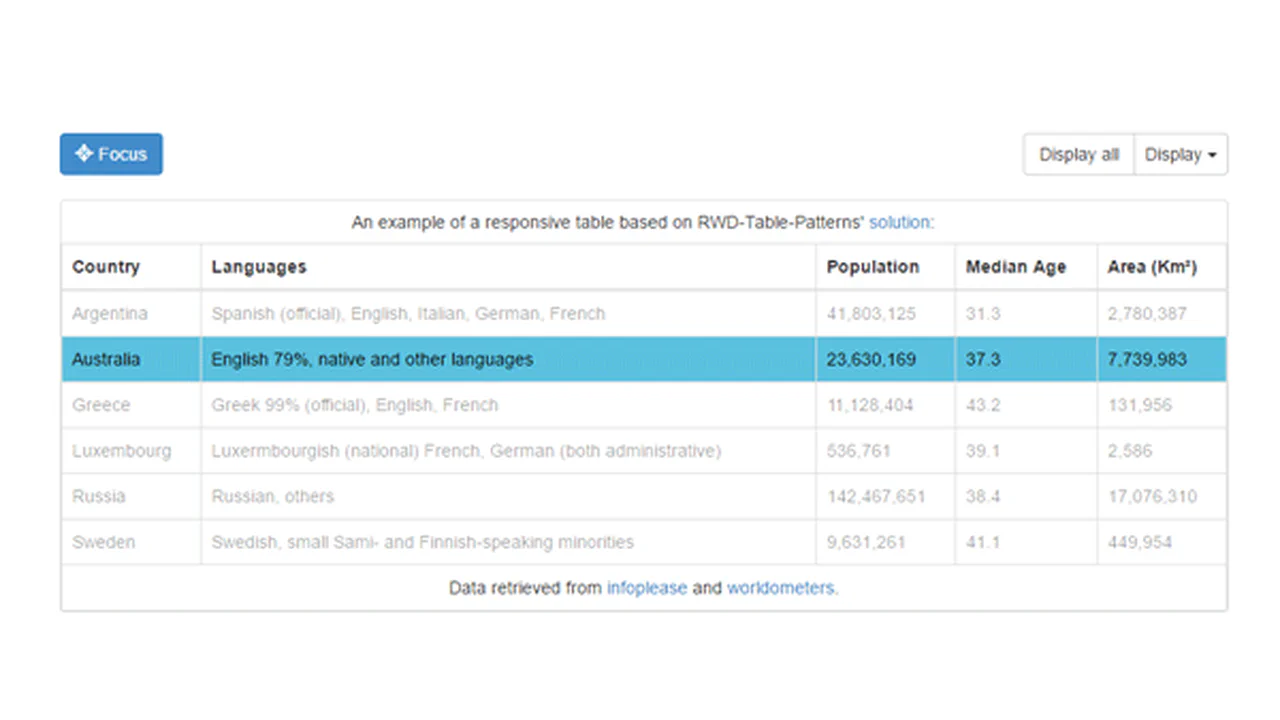
This snippet shows a responsive table powered by the RWD‑Table‑Patterns library. On narrow screens, low‑priority columns are hidden, and the remaining ones adjust to fit — configured via data-priority. Minimal custom styling, all magic inside the library.

This snippet creates a table with a fixed header and a scrollable body. jQuery calculates the scrollbar width and applies it as padding to the header, keeping columns aligned. Header and body are separate containers but share fixed column widths. Simple, functional, no extra dependencies.
A minimal table with semi‑transparent cells over a gradient background. Hovering a row highlights it; hovering a cell triggers a full‑height mask via a pseudo‑element. Minimal code, maximum visual impact.

A responsive table with pure CSS. On narrow screens, headers disappear and each cell is labelled via :before using inline data. Widths and padding keep it readable. No JavaScript — just media queries and pseudo‑elements.


