90+ CSS Text Effects: Free Code Examples & UI Snippets
CSS text effects redefine web typography by introducing tactile textures, dynamic color shifts, and dimensional depth directly to editable DOM content. By applying creative masking, shadow arrays, and motion paths natively within stylesheets, developers can craft highly expressive typographic headlines that maintain search engine readability and complete layout scaling.
- Texturing and color-flow overlays utilize background-clip: text coupled with linear gradients to apply dynamic color arrays inside text glyph boundaries.
- Atmospheric lighting and three-dimensional block depth are achieved by stacking multi-tiered, semi-transparent text-shadow layers that mimic realistic light scattering.
- To safeguard thread responsiveness and secure low INP (Interaction to Next Paint) speeds, continuous hover distortions are offloaded directly to GPU-composited transform planes.
Examine these modern typographic architectures to master the styling of lightweight, accessible, and high-performance text effects across your design system.
Table of Contents:
Examples

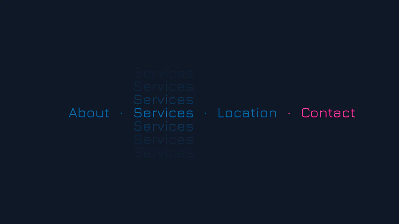
Animated Scroll Highlight Annotations
This is an Animated Scroll Highlight Annotations component. It combines a spatial theme toggle with progressive reading indicators that colorfully highlight key text passages as they enter the viewport. Its function is to enhance long-form reading experiences by guiding the user’s eye to critical information through contextual, scroll-bound motion.
 Chrome 115+
 Edge 115+
 Firefox 55+ (via fallback)
 Safari 26.0+
See the Pen Animated Scroll Highlight Annotations.

Pure CSS Faded Infinite Text Marquee
This is a Faded Infinite CSS Text Marquee. It creates a continuous, horizontal scrolling display for text elements using advanced CSS animation math. Its function is to showcase lists of keywords, tags, or announcements in a constrained space, using gradient masks to seamlessly blend the moving text into the background.
Chrome 104+
Edge 104+
Firefox 104+
Safari 14.1+
See the Pen Pure CSS Faded Infinite Text Marquee.

Generative 3D Parallax Typography
This is a Generative 3D Parallax Typography component. It utilizes the css-doodle web component to automatically duplicate and stack text elements into a volumetric layout. Its function is to create a dynamic, mouse-reactive hero graphic without the need to write complex JavaScript event listeners or maintain heavy WebGL canvases. (Requires: css-doodle)
Chrome 61+
Edge 79+
Firefox 63+
Safari 10.1+
See the Pen Generative 3D Parallax Typography.

CSS Scroll-Driven Circular Typographic Scramble
This is a Scroll-Driven Circular Typographic Scramble. It utilizes experimental CSS animation-timeline to bind complex trigonometric and geometric transitions directly to the user’s scrollbar. Its function is to create a highly engaging, interactive hero section where chaotic, scattered letters perfectly align into a readable circular sentence as the user scrolls down.
Chrome 115+
Edge 115+
See the Pen CSS Scroll-Driven Circular Typographic Scramble.

Neon 3D Seven-Segment Digital Clock
This is a Neon 3D Seven-Segment Digital Clock. It procedurally generates a classic LCD/LED interface using pure CSS geometry. Its function is to provide a highly atmospheric, real-time clock that utilizes 3D space and realistic glowing floor reflections to enhance cyberpunk or dashboard aesthetics.
Chrome 60+
Edge 79+
Firefox 55+
Safari 11+
See the Pen Neon 3D Seven-Segment Digital Clock.

Interactive 3D Layered Text Wave Effect
This is an Interactive 3D Layered Text Wave Effect. It transforms a flat heading into a dynamic, multi-layered typographical stack that tracks cursor movement. Its function is to create immersive, interactive hero sections, replacing static typography with a playful spatial experience.
Chrome 36+
Edge 12+
Firefox 16+
Safari 9+
See the Pen Interactive 3D Layered Text Wave Effect.

CSS Staggered Bars Reveal Animation
This Staggered Bars Reveal Animation creates a cinematic intro for landing pages using zero JavaScript. By orchestrating a single pseudo-element (::after) with complex linear-gradient backgrounds, the component simulates seven distinct bars sliding into place. The animation cleverly shifts the background-position of each gradient strip sequentially, creating a rhythmic “wipe” effect that culminates in the text appearing.
Chrome 100+
Edge 100+
Safari 14+
Firefox 90+
See the Pen CSS Staggered Bars Reveal Animation.
Vertical Ghost Text Hover Effect
This Vertical Ghost Text Hover Effect adds a spectral, sci-fi vibe to navigation menus without requiring extra HTML elements or pseudo-elements. By animating a stack of vertical text-shadows, the component creates a fading “echo” or “glitch” visual that expands outward when a user interacts with the link. It utilizes the modern light-dark() function to handle system theme preferences automatically.
Chrome 123+
Edge 123+
Safari 17.5+
Firefox 120+See the Pen Vertical Ghost Text Hover Effect.

Tick-Tock Typographic Clock
This Tick-Tock Typographic Clock reimagines the traditional clock face by replacing ticks and numbers with words. Using a clever SCSS loop, it arranges 60 text elements (“TICK” for even seconds, “TOCK” for odd) in a perfect circle. A JavaScript interval updates the active class every second, creating a rhythmic, reading-based timekeeping experience. (Requires: FontAwesome)
Chrome 49+
Edge 15+
Firefox 43+
Safari 10+
See the Pen Tick-Tock Typographic Clock.

Shapes Alphabet with CSS
A pure CSS typography experiment rendering the full alphabet using layered gradients.
See the Pen Shapes Alphabet with CSS.

CSS Cube
A pure CSS isometric text cube constructed via 3D transforms and trigonometry-based SCSS calculations. It features dynamic styling controlled by :has() and CSS variables, allowing for runtime theme switching (tritone/monotone/dim) and dark mode adaptation without JavaScript logic.
See the Pen CSS Cube.

Floating Headers
Impressive, weighty 3D typography that reacts to scrolling with a natural shift in perspective, reminiscent of volumetric signage or cinematic titles.
See the Pen Floating Headers.
Text Shimmer Lines Effect
A text shimmer effect, where all parameters - from gradient angle to animation speed - are configured in real-time via Tweakpane. The smooth theme change is implemented using the latest View Transitions API, and the effect itself is built on background-clip: text and CSS variables.
See the Pen Text Shimmer Lines Effect.

3D Text Shadow
An example of a complex text-shadow where SCSS is used to create a multi-layered shadow with precise offsets for each layer - this gives the text a dimensional, “cartoonish” effect that is unachievable with standard tools.
See the Pen 3D Text Shadow.

Cosmic Neon Text Effect
A spectacular, interactive heading design: on hover, the text stroke disappears, giving way to a powerful, multi-colored neon glow. It’s a perfect demonstration of pure CSS capabilities for creating complex typography and “wow” effects.
See the Pen Cosmic Neon Text Effect.

Multiline Skewed Text Effect
Demonstrates applying a skewY transform to multiline text, showing how the preserve-3d property ensures the text block itself is skewed as a single plane, creating a seamless, angled effect across all lines.
See the Pen Multiline Skewed Text Effect.

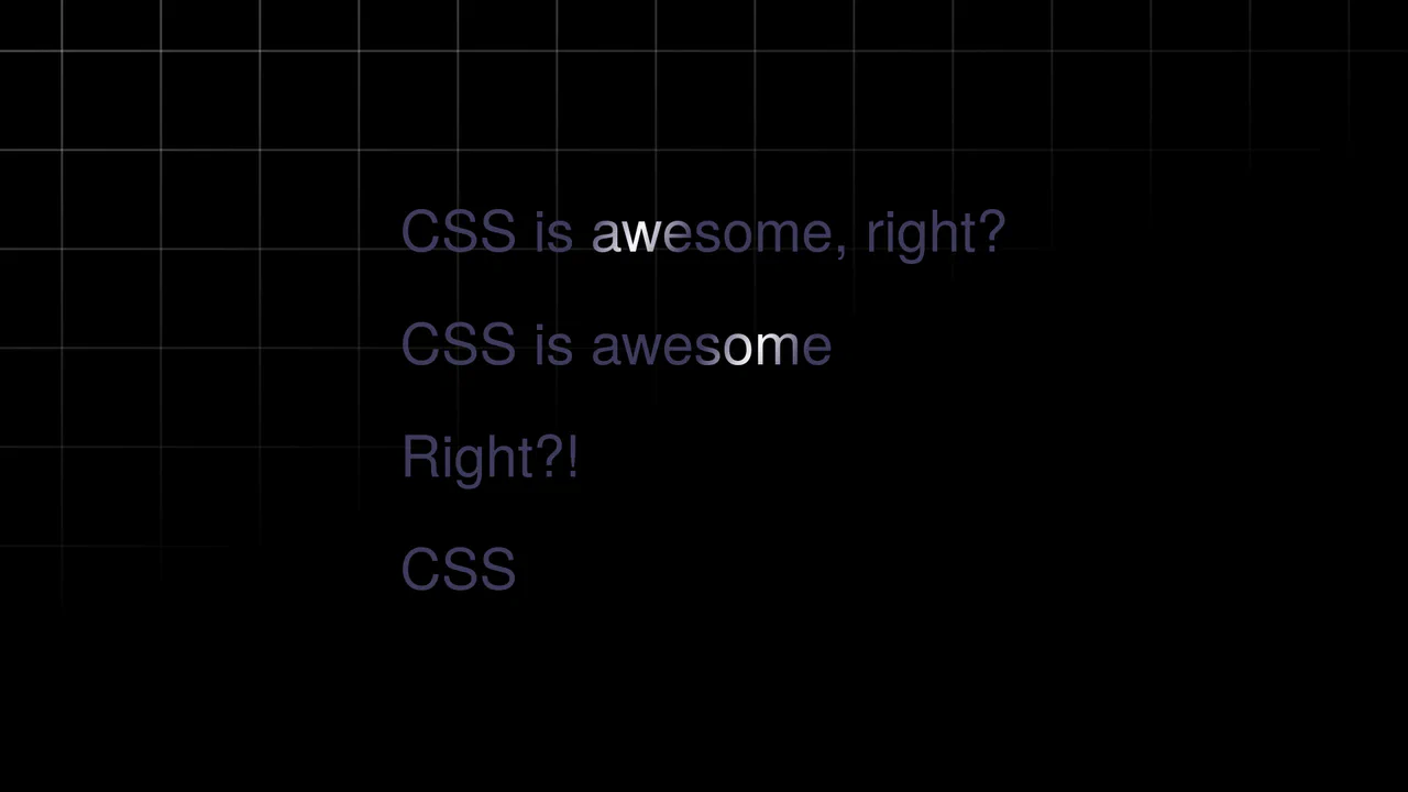
Fading Away Text Effect
This demo shows how to create a dynamic text fade effect using CSS variables and JavaScript. Each character is wrapped in a <span> with a unique index, which is then used in calc() to apply a blur and opacity effect.
See the Pen Fading Away Text Effect.

Infinite CSS Loop Text Animation
A complex 3D text animation demonstrating advanced use of CSS Grid and Flexbox along with container-type: size for responsiveness. The text rotation and “neon glow” effect (Text Shadow) are dynamically controlled via var(–glow) and hsl().
See the Pen Infinite CSS Loop Text Animation.

Animated Text Ribbon with SVG and CSS
Explore an SVG-powered animated text ribbon, showcasing complex path animations and efficient CSS for a visually striking, scalable effect.
See the Pen Animated Text Ribbon with SVG and CSS.
Animated Gradient Text
Shimmering text animation via gradient shifting. Linear gradient moves across background position, background-clip: text restricts it to letter shapes. color: transparent reveals gradient. Forced-colors media query maintains readability.
See the Pen Animated Gradient Text.
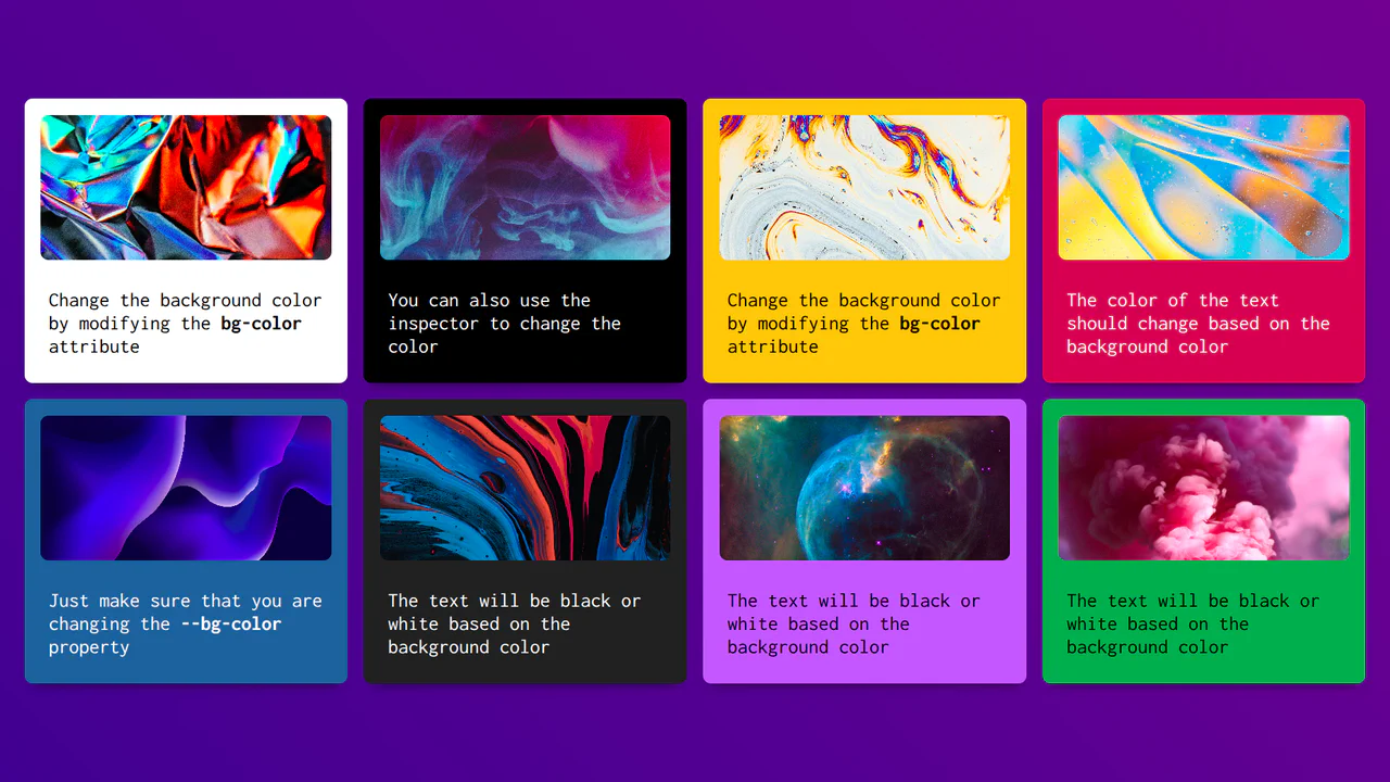
Accessible Text Color Based on the Background Element
CSS-Calculated Text Contrast is a pure CSS implementation of color accessibility. It uses attr() to read a background color directly from HTML. The “magic” lies in a series of calc() and pow() functions that determine the color’s relative luminance based on sRGB standards. By leveraging Relative Color Syntax, it automatically toggles text between black and white. No JavaScript required.
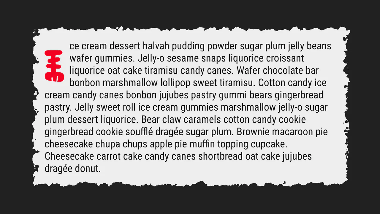
Drop Cap, Please!
A creative “torn paper” text effect powered by SVG filters such as feTurbulence and feDisplacementMap for realistic edge distortion. This snippet showcases advanced CSS pseudo-element styling and fluid typography, providing a lightweight and high-performance solution for organic UI design.
See the Pen Drop Cap, Please!.
Text Circle Animation
A high-performance pure CSS circular text animation leveraging modern Scroll-Driven Animations and custom @property logic. This snippet accurately simulates motion inertia and scroll velocity without JavaScript, providing a lightweight and scalable alternative to complex WebGL implementations for creative UI/UX.
See the Pen Text Circle Animation.
Scroll Driven Gradient Reveal Text
Scroll-Driven Text Gradient Reveal implements a fluid text color-shimmer effect tied directly to scroll coordinates. By utilizing the native animation-timeline: scroll(root) property, scroll offsets shift the position of a text-masked radial-gradient background. Checkbox logic handles toggling -webkit-background-clip off to expose the unclipped gradient block.
See the Pen Scroll Driven Gradient Reveal Text.
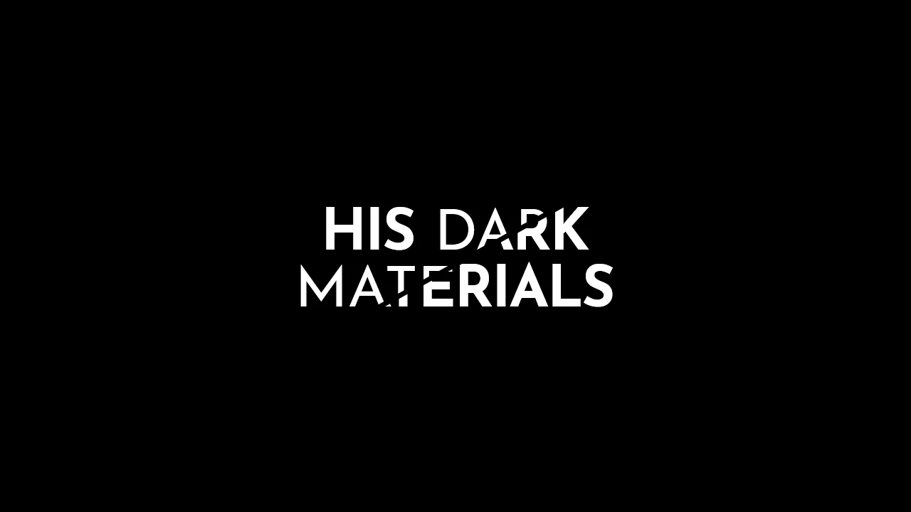
His Dark Materials: TV Series Logo
A stylish, graphic headline with a diagonal split, creating a sense of layering or a “cut-out” effect, ideal for posters or logos.
See the Pen His Dark Materials: TV Series Logo.
Link Split Hover Effect
A “tearing” text effect created by layering two <span>s with an asymmetrical clip-path. On hover, transform shifts the top part, ::after pseudo-elements draw the tear line, and an underline animates via background-position - the entire choreography is managed by transition-delay and a custom cubic-bezier function.
See the Pen Link Split Hover Effect.
Hover Effect #2
A performant text-swapping effect on hover, built on a synchronized animation - the original <span> is displaced by a ::after pseudo-element. The replacement content is sourced from a data-replace attribute via attr(), while smoothness and performance are ensured by transform: translate3d and a custom cubic-bezier function.
See the Pen Hover Effect #2.
80s Fonts Text Effect 4: Cyberspace Text
The ready-to-use 80s-style effect is achieved through the synergy of two key components: an SVG extrude filter for crafting the neon 3D text and a dynamic CSS starfield background animated along the Z-axis.
See the Pen 80s Fonts Text Effect 4: Cyberspace Text.
CSS Text Hover
Variable Font Hover Effect showcases the power of modern typography. It uses a single main element and a variable font to transition between extreme weights. The 3D depth comes from stacked text-shadow layers and a thick -webkit-text-stroke. On hover, font-variation-settings smoothly morphs the weight from 900 to 100. It’s a clean, declarative way to create high-impact interactive headers without any JavaScript.
See the Pen CSS Text Hover.
Make the Web Less Boring
Variable Font Morphing Effect uses two layers of variable fonts to create a 3D expansion. The span handles the top face, while ::before renders the spine. On hover, font-variation-settings animate custom axes like hrzn and vert. It uses clamp() for fluid sizing and a custom cursor. High visual impact, zero JavaScript, and minimal DOM.
See the Pen Make the Web Less Boring.