90+ CSS Text Effects: Free Code Examples & UI Snippets (Page 2)
Examples

Fluid Gooey Text Background
Gooey Text and Image Mask creates organic, rounded shapes for text backgrounds and images. It relies on an inline SVG filter that combines Gaussian blur and a color matrix to “melt” edges together. The text uses box-decoration-break: clone to maintain padding across line breaks. It is a smart, zero-JS alternative to rigid rectangles. The title is also contentEditable.
See the Pen Fluid Gooey Text Background.
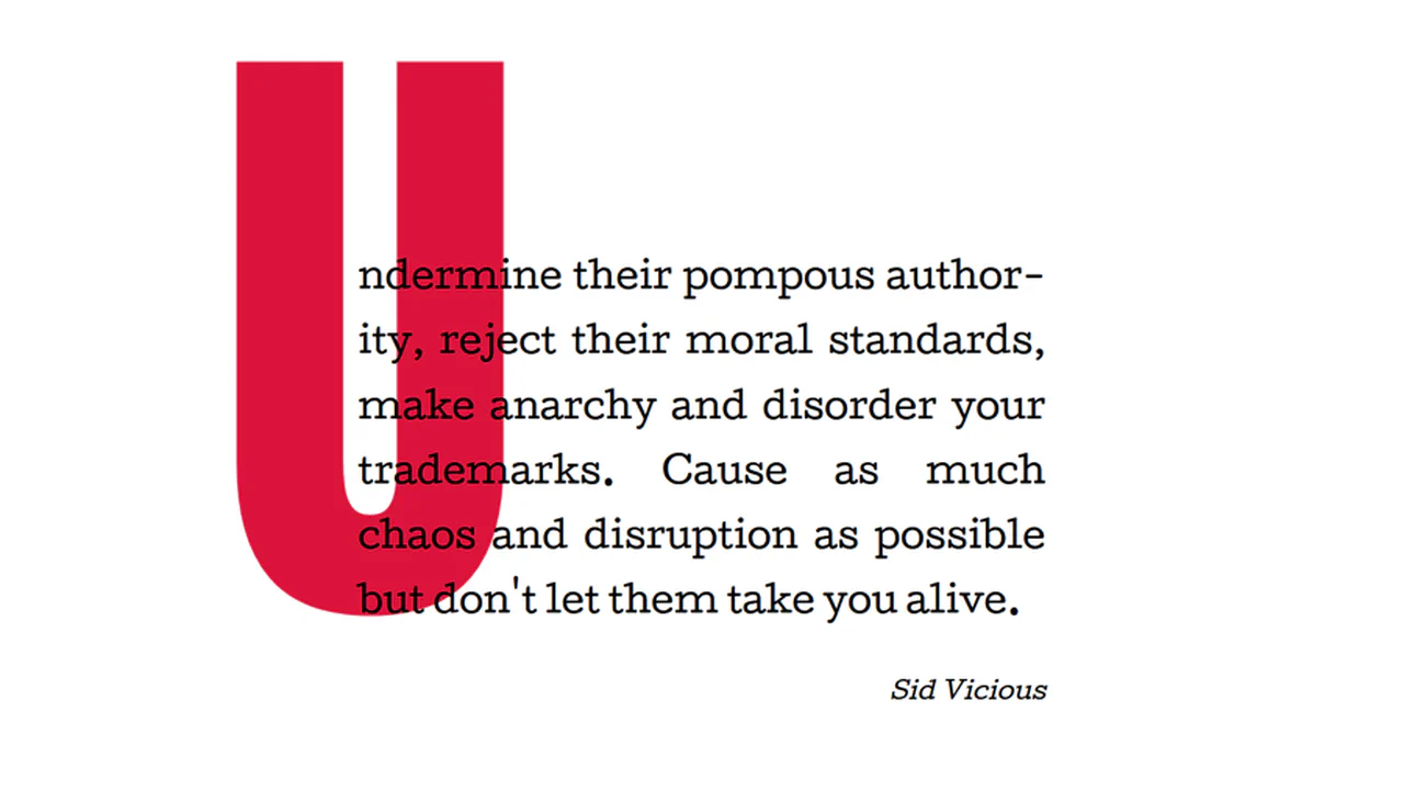
Big Drop Cap
The demo showcases a classic yet relevant technique for creating an extra-large drop cap via :first-letter using negative horizontal margins (margin-right: -1000px) and line-height: 1, allowing the element not to affect the main text flow, thus ensuring clean typography.
See the Pen Big Drop Cap.
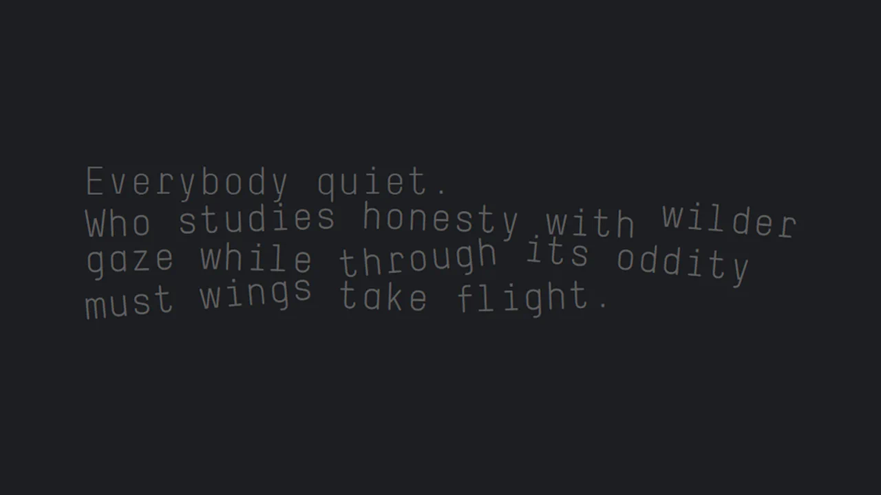
Chromatica Sonnet Interlude
Tilted Typography Layout creates an organic, jagged reading rhythm using only basic CSS properties. It wraps individual words in inline-block containers and applies subtle rotate() transforms. By alternating between 2 and 5-degree angles, it effectively breaks the rigid horizontal grid of the modern web. It is a lightweight, declarative way to achieve a “zine” aesthetic without any JavaScript.
See the Pen Chromatica Sonnet Interlude.
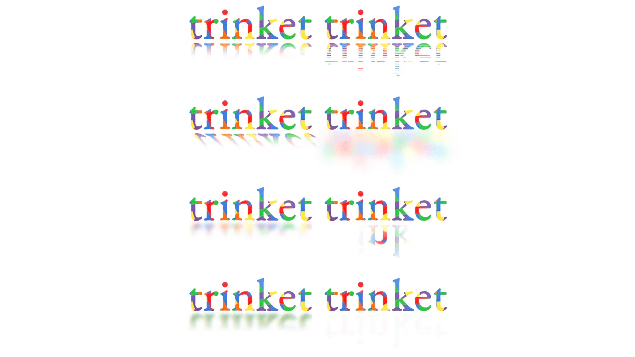
Reflections with CSS
Trinket Text Reflections uses background-clip: text to fill glyphs with imagery. Reflections are mirrored with rotateX(180deg). The real power lies in mask-image; it uses linear and repeating gradients to fade the “floor.” By adding filter: blur and skew, it mimics physical surfaces. It’s a declarative, zero-JS approach to high-end display type.
See the Pen Reflections with CSS.
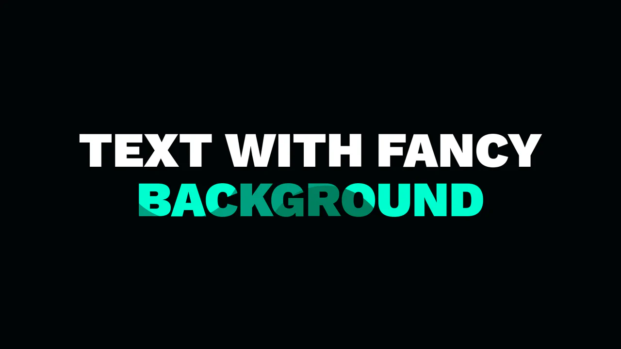
background-image for Text
Fancy Text Background leverages background-clip: text to fill heavy typography with a custom pattern. The background is an inline SVG data URL, keeping the design self-contained. By setting color: transparent, the vector shapes become the text fill. It uses @supports for a safe fallback to solid white. Simple, performant, and zero-dependency decorative type.
See the Pen background-image for Text.

Cut Out Typography
GO FOR IT 3D type. A brute-force extrusion achieved through 500+ layers of text-shadow. Each 1px offset is meticulously hardcoded to create depth. It’s a CSS “monstrosity” that trades file size for a bold, retro aesthetic. High visual impact, but watch the paint performance on low-end devices. The commented JS shows how to automate this manual madness.
See the Pen Cut Out Typography.
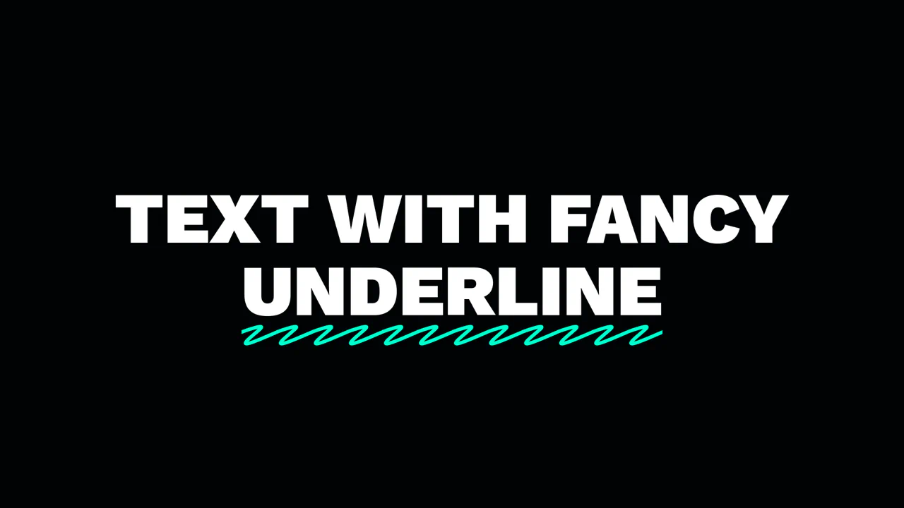
Pseudo Element for Fancy text-decoration
Fancy Underline swaps boring borders for an inline SVG pattern. It uses the :after pseudo-element and background-repeat: round to tile a hand-drawn path perfectly across any word length. By anchoring dimensions to em units, the decoration scales with the font-size.
See the Pen Pseudo Element for Fancy text-decoration.

Pure CSS. Useless
Believe 3D Typography is a masterclass in pseudo-element stacking. It uses perspective and rotateX to tilt the baseline. The glow and reflection are generated via attr() and mix-blend-mode. By combining background-clip: text with a linear-gradient on the ::before element, it creates a distorted chromatic shadow. Pure CSS, zero JS, and highly performant.
See the Pen Pure CSS. Useless.
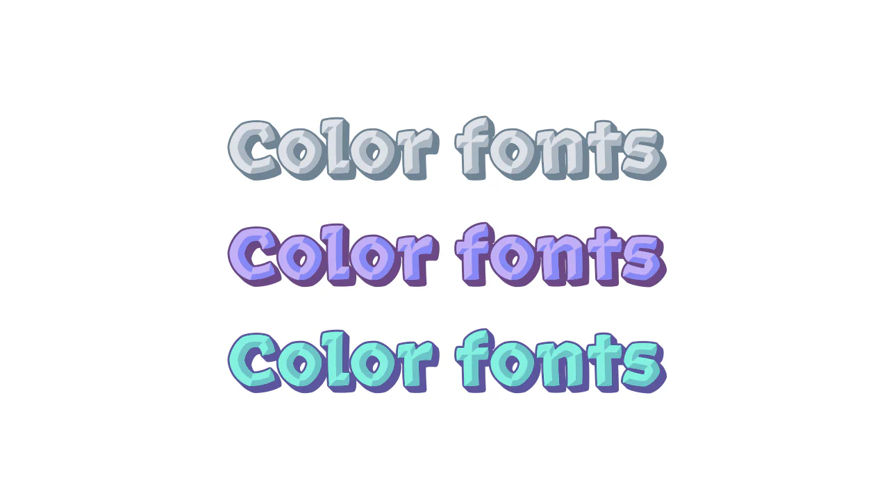
font-palette
Color Fonts with Rocher uses the font-palette property to style multi-colored type. No more layering <span> tags or complex SVG masks. It picks predefined color schemes from the font file using @font-palette-values. You just set a base-palette index and apply it. It’s declarative, performant, and keeps the DOM clean. Modern typography at its simplest.
See the Pen font-palette.

Newspaper Cutout Text
An eclectic CSS typography experiment where every character features a distinct font family and a custom geometric background shaped via clip-path. This snippet showcases how to mix patterns, shadows, and shapes to achieve a complex collage-style or “ransom note” effect using only CSS3.
See the Pen Newspaper Cutout Text.
Stippling on Text
Layered Dotted Typography uses attr(data-text) to stack three versions of the same string. The base h1 sits between a solid blue shadow (::before) and a red-stroked top layer (::after). This top layer features a halftone dot pattern created via background-clip: text and radial-gradient. On hover, layers shift in opposite directions for a 3D pop. Pure CSS. No JS.
See the Pen Stippling on Text.

Word Underline with CSS & clip-path
Curved Underlines demonstrates three CSS tricks for hand-drawn arcs. Each uses an :after pseudo-element with a border-radius: 50%. The first uses clip-path to crop the circle. The second uses mask: conic-gradient to reveal a specific angle. The third relies on overflow: hidden. It’s a performant way to add organic flair without extra assets.
See the Pen Word Underline with CSS & clip-path.
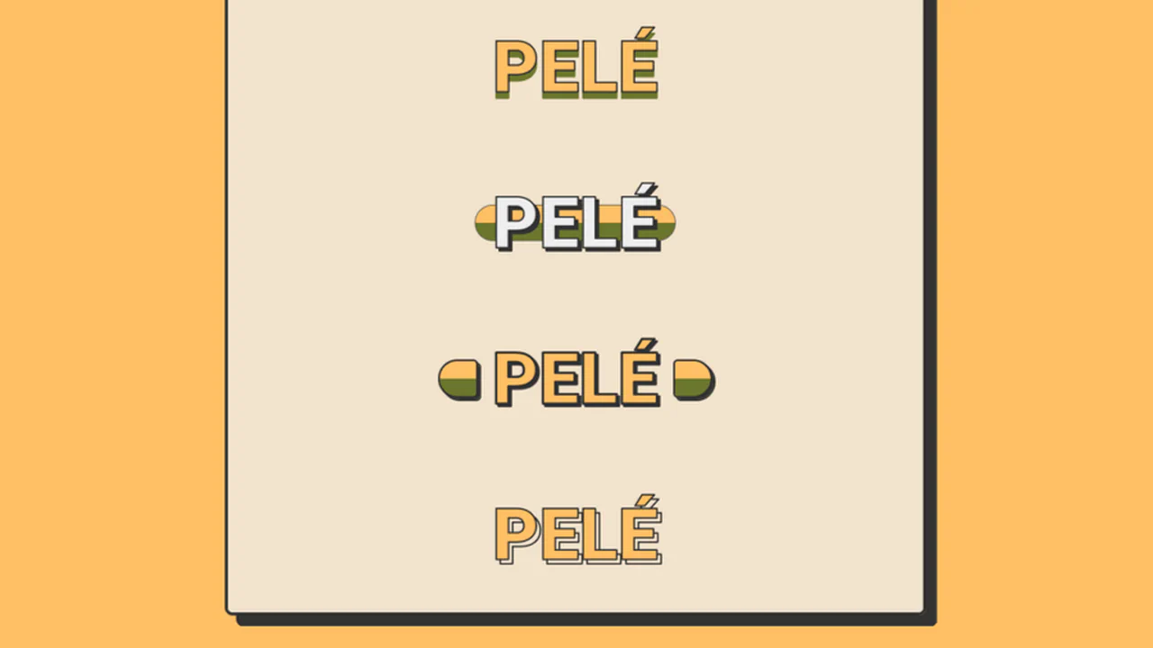
Football Sticker Titles
Pelé Pop Art Typography explores nine distinct ways to style a single name using pure CSS. It leverages -webkit-text-stroke for bold outlines and drop-shadow filters for offset depth. Creative use of ::after pseudo-elements and linear-gradient backgrounds creates “cut-out” and “sticker” effects. It also uses attr(data-name) to duplicate text for background layers. A masterclass in declarative display type.
See the Pen Football Sticker Titles.
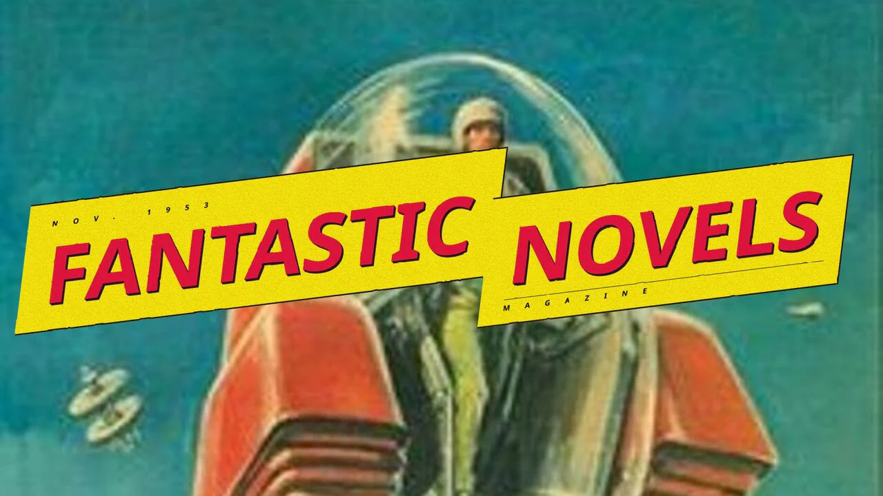
Lightning Text Skew Idea
Fantastic Novels Magazine recreates a retro cover using SVG filters. It uses feTurbulence and feDisplacementMap for a hand-drawn, “squiggly” look. The lightning bolt shape relies on skew transforms. Textures are built with base64 noise and SVG noise. Layered text-shadow and box-shadow provide 3D depth. It is a pure CSS/SVG implementation with no JavaScript.
See the Pen Lightning Text Skew Idea.
Retro CSS Text Effect
Jello showcases modern typography using the variable font Honk. It utilizes @font-palette-values to override internal glyph colors, creating a custom dark aesthetic. The neon depth comes from stacked drop-shadow filters and text-shadow. A simple hover on the wrapper scales the background. It’s a clean, declarative approach to styling complex color fonts without extra DOM.
See the Pen Retro CSS Text Effect.
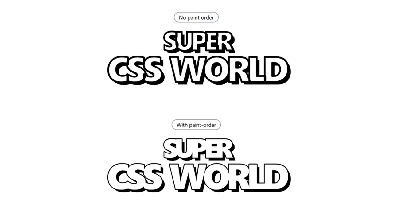
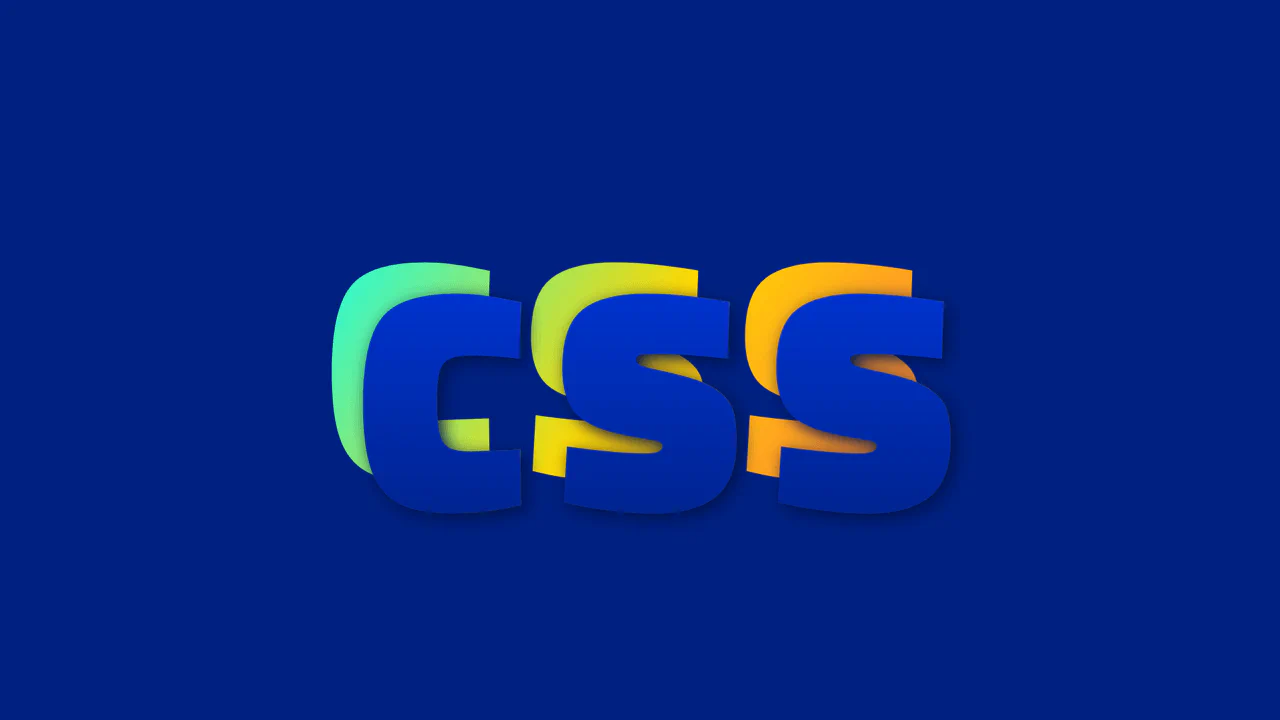
Super CSS World
Super CSS World demonstrates the paint-order property. By default, browsers paint text fill over the stroke. Thick outlines often choke the letterforms. Setting paint-order: stroke fill pushes the -webkit-text-stroke behind the fill. This preserves font weight and legibility even with a heavy 5px outline. It is a clean, declarative fix for bold display type. No JavaScript required.
See the Pen Super CSS World.
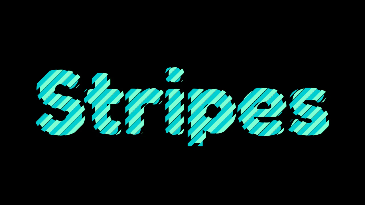
Colored Text with CSS Masks
Interlocking Striped Typography creates a woven ribbon effect using CSS masking. It duplicates text via attr(data-text) on a pseudo-element. Both layers apply a repeating-linear-gradient as a mask-image at a -45deg angle. By offsetting the position and mask coordinates of the ::before layer, the two colored stripe patterns interlock perfectly. It’s a clean, zero-dependency visual technique.
See the Pen Colored Text with CSS Masks.
CSS-Only Text Shader
CSS-Only Metal Shader uses text clipping and blending to build a dynamic chrome texture. It masks a metallic background inside .metal using background-clip: text. Inside, an absolute-positioned .texture span inherits the text mask, using background-attachment: fixed to create a scroll-linked light leak. Layers of color-dodge and multiply blend modes render realistic reflections without JavaScript.
See the Pen CSS-Only Text Shader.
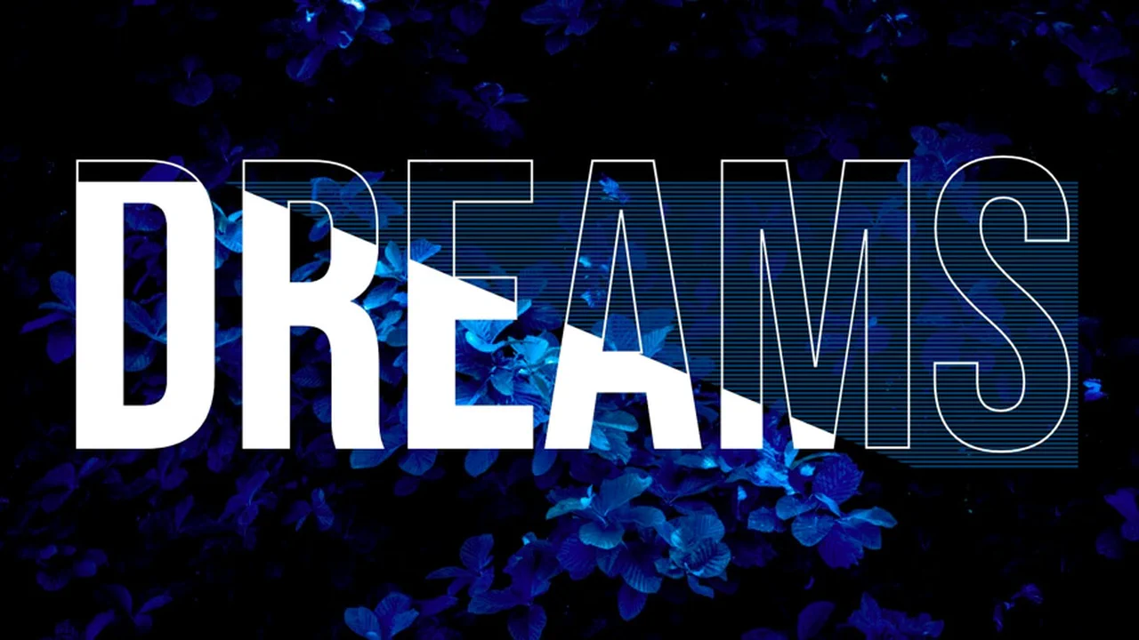
Pure CSS Text Effect
Dreams Ribbon Text is a highly mathematical CSS layout. It uses advanced CSS math like Round() and clamp() to align background stripe heights with the font’s line height. The 3D folded ribbon illusion is made by overlaying transparent text, a white -webkit-text-stroke, and dual gradients. Combined with mix-blend-mode: screen, it blends the underlying body image seamlessly through the gaps.
See the Pen Pure CSS Text Effect.
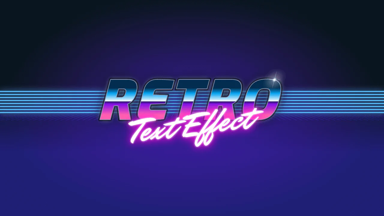
Retro Text Effect
Retro Synthwave Text Effect is a pure CSS tribute to the 80s outrun aesthetic. The classic 3D wireframe horizon is made by skewing and rotating a grid of CSS gradients on the X-axis. The metallic “RETRO” text layers a text-clipped sunset gradient over a glowing outline. A final lens flare is drawn directly on h1::after using nested radial-gradient layers.
See the Pen Retro Text Effect.
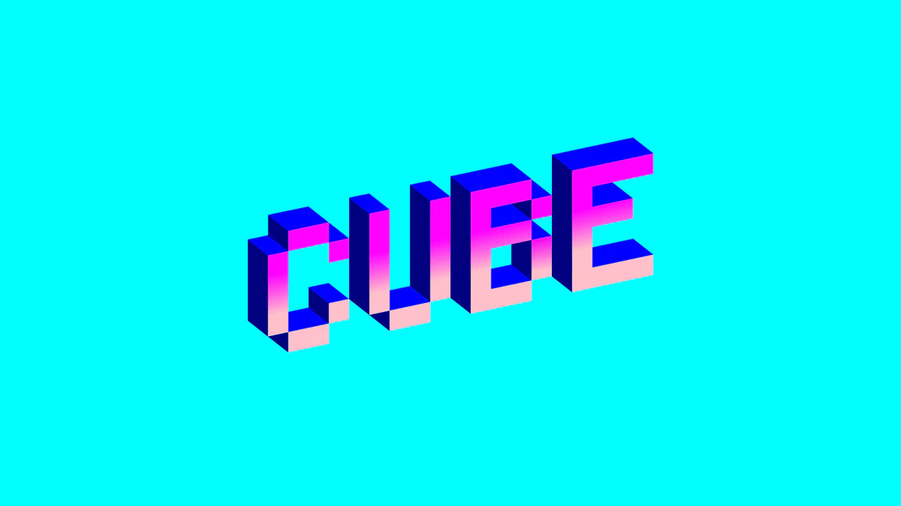
Single div CSS Cube
Single-Div Isometric “CUBED” is an extreme showcase of CSS gradient art. It renders a 3D isometric word using just one HTML div. The magic lies in a massive chain of styled linear-gradient declarations acting as individual pixel blocks. A final skewY(-12deg) transform locks the isometric perspective. While impractical for production, it’s a brilliant exercise in CSS drawing.
See the Pen Single div CSS Cube.
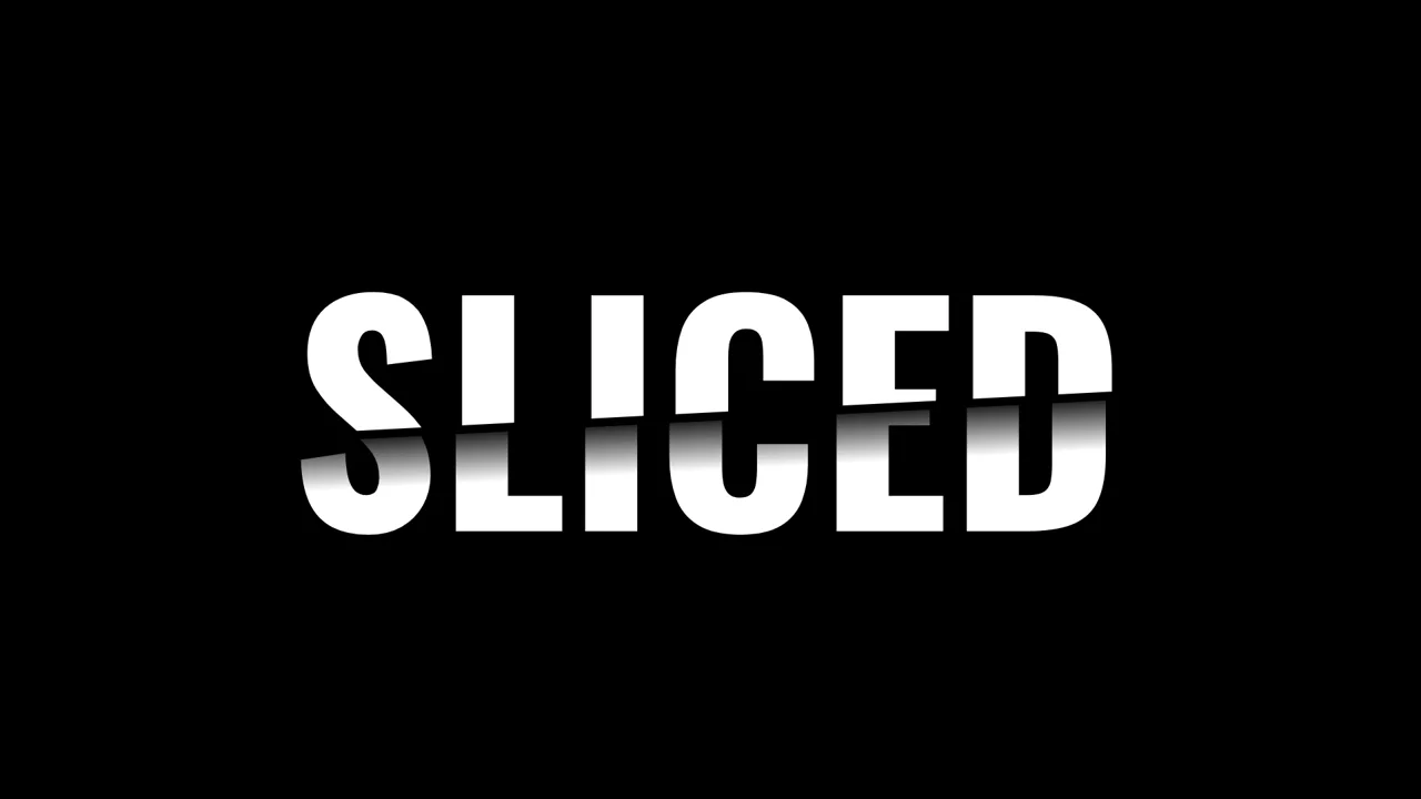
Sliced Text Effect
Sliced Text Effect splits a word in half using CSS layout and masking. It stacks two identical text layers inside a grid. The .top layer is cropped by a clip-path polygon. The .bottom layer is cropped on the opposite side and shifted with transform: translateX(). A linear-gradient text mask creates a shadow on the cut. Pure CSS, zero JS, and highly performant.
See the Pen Sliced Text Effect.
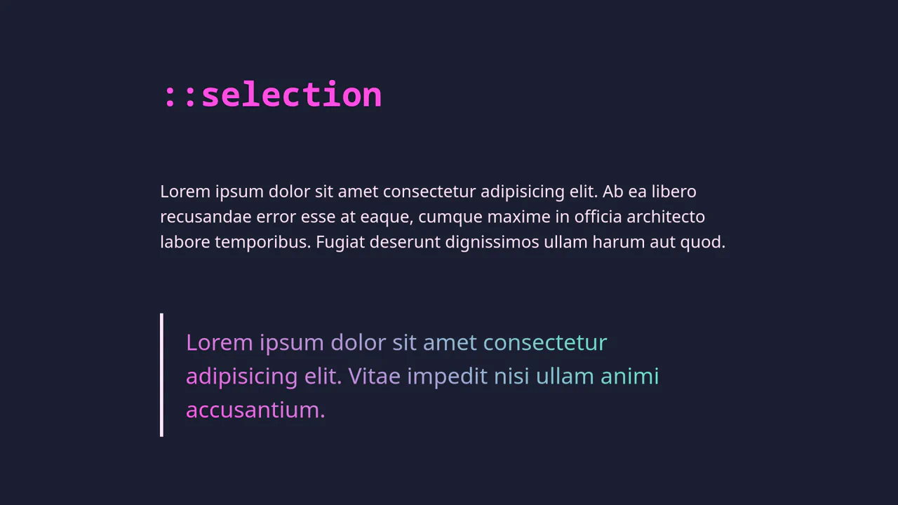
Gradient Text and ::selection Customization
Selection and Gradient Text is about small details. It uses ::selection to change the highlight color. The blockquote gets a gradient by using background-clip: text and making the fill transparent. It uses HSL variables for easy color control. No JavaScript. Just clean, declarative CSS. It is fast, accessible, and works natively in the browser.
See the Pen Gradient Text and ::selection Customization.
Text Stroke CSS Mask Effect
Text Stroke Mask Effect uses a clever stacking trick. It sandwiches a position: fixed image between two identical text layers. The bottom layer is solid white. The top layer is transparent with a -webkit-text-stroke. As you scroll, the image stays put while the text moves, creating a masking illusion. It is a zero-JS solution that relies entirely on the CSS z-axis.
See the Pen Text Stroke CSS Mask Effect.
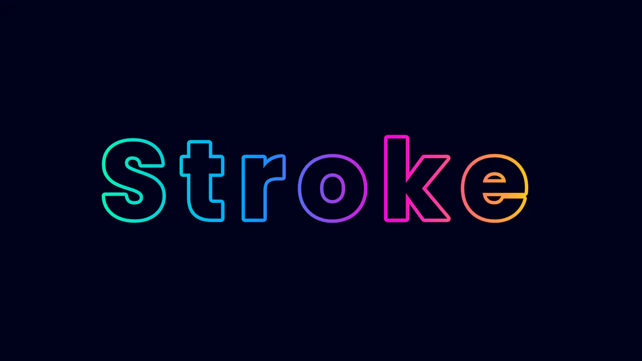
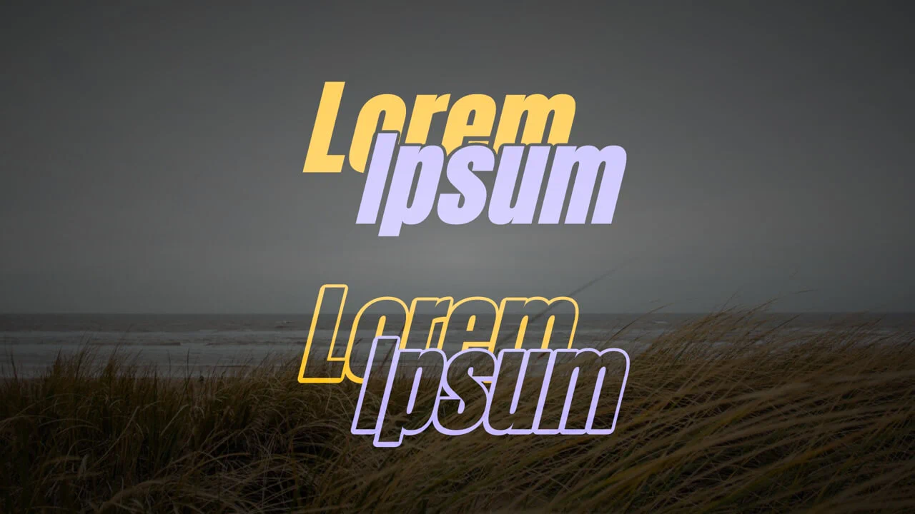
Gradient Stroke
Gradient Text Stroke uses background-clip: text to mask a linear gradient. The trick is setting the text color to match the background while making -webkit-text-stroke-color transparent. This renders a hollow letter where only the outline shows the gradient. It is a declarative, zero-JS solution for bold headers. Simple math with calc() keeps the stroke width proportional to the font-size.
See the Pen Gradient Stroke.
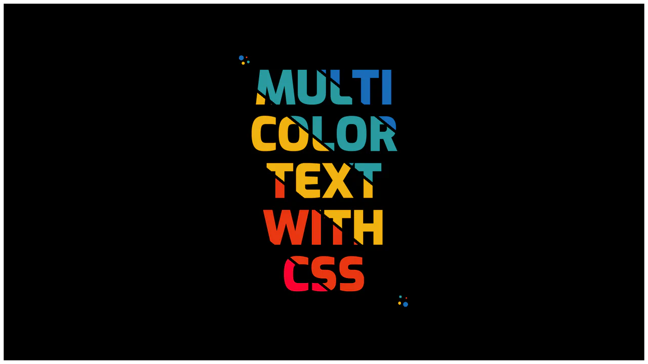
Multi Colored Text with CSS
Multi color text with CSS uses background-clip: text to fill glyphs with a striped linear-gradient. By setting color: transparent, the text acts as a mask for the colors underneath. Hard color stops create sharp, clean lines. The surrounding dots are made with multiple radial-gradient layers on the container. It is a clean, zero-JS way to achieve a bold graphic design look.
See the Pen Multi Colored Text with CSS.
CSS Paper Cut-out Effect
3D Chromatic Typography creates an elegant, volumetric headline layout. It uses CSS grid area coordinates to overlap two layers of the same word. The front span is masked over a vibrant diagonal gradient, while the ::after pseudo-element duplicates the text, offsets it by 0.1em, and applies a subtle vertical shadow gradient. It is a highly performant, vector-based display style.
See the Pen CSS Paper Cut-out Effect.
Lightness
Floating Typography with Reflections uses simple layout tricks to simulate vertical depth. It places identical letter nodes inside segments, flipping the lower .shadow layer using scale(1, -1). Hovering over a wrapper animates the elements in opposite directions via translateY. A solid gradient .overlay at the base masks the shadows, completing a convincing floating reflection.
See the Pen Lightness.
Overlapping & Hollowed Text
Interlocking Blended Typography builds an overlapping layout where text layers intersect with a clean visual bleed. Stacking identical span elements and translating them in opposite directions creates the diagonal offset. By declaring mix-blend-mode: screen on the wrapper, the contrasting colors blend on intersection. Pseudo-elements pull attributes to draw thick, clean vector outlines.
See the Pen Overlapping & Hollowed Text.
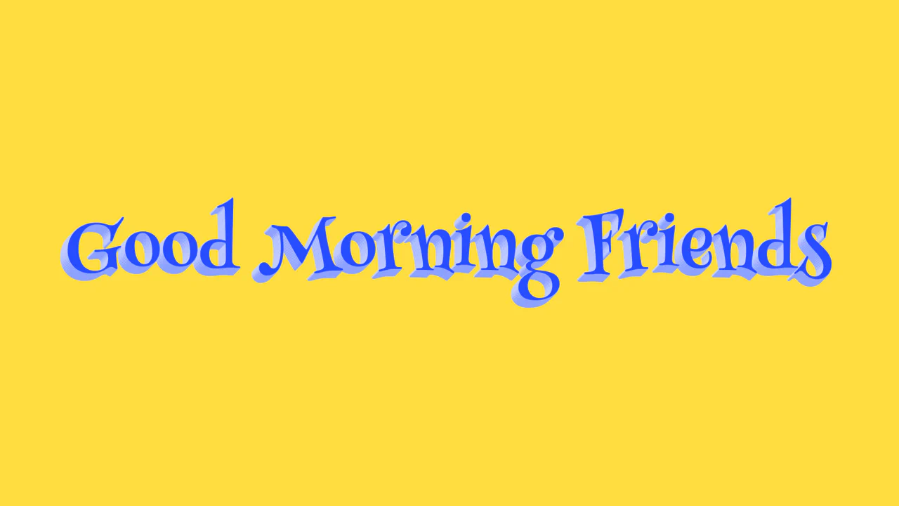
Text Shadow
3D Alternating Text Shadow implements a volumetric, retro-comic typography style using pure CSS. It builds a realistic, extruded 3D text look by chaining multiple coordinate offsets inside the text-shadow property. By alternating light and dark blue colors (#8da1ff and #c0cbff) down to 8 pixels, it creates a tactile depth effect without heavy performance overhead.
See the Pen Text Shadow.