90+ CSS Text Effects: Free Code Examples & UI Snippets (Page 3)
Examples
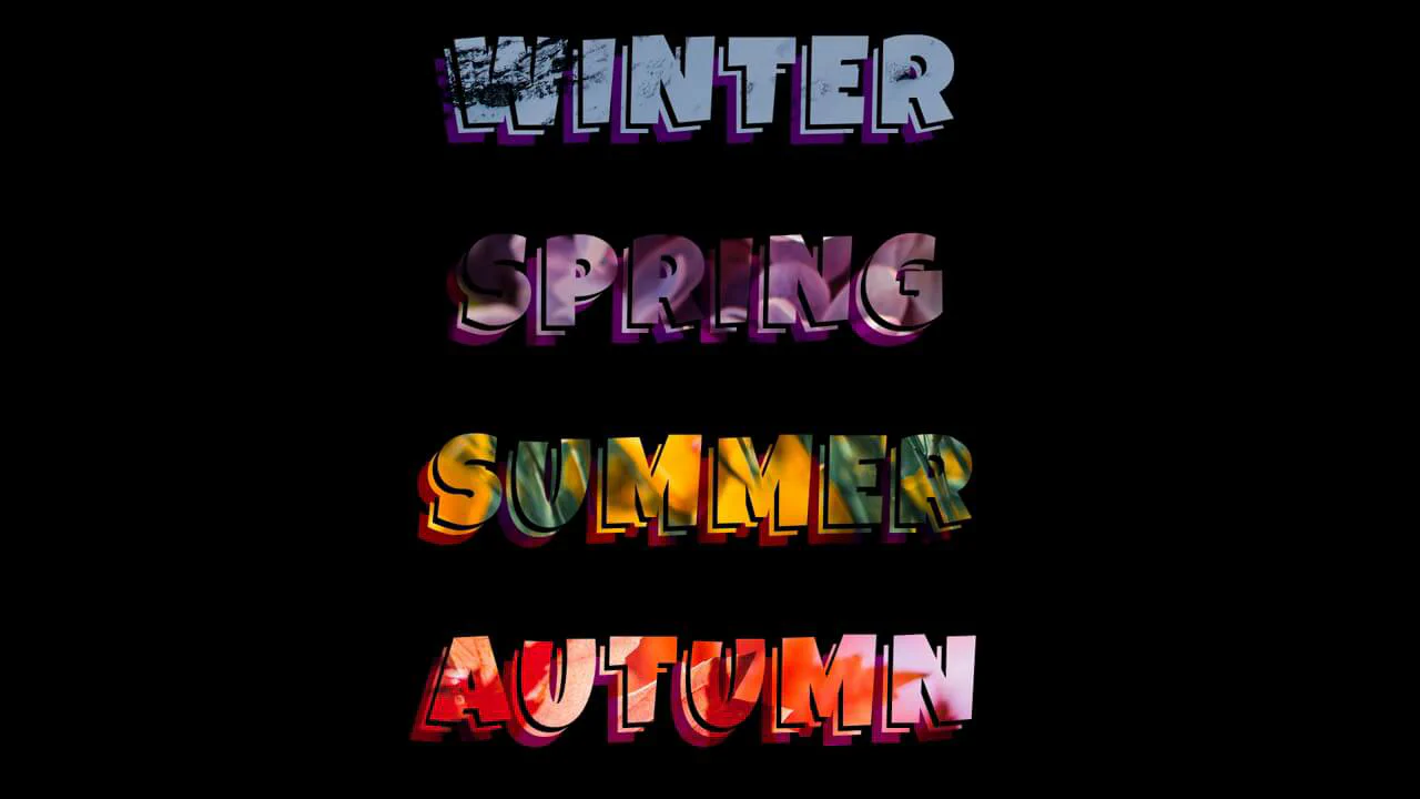
Text-Shadow
3D Striped Text Hover is a clever typographical transition made on pure CSS. It duplicates text via content: attr(data-text) on pseudo-elements. The background layer :before uses a repeating mask: repeating-linear-gradient and is animated on hover. The text-shadow shifts from flat coordinates to a staggered 10-step offset, creating a textured 3D extruded depth.
See the Pen Text-Shadow.
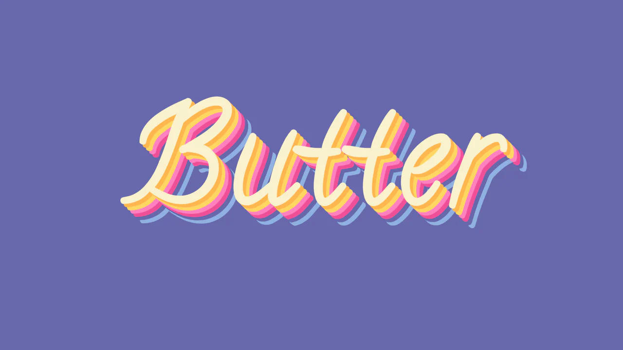
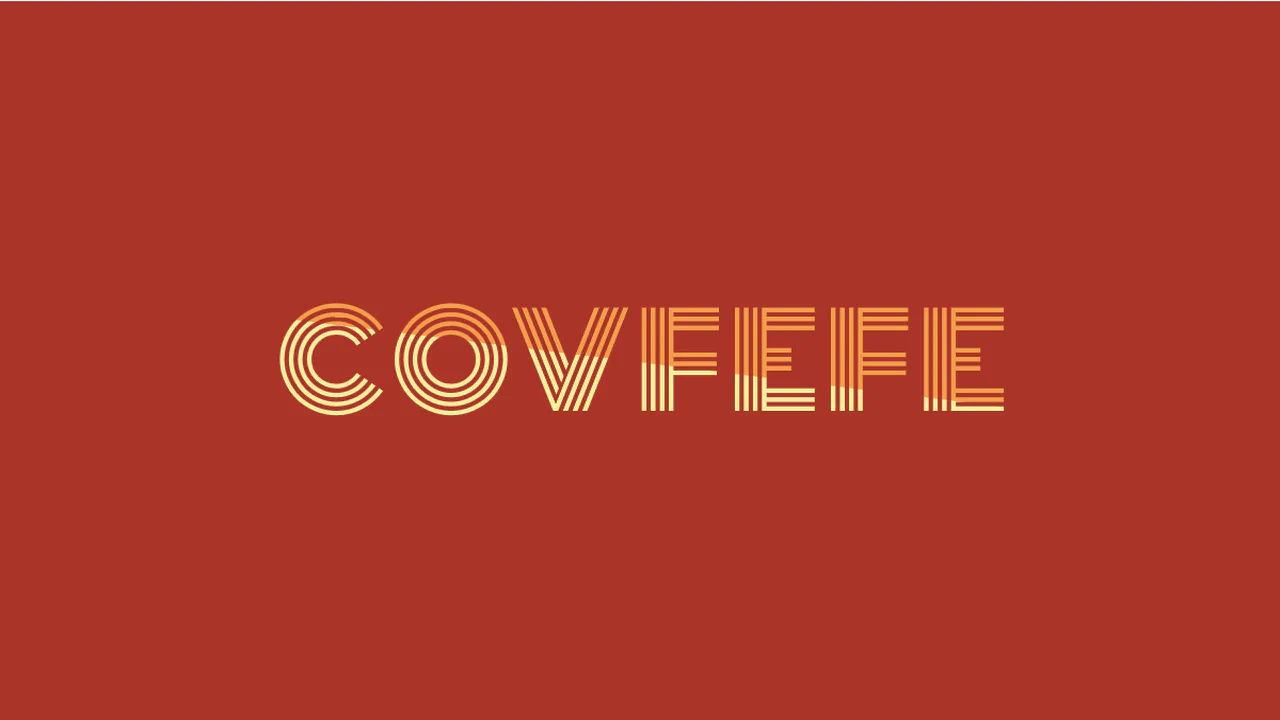
Butter
Staggered Multi-Color Retro Shadow builds a volumetric, layered typography layout using pure CSS. It chains multiple offsets within a single text-shadow declaration to simulate 3D depth extrusion. By setting the fifth shadow layer (25px) to match the body’s background color, it creates a clean, isometric gap illusion between the color blocks without splitting the DOM.
See the Pen Butter.
Custom Multiline Text Underline with Rounded Caps
Tiled Rounded Underline implements a highly detailed, multi-line text decoration using pure CSS. By declaring box-decoration-break: clone, it forces background layers to render on every text row individually. It combines a central linear-gradient line with left and right SVG cap images, using CSS variable calculations to scale the capsule seamlessly on any wrapping line split.
See the Pen Custom Multiline Text Underline with Rounded Caps.
Knockout Text
Multiply Blend-Mode Text Mask implements a high-contrast text clipping effect using pure CSS. By applying background: black and color: white directly to paragraphs, it sets up a monochrome canvas. Declaring mix-blend-mode: multiply reverses the rendering: the white text becomes transparent, exposing the parent container’s photo background, while the black area remains solid.
See the Pen Knockout Text.
Sliding Perspective
3D Sliding Accordion Text constructs an interactive folded-screen text effect using pure CSS. It splits text into masked .perspective-line segments. Odd and even rows are sheared in opposite directions using alternating skew() and scaleY() transforms. Hovering over the text triggers a translate() shift on internal paragraphs, creating a fluid 3D sliding panel transition.
See the Pen Sliding Perspective.
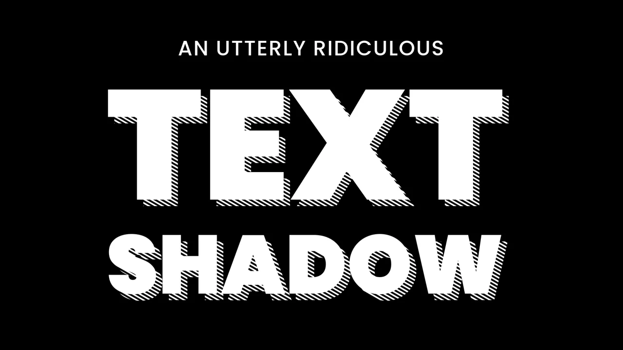
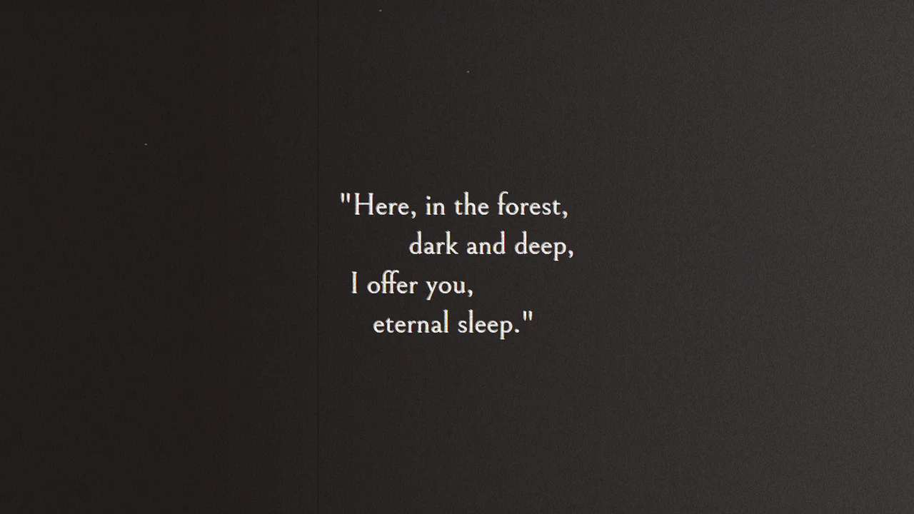
Text Shadow
Ridiculous Text Shadow is a mind-bending typography trick on pure CSS. It creates a full-screen diagonal stripe pattern using a single hyphen character - with a massive 3000px alternating text-shadow stretched via scaleX(100) skewY(89deg). This pattern is then masked inside the letters of a .text--knockout wrapper using mix-blend-mode: multiply. An incredible, highly creative display hack.
See the Pen Text Shadow.
Multi Line Text Fat Underline Hover
Multi-Line Text Highlight demonstrates a simple yet effective transition for text underlines. By using display: inline on the inner span, the text wraps naturally. The underline itself is drawn using a static linear-gradient background. Hovering over the header transitions background-size from 0 to 100%, smoothly sliding the underline across multiple lines without JavaScript.
See the Pen Multi Line Text Fat Underline Hover.
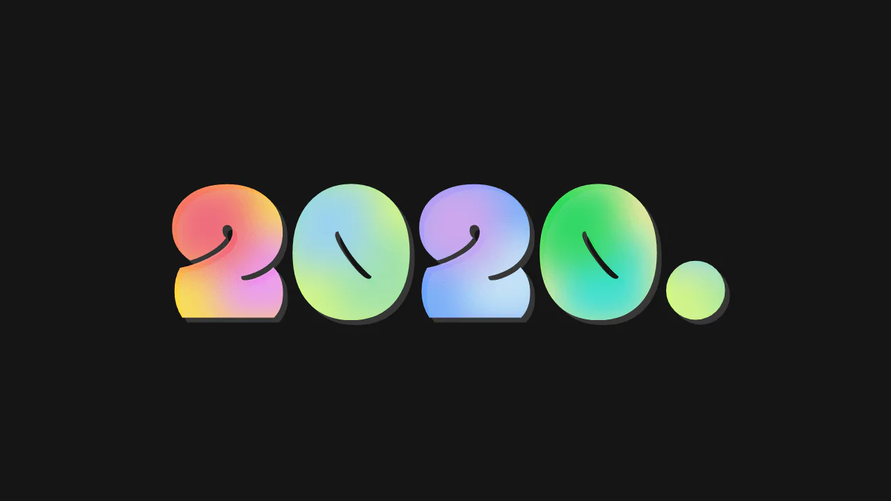
Twenty Twenty & Multi-Color Gradients
Mesh Gradient Masked Text renders vibrant, liquid-mesh gradients inside display letters. It applies background-clip: text and color: transparent to mask the backgrounds. The gradients are built using inline SVG data URLs inside background-image. These SVGs utilize primitive filters like feFlood and feGaussianBlur to create smooth blur meshes. However, embedding raw SVG code makes the CSS extremely bloated.
See the Pen Twenty Twenty & Multi-Color Gradients.
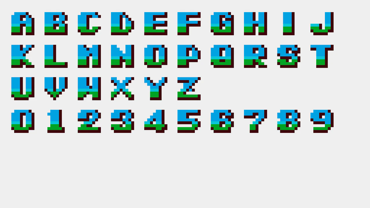
CSS Arcade Typography: Snow Bros. (1990)
Snow Bros Pixel Art is an extreme exercise in CSS drawing limits. It renders a complete retro pixel-art alphabet and numeric set using just one HTML li element per character. The magic is in the massive, layered linear-gradient chains. By defining precise background-size and background-position maps, each segment is painted manually. It’s a heavy but fascinating CSS-only display.
See the Pen CSS Arcade Typography: Snow Bros. (1990).
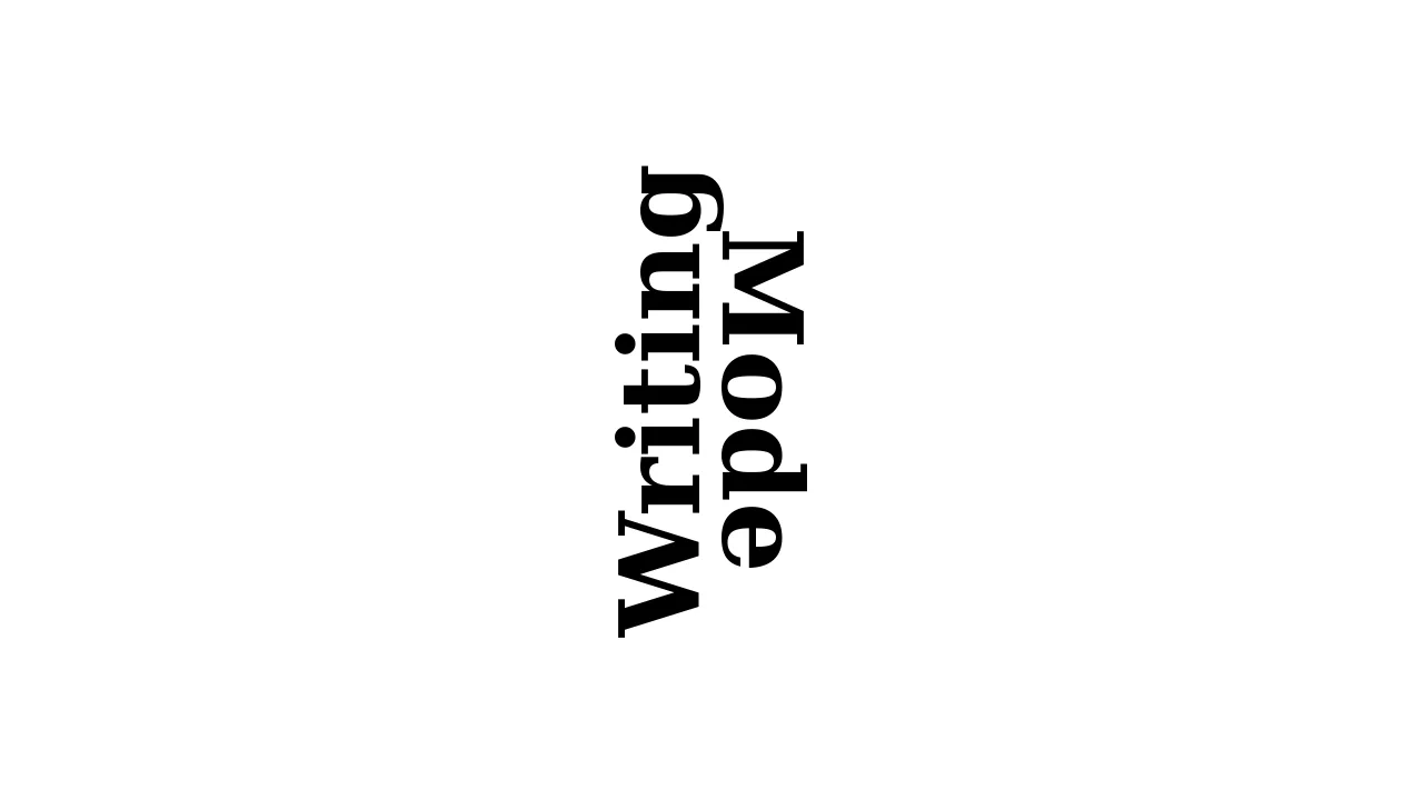
writing-mode
Editorial Writing-Mode Layout demonstrates an elegant, book-cover typography style using pure CSS. It declares writing-mode: vertical-lr on both heading columns to orient the text lines vertically. By rotating the first column (.rotate) 180deg, it flips the reading direction of the first word upward, while the second flows downward. It is a clean, semantic, and highly responsive grid layout.
See the Pen writing-mode.
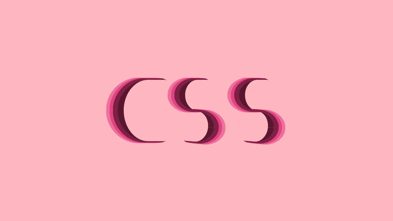
CSS in CSS with a lot of C and S
CSS Logo from Border Shapes builds a volumetric “CSS” logo using pure CSS layout geometry. It forms the letter “C” by shaping a div with a thick left border and an asymmetric border-radius. The letter “S” is constructed by nesting two smaller “C” shapes and flipping the bottom one 185deg. Multiple flat box-shadow offsets provide retro 3D depth. It is a highly performant and creative vector-like showcase.
See the Pen CSS in CSS with a lot of C and S.
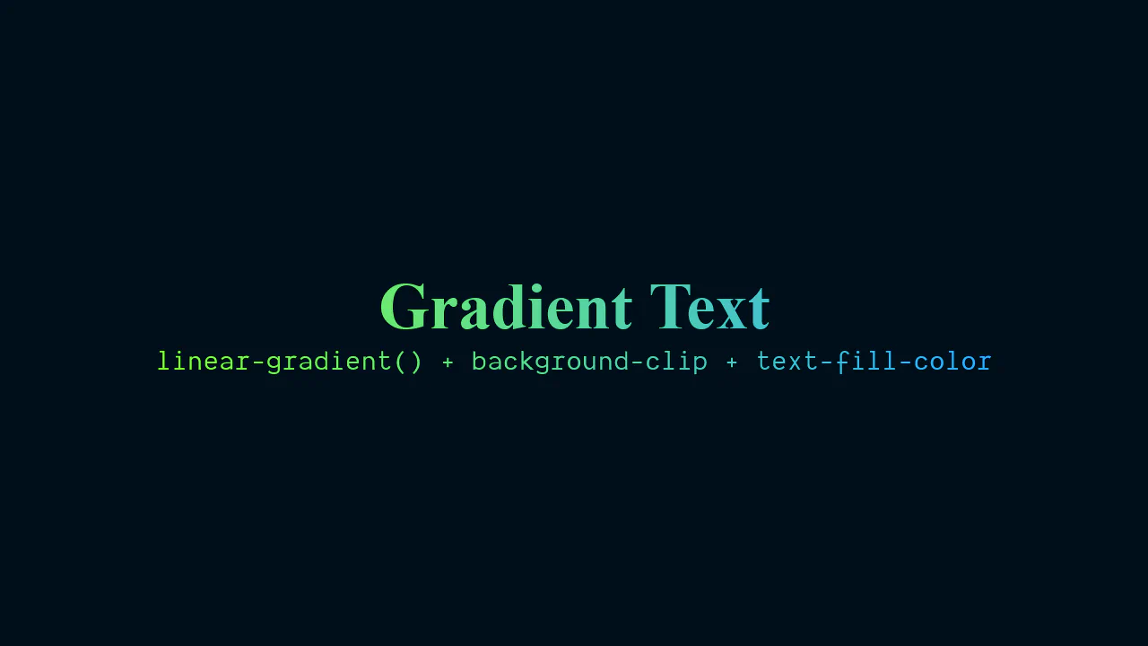
CSS Gradient Text
Modern Gradient Interpolation demonstrates how color spaces change typography. It masks text with background-clip: text and color: transparent. The core feature is linear-gradient(to right in oklch, ...). Interpolating in the oklch color space avoids the muddy gray “dead zones” typical of sRGB. Combined with modern @layer and text-wrap: balance, it is a clean, future-proof approach to display type.
See the Pen CSS Gradient Text.
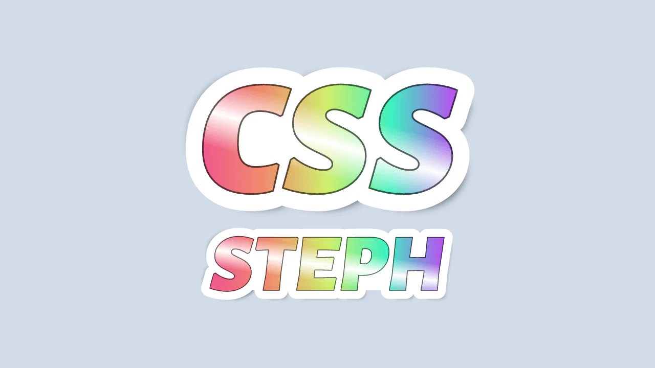
CSS Sticker
3D Sticker Text Effect builds a realistic sticker mockup on pure CSS. It stacks pseudo-elements and the main span onto a single grid area. The top layer uses a double linear-gradient with background-clip: text to combine a colorful base with a glossy lens flare. The ::before element applies a thick white -webkit-text-stroke to simulate a solid die-cut backing.
See the Pen CSS Sticker.
FeTurbulence, feColorMatrix, feDisplacementMap
Crumbling SVG Text Filter creates a tactile, fractured stone texture over typography. It applies an inline SVG <filter> onto a contenteditable container. The effect relies on <feTurbulence> noise and <feColorMatrix> color-threshold clipping. An <feDisplacementMap> then offsets pixels along these hard noise borders, creating a chipped, eroded edge.
See the Pen FeTurbulence, feColorMatrix, feDisplacementMap.
Only CSS: Text Slicer Gradient
Fragmented Exploding Typography is a massive, highly intricate CSS-only 3D motion graphic. It duplicates a text container 40 times, using custom clip-path polygons to slice each copy into a unique triangular shard. Driven by individual @keyframes with staggered delays, these shards fly, spin, and reconstruct from deep 3D space into a unified, legible text block.
See the Pen Only CSS: Text Slicer Gradient.
CSS Text Reveal
CSS Block Reveal Transition implements a modern left-to-right block swipe to expose text lines on load. It coordinates two overlapping pseudo-elements inside overflow-hidden wrappers. The ::after block slides across to act as a colored swipe vector, while ::before (matching the page background) retreats to reveal the text. Staggered animation delays cascade the lines.
See the Pen CSS Text Reveal.
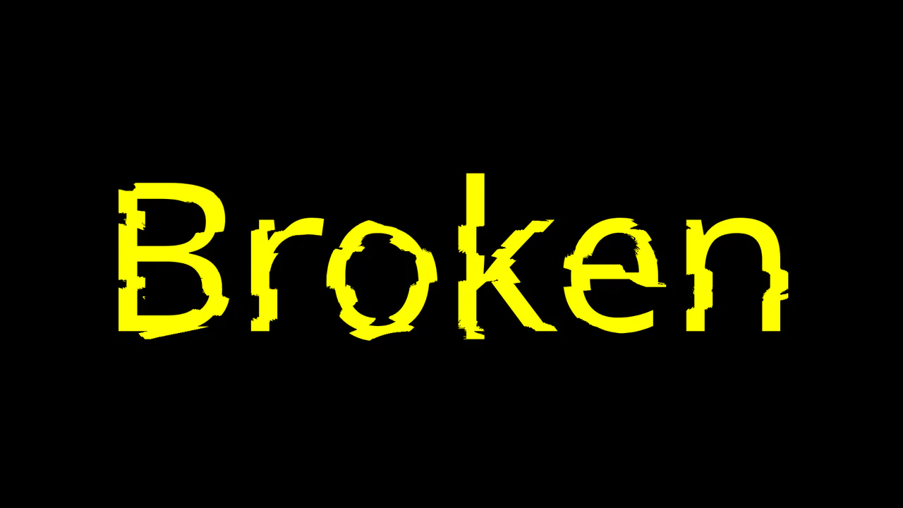
DECONSTRUCTED
Deconstructed Glitch Typography achieves a realistic sliding glitch effect using pure CSS masking. It overlays four duplicate text containers, setting the master element’s color to transparent. Each duplicate is sliced into a horizontal quadrant (25% height) using a linear mask-image gradient. Independent, offset translateX keyframe animations then slide the slices at different velocities.
See the Pen DECONSTRUCTED.
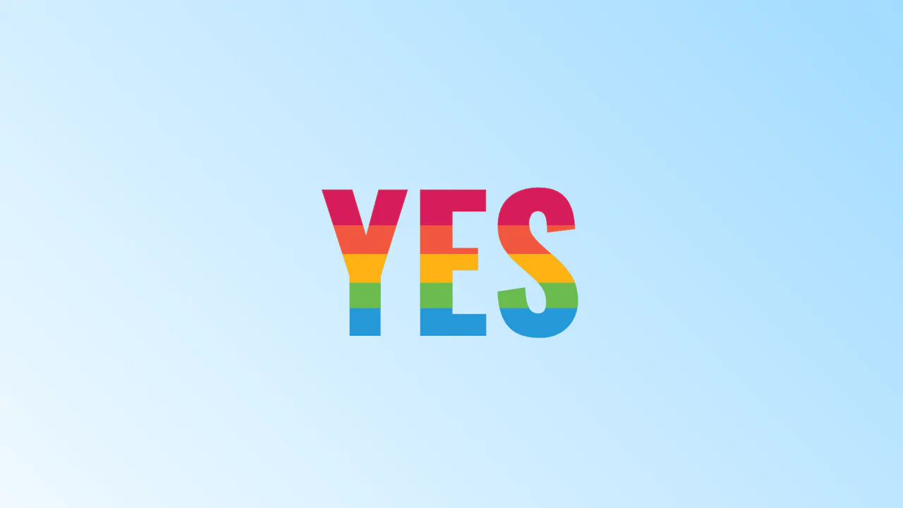
Stay Positive: Text Effect
CSS Interactive Logo Morph is a highly playful typography interaction built without JavaScript. Clicking a giant transparent checkbox toggles active states, shifting the word “CSS” into “CSYES”. Hidden letters and their constituent segment lines (modeled with pseudo-elements) scale and rotate into place using spring cubic-bezier() functions and staggered transition delays.
See the Pen Stay Positive: Text Effect.
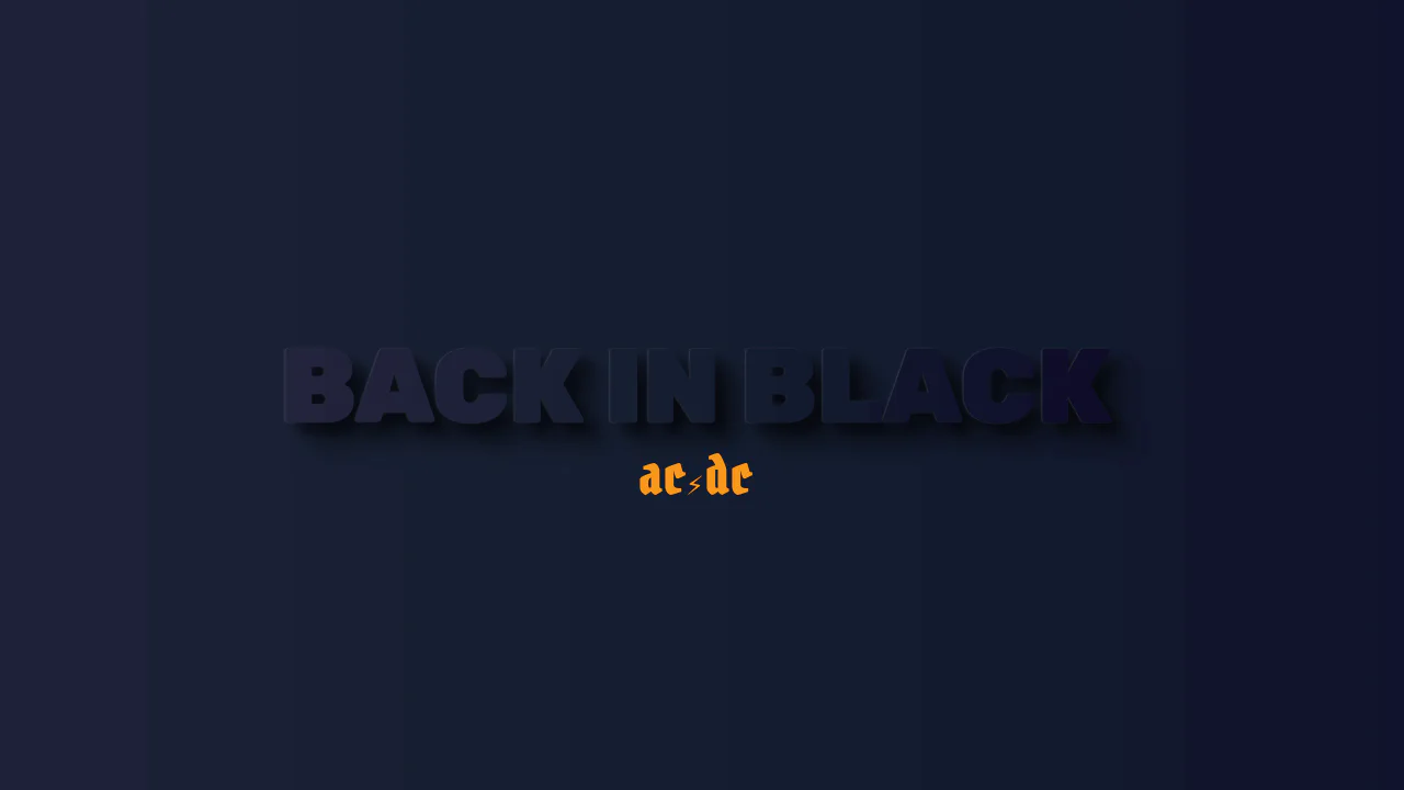
Back in Black
Back in Black Typography uses CSS masks and pseudo-elements to render a heavy, embossed 3D rock band logo. It clips a dark linear gradient inside the heading using background-clip: text. It then projects duplicated text backwards via attr(data-text). Using multiple blurred text-shadow layers on ::after with mix-blend-mode: multiply creates a deep, photorealistic carve.
See the Pen Back in Black.
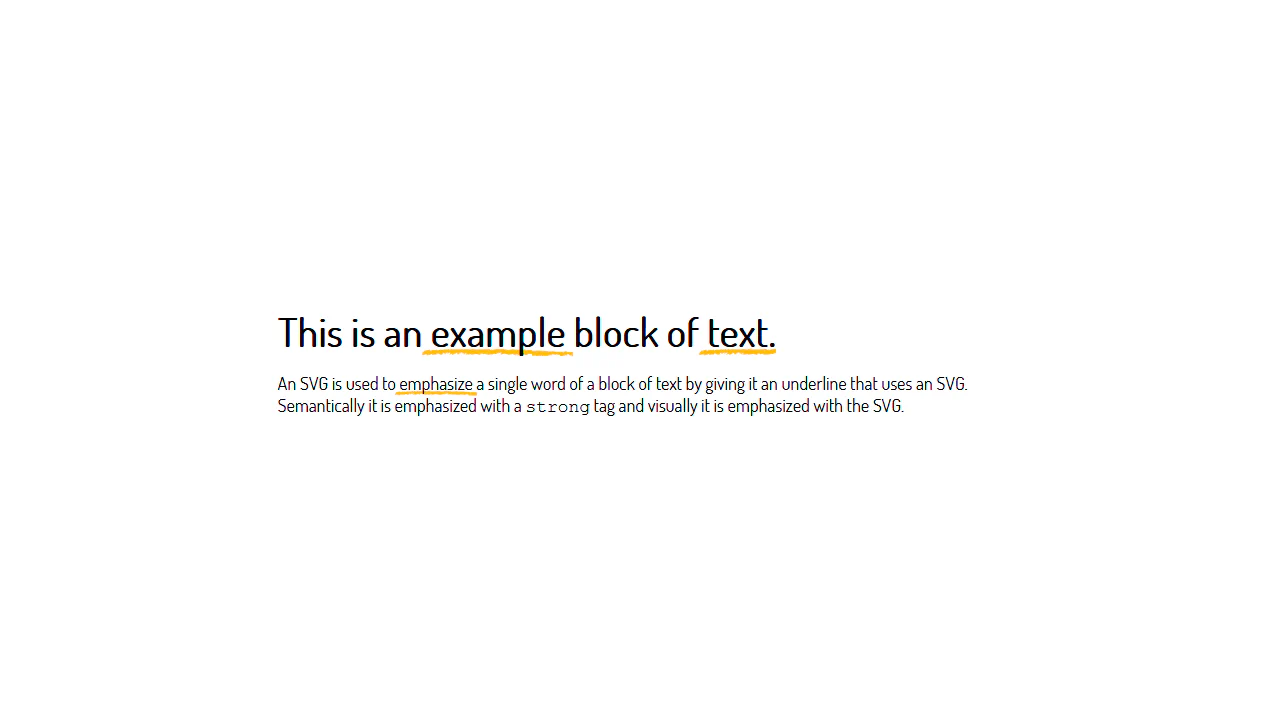
SVG Text Underline
SVG Textured Underline implements an organic, hand-drawn text emphasis effect using pure CSS. It positions an absolute ::after pseudo-element underneath strong tags using a negative z-index. By loading a custom vector SVG file as a background with background-size: cover, the brush stroke stretches seamlessly to fit the fluid width of any highlighted word across your layout.
See the Pen SVG Text Underline.
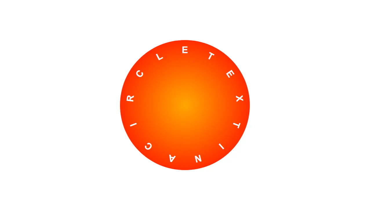
Text In A Circle
Circular CSS Typography arranges characters along a circular path using pure CSS. It declares absolute-positioned, full-height span layers inside a relative container. By utilizing the 1turn CSS unit, it calculates equal rotation segments (--rotationUnit) and multiplies them per child. This rotates each letter around a shared central pivot point, eliminating JavaScript.
See the Pen Text In A Circle.
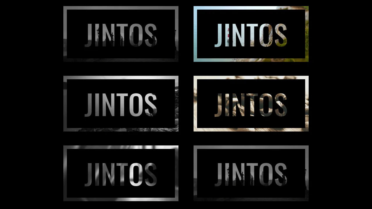
background-clip:text CSS effect
Paper Cutout Text Transition creates an elegant stencil poster effect using pure CSS. It layers the main card container, a solid black background box (::after), and the original image (::before) stacked underneath. Applying -webkit-background-clip: text and transparent text fill exposes the deepest image layer inside the text bounds, mimicking a precise paper-cut stencil.
See the Pen background-clip:text CSS effect.
Multiline Text Strikthrough
Interactive Multi-Line Underline demonstrates an elegant, CSS-only solution to animating highlights across wrapped text. It applies a sharp, custom linear-gradient underline directly onto an inline span. Hovering transitions the background-size property from 0 to 100%, causing the underline to slide and wrap smoothly across multiple lines without JavaScript.
See the Pen Multiline Text Strikthrough.
Stripy Rainbow Text Effect
Sliced Rainbow Typography is a pure CSS layered text effect. It duplicates a heading using content: attr(data-heading) across four absolute pseudo-elements. By stacking these duplicates with decreasing height percentages (from 34% to 80%) and layered z-index orders, it renders a clean, horizontal multicolor slice look. It is an efficient and performant design pattern.
See the Pen Stripy Rainbow Text Effect.
Text Background
Split-Color Retro Typography implements a clean, sticker-like text effect using pure CSS. By combining the multi-line “Monoton” font with @supports checking, it applies a sharp, tilted 7-degree dual-color linear-gradient over the text bounds. Setting background-clip: text and transparent text fill masks this split perfectly inside the letters.
See the Pen Text Background.
Silent Movie Text Effect
Old Movie Style Vignette recreates a nostalgic, worn-out cinema projector aesthetic. The layout combines a pulsing CSS vignette (mix-blend-mode: multiply) with a canvas-based #noise layer. It relies on GSAP to dynamically inject moving vertical lines (.line) and tiny dust specks (.dot), mimicking scratches on antique celluloid film. It is a highly textured retro mockup.
See the Pen Silent Movie Text Effect.
SVG Text Animation
Staggered SVG Line Drawing is an interactive, vectorized name reveal animation. It stacks colored SVG <path> duplicates, using translate3d(2px, 2px, 0) to offset the layers into a flat 3D look. An Anime.js script coordinates elastic bounce translations on load and progressively animates the strokeDashoffset of each stroke, smoothly drawing the letters.
See the Pen SVG Text Animation.
Text With Video Background
Video-In-Text SVG Mask renders a looping background video masked inside text glyphs. It overlays an absolute SVG with custom path characters over a muted, autoplaying YouTube iframe. The SVG defines a <mask> that cuts the video into the typography’s shapes. A responsive media query replaces the heavy video setup with a flat .teaser image on smaller screens.
See the Pen Text With Video Background.
Dual Color Text Scroll Effect
Gooey SVG Text Filter creates organic, unified rounded background corners across wrapped lines. Applying box-decoration-break: clone on an inline .goo element duplicates the background and padding on every line split. A custom inline SVG <filter> then blurs and sharpens the alpha channel, seamlessly melting the block corners together into a fluid, responsive capsule.
See the Pen Dual Color Text Scroll Effect.
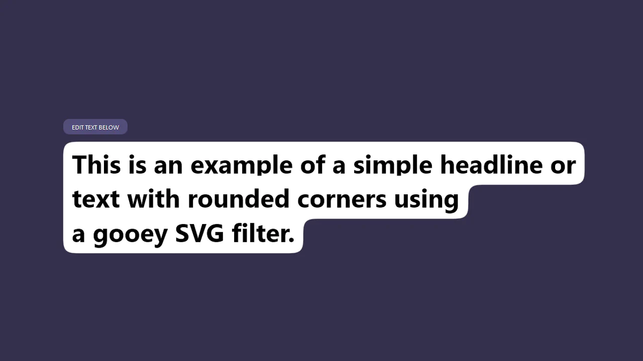
Gooey Text Background With SVG Filters
Gooey SVG Text Filter creates organic, unified rounded background corners across wrapped lines. Applying box-decoration-break: clone on an inline .goo element duplicates the background and padding on every line split. A custom inline SVG <filter> then blurs and sharpens the alpha channel, seamlessly melting the block corners together into a fluid, responsive capsule.
See the Pen Gooey Text Background With SVG Filters.