10+ CSS Text Glitch Effects: Free Code Snippets & Examples
CSS text glitch effects simulate dynamic digital signal distortion directly across headings and copy, introducing high-impact cyberpunk styling to modern web interfaces. By slicing text blocks horizontally and separating color channels natively, this pattern transforms plain headlines into striking kinetic accents.
- Slicing coordinates are generated procedurally by animating clip-path: inset() values across rapid, high-frequency keyframe loops.
- Vibrant RGB splitting is achieved by overlaying absolutely positioned pseudo-elements (like
:before) styled with red-cyan offsets andmix-blend-mode: screen. - To preserve critical INP (Interaction to Next Paint) performance, all displacement transforms run natively on GPU compositor threads.
Master these structural styling techniques to integrate raw, tech-inspired typography animations into your interface.
Table of Contents:
Examples
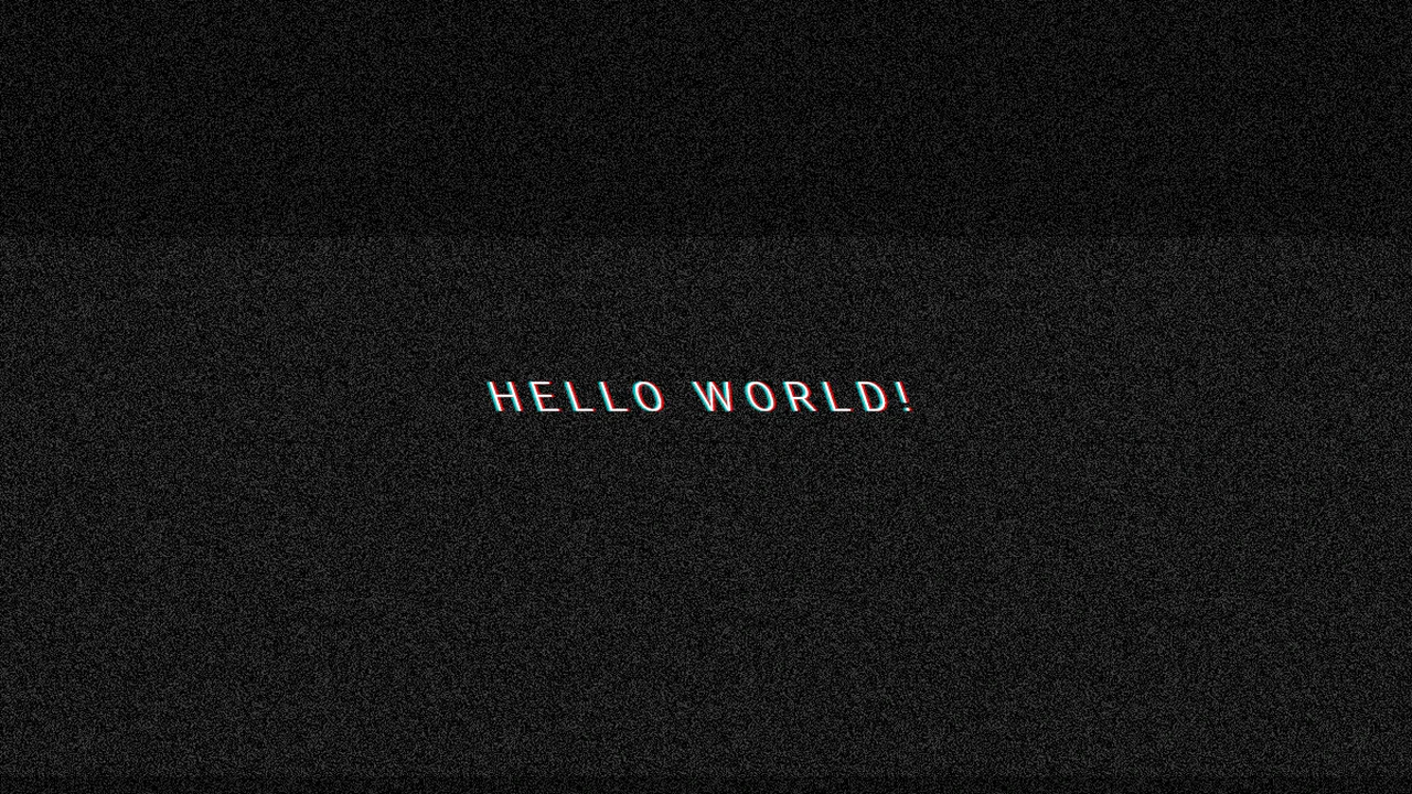
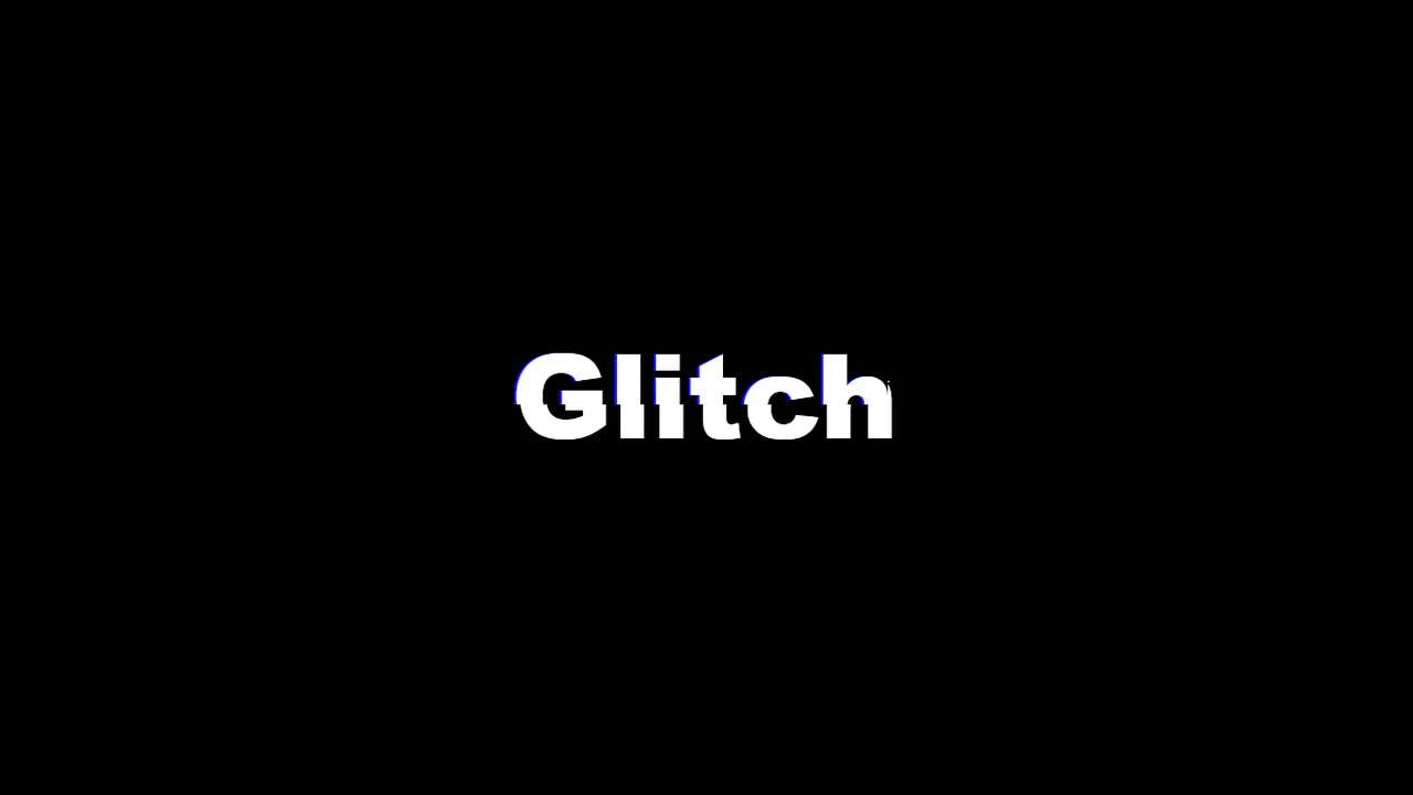
Glitched Text
Dynamic Text Glitch Effect, created purely with CSS using pseudo-elements, skew() animation, and background noise.
See the Pen Glitched Text.
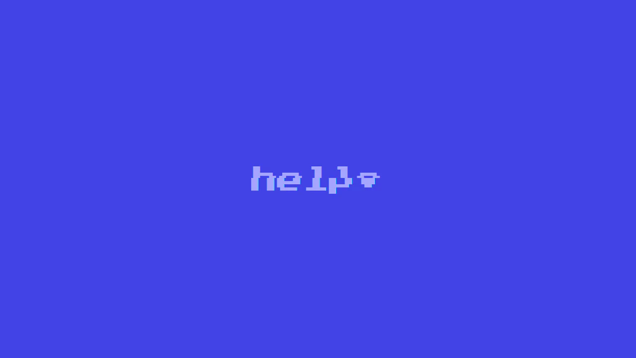
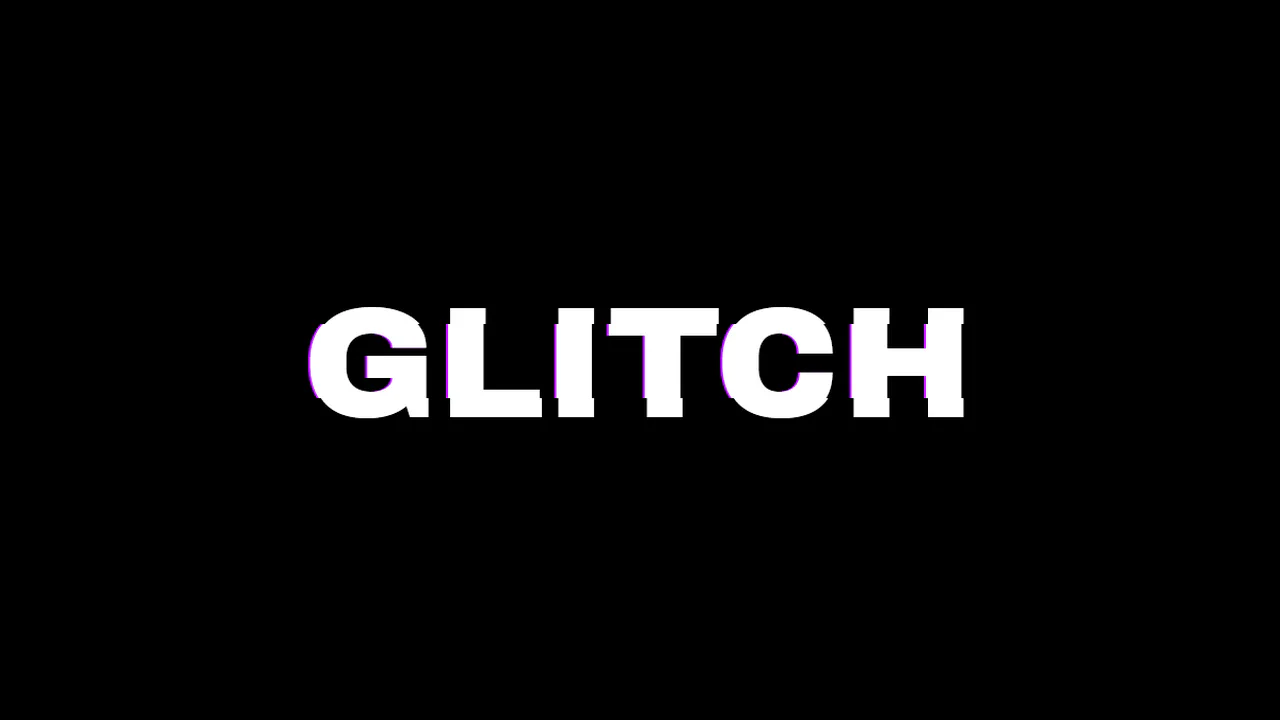
CSS Glitch
Authentic 8-bit Glitch Effect using a retro font and precise digital interference simulation via the clip: rect() property and randomized @keyframes in SCSS.
See the Pen CSS Glitch.
CSS Glitch Text
Glitch text effect implemented using pseudo-elements, CSS animations, ensuring compatibility with any background without reliance on blend modes.
See the Pen CSS Glitch Text.
Glitch Text Hover
A dynamic text glitch effect built with pure CSS using pseudo-elements and clip property animations. This snippet simulates digital distortion and chromatic aberration on hover, providing a high-performance and easily customizable solution for modern frontend UI designs.
See the Pen Glitch Text Hover.

Glitch Hover Effect CSS
A striking pure CSS glitch animation for typography, utilizing pseudo-elements and hardware-accelerated transform properties. This snippet simulates digital noise and RGB splitting through layered keyframe animations, providing a high-performance and lightweight solution for creative UI design.
See the Pen Glitch Hover Effect CSS.
Glitch Text
An advanced pure CSS glitch text effect built with SCSS mixins and @for loops to generate randomized keyframes. This snippet leverages the clip property to simulate digital distortion, providing a high-performance and lightweight solution for creative frontend UI components.
See the Pen Glitch Text.
Glitch Text
A high-performance text glitch effect powered by SASS loops to automate randomized keyframe generation for the clip property. This snippet utilizes pseudo-elements and color-shifted shadows to simulate digital noise, providing a lightweight and scalable solution for creative UI design.
See the Pen Glitch Text.
Glitch Effect in LESS
A high-performance text glitch animation leveraging recursive Less mixins to generate unique, randomized keyframes for the clip property. This snippet utilizes pseudo-elements and text-shadow to simulate digital distortion and chromatic aberration, providing a lightweight solution for creative frontend UI components.
See the Pen Glitch Effect in LESS.
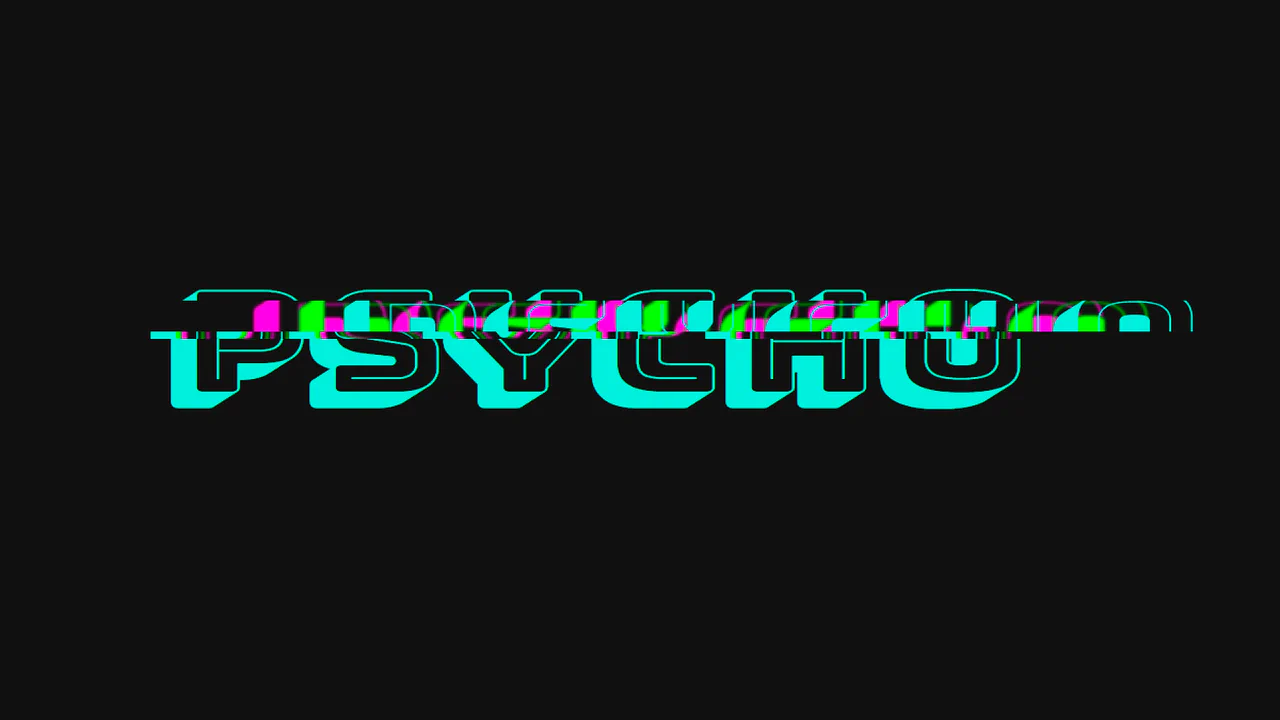
Psycho Glitch with CSS variables & @keyframes
A high-performance CSS glitch text effect leveraging clip-path and custom properties for sophisticated text slicing and animation. This snippet features integrated chromatic aberration via multi-layered shadows, providing a lightweight, hardware-accelerated solution.
See the Pen Psycho Glitch with CSS variables & @keyframes.
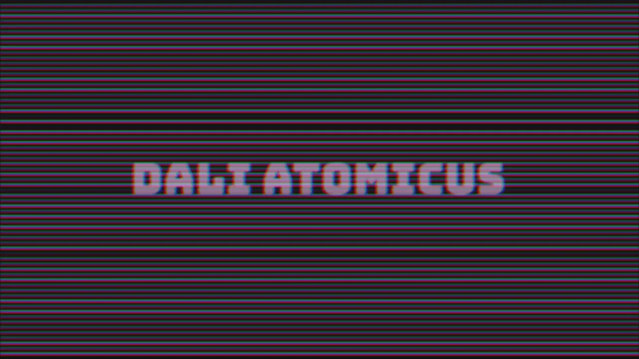
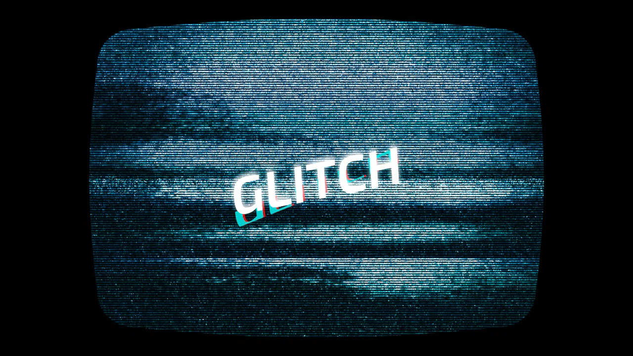
VHS Text
An atmospheric glitch effect combining dynamic JavaScript scanline generation with advanced SCSS animations. This snippet utilizes mix-blend-mode, blur filters, and chromatic aberration to achieve an authentic cyberpunk digital distortion aesthetic for high-end frontend interfaces.
See the Pen VHS Text.
Glitch Hover
This typographic element uses text-shadow offsets and transform: skewX() to mimic a digital glitch. Triggering the wiggle keyframes on hover provides tactile visual feedback, erasing the static screen barrier. The CSS engine runs this on the GPU, preventing layout recalculations.
See the Pen Glitch Hover.
Glitch Animation with Pseudo-Element
This typographic layout coordinates a procedural glitch effect on hover. Pairing layered duplicates via ::before and data-text with high-frequency offsets, it delivers immediate tactile feedback. Utilizing CSS text-shadow on the GPU, it dissolves the static screen barrier.
See the Pen Glitch Animation with Pseudo-Element.
Text Glitch Animation with clip-path, text-shadow and Pseudo-Elements
This typographic component establishes a kinetic visual distortion by mapping layered text-shadows and synchronized keyframe animations to hover states, entirely offloading the rendering pipeline to CSS. By utilizing hardware-accelerated polygon clip-paths to slice pseudo-elements without DOM bloat, the architecture delivers an instantaneous, high-frequency tactile response that evokes an immersive retro-futuristic aesthetic.