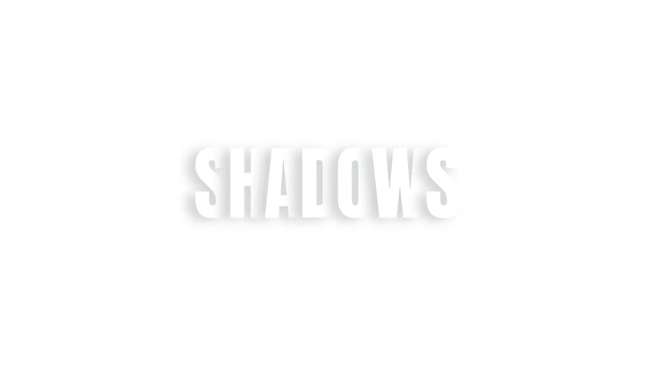
20+ CSS Text Shadow Effects: Free Code Snippets & Examples
CSS text shadow effects inject volumetric depth and illustrative styling directly into digital editorial copy, leveraging offset shadows and soft blur profiles to establish clear typographic focal weight. By organizing stacked shadow declarations natively in your stylesheets, this visual system enhances copy visibility without requiring heavy pre-rendered graphic headers.
- Layered vintage and retro lighting is designed by stacking multiple values inside the text-shadow property, shifting offsets progressively to emulate extrusion.
- Modern high-chroma glows utilize the native oklch() color space to generate highly saturated, vibrant shadow hues that retain uniform perceptual brightness.
- To guarantee a responsive INP (Interaction to Next Paint) metric during interactive scaling, complex dynamic shadow blurs are promoted to composited GPU layers.
Master these multi-layered shadow configurations to build striking, high-contrast dark-mode typography systems that respond seamlessly to dynamic actions.
Table of Contents:
Examples
Skewed Perspective Drop Shadow Typography
A pure CSS typography effect that simulates a realistic, perspective-cast drop shadow. The main text is styled with a metallic linear gradient using background-clip: text. The shadow is generated via a ::before pseudo-element that duplicates the text content using attr(data-text). This shadow layer is then skewed, scaled down, blurred, and faded out using a linear gradient mask-image to mimic natural light diffusion.
 Chrome 53+
 Edge 79+
 Firefox 53+
 Safari 10.1+
See the Pen Skewed Perspective Drop Shadow Typography.

Skeuomorphic Lunar Desk Calendar
The Skeuomorphic Lunar Desk Calendar is a digital recreation of the traditional “Hardware Store Calendar”. It bridges the gap between physical paper textures and dynamic digital logic, providing users with both Gregorian and Lunar dates. Its function is to serve as a high-fidelity desktop widget that celebrates heritage design through modern CSS geometry.
Chrome 80+
Edge 80+
Firefox 75+
Safari 13.5+
See the Pen Skeuomorphic Lunar Desk Calendar.

Interactive 3D Layered Text Wave Effect
This is an Interactive 3D Layered Text Wave Effect. It transforms a flat heading into a dynamic, multi-layered typographical stack that tracks cursor movement. Its function is to create immersive, interactive hero sections, replacing static typography with a playful spatial experience.
Chrome 36+
Edge 12+
Firefox 16+
Safari 9+
See the Pen Interactive 3D Layered Text Wave Effect.
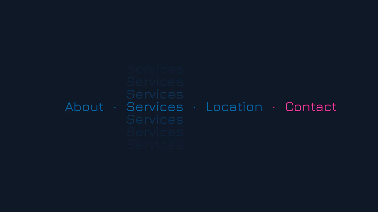
Vertical Ghost Text Hover Effect
This Vertical Ghost Text Hover Effect adds a spectral, sci-fi vibe to navigation menus without requiring extra HTML elements or pseudo-elements. By animating a stack of vertical text-shadows, the component creates a fading “echo” or “glitch” visual that expands outward when a user interacts with the link. It utilizes the modern light-dark() function to handle system theme preferences automatically.
Chrome 123+
Edge 123+
Safari 17.5+
Firefox 120+
See the Pen Vertical Ghost Text Hover Effect.

3D Text Shadow
An example of a complex text-shadow where SCSS is used to create a multi-layered shadow with precise offsets for each layer - this gives the text a dimensional, “cartoonish” effect that is unachievable with standard tools.
See the Pen 3D Text Shadow.

Cosmic Neon Text Effect
A spectacular, interactive heading design: on hover, the text stroke disappears, giving way to a powerful, multi-colored neon glow. It’s a perfect demonstration of pure CSS capabilities for creating complex typography and “wow” effects.
See the Pen Cosmic Neon Text Effect.

Neon Clock
A technical showcase demonstrating how to control the neon glow intensity and color scheme using CSS variables and the hsl() function, while delivering a realistic neon tube effect on each digital segment via subtle text-shadow and box-shadow styling.
See the Pen Neon Clock.
Animated Fire Text Shadow
Fire animation achieved exclusively via a multi-layered text-shadow property within @keyframes. It uses ease-in-out infinite alternate with varying durations to create the flickering effect.
See the Pen Animated Fire Text Shadow.
Blazing Fire
A realistic blazing text effect created purely with CSS using multi-layered text-shadow, where each layer simulates thermal glow and flames, with continuous motion driven by @keyframes.
See the Pen Blazing Fire.
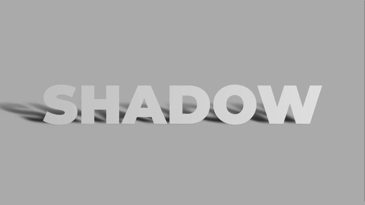
CSS Text Shadow Effect
A realistic 3D text shadow effect achieved through pure CSS using perspective and rotateX transformations. This snippet leverages pseudo-elements and data attributes to simulate a floor shadow, adding depth to typography with minimal DOM overhead and high frontend performance.
See the Pen CSS Text Shadow Effect.

Outlined Text Shadow with Fallback
A minimalist typography effect built with CSS custom properties to create dynamic outlines and shadow offsets. By leveraging calc() and relative em units, this style scales perfectly across viewports, providing a high-performance and flexible solution for modern web design.
See the Pen Outlined Text Shadow with Fallback.
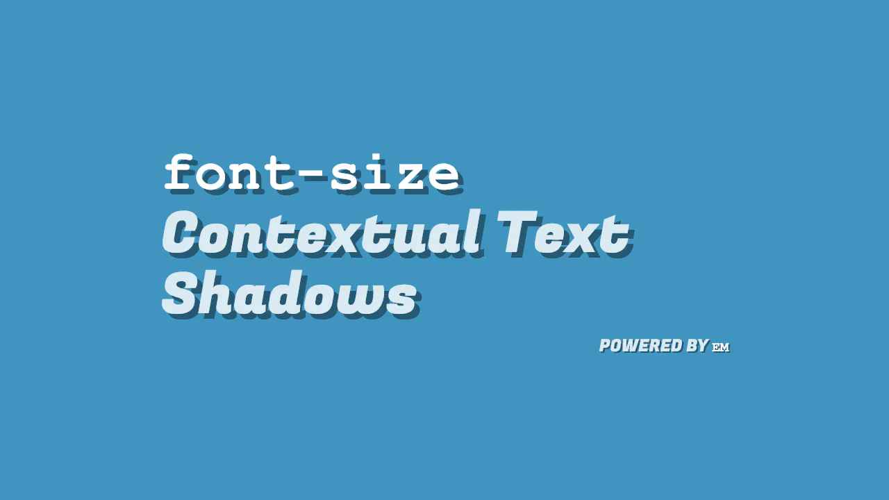
Bigger Font Size, Bigger Text Shadow
A scalable CSS text-shadow implementation that leverages em units to maintain proportional offsets relative to the font-size. This technique offers a clean, high-performance solution for responsive typography, ensuring consistent visual depth across all screen sizes without additional CSS overhead.
See the Pen Bigger Font Size, Bigger Text Shadow.
Pop Out Text
popout uses staggered CSS animation delays to create a wave-like 3D popping effect on individual letters. Each letter sits in a <span> and runs a synchronized transition: as translate3d shifts the character up and right, a matching text-shadow extends down and left. Negative animation delays offset the timing, producing a smooth, continuous kinetic wave.
See the Pen Pop Out Text.
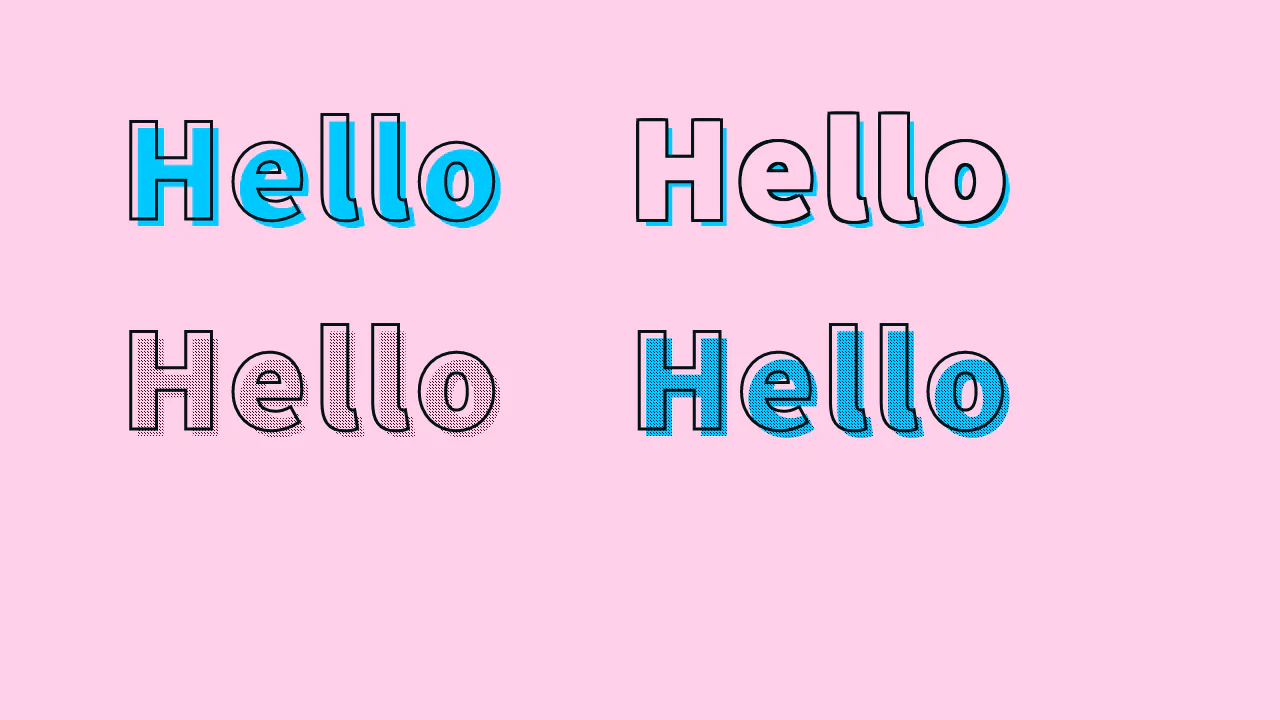
Text Stroke + Offset Shadow
stroke halftone presents four typographic styles using outlines, stacked shadows, and patterns. Outlines are created natively via -webkit-text-stroke or manually with eight-way text-shadow offsets. The halftone effects leverage an offset :after pseudo-element with a tiny tiled base64 PNG, masked to the text shape using background-clip: text for a retro comic print look.
See the Pen Text Stroke + Offset Shadow.
Cool Spotlight Shadows
CSS uses pure CSS 3D transforms to create an interactive letter pop-up with a projected spotlight. On :hover, the container uses perspective and preserve-3d to lift letters along translateZ. The first and last characters fan out via rotateY. Meanwhile, pseudo-elements project a smooth linear-gradient light cone and stretched text shadows onto the dark background.
See the Pen Cool Spotlight Shadows.
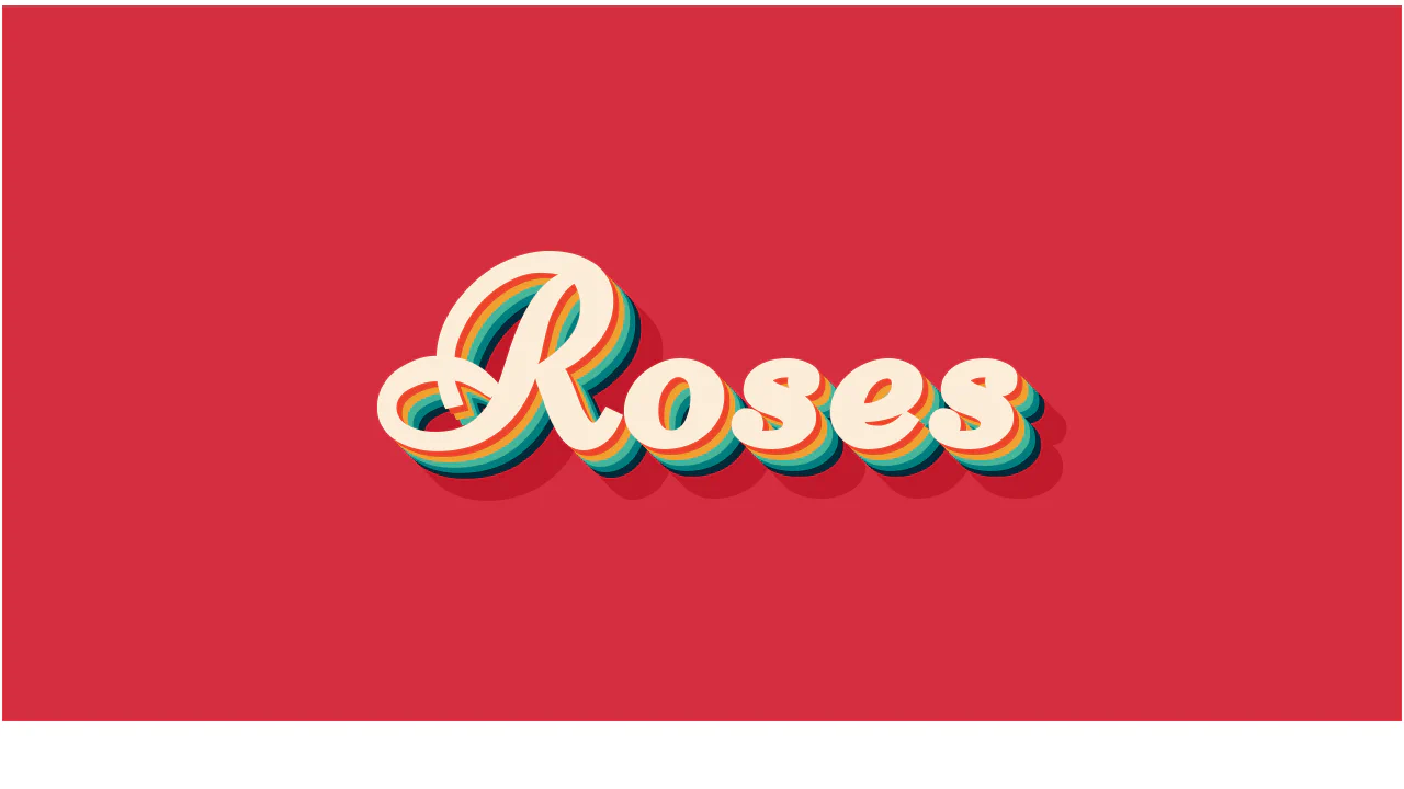
Layered text-shadow Effect CSS
Roses uses stacked, hard-edged text-shadow layers to build a retro 3D extrusion effect. By using exact 5px increments with 0px blur, it creates distinct colored bands rather than soft blurs. The shadow color transitions from bright warm hues to cool tones, and finishes with a solid dark red base, giving the cursive typeface an illustrated, blocky depth.
See the Pen Layered text-shadow Effect CSS.
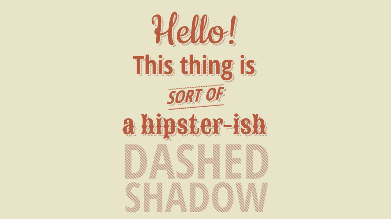
CSS Dashed Shadow
Dashed Shadow creates a vintage, striped 3D text effect by clever layering of pseudo-elements. The foreground text is rendered in :after using attr(data-text). Behind it, :before overlays a diagonal linear-gradient matching the background. This masks the base shadow layer into clean stripes. On :hover, animating the background-position makes the dashes crawl dynamically.
See the Pen CSS Dashed Shadow.
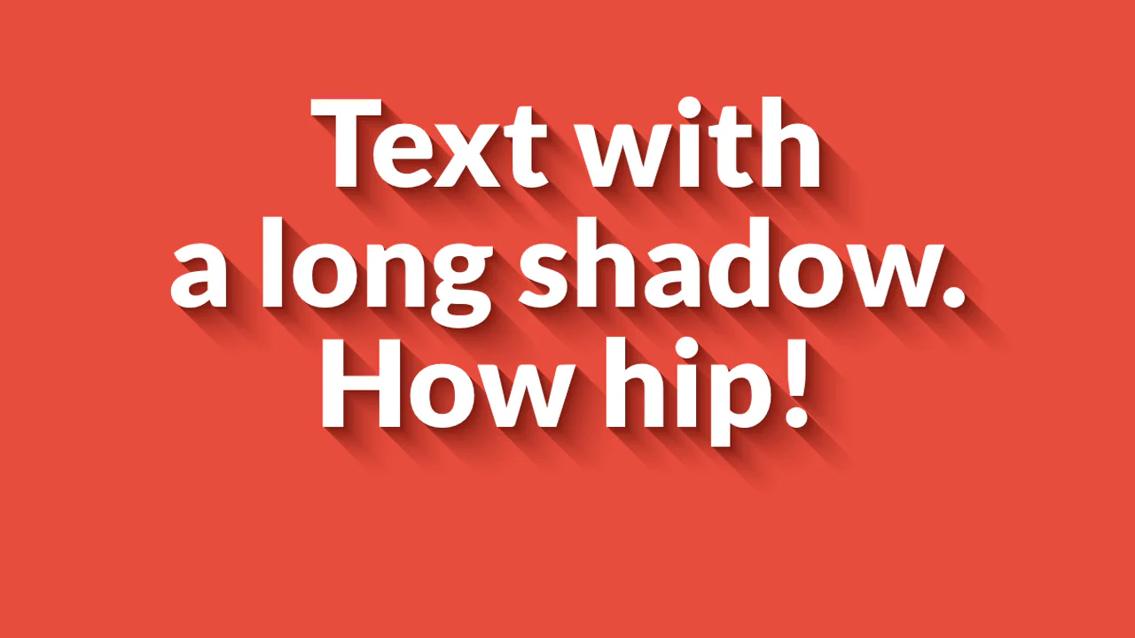
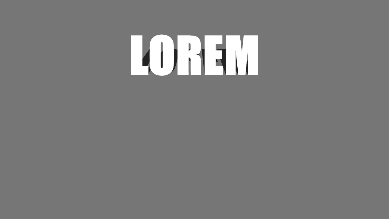
Long Shadow Gradient Mixin
Text with a long shadow demonstrates how to build a smooth, fading 3D shadow using only CSS. It chains 50 text-shadow declarations, with each step increasing the offset by 1px. The colors smoothly transition from a dark crimson near the text to a lighter red, gradually increasing in opacity to blend into the background. It is a clean, performant way to mimic a Sass mixin output.
See the Pen Long Shadow Gradient Mixin.
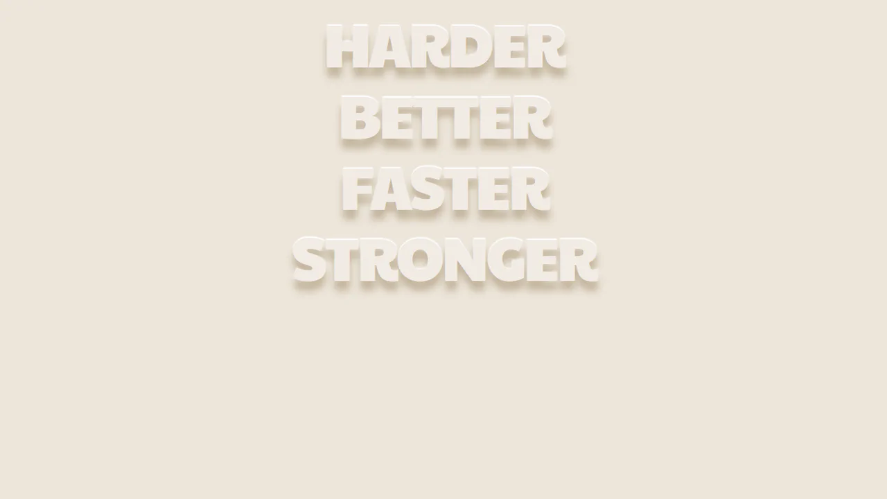
Awesome text-shadow
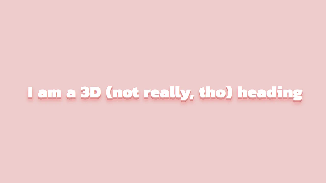
Harder Better Faster Stronger uses two opposing text shadows to create a carved, floating 3D effect. The text color nearly matches the background. A sharp, white shadow offset upwards (0 -2px) acts as a top highlight, while a soft, dark-beige shadow offset downwards (13.36px) provides a realistic depth. It is a highly optimized, clean design trick requiring zero images.
See the Pen Awesome text-shadow.
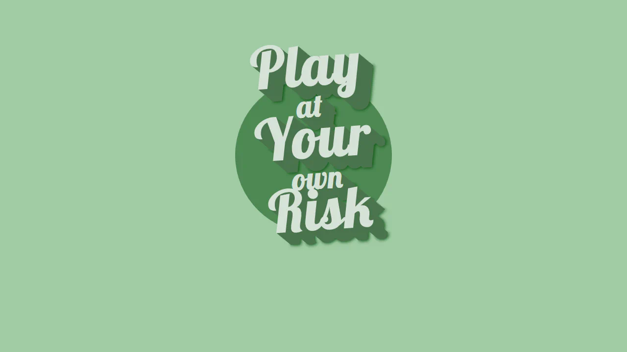
Text-Shadow
Play at Your own Risk creates a retro badge layout with skewed typography over a flat circle. The vintage poster aesthetic is built using a slight rotational transform and staggered font sizes. A pixel-by-pixel text-shadow stack extends 25px deep, capped with a final blurred shadow (#06520C) to ground the text and give it a crisp, illustrated 3D depth.
See the Pen Text-Shadow.
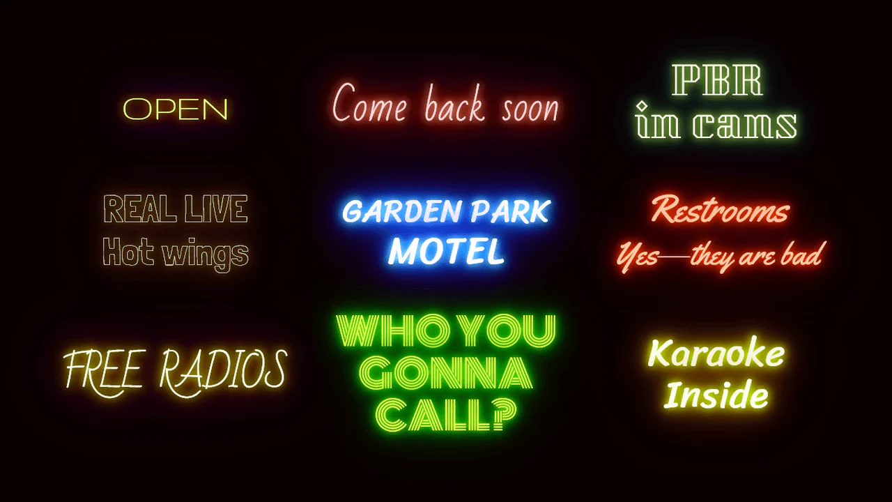
Neon Effects
Multi-layered text-shadow declarations on each element use custom properties to control glow colors. CSS keyframes handle the flicker by altering saturation and hue. A tiny JS loop randomizes the CSS --interval variable on each animation iteration, making the flickering pattern organic.
See the Pen Neon Effects.

Pretty Shadow
Pretty shadow combines CSS variables, a simple JS interval, and clever text-shadow layering. The text-shadow uses three layers: two matching the background to create a gap, and a third semi-transparent black one for depth. Every few seconds, JS randomly updates the --background custom property. A long transition on the body smoothly morphs the layout into new color schemes.
See the Pen Pretty Shadow.

Variable Longshadow with Gradients Mixin
Variable Spread Long Shadows uses pure CSS to build a 3D text gradient. By chaining dozens of text-shadow offsets, each shifting color slightly, it creates a smooth shadow path blending into the background. No JS or SVG required. It is a brute-force approach that is heavy for manual edits, but works well when generated with Sass or tool-assisted CSS variables.
See the Pen Variable Longshadow with Gradients Mixin.
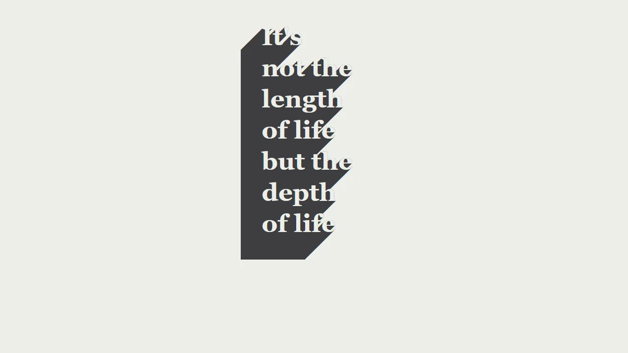
CSS text-shadow
3D Hollow Extruded Shadow implements a realistic paper-carve stencil effect using pure CSS. By matching the text color exactly to the page background (#EDEEE9), the text body becomes invisible. Chaining a 100-step, 1px offset text-shadow down and left then projects a solid grey extrusion, giving the hollow letters a clean, isometric 3D depth.
See the Pen CSS text-shadow.
Fancy Text Shadow
3D Staggered Extrusion Shadow creates a volumetric typography effect using only CSS. It chains 15 coordinate offsets within a single text-shadow property. The first eight layers are flat, solid, progressively darker pink offsets that simulate the text’s 3D side faces. The remaining layers are blurred, translucent shadows that render a soft ambient drop shadow on the background.
See the Pen Fancy Text Shadow.
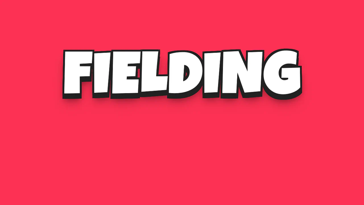
3D Cartoon Text with CSS text-shadow
3D Comic Outline Shadow implements a bold, comic-style display headline using pure CSS. It builds a solid, thick black outline and a volumetric shadow by chaining 23 coordinate offsets inside a single text-shadow declaration. The first offsets envelope the white letters, while subsequent offsets project the outline down to 18px, finishing with a series of blurred drop shadows.
See the Pen 3D Cartoon Text with CSS text-shadow.
SCSS 3D Text Mixin
3D Staggered Extrusion Shadow creates a volumetric typography effect using only CSS. It chains 15 coordinate offsets within a single text-shadow property. The first eight layers are flat, solid, progressively darker pink offsets that simulate the text’s 3D side faces. The remaining layers are blurred, translucent shadows that render a soft ambient drop shadow on the background.
See the Pen SCSS 3D Text Mixin.
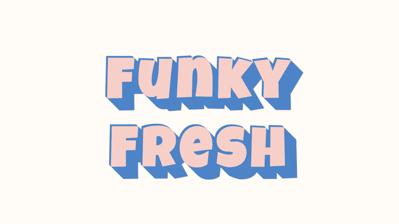
Funky Retro Text Shadow
Flat Extruded 3D Typography implements an eye-catching, retro poster look using pure CSS. It builds a solid, volumetric 3D shadow extrusion by stacking over 45 custom coordinates within a single text-shadow declaration. Alternating negative and positive offsets draw both a top-left highlight and a massive, flat-shaded bottom-right block that gives the text real physical weight.
See the Pen Funky Retro Text Shadow.