10+ CSS text-stroke Examples
Typography dictates visual structure. The CSS text-stroke examples in this updated collection provide a direct path to outline and hollow text effects without the use of raster images or complex SVG paths. It removes the barrier between solid fills and clean, geometric outlines, allowing UI design to remain lightweight and infinitely scalable.
Technically, the logic relies on the -webkit-text-stroke-width and -webkit-text-stroke-color properties, often paired with a transparent color value. This approach is hardware-accelerated, ensuring crisp vector rendering on the GPU. The code maintains high layout stability and keeps the HTML structure strictly semantic. Animated transitions of the stroke color or width provide tactile feedback without triggering expensive repaints.
Every free demo in this library is fully responsive and cross-browser compatible with vendor prefixes. The assets are optimized for performance and readability, ensuring that text remains accessible even when highly stylized. Users can instantly download the raw code or fork an updated effect on CodePen.
Examples
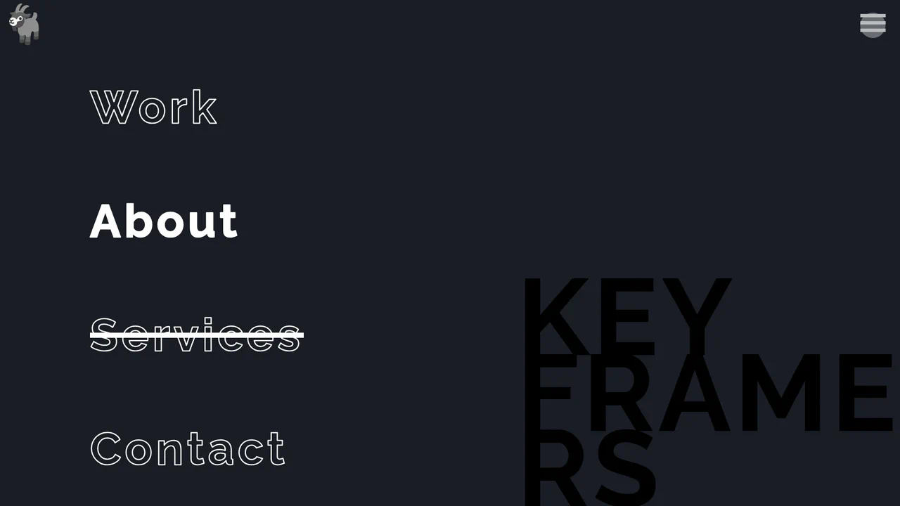
Split-Screen Staggered Menu Reveal
A full-screen navigation overlay driven by CSS transitions and data-attribute toggling. Clicking the menu button triggers a split-screen background slide, where two pseudo-elements converge from opposite vertical directions. The menu items and background typography fade in sequentially using CSS variable-based staggered delays, while hover states utilize -webkit-text-stroke and animated strikethrough lines.
 Chrome 49+
 Edge 12+
 Firefox 49+
 Safari 9.1+
See the Pen Split-Screen Staggered Menu Reveal.
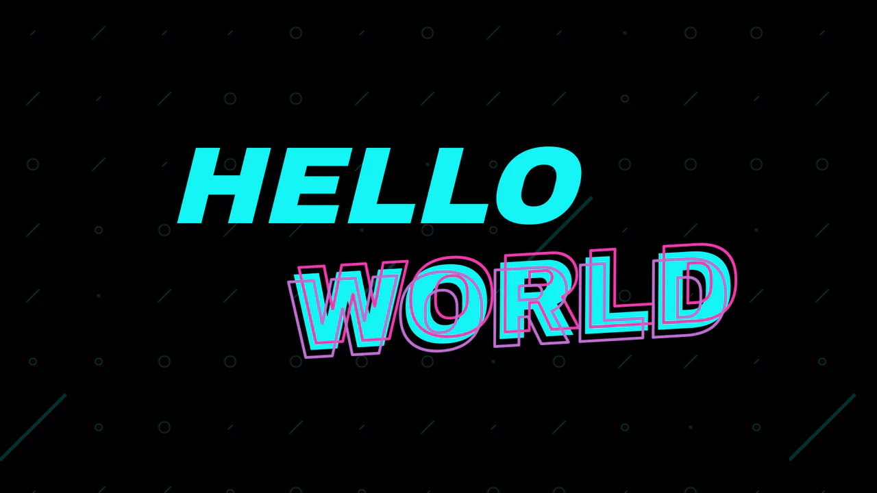
Sticky Neon Layered Text Effect
React drives an interactive, cursor-aware text transformation, while the layered Neon effect is achieved purely with CSS using pseudo-elements and the text-stroke property.
See the Pen Sticky Neon Layered Text Effect.
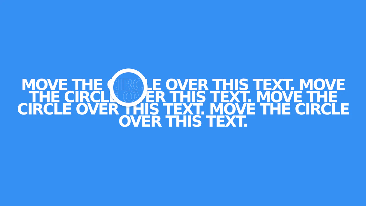
X-Ray Text Hover Effect with JS Masking
The effect is technically created by overlaying two text blocks (filled and outlined) with different z-index values, where a masking circle is moved via JavaScript on mousemove events to hide the bottom text layer, resulting in a crisp, performant animation.
See the Pen X-Ray Text Hover Effect with JS Masking.
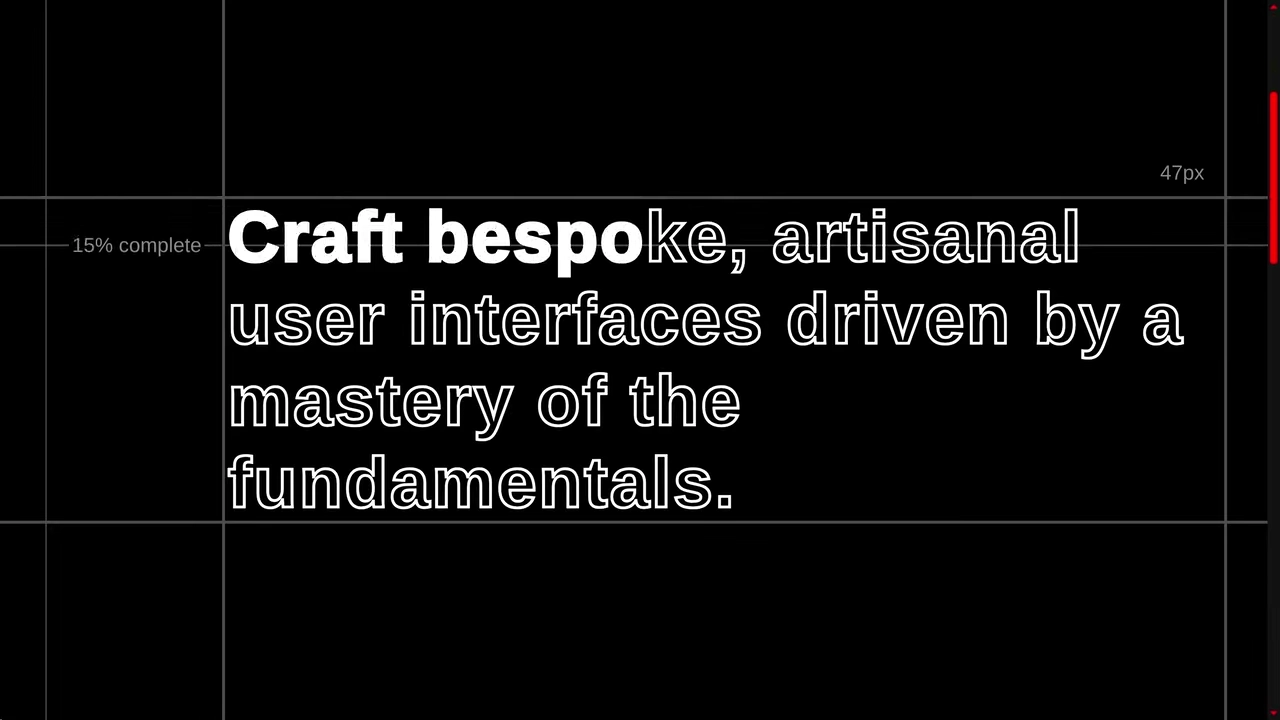
CSS scroll-driven Stroke Text
A sophisticated scroll-linked text filling effect powered by modern CSS Scroll-Driven Animations and custom @property logic. This snippet showcases fluid typography, responsive layouts, and the View Transition API for seamless theme switching, providing a high-performance blueprint for advanced frontend interfaces.
See the Pen CSS scroll-driven Stroke Text.

CSS Text Stroke and CSS Text Border
Interactive typography using an array of 30 layered text elements. The effect is achieved via GSAP (TweenMax), sequentially altering layer opacity upon user input.
See the Pen CSS Text Stroke and CSS Text Border.
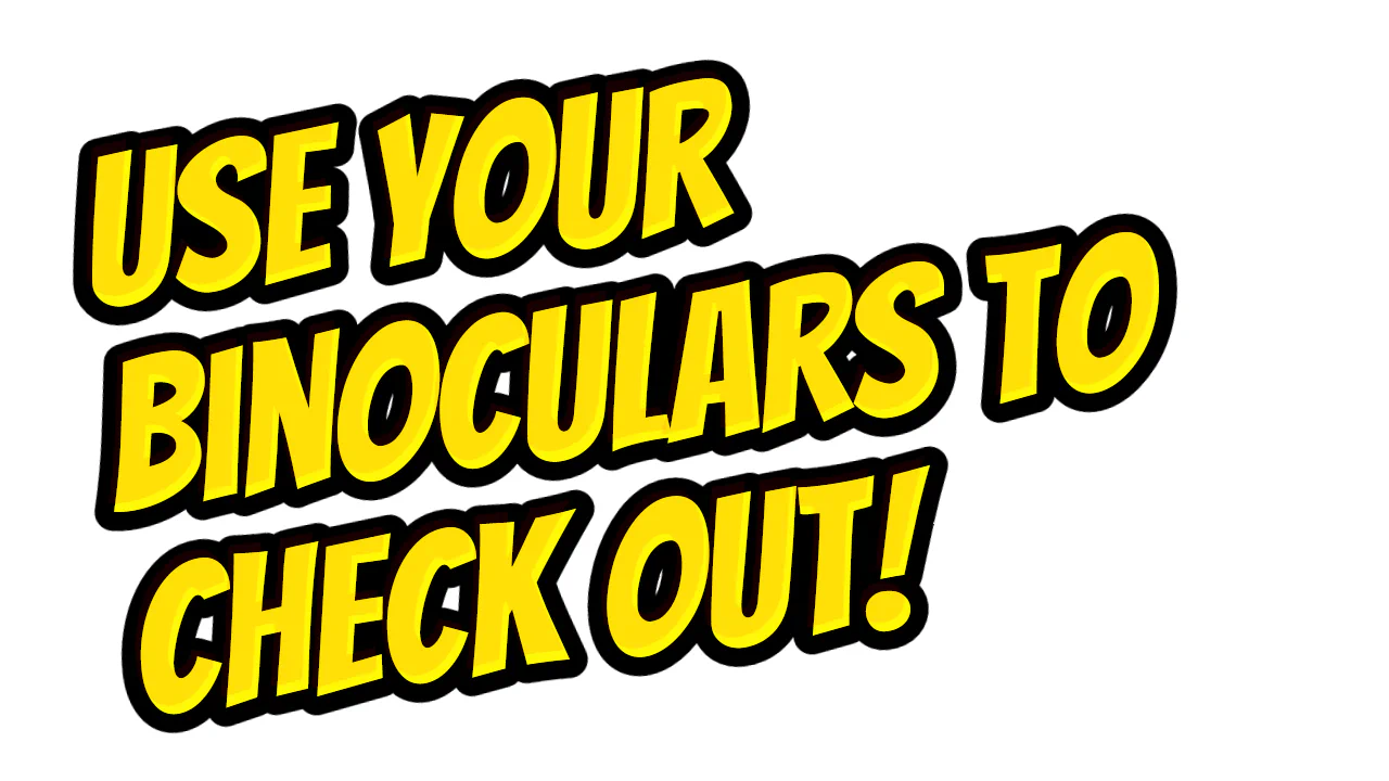
CSS Outline Text Stroke
Comic-style typography achieved through pseudo-element layering. It utilizes -webkit-text-stroke for the outline and gradient masks combined with rotation for visual depth and dynamics.
See the Pen CSS Outline Text Stroke.
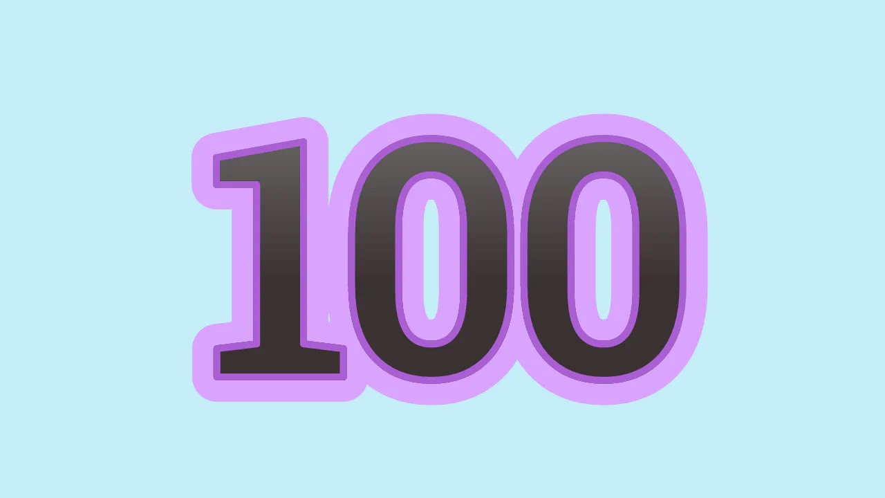
CSS3 Stroke and Gradient Text
Double-layered typography using -webkit-text-stroke and gradient fills via background-clip. The :after pseudo-element duplicates content to create a secondary outer outline. Efficient volumetric text implementation without additional DOM nodes.
See the Pen CSS3 Stroke and Gradient Text.
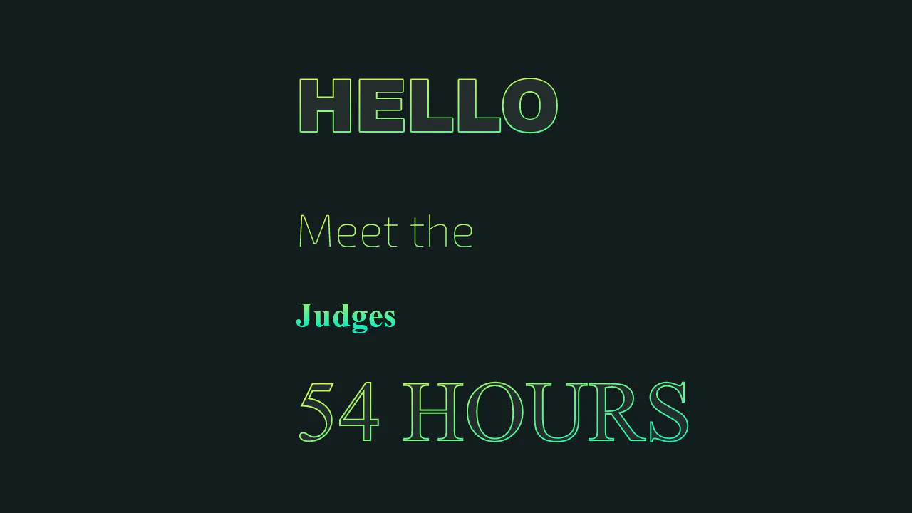
Gradient Text Stroke CSS
A combination of CSS background-clip and -webkit-text-stroke to create gradient text outlines. The SVG section replicates the logic via linearGradient for precise vector stroke control. A minimalist approach to decorative typography.
See the Pen Gradient Text Stroke CSS.

Pure CSS Animation on Single Letter, Slide & Bounce
Character-by-character text animation utilizing Sass loops for dynamic delay calculation. Depth is created by layering pseudo-elements with -webkit-text-stroke and hardware-accelerated translate3d transforms.
See the Pen Pure CSS Animation on Single Letter, Slide & Bounce.
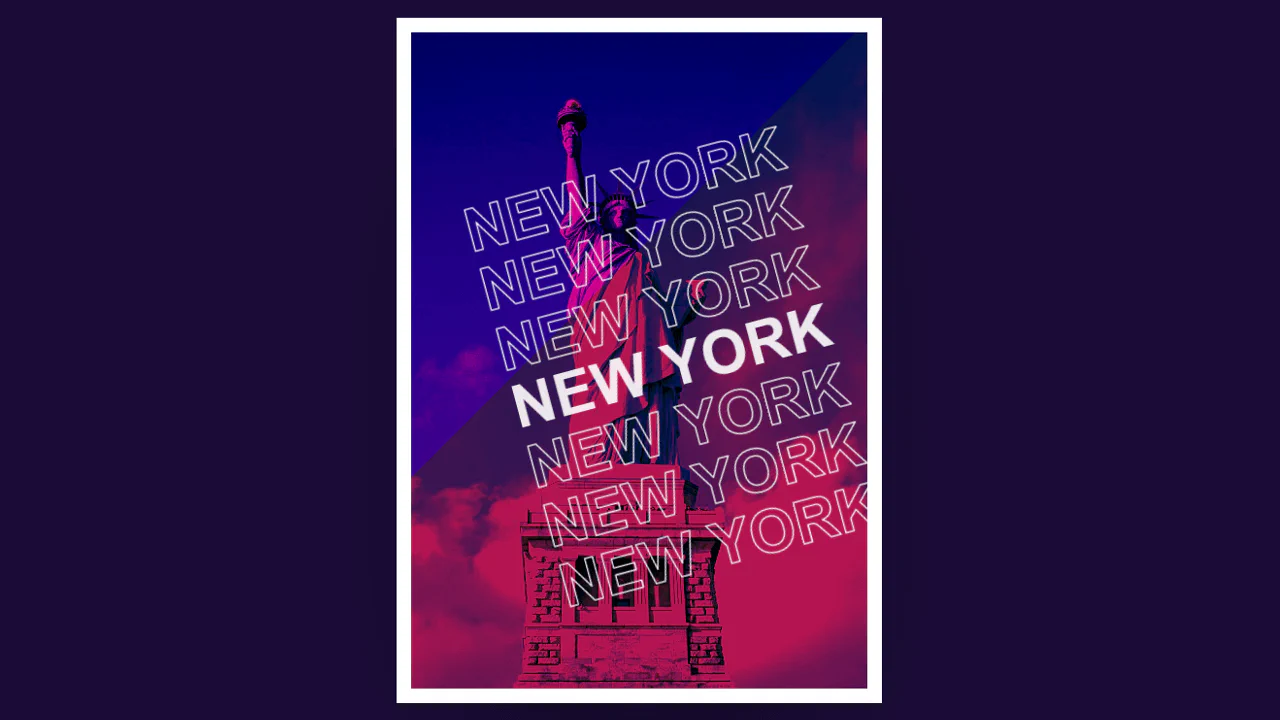
Start Spreading The News — New York Poster
The design uses mix-blend-mode: darken and filters to achieve a duotone effect on the background image. Hollow typography is defined by -webkit-text-stroke, while content repetition is handled by pseudo-elements using attr(data-place).
See the Pen Start Spreading The News — New York Poster.

Strokes, Shadows + Halftone Effects
A set of text styling techniques utilizing Sass mixins for stroke management. Halftone effects are achieved via a raster pattern and background-clip, while visual depth is created using multi-layered text-shadow.
See the Pen Strokes, Shadows + Halftone Effects.

text-stroke: 4 Ways
A comparison of four text outline methods: -webkit-text-stroke, text-shadow, drop-shadow, and SVG. Parameter control is handled via CSS variables and checkbox states, bypassing JavaScript.
See the Pen text-stroke: 4 Ways.

Gradient Stroke
Gradient outline via background-clip: text and transparent text-stroke. Text color matches background. Hollow shape effect.
See the Pen Gradient Stroke.
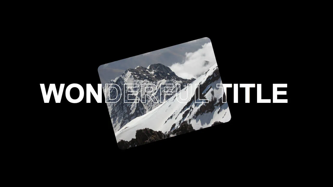
Text Stroke
Text Stroke Mask Effect builds an optical illusion using DOM stacking order. It sandwiches a position: fixed image between two identical text blocks. The back layer is solid white, while the front h1 uses -webkit-text-stroke and transparent fill. As you scroll, the fixed mountain “passes through” the letters. It’s a clever, zero-JS masking trick that relies entirely on CSS.
See the Pen Text Stroke.
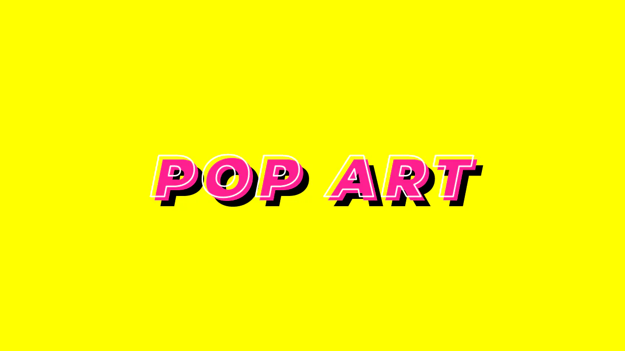
Typo Triple
Pop Art Typography uses standard CSS properties to mimic a classic comic book aesthetic. It relies on -webkit-text-stroke for the white outline and -webkit-text-fill-color: transparent to hollow the letters. The depth is simulated through a hard-edged, double text-shadow. No SVG or images needed. It is a clean, performant way to build bold, high-contrast hero text with minimal markup.
See the Pen Typo Triple.