10+ CSS Theme Switchers & Dark Modes
Visual comfort demands adaptability. Pure CSS theme switcher examples remove the friction of JavaScript state management, allowing the interface to respond directly to user preference. This collection provides essential blocks for modern UI design, prioritizing transparent logic. Utilizing curated snippets ensures dark mode toggles remain fast, lightweight, and native.
The logic relies on the checkbox hack coupled with the :checked pseudo-class and the has() selector to apply CSS Variables across the document root. This approach completely bypasses DOM manipulation scripts. Transitions leverage hardware acceleration, animating properties like opacity and transform for the toggle icon itself, guaranteeing 60fps performance. The HTML structure remains semantic, ensuring absolute layout stability.
Every free demo is fully responsive and cross-browser compatible. Users can instantly download the raw code or fork an updated layout on CodePen.
Examples
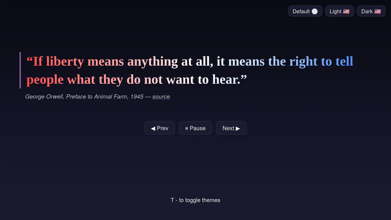
Accessible Multi-Theme Quote Rotator
An accessible quote rotator featuring fluid GSAP slide-fade transitions and dynamic theme switching. It loads quotes asynchronously from a target JSON file, outputting them into semantic citation structures. Includes native ARIA live-regions (aria-live), responsive height clamps, and keyboard-mapped theme toggles. (Requires: gsap.js)
 Chrome 110+
 Edge 110+
 Firefox 110+
 Safari 16.2+
See the Pen Accessible Multi-Theme Quote Rotator.

3D Star Wars Lightsaber Theme Toggle
3D Star Wars Lightsaber Theme Toggle relies on trigonometric CSS functions sin() and cos() to rotate vector elements along a 3D spherical path as the toggle slides. Custom numeric transitions are facilitated by redefining modern @property rules inside a @layer properties block, animating the --progress variable dynamically across state-driven keyframes. While providing a deeply thematic visual experience, performing continuous trigonometric transformations and animating complex CSS masks can trigger layout rasterization strain on standard devices, requiring GPU acceleration layers to preserve smooth 3D motion.
Chrome 111+
Edge 111+
Firefox 128+
Safari 16.4+
See the Pen 3D Star Wars Lightsaber Theme Toggle.
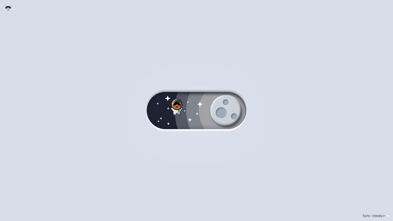
Bouncy Bear Theme Toggle Switch
Bouncy Bear Theme Toggle Switch relies on a clean, accessible HTML <button> to toggle an aria-pressed state, initiating a complex visual narrative that shifts between an aviator bear in light mode and an astronaut bear in dark mode. The animation utilizes modern CSS layout techniques including container-type queries, separate translate declarations, and a heavy-backwards cubic-bezier(.4,-0.3,.6,1.3) curve to achieve physical bounce. While structurally robust, the sheer volume of concurrently transitioning inline SVG paths and scaling stars can generate intensive layout recalculation spikes unless elements are actively isolated via hardware-promoted layers.
Chrome 105+
Edge 105+
Firefox 110+
Safari 16+
See the Pen Bouncy Bear Theme Toggle Switch.

Animated Scroll Highlight Annotations
This is an Animated Scroll Highlight Annotations component. It combines a spatial theme toggle with progressive reading indicators that colorfully highlight key text passages as they enter the viewport. Its function is to enhance long-form reading experiences by guiding the user’s eye to critical information through contextual, scroll-bound motion.
Chrome 115+
Edge 115+
Firefox 55+ (via fallback)
Safari 26.0+See the Pen Animated Scroll Highlight Annotations.

Sliding Theme Toggle Sidebar Menu
This is a Sliding Theme Toggle Sidebar Menu. It integrates an interactive light/dark mode switch directly into a scrollable navigation panel. Its function is to provide centralized control over the application’s visual environment while maintaining immediate access to primary routing options.
Chrome 59+
Edge 79+
Firefox 52+
Safari 10.1+
See the Pen Sliding Theme Toggle Sidebar Menu.

Pure CSS Morphing Dark Mode Toggle
This Pure CSS Morphing Dark Mode Toggle is a sophisticated implementation of a theme switcher that eliminates the need for JavaScript. By utilizing the modern CSS :has() relational selector and complex transform logic, the component morphs a sun icon into a moon icon seamlessly. It offers a premium feel through the use of custom cubic-bezier timing and modular CSS construction.
Chrome 105+
Edge 105+
Safari 15.4+
Firefox 121+
See the Pen Pure CSS Morphing Dark Mode Toggle.

Pure CSS Mix-Blend-Mode Dark Toggle
This Pure CSS Mix-Blend-Mode Dark Toggle offers a lightweight, JavaScript-free solution for theming. Instead of manually redefining colors for a dark theme, it utilizes a full-screen “curtain” overlay with a specific blending mode to mathematically invert the page’s color palette. The result is a smooth, wiping transition that instantly creates a high-contrast dark mode.
Chrome 41+
Edge 79+
Firefox 32+
Safari 8+See the Pen Pure CSS Mix-Blend-Mode Dark Toggle.

Theme Toggle
A smooth and striking transition between light and dark themes, where the background fills with “blinds” from the center outwards (or vice versa, thanks to symmetric --i indices), while the button playfully rotates.
See the Pen Theme Toggle.

Pure CSS Dark Mode Toggle Switch
This is a toggle switch that allows selecting between skeuomorphic and neumorphic design styles. It also features a dark/light theme change triggered by toggling the switch itself.
See the Pen Pure CSS Dark Mode Toggle Switch.

CSS List Filtering with :has()
A comprehensive demonstration of CSS :has() selector and Container Queries capabilities. :has() is used to toggle between light/dark themes and to dynamically filter cards by category without using JavaScript.
See the Pen CSS List Filtering with :has().
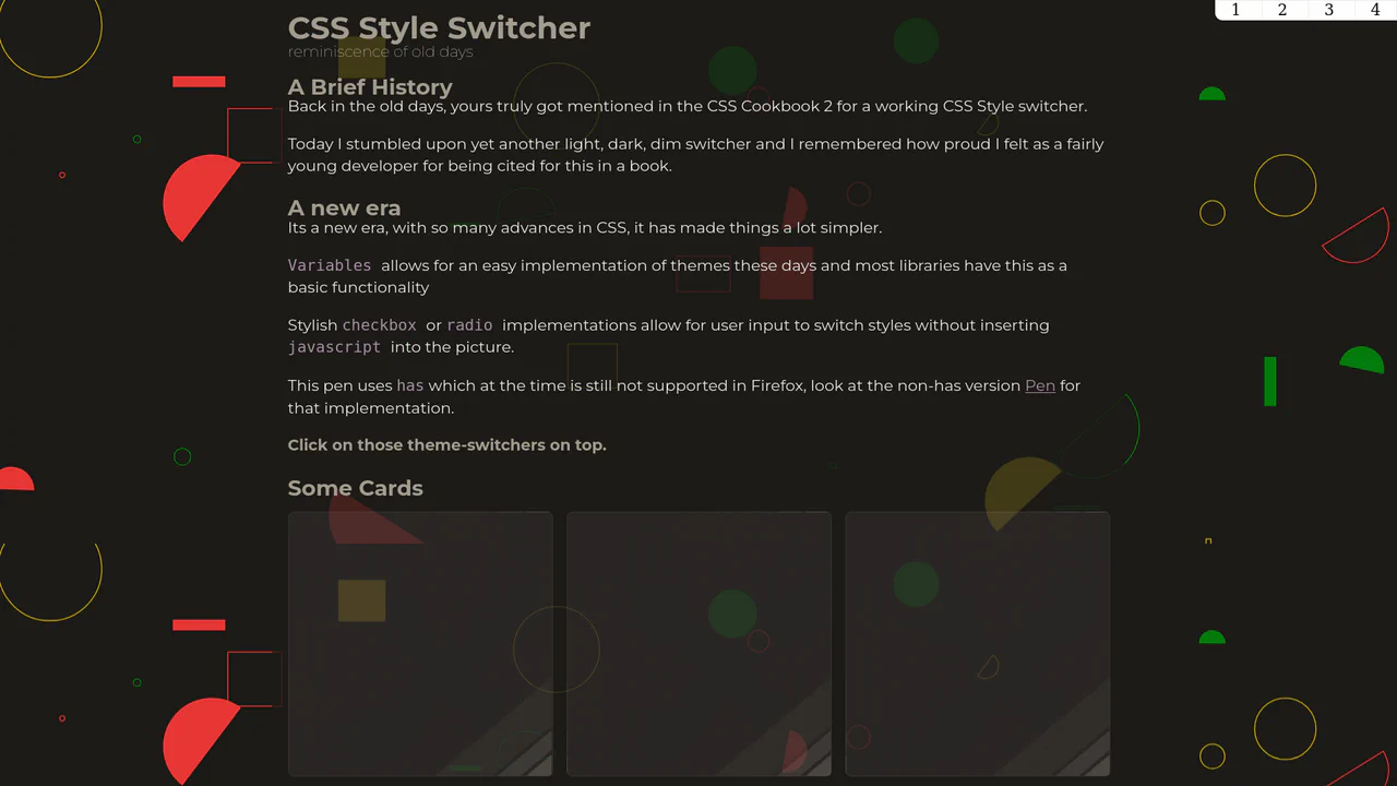
CSS Style Switcher with :has()
An example of powerful reactivity with :has() - theme switching not only changes colors but also radically reworks the layout, adds stylized shadows, and even changes fonts and background SVG patterns.
See the Pen CSS Style Switcher with :has().

Color Scheme Switcher with :has()
A color scheme switcher demonstrating the power of modern CSS: dynamic theme change (Dark, Light, High-contrast) occurs instantly and exclusively via the native :has() selector, without a single line of JavaScript.
See the Pen Color Scheme Switcher with :has().

Light/Dark Theme Switch with CSS Color-Scheme
A magnificent theme switch featuring a day-night effect, leveraging advanced CSS capabilities like color-scheme: light-dark and &:has(input:checked) to automatically invert background colors and gradients.
See the Pen Light/Dark Theme Switch with CSS Color-Scheme.
Love Is in the Air...
Explore the power of pure CSS for complex shapes and motion: a beautifully designed love letter featuring floating heart elements built entirely with CSS pseudo-elements and keyframe animations.
See the Pen Love Is in the Air....
An interactive mobile ticket mockup that instantly changes its appearance (light, dark, yellow themes) upon user selection.