30+ CSS Thumbnails
Media galleries require structural discipline. Pure CSS thumbnail examples organize visual assets into rigid, scalable grids without breaking aspect ratios. This collection delivers minimalist logic for modern UI design. Utilizing curated snippets eliminates layout thrashing during image loads. The code dictates the structure; the media simply populates it.
The architecture relies strictly on CSS Grid and object-fit: cover to ensure uniform sizing regardless of the source dimensions. Hover interactions leverage hardware acceleration, animating properties like transform: scale and filter to provide immediate tactile feedback without triggering expensive repaints. The HTML markup remains lightweight and semantic, maintaining absolute layout stability across breakpoints.
Every free demo is fully responsive and cross-browser compatible. Users can instantly download the raw code or fork an updated grid on CodePen.
Examples

Invert Radius Shape with Cool Hover Effect
A sophisticated hover effect utilizing CSS Houdini to animate a complex image mask.
See the Pen Invert Radius Shape with Cool Hover Effect.
A stylish card that rests as a diagonal fragment and smoothly “straightens” into a full rectangular image on hover, shifting the text downwards.
A fluid, responsive gallery that automatically adjusts to screen size and provides rich visual feedback on hover.
The SCSS organises styles with variables, nesting, and mixins. Animations and @for loops control element delays and appearance. The slide-popout mixin handles absolute positioning, though its logic is straightforward and could be inlined. Overall, the code is structured and predictable.

A float‑based grid with widths calculated via SCSS variables. Three hover effects use a pseudo‑element :after with skew and scale transforms. Text fades in synchronised with the background animation — all controlled by CSS transitions and delays.
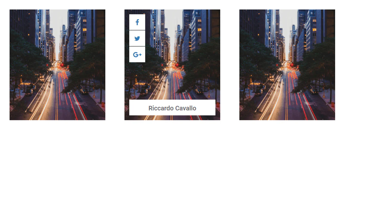
Three cards aligned with flexbox, each with an image and text overlay. On hover, the description smoothly expands — max-height and opacity animate. The overlay gradient shifts to keep text readable. No JavaScript — just CSS transitions.
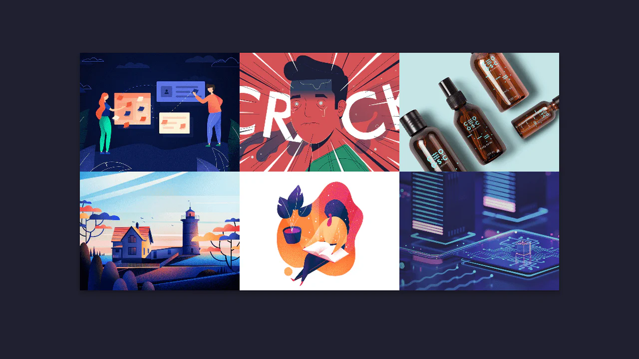
Three flex items with responsive images via <picture> — different crops per breakpoint. On hover, the overlay smoothly expands to full height, the background darkens, and the text stays visible. The grid stacks vertically on narrow screens; object‑fit and object‑position handle image cropping. Pure CSS, no scripts.
A card with an image split into four vertical strips. On hover, the strips slide up with staggered delays, revealing a text block that slides in from the bottom. The animation uses CSS transitions; the split background is achieved by positioning separate spans. Simple structure: container, strips, and content.
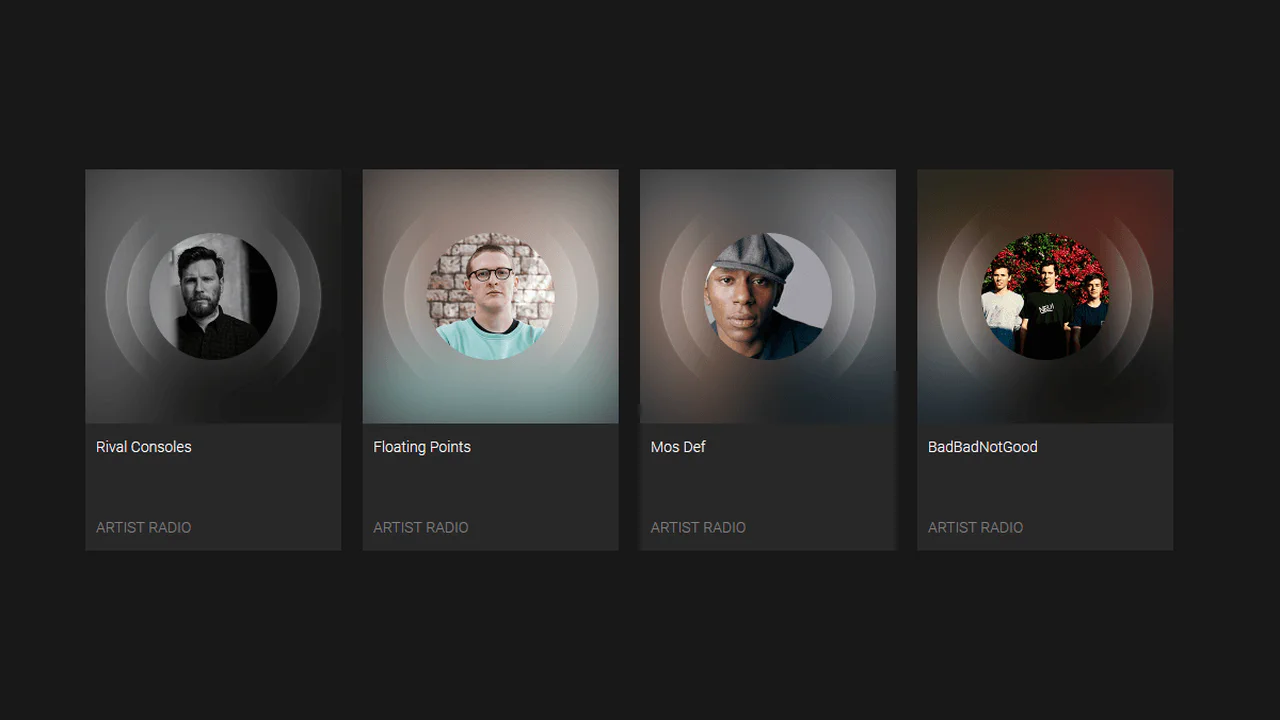
Four image cards with sliding info panels on hover. Each panel slides in from a different side (bottom, top, left, right) matching the card’s style. The background also shifts slightly for extra effect. Responsive grid uses CSS Grid. No JavaScript — just transitions and transforms.
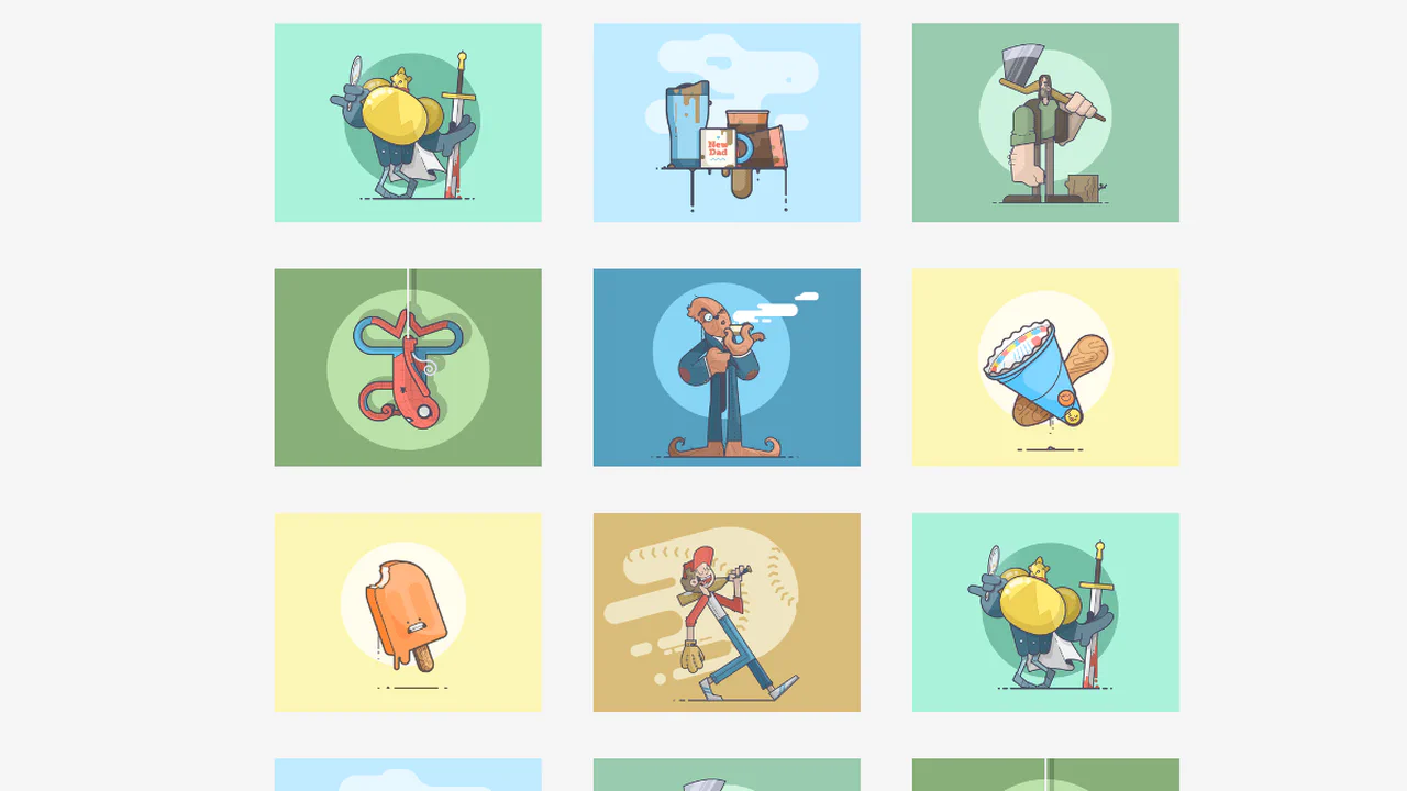
Three character cards with diagonal colour strips built with absolute positioning and rotate transforms. On hover, the strips slide in, the card smoothly scales down, and the text fades in. All animations are pure CSS, no JavaScript. Colour schemes reinforce each character’s identity.
Four image cards showcase different hover effects: scaling, text fade‑in, background shift, and colour change. Each effect is handled by a dedicated CSS class. No JavaScript — just transitions and transforms.
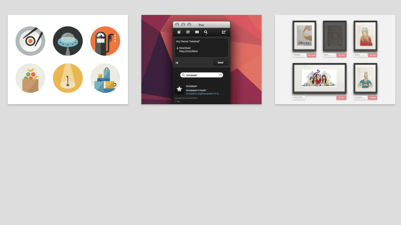
Six image cards with distinct hover effects — zoom, frame reveal, text slide, blur overlay, vintage gradient, and scale‑out. Each effect is isolated in its own modifier class; animations rely on transforms and transitions. No JavaScript — just styles and predictable behaviour.