10+ CSS Tilt Effects: Free 3D UI Code Snippets
CSS tilt effects establish realistic spatial depth across flat layouts, converting standard UI cards and product grids into tactile, three-dimensional elements upon interaction. By tilting containers smoothly in response to pointer gestures, this interactive design pattern captures user focus and naturally communicates clickability.
- Volumetric projection is established by combining the parent perspective property with coordinate-based rotations along the X and Y axes.
- Interactive hover tilt positions and glare reflection gradients are resolved smoothly on the GPU by transforming compositor-friendly properties.
- To maintain a responsive INP (Interaction to Next Paint) score, continuous transform calculations are kept detached from document-wide paint passes.
Master these spatial transformation techniques to integrate responsive, hardware-accelerated 3D hover actions and glassmorphic glares into your designs.
Table of Contents:
Examples
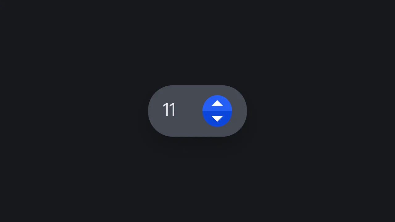
Tilted Rotational Elastic Number Input
An interactive number input designed with playful rotational physics. Powered by a vanilla ES6 class, the component dynamically tilts left or right upon button click or screen touch. When released, the parent card bounces back to its neutral position while the internal value increments or decrements under a synced CSS keyframe sequence. Fully supports dark mode media preferences.
 Chrome 36+
 Edge 12+
 Firefox 16+
 Safari 9+
See the Pen Tilted Rotational Elastic Number Input.
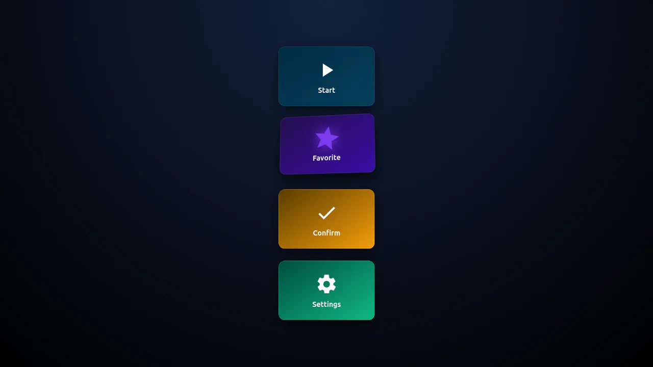
3D Isometric Neon Glow Buttons
An interactive set of 3D-perspective dashboard buttons styled with vibrant neon glowing highlights. Hovering over a card rotates its panel dynamically along the X and Y axes using native CSS preserve-3d and perspective properties, while styling the SVG icon with custom scaling and color-matched drop-shadow filters. Clicking triggers a quick, synchronized scale-pulse animation.
Chrome 57+
Edge 16+
Firefox 52+
Safari 10.1+
See the Pen 3D Isometric Neon Glow Buttons.

Interactive 3D Parallax Landscape
This volumetric 2.5D landscape utilizes spatial depth and layered parallax to create a tactile, multi-planar environment. While CSS preserve-3d handles the heavy lifting of perspective rendering, JavaScript orchestrates the state by mapping input to parametric rotation. By delegating logic to a hidden hit-area grid and leveraging GPU-accelerated transforms, the component ensures performance-optimized motion. This physical feedback minimizes cognitive load through intuitive spatial orientation for an immersive feel.
See the Pen Interactive 3D Parallax Landscape.

CSS-Only Image Tilt Towards Cursor
A 3D image tilt effect that mimics cursor movement, achieved purely with CSS by combining multiple invisible overlay zones, the general sibling combinator, and the transform: rotate3d() function with perspective on the parent container.
See the Pen CSS-Only Image Tilt Towards Cursor.
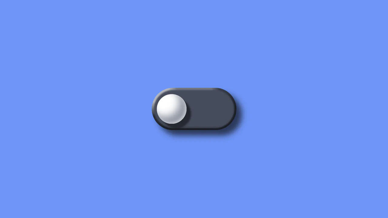
3D Tilt Toggle Switch
A realistic 3D toggle effect implemented entirely using pure CSS transforms (perspective, translate3d) and complex multi-step @keyframes animations to simulate press physics.
See the Pen 3D Tilt Toggle Switch.
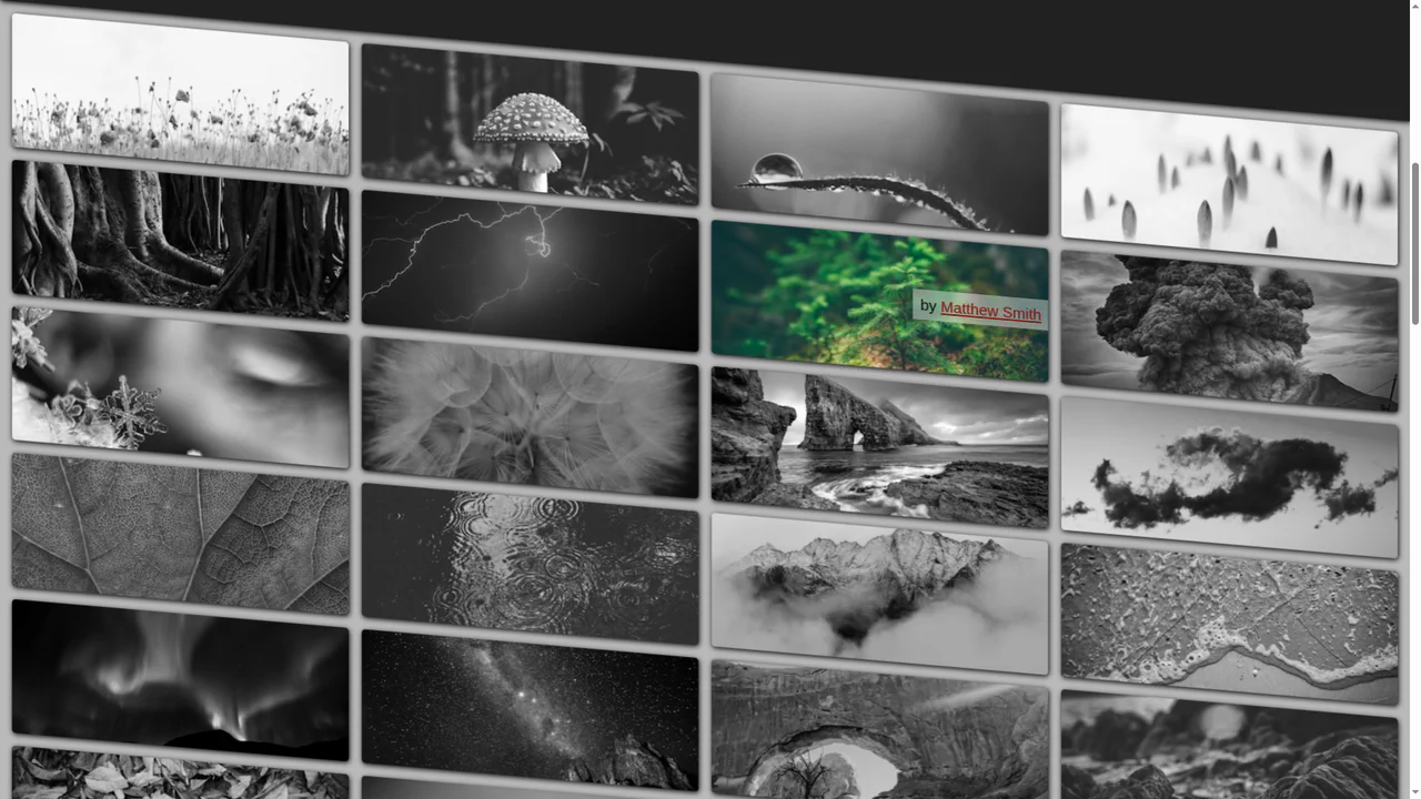
Pure CSS Tilt & Zoom Grid on Scroll
A cutting-edge pure CSS grid featuring scroll-driven animations and advanced trigonometric functions for dynamic tilt and zoom effects. It leverages @property and SVG displacement maps to create an immersive UI experience with maximum performance and zero JavaScript overhead.
See the Pen Pure CSS Tilt & Zoom Grid on Scroll.
Tilt to Make Room for Menu
A creative mobile UI concept featuring a 3D perspective menu built with pure CSS and SVG animations. By leveraging perspective and rotateX properties alongside smooth cubic-bezier transitions, this snippet delivers a high-performance interactive experience, making it an ideal component for advanced frontend design and mobile-first web apps.
See the Pen Tilt to Make Room for Menu.

Perspective Tilty Images
A sophisticated pure CSS 3D parallax effect that utilizes complex matrix3d transformations to create an immersive perspective shift on hover. This snippet showcases state management via sibling combinators and hardware-accelerated transforms, providing a high-performance UI animation solution without JavaScript.
See the Pen Perspective Tilty Images.
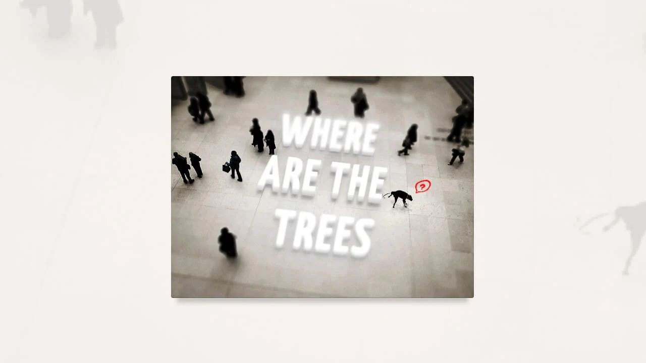
Tilt-Shift Text
A sophisticated CSS 3D typography effect that leverages perspective, rotateX, and complex text-shadow layers to achieve a tangible sense of depth. This interactive snippet features contenteditable support and smooth transitions, providing a high-performance solution for immersive UI/UX components.
See the Pen Tilt-Shift Text.

3D Tilting Moleskine Notebooks
A realistic 3D Moleskine notebook component built with pure CSS and SCSS, utilizing perspective and rotateY transforms. This snippet features detailed paper textures created with linear gradients and a smooth opening animation on hover, offering a high-performance UI/UX solution for digital portfolios or creative web apps.
See the Pen 3D Tilting Moleskine Notebooks.