2 CSS Titles: Free Code Snippets & Examples
Titles establish the visual hierarchy of every page — they tell users what content is about and guide attention to the most important message. CSS titles use fluid typography and gradient effects to create headings that scale smoothly across any viewport.
- Each title uses
clamp()with container query units (cqi) for fluid font sizing, ensuring the heading scales continuously between minimum and maximum values without breakpoint jumps. - Gradient titles use
background: linear-gradient()withbackground-clip: textfor color transitions, withcolor: transparentto reveal the gradient while keeping the underlying text fully accessible. - Semantic HTML with proper
<h1>through<h6>hierarchy ensures screen readers can navigate the document outline, whilearia-labelprovides additional context when needed.
Browse the collection to find a title style that matches your typographic voice — from minimal gradient headings with fluid scaling to dramatic text reveals with staggered letter animations.
Table of Contents:
Examples

Editorial Grid Magazine Layout
This is an Editorial CSS Grid Magazine Layout. It translates the overlapping, asymmetrical structures of print media into the browser. Its function is to break rigid top-to-bottom reading patterns, utilizing layered images and multi-column typography to construct visual tension and content hierarchy without relying on JavaScript.
 Chrome 57+
 Edge 16+
 Firefox 52+
 Safari 10.1+
See the Pen Editorial Grid Magazine Layout.
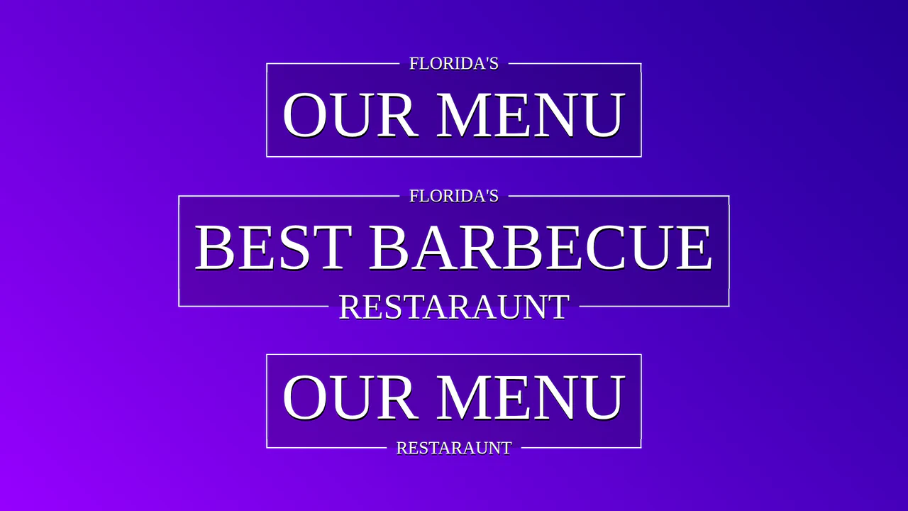
Fancy Title with CSS Responsive Frame
Creating a complex decorative title where breaks in the border are elegantly implemented using CSS Grid and pseudo-elements. Padding sizes adapt dynamically thanks to a CSS variable calculated by a mixin.
See the Pen Fancy Title with CSS Responsive Frame.