150+ CSS Toggle Switches (Page 2)
Examples
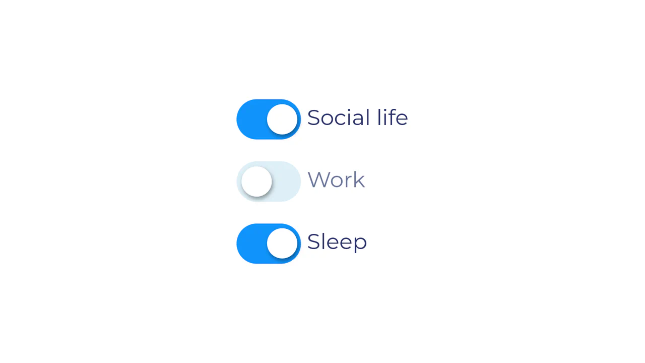
Life Paradox CSS Toggle Checkboxes
This demo shows a CSS-only custom toggle checkbox design with a dynamic visual effect, where a minimal JavaScript function cbChange(obj) enforces the ‘Life Paradox’ rule: only one box can be unchecked at any time by setting all others to checked state.
See the Pen Life Paradox CSS Toggle Checkboxes.

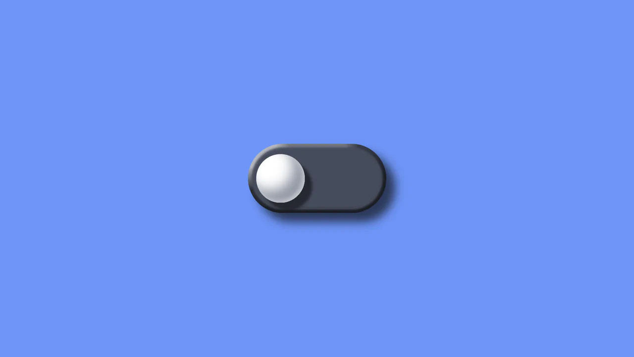
Neumorphic Soft UI Radio Buttons and Checkboxes
This demo explores the Neumorphic or Soft UI design trend, implementing a complete set of custom radio buttons, checkboxes, and toggle switches using only pure CSS box-shadow properties to achieve the signature concave/convex 3D-like effect, while a concise Vanilla JS script manages the dynamic background gradient on state change.
See the Pen Neumorphic Soft UI Radio Buttons and Checkboxes.
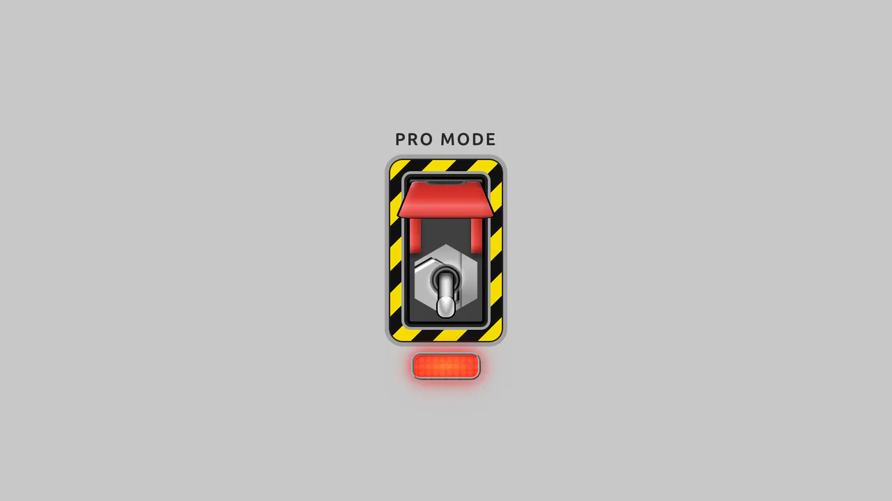
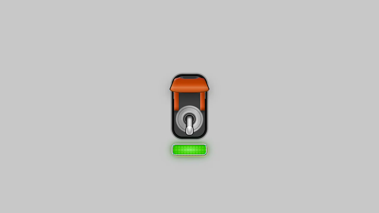
Pro-Mode Toggle Switch w/ Guard
Dual input[type="checkbox"] system for two-step activation, showcasing mastery in creating logic without JavaScript and detailed UI using a repeating-linear-gradient background and complex pseudo-elements."
See the Pen Pro-Mode Toggle Switch w/ Guard.
Pro-Mode Toggle Switch with Guard (Softer)
A technically complex stylized toggle switch utilizing advanced CSS capabilities: box-shadow for realistic depth, perspective for a 3D casing effect, and a dynamic glowing effect via the hue-rotate filter.
See the Pen Pro-Mode Toggle Switch with Guard (Softer).
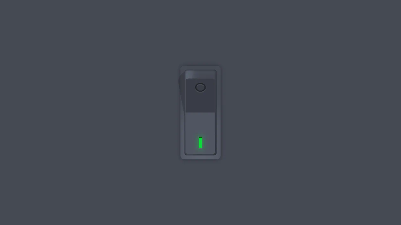
Vertical Rocker Switch
A tactilely realistic vertical toggle, created using advanced CSS variable techniques and multiple box-shadow layers to mimic three-dimensional depth, combined with smooth cubic-bezier animations.
See the Pen Vertical Rocker Switch.
3D Tilt Toggle Switch
A realistic 3D toggle effect implemented entirely using pure CSS transforms (perspective, translate3d) and complex multi-step @keyframes animations to simulate press physics.
See the Pen 3D Tilt Toggle Switch.

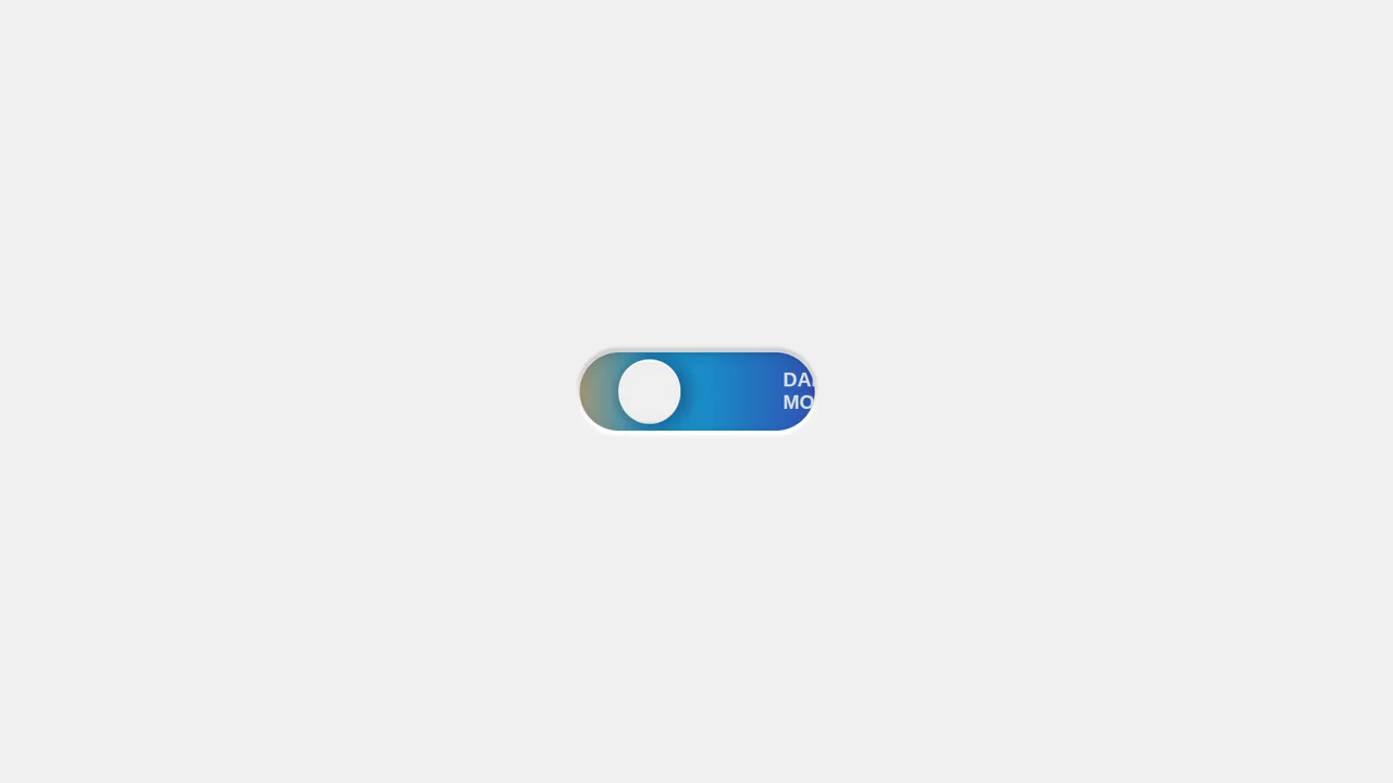
Light/Dark Theme Switch with CSS Color-Scheme
A magnificent theme switch featuring a day-night effect, leveraging advanced CSS capabilities like color-scheme: light-dark and &:has(input:checked) to automatically invert background colors and gradients.
See the Pen Light/Dark Theme Switch with CSS Color-Scheme.

Elastic Checkboxes with Pure CSS
A demonstration of creating custom, highly styled checkbox toggles using pure CSS, featuring complex conic-gradient functions to render the tick mark and a sophisticated background with a subtle repeating pattern.
See the Pen Elastic Checkboxes with Pure CSS.
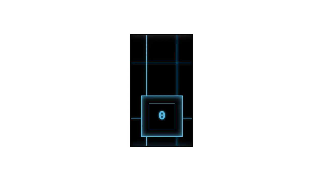
Cyberpunk CSS Switch
This cyberpunk-styled CSS switch is a great example of creating complex UI elements without JavaScript. The effect is built on CSS variables for easy customization and pseudo-elements for rendering animated on/off states using @keyframes and box-shadow.
See the Pen Cyberpunk CSS Switch.
Day-Night Toggle Switch
This switch demonstrates advanced CSS capabilities, combining radial and linear gradients with multiple backgrounds to simulate animated motion. The state change is achieved by adjusting background-position on the :checked pseudo-class.
See the Pen Day-Night Toggle Switch.
Rolling Theme Switch
An advanced Dark Mode switcher built with pure CSS, utilizing the :has() pseudo-class for seamless global theme updates. This snippet features animated SVG icons and smooth transitions, delivering a high-performance and accessible (A11y) UI component for modern frontend projects.
See the Pen Rolling Theme Switch.