40+ CSS Tooltips
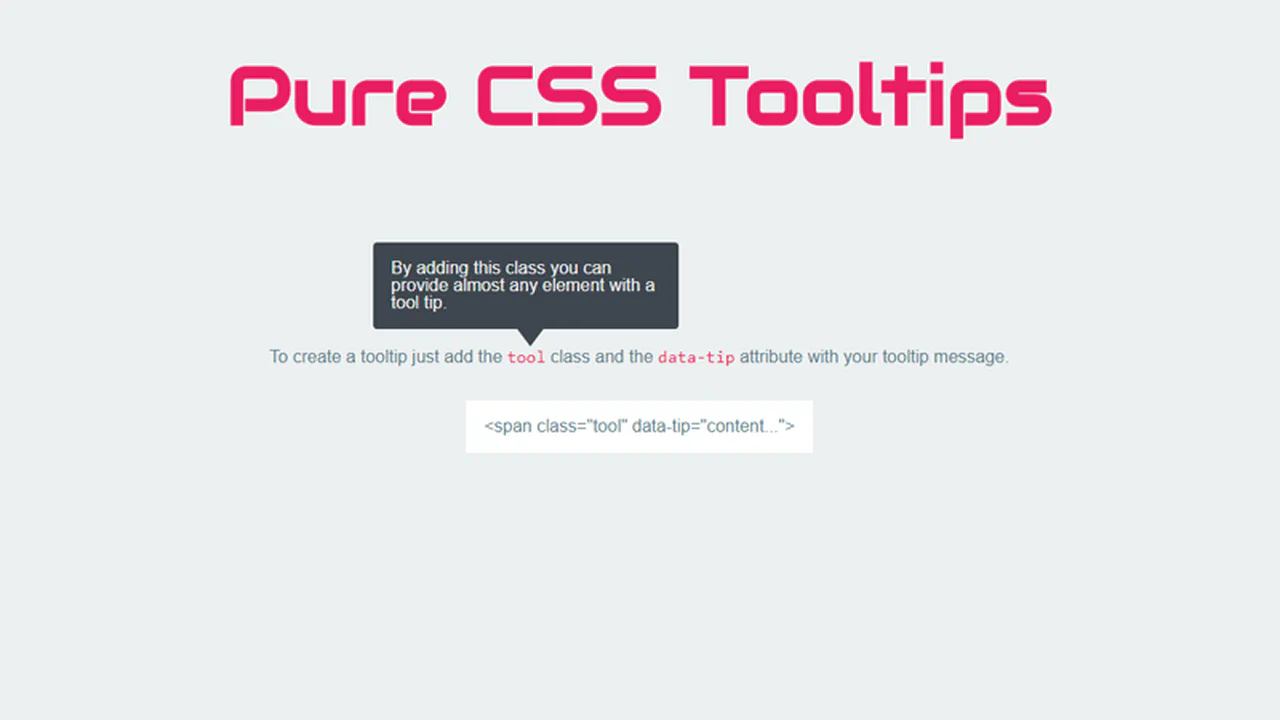
Context is essential for clear interaction. CSS tooltips provide immediate data without disrupting the interface or adding visual clutter. This updated collection removes noise, delivering information only when the user requires it. Utilizing these curated snippets ensures a streamlined UI design where the primary content remains the focus.
These examples utilize absolute positioning and pseudo-elements (::before, ::after) to construct precise pointers. Interaction logic leverages hardware acceleration, animating properties like transform and opacity to ensure 60fps transitions on the compositor thread. The code relies on semantic HTML data attributes to manage content, ensuring high layout stability and rapid rendering without additional DOM nodes.
Every free demo is fully responsive and cross-browser compatible. Users can instantly download the raw code or fork a specific layout on CodePen.
Examples

Anchored Glassmorphic Tab Indicator
This is an Anchored Glassmorphic Tab Indicator. It utilizes the cutting-edge CSS Anchor Positioning API to physically tether a floating visual highlight to the currently active or hovered navigation button. Its function is to provide highly fluid, magnetic feedback without relying on complex JavaScript bounding-box calculations.
 Chrome 125+
 Edge 125+
 Firefox (partial)
 Safari (partial)
See the Pen Anchored Glassmorphic Tab Indicator.

Tectonic Stacked Tooltip Button
This Tectonic Stacked Tooltip creates a sophisticated, industrial-grade micro-interaction. Instead of a simple fade-in, the tooltip constructs itself from multiple sliding “plates” (slabs) that expand outward upon hovering. With its dark aesthetic, noise textures, and precise easing, it fits perfectly into sci-fi games, technical dashboards, or brutalist web designs. (Requires: Google Fonts (JetBrains Mono))
Chrome 60+
Edge 79+
Firefox 55+
Safari 12+
See the Pen Tectonic Stacked Tooltip Button.

Little Details
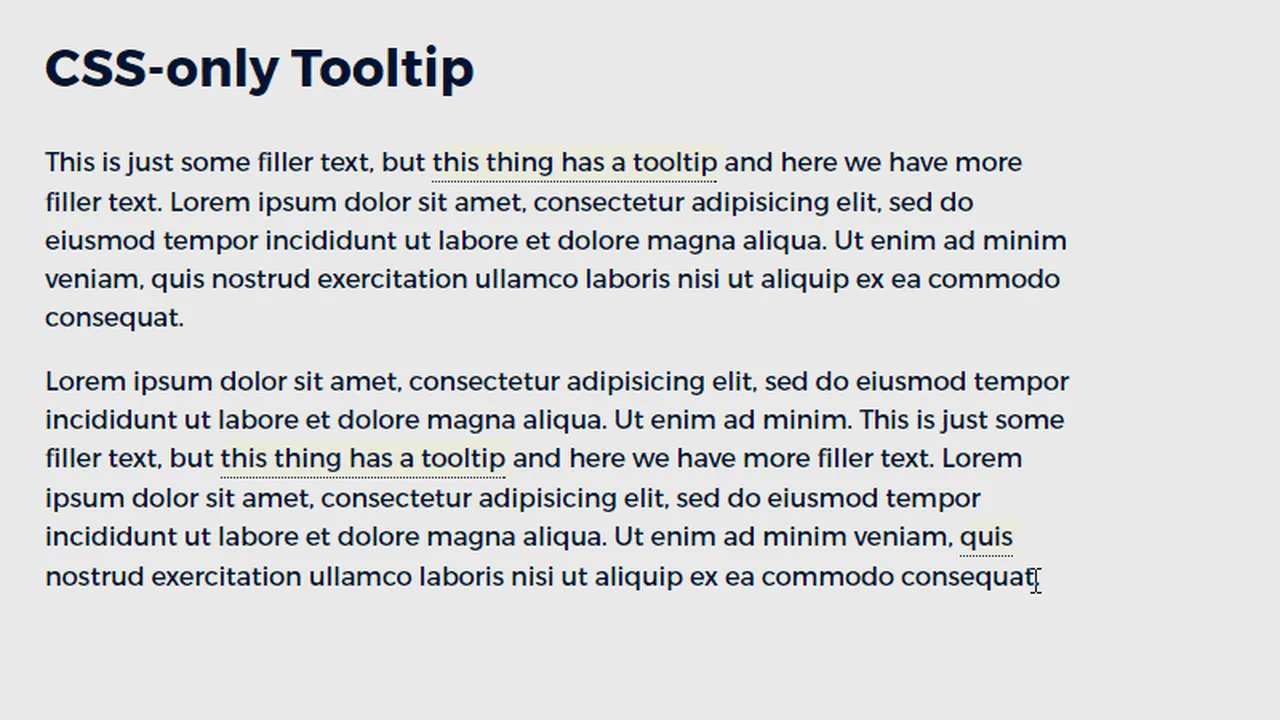
A stylized nested to-do list employing advanced CSS pseudo-elements for custom markers and hover-based reveal logic for sub-tasks. JavaScript handles basic DOM manipulation for adding/removing items, while the dark UI features gradient borders and tooltip interactions.
See the Pen Little Details.
Note-Taking Toolbar with Dynamic Tooltip
This is a sleek, reusable Note-Taking Toolbar component, utilizing pure CSS for :hover and :active effects (including the dynamic tooltip), and basic JavaScript to manage a single selected state without external libraries.
See the Pen Note-Taking Toolbar with Dynamic Tooltip.
Hover Effects
A dynamic hover effect in pure CSS, where the :has() pseudo-class triggers simultaneous animations: a slide-out tooltip and a smooth icon fill. The tooltip’s content is sourced from a data-tooltip attribute via attr(), and the fill color is flexibly configured with a --bg CSS Custom Property.
See the Pen Hover Effects.
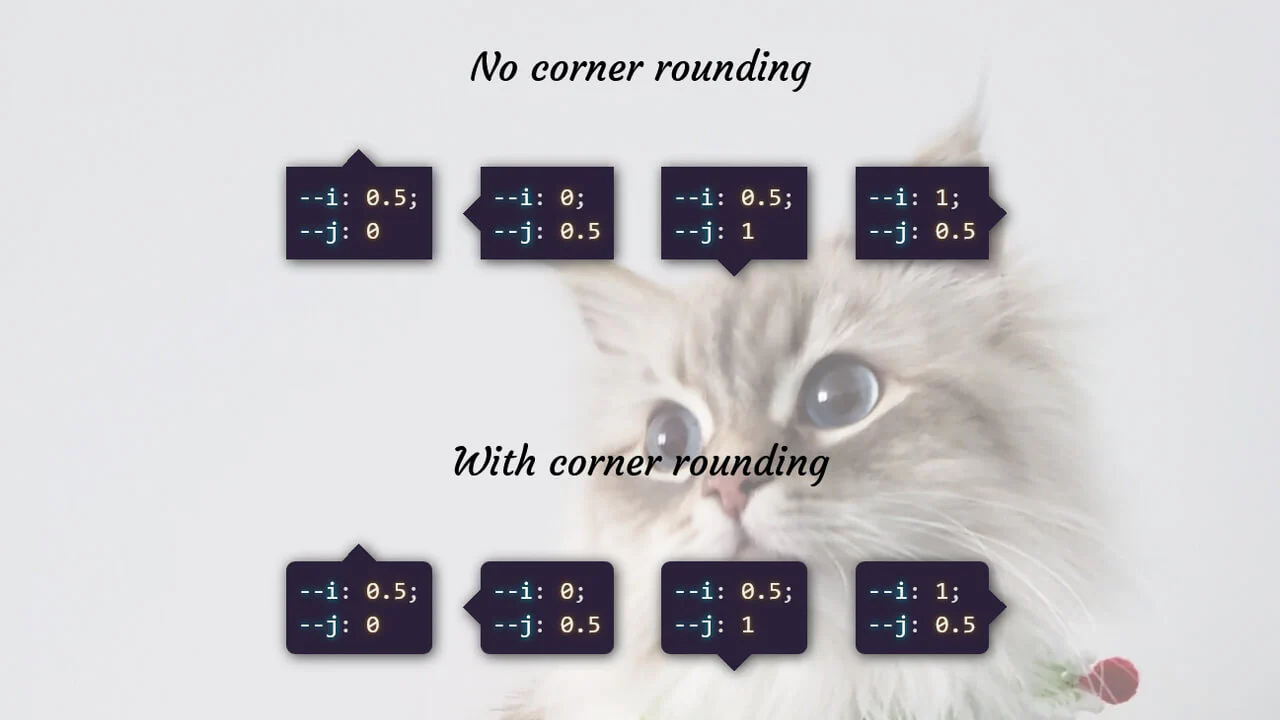
A flexible and customizable sidebar built with CSS Custom Properties - sizes, spacing, and colors are easily configurable. The complex choreography of element appearance is achieved through transition-delay, and tooltip content is sourced from data-* attributes.
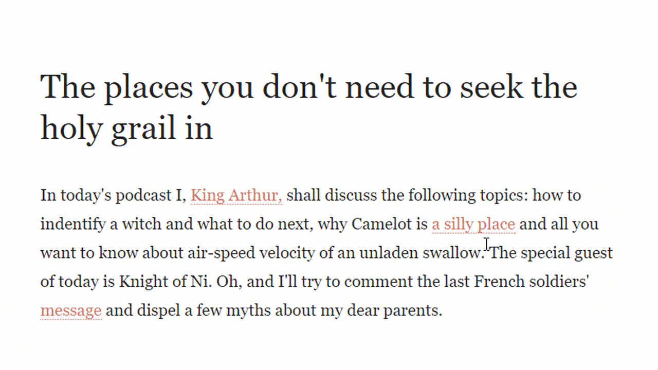
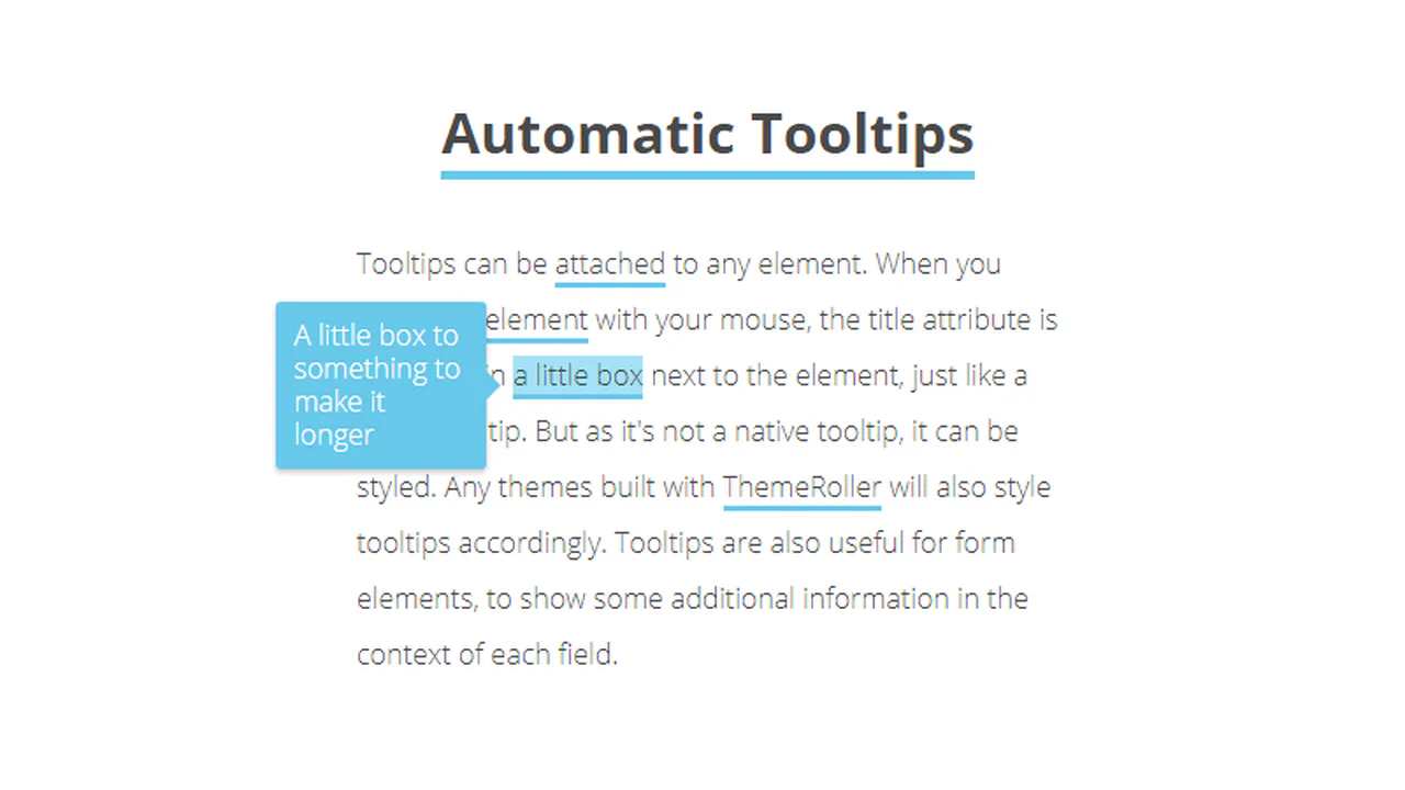
Tooltips with triangular tails and color coding. Each icon changes color on hover and shows tooltip. Tail formed by pseudo-elements with rotation and shadow. Tooltip positioning (top/bottom) set via modifiers.
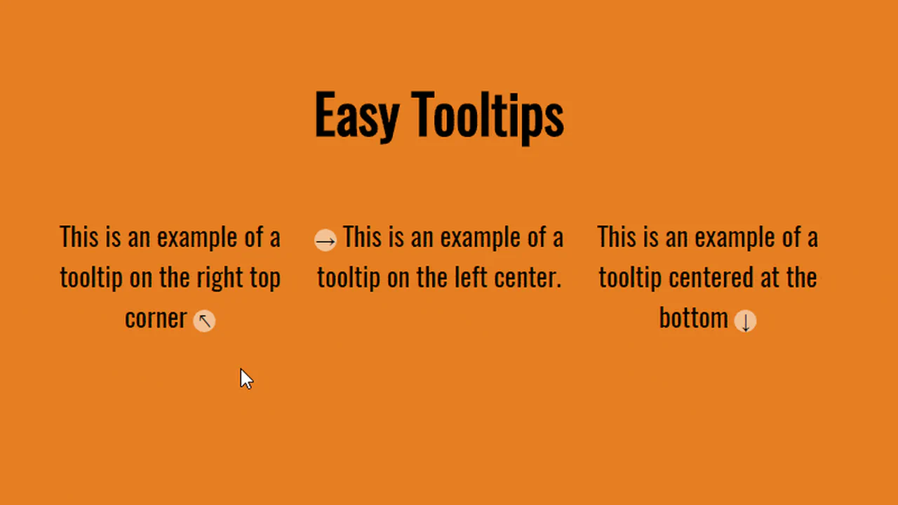
Tooltip system via data attributes with appearance animation. Position set via data-tooltip-location. Tooltip appears with scaling, arrow slides with delay. Gradient background and shadow. Responsive mobile mode.
Simple tooltip below icon. On hover, label slides from bottom. Gradient text via background-clip. Positioning and smoothness via transition.
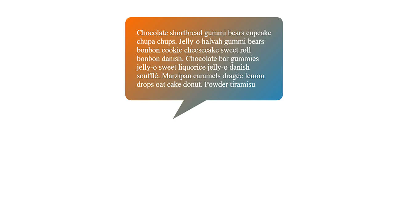
Animated balloon tooltip appearance. Starting as tiny dot, element expands to full content block, morphing from circle to rounded rectangle. Bottom arrow and text appear with delay. After completion — gentle shake.
Cooltipz.css library demo — customizable tooltips via CSS variables. Control size, position, animation, color, and shape via data attributes and custom properties. Examples showcase all customization options.
Animated plus button revealing tooltip with icons. On checkbox click, plus rotates, tooltip stretches and slides up, geometric shapes scatter around. SCSS loop randomly positions shapes.
Minimal tooltip above button. On hover, hint appears sliding from bottom with triangular tail. Positioning via left: 50% and transform. Colors and sizes match retro pixel game style.
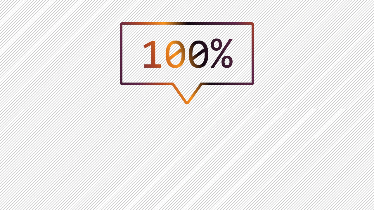
Card with interactive SVG-outlined tooltip. On question mark hover, speech bubble appears with animated stroke: left part draws (stroke-dasharray), right slides (stroke-dashoffset). Inside — explanatory text.