180+ CSS transform Examples
Spatial manipulation defines the modern interface. CSS transform examples in this updated collection remove the friction of static layouts, allowing elements to shift, rotate, and scale without disturbing the document flow. Using these curated snippets is more efficient than building coordinate systems from scratch. Technology must move beyond flat surfaces to create depth and focus.
Technically, these snippets leverage hardware acceleration by offloading calculations to the GPU. Properties like translate3d, rotateZ, and scale ensure 60fps performance and high layout stability. The code utilizes semantic HTML, ensuring the DOM remains lightweight while the browser handles complex visual shifts through the transform matrix. This approach prevents expensive repaints and maintains absolute logic in the rendering cycle.
Every free demo is cross-browser compatible and responsive. Users can instantly download the raw code or fork an interactive project on CodePen. These UI design components are strictly optimized for performance across all modern mobile and desktop devices, delivering a transparent and direct interaction model.
Examples
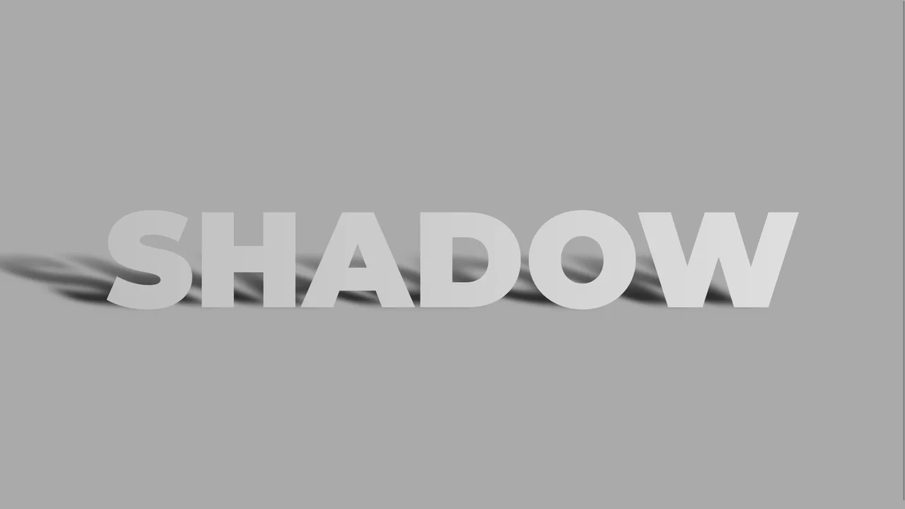
Skewed Perspective Drop Shadow Typography
A pure CSS typography effect that simulates a realistic, perspective-cast drop shadow. The main text is styled with a metallic linear gradient using background-clip: text. The shadow is generated via a ::before pseudo-element that duplicates the text content using attr(data-text). This shadow layer is then skewed, scaled down, blurred, and faded out using a linear gradient mask-image to mimic natural light diffusion.
 Chrome 53+
 Edge 79+
 Firefox 53+
 Safari 10.1+
See the Pen Skewed Perspective Drop Shadow Typography.
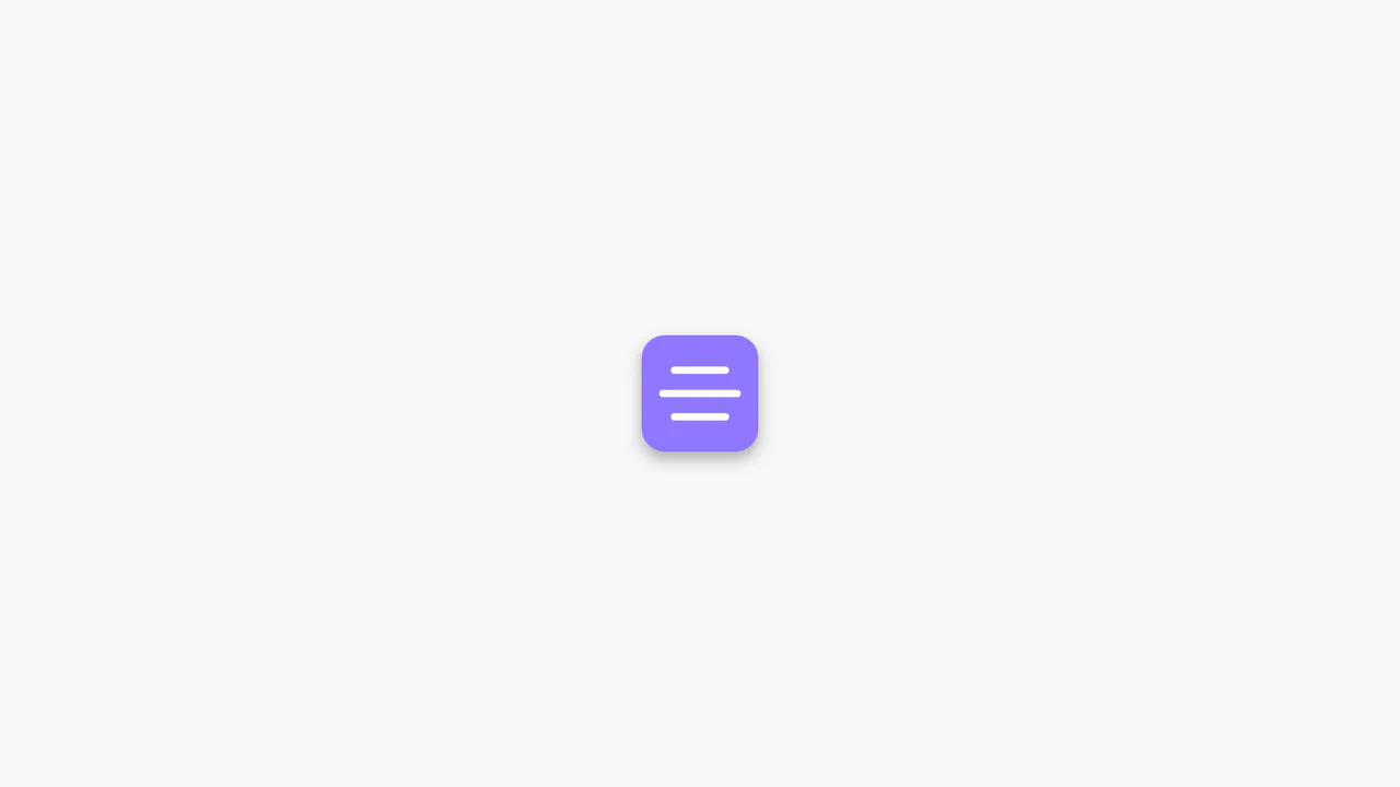
Animated CSS Hamburger Menu Icon
Animated CSS Hamburger Menu Icon transforms a standard three-line menu into a close button. JavaScript toggles an active class, while CSS handles the heavy lifting. The middle line slides out using translateX, and the outer lines rotate 45 degrees via transform. Simultaneously, the background and icon colors invert. A clean, lightweight micro-interaction for mobile navigation headers.
Chrome 49+
Edge 15+
Firefox 31+
Safari 10+
See the Pen Animated CSS Hamburger Menu Icon.
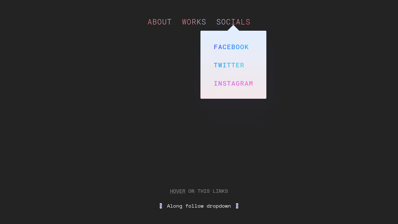
Morphing Stripe-Style Dropdown Navigation
“Morphing Stripe-Style Dropdown Navigation” replicates the famous Stripe header effect. A single background element dynamically resizes and moves behind the active content. JavaScript calculates dimensions using getBoundingClientRect() and updates CSS properties to animate the panel. This approach keeps the DOM clean and ensures smooth transitions between menu sections.
Chrome 48+
Edge 15+
Firefox 48+
Safari 10+
See the Pen Morphing Stripe-Style Dropdown Navigation.
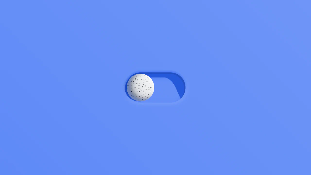
Rollback Ball 3D Toggle Switch
Rollback Ball 3D Toggle Switch is a highly tactile, skeuomorphic switch concept. When clicked, a textured 3D ball realistically rolls across the track, cast-shadows shifting in unison. An ES6 JavaScript class dynamically reads the CSS animation duration, disables the input during the roll, and automatically resets the toggle state once the animation completes. A stellar example of interactive micro-design.
Chrome 55+
Edge 79+
Firefox 54+
Safari 10+
See the Pen Rollback Ball 3D Toggle Switch.
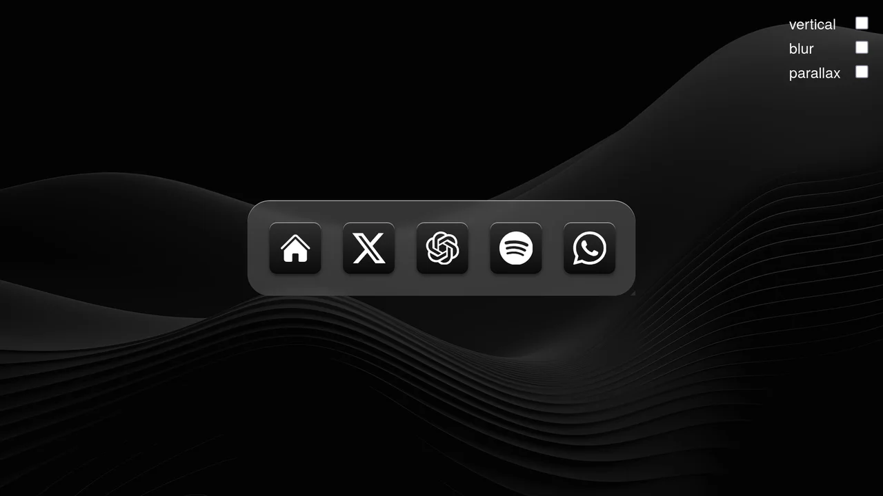
Scroll-Driven macOS iOS Dock Concept
Pure CSS Scroll-Driven macOS iOS Dock recreates Apple’s legendary dock using the native CSS Scroll-Driven Animations API. Icons dynamically scale, blur, and shift depth completely without JavaScript. Utilizing @supports (animation-timeline: scroll()), the layout safely handles horizontal and vertical snaps. A zero-dependency, ultra-lightweight demonstrator of modern CSS capabilities. (Requires: gsap.js, scroll-trigger.js)
Chrome 115+
Edge 115+
Safari 26+
See the Pen Scroll-Driven macOS iOS Dock Concept.
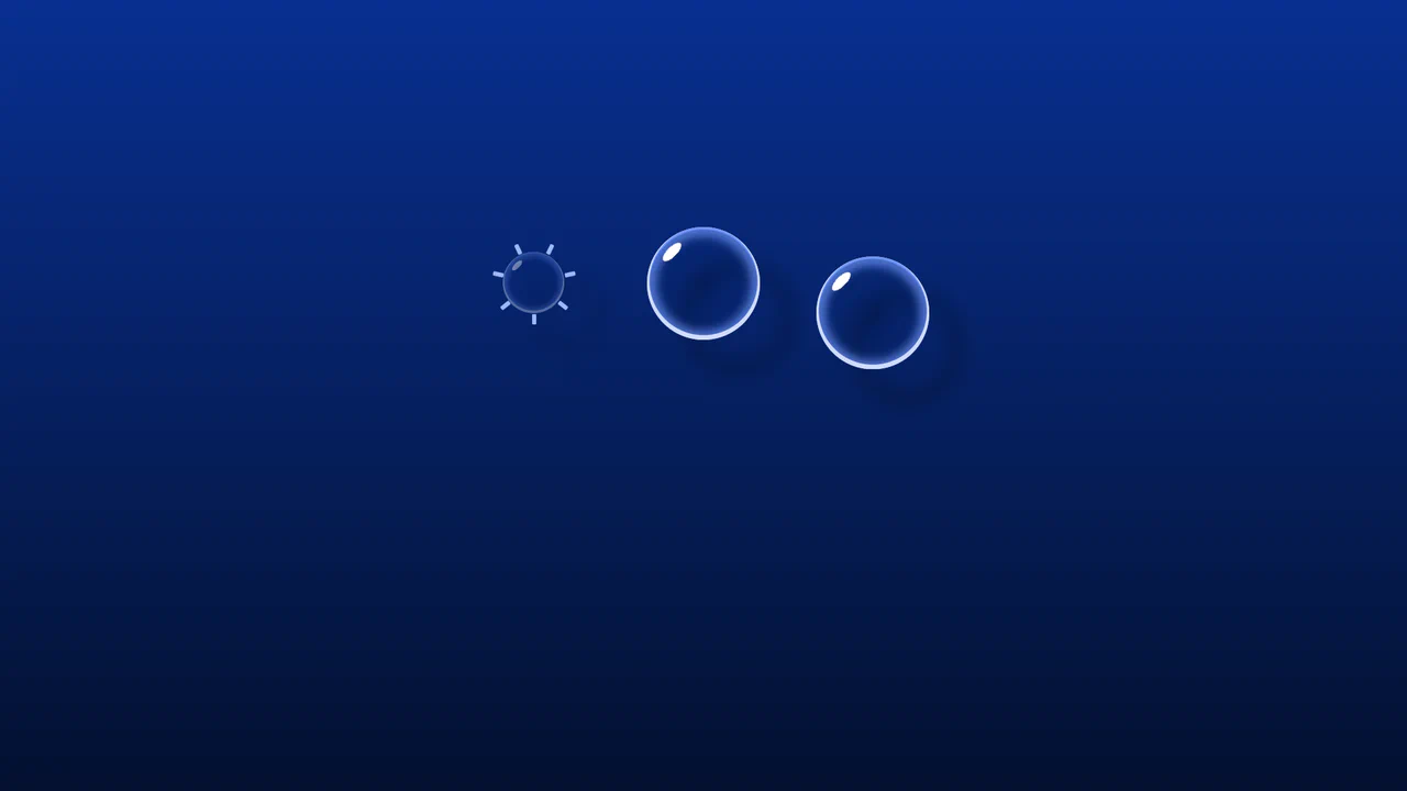
Whimsical CSS Bubble Preloader
Whimsical CSS Bubble Preloader is a pure CSS animation that simulates rising bubbles that pop and scatter tiny droplets. Using HTML layout without JavaScript, it relies entirely on staggered @keyframes delays, absolute positioning, and math-based rotations via :nth-child. Radial gradients generate realistic reflections, while drop-shadow adds depth. A smart choice for lightweight, playful interfaces, though the dense DOM structure for droplets might feel redundant for some.
Chrome 52+
Edge 15+
Firefox 49+
Safari 9.1+See the Pen Whimsical CSS Bubble Preloader.

3D Star Wars Lightsaber Theme Toggle
3D Star Wars Lightsaber Theme Toggle relies on trigonometric CSS functions sin() and cos() to rotate vector elements along a 3D spherical path as the toggle slides. Custom numeric transitions are facilitated by redefining modern @property rules inside a @layer properties block, animating the --progress variable dynamically across state-driven keyframes. While providing a deeply thematic visual experience, performing continuous trigonometric transformations and animating complex CSS masks can trigger layout rasterization strain on standard devices, requiring GPU acceleration layers to preserve smooth 3D motion.
Chrome 111+
Edge 111+
Firefox 128+
Safari 16.4+
See the Pen 3D Star Wars Lightsaber Theme Toggle.
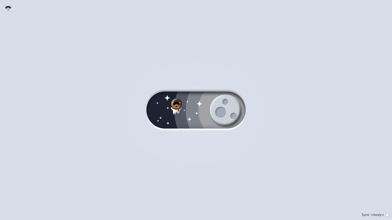
Bouncy Bear Theme Toggle Switch
Bouncy Bear Theme Toggle Switch relies on a clean, accessible HTML <button> to toggle an aria-pressed state, initiating a complex visual narrative that shifts between an aviator bear in light mode and an astronaut bear in dark mode. The animation utilizes modern CSS layout techniques including container-type queries, separate translate declarations, and a heavy-backwards cubic-bezier(.4,-0.3,.6,1.3) curve to achieve physical bounce. While structurally robust, the sheer volume of concurrently transitioning inline SVG paths and scaling stars can generate intensive layout recalculation spikes unless elements are actively isolated via hardware-promoted layers.
Chrome 105+
Edge 105+
Firefox 110+
Safari 16+See the Pen Bouncy Bear Theme Toggle Switch.
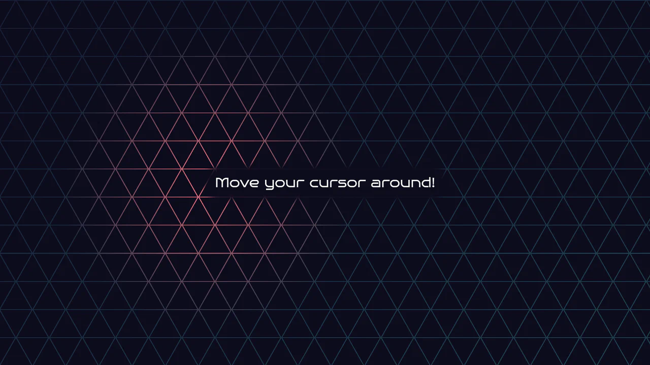
Geometric Glowing Triangle Mask Grid
Geometric Glowing Triangle Mask Grid creates an interactive mesh overlay by dynamically calculating and appending CSS border triangles to mask a neon background. The layout binds a mouse-tracking #glow radial gradient to the cursor, while modern CSS @property interpolates color shifts directly in keyframe animations. However, running heavy JS-based DOM recalculations on window.onresize combined with moving massive layout-disrupting absolute positions like top/left on every mousemove can cause paint pipeline bottlenecks, which are easily alleviated by transforming with hardware-accelerated translate3d instead.
Chrome 85+
Edge 85+
Firefox 128+
Safari 16.4+
See the Pen Geometric Glowing Triangle Mask Grid.

Curtain Transition Navigation Menu
Curtain Transition Navigation Menu implements a lightweight state toggle via a data-nav attribute, shifting the entire <main> view up by 50% to reveal an absolutely-positioned bottom navigation drawer. Dynamic sizing features like clamp() and max() ensure responsive link layouts, while a sharp cubic-bezier(.13, .53, .38, .97) curve coordinates the simultaneous scaling and entry of image-rich navigation elements. While visually fluid, animating massive full-screen wrappers containing large Unsplash media can trigger costly rasterization overhead unless GPU compositing is actively hinted.
Chrome 88+
Edge 88+
Firefox 89+
Safari 15+
See the Pen Curtain Transition Navigation Menu.
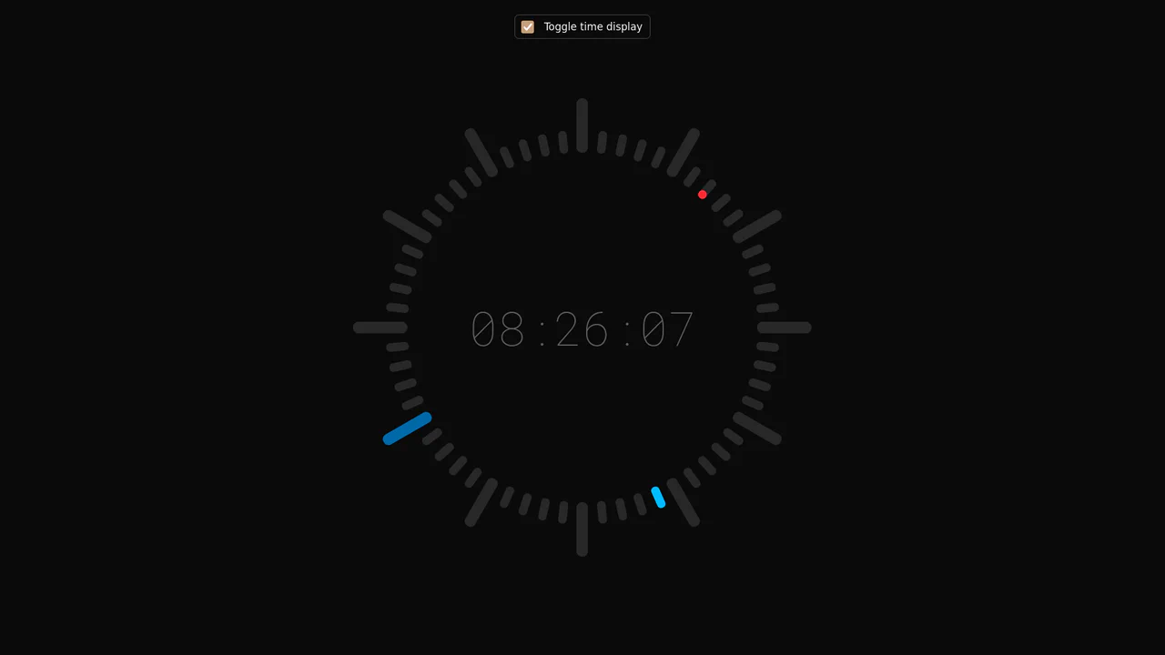
Minimalist Radial Dot Clock
This is a Minimalist Radial Dot Clock. It visualizes time through three concentric rings of geometric dots (hours, minutes, seconds) rather than traditional sweeping hands. Its function is to provide an ambient, modern alternative to standard analog or digital readouts, integrating seamlessly into high-end, futuristic interfaces.
Chrome 123+
Edge 123+
Safari 17.5+
Firefox 120+
See the Pen Minimalist Radial Dot Clock.

Fluid Flexbox Accordion Carousel
This is a Fluid Flexbox Accordion Carousel. It manages the spatial distribution of images using CSS flex-basis and animates an infinite scrolling loop via DOM node manipulation. Its function is to showcase featured content without hard clipping, allowing users to preview adjacent items while maintaining absolute focus on the active selection.
Chrome 88+
Edge 88+
Firefox 78+
Safari 14+
See the Pen Fluid Flexbox Accordion Carousel.

Spatial Grid Image Explorer
This is a Spatial Grid Image Explorer. It maps a collection of high-resolution images onto an infinite 2D canvas, allowing users to pan spatially rather than scrolling linearly. Its function is to provide an immersive, map-like navigation experience for visual portfolios, shifting the paradigm from vertical feeds to omnidirectional exploration.
Chrome 80+
Edge 80+
Firefox 75+
Safari 13.1+
See the Pen Spatial Grid Image Explorer.

Smooth Parallax Image Scroll Gallery
This is a Smooth Parallax Image Scroll Gallery. It translates vertical scroll progression into independent Y-axis movement for masked images. Its function is to create a sense of depth and momentum, elevating standard vertical feeds into immersive visual narratives. (Requires: gsap-js, scroll-trigger-js, lenis-js)
Chrome 108+
Edge 108+
Firefox 101+
Safari 15.4+
See the Pen Smooth Parallax Image Scroll Gallery.

Sliding Theme Toggle Sidebar Menu
This is a Sliding Theme Toggle Sidebar Menu. It integrates an interactive light/dark mode switch directly into a scrollable navigation panel. Its function is to provide centralized control over the application’s visual environment while maintaining immediate access to primary routing options.
Chrome 59+
Edge 79+
Firefox 52+
Safari 10.1+
See the Pen Sliding Theme Toggle Sidebar Menu.

Stacked Card Pull-Down Navigation
This is a Stacked Card Pull-Down Navigation. It transforms a standard mobile menu into a tactile, deck-like interface that cascades down from the viewport’s top edge. Its primary function is to provide an engaging, full-screen routing experience, replacing the traditional hamburger icon with an interactive, overlapping layer system that optimizes touch targets.
Chrome 86+
Edge 86+
Firefox 85+
Safari 14+See the Pen Stacked Card Pull-Down Navigation.

Grid Lightbox Gallery Effect
This is a CSS Grid Lightbox Gallery Effect. It structures an asymmetric image grid that expands individual photos into a full-screen, blurred overlay upon interaction. Its primary function is to focus user attention on a single visual asset while maintaining the context of the underlying page through transparency.
Chrome 76+
Edge 79+
Firefox 103+
Safari 13+
See the Pen Grid Lightbox Gallery Effect.

Neon Glow Toggle Switch
This is a Neon Glow Toggle Switch. It replaces a standard HTML checkbox with a highly tactile, skeuomorphic control. Its function is to provide satisfying visual feedback for state changes, utilizing a “filling” neon border and a sliding, textured handle to make binary selections feel like engaging physical hardware.
Chrome 85+
Edge 85+
Firefox 128+
Safari 16.4+
See the Pen Neon Glow Toggle Switch.

Skeuomorphic Snowball Range Slider
This is a Skeuomorphic Snowball Range Slider. It re-imagines the standard HTML range input as a photorealistic physical object. Its function is to provide a highly tactile and playful interface where the slider’s thumb appears as a snowball, complete with a dynamic snow texture that seems to “roll” and cast realistic environmental shadows as it moves along its track.
Chrome 60+
Edge 79+
Firefox 55+
Safari 11+See the Pen Skeuomorphic Snowball Range Slider.

Circular Variable Font Loading Spinner
This is a Circular Variable Font Loading Spinner. It arranges individual characters into a radial path, creating a sophisticated typographic loop. Its function is to serve as a high-fidelity alternative to standard SVG or icon-based loaders, utilizing the weight-axis of variable fonts to simulate organic growth and motion.
Chrome 92+
Edge 92+
Firefox 90+
Safari 15.4+
See the Pen Circular Variable Font Loading Spinner.

Staggered Animated Hamburger Toggle Button
The Staggered Animated Hamburger Toggle Button is a highly refined navigation trigger. It utilizes aria-pressed states to drive complex, multi-stage CSS transitions. Its function is to provide an accessible, tactile entry point for menus, using staggered motion to visually explain the transformation from a “hamburger” to a “close” icon.
Chrome 99+
Edge 99+
Firefox 97+
Safari 15.4+See the Pen Staggered Animated Hamburger Toggle Button.

Animated Striking Checkbox
This is an Animated Striking Checkbox. It transforms a standard checkbox into a highly expressive UI element that physically becomes the strikethrough line for its associated label. Its function is to provide satisfying, immediate feedback for to-do list items, visually linking the action of checking a box to the result of striking out the text.
Chrome 60+
Edge 79+
Firefox 55+
Safari 11+See the Pen Animated Striking Checkbox.

FLIP Animated Responsive Grid Switcher
This is an Animated FLIP Grid Switcher. It bridges the gap between two distinct visual states — Card and List — by mathematically calculating the delta of motion. The component ensures that interface elements do not simply “jump” during a layout change but glide organically into their new coordinates, maintaining spatial continuity for the user.
Chrome 60+
Edge 79+
Firefox 55+
Safari 11+
See the Pen FLIP Animated Responsive Grid Switcher.

Scroll-Driven Jigsaw Puzzle Assembler
This is a Scroll-Driven Jigsaw Puzzle Assembler. It utilizes SVG patterns and CSS variables to deconstruct a single image into interactive, interlocking pieces. Its function is to provide a cinematic content reveal where scrolling physically assembles the visual asset from a scattered state into a coherent whole.
Chrome 80+
Edge 80+
Firefox 75+
Safari 13.1+
See the Pen Scroll-Driven Jigsaw Puzzle Assembler.

Skeuomorphic 3D Elastic Toggle Switch
This is a Skeuomorphic 3D Elastic Toggle Switch. It utilizes multi-layered shadowing and complex keyframe sequences to mimic a physical sliding component embedded in a technical grid. Its function is to transform a standard checkbox into a high-fidelity micro-interaction that emphasizes physical mass and momentum.
Chrome 43+
Edge 12+
Firefox 16+
Safari 9+See the Pen Skeuomorphic 3D Elastic Toggle Switch.

DotLottie Interactive Sparkle Header
This is a DotLottie Interactive Sparkle Header. It blends high-performance character-level typography effects with the modern DotLottie animation format. Its function is to create a delightful, “juicy” hero interaction: when a user hovers over the title, the letters individually react with a staggered lift-and-tilt motion, while a complex Lottie sparkle animation plays in the background. (Requires: @lottiefiles/dotlottie-web)
Chrome 80+
Edge 80+
Firefox 75+
Safari 13+
See the Pen DotLottie Interactive Sparkle Header.

Clipping Quadrant Image Gallery
This is a Clipping Quadrant Image Gallery. It segments a full-screen display into four interactive quadrants, each housing a unique photograph. Upon clicking any segment, the component utilizes the clip-path property to instantly expand that specific quadrant to cover the entire viewport, transitioning from a mosaic-style grid into a singular, immersive view.
Chrome 55+
Edge 79+
Firefox 52+
Safari 11+
See the Pen Clipping Quadrant Image Gallery.

Animated Power-Up Button
This is an Animated Power-Up Button. It replaces standard interaction states with a visually rich, multi-layered animation sequence. Upon clicking, the button rotates, and a series of semi-transparent shadow layers stagger-in behind it, creating a “motion blur” or “power-up” trail effect. Its function is to provide highly stylized feedback for high-impact actions. (Requires: GSAP)
Chrome 60+
Edge 79+
Firefox 55+
Safari 11+
See the Pen Animated Power-Up Button.

Skeuomorphic Reversi Radio Buttons
This is a Skeuomorphic Reversi Radio Button component. It overrides standard browser inputs to create a tactile, three-dimensional interaction mechanism. Its function is to replace flat state changes with physical motion, animating the selection exactly like a two-sided piece flipping over on a board.
Chrome 43+
Edge 12+
Firefox 16+
Safari 9+See the Pen Skeuomorphic Reversi Radio Buttons.

CSS Scroll-Driven Circular Typographic Scramble
This is a Scroll-Driven Circular Typographic Scramble. It utilizes experimental CSS animation-timeline to bind complex trigonometric and geometric transitions directly to the user’s scrollbar. Its function is to create a highly engaging, interactive hero section where chaotic, scattered letters perfectly align into a readable circular sentence as the user scrolls down.
Chrome 115+
Edge 115+See the Pen CSS Scroll-Driven Circular Typographic Scramble.