190+ CSS transform Examples (Page 2)
Examples

Skeuomorphic Reversi Radio Buttons
This is a Skeuomorphic Reversi Radio Button component. It overrides standard browser inputs to create a tactile, three-dimensional interaction mechanism. Its function is to replace flat state changes with physical motion, animating the selection exactly like a two-sided piece flipping over on a board.
 Chrome 43+
 Edge 12+
 Firefox 16+
 Safari 9+
See the Pen Skeuomorphic Reversi Radio Buttons.

CSS Scroll-Driven Circular Typographic Scramble
This is a Scroll-Driven Circular Typographic Scramble. It utilizes experimental CSS animation-timeline to bind complex trigonometric and geometric transitions directly to the user’s scrollbar. Its function is to create a highly engaging, interactive hero section where chaotic, scattered letters perfectly align into a readable circular sentence as the user scrolls down.
Chrome 115+
Edge 115+
See the Pen CSS Scroll-Driven Circular Typographic Scramble.
Dynamic Circular Avatar Gallery
This is a Dynamic Circular Avatar Gallery. It arranges a series of profile images into a perfect circle that smoothly expands when interacted with. Its function is to showcase user groups or team members in a compact, engaging format, using cutting-edge CSS math instead of JavaScript to handle complex radial positioning and dynamic item counting.
Chrome 119+
Edge 119+
See the Pen Dynamic Circular Avatar Gallery.

Trigonometric Radial Popover Menu
This is a Trigonometric Radial Popover Menu. It replaces heavy JavaScript positioning arrays with native CSS mathematics and the HTML Popover API. Its function is to reveal secondary actions in a circular layout on demand, expanding the interactive surface area without permanently cluttering the interface.
Chrome 139+
Edge 139+
See the Pen Trigonometric Radial Popover Menu.

Animated Movie Schedule Blocks
This is an Animated Movie Schedule Block component. It structures chronological event data (like cinema showtimes) into a visual grid. Its function is to condense information using a pure CSS hover interaction, where an image poster slides away to reveal structured metadata (genre, time, title) through intersecting animated panels.
Chrome 36+
Edge 12+
Firefox 16+
Safari 9+
See the Pen Animated Movie Schedule Blocks.

Interactive 3D Layered Text Wave Effect
This is an Interactive 3D Layered Text Wave Effect. It transforms a flat heading into a dynamic, multi-layered typographical stack that tracks cursor movement. Its function is to create immersive, interactive hero sections, replacing static typography with a playful spatial experience.
Chrome 36+
Edge 12+
Firefox 16+
Safari 9+
See the Pen Interactive 3D Layered Text Wave Effect.

Tumbling 3D Cubes Animation
This is a Tumbling 3D Cubes Animation. It visualizes three interconnected, translucent cubes endlessly rolling across a grid floor in a synchronized sequence. Its function is to demonstrate complex spatial geometry and continuous kinetic motion using exclusively DOM nodes and stylesheets, replacing heavy WebGL libraries with pure CSS mathematics.
Chrome 36+
Edge 12+
Firefox 16+
Safari 9+
See the Pen Tumbling 3D Cubes Animation.

Liquid Filling Heart Interaction
This is a Liquid Filling Heart Interaction. It visualizes a “pumping” effect by animating a fluid level inside a heart-shaped container. Its function is to serve as a playful, interactive state indicator — like a “like” button or health bar — that responds to user clicks with a simulated hydraulic fill and a 3D perspective jolt. (Requires: gsap.js)
Chrome 80+
Edge 80+
Firefox 75+
Safari 13+
See the Pen Liquid Filling Heart Interaction.

Tectonic Stacked Tooltip Button
This Tectonic Stacked Tooltip creates a sophisticated, industrial-grade micro-interaction. Instead of a simple fade-in, the tooltip constructs itself from multiple sliding “plates” (slabs) that expand outward upon hovering. With its dark aesthetic, noise textures, and precise easing, it fits perfectly into sci-fi games, technical dashboards, or brutalist web designs. (Requires: Google Fonts (JetBrains Mono))
Chrome 60+
Edge 79+
Firefox 55+
Safari 12+
See the Pen Tectonic Stacked Tooltip Button.

CSS Scroll-Driven Masonry Reveal
This Scroll-Driven Masonry Reveal creates a playful, tactile experience where content cards appear to be “dealt” onto the screen as the user scrolls. By leveraging the native CSS Scroll-driven Animations API, it achieves smooth, main-thread-free entrance effects without a single line of JavaScript. The layout adapts intelligently from 2 to 8 columns, making it a robust solution for image galleries or blog archives. (Requires: Open Props (CSS Library))
Chrome 115+
Edge 115+
Safari 26+
Firefox (flag/polyfill)
See the Pen CSS Scroll-Driven Masonry Reveal.

Nike Product Card Interaction
This Nike Product Card Interaction is a dynamic UI component designed for e-commerce listings. It transforms a standard static product grid into an engaging experience. When a user hovers over a card, the product image rotates and shifts to make room for a vertical brand label that slides in from the side. This clever use of space allows for a clean initial view while revealing branding details on demand.
Chrome 57+
Edge 16+
Firefox 52+
Safari 10.1+
See the Pen Nike Product Card Interaction.

Holographic 3D Interactive Card
This Holographic 3D Interactive Card is a premium UI component inspired by rare physical trading cards. It features a sophisticated depth effect where the logo floats independently from the iridescent background, reacting dynamically to mouse movements or touch input. The use of modern CSS APIs ensures high-performance rendering of complex gradients and masks, creating a truly immersive “collectible” feel for digital assets.
Chrome 85+
Edge 85+
Safari 16.4+
Firefox 128+
See the Pen Holographic 3D Interactive Card.

Interactive 3D Photo Cube
This Interactive 3D Photo Cube creates a spatial navigation experience where a user explores six images mapped onto a cube by moving their cursor. Unlike standard sliders, it utilizes CSS 3D transforms orchestrated by GSAP to create a seamless, physics-like rotation. The snippet also features a “window-pane” parallax effect where the background images shift slightly inside their frames, adding an extra layer of depth. (Requires: GSAP)
Chrome 90+
Edge 90+
Safari 14+
Firefox 88+
See the Pen Interactive 3D Photo Cube.

Vue FLIP Image Gallery
This Vue FLIP Image Gallery showcases a high-performance way to animate layout changes that are typically expensive for the browser. When a user selects an image, it expands to fill a larger portion of the grid, while surrounding items gracefully rearrange themselves. This is achieved not by simple CSS transitions, but by the FLIP technique (First, Last, Invert, Play), ensuring buttery smooth 60fps animations even during complex DOM reflows. (Requires: Vue.js)
Chrome 80+
Edge 80+
Safari 14+
Firefox 90+
See the Pen Vue FLIP Image Gallery.

Tick-Tock Typographic Clock
This Tick-Tock Typographic Clock reimagines the traditional clock face by replacing ticks and numbers with words. Using a clever SCSS loop, it arranges 60 text elements (“TICK” for even seconds, “TOCK” for odd) in a perfect circle. A JavaScript interval updates the active class every second, creating a rhythmic, reading-based timekeeping experience. (Requires: FontAwesome)
Chrome 49+
Edge 15+
Firefox 43+
Safari 10+
See the Pen Tick-Tock Typographic Clock.
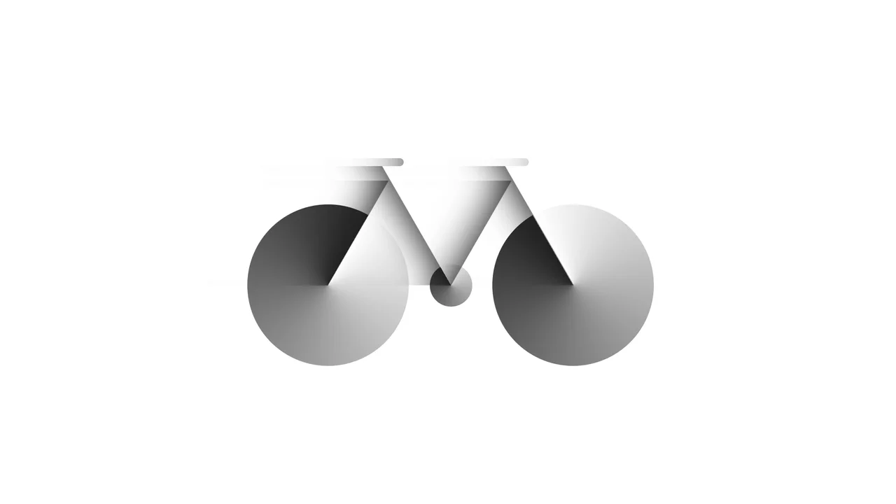
Bicycle
A pure CSS bicycle illustration constructed from geometric primitives using absolute positioning and vmin units for responsiveness. conic-gradient simulates wheel spokes, transform: skewX shapes the frame, and inset box-shadow adds depth, while pseudo-elements efficiently duplicate components like wheels.
See the Pen Bicycle.

Dipper Pines from Gravity Falls
A pure CSS character illustration of Dipper Pines, constructed from geometric primitives using absolute positioning and vmin units for responsiveness. The design leverages border-radius, transform, clip-path masking, and pseudo-elements to shape detailed features like the signature pine tree hat and hair, all styled with CSS variables and a custom web font.
See the Pen Dipper Pines from Gravity Falls.
Fancy Hover Effect on Avatar
A pure CSS “pop-out” avatar effect utilizing CSS variables to orchestrate a scale transition.
See the Pen Fancy Hover Effect on Avatar.
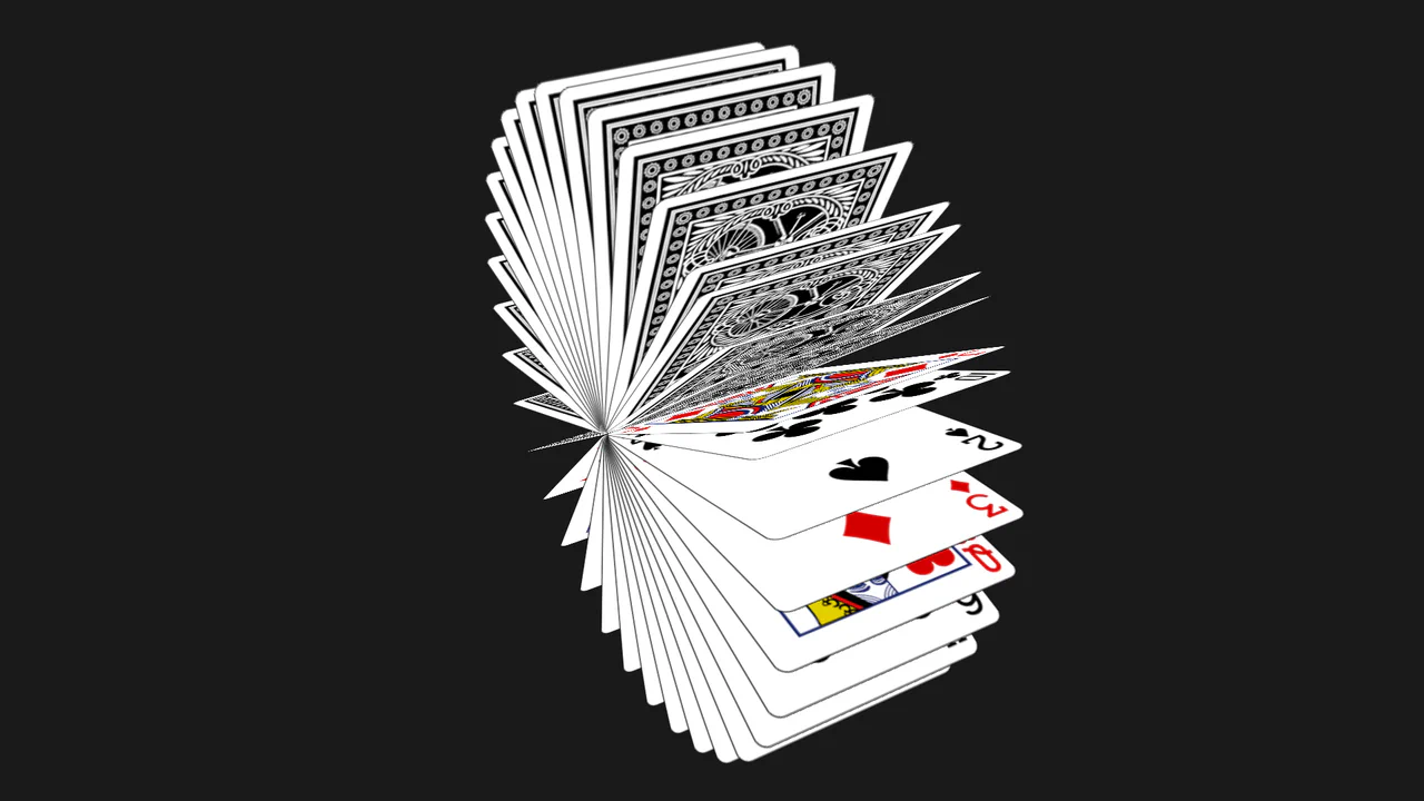
Flipping Playing Cards
A mesmerizing 3D animation of cascading playing cards fetched dynamically from the Deck of Cards API via JavaScript.
See the Pen Flipping Playing Cards.

Let's Jump to Conclusions
A playful kinetic typography animation where words sequentially crouch, leap with a flip, and land softly, simulating the physical action of “jumping to conclusions.”
See the Pen Let's Jump to Conclusions.
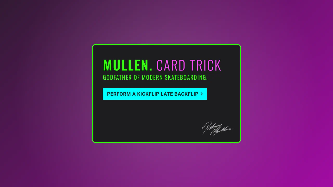
SlowMo Mullen Card Trick
An interactive 3D simulation of skateboarding tricks (Kickflip, Impossible, etc.) performed by a rotating card via CSS transforms and JavaScript.
See the Pen SlowMo Mullen Card Trick.
Up Arrow
A rectangular button smoothly shrinks into a circle, the text fades out, and an upward-pointing arrow begins to cyclically rise within it.
See the Pen Up Arrow.

Animated Sign-In Form with Theme Switcher
An interactive login form that performs a 360-degree 3D flip animation to seamlessly transition between vibrant, gradient-based color themes triggered by a JavaScript state manager.
See the Pen Animated Sign-In Form with Theme Switcher.
Side Navigation with Icons
A vertical CSS-only navigation menu where hovering triggers a smooth animation: the icon scales up and changes color while the text label fades out, emphasizing the visual symbol.
See the Pen Side Navigation with Icons.
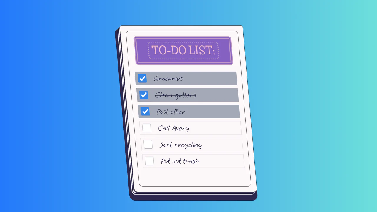
To-Do List
A stylized paper notepad To-Do list featuring a skew transformation and stack-effect shadows. Clicking checkboxes toggles a strikethrough style on handwritten list items via JavaScript class manipulation.
See the Pen To-Do List.

Log In and Sign Up Forms with Fingerprint
A fluid mobile prototype demonstrating state-driven navigation transitions and a 3D dashboard carousel powered by Swiper.js.
See the Pen Log In and Sign Up Forms with Fingerprint.

Physics Milestones Timeline
An animated vertical timeline where historical event cards slide in from alternating sides as they enter the viewport upon scrolling.
See the Pen Physics Milestones Timeline.

Real-time Clock
An analog clock with a mechanical ticking effect driven by cubic-bezier transitions and precise rotation logic.
See the Pen Real-time Clock.

Stopwatch
A high-precision chronograph featuring a smooth sweeping hand with a dynamic gradient trail and sub-millisecond accuracy.
See the Pen Stopwatch.

Animated Navigation
An elegant and responsive menu that saves space when collapsed and provides a smooth, delightful interaction experience upon opening.
See the Pen Animated Navigation.