190+ CSS transform Examples (Page 4)
Examples

Multi-Card Spotlight Effect
An interactive 3D card effect where JavaScript tracks pointermove, calculates the relative cursor position, and passes it to --ratio-x and --ratio-y CSS variables, while CSS uses calc() to drive rotateX and rotateY.
See the Pen Multi-Card Spotlight Effect.

Skeuomorphic Like Button
An advanced “Like” button micro-animation based on CSS @property, where custom variables are used to animate the numbers and the icon.
See the Pen Skeuomorphic Like Button.
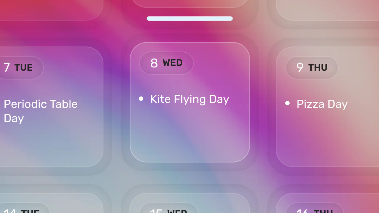
Click-to-Zoom Calendar
Explore responsive calendar design featuring a detailed hover and click zoom effect, implemented through precise coordinate calculations to manipulate CSS transform based on the selected date’s index.
See the Pen Click-to-Zoom Calendar.
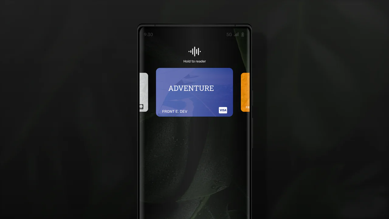
React Phone with Credit Card Selector
A mobile wallet interface in React and TypeScript where the card swipe mechanism is implemented with a CSS translateX transform - the position is calculated on-the-fly based on the active card’s index.
See the Pen React Phone with Credit Card Selector.

Animated Day/Night Toggle Switch
An implementation of a complex animated switcher in pure CSS, where a single line of JS is only used to toggle the .is-active class - the rest is the magic of transform and custom properties.
See the Pen Animated Day/Night Toggle Switch.

Animated Ratings Component
This interactive rating component stands out with three unique 3D effects, built using advanced Sass (loops, gradient randomization), - and showcases SVG facial animation via path morphing in pure JS.
See the Pen Animated Ratings Component.

CSS Hamburger Click Effect
Explore the technique of creating a three-line hamburger using a single <span> tag and two pseudo-elements, - which are then animated into an ‘X’ via a combination of CSS properties rotate(45deg) and translate.
See the Pen CSS Hamburger Click Effect.

Gender Toggle Button with Bounce Effect
This interactive toggle switch demonstrates advanced animation work, where delayed class toggling in jQuery coordinates the knob movement and a stylish “color fill” text effect, created in CSS using overflow: hidden; and pseudo-elements.
See the Pen Gender Toggle Button with Bounce Effect.
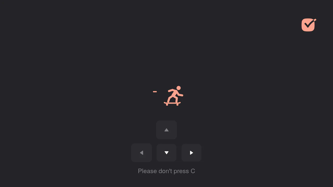
Interactive Skateboard Loading Animation
Explore how a GSAP timeline is used to create a complex movement sequence using keyframes and onComplete callbacks to ensure smooth and realistic transitions between poses. All control is implemented via keyboard and touch event handlers.
See the Pen Interactive Skateboard Loading Animation.

Interactive Super Mario Timeline with Parallax
An interactive timeline where JS synchronizes CSS transform: translateX for scrolling, background-position for parallax, and classes for sprite animation.
See the Pen Interactive Super Mario Timeline with Parallax.

Liquid Gooey UI Elements
Explore the powerful tandem of GSAP and CSS Variables, where to/fromTo with keyframes control SVG elements inside Radio/Checkbox/Switch. The animations utilize the feColorMatrix filter (the “Gooey” effect) and SVG transforms to create smoothly “flowing” shapes and stylish toggles.
See the Pen Liquid Gooey UI Elements.

Pricing Table with CSS Transforms
An elegant pricing switcher in pure JS that changes prices by fetching them from data-* attributes - plus a bundle of slick CSS animations using transform.
See the Pen Pricing Table with CSS Transforms.
Soft UI Counter Component
This simple counter demonstrates clean vanilla JavaScript functionality: counter management, class switching for instant color scheme change based on the number’s sign. The stylistic focus is on “Soft UI” aesthetics.
See the Pen Soft UI Counter Component.

Tilting Maze Game with Complex Physics
This maze puzzle is implemented using pure JavaScript and CSS 3D transforms which tilt the maze, creating the illusion of gravity and ball movement. The code features complex collision physics for balls hitting walls and “rolling” around corners with precise mathematical calculations.
See the Pen Tilting Maze Game with Complex Physics.
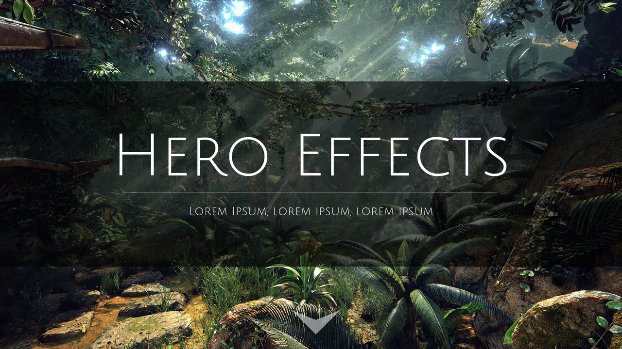
Webpage Hero Header Scroll Effects
This Parallax effect with a “Hero” section is implemented purely via a jQuery scroll handler that directly manipulates the CSS properties opacity, transform: scale, and margin-top. The background image is fixed, which is critical for the effect.
See the Pen Webpage Hero Header Scroll Effects.
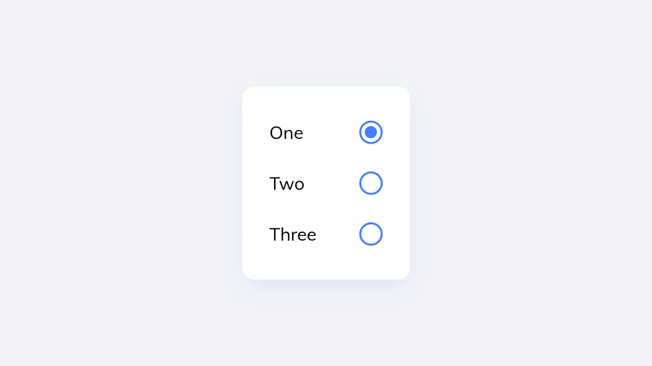
Animated UI Radio Button with CSS Keyframes
This custom radio button UI employs pure CSS @keyframes and transform properties to create a dynamic, liquid-like squash-and-stretch animation upon selection - the smooth UI transition is managed by complex jQuery state logic that precisely adds and removes animation classes.
See the Pen Animated UI Radio Button with CSS Keyframes.

Control Interaction with GSAP
A sleek, animated segmented control using GSAP for smooth slide and a subtle 3D-like tilt effect on click, providing a polished micro-interaction.
See the Pen Control Interaction with GSAP.

Direction-Aware SVG Cursor
This custom SVG cursor rotates dynamically based on the mouse’s velocity and direction, achieved by calculating the angle between the previous and current coordinates using JavaScript’s Math.atan2 and applying the rotation via CSS transform.
See the Pen Direction-Aware SVG Cursor.

JFK Speech Text Wave Animation
Dynamic visualization of John F. Kennedy’s speech, where each word is a separate element, creating a “running wave” effect using CSS transformations and a JavaScript setInterval.
See the Pen JFK Speech Text Wave Animation.

Custom Range Slider
Custom vertical range slider with a retro-futuristic design and a flickering display effect, achieved using a CSS transform on input[type
See the Pen Custom Range Slider.

Corner Pop-Out Menu
A stylish “pop-out” corner menu implemented with pure CSS for styling and JavaScript for toggle functionality, controlling the precise radial positioning of menu items using the transform: translate() property.
See the Pen Corner Pop-Out Menu.
Pixel Heart Animation
A visually engaging pixel heart animation created purely using an HTML ul/li structure and CSS @keyframes, where the “pop-in” effect is achieved through smooth transform: scale transitions.
See the Pen Pixel Heart Animation.
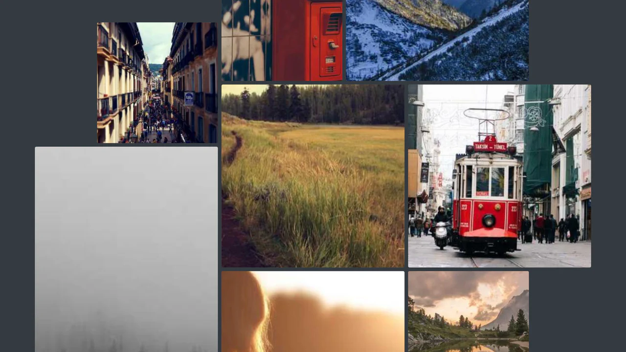
Scroll-Driven Gallery
A demonstration of the new CSS Scroll-Driven Animations (SDA) API, where the scroll position of the entire page directly drives a complex, scaling, and rotating grid of images, achieving a high-performance, engaging visual effect purely with CSS.
See the Pen Scroll-Driven Gallery.

The Last Duel Movie Trailer But It's Cats Gallery
A dynamic image gallery built with React and TypeScript, featuring a complex photo-bar decomposition effect that uses CSS transforms and state management to create a seamless, cinematic slideshow.
See the Pen The Last Duel Movie Trailer But It's Cats Gallery.
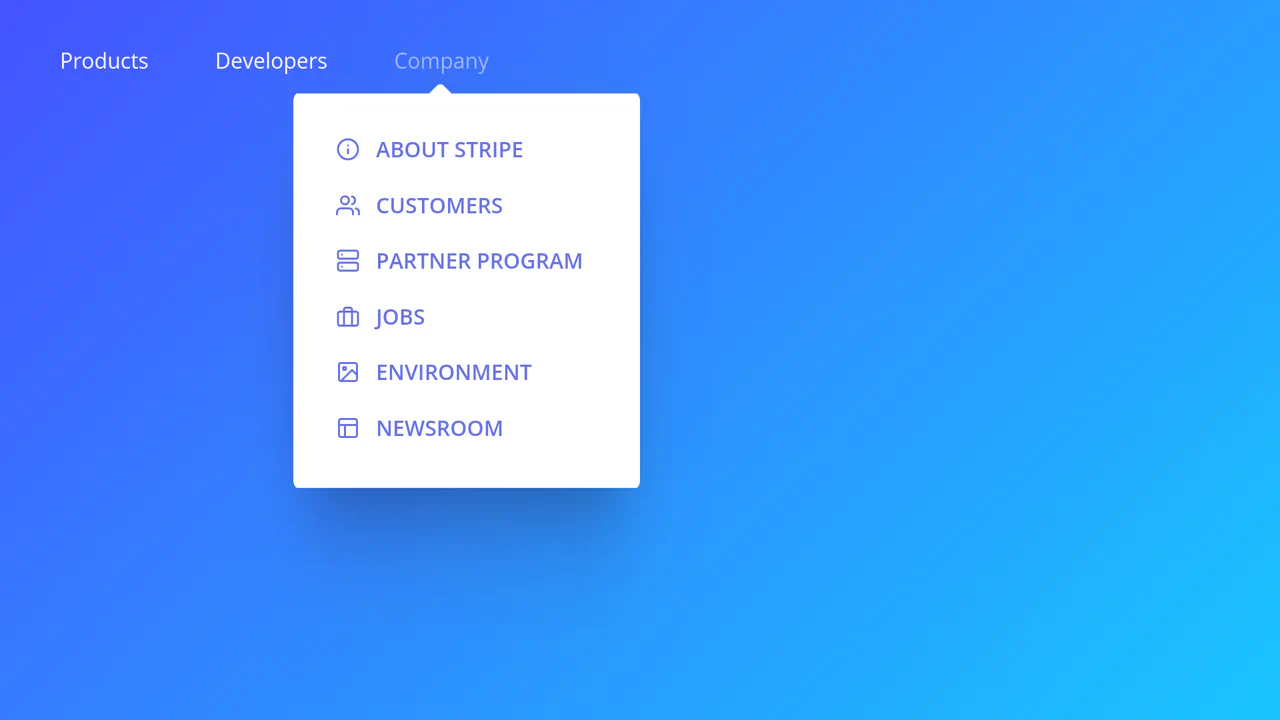
Stripe Style Main Navigation Mega Menu
A dynamic navigation menu replicating the Stripe pattern: Vanilla JS calculates the position and size, while CSS transforms ensure a smooth transition and scaling of the background between sections of varying sizes, creating a “living” popover effect.
See the Pen Stripe Style Main Navigation Mega Menu.

Vanilla JS Skew Images on Scroll
A dynamic image skew effect in pure Vanilla JS, where the transformation angle directly depends on the page’s scroll velocity, providing unique and responsive visual feedback.
See the Pen Vanilla JS Skew Images on Scroll.

CSS Clock (Braun x Paul Smith Style)
This is a fully functional analog clock where the 60 minute dashes and 12 hour numerals are dynamically generated using Vanilla JavaScript template nodes and precise angular calculation, demonstrating efficient DOM rendering for complex, repetitive UI elements.
See the Pen CSS Clock (Braun x Paul Smith Style).

Multiline Skewed Text Effect
Demonstrates applying a skewY transform to multiline text, showing how the preserve-3d property ensures the text block itself is skewed as a single plane, creating a seamless, angled effect across all lines.
See the Pen Multiline Skewed Text Effect.

Cube Clock with CSS 3D
A demonstration of a styled digital clock rendered as an interactive 3D cube created purely using CSS transformations (transform-style: preserve-3d), which smoothly shifts its perspective on hover.
See the Pen Cube Clock with CSS 3D.
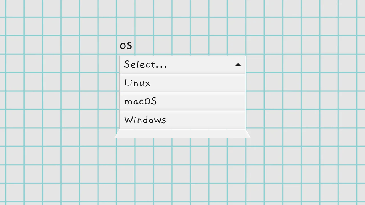
Folding Select Dropdowns
A custom dropdown fully replacing the native <select>, featuring a unique 3D “unfolding” animation that simulates a dropping paper sheet. The implementation is based on pure, object-oriented JavaScript, ensuring full ARIA accessibility and keyboard navigation.
See the Pen Folding Select Dropdowns.