190+ CSS transform Examples (Page 5)
Examples

Photo Gallery with a Comic Touch
Explore a dual-interaction card where a 3D parallax responds to mouse movement, while a click triggers a “camera flash” and a comic-style text reveal. The hover effect uses throttled JS for performance, and the click animations are powered by GSAP.
See the Pen Photo Gallery with a Comic Touch.

Smart Animated Custom Mouse Cursor
A custom cursor that smoothly tracks the mouse pointer using the native Web Animations API and instantly scales/changes its Font Awesome icon when hovering over an interactive element with a data-type attribute.
See the Pen Smart Animated Custom Mouse Cursor.

Reflection with Progressive Blur in CSS
Progressive Blur for the lower screen half is implemented to simulate fog: the effect is created by layering multiple elements with varying backdrop-filter: blur() values, precisely masked using mask: linear-gradient().
See the Pen Reflection with Progressive Blur in CSS.

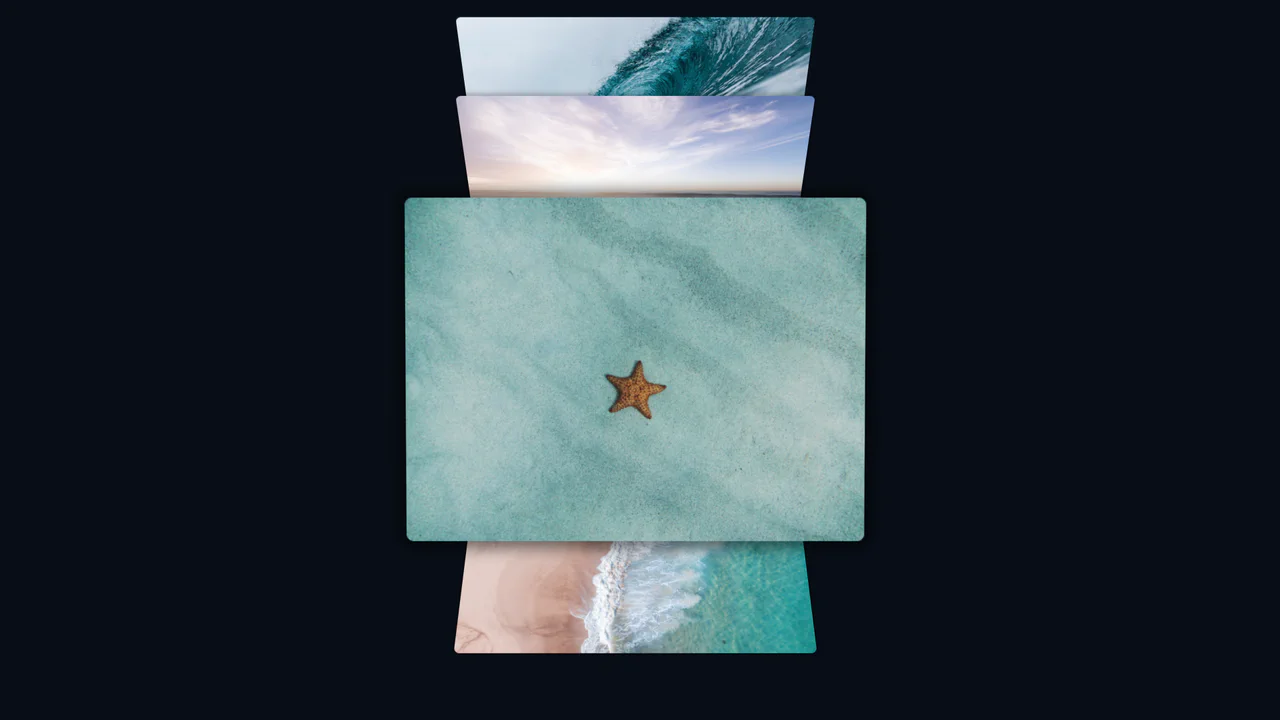
Gallery Hover Effect in React
Interactive postcard gallery that randomizes position, rotation and z-index on hover, using pure React hooks and CSS 3D transforms for a lively, physics-like layout.
See the Pen Gallery Hover Effect in React.

React Animated Circular Carousel
An efficient 3D carousel implementation in React, where slide positioning and animation are calculated using custom hooks. The component dynamically adapts to the container size, ensuring smooth interaction on any device.
See the Pen React Animated Circular Carousel.

React Infinity 3D Carousel
A stunning implementation of an infinite 3D slider in React, controlled by mouse and touch gestures. This demo showcases how to create smooth transitions between slides using CSS translateZ and translateX transforms to simulate depth.
See the Pen React Infinity 3D Carousel.
Coverflow 3D Effect with CSS
A truly modern image flow powered by CSS Scroll-driven Animations and view-timeline. This demo uses pure CSS to create a 3D perspective effect where images pop out and rotate as they enter the viewport, with no JavaScript required.
See the Pen Coverflow 3D Effect with CSS.

3D Cube Resume with CSS Transforms
A complex 3D navigation for a resume is achieved using pure CSS/JS, where each cube face is a section; this is a powerful display of UX/UI creativity and animation skills.
See the Pen 3D Cube Resume with CSS Transforms.
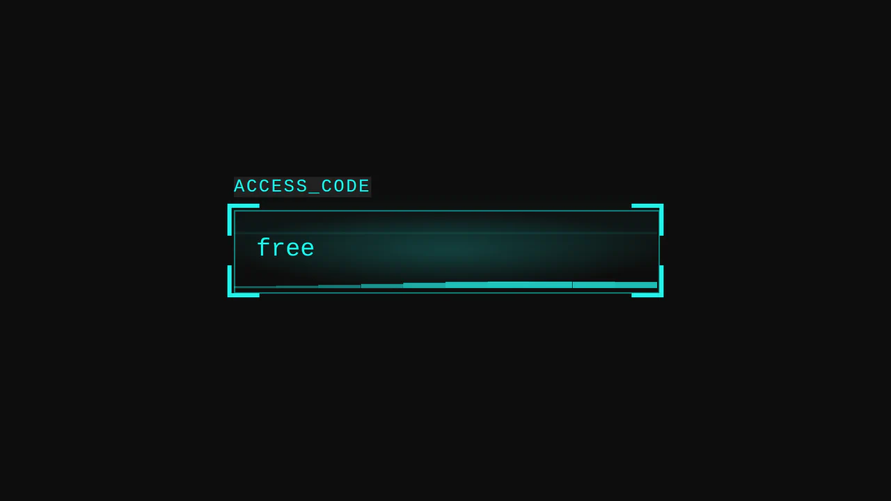
Cyberpunk Glitch Input
Here is an advanced example of an interactive UI element built entirely with CSS. The demo is technically notable for its approach to visualizing activity: it uses pseudo-elements and CSS variables to create glow effects, scanning lines, and a “data stream” that activates on input focus.
See the Pen Cyberpunk Glitch Input.
Gummy Buttons
A “gummy” button animation in pure CSS, where the effect is achieved by simultaneously animating transform: scale() and border-radius. Separate @keyframes are used for the :hover and :active states, creating a unique tactile response.
See the Pen Gummy Buttons.
Box Preloader
This pure CSS preloader simulates a ribbon wrapping around a 3D isometric cube. Working with preserve-3d, the layout folds six panels to form the cube’s faces. The pseudo-elements run staggered translation and fade keyframe loops, creating the illusion of a continuous, bi-color ribbon winding endlessly around the shape.
See the Pen Box Preloader.
Climbing Cube
An illusion of an endlessly rolling 3D cube, achieved by synchronizing two @keyframes animations for rotation and sliding with an offset transform-origin. The complex rotation animation uses intermediate steps for a “bounce” effect, while a neon glow and -webkit-box-reflect complete the futuristic look.
See the Pen Climbing Cube.
Pure CSS 3D David Eye
The Creation of Adam is an advanced low-poly 3D scene built with pure CSS and highly nested HTML. By structuring divs into inverse-kinematics chains, it models anatomical skeletal joints. Flat polygons are folded via preserve-3d, while custom clip-path facets are styled with color-mix() to calculate shading. Global animations drive the smooth, interactive, kinetic sculpture movement.
See the Pen Pure CSS 3D David Eye.
Shuffling Effect in Pure CSS
Efficient layout using CSS Grid to stack cards on top of each other, with dynamic layer control via z-index and the :has() selector to determine the position of the next element; the image animation includes movement and straightening of the rotation upon selection.
See the Pen Shuffling Effect in Pure CSS.
Wheel Timeline. Pure CSS
An interactive radial carousel in pure CSS, where element positioning in a circle is calculated via calc(). State management is handled without JS using the “radio button hack” and the :has() pseudo-class, which triggers rotation animations and sequential content appearance.
See the Pen Wheel Timeline. Pure CSS.
Stacked Poetic Cards
A dynamic card carousel/stack technically driven entirely by CSS custom properties and the :has() selector; interactivity is achieved via the “Radio Button Hack” (hidden input[type="radio"]), where selecting one card recalculates variables for all others, creating a smooth 3D transformation effect and dynamic stacking order; a decorative dotted background and a responsive grid layout complement the functionality.
See the Pen Stacked Poetic Cards.
Arrow Icon Animation
A technically advanced use of ::before and ::after pseudo-elements to create an arrow. jQuery toggles the .right class, and CSS animates the left and transform: rotate() properties of the pseudo-elements, creating a “switch” or 3D flip effect.
See the Pen Arrow Icon Animation.
Arrow Keyframes Animation
A “snake” arrow style loader animation where each circle smoothly changes color using @keyframes, and animation-delay sets an offset for each element, creating a running wave effect.
See the Pen Arrow Keyframes Animation.

Pop-Up Overlay
This is a robust component built entirely with SCSS, leveraging a full suite of custom mixins for cross-browser animation, transform, and transition. A centralized variable block for the color palette makes the component highly themeable and maintainable.
See the Pen Pop-Up Overlay.

Subscribe Email Form
This demo features subtle but effective micro-interactions implemented entirely in CSS. The social login buttons and the primary submit button use a transform: scale(1.1) on :hover to create a satisfying “pop” effect, enhancing the user experience with minimal code.
See the Pen Subscribe Email Form.

Pure CSS Star Rating from 0 to 8 with Colored Points of the Star
This star rating component is a showcase of static state management using a modular, class-based system. The rating is set by applying classes like .one and .half to the main container, which then declaratively styles the individual points of the star without any JavaScript or form inputs.
Animated Gallery Thumbnails
A stylish card that rests as a diagonal fragment and smoothly “straightens” into a full rectangular image on hover, shifting the text downwards.
See the Pen Animated Gallery Thumbnails.
CSS Thumbnail Transition Effects
A fluid, responsive gallery that automatically adjusts to screen size and provides rich visual feedback on hover.
See the Pen CSS Thumbnail Transition Effects.
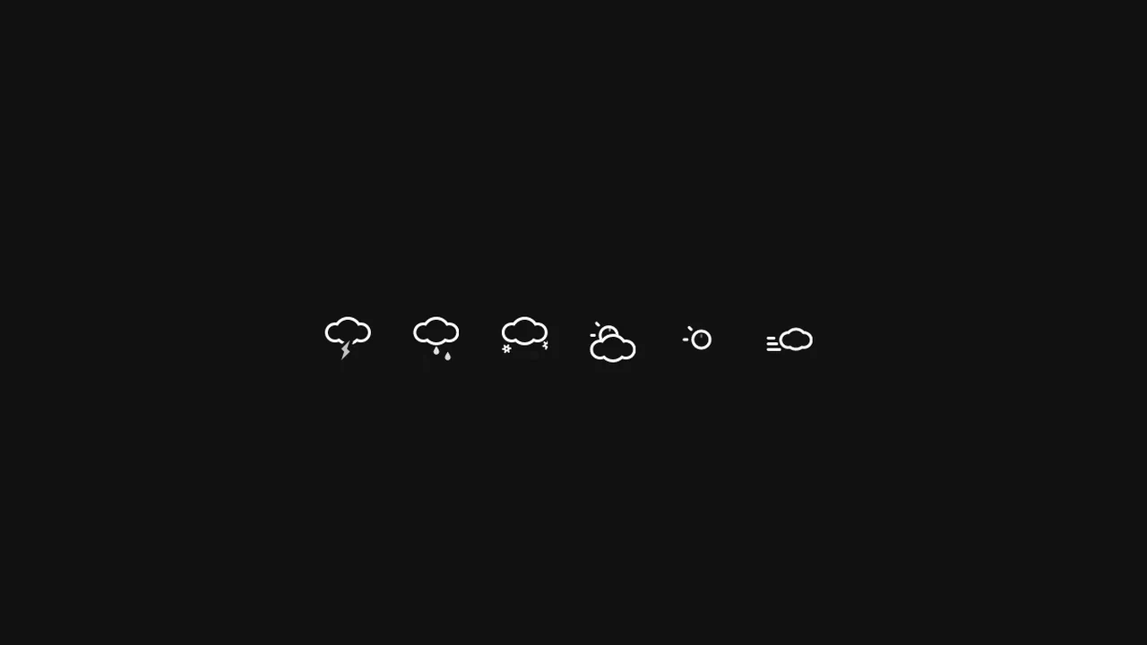
Animated SVG Weather Icons
A suite of animated weather icons utilizing inline SVG and CSS keyframes to create fluid, vector-based meteorological effects.
See the Pen Animated SVG Weather Icons.
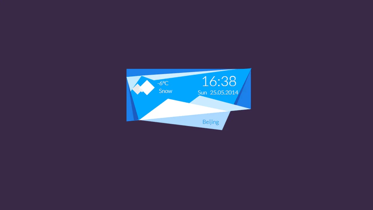
CSS3 Weather Widget
An artistic, non-trivial weather card that resembles a paper-cut collage crafted in a low-poly style.
See the Pen CSS3 Weather Widget.

Pure CSS Expanding Search
This search bar features a sophisticated, multi-stage animation where the icon morphs from a magnifying glass to a cross. The effect is achieved by transitioning the border-radius, transform, and box-shadow of the ::after pseudo-element with custom cubic-bezier timing functions that are dynamically updated via CSS variables, creating a seamless and fluid transformation.
See the Pen Pure CSS Expanding Search.

Periodic Table
A responsive table where hovering over a cell triggers an instant 3x magnification pop-up atop other elements, allowing details to be read while keeping the interface stable.
See the Pen Periodic Table.
A static grid that comes alive on hover: font cards “jump out” at the user with a springy animation, doubling in size for easy reading.

Olly Moss Star Wars Parallax
A multi-layered 3D parallax poster of C-3PO from Star Wars, driven by JavaScript mouse tracking.
See the Pen Olly Moss Star Wars Parallax.
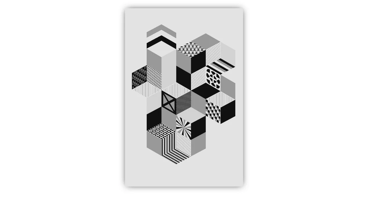
2011 - Greetings Poster B - Haguruma Envelope. Shinnoske Design
A complex, textured geometric poster with a pseudo-3D effect and retro aesthetics, rendered natively without Canvas.