190+ CSS transform Examples (Page 6)
Examples
Netflix Logo
A minimalist, pure CSS recreation of the Netflix logo. The iconic “N” is constructed from three rectangular elements - a primary div and two pseudo-elements - using transform: skew() to form the central diagonal stroke and z-index layering to simulate the ribbon-like 3D effect, complete with a subtle drop shadow.
See the Pen Netflix Logo.
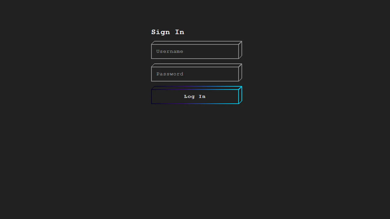
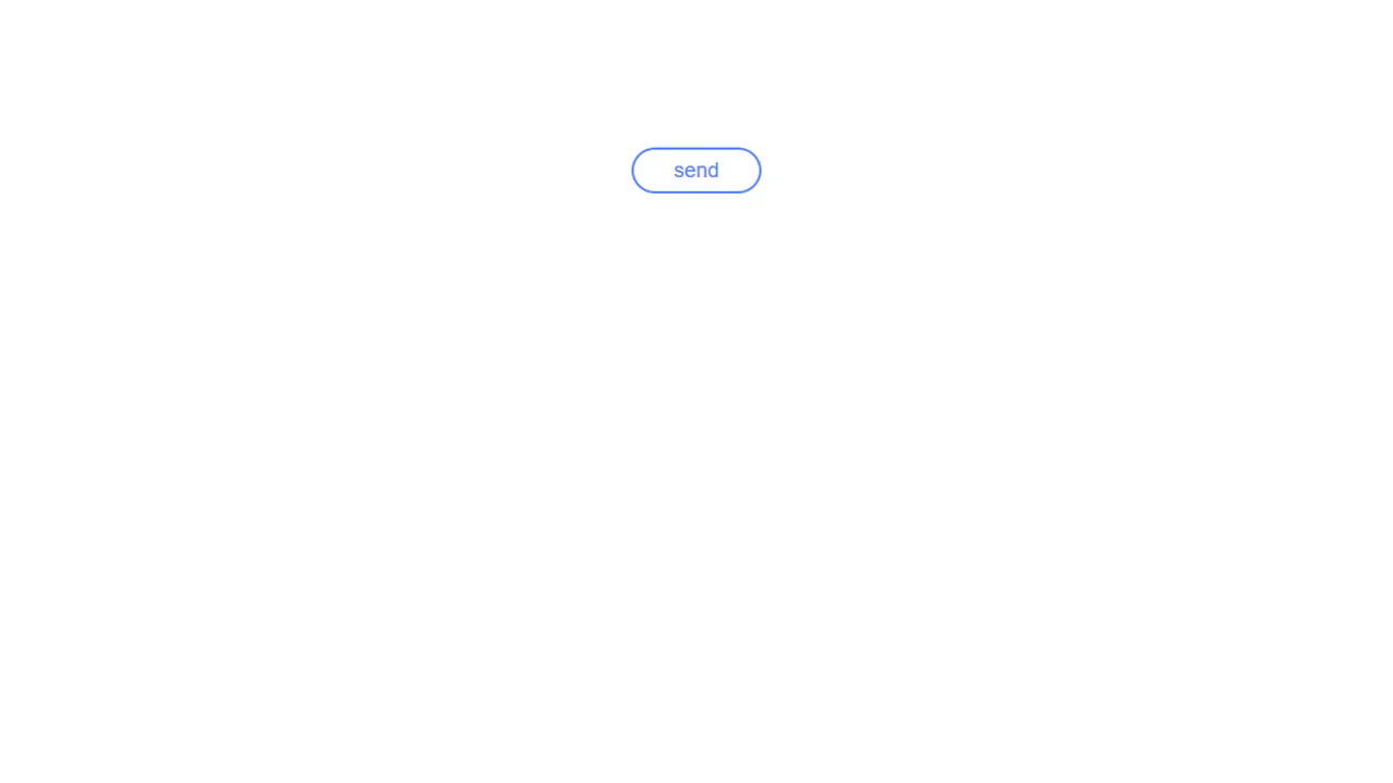
Cube Login Form
This demo showcases a pseudo-3D cube effect for form elements, architected in pure CSS using nested divs and transform: skew() to create a lightweight isometric perspective. The key micro-interaction is a satisfying “wipe” animation - triggered on :focus via the general sibling combinator - which transitions the top property of an inner element to reveal a vibrant gradient fill.
See the Pen Cube Login Form.
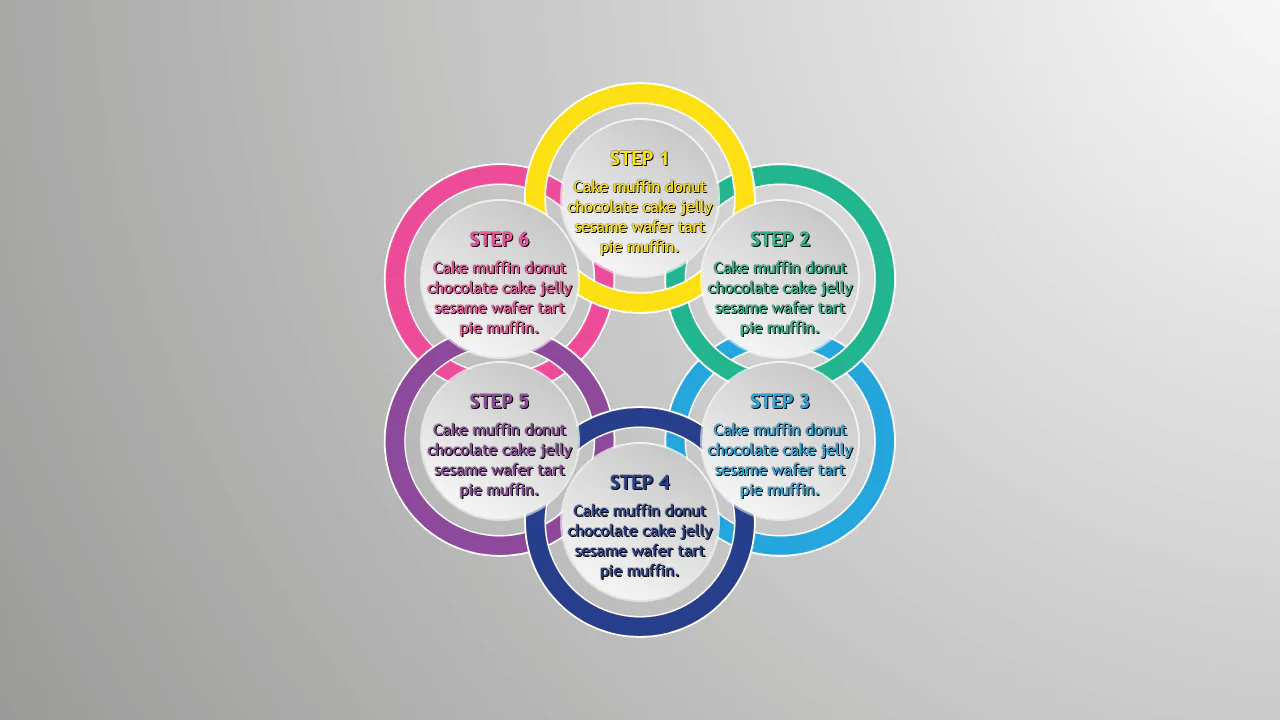
Pure CSS Circles Infographic
A circular step diagram constructed entirely with CSS transforms, where items are positioned radially using a custom property to calculate rotation angles.
See the Pen Pure CSS Circles Infographic.
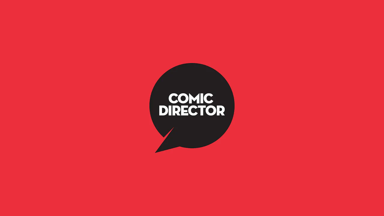
Comic Director Splash Animation
A dynamic splash screen where the layer reveal choreography is built on transform and transition-delay, applied to each element via :nth-child. The final layer “explodes” spectacularly using @keyframes and a custom cubic-bezier function, with the entire animation optimized for hardware acceleration.
See the Pen Comic Director Splash Animation.

PureCalc
An attractive calculator mockup with a ’live’ cursor and interactive buttons, ready for the integration of calculation logic.
See the Pen PureCalc.
Ribbon Design
A layered ribbon effect created by stacking two pseudo-elements, ::before and ::after. Each is slightly rotated using transform: rotate() and clipped by the parent’s overflow: hidden to create “torn” edges.
See the Pen Ribbon Design.
Only CSS Loading Animation
An advanced SCSS technique - the percentage counter animation up to 100% is generated using a @for loop. It demonstrates dynamic content changes and multi-step @keyframes to create a realistic loading process.
See the Pen Only CSS Loading Animation.

Flyer Design #01
A modern, corporate cover design with an emphasis on geometry and typography, fully implemented with CSS without relying on graphic editors for composition.
See the Pen Flyer Design #01.

CSS-only Sliding Panels Using Transforms
A responsive Flexbox split layout that switches from horizontal to vertical via a media query. The “sliding doors” effect is created with pure CSS using transform and the sibling selector, while the parallax on hover is achieved with different content movement speeds controlled by LESS variables.
See the Pen CSS-only Sliding Panels Using Transforms.
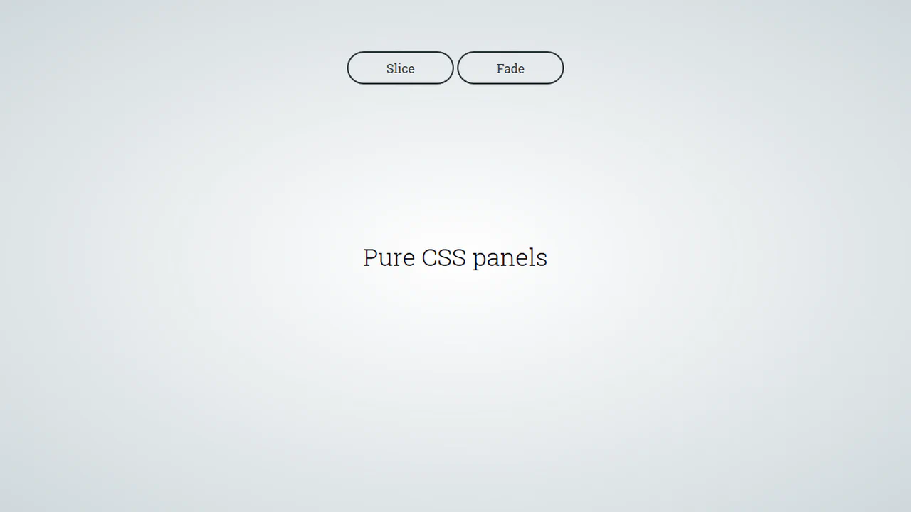
Pure CSS Panels
A pure CSS solution for full-screen panels controlled via :target - clicking a link triggers their appearance animation. It demonstrates various effects with a two-stage animation: first the panel appears, then its content follows with a transition-delay.
See the Pen Pure CSS Panels.

CSS Circle Notifications
A library of pure CSS animations for notification badges, where different effects like swing, tada, or bounce are triggered on parent element hover. The technique uses classes to switch the animation-name property via the :hover pseudo-selector, demonstrating a modular approach to creating microinteractions.
See the Pen CSS Circle Notifications.
Link Split Hover Effect
A “tearing” text effect created by layering two <span>s with an asymmetrical clip-path. On hover, transform shifts the top part, ::after pseudo-elements draw the tear line, and an underline animates via background-position - the entire choreography is managed by transition-delay and a custom cubic-bezier function.
See the Pen Link Split Hover Effect.
Hover Effect #2
A performant text-swapping effect on hover, built on a synchronized animation - the original <span> is displaced by a ::after pseudo-element. The replacement content is sourced from a data-replace attribute via attr(), while smoothness and performance are ensured by transform: translate3d and a custom cubic-bezier function.
See the Pen Hover Effect #2.
Color Swatch
This is a dynamic radial menu built purely with HTML/CSS, where elements deploy on hover using the CSS transform: rotate() technique and smooth transitions, controlled by SASS variables. It showcases current techniques for complex hover animations, cross-browser compatibility via vendor prefixes, and precise interactivity control using pointer-events: initial.
See the Pen Color Swatch.
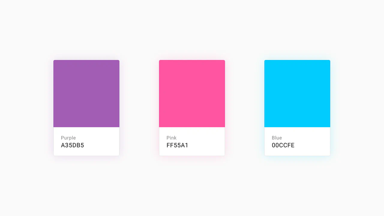
Color Palette
A responsive Flexbox grid featuring interactive cards that combine smooth transition and a @keyframes animation on hover. The implementation focuses on performance - using will-change - and styling flexibility through SASS variables and currentColor.
See the Pen Color Palette.
Recipe Card
An interactive recipe detail modal technically implemented via JavaScript class toggling to trigger a complex, two-stage CSS transition - this creates a sliding panel effect; the demo uses gradients for the background, animates inner details, includes a zoom effect on the image on hover, and rotates the toggle icon using transform: rotate().
See the Pen Recipe Card.
Material Design: Profile Card
This is a technically complex Material Design demo, relying on intricate CSS animation precisely controlled by @keyframes and Bézier curves, which creates a sequential element reveal effect; the key feature is the four-stage transformation of the card from a circle to a rectangle and the dynamic background fill, while the entire layout is responsive via media queries.
See the Pen Material Design: Profile Card.
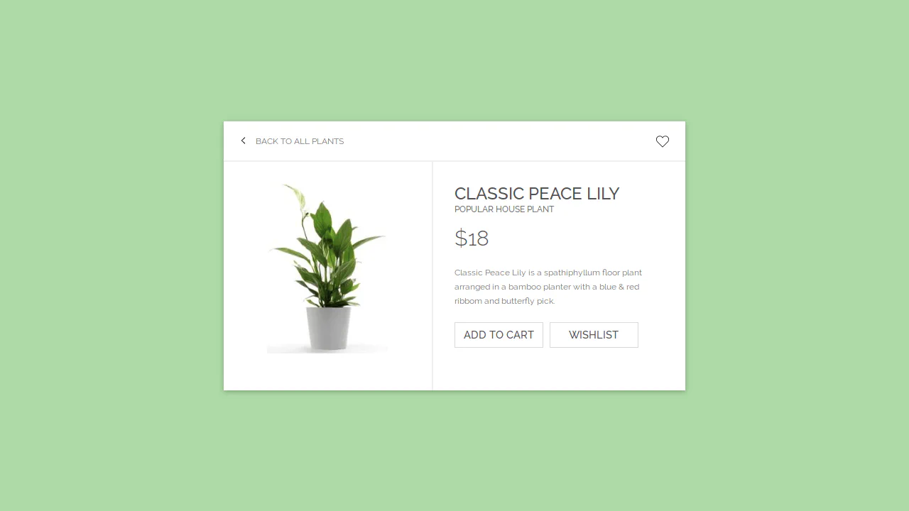
E-Commerce Card
This interactive card template, built with Sass/CSS, showcases a clean and flexible layout centered using transform: translate, focusing on smooth transition effects for box-shadow and detailed styling of interactive elements like buttons and SVG icons using the :hover pseudo-class.
See the Pen E-Commerce Card.

Movie Card
A visually rich card where a skewed background is created using transform: skewY on a pseudo-element. It showcases pure CSS solutions for interactive elements: a ‘star’ rating system based on hidden radio inputs, and custom tooltips that pull content from data-* attributes. The two-column layout is built using classic float.
See the Pen Movie Card.
Business Card Concept
An interactive SCSS business card where a hover triggers an elegant choreography of animations: multiple elements transform simultaneously via transition and transform: translateY to smoothly reveal hidden contact information.
See the Pen Business Card Concept.
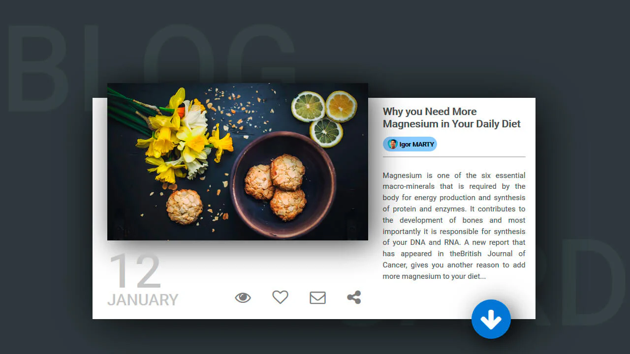
Blog Card
A multi-layered card that combines a classic float-based layout with position: absolute for offsetting elements, while multiple box-shadow properties create a depth effect - plus, an elegant image centering trick using transform: translate(-50%, -50%).
See the Pen Blog Card.

Attractive Play Button
This interactive play button uses synchronized SVG stroke manipulation for its hover effect: the solid stroke fades out and dashes off, while the dotted stroke fades in and increases its width to take its place.
See the Pen Attractive Play Button.
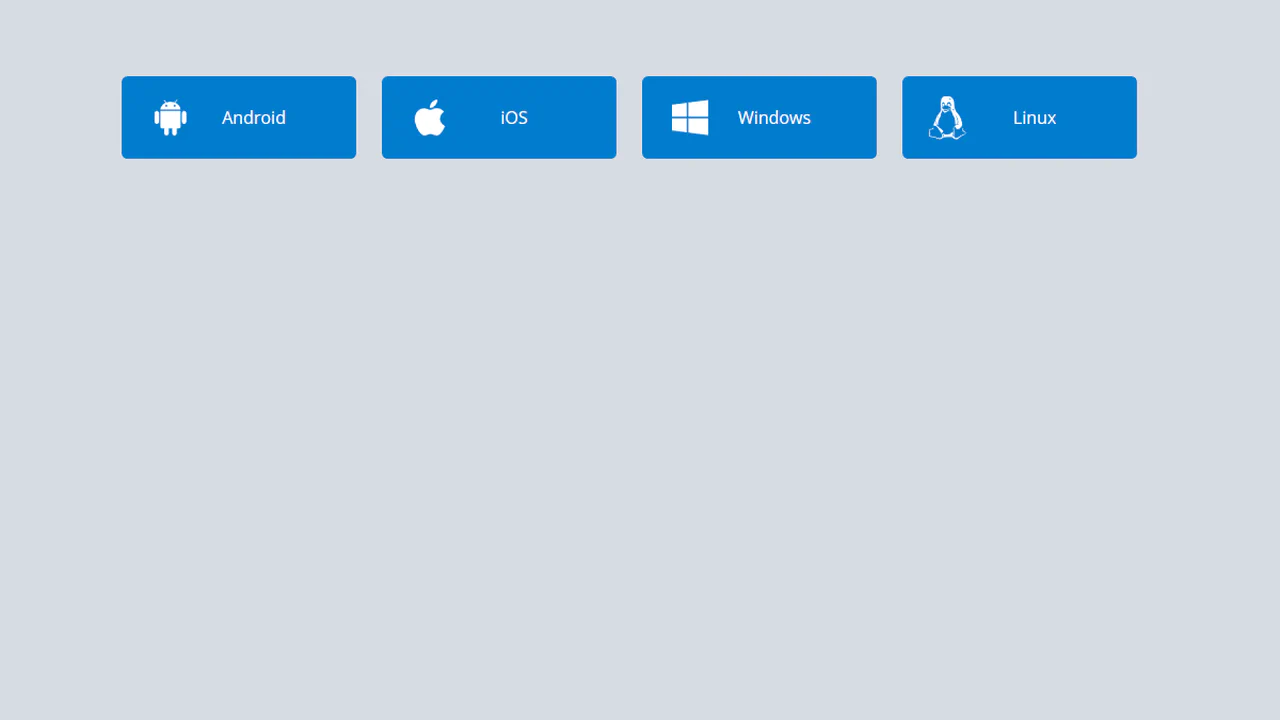
Download Buttons
A collection of operating system SVG icons, styled and animated with CSS. On hover, two synchronized animations are triggered: the icon smoothly scales up and rotates , while the caption smoothly slides out.
See the Pen Download Buttons.
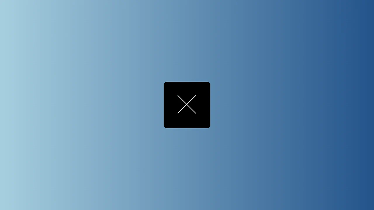
Close Button
A “close” icon created in pure CSS from two pseudo-elements. On hover, both lines forming the cross smoothly rotate 180 degrees using transform: rotate(180deg) and transition.
See the Pen Close Button.
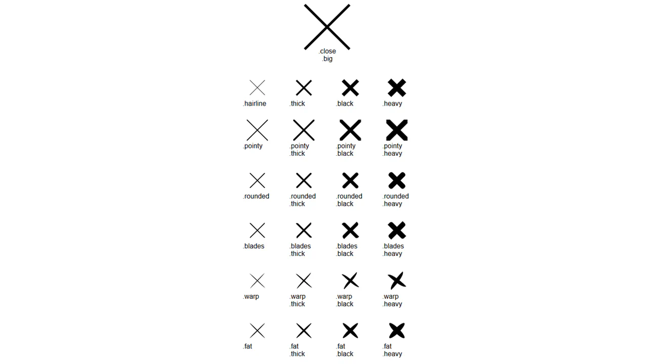
Pure CSS Close Buttons
A collection of “close” icon variations created with a single base class, .close, and multiple modifier classes. Each modifier changes one property to create a new style.
See the Pen Pure CSS Close Buttons.
Back To Close
Creation of a complex icon from three <span> elements that form a “back” arrow in one state and reconfigure into a cross in another state with the .open class. JavaScript is used solely for toggling the state.
See the Pen Back To Close.
Button Hover Animation
A complex “add” button hover animation where the text is replaced by a cross and the border “draws” itself. On hover, the .fl and .sfl layers fill the button with color, hiding the text, while pseudo-elements animate their width and height to create the border. The cross animation uses cubic-bezier and transition-delay for an “assembly” effect, and the <i> icon morphs from a plus to an arrow.
See the Pen Button Hover Animation.
Hover Over Me Button
A button with a multi-stage animation in pure CSS: on load, it smoothly appears “from the ground up” using @keyframes that animate opacity and transform: translateY(). On hover, a ::after pseudo-element, positioned underneath the button with z-index: -1, scales up and fades out, creating a “pulsating” wave effect.
See the Pen Hover Over Me Button.
Hover/Focus Effect For Flat Burron
A “slicing” fill effect created with two pseudo-elements - rotated rectangles that slide in from opposite sides on hover. The animation state is controlled by the --p CSS variable, which changes from 0 to 1, triggering the transform of the pseudo-elements via calc() to create a complex geometric transition.
See the Pen Hover/Focus Effect For Flat Burron.
Organic Button
A multi-step submit button animation where JavaScript setTimeout toggles loading and ready classes. In the “loading” state, @keyframes animates the button’s contraction and the appearance of pulsating circles created with pseudo-elements. In the “ready” state, the button expands and changes its text, showcasing a complex, synchronized animation.
See the Pen Organic Button.