170+ CSS transition Examples
This updated collection of CSS transition Examples provides the fundamental logic for creating state changes in modern UI design. Transitions remove the jarring cuts between interface states, bridging the gap between user action and system response. Utilizing these curated snippets ensures a fluid, predictable user experience where motion communicates change instantly.
The code relies on the transition property to interpolate between an initial and final state. These examples prioritize hardware acceleration by animating compositor-only properties like transform and opacity. This approach maintains high layout stability by offloading all motion calculations to the GPU. The HTML structure remains strictly semantic, as the visual change is handled entirely by the browser’s rendering engine, avoiding costly repaints.
Every free demo is fully responsive and cross-browser compatible. Users can instantly download the raw code or fork an interaction on CodePen. These assets are optimized for performance, delivering a fast, frictionless experience across all modern devices.
Examples
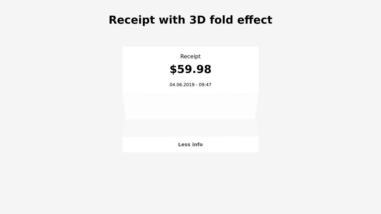
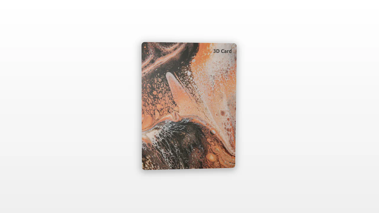
3D Folding Paper Receipt Card
An interactive receipt component showcasing a realistic 3D paper fold transition. Built with SCSS and vanilla JS, clicking the trigger button initiates a multi-stage unfold sequence: the dashed seam rotates flat using rotate3d(), the bottom section slides down, and the hidden itemized table fades in. Transition delays are carefully synced to prevent content visibility until the folding animation completes.
 Chrome 36+
 Edge 12+
 Firefox 16+
 Safari 9+
See the Pen 3D Folding Paper Receipt Card.
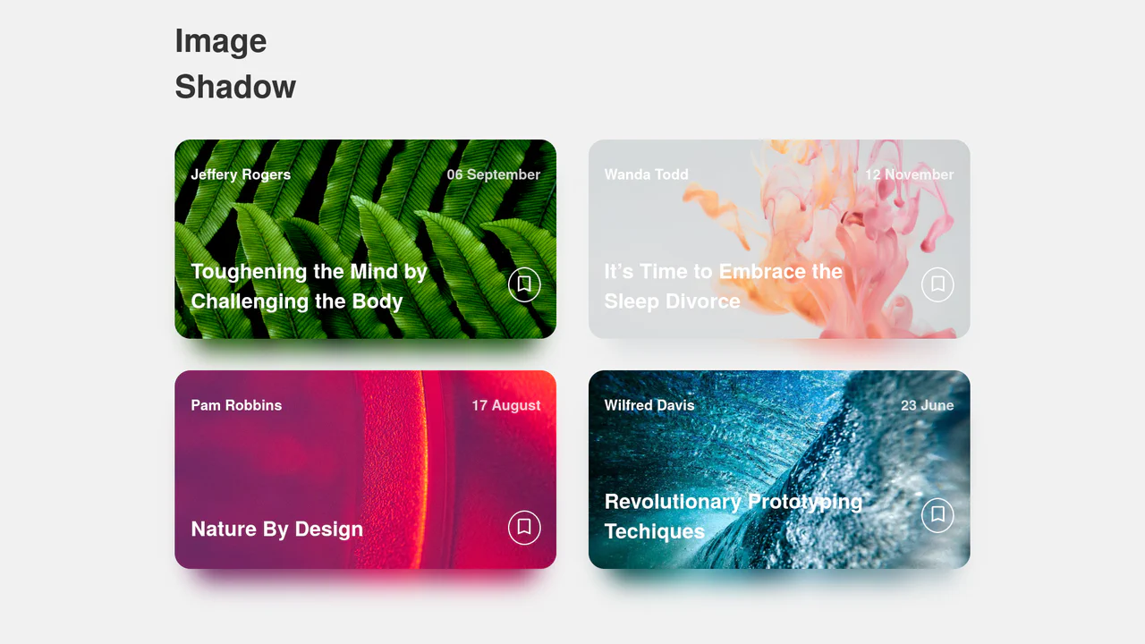
Dynamic Image Drop Shadow Cards
A responsive grid of article cards showcasing a dynamic, color-matched drop shadow effect. Built entirely with HTML and SCSS, the trick involves duplicating the card’s background image into a lower z-index container, shifting it downwards, and applying a heavy CSS filter: blur(). This creates a soft, glowing shadow that perfectly matches the hues of the original photograph.
Chrome 57+
Edge 16+
Firefox 52+
Safari 10.1+
See the Pen Dynamic Image Drop Shadow Cards.
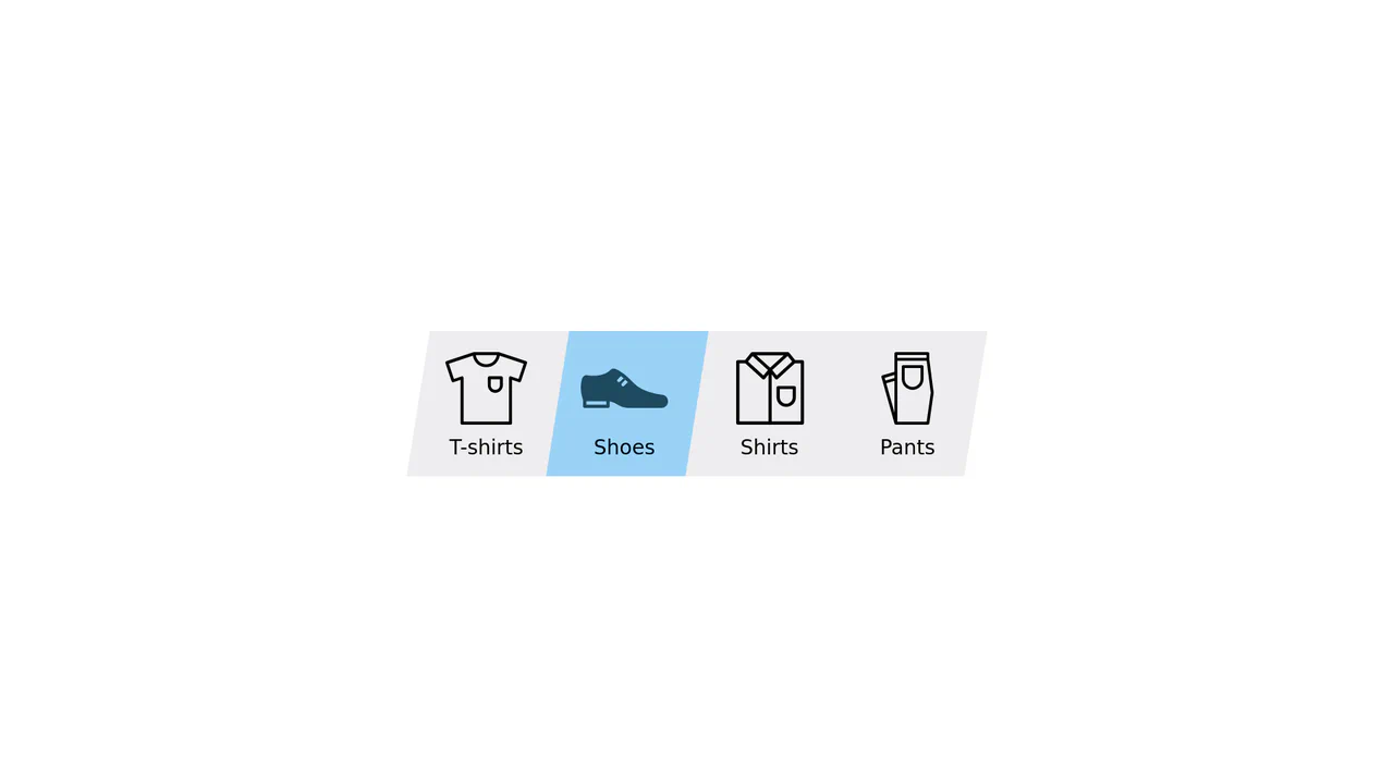
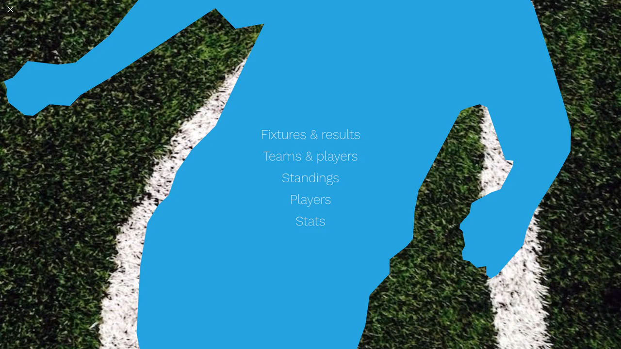
Elastic Clip-Path Sliding Navigation Tab
An advanced category navigation bar designed with direction-aware elastic slide transitions. By structuring dual overlay layers of identical SVGs, the component masks them along parallel polygon paths using CSS clip-path. Staggered transition-delay configurations applied asymmetrically between the inner and outer shapes generate an organic, jelly-like pulling effect depending on traversal direction.
Chrome 55+
Edge 79+
Firefox 54+
Safari 9.1+
See the Pen Elastic Clip-Path Sliding Navigation Tab.

Interactive 3D Folding File Folder
An interactive flat-design file folder built entirely with HTML and CSS. Hovering over the component triggers a coordinated micro-interaction: the parent card rises, nested paper sheets slide upwards, and the front pockets skew and scale down simultaneously. This combination of standard 2D transform rules effectively simulates a 3D folding folder flap.
Chrome 36+
Edge 12+
Firefox 16+
Safari 9+
See the Pen Interactive 3D Folding File Folder.
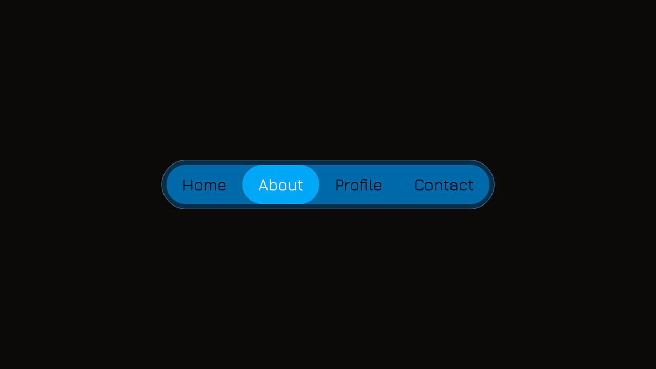
Elastic Anchor-Positioned Slider Navigation
An elegant, zero-JavaScript navigation bar powered entirely by CSS Anchor Positioning. Hover and active indicator bubbles are mapped dynamically to target links using pseudo-elements that reference custom --hovered-option and --active-option anchors. The sliding animations utilize a complex CSS linear() timing function to generate organic, elastic bouncing transitions.
Chrome 125+
Edge 125+
See the Pen Elastic Anchor-Positioned Slider Navigation.
3D Tilt Card with Dynamic Glow
An interactive 3D card utilizing pointer tracking to calculate tilt angle and rotation dynamically. By measuring mouse position relative to the element’s center, the card tilts along the X and Y axes while scaling. A radial gradient overlay shifts concurrently, mimicking realistic surface glare and light reflections.
Chrome 56+
Edge 15+
Firefox 49+
Safari 10+
See the Pen 3D Tilt Card with Dynamic Glow.
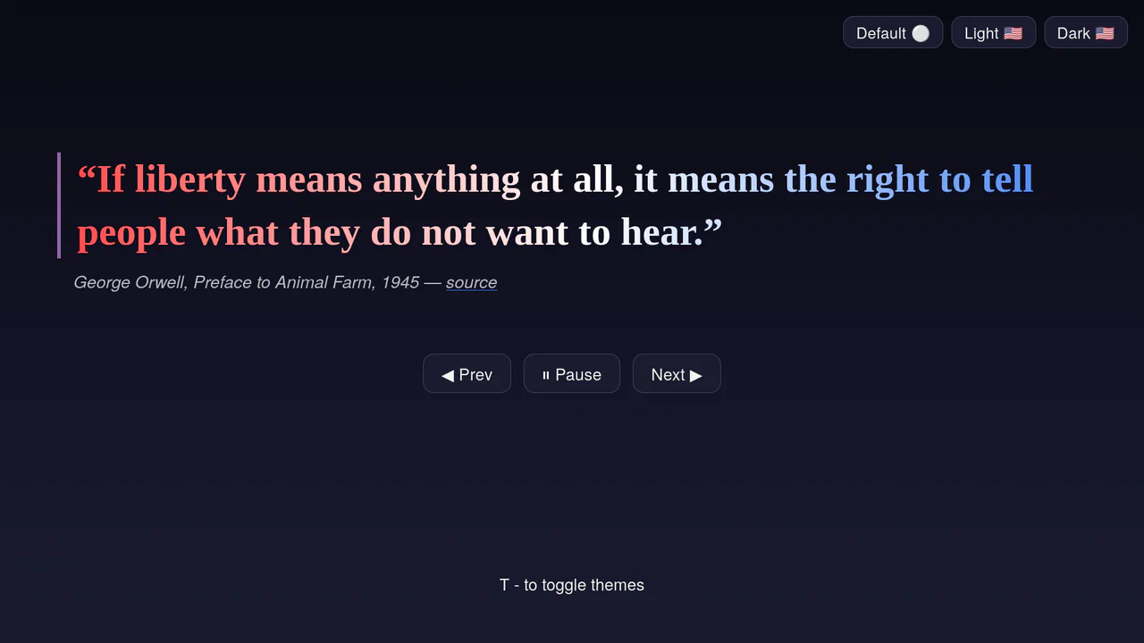
Accessible Multi-Theme Quote Rotator
An accessible quote rotator featuring fluid GSAP slide-fade transitions and dynamic theme switching. It loads quotes asynchronously from a target JSON file, outputting them into semantic citation structures. Includes native ARIA live-regions (aria-live), responsive height clamps, and keyboard-mapped theme toggles. (Requires: gsap.js)
Chrome 110+
Edge 110+
Firefox 110+
Safari 16.2+
See the Pen Accessible Multi-Theme Quote Rotator.
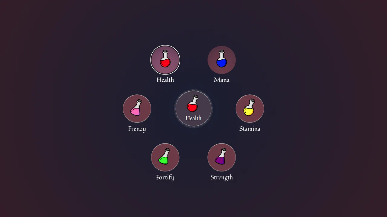
Circular Popover Potion Dropdown Menu
An experimental, zero-JavaScript custom select dropdown leveraging cutting-edge HTML customizable select specifications. When opened, the custom picker formats standard <option> tags into an interactive circular radial layout using native CSS Anchor Positioning, @starting-style entry transitions, and mathematical sibling-index() and sibling-count() functions. Includes gorgeous vector potion SVG assets mapped with variable custom properties.
Chrome 130+
Edge 130+
See the Pen Circular Popover Potion Dropdown Menu.
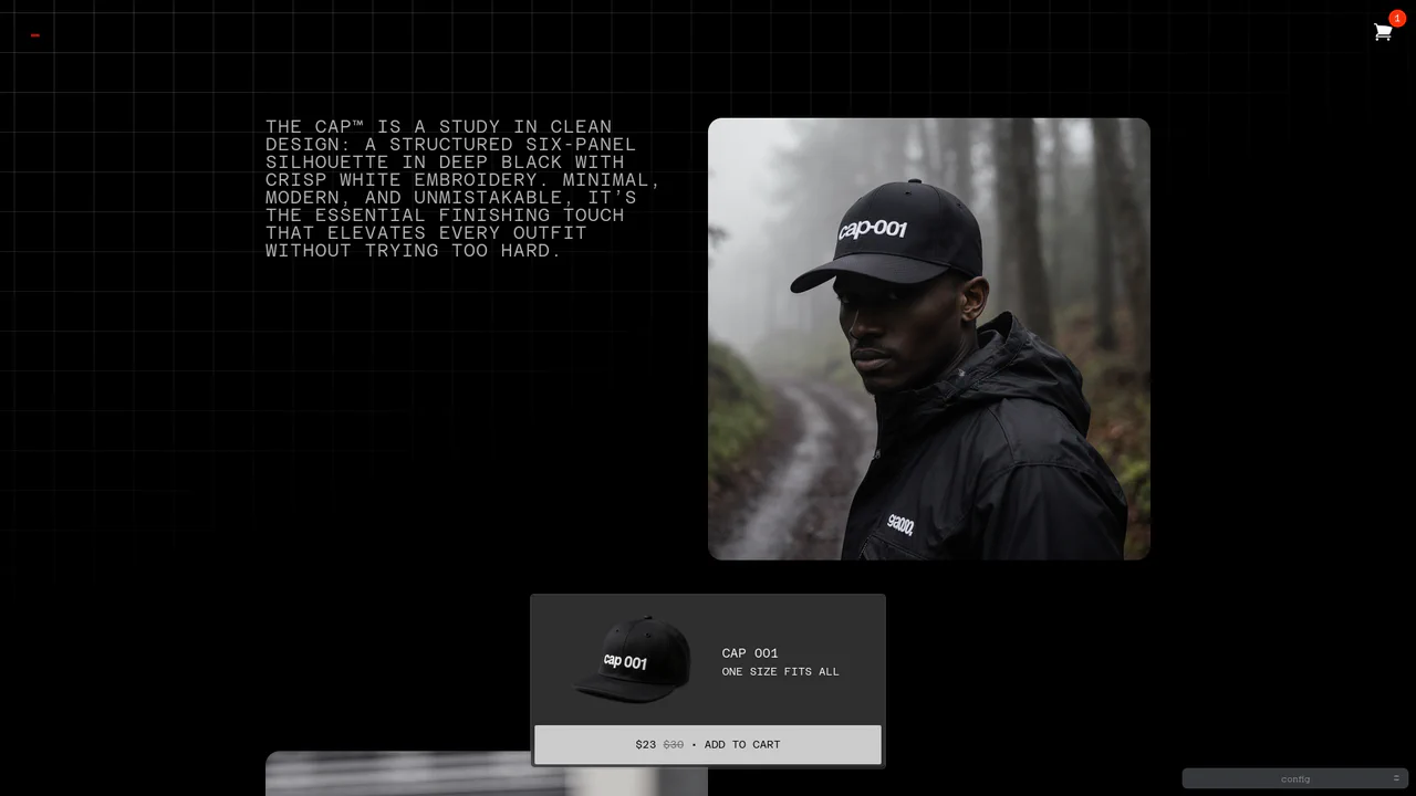
Dynamic Bezier Curve Fly-to-Cart Animation
An advanced e-commerce prototype demonstrating a highly customizable fly-to-cart animation. On click, a duplicate product image is projected into coordinates calculated via active client measurements, traveling along a dual-axis curved motion path toward the cart badge. Built with custom Web Components, it includes live Bezier timing trackpads and elastic cart bump physics. (Requires: gsap.js, tweakpane.js)
Chrome 54+
Edge 79+
Firefox 63+
Safari 10.1+
See the Pen Dynamic Bezier Curve Fly-to-Cart Animation.
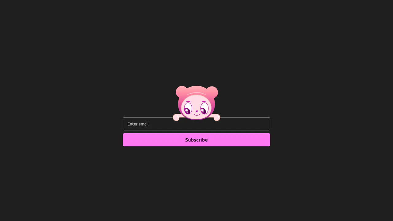
Interactive Eye-Tracking Subscription Form
An advanced interactive subscription form starring a playful cartoon character with dual eye-tracking modes. Pupils react in real time, following the pointer position or snapping directly to the input text caret inside the email field. Dragging the character horizontally triggers fluid physics, rubber-band borders, and elastic drag resets, while error states morph the SVG mouth. (Requires: canvas-confetti.js)
Chrome 110+
Edge 110+
Firefox 110+
Safari 16.2+
See the Pen Interactive Eye-Tracking Subscription Form.
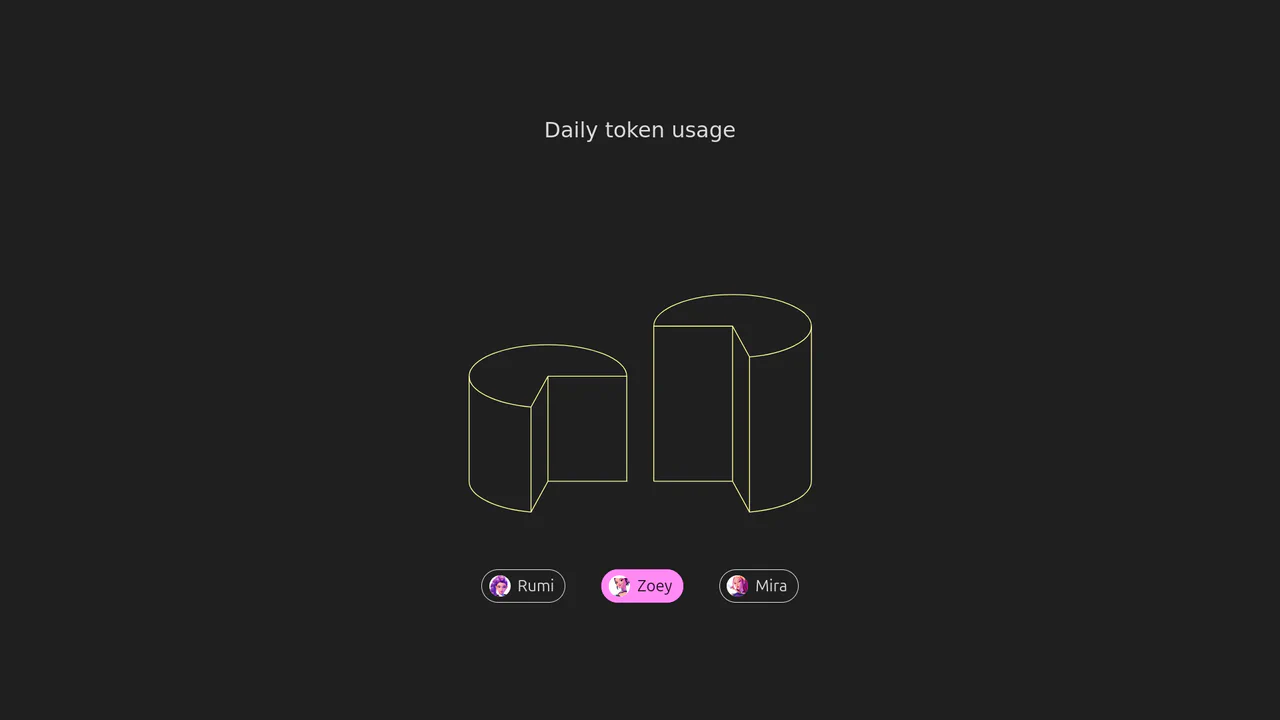
Isometric 3D SVG Morphing Chart
An interactive 3D isometric token usage chart powered by manual SVG path morphing. Instead of relying on heavy drawing libraries, a custom JavaScript interpolator parses matching vector commands and applies organic sine easing. Clicking the menu controls morphs the column heights and cylinder top caps synchronously, highlighted by vibrant rainbow keyframe animations.
Chrome 73+
Edge 79+
Firefox 67+
Safari 13+See the Pen Isometric 3D SVG Morphing Chart.
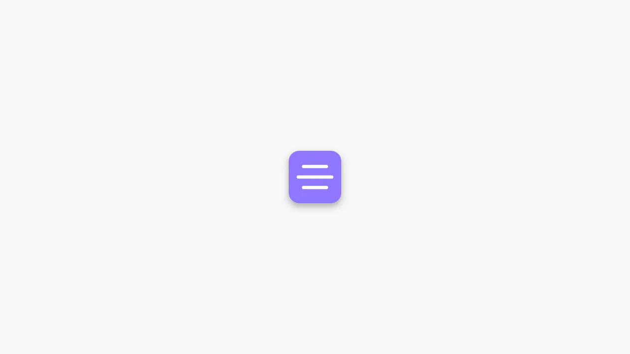
Animated CSS Hamburger Menu Icon
Animated CSS Hamburger Menu Icon transforms a standard three-line menu into a close button. JavaScript toggles an active class, while CSS handles the heavy lifting. The middle line slides out using translateX, and the outer lines rotate 45 degrees via transform. Simultaneously, the background and icon colors invert. A clean, lightweight micro-interaction for mobile navigation headers.
Chrome 49+
Edge 15+
Firefox 31+
Safari 10+
See the Pen Animated CSS Hamburger Menu Icon.
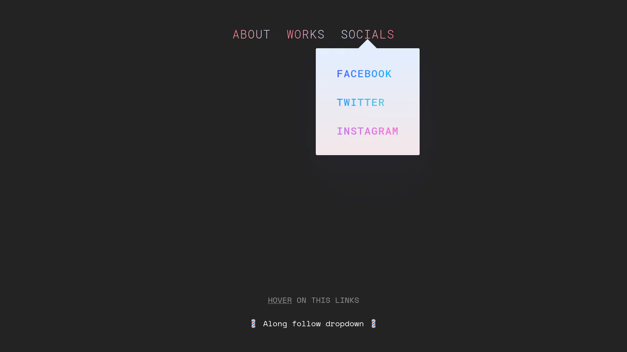
Morphing Stripe-Style Dropdown Navigation
“Morphing Stripe-Style Dropdown Navigation” replicates the famous Stripe header effect. A single background element dynamically resizes and moves behind the active content. JavaScript calculates dimensions using getBoundingClientRect() and updates CSS properties to animate the panel. This approach keeps the DOM clean and ensures smooth transitions between menu sections.
Chrome 48+
Edge 15+
Firefox 48+
Safari 10+
See the Pen Morphing Stripe-Style Dropdown Navigation.

Rollback Ball 3D Toggle Switch
Rollback Ball 3D Toggle Switch is a highly tactile, skeuomorphic switch concept. When clicked, a textured 3D ball realistically rolls across the track, cast-shadows shifting in unison. An ES6 JavaScript class dynamically reads the CSS animation duration, disables the input during the roll, and automatically resets the toggle state once the animation completes. A stellar example of interactive micro-design.
Chrome 55+
Edge 79+
Firefox 54+
Safari 10+
See the Pen Rollback Ball 3D Toggle Switch.
Gooey Liquid SVG Filter Toggle Switch
Gooey Liquid SVG Filter Toggle Switch uses a classic SVG filter trick — combining a blur (feGaussianBlur) with a high-contrast color matrix (feColorMatrix) — to achieve a fluid, organic morphing effect. The sliding thumb dynamically deforms and stretches before snapping into place. Built with modern CSS custom properties and individual transform properties, it includes a simple JavaScript loop for continuous demonstration.
Chrome 111+
Edge 111+
Firefox 113+
Safari 16.2+
See the Pen Gooey Liquid SVG Filter Toggle Switch.
Realistic 3D CSS Toggle Switches
“Realistic 3D CSS Toggle Switches” showcase three distinct switch variations using the classic checkbox hack. Built entirely without JavaScript, they rely on CSS box-shadow and linear-gradient to create tactile, 3D inset depths. State changes are smoothly animated via transition on pseudo-elements. A lightweight, robust solution for adding polished micro-interactions to forms.
Chrome 26+
Edge 12+
Firefox 16+
Safari 6.1+
See the Pen Realistic 3D CSS Toggle Switches.

Whimsical CSS Bubble Preloader
Whimsical CSS Bubble Preloader is a pure CSS animation that simulates rising bubbles that pop and scatter tiny droplets. Using HTML layout without JavaScript, it relies entirely on staggered @keyframes delays, absolute positioning, and math-based rotations via :nth-child. Radial gradients generate realistic reflections, while drop-shadow adds depth. A smart choice for lightweight, playful interfaces, though the dense DOM structure for droplets might feel redundant for some.
Chrome 52+
Edge 15+
Firefox 49+
Safari 9.1+See the Pen Whimsical CSS Bubble Preloader.

3D Star Wars Lightsaber Theme Toggle
3D Star Wars Lightsaber Theme Toggle relies on trigonometric CSS functions sin() and cos() to rotate vector elements along a 3D spherical path as the toggle slides. Custom numeric transitions are facilitated by redefining modern @property rules inside a @layer properties block, animating the --progress variable dynamically across state-driven keyframes. While providing a deeply thematic visual experience, performing continuous trigonometric transformations and animating complex CSS masks can trigger layout rasterization strain on standard devices, requiring GPU acceleration layers to preserve smooth 3D motion.
Chrome 111+
Edge 111+
Firefox 128+
Safari 16.4+See the Pen 3D Star Wars Lightsaber Theme Toggle.

Animated Clipboard Copy Action Button
Animated Clipboard Copy Action Button leverages overlapping SVG path duplicates to simulate a seamless paper ejection sequence upon trigger. When the .copied class is appended via jQuery, the secondary page .page and a glowing checkmark .check are animated along a skewed gravity curve copiedPage while the checkmark simultaneously expands its stroke-dasharray to appear fully drawn. This micro-interaction utilizes hardware-accelerated transforms. (Requires: jquery.js)
Chrome 49+
Edge 16+
Firefox 55+
Safari 11+
See the Pen Animated Clipboard Copy Action Button.
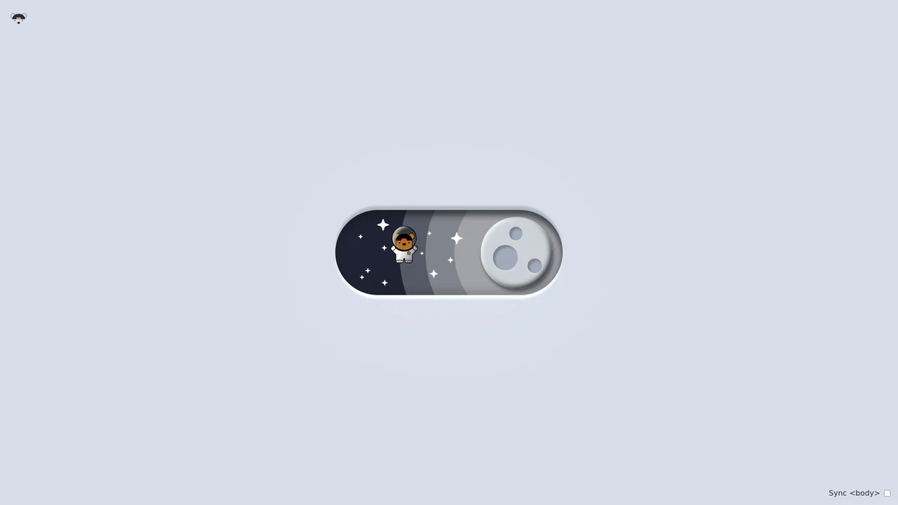
Bouncy Bear Theme Toggle Switch
Bouncy Bear Theme Toggle Switch relies on a clean, accessible HTML <button> to toggle an aria-pressed state, initiating a complex visual narrative that shifts between an aviator bear in light mode and an astronaut bear in dark mode. The animation utilizes modern CSS layout techniques including container-type queries, separate translate declarations, and a heavy-backwards cubic-bezier(.4,-0.3,.6,1.3) curve to achieve physical bounce. While structurally robust, the sheer volume of concurrently transitioning inline SVG paths and scaling stars can generate intensive layout recalculation spikes unless elements are actively isolated via hardware-promoted layers.
Chrome 105+
Edge 105+
Firefox 110+
Safari 16+See the Pen Bouncy Bear Theme Toggle Switch.

Circular Reveal Fullscreen Navigation Menu
Circular Reveal Fullscreen Navigation Menu leverages GSAP timelines to orchestrate a fluid canvas expansion by animating a CSS clip-path circle from 0px to 200%. Simultaneous staggered translations are applied to navigation links using a responsive elastic.out easing curve, creating a highly tactile, sequential entry. While the transition remains visually seamless on high-refresh-rate screens, full-screen masking with dynamic clip paths can impose substantial rendering overhead, demanding GPU-accelerated layer promotion via will-change: clip-path to maintain consistent frame rates. (Requires: gsap.js)
Chrome 112+
Edge 112+
Firefox 117+
Safari 16.5+
See the Pen Circular Reveal Fullscreen Navigation Menu.

Curtain Transition Navigation Menu
Curtain Transition Navigation Menu implements a lightweight state toggle via a data-nav attribute, shifting the entire <main> view up by 50% to reveal an absolutely-positioned bottom navigation drawer. Dynamic sizing features like clamp() and max() ensure responsive link layouts, while a sharp cubic-bezier(.13, .53, .38, .97) curve coordinates the simultaneous scaling and entry of image-rich navigation elements. While visually fluid, animating massive full-screen wrappers containing large Unsplash media can trigger costly rasterization overhead unless GPU compositing is actively hinted.
Chrome 88+
Edge 88+
Firefox 89+
Safari 15+
See the Pen Curtain Transition Navigation Menu.

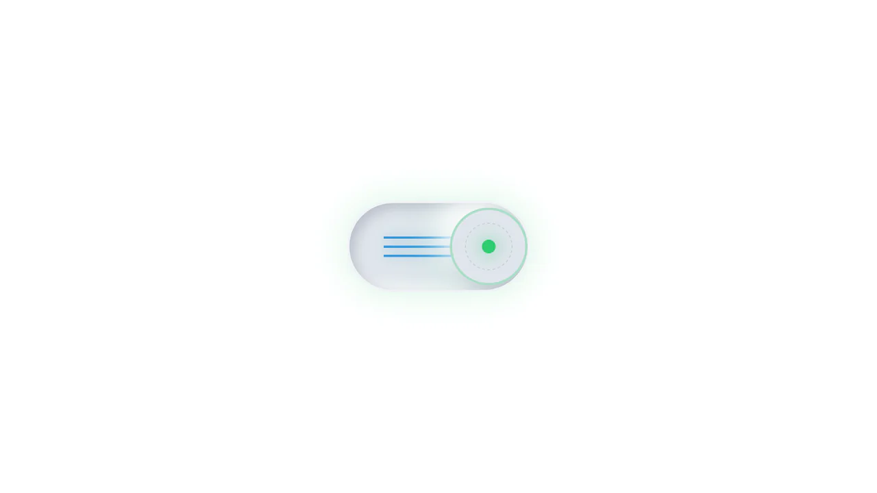
3D Neumorphic Pill Toggle Switch
This is a 3D Neumorphic Pill Toggle Switch. It replaces the default browser checkbox with a tactile, extruded slider mechanism. Its function is to govern binary states (on/off) while providing physical, hardware-like visual feedback to ground the digital interaction in reality.
Chrome 87+
Edge 87+
Firefox 66+
Safari 14.1+
See the Pen 3D Neumorphic Pill Toggle Switch.
Neumorphic Mechanical Toggle Switch
This is a Neumorphic Mechanical Toggle Switch. It replaces the default browser checkbox with a tactile, extruded hardware-style button. Its function is to govern binary states (on/off) while providing strong physical visual feedback through inverted shadows, glowing indicators, and spring-loaded motion.
Chrome 80+
Edge 80+
Firefox 70+
Safari 14+
See the Pen Neumorphic Mechanical Toggle Switch.
Liquid Polygon Fullscreen Navigation Menu
This is a Liquid Polygon Fullscreen Navigation Menu. It utilizes an intricate CSS clip-path mask to create an organic, ink-bleed reveal effect over the viewport. Its function is to replace standard rigid slide-in menus with a spatial, fluid transition, immediately altering the user’s interface context.
Chrome 55+
Edge 79+
Firefox 54+
Safari 13.1+See the Pen Liquid Polygon Fullscreen Navigation Menu.

Interactive Drag-and-Drop Jigsaw Puzzle
This is an Interactive Drag-and-Drop Jigsaw Puzzle. It dissects a single raster image into an interlocking grid of movable pieces without relying on a single line of JavaScript. Its function is to gamify visual content, converting passive image consumption into a tactile, logic-driven interaction.
Chrome 84+
Edge 84+
Firefox 90+
Safari 15.4+
See the Pen Interactive Drag-and-Drop Jigsaw Puzzle.

Sliding Theme Toggle Sidebar Menu
This is a Sliding Theme Toggle Sidebar Menu. It integrates an interactive light/dark mode switch directly into a scrollable navigation panel. Its function is to provide centralized control over the application’s visual environment while maintaining immediate access to primary routing options.
Chrome 59+
Edge 79+
Firefox 52+
Safari 10.1+
See the Pen Sliding Theme Toggle Sidebar Menu.

Stacked Card Pull-Down Navigation
This is a Stacked Card Pull-Down Navigation. It transforms a standard mobile menu into a tactile, deck-like interface that cascades down from the viewport’s top edge. Its primary function is to provide an engaging, full-screen routing experience, replacing the traditional hamburger icon with an interactive, overlapping layer system that optimizes touch targets.
Chrome 86+
Edge 86+
Firefox 85+
Safari 14+See the Pen Stacked Card Pull-Down Navigation.

Odometer Number Counter
This is an Odometer Number Counter. It visualizes numerical changes (such as MRR, follower counts, or revenue) using a mechanical rolling effect. Its function is to provide a highly configurable, tactile alternative to instant number swapping, bringing physical momentum to digital dashboards. (Requires: React, ReactDOM, dat.gui)
Chrome 90+
Edge 90+
Firefox 88+
Safari 15+See the Pen Odometer Number Counter.

Staggered Animated Hamburger Toggle Button
The Staggered Animated Hamburger Toggle Button is a highly refined navigation trigger. It utilizes aria-pressed states to drive complex, multi-stage CSS transitions. Its function is to provide an accessible, tactile entry point for menus, using staggered motion to visually explain the transformation from a “hamburger” to a “close” icon.
Chrome 99+
Edge 99+
Firefox 97+
Safari 15.4+See the Pen Staggered Animated Hamburger Toggle Button.