170+ CSS transition Examples (Page 2)
Examples

FLIP Animated Responsive Grid Switcher
This is an Animated FLIP Grid Switcher. It bridges the gap between two distinct visual states — Card and List — by mathematically calculating the delta of motion. The component ensures that interface elements do not simply “jump” during a layout change but glide organically into their new coordinates, maintaining spatial continuity for the user.
 Chrome 60+
 Edge 79+
 Firefox 55+
 Safari 11+
See the Pen FLIP Animated Responsive Grid Switcher.

Clipping Quadrant Image Gallery
This is a Clipping Quadrant Image Gallery. It segments a full-screen display into four interactive quadrants, each housing a unique photograph. Upon clicking any segment, the component utilizes the clip-path property to instantly expand that specific quadrant to cover the entire viewport, transitioning from a mosaic-style grid into a singular, immersive view.
Chrome 55+
Edge 79+
Firefox 52+
Safari 11+
See the Pen Clipping Quadrant Image Gallery.
Sliding Line Hamburger Menu Animation
This is a Sliding Line Hamburger Menu Animation. It reinvents the standard three-bar toggle by using internal pseudo-element sliding instead of simple opacity changes. Its function is to provide a high-end, staggered interaction that signals navigation states with mechanical precision.
Chrome 26+
Edge 12+
Firefox 16+
Safari 7+
See the Pen Sliding Line Hamburger Menu Animation.
Dynamic Circular Avatar Gallery
This is a Dynamic Circular Avatar Gallery. It arranges a series of profile images into a perfect circle that smoothly expands when interacted with. Its function is to showcase user groups or team members in a compact, engaging format, using cutting-edge CSS math instead of JavaScript to handle complex radial positioning and dynamic item counting.
Chrome 119+
Edge 119+
See the Pen Dynamic Circular Avatar Gallery.

Trigonometric Radial Popover Menu
This is a Trigonometric Radial Popover Menu. It replaces heavy JavaScript positioning arrays with native CSS mathematics and the HTML Popover API. Its function is to reveal secondary actions in a circular layout on demand, expanding the interactive surface area without permanently cluttering the interface.
Chrome 139+
Edge 139+
See the Pen Trigonometric Radial Popover Menu.

Animated Movie Schedule Blocks
This is an Animated Movie Schedule Block component. It structures chronological event data (like cinema showtimes) into a visual grid. Its function is to condense information using a pure CSS hover interaction, where an image poster slides away to reveal structured metadata (genre, time, title) through intersecting animated panels.
Chrome 36+
Edge 12+
Firefox 16+
Safari 9+
See the Pen Animated Movie Schedule Blocks.

Kinetic 144-Clock Digital Display
This Kinetic 144-Clock Digital Display is a stunning example of procedural animation. Inspired by physical kinetic art installations (like those by Humans Since 1982), it uses a grid of 144 individual analog clocks to form digital numbers. React manages the “target state” of every single clock hand, while CSS transitions handle the smooth, synchronized movement, creating a mesmerizing flow of time. (Requires: React, react-dom)
Chrome 60+
Edge 79+
Firefox 60+
Safari 12+
See the Pen Kinetic 144-Clock Digital Display.

Nike Product Card Interaction
This Nike Product Card Interaction is a dynamic UI component designed for e-commerce listings. It transforms a standard static product grid into an engaging experience. When a user hovers over a card, the product image rotates and shifts to make room for a vertical brand label that slides in from the side. This clever use of space allows for a clean initial view while revealing branding details on demand.
Chrome 57+
Edge 16+
Firefox 52+
Safari 10.1+
See the Pen Nike Product Card Interaction.

Holographic 3D Interactive Card
This Holographic 3D Interactive Card is a premium UI component inspired by rare physical trading cards. It features a sophisticated depth effect where the logo floats independently from the iridescent background, reacting dynamically to mouse movements or touch input. The use of modern CSS APIs ensures high-performance rendering of complex gradients and masks, creating a truly immersive “collectible” feel for digital assets.
Chrome 85+
Edge 85+
Safari 16.4+
Firefox 128+
See the Pen Holographic 3D Interactive Card.
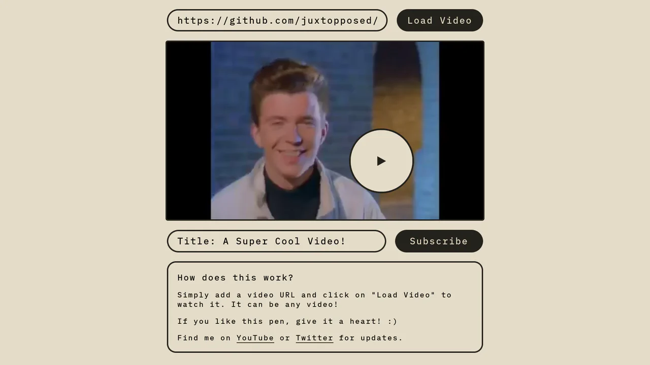
Magnetic Video Play Button Concept
The Magnetic Video Play Button Concept is an interactive UI element that replaces the standard video player controls with a creative, cursor-following play button. This implementation enhances user engagement by making the primary interaction point - the play toggle - dynamic and physically responsive to the user’s movement. It is perfect for landing pages and high-end portfolio sites where media content is the centerpiece.
Chrome 60+
Edge 79+
Firefox 60+
Safari 11+
See the Pen Magnetic Video Play Button Concept.

Twitch Style Gradient Hover Card
This Twitch Style Gradient Hover Card brings a high-energy interactive element to your UI, perfect for feature highlights or gaming profiles. It combines a sliding background gradient that utilizes responsive vmin units with a JavaScript-powered staggered text reveal. The result is a fluid animation where the background shifts dynamically while the subtitle types itself in word by word.
Chrome 88+
Edge 88+
Firefox 89+
Safari 15+
See the Pen Twitch Style Gradient Hover Card.

Expandable News Card Widget
This Expandable News Card Widget demonstrates a classic pattern for managing content density in UI design. By default, it presents a single “Headline” state to save screen space. Upon interaction, it smoothly transitions into an “Expanded” state, revealing a scrollable list of news items. It utilizes React state to handle the logic and CSS transitions for the visual effect. (Requires: React, react-dom)
Chrome 100+
Edge 100+
Safari 14+
Firefox 90+
See the Pen Expandable News Card Widget.

Vue FLIP Image Gallery
This Vue FLIP Image Gallery showcases a high-performance way to animate layout changes that are typically expensive for the browser. When a user selects an image, it expands to fill a larger portion of the grid, while surrounding items gracefully rearrange themselves. This is achieved not by simple CSS transitions, but by the FLIP technique (First, Last, Invert, Play), ensuring buttery smooth 60fps animations even during complex DOM reflows. (Requires: Vue.js)
Chrome 80+
Edge 80+
Safari 14+
Firefox 90+
See the Pen Vue FLIP Image Gallery.
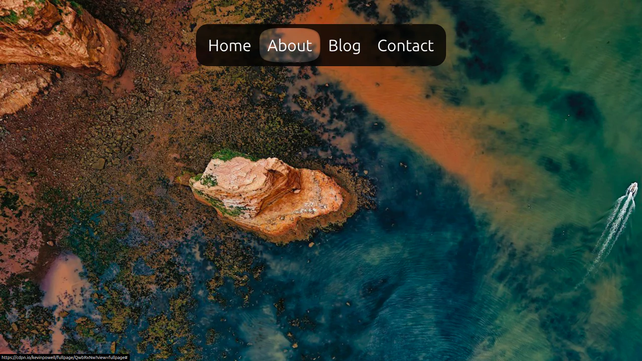
CSS Anchor Positioning Navigation Effect
This CSS Anchor Positioning Navigation Effect is a masterclass in modern web standards, achieving a complex “sliding highlight” interaction entirely without JavaScript. By leveraging the new Anchor Positioning API alongside the :has() selector, the component allows a single background element to tether itself to whichever menu item is currently hovered, creating a premium, app-like feel with minimal code overhead.
Chrome 125+
Edge 125+
See the Pen CSS Anchor Positioning Navigation Effect.

Micro-Interaction Loading Button
This Micro-Interaction Loading Button demonstrates how to pack multiple feedback states into a single UI element without cluttering the interface. It starts as a clean “Submit” button. Hovering reveals a directional arrow, hinting at action. Clicking triggers a seamless loading sequence where the arrow transforms into a spinner, finally resolving into a checkmark to confirm success.
Chrome 49+
Edge 15+
Firefox 43+
Safari 10+
See the Pen Micro-Interaction Loading Button.

Animated Multi-Player Selection Card
This Responsive Vue Multiplayer Select component is a playful UI pattern for game interfaces or configuration forms. It utilizes Vue’s reactivity to dynamically calculate the width of game controller illustrations, ensuring they perfectly fill the container regardless of whether 1, 2, 3, or 4 players are selected. The result is a smooth, accordian-like expansion effect. (Requires: Vue)
Chrome 49+
Edge 15+
Firefox 31+
Safari 9.1+
See the Pen Animated Multi-Player Selection Card.

Animated Grid Tracks with :has()
A pure CSS expanding gallery powered by the modern :has() selector. Hovering triggers a grid-template-columns transition, widening the active item while revealing content via opacity and transform animations, all styled with blend modes for a tinted monochrome aesthetic.
See the Pen Animated Grid Tracks with :has().
Up Arrow
A rectangular button smoothly shrinks into a circle, the text fades out, and an upward-pointing arrow begins to cyclically rise within it.
See the Pen Up Arrow.
Intersection Observer Example
A horizontal scrolling gallery where the background color smoothly transitions to match the current image, triggered by the Intersection Observer API.
See the Pen Intersection Observer Example.

Radial Navigation Menu
A stylish, responsive sidebar menu built with React and SCSS, featuring a staggered reveal animation orchestrated by dynamic transition-delay calculation. The layout combines a radial quick-action menu around a user avatar with a cascading list of full navigation options, all controlled via React Context.
See the Pen Radial Navigation Menu.
Side Navigation with Icons
A vertical CSS-only navigation menu where hovering triggers a smooth animation: the icon scales up and changes color while the text label fades out, emphasizing the visual symbol.
See the Pen Side Navigation with Icons.

Extreme Hover with HTML and CSS
A visually dynamic and impressive effect where hovering over a static image transforms it into a complex, 3D-like collage, showcasing the capabilities of CSS transitions and imperative loading control.
See the Pen Extreme Hover with HTML and CSS.

Log In and Sign Up Forms with Fingerprint
A fluid mobile prototype demonstrating state-driven navigation transitions and a 3D dashboard carousel powered by Swiper.js.
See the Pen Log In and Sign Up Forms with Fingerprint.

Physics Milestones Timeline
An animated vertical timeline where historical event cards slide in from alternating sides as they enter the viewport upon scrolling.
See the Pen Physics Milestones Timeline.
Pure CSS Home Media (Ambilight)
A remarkable, zero-JS interactive environment simulation utilizing the CSS Checkbox Hack and global CSS Variables to control the scene’s ambient lighting.
See the Pen Pure CSS Home Media (Ambilight).

Real-time Clock
An analog clock with a mechanical ticking effect driven by cubic-bezier transitions and precise rotation logic.
See the Pen Real-time Clock.

Responsive Watch Using vmin
A highly detailed, photorealistic Analog Watch simulation using Vanilla JavaScript and setInterval to imperatively calculate and apply rotate(Xdeg) transforms to the clock hands. The visual realism and theme switching are driven entirely by complex CSS, utilizing layered linear gradients for case and bezel depth, advanced SVG clipPath for irregular shapes (lugs), and a dedicated .lume class for a dramatic, phosphorescent theme change.
See the Pen Responsive Watch Using vmin.

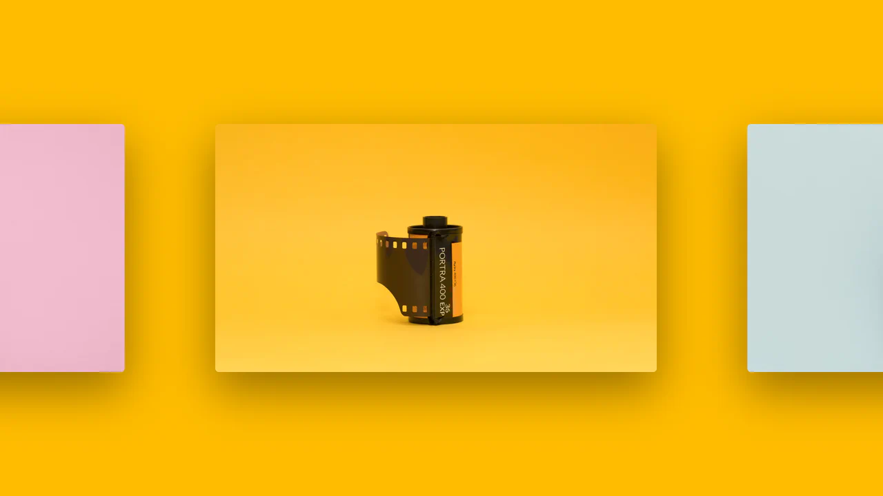
Simple and Responsive Image Slider
A smooth, responsive image slider where slides glide horizontally via container translation, featuring dynamic navigation dots and adaptive resizing.
See the Pen Simple and Responsive Image Slider.
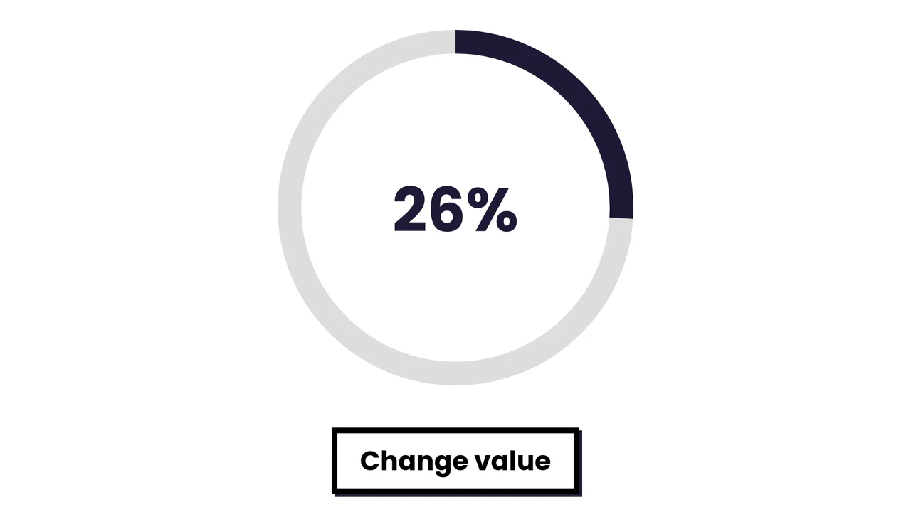
Simple SVG Circle Graph with Animation
A smooth radial progress animation where the SVG stroke fills the circumference based on a dynamically calculated offset.
See the Pen Simple SVG Circle Graph with Animation.

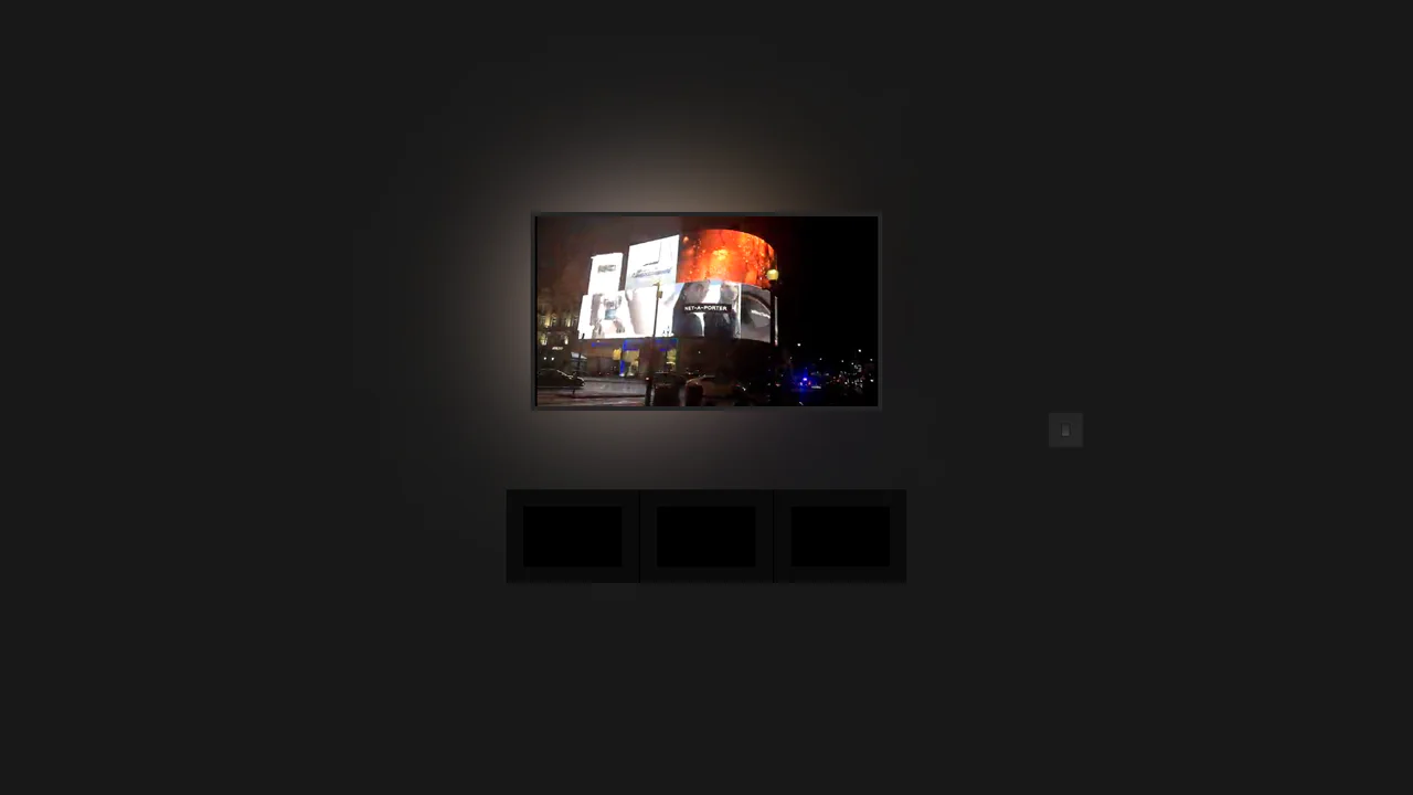
Background Slider
An atmospheric and immersive gallery where the main content (slide) is the focus, and the page background serves as its blurred and darkened echo, creating a unified visual space.
See the Pen Background Slider.