170+ CSS transition Examples (Page 4)
Examples

SVG Upload Animation
An impactful loading icon built on stroke-dashoffset animation for an SVG circle and swinging @keyframes for the icon. A minimalistic jQuery script with setTimeout is used to manage the loading cycle by adding state classes.
See the Pen SVG Upload Animation.
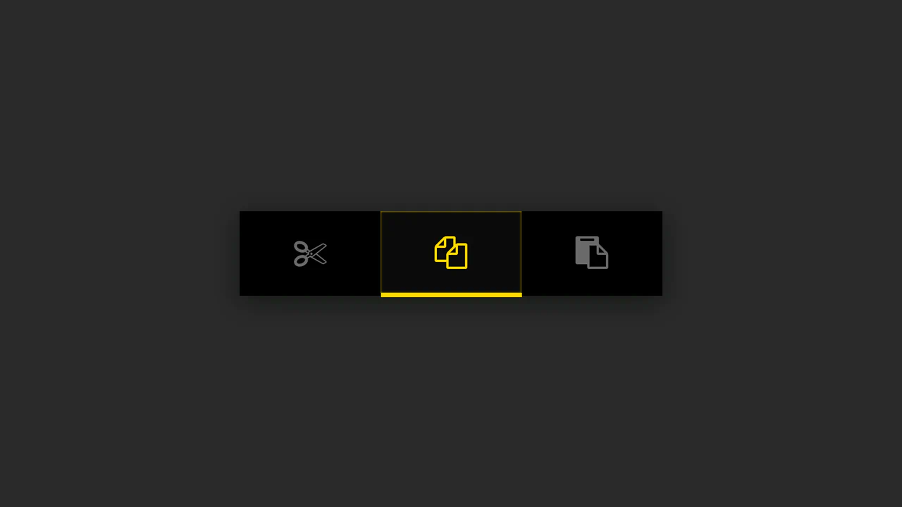
Button Group with Animated Indicator
A simple button group where the indicator’s position is calculated in JS based on the button’s data-num attribute - the offset is set via style.marginLeft, while the active state is animated using CSS.
See the Pen Button Group with Animated Indicator.

CSS Hamburger Click Effect
Explore the technique of creating a three-line hamburger using a single <span> tag and two pseudo-elements, - which are then animated into an ‘X’ via a combination of CSS properties rotate(45deg) and translate.
See the Pen CSS Hamburger Click Effect.
FAQ Accordion with Font Awesome Icons
The “Accordion/FAQ” functionality is implemented using pure JavaScript, which handles the click on the parent element and toggles the active class on the FAQ container. The visual highlight is the icon change via CSS display: none/block properties.
See the Pen FAQ Accordion with Font Awesome Icons.

Gender Toggle Button with Bounce Effect
This interactive toggle switch demonstrates advanced animation work, where delayed class toggling in jQuery coordinates the knob movement and a stylish “color fill” text effect, created in CSS using overflow: hidden; and pseudo-elements.
See the Pen Gender Toggle Button with Bounce Effect.

Interactive Super Mario Timeline with Parallax
An interactive timeline where JS synchronizes CSS transform: translateX for scrolling, background-position for parallax, and classes for sprite animation.
See the Pen Interactive Super Mario Timeline with Parallax.
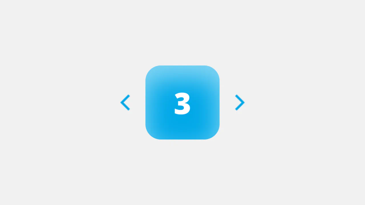
Soft UI Counter Component
This simple counter demonstrates clean vanilla JavaScript functionality: counter management, class switching for instant color scheme change based on the number’s sign. The stylistic focus is on “Soft UI” aesthetics.
See the Pen Soft UI Counter Component.

Control Interaction with GSAP
A sleek, animated segmented control using GSAP for smooth slide and a subtle 3D-like tilt effect on click, providing a polished micro-interaction.
See the Pen Control Interaction with GSAP.
Progress Bar with Dynamic CSS Gradient
This loader achieves a liquid-smooth animation by calculating progress on the JavaScript requestAnimationFrame loop and programmatically updating the CSS linear-gradient background property to create dynamic color shifts.
See the Pen Progress Bar with Dynamic CSS Gradient.
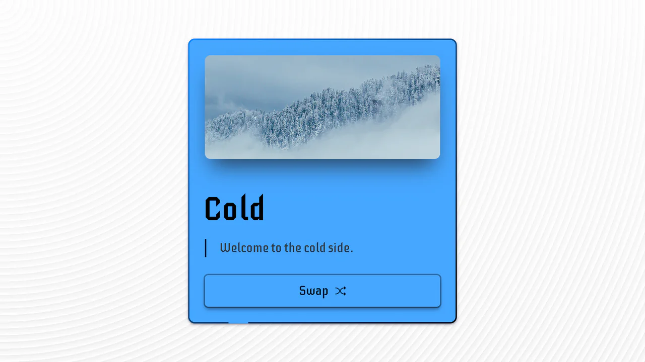
Hot & Cold Swap Card
An advanced UI component demonstrating pure CSS capabilities to create a complex 3D flip effect, with the added use of animated SVG strokes and CSS variables for an instant change of color scheme and media content.
See the Pen Hot & Cold Swap Card.

Minimal Carousel (No Dependencies)
An ultra-lightweight slider showcasing a clean implementation of essential functionality (including infinite looping and arrow navigation) via direct CSS positioning manipulation using Vanilla JavaScript.
See the Pen Minimal Carousel (No Dependencies).
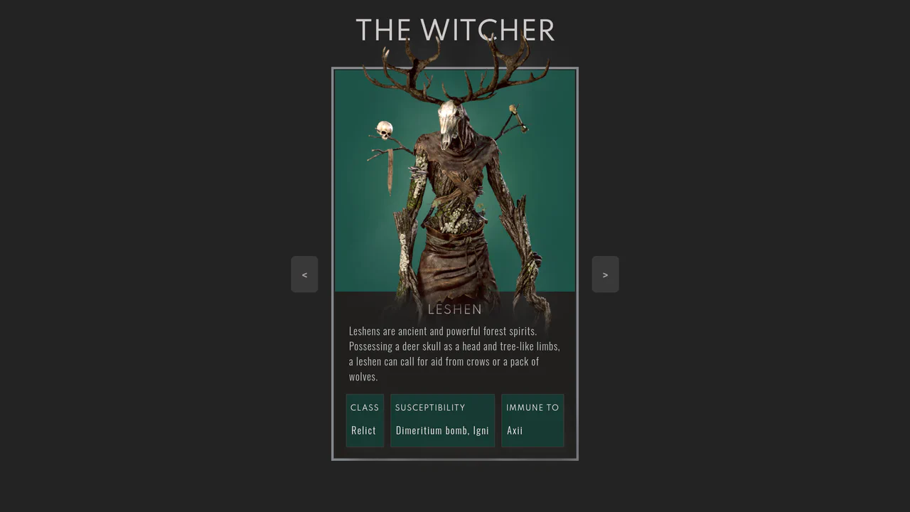
The Witcher Monster Cards Slider
Showcases a stylish, interactive monster card slider, utilizing pure HTML and CSS for complex design, custom typography, and subtle image animations with a zoom/lift effect on hover.
See the Pen The Witcher Monster Cards Slider.
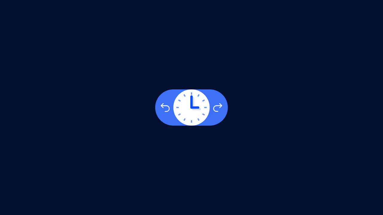
Undo/Redo With Active Clock Animation
A clean frontend implementation of an interactive button pair, where the history logic (Undo/Redo state) is managed by minimal Vanilla JS, and the rich clock rotation and dial animation is fully delegated to CSS transforms.
See the Pen Undo/Redo With Active Clock Animation.

Card Slider
An interactive, responsive content component built on vanilla JavaScript (Swiper), highlighting CSS transitions for the slide change effect, complete with custom navigation and modular styling via SCSS for easy customization.
See the Pen Card Slider.
Stripe-Style Animated Vertical Tabs
A slick, animated vertical tabs component styled with Tailwind CSS, leveraging Vue.js for reactive state management and utilizing CSS transform properties for ultra-smooth indicator movement.
See the Pen Stripe-Style Animated Vertical Tabs.
3D Page Fold Transition (FLIP Principle)
An elegant implementation of the FLIP animation principle to create a stunning shared element transition between two views, where JS calculates the positions and CSS performs the inverse transform for a smooth change.
See the Pen 3D Page Fold Transition (FLIP Principle).
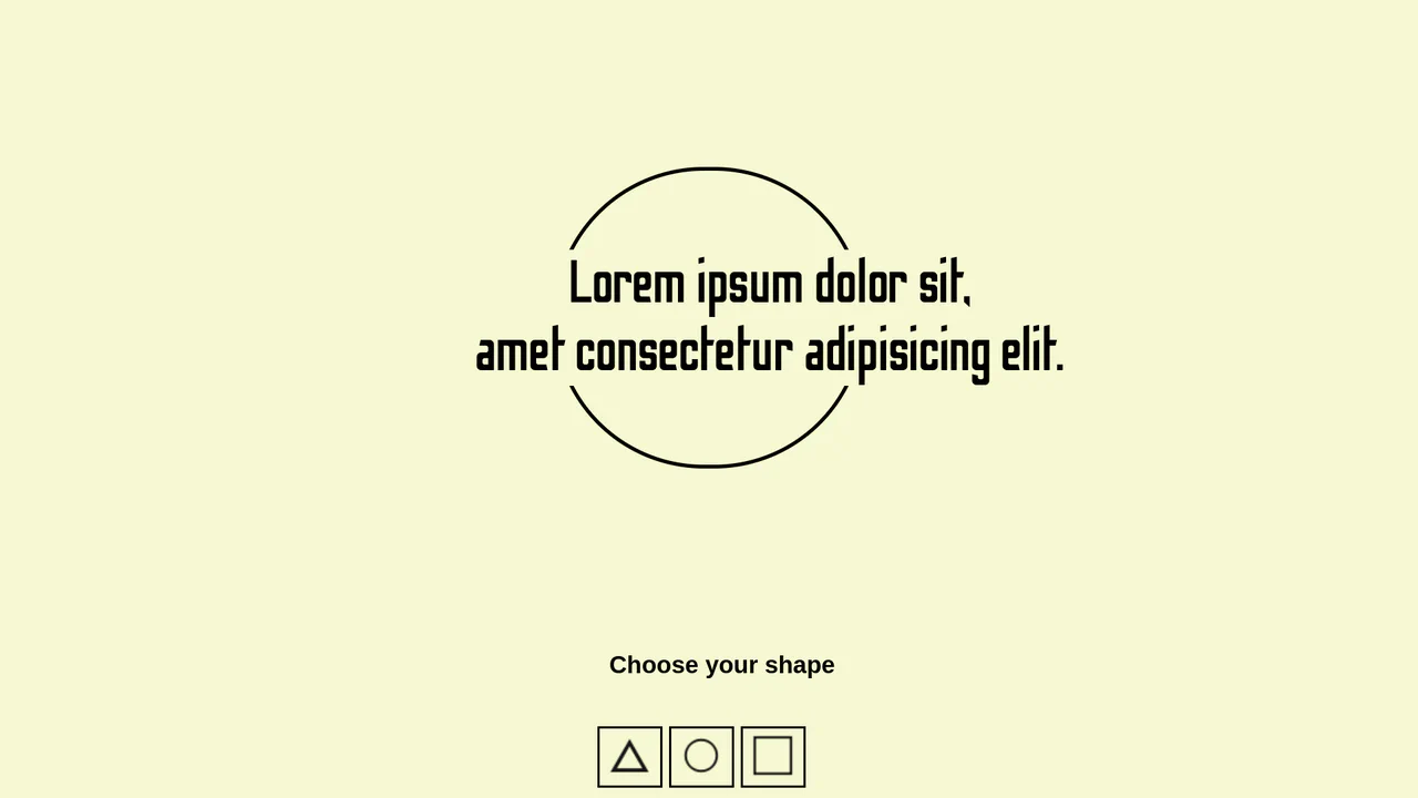
Background Shape Change (Simple Transition)
A simple example of dynamic shape and style modification of an element using JavaScript, clearly showing how to toggle CSS properties on a click event.
See the Pen Background Shape Change (Simple Transition).
Smooth Fullscreen Slideshow Animation
A simple yet effective horizontal slider built with Vanilla JavaScript controls the scroll via margin-left, leveraging 100vw CSS units for precise, full-viewport step movement.
See the Pen Smooth Fullscreen Slideshow Animation.
Hero Section Article Gallery Hover
This demo showcases a dynamic split-screen layout where hovering over a column triggers a full background image reveal and slides in a content box. The interactive effect is efficiently managed by toggling an .active class with a simple jQuery mouseover event, while all animations are handled purely by CSS transitions.
See the Pen Hero Section Article Gallery Hover.
Play with Header on Page Transitions
A sophisticated yet elegant content switching animation using dynamic CSS variables and @keyframes to create the “running dots” background effect. The background transition itself is achieved through a smooth scaling effect using transform-origin and translateX.
See the Pen Play with Header on Page Transitions.

CSS Accordion with Custom Animated Arrows
A pure CSS accordion based on native <details>/<summary> elements, where the standard marker is hidden, and a custom animated chevron arrow is created and controlled exclusively via clip-path: polygon() and the rotate property upon expansion.
See the Pen CSS Accordion with Custom Animated Arrows.
CSS-Only Character Profile Card with Tabs
A stylish custom layout (character profile card) built entirely on CSS positioning and content switching using HTML radio inputs without JavaScript, effectively creating pure CSS tabs.
See the Pen CSS-Only Character Profile Card with Tabs.
Photo Gallery Grid Animation with CSS Clip-Path
A showcase of the creative application of clip-path to create an “unfolding” image effect on hover, where the interaction not only changes the shape but also uses z-index to elevate the element and overlap neighboring tiles.
See the Pen Photo Gallery Grid Animation with CSS Clip-Path.
Emerging Dropdown Menu
This interactive component features a visually striking dropdown effect where the menu container morphs into shape using pure CSS animation of the SVG stroke-dashoffset property. It uses a separate SVG element with a Gaussian blur filter to create a subtle, soft shadow that follows the menu’s outline when expanded.
See the Pen Emerging Dropdown Menu.

Accordion Slider with Vanilla JS
This is a fully responsive accordion slider built with vanilla JavaScript and CSS, handling both click and keyboard arrow events for seamless slide navigation.
See the Pen Accordion Slider with Vanilla JS.
Space Nav: A Full-Screen Menu
An impressive menu example where all visuals are built with pure CSS and SVG. Clicking the burger icon triggers smooth animations for gradients, SVG arcs, and the background, while changing the overall page state with a single class.
See the Pen Space Nav: A Full-Screen Menu.
The Intention of :hover
This component builds an interactive hover-intent demonstrator by linking GUI configuration nodes to dynamic CSS transform-origin alignments and a View Transitions bloom animation. The logic drives a responsive text-inverting ::after pseudo-element with mix-blend-mode: difference that scales on hover, optionally injecting a brief intentional delay to optimize cursor path traversal. Because the transition states and the circular theme clipping rely on hardware-accelerated transforms and clip-paths, the interface retains fluid composited performance while offering high-fidelity, educational user feedback.
See the Pen The Intention of :hover.
This demo is a masterclass in progressive enhancement, applying advanced styling only on hover-capable devices that support appearance: base-select. The fluid dropdown animation is powered by @starting-style and transition-behavior: allow-discrete, enabling transitions on previously non-animatable properties.
clip-path controls the shape of the viewport (from a point to a full frame), while transform applies a subtle scaling effect to the image, creating a cinematic reveal.
A demonstration of advanced synchronization between the ResizeObserver API and the Popover API, where the Observer monitors the notification’s size change to automatically dismiss it once the height hits zero. It uses @starting-style and transition to create a smooth and controlled fade-out effect for the popover element.