170+ CSS transition Examples (Page 5)
Examples
Glass Effect UI
An elegant UI element using the “frosted glass” effect (backdrop-filter), enhanced with complex box-shadow and pseudo-elements for depth and a realistic, shimmering glare.
See the Pen Glass Effect UI.
A flexible and customizable sidebar built with CSS Custom Properties - sizes, spacing, and colors are easily configurable. The complex choreography of element appearance is achieved through transition-delay, and tooltip content is sourced from data-* attributes.
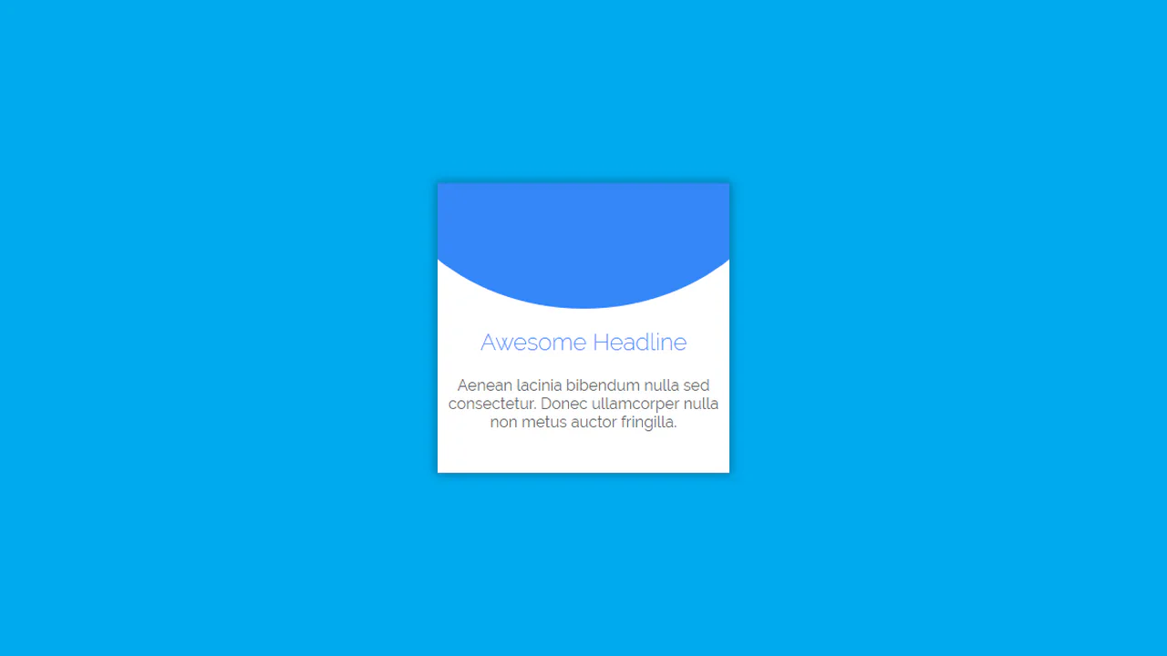
Shuffling Effect in Pure CSS
Efficient layout using CSS Grid to stack cards on top of each other, with dynamic layer control via z-index and the :has() selector to determine the position of the next element; the image animation includes movement and straightening of the rotation upon selection.
See the Pen Shuffling Effect in Pure CSS.
A dynamic card carousel/stack technically driven entirely by CSS custom properties and the :has() selector; interactivity is achieved via the “Radio Button Hack” (hidden input[type="radio"]), where selecting one card recalculates variables for all others, creating a smooth 3D transformation effect and dynamic stacking order; a decorative dotted background and a responsive grid layout complement the functionality.
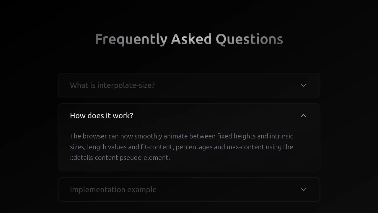
Exclusive Accordion with Tailwind and interpolate-size
A high-performance, smooth accordion that expands to the content’s natural height, looking and feeling like a complex JS solution but running entirely on the browser engine.
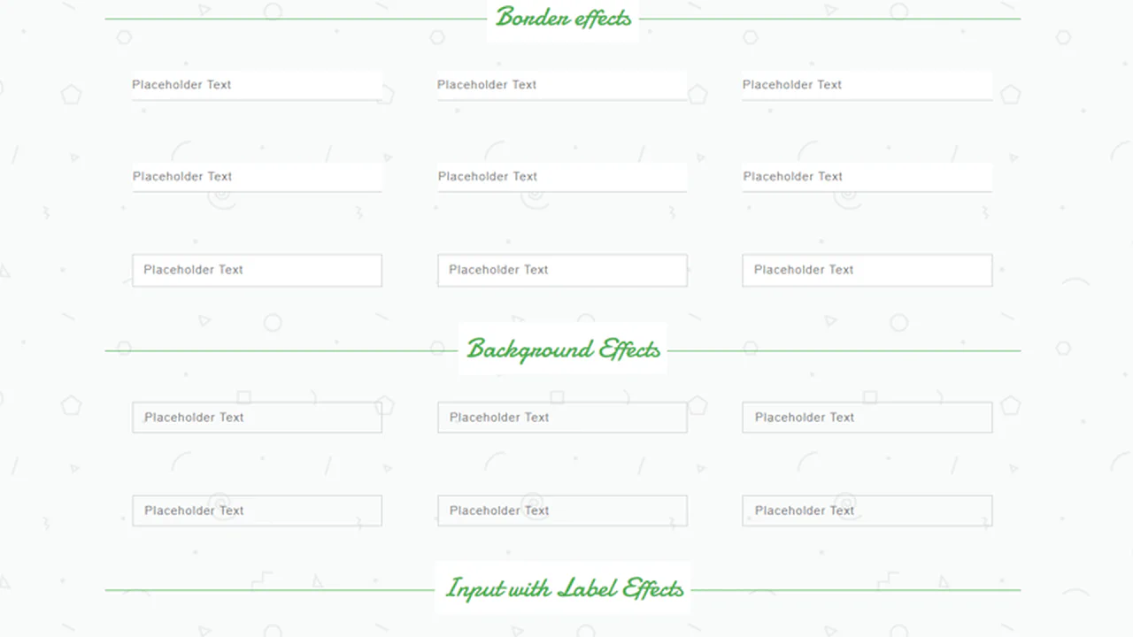
Form Input Design
This is a comprehensive library of pure CSS input animations, triggered by the :focus pseudo-class. The effects are created by transitioning the width and height of a sibling <span> styled as a border or background, showcasing a wide range of sophisticated, JS-free micro-interactions.
See the Pen Form Input Design.

Pop-Up Overlay
This is a robust component built entirely with SCSS, leveraging a full suite of custom mixins for cross-browser animation, transform, and transition. A centralized variable block for the color palette makes the component highly themeable and maintainable.
See the Pen Pop-Up Overlay.
A stylish card that rests as a diagonal fragment and smoothly “straightens” into a full rectangular image on hover, shifting the text downwards.
A fluid, responsive gallery that automatically adjusts to screen size and provides rich visual feedback on hover.

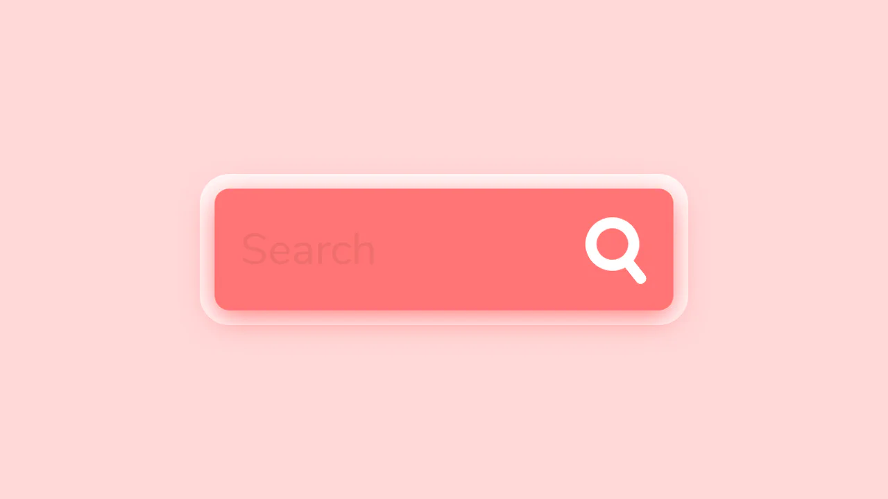
Expandable Search Bar Animation
This expanding search bar showcases the power of the :focus-within pseudo-class to manage the entire component’s state. The width of the <form> and its child <input> are animated purely through CSS transitions, creating a fluid user experience without any JavaScript for the core interaction.
See the Pen Expandable Search Bar Animation.
Search Form With Animated Search Button
This is a fully interactive search bar. On :hover, a coordinated set of CSS transitions transforms the icon’s geometry - from a circle to a rounded rectangle - while its pseudo-elements reconfigure from a handle into a cross, creating a fluid and polished UI element.
See the Pen Search Form With Animated Search Button.
Retro CSS Slideshow
A demonstration of how two independent, infinite @keyframes animations can be layered to create a complex visual sequence. One set of animation-delay manages the colored transitions, while the second controls the smooth appearance of the background images, creating a dynamic slideshow effect.
See the Pen Retro CSS Slideshow.
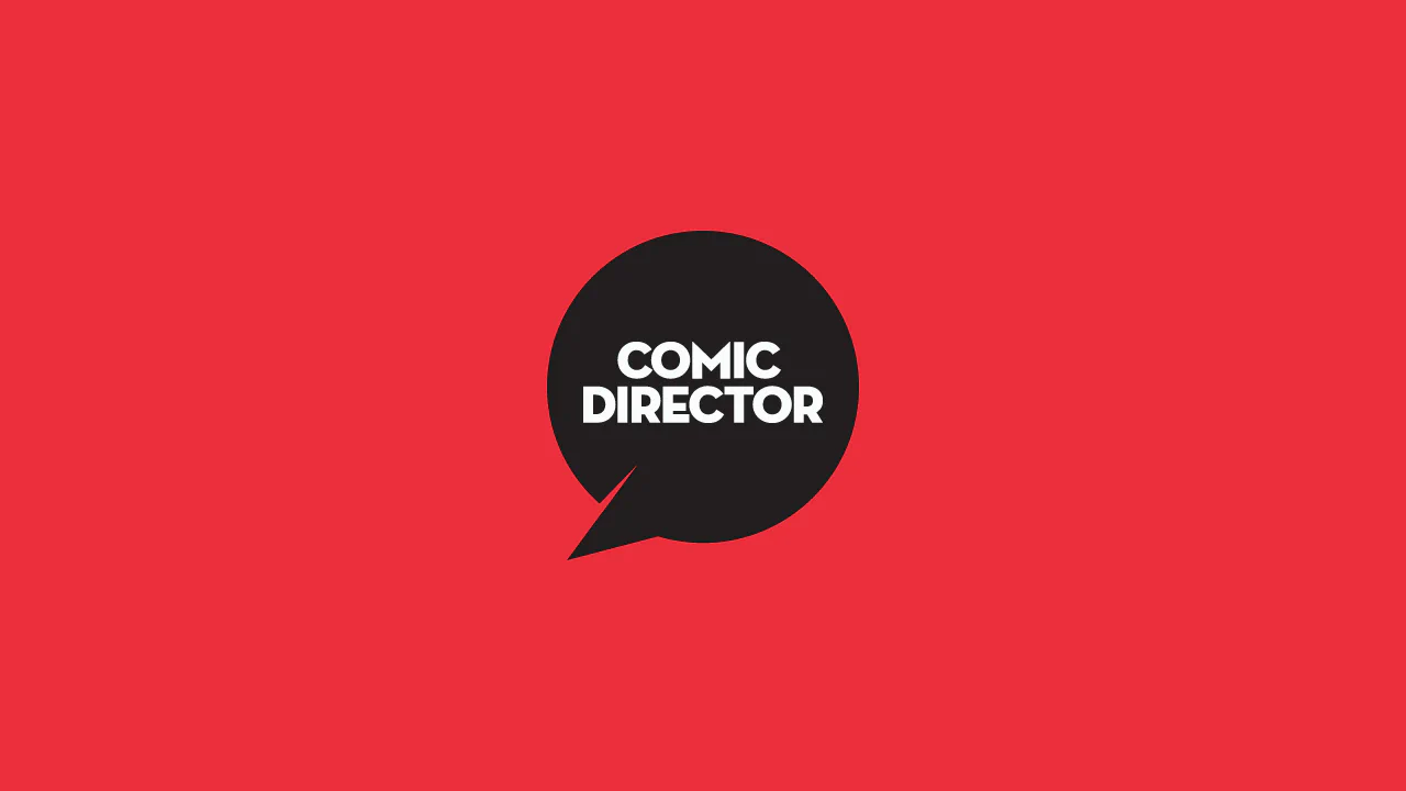
Comic Director Splash Animation
A dynamic splash screen where the layer reveal choreography is built on transform and transition-delay, applied to each element via :nth-child. The final layer “explodes” spectacularly using @keyframes and a custom cubic-bezier function, with the entire animation optimized for hardware acceleration.
See the Pen Comic Director Splash Animation.
A stylish “hipster” image card featuring a lifted paper effect created with rotated pseudo-elements and shadows.
A responsive masonry-style image gallery constructed using CSS floats and media queries to manage varied tile dimensions.

Dual Sliding Panels
An adaptive split-screen layout where panels unfold in 3D - along the Y-axis on desktop and the X-axis on mobile. A JS controller manages the state via classes, while all the complex animation, optimized with will-change and perspective, is written in Stylus.
See the Pen Dual Sliding Panels.
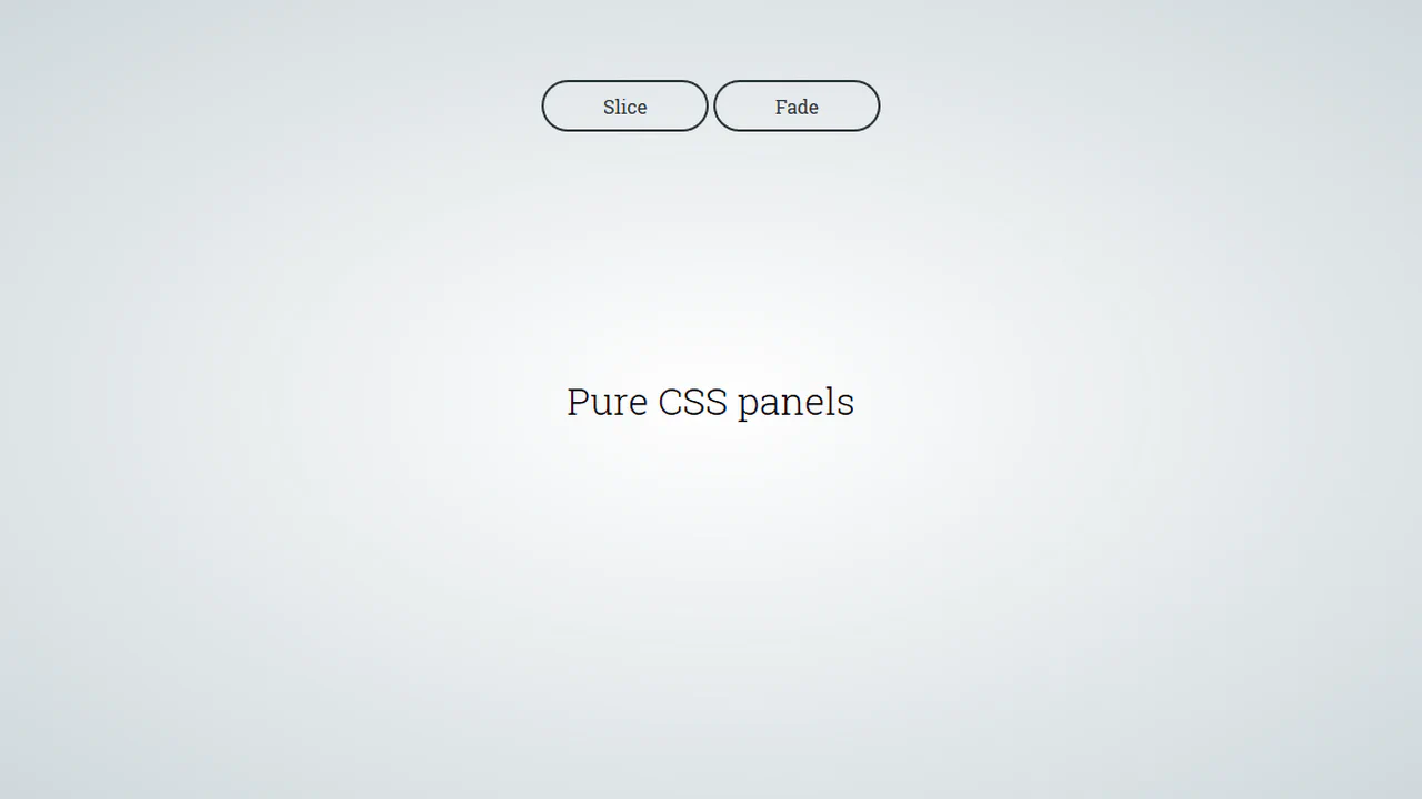
Pure CSS Panels
A pure CSS solution for full-screen panels controlled via :target - clicking a link triggers their appearance animation. It demonstrates various effects with a two-stage animation: first the panel appears, then its content follows with a transition-delay.
See the Pen Pure CSS Panels.

Pure CSS Magazine Style
This interactive flipbook component uses CSS perspective and rotateY transforms to create a physical page-turning effect. State management relies on radio inputs and complex sibling selectors, avoiding JavaScript entirely. GPU-accelerated layers and clip-path masks ensure smooth transitions for visual content. The architecture prioritizes structural modularity and performance-oriented motion.
See the Pen Pure CSS Magazine Style.
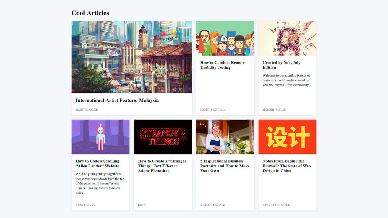
Card Grid
A responsive article layout built with CSS Grid that adapts from a single column stack to a complex four-column grid.
See the Pen Card Grid.
Link Split Hover Effect
A “tearing” text effect created by layering two <span>s with an asymmetrical clip-path. On hover, transform shifts the top part, ::after pseudo-elements draw the tear line, and an underline animates via background-position - the entire choreography is managed by transition-delay and a custom cubic-bezier function.
See the Pen Link Split Hover Effect.
Hover Effect #2
A performant text-swapping effect on hover, built on a synchronized animation - the original <span> is displaced by a ::after pseudo-element. The replacement content is sourced from a data-replace attribute via attr(), while smoothness and performance are ensured by transform: translate3d and a custom cubic-bezier function.
See the Pen Hover Effect #2.
This is a dynamic radial menu built purely with HTML/CSS, where elements deploy on hover using the CSS transform: rotate() technique and smooth transitions, controlled by SASS variables. It showcases current techniques for complex hover animations, cross-browser compatibility via vendor prefixes, and precise interactivity control using pointer-events: initial.
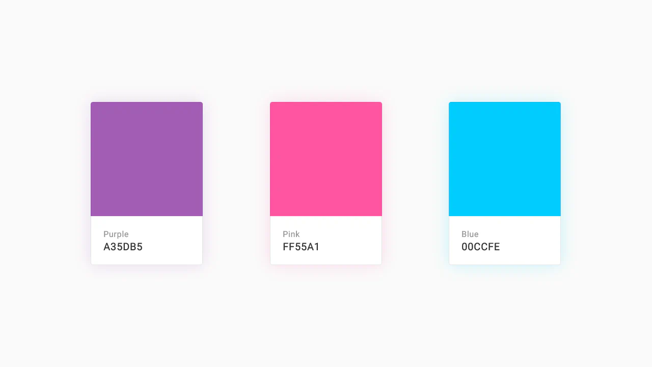
Color Palette
A responsive Flexbox grid featuring interactive cards that combine smooth transition and a @keyframes animation on hover. The implementation focuses on performance - using will-change - and styling flexibility through SASS variables and currentColor.
See the Pen Color Palette.
Recipe Card
An interactive recipe detail modal technically implemented via JavaScript class toggling to trigger a complex, two-stage CSS transition - this creates a sliding panel effect; the demo uses gradients for the background, animates inner details, includes a zoom effect on the image on hover, and rotates the toggle icon using transform: rotate().
See the Pen Recipe Card.
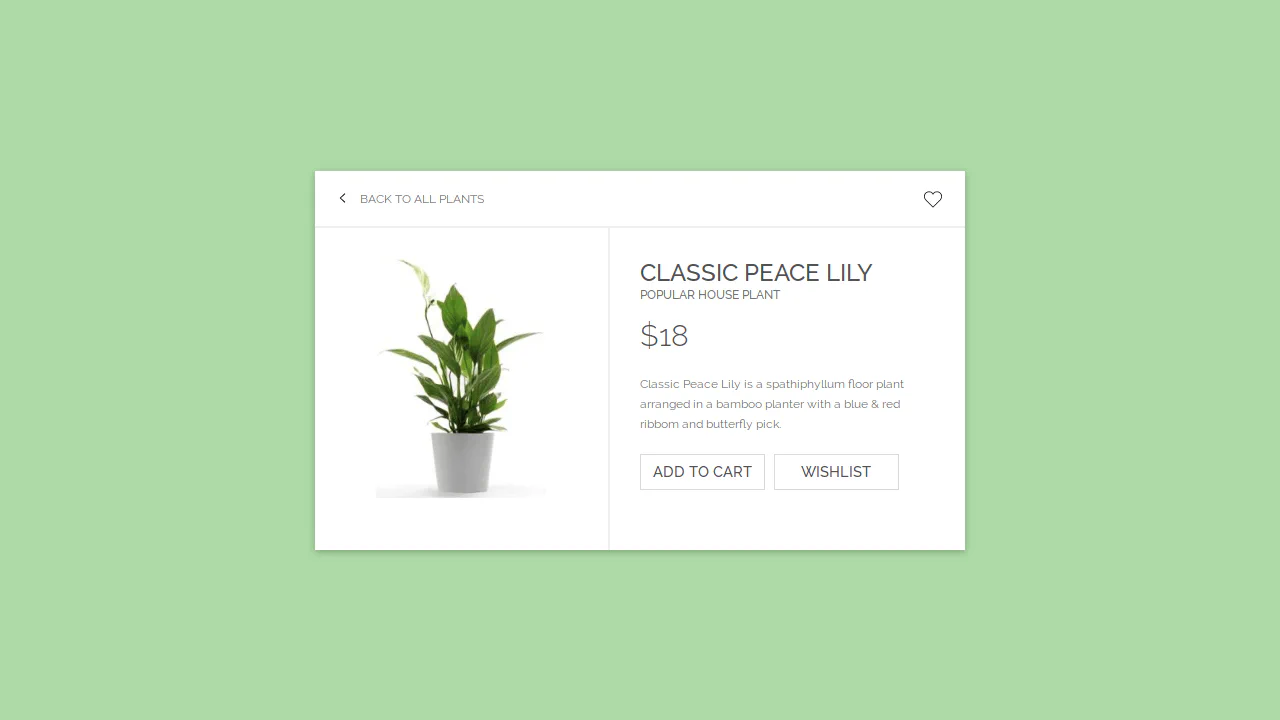
E-Commerce Card
This interactive card template, built with Sass/CSS, showcases a clean and flexible layout centered using transform: translate, focusing on smooth transition effects for box-shadow and detailed styling of interactive elements like buttons and SVG icons using the :hover pseudo-class.
See the Pen E-Commerce Card.

Movie Card Interactive UI
A horizontal card built with preprocessors (Sass/Pug) and a classic float layout. It demonstrates complex interactive elements in pure CSS - a “star” rating on radio inputs and a button with a smooth transition animation of its color and background icon on :hover.
See the Pen Movie Card Interactive UI.
Material Card with Animated Featured Image
A pure CSS card transformation effect on :hover, where a circular background element morphs into a rectangle via a transition of the border-radius property, while a custom cubic-bezier(.3, 0, 0, 1.3) function gives the motion a unique “elasticity”.
See the Pen Material Card with Animated Featured Image.