170+ CSS transition Examples (Page 6)
Examples
Material Cards
A responsive card grid on Flexbox, using SCSS with variables for easier style management. A complex transition effect fires on :hover, synchronously animating the box-shadow for a “lift” effect, text colors, and the width of a dynamic header underline.
See the Pen Material Cards.
3D Flip Card
A practical approach where a spectacular 3D flip is implemented in pure CSS, complemented by a small jQuery script for dynamically substituting background images from data-image attributes.
See the Pen 3D Flip Card.

3D Flipping Cards
A classic 3D card flip on :hover within a perspective container, plus an elegant solution for auto-numbering items using CSS counters.
See the Pen 3D Flipping Cards.
An interactive SCSS business card where a hover triggers an elegant choreography of animations: multiple elements transform simultaneously via transition and transform: translateY to smoothly reveal hidden contact information.
A spectacular 3D card flip on click, implemented through a combination of jQuery’s toggleClass and CSS transforms - the animation is enhanced with hover effects and a delayed content reveal on the back using transition-delay, while backface-visibility: hidden ensures a clean execution.
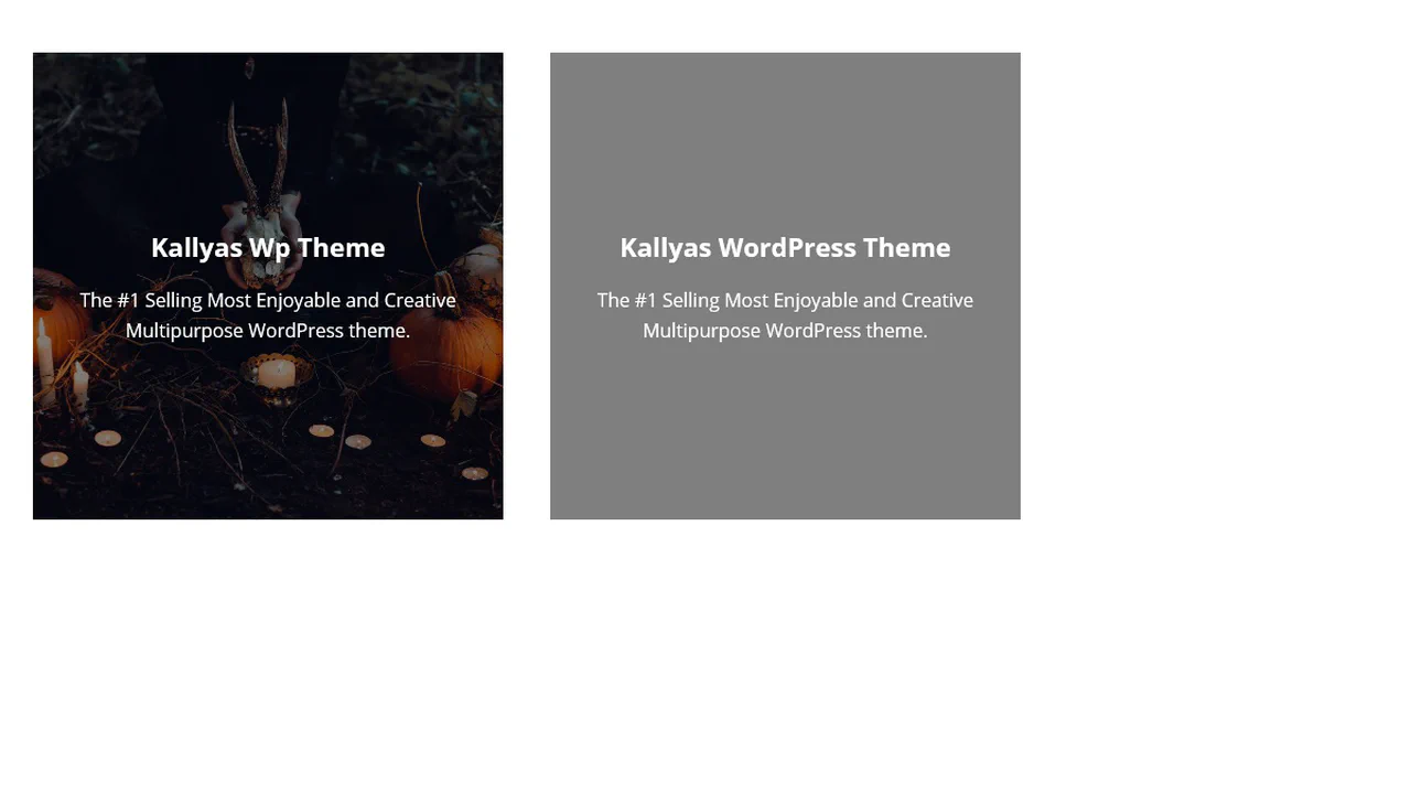
CSS Blog Card
A SCSS card with a multi-layered structure, where a text block smoothly “slides up” on hover. Dimensions and colors are defined by variables, while z-index and position: absolute are used to manage layers of text and overlays that darken the background for better readability.
See the Pen CSS Blog Card.

Attractive Play Button
This interactive play button uses synchronized SVG stroke manipulation for its hover effect: the solid stroke fades out and dashes off, while the dotted stroke fades in and increases its width to take its place.
See the Pen Attractive Play Button.
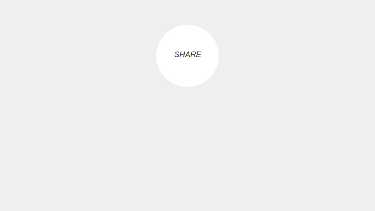
Simple Share Button
A “split-button” effect in pure CSS where two social media buttons, hidden outside a circular container with overflow: hidden, slide in on hover of their common parent. An ::after pseudo-element displays default text, which is then overlapped by the buttons with a higher z-index, creating a smooth UI transition.
See the Pen Simple Share Button.
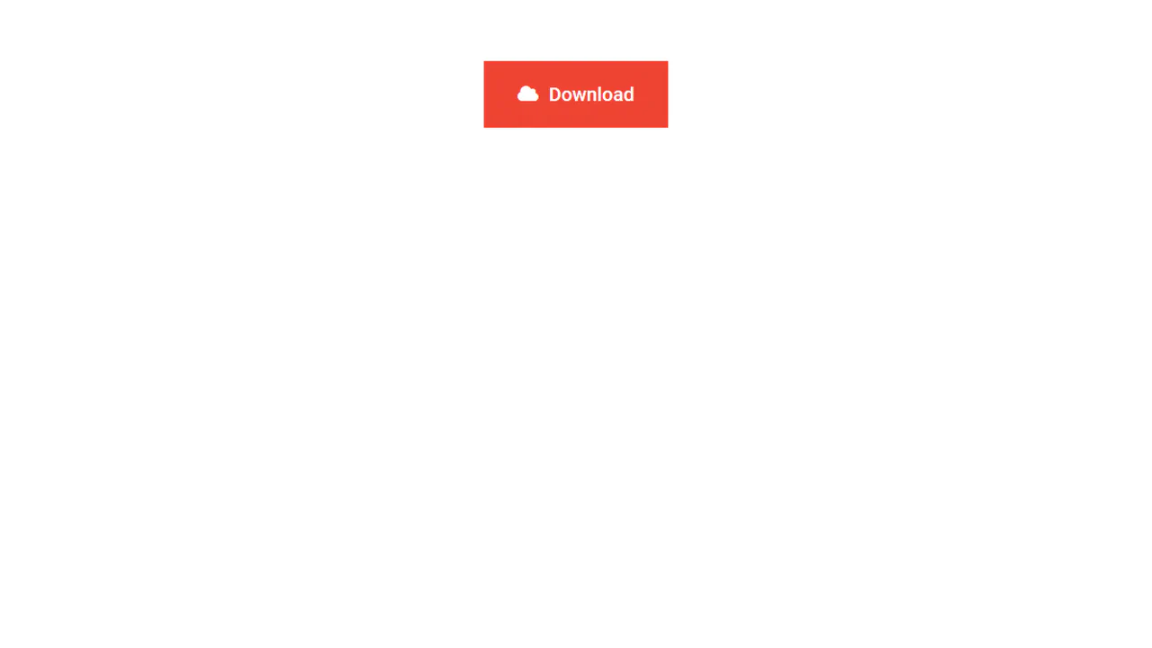
Download Button with Sliding Information
A technique for creating a two-state button where overflow: hidden on the parent container hides content that moves outside its bounds. A transition: margin .4s ensures the smooth animation of .face-primary’s shift on hover.
See the Pen Download Button with Sliding Information.

Close Button
A “close” icon created in pure CSS from two pseudo-elements. On hover, both lines forming the cross smoothly rotate 180 degrees using transform: rotate(180deg) and transition.
See the Pen Close Button.

Back To Close
Creation of a complex icon from three <span> elements that form a “back” arrow in one state and reconfigure into a cross in another state with the .open class. JavaScript is used solely for toggling the state.
See the Pen Back To Close.
Multi-Button Animation
This multi-button group features a simultaneous text shift and icon slide-in effect, achieved by animating the right position and opacity of the span:after pseudo-element on hover.
See the Pen Multi-Button Animation.
Animated Ghost Button 2
The button features a complex, non-linear hover effect powered by a cubic-bezier transition curve and CSS transform: translate3d applied to the inner .mask element, creating a sweeping diagonal light wipe effect.
See the Pen Animated Ghost Button 2.
Ghost Button Animation
This SASS component defines two aesthetically consistent styles (.bttn and .bttn-dark) using centralized color variables and implements a distinctive “slide-out” hover effect by animating the ::before pseudo-element’s left and right properties from 50% to 0.
See the Pen Ghost Button Animation.
Action Button with Checkbox Trick
A complex mobile app UI built entirely on the CSS “checkbox hack” - four independent <input type="checkbox"> elements are used to control different states: opening a menu, showing an overlay, switching cards, and hiding elements.
See the Pen Action Button with Checkbox Trick.
Retro CSS Slideshow
A demonstration of how two independent, infinite @keyframes animations can be layered to create a complex visual sequence. One set of animation-delay manages the colored transitions, while the second controls the smooth appearance of the background images, creating a dynamic slideshow effect.
See the Pen Retro CSS Slideshow.
A Figure with a Figcaption
Showcases advanced layering using z-index and :after pseudo-elements to introduce a large, animated overlay with new content upon hover. The design strategically uses this overlay to conceal the primary <figcaption> via a strong negative translateY transformation.
See the Pen A Figure with a Figcaption.
This card demonstrates JavaScript-driven hover interactivity where jQuery handles the state change, transitioning the main overlay’s opacity and triggering a dynamic transform: scale() effect on the heading element. It showcases layered content, including nested images, within the primary caption area.
Figure & Figcaption
Transform a simple image block into a rich UI card by combining semantic markup with complex visual styling. The design uses a background expansion technique for the caption, where a growing ::before element creates a clean, animated fill-in effect upon interaction.
See the Pen Figure & Figcaption.

Dictionary Book
This demo achieves a striking 3D page-flipping effect by masterfully employing perspective and transform-style: preserve-3d on the book container. Crucially, the animation uses rotateY(-180deg) with a fixed transform-origin: left center to simulate a physical book spine opening via a smooth transition.
See the Pen Dictionary Book.
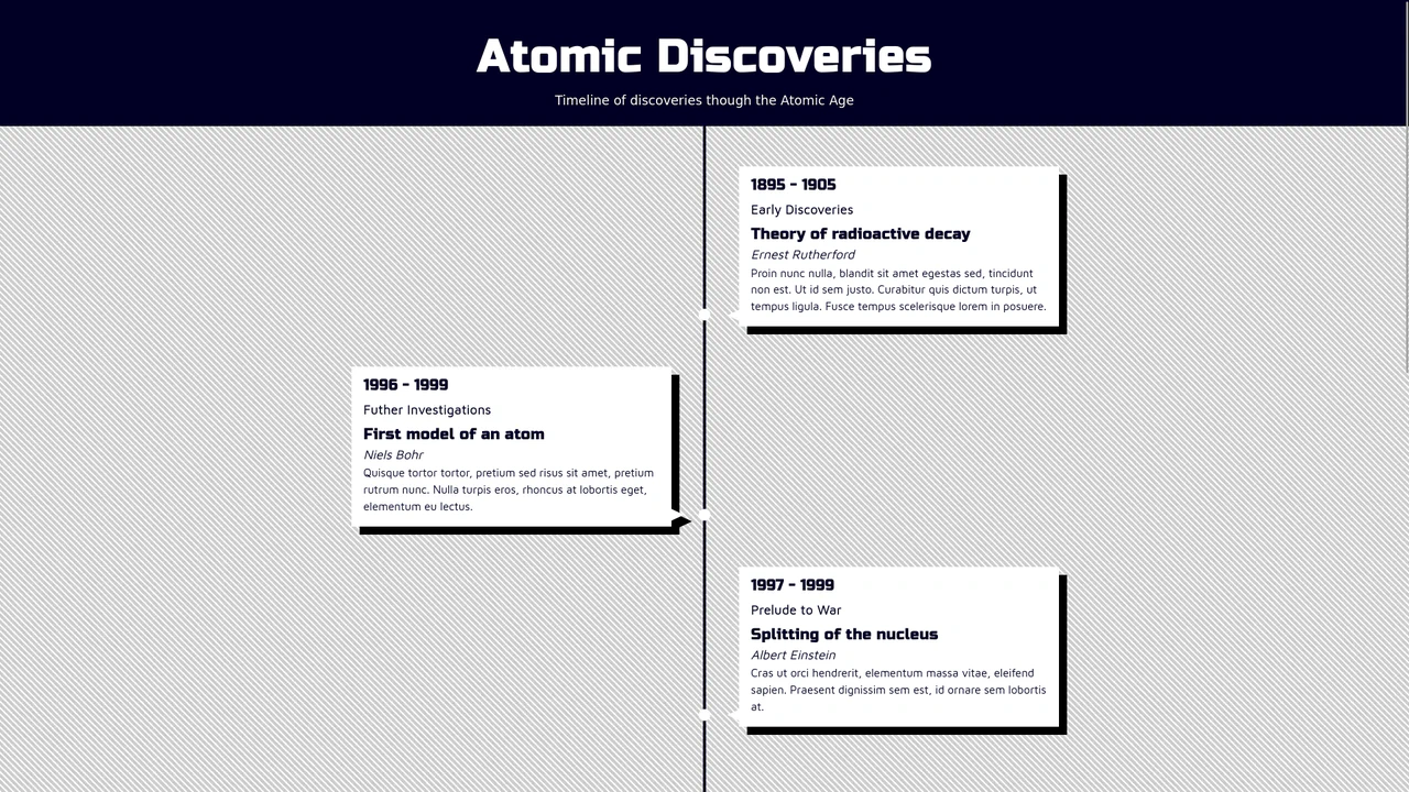
Animated Vertical Timeline with React Hooks
A dynamic React vertical timeline that utilizes a custom useScrollPosition hook with useLayoutEffect for high-precision scroll position tracking and creating a “fade-in on scroll” visual effect.
See the Pen Animated Vertical Timeline with React Hooks.
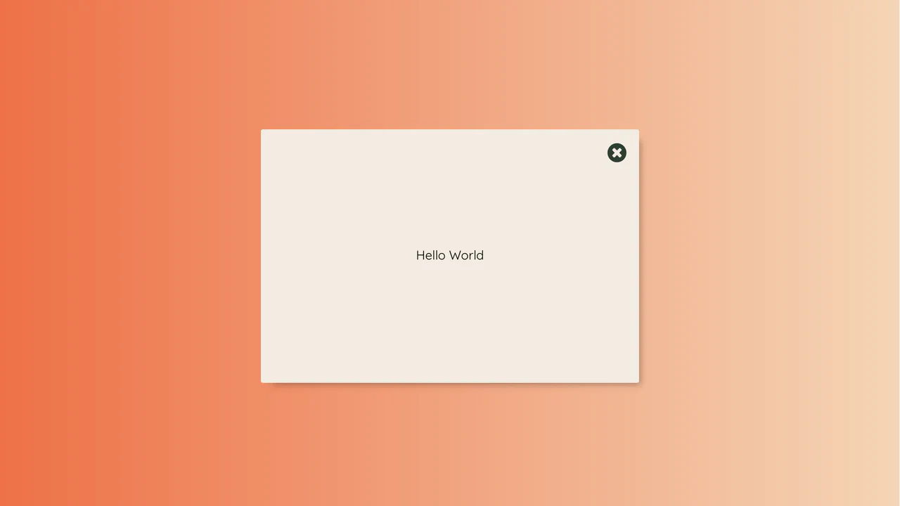
React Modal Button Animation with Pure CSS Transitions
This demo showcases a visually striking modal: the opening/closing effect is achieved entirely through pure CSS transitions and aggressive scaling, managed by toggling a single class based on the React state.