10+ CSS Triangle Backgrounds: Free Examples & Code Snippets
Triangle backgrounds bring a geometric, low-poly aesthetic to web interfaces, adding structural depth and visual rhythm without heavy SVG or raster assets. Pure CSS triangles enable designers to build architectural, tessellated backgrounds that feel dimensional yet remain lightweight.
- These patterns use clip-path: polygon() on pseudo-elements or sharp gradient stops within linear-gradient functions to render triangular shapes directly on the compositor thread without allocating DOM nodes.
- The legacy border trick creates triangles by rendering thick transparent borders with a colored edge — though functional, this approach increases paint complexity by forcing the browser to compute extra border geometry.
- Modern implementations combine multiple gradient layers with precise angle stops and background-size values to generate seamless low-poly tessellations that scale infinitely without gaps or overlapping artifacts.
Browse this collection of CSS triangle backgrounds to master geometric, zero-image texture rendering that brings architectural precision to your landing pages and hero sections.
Table of Contents:
Examples

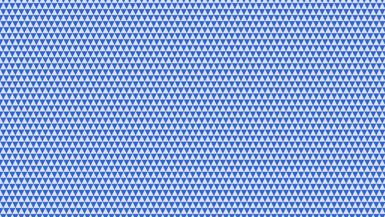
Background Triangle Pattern
A clever technique for creating triangles using CSS border (width: 0; height: 0; border: ... solid transparent). The transparent side and top borders allow border-bottom to form a triangle, and its color is cyclically changed via the SCSS selector :nth-child(5n+...).
See the Pen Background Triangle Pattern.
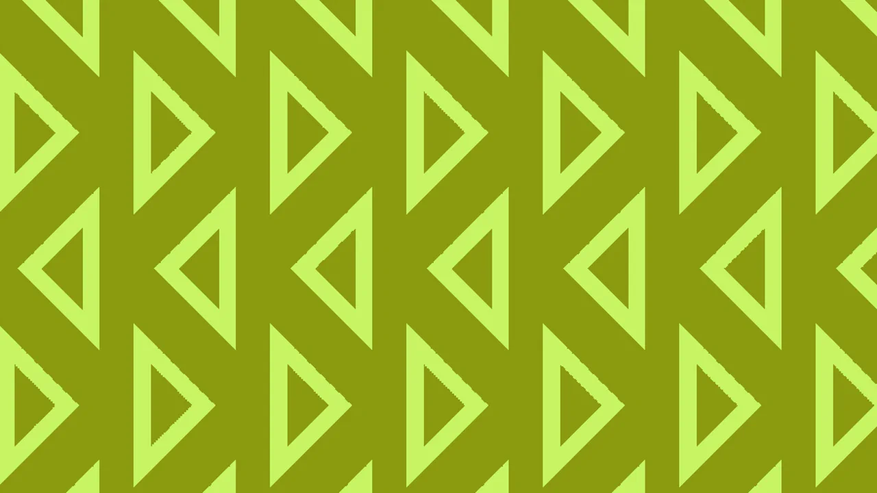
The Half-Rombes Pattern
The use of the atan() function in SCSS to calculate the angles for a conic-gradient, which allows for the creation of a complex geometric pattern. The entire page background is set with a single background property, demonstrating the power and conciseness of modern CSS.
See the Pen The Half-Rombes Pattern.
Another CSS Pattern
A sophisticated pure CSS geometric pattern created using layered conic gradients and custom properties. This lightweight and scalable background solution ensures high frontend performance and easy customization via CSS variables, eliminating the need for external image assets.
See the Pen Another CSS Pattern.
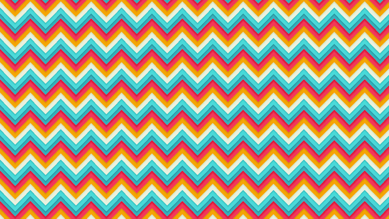
Colored Paper
A vibrant multi-colored chevron pattern built entirely with SCSS and a complex stack of linear gradients. This performant snippet leverages mathematical calculations for offsets and color functions like darken(), offering a scalable, image-free background solution for modern frontend development.
See the Pen Colored Paper.
Random Triangle Background
A dynamic geometric pattern powered by SCSS loops and randomized color palettes for a vibrant kaleidoscope effect. This snippet leverages pure CSS animations and border-width tricks to create a high-performance, interactive background ideal for modern and creative UI/UX designs.
See the Pen Random Triangle Background.
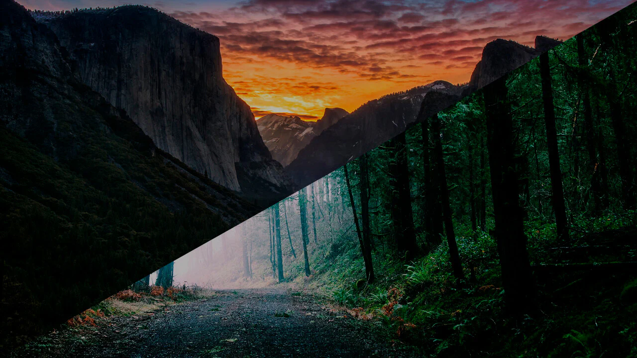
Responsive Triangle Background Images
A modern technique for creating a responsive background layout using the CSS clip-path property. This snippet showcases how to split the viewport into triangular sections with background images, offering a high-performance, JavaScript-free solution for striking hero sections.
See the Pen Responsive Triangle Background Images.
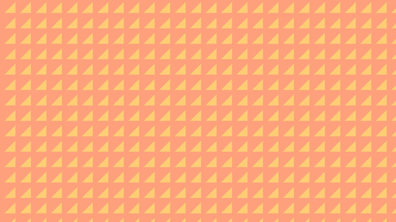
Triangle Pattern
A minimalist pure CSS geometric pattern constructed with a single linear gradient for optimal rendering performance. This snippet allows for instant customization of scale and color through SCSS variables, providing a lightweight, image-free solution for modern web backgrounds.
See the Pen Triangle Pattern.
Triangles Animation
A dynamic geometric background built with SVG polygons and CSS keyframe animations. This performance-oriented snippet creates a professional drifting effect with layered depth, making it an ideal lightweight solution for modern frontend interfaces and tech-focused hero sections.
See the Pen Triangles Animation.
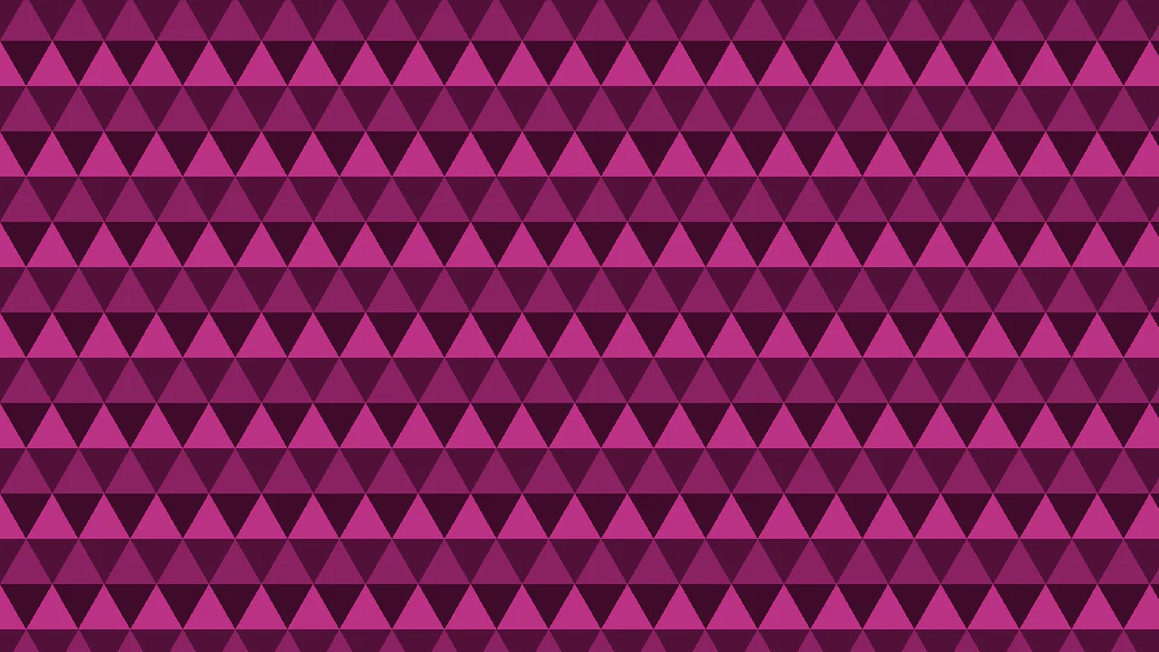
Triangular Grid
A sophisticated pure CSS geometric pattern implemented as a Stylus mixin using mathematical trigonometric calculations. This snippet creates a seamless triangle background through layered linear gradients, ensuring high frontend performance and easy customization with zero external image assets.
See the Pen Triangular Grid.
Pure CSS Triangle Grid Tile Flip
CSS 3D tile flip animation with triangular tiles in a grid (12 rows × 7 columns). Each .tile uses ::before / ::after pseudo-elements to form the two faces of an equilateral triangle via clip-path: polygon(...). Tiles alternate parity (--p: 0/1) for staggered timing. The @keyframes r rotates each tile 180° around the X axis (0.5turn → 1turn). The @keyframes f animates brightness for a lighting effect.
See the Pen Pure CSS Triangle Grid Tile Flip.

Triangle Background
A single <div> creates a repeating triangle pattern using two linear-gradient layers. background-image uses linear-gradient(120deg, transparent 114px, #65b1b3 114px) and linear-gradient(240deg, ...) with background-size: 93px 92px to tile teal triangles on a white background.
See the Pen Triangle Background.

Two Triangles Background
A single <div class="box"> creates a diagonal split background. The div fills the viewport with background-color: white. Its ::after pseudo-element uses the border trick — border-top: 100vh solid #008ce6 and border-right: 100vw solid transparent — forming a blue triangle that covers the top-right half. The result is a two-tone diagonal background.
See the Pen Two Triangles Background.

3D Triangles Tessellated Pattern. No Div. Pure CSS
Pure CSS 3D tessellated triangle pattern — no HTML elements, no JavaScript. Built entirely with conic-gradient and linear-gradient layers on the <html> element. Uses five dark shades (#050505 to #363636) and custom properties (--u for unit scaling, --gp for repeating tile size). The stacked gradients create an isometric 3D triangle grid with shading and depth.
See the Pen 3D Triangles Tessellated Pattern. No Div. Pure CSS.

Triangle Pattern
A 5×5 CSS grid of alternating up/down triangles using the border trick (CSS-Tricks “Shapes of CSS”). .tr-up uses border-top, .tr-down uses border-bottom to form triangles. Silver triangles point up, gold triangles point down in a checkerboard pattern.
See the Pen Triangle Pattern.