30+ CSS Triangles: Free Code Snippets & Examples
Triangles are the most fundamental geometric UI primitive — they point, indicate, and highlight with minimal visual weight. CSS triangles use clip-path polygons and the classic border hack to create directional shapes that scale with content.
- Each triangle uses
clip-path: polygon()with three coordinate pairs to define the vertex positions, creating precise isosceles, right-angle, or equilateral triangles that scale proportionally with the container. - The classic border hack uses three transparent borders with one solid-colored border, creating a triangle shape that works in all browsers without requiring CSS clip-path support.
- Semantic HTML with
aria-hidden="true"on purely decorative triangles ensures screen readers ignore the visual shape, whilearia-expandedon trigger elements communicates direction changes.
Browse the collection to find a triangle technique that fits your geometric needs — from small directional arrows for dropdown indicators to large hero section triangles used as background overlays.
Table of Contents:
Examples
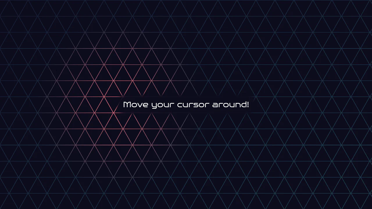
Geometric Glowing Triangle Mask Grid
Geometric Glowing Triangle Mask Grid creates an interactive mesh overlay by dynamically calculating and appending CSS border triangles to mask a neon background. The layout binds a mouse-tracking #glow radial gradient to the cursor, while modern CSS @property interpolates color shifts directly in keyframe animations. However, running heavy JS-based DOM recalculations on window.onresize combined with moving massive layout-disrupting absolute positions like top/left on every mousemove can cause paint pipeline bottlenecks, which are easily alleviated by transforming with hardware-accelerated translate3d instead.
 Chrome 85+
 Edge 85+
 Firefox 128+
 Safari 16.4+
See the Pen Geometric Glowing Triangle Mask Grid.

Sci-Fi Glowing Triangle Loader
This is a Sci-Fi Glowing Triangle Loader. It animates three spheres along the edges of a neon-lit geometric path while rotating in 3D space. Its function is to serve as a high-fidelity visual placeholder during asynchronous data fetching, establishing a strong thematic aesthetic immediately upon application launch.
Chrome 104+
Edge 104+
Firefox 104+
Safari 14.1+
See the Pen Sci-Fi Glowing Triangle Loader.

CSS Triangles with pow() and sqrt()
A demonstration of creating perfectly equilateral CSS triangles using the native pow() and sqrt() mathematical functions inside calc(). This showcases how to achieve geometric precision without preprocessors, relying solely on modern CSS.
See the Pen CSS Triangles with pow() and sqrt().

Background Triangle Pattern
A clever technique for creating triangles using CSS border (width: 0; height: 0; border: ... solid transparent). The transparent side and top borders allow border-bottom to form a triangle, and its color is cyclically changed via the SCSS selector :nth-child(5n+...).
See the Pen Background Triangle Pattern.
Reverse clip-path with blend-modes
An SVG clipPath effect layering two triangle-shaped elements. The geometry is defined by a single path reference inside an invisible SVG, applied to multiple DOM divs. background-blend-mode creates an overlapping color effect, while clipPathUnits="objectBoundingBox" ensures the shape scales proportionally with the element’s size.
See the Pen Reverse clip-path with blend-modes.

CSS Triangles
A visual demonstration of the classic CSS triangle trick - shapes are created using thick borders on elements with zero width and height, and arrow direction is controlled with border-color: transparent.
See the Pen CSS Triangles.
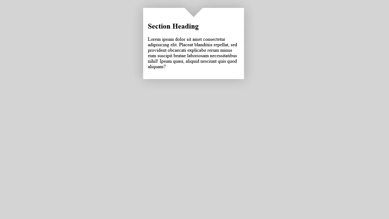
Triangle Cutout
“Cutout triangle” effect at top of block via inline SVG. Two pseudo-elements form left and right cutout halves using SVG polygons and linear gradient. drop-shadow creates shadow around entire shape. SCSS function escapes color for SVG injection.
See the Pen Triangle Cutout.

CSS Penrose Triangle
Abstract composition of six trapezoids creating optical 3D illusion. Elements absolutely positioned and transformed via skew and rotate. Gradients and semi-transparent borders create shadows and depth.
See the Pen CSS Penrose Triangle.

Landscape in a Triangle
CSS triangles and clip-path landscape. Mountains, trees, clouds, and dry grass built from border elements and transforms. Animations change colors and move clouds, simulating season change. SCSS variables control sizing.
See the Pen Landscape in a Triangle.
Pure CSS Animated Triangle Grid
Animated hexagonal grid from triangles. Each triangle — element with clip-path forming triangle, and two pseudo-elements creating pulsation and color inversion effects. Pug generates complex grid with positioning and animation variables.
See the Pen Pure CSS Animated Triangle Grid.
Pure CSS Prism Grid Wave
Rotating 3D grid of triangular prisms. Each prism — element with clip-path for triangular face and four rectangles for sides. Colors randomly generated from array. Whole structure slowly rotates in perspective.
See the Pen Pure CSS Prism Grid Wave.
Rotating Rounded Triangles Animation
Animated nested triangles composition. 15 .plane elements with animation delays create rotating spiral effect. Each triangle has pseudo-elements forming shadows and depth. Sizes increase with each level.
See the Pen Rotating Rounded Triangles Animation.
Triangle
Triangle with animated shadows. Main element scales (scale), two pseudo-elements with delay rotate, creating falling shadow effect. Gradients inside shadows add depth.
See the Pen Triangle.
Triangle
Star formed from triangles. Three triangles rotate and scale, changing colors at set stages. Container shrinks, rotator toggles 180° rotation via steps(1), creating stepped animation.
See the Pen Triangle.
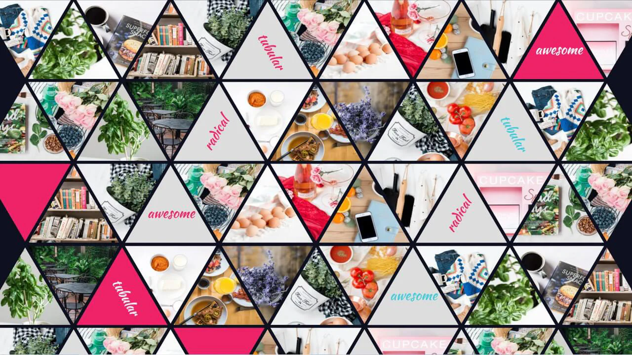
Triangle Grid with nth-child
Responsive hexagon grid with photos. Odd/even elements have opposite clip-path cuts, creating honeycomb. SCSS loop injects random Unsplash images. Some cells have text overlay.
See the Pen Triangle Grid with nth-child.
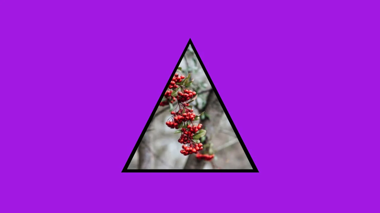
Bordered Image Triangle
Triangular picture frame via nested clip-path. Outer container clipped to triangle shape, inner image has same cutout with offset, creating frame effect. Sizes controlled by CSS variables.
See the Pen Bordered Image Triangle.
CSS 3D Triangle Spin
A 3D rotating prism constructed from ten layered segments. Each segment uses a background image slice derived from background-position and CSS custom properties (--i). The prism is animated using preserve-3d and rotated along the Y-axis, while ::before and ::after pseudo-elements create depth through angled faces and gradients.
See the Pen CSS 3D Triangle Spin.
Moving on a Penrose Triangle
A Penrose triangle illusion animated using CSS z-index toggling and keyframe-driven transformations. The structure consists of six skewed divs rotated at 120-degree intervals to create the impossible geometry. An animated ball moves across the shape using discrete keyframe positions, while a pseudo-element shadow maintains the illusion of depth by rotating in sync with the structure.
See the Pen Moving on a Penrose Triangle.
Slicing Triangles
A generative grid animation using CSS variables and conic/linear-gradient overlays. It maps index positions (--i, --j) to generate a synchronized wave effect. Each cell contains two pseudo-elements that scale using animation-delay calculations based on their distance from the center, creating a ripple-like distortion across the entire viewport.
See the Pen Slicing Triangles.
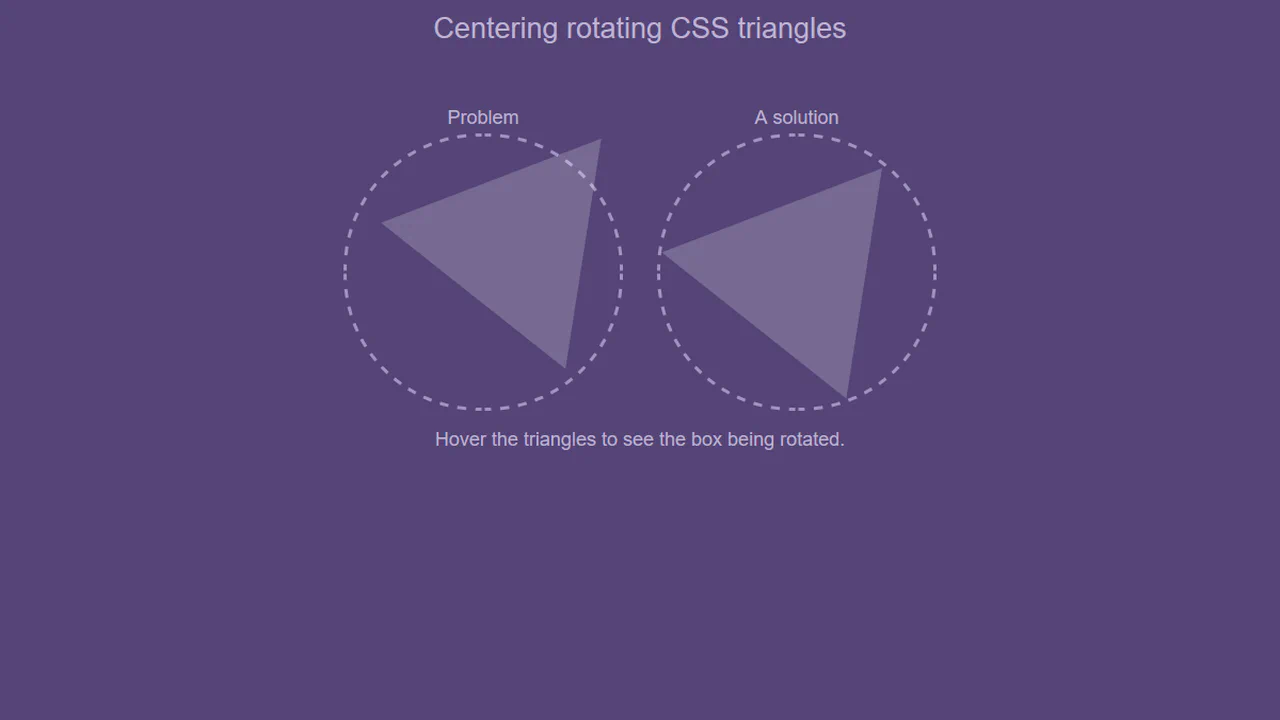
Centroid-Centred CSS Triangle
A comparison demonstrating how to properly rotate a CSS triangle around its visual centroid. Because default rotation centers on a bounding box, the “naive” approach swings off-axis. The solution uses an empty parent container with a defined size and a ::after pseudo-element to offset the triangle’s actual geometry, ensuring a perfectly stable spin.
See the Pen Centroid-Centred CSS Triangle.
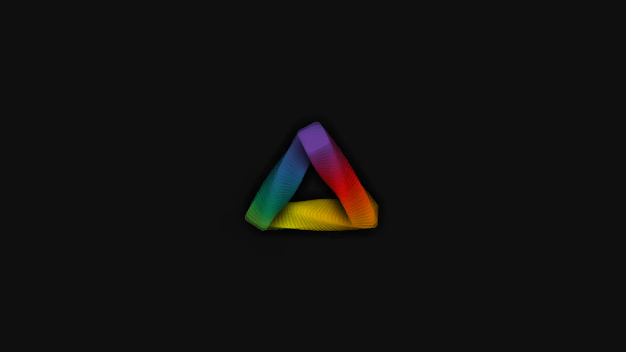
Chromatic Triangle
A high-performance chromatic orbital animation featuring multiple layers of oscillating rings. The layout uses three side-containers, each populated with dozens of div elements representing individual rings. Each ring is assigned unique animation-delay and margin values via CSS, creating a cascading wave effect. The cromatic keyframe loop generates continuous, synchronized color shifts.
See the Pen Chromatic Triangle.
CSS Only Triangle with Rounded Corners
A collection of rounded-corner CSS triangles achieved through complex mask compositions. By using conic and radial-gradient layers, the code subtracts shapes from a base triangle to simulate corner radii. The border-radius of the mask is controlled via the @property API, enabling smooth, animated transitions of the curvature when hovering.
See the Pen CSS Only Triangle with Rounded Corners.
CSS Tri Spinner
A pulsing triangular portal created using repeating-conic-gradient and geometric clip-path. The portal consists of a main element and its ::before pseudo-element, both clipped into a triangle. The animation shifts the background position with a custom cubic-bezier timing function, resulting in a hypnotic “inward-flowing” visual effect.
See the Pen CSS Tri Spinner.

Negative Triangle SASS Mixin
An interactive document folder built with absolute positioning and pseudo-elements. The folder flap is created by pairing border property triangles on ::before and ::after elements to form a tab, while CSS transitions handle the smooth paper reveal on hover. A simple jQuery toggle adds an “opened” state that slides the document away.
See the Pen Negative Triangle SASS Mixin.
Pyramid Triangle: Pure CSS Animation
A 3D rotating pyramid built with native CSS transform-style: preserve-3d and custom perspective transforms. The structure relies on nested face-wrapper elements that use precise matrix-like rotations and scaling to achieve geometric accuracy. Lighting is simulated through layered box-shadow insets and a dedicated photon shader overlay to add depth and realistic shading effects.
See the Pen Pyramid Triangle: Pure CSS Animation.
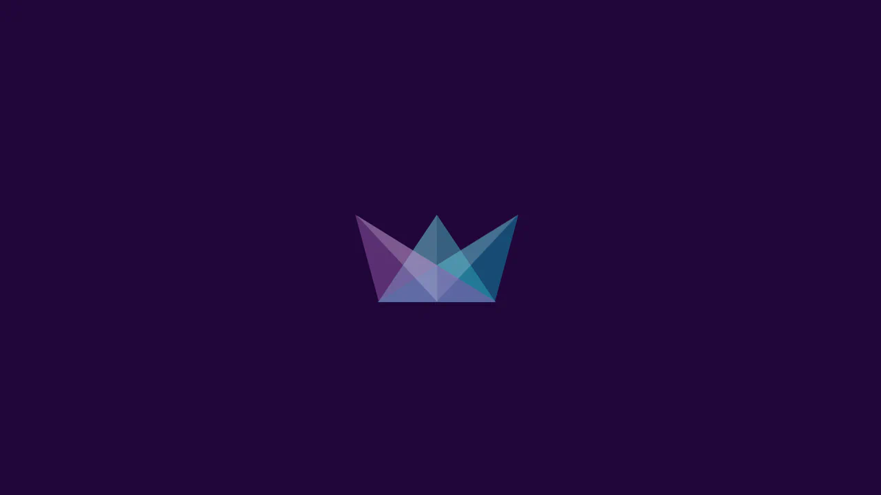
Triangles
An abstract geometric logo animation constructed entirely from li elements and ::after pseudo-elements using border-width tricks to create triangles. On hover, the fragmented shapes transition to a unified, rectangular layout via transform resets. It’s a clever study in geometric manipulation, using skew and rotate transforms to hide complex vector paths within simple list items.
See the Pen Triangles.

Penrose Triangle
A 3D-perspective triangle constructed using nested div elements and skewed pseudo-elements. The design uses layered transform properties (rotate, skew) to create depth. By carefully aligning overlapping elements with specific background colors, it mimics an isometric solid shape, showcasing structural composition and coordinate math in plain CSS.
See the Pen Penrose Triangle.
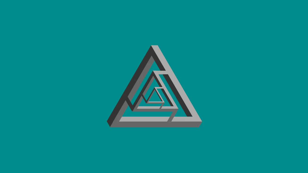
Penrose Triangle x3
A geometric tri-axis composition constructed entirely from absolute-positioned divs. The structure uses rotate and skew transforms to create isometric, interconnected bars. By layering scaled wrappers and connector elements, the design forms a complex, abstract 3D-like graphic, showcasing precise coordinate control and structural composition with pure CSS.
See the Pen Penrose Triangle x3.
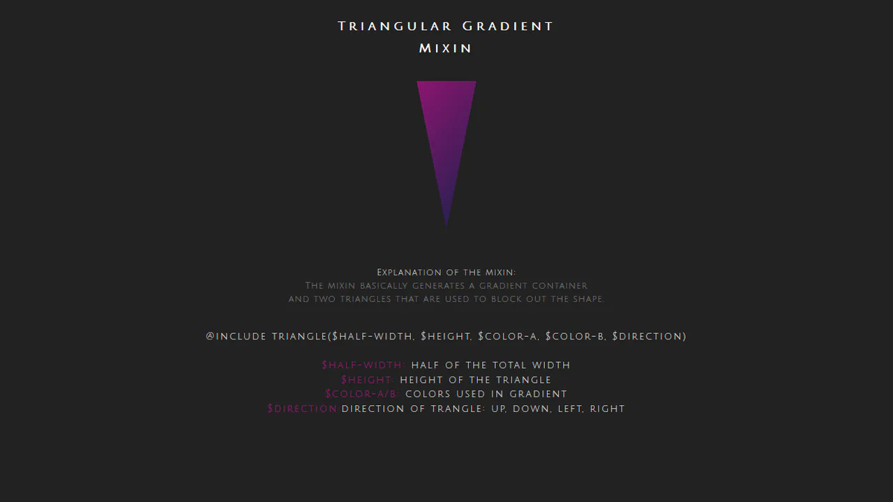
Quick gradient triangle mixin
A gradient-filled triangle generated by masking a rectangular container with two overlapping pseudo-element triangles. The core uses linear-gradient for the fill, while border properties on ::before and ::after carve out the shape against the background. This technique provides a clean, maintainable way to create responsive triangles with complex backgrounds.
See the Pen Quick gradient triangle mixin.

Double Triangle
A dual-column modular grid using CSS flexbox and absolute-positioned triangle overlays for visual accents. Each service card is composed of a content block paired with a decorative triangular wrap containing icons. Media queries handle responsive reflow, shifting layouts from side-by-side columns to a single-column stack with simplified geometry for mobile viewports.
See the Pen Double Triangle.