
Form Wave Animation
Clicking the input field doesn’t just slide the label up; instead, it playfully ‘hops’ letter by letter, adding a micro-interaction that brings the form to life.
See the Pen Form Wave Animation.
CSS wave effects establish dynamic, organic spatial rhythm across modern interfaces, introducing fluid section dividers and ambient background animations. By sliding and morphing periodic wave geometries natively, this styling system replaces hard horizontal cuts with natural, physics-inspired boundary transitions.
sin() and cos() to calculate smooth periodic node shifts natively.transform matrix directly on compositor layers.Explore these undulating layout patterns to integrate responsive, organic wave dividers and ambient liquid dynamics into your projects.
Table of Contents:
Clicking the input field doesn’t just slide the label up; instead, it playfully ‘hops’ letter by letter, adding a micro-interaction that brings the form to life.
See the Pen Form Wave Animation.
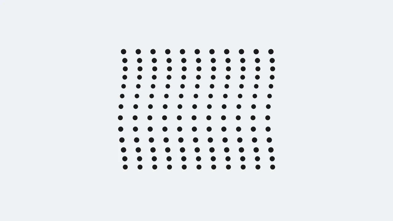
A dynamic field of black dots moving synchronously yet phase-shifted in time, forming complex geometric patterns reminiscent of moiré.
See the Pen Pure CSS Moiré Wave Dots.

This demo creates a captivating liquid wave illusion using a single ::before pseudo-element inside multiple overflow: hidden containers. The fluid motion is the result of two simultaneous @keyframes animations - one controlling top and the other transform: rotateZ.
See the Pen Pure CSS Liquid Wave Illusion.

Pure CSS ripple animation with neumorphic styling. Checkbox-triggered wave sequence using scale transforms and opacity transitions.
See the Pen Neumorphism Waves Animation.

Experimental visualization utilizing CSS Custom Properties (@property), the CSS Shapes module (shape()), and relative color syntax (hsl(from ...)). Fluid deformation of wave-like layers is achieved by animating clip-path with arc and line primitives. Background and graphic color states are synchronized via a shared --color variable, which transitions dynamically throughout the animation sequence.
See the Pen Pure CSS Waves.

Generation of wavy dividers using a Sass function that calculates points for clip-path via math.sin. The layout is dynamically inverted via the --p CSS Custom Property, which simultaneously controls element order and the color scheme through color-mix(), while negative margins ensure seamless section overlapping.
See the Pen Stacked Wave Dividers.
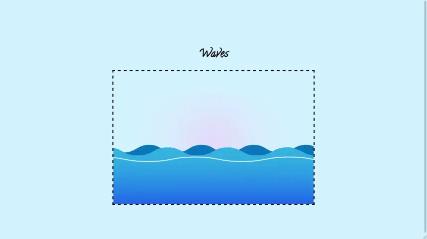
This lightweight demo showcases dynamic, animated waves built entirely with SVG and pure CSS keyframes, eliminating the need for complex JavaScript to create a smooth, scalable visual effect.
See the Pen Waves.
Native CSS path animations, driven by animating the SVG d property directly, calculate vector coordinate steps on the browser’s hardware-accelerated rendering pipeline. JavaScript canvas generators run continuous calculation loops on the main thread, introducing notable bundle payloads, rendering lag, and substantial input latency that degrades your INP score.
Continuous background motion can cause cognitive distraction and trigger notable vestibular distress. Developers must always isolate wave movement keyframes inside a @media (prefers-reduced-motion: reduce) block to instantly freeze the waves or gracefully degrade to a static vector layout.
Frame drops occur when overlapping transparent waves force the browser’s layout engine to perform continuous, demanding rasterization repaints. To optimize this, limit the number of active layers, isolate the wave wrapper using contain: strict, and apply will-change: transform to offload the animation entirely to the GPU compositor thread.
Modern browsers natively support math functions like sin() and cos(), allowing developers to programmatically generate organic wave oscillations directly inside stylesheets. By feeding a custom keyframe progress variable into these trigonometric formulas, you can calculate fluid harmonic motion natively without importing external JavaScript math frameworks.
Implement progressive enhancement using an @supports (clip-path: polygon(0 0, 100% 0, 0 100%)) query. For legacy browser engines, gracefully degrade the dynamic wave layout to a flat, straight solid border to preserve readability and visual usability.