9 CSS Zoom Effects: Free Examples & Code Snippets
CSS zoom effects provide interactive focal feedback inside responsive layouts, magnifying product grids, image cards, and modal states to draw immediate user attention. By transitioning scale properties natively inside stylesheets, these templates deliver fluid close-up interactions that feel tactile and lightweight.
- Standard visual scaling is calculated natively using the standalone scale property, allowing developers to isolate scaling from coordinate translations.
- Advanced entry animations utilize the modern @starting-style rule, enabling smooth zoom-in transitions directly from a
display: nonecontext. - To preserve INP (Interaction to Next Paint) performance, continuous scale transitions execute on GPU compositor layers to bypass demanding layout recalculations.
Master these performance-first scaling techniques to integrate zoom hover states and modal entrances into your projects.
Table of Contents:
Examples
Pure CSS Tilt & Zoom Grid on Scroll
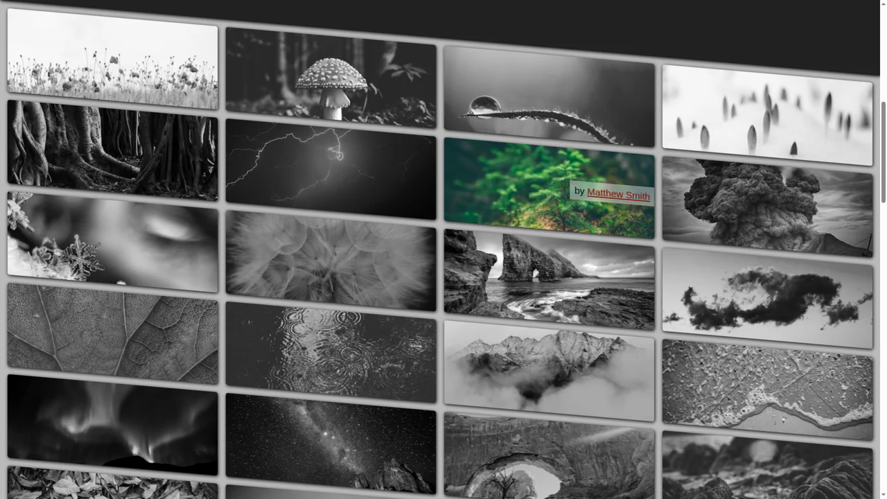
A cutting-edge pure CSS grid featuring scroll-driven animations and advanced trigonometric functions for dynamic tilt and zoom effects. It leverages @property and SVG displacement maps to create an immersive UI experience with maximum performance and zero JavaScript overhead.
See the Pen Pure CSS Tilt & Zoom Grid on Scroll.
Pure CSS: Radio Button Zoom Animation
An innovative radio button animation that leverages the modern CSS :has() selector and custom properties to create a dynamic background zoom effect. This lightweight snippet seamlessly integrates emoji icons and fluid color transitions, providing a high-impact micro-interaction for creative and performant web interfaces.
See the Pen Pure CSS: Radio Button Zoom Animation.

Image Cropped And Hover Zoom Effect
A responsive thumbnail grid built with Flexbox featuring a smooth CSS zoom effect on hover. This snippet utilizes outline-offset and backface-visibility to create a polished UI, delivering a high-performance interactive experience for image-heavy frontend projects.
See the Pen Image Cropped And Hover Zoom Effect.

Zoom Image
A lightweight CSS hover effect featuring smooth image scaling and a fading gradient overlay. This high-performance UI component utilizes transform: scale and opacity transitions, offering an engaging and responsive visual reveal for gallery or product cards.
See the Pen Zoom Image.
Zutto Zoom Images
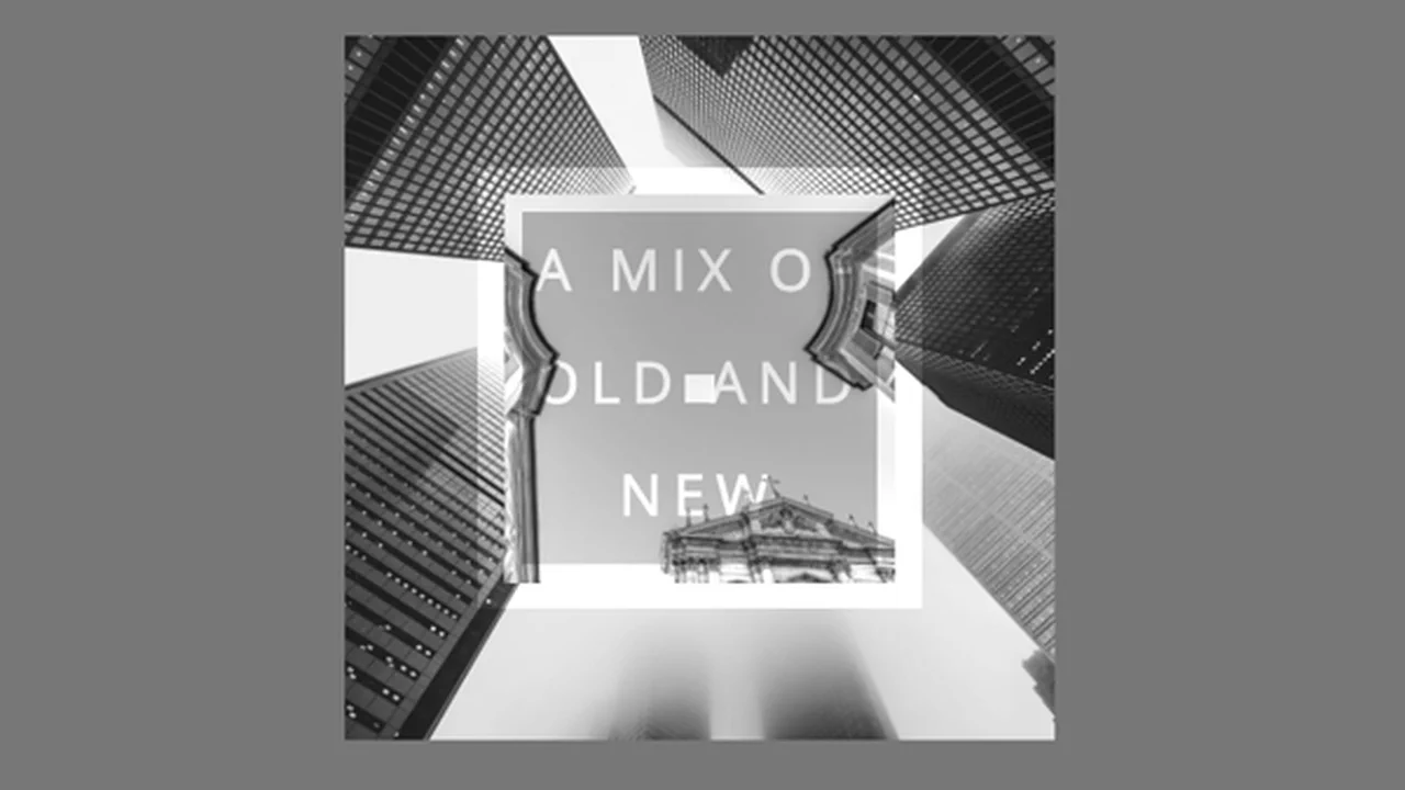
A creative pure CSS animation featuring infinite keyframes and staggered delays to produce a dynamic, multi-layered background effect. This snippet showcases the use of mix-blend-mode and hardware-accelerated translate3d transforms, providing a high-performance solution for eye-catching hero sections.
See the Pen Zutto Zoom Images.
Flexbox Responsive Calendar
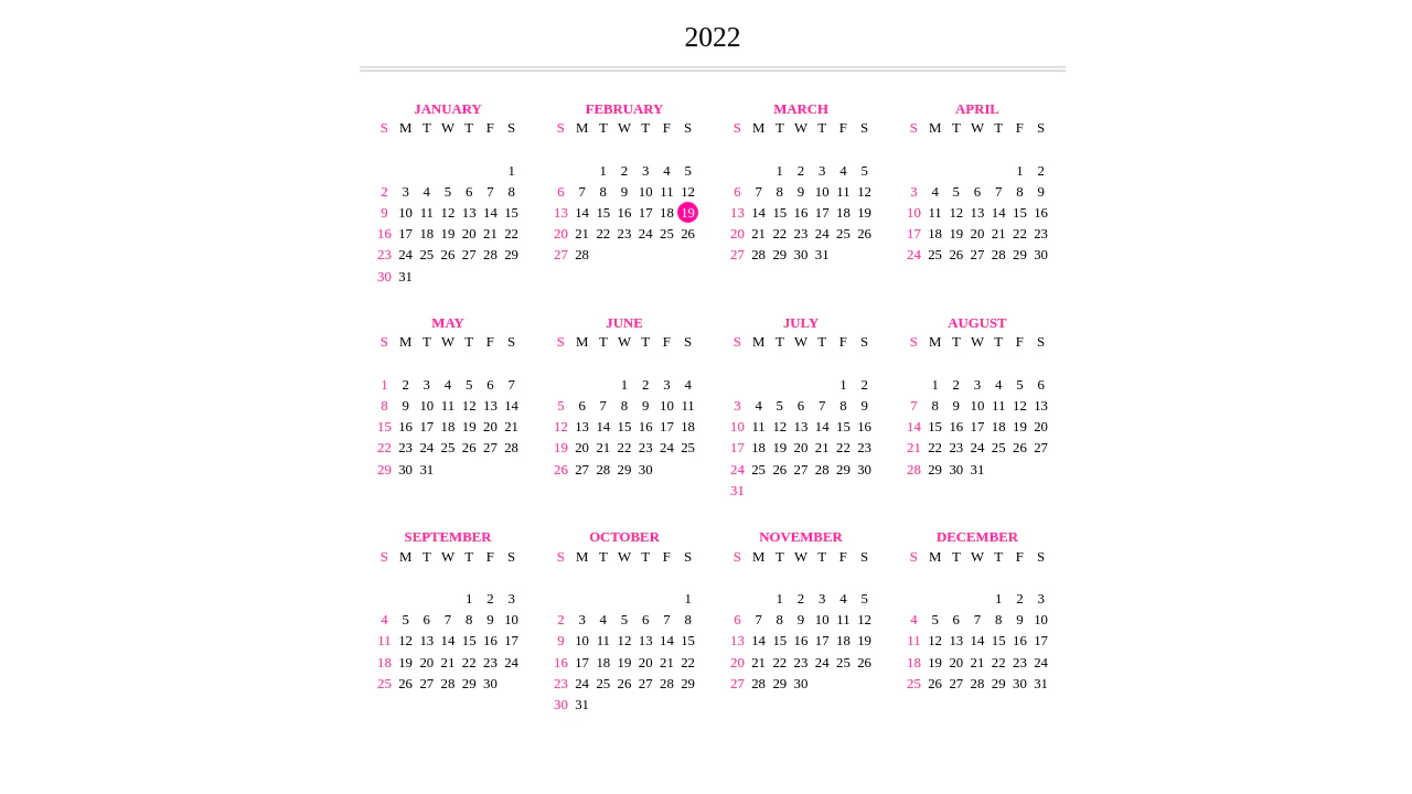
A dynamic yearly calendar generated via JavaScript DOM manipulation that accurately renders months and days using Flexbox ordering.
See the Pen Flexbox Responsive Calendar.
Recipe Card
An interactive recipe detail modal technically implemented via JavaScript class toggling to trigger a complex, two-stage CSS transition - this creates a sliding panel effect; the demo uses gradients for the background, animates inner details, includes a zoom effect on the image on hover, and rotates the toggle icon using transform: rotate().
See the Pen Recipe Card.
Shape Zoom Transition
A cinematic image transition powered by CSS mask-image, featuring a vector-based shape zoom effect to reveal underlying content. This performant snippet demonstrates advanced manipulation of mask-size and filter properties, offering a sleek, JavaScript-free solution for creative storytelling and immersive web design.
See the Pen Shape Zoom Transition.
Box with Magic Zoom Effect
An interactive CSS hover effect card designed for information-dense dashboards and security modules. This UI component leverages transform: scale and transition-delay properties to create a smooth content reveal animation, enhancing user engagement through polished and performant micro-interactions.
See the Pen Box with Magic Zoom Effect.