40+ HTML <details> and <summary> Examples
This collection showcases the native HTML mechanism for creating interactive content: the <details> and <summary> tags. Forget bulky JS libraries for accordions; this solution ensures high performance and out-of-the-box functionality. The demos illustrate how pure CSS can style the open state (via the [open] selector) and customize the default marker to build modern UI components.
Examples

Smooth Accordion with Parallax Images
An advanced semantic accordion using native <details> elements synchronized with a parallax image gallery. Height transitions are made fluid through modern interpolate-size: allow-keywords and complex linear() bounce easings. JavaScript connects active toggles to external navigation buttons, aligning the active image block to match disclosure states. (Requires: gsap.js, tweakpane.js)
 Chrome 129+
 Edge 129+
 Firefox 121+
 Safari 17.2+
See the Pen Smooth Accordion with Parallax Images.

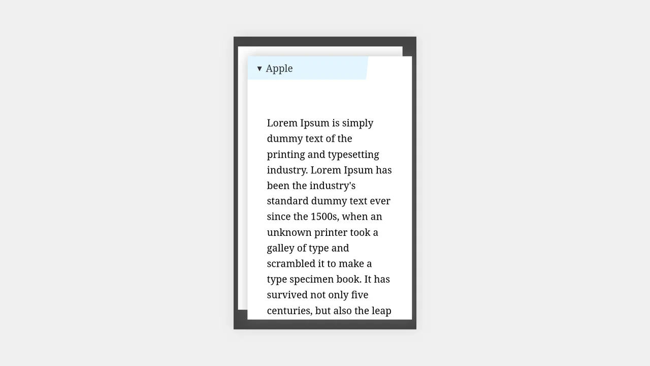
Apple-Style Smooth Animated Accordion
The Apple-Style Smooth Animated Accordion is a cutting-edge UI component that achieves high-end animation results without a single line of JavaScript. Inspired by the sleek marketing pages of Apple, it utilizes the newest CSS specifications to solve the age-old problem of animating to height: auto while maintaining full accessibility through semantic HTML.
Chrome 131+
Edge 131+
See the Pen Apple-Style Smooth Animated Accordion.

Pure CSS Animated Details Accordion
This Pure CSS Animated Details Accordion utilizes cutting-edge CSS functions to achieve smooth height transitions on native HTML elements without a single line of JavaScript. By leveraging the revolutionary calc-size() function and the ::details-content pseudo-element, it finally solves the age-old problem of animating from height: 0 to height: auto.
Chrome 129+
Edge 129+
See the Pen Pure CSS Animated Details Accordion.

Dropdown Menu with Tailwind and Alpine.js
A native <details> dropdown component enhanced with Alpine.js for state management and smooth transitions. It features a rotating chevron icon, a custom-styled summary that removes the default marker, and a checklist where selected items are boldly highlighted using Tailwind CSS peer-checked utilities.
See the Pen Dropdown Menu with Tailwind and Alpine.js.

CSS Accordion with Custom Animated Arrows
A pure CSS accordion based on native <details>/<summary> elements, where the standard marker is hidden, and a custom animated chevron arrow is created and controlled exclusively via clip-path: polygon() and the rotate property upon expansion.
See the Pen CSS Accordion with Custom Animated Arrows.

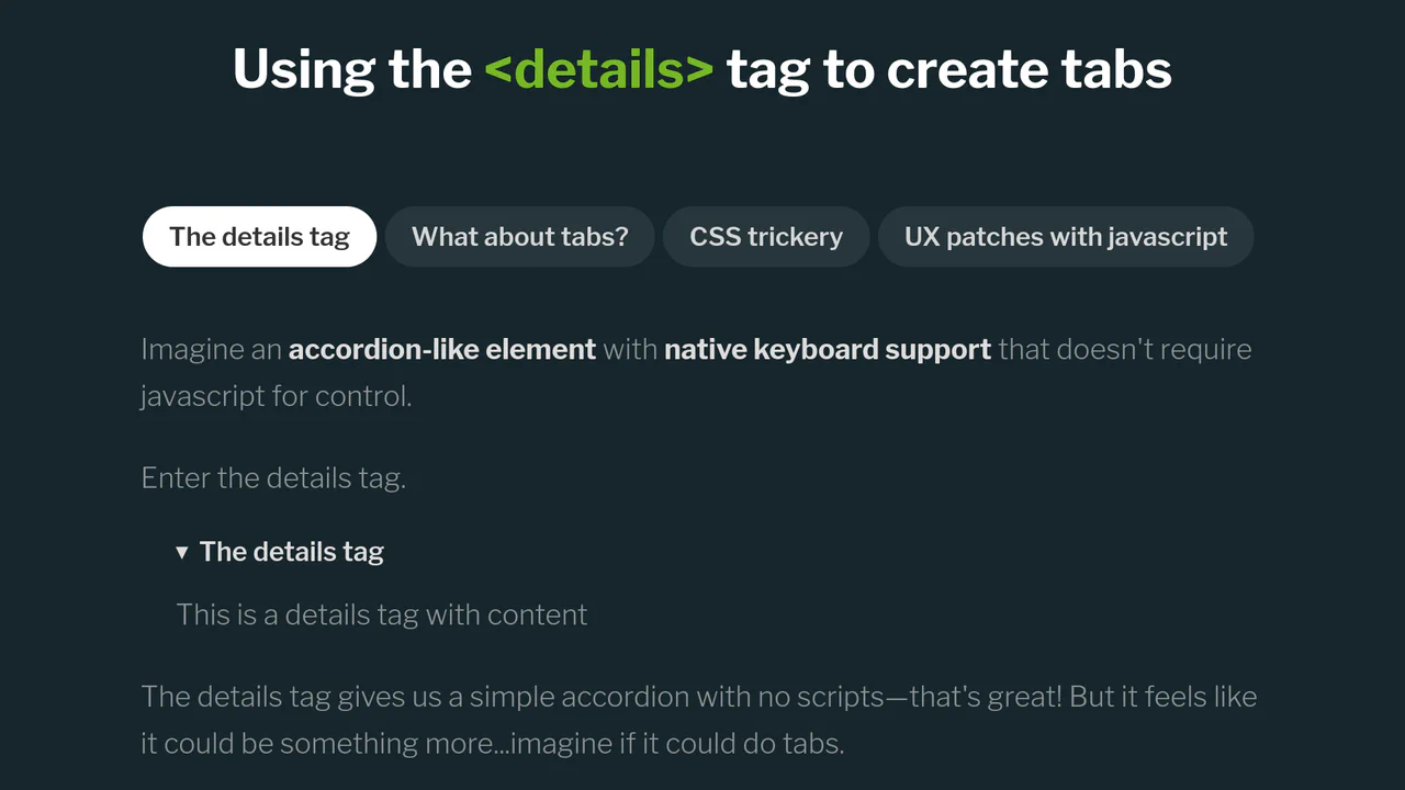
CSS Tabs Component using Details Tag (No JS)
A multi-functional CSS tabs component built using the native <details> tag and the name attribute, which enables grouped tab behavior where only one tab can be open simultaneously, all without JavaScript.
See the Pen CSS Tabs Component using Details Tag (No JS).
Tabs Based on the Details Tag
Explore a clean solution for creating exclusive, accessible tab groups by leveraging a Mutation Observer (via jQuery) to manage the state of <details> elements, preventing accidental closures and ensuring only one content panel is open at a time.
See the Pen Tabs Based on the Details Tag.

Exclusive Accordion with Tailwind and interpolate-size
A high-performance, smooth accordion that expands to the content’s natural height, looking and feeling like a complex JS solution but running entirely on the browser engine.
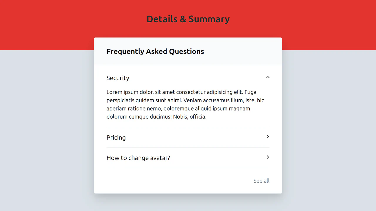
An excellent example of a semantic UI pattern where only native HTML is used to create a large accordion list, ensuring high performance.
A classic yet clean example of marker customization on <summary> via the CSS ::before pseudo-element, which smoothly rotates when the element opens using the [open] selector.
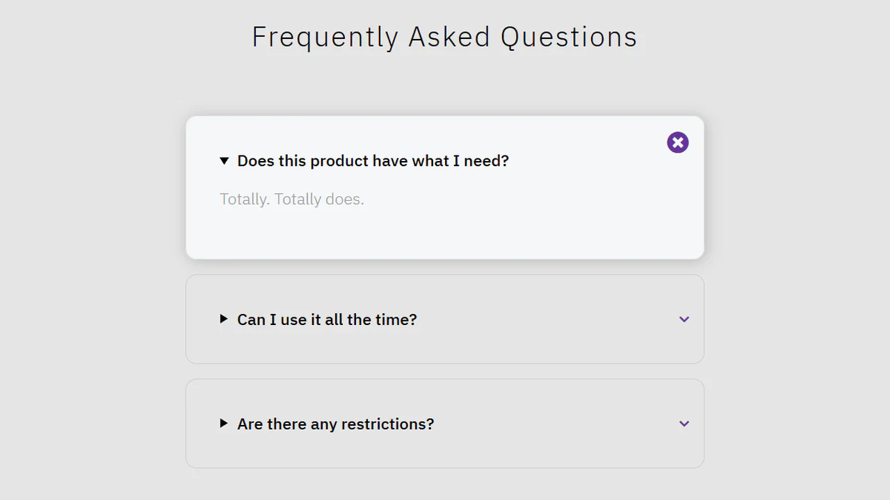
A clean, semantically correct UI element providing supplemental form information using only native <details> and CSS, thus maintaining high accessibility (A11y) standards.