10+ Popover API Examples
Say goodbye to heavyweight JavaScript for popovers! This collection demonstrates the new HTML Popover API, which provides native and high-performance handling for tooltips, modals, and menus. We show how using the simple popover and popovertarget attributes eliminates the need to write complex logic for state management, focus, and dismissal. This clean, semantic solution significantly simplifies modern frontend development.
Examples

FLIP Drag Snap Floating Popover on GSAP
This prototype demonstrates a dynamic draggable chat input combining the native HTML Popover API with GSAP FLIP, Draggable, and Inertia. Pulling the toggle button breaks its resistance to lock onto proximity gravity wells. Toggling the popover morphs the circular button smoothly into a fully functional editor using layout-driven calculations to prevent offscreen rendering. (Requires: gsap.js, gsap-draggable.js, gsap-inertia.js, gsap-flip.js, tweakpane.js)
 Chrome
 Edge
Edge
 Firefox
 Safari
<button
      aria-label="Start chat"
      class="toggle"
      popovertarget="chat"
      popovertargetaction="toggle"
    >
      <svg
        xmlns="http://www.w3.org/2000/svg"
        width="24"
        height="24"
        viewBox="0 0 24 24"
        fill="none"
        stroke="currentColor"
        stroke-width="2"
        stroke-linecap="round"
        stroke-linejoin="round"
      >
        <circle cx="12" cy="12" r="1"></circle>
        <path
          d="M20.2 20.2c2.04-2.03.02-7.36-4.5-11.9-4.54-4.52-9.87-6.54-11.9-4.5-2.04 2.03-.02 7.36 4.5 11.9 4.54 4.52 9.87 6.54 11.9 4.5Z"
        ></path>
        <path
          d="M15.7 15.7c4.52-4.54 6.54-9.87 4.5-11.9-2.03-2.04-7.36-.02-11.9 4.5-4.52 4.54-6.54 9.87-4.5 11.9 2.03 2.04 7.36.02 11.9-4.5Z"
        ></path>
      </svg>
    </button>
    <div id="chat" popover="manual">
      <span class="placeholder">
        <svg
          xmlns="http://www.w3.org/2000/svg"
          viewBox="0 0 24 24"
          fill="none"
          stroke="currentColor"
          stroke-width="2"
          stroke-linecap="round"
          stroke-linejoin="round"
        >
          <circle cx="12" cy="12" r="1"></circle>
          <path
            d="M20.2 20.2c2.04-2.03.02-7.36-4.5-11.9-4.54-4.52-9.87-6.54-11.9-4.5-2.04 2.03-.02 7.36 4.5 11.9 4.54 4.52 9.87 6.54 11.9 4.5Z"
          ></path>
          <path
            d="M15.7 15.7c4.52-4.54 6.54-9.87 4.5-11.9-2.03-2.04-7.36-.02-11.9 4.5-4.52 4.54-6.54 9.87-4.5 11.9 2.03 2.04 7.36.02 11.9-4.5Z"
          ></path>
        </svg>
      </span>
      <div class="popover__content">
        <textarea
          placeholder="What do you want to build?"
          name="prompt"
          id="prompt"
          data-gramm="false"
          autocomplete="off"
          spellcheck="false"
        ></textarea>

        <div class="actions">
          <div class="secondary">
            <button aria-label="Attach">
              <svg
                xmlns="http://www.w3.org/2000/svg"
                viewBox="0 0 24 24"
                fill="none"
                stroke="currentColor"
                stroke-width="2"
                stroke-linecap="round"
                stroke-linejoin="round"
              >
                <path d="M13.234 20.252 21 12.3"></path>
                <path
                  d="m16 6-8.414 8.586a2 2 0 0 0 0 2.828 2 2 0 0 0 2.828 0l8.414-8.586a4 4 0 0 0 0-5.656 4 4 0 0 0-5.656 0l-8.415 8.585a6 6 0 1 0 8.486 8.486"
                ></path>
              </svg>
            </button>
            <button aria-label="Search">
              <svg
                xmlns="http://www.w3.org/2000/svg"
                viewBox="0 0 24 24"
                fill="none"
                stroke="currentColor"
                stroke-width="2"
                stroke-linecap="round"
                stroke-linejoin="round"
              >
                <path d="M21.54 15H17a2 2 0 0 0-2 2v4.54"></path>
                <path
                  d="M7 3.34V5a3 3 0 0 0 3 3a2 2 0 0 1 2 2c0 1.1.9 2 2 2a2 2 0 0 0 2-2c0-1.1.9-2 2-2h3.17"
                ></path>
                <path
                  d="M11 21.95V18a2 2 0 0 0-2-2a2 2 0 0 1-2-2v-1a2 2 0 0 0-2-2H2.05"
                ></path>
                <circle cx="12" cy="12" r="10"></circle>
              </svg>
            </button>
            <button aria-label="Cook">
              <svg
                xmlns="http://www.w3.org/2000/svg"
                viewBox="0 0 24 24"
                fill="none"
                stroke="currentColor"
                stroke-width="2"
                stroke-linecap="round"
                stroke-linejoin="round"
              >
                <path
                  d="M17 21a1 1 0 0 0 1-1v-5.35c0-.457.316-.844.727-1.041a4 4 0 0 0-2.134-7.589 5 5 0 0 0-9.186 0 4 4 0 0 0-2.134 7.588c.411.198.727.585.727 1.041V20a1 1 0 0 0 1 1Z"
                ></path>
                <path d="M6 17h12"></path>
              </svg>
            </button>
          </div>
          <div class="primary">
            <button aria-label="Minimize">
              <svg
                xmlns="http://www.w3.org/2000/svg"
                viewBox="0 0 24 24"
                fill="none"
                stroke="currentColor"
                stroke-width="2"
                stroke-linecap="round"
                stroke-linejoin="round"
              >
                <polyline points="4 14 10 14 10 20"></polyline>
                <polyline points="20 10 14 10 14 4"></polyline>
                <line x1="14" x2="21" y1="10" y2="3"></line>
                <line x1="3" x2="10" y1="21" y2="14"></line>
              </svg>
            </button>
            <button aria-label="Submit" class="submit">
              <svg
                xmlns="http://www.w3.org/2000/svg"
                viewBox="0 0 24 24"
                fill="none"
                stroke="currentColor"
                stroke-width="2"
                stroke-linecap="round"
                stroke-linejoin="round"
              >
                <polyline points="9 10 4 15 9 20"></polyline>
                <path d="M20 4v7a4 4 0 0 1-4 4H4"></path>
              </svg>
            </button>
          </div>
        </div>
      </div>
    </div>
    <div class="targets">
      <div class="target target--north"></div>
      <div class="target target--west"></div>
      <div class="target target--south-west"></div>
      <div class="target target--south"></div>
      <div class="target target--south-east"></div>
      <div class="target target--east"></div>
    </div>
    <div class="info">
      <span class="arrow arrow--debug">
        <span>check<br />the debug</span>
        <svg
          viewBox="0 0 122 97"
          fill="none"
          xmlns="http://www.w3.org/2000/svg"
        >
          <path
            fill-rule="evenodd"
            clip-rule="evenodd"
            d="M116.102 0.0996005C114.952 0.334095 112.7 1.53002 111.433 2.53834C110.869 2.98388 109.368 4.15635 108.077 5.11778C103.455 8.6352 102.61 9.40903 102.187 10.4877C101.39 12.5982 102.798 14.5914 105.097 14.5914C106.13 14.5914 108.241 13.7941 109.696 12.8561C110.424 12.3871 111.01 12.0823 111.01 12.1526C111.01 12.692 107.796 17.8274 106.2 19.8206C102.023 25.0733 95.6642 29.6928 86.2548 34.2889C81.0926 36.8214 77.4555 38.2753 73.9123 39.2367C71.7066 39.823 70.6507 39.9871 67.9053 40.0809C66.0516 40.1513 64.5499 40.1747 64.5499 40.1278C64.5499 40.0809 64.808 38.9788 65.1365 37.6891C65.465 36.3993 65.8404 34.1716 66.0047 32.7647C66.4505 28.3796 65.4884 24.2994 63.4704 22.2359C62.1564 20.8758 60.9363 20.3599 59.0121 20.3599C57.6043 20.3599 57.1115 20.4537 55.7975 21.1103C52.8878 22.5407 50.5648 25.9878 49.5089 30.4197C48.453 34.922 49.2742 38.0877 52.3481 41.1127C53.4744 42.2148 54.46 42.9183 55.9852 43.6921C57.1584 44.2549 58.1439 44.7473 58.1909 44.7708C58.5898 45.0053 54.5304 53.4705 52.0666 57.6211C47.4674 65.3125 39.3486 74.575 30.5728 82.0789C22.2427 89.2309 16.7285 92.4435 9.87677 94.1553C8.28116 94.554 7.13138 94.6478 4.2452 94.6478C1.17131 94.6712 0.608154 94.7181 0.608154 95.023C0.608154 95.234 1.19478 95.5857 2.13337 95.9609C3.54126 96.4768 3.96363 96.5472 7.41296 96.5237C10.5572 96.5237 11.4724 96.4299 13.1149 96.0078C21.7265 93.6863 31.1594 87.1908 42.6102 75.7006C49.2977 69.0175 52.5828 64.9373 56.1494 58.9343C58.0501 55.7217 60.6312 50.6801 61.7575 47.9365L62.5553 45.9902L64.0806 46.1543C71.3547 46.9047 77.7136 45.3101 88.3667 40.034C96.2274 36.1414 101.976 32.3426 106.505 28.0748C108.617 26.0816 111.855 22.2828 112.794 20.7117C113.028 20.313 113.286 19.9847 113.357 19.9847C113.427 19.9847 113.662 20.782 113.873 21.72C114.084 22.6814 114.647 24.276 115.093 25.2609C115.82 26.8085 116.008 27.043 116.454 26.9727C116.876 26.9258 117.228 26.4333 117.956 24.9795C119.317 22.2828 119.833 20.2661 120.772 13.8879C121.757 7.25168 121.781 4.4143 120.889 2.56179C119.95 0.615488 118.12 -0.322489 116.102 0.0996005ZM60.7016 25.7767C61.4525 26.9023 61.8279 29.2942 61.6637 31.9205C61.4759 34.7813 60.5139 38.9788 60.0681 38.9788C59.5284 38.9788 57.1584 37.6422 56.2198 36.8214C54.8354 35.6021 54.3426 34.2889 54.5538 32.2957C54.8589 29.2473 56.1964 26.2223 57.5808 25.3547C58.7306 24.6512 60.0681 24.8388 60.7016 25.7767Z"
            fill="currentColor"
          />
        </svg>
      </span>
      <span class="arrow arrow--instruction">
        <span>open / drag and fling</span>
        <svg viewBox="0 0 97 52" fill="none" xmlns="http://www.w3.org/2000/svg">
          <path
            fill-rule="evenodd"
            clip-rule="evenodd"
            d="M74.568 0.553803C74.0753 0.881909 73.6295 1.4678 73.3713 2.12401C73.1367 2.70991 72.3858 4.67856 71.6584 6.50658C70.9544 8.35803 69.4526 11.8031 68.3498 14.1936C66.1441 19.0214 65.839 20.2167 66.543 21.576C67.4581 23.3337 69.4527 23.9196 71.3064 22.9821C72.4797 22.3728 74.8965 19.5839 76.9615 16.4435C78.8387 13.5843 78.8387 13.6077 78.1113 18.3418C77.3369 23.4275 76.4687 26.2866 74.5915 30.0364C73.254 32.7316 71.8461 34.6299 69.218 37.3485C65.9563 40.6999 62.2254 42.9732 57.4385 44.4965C53.8718 45.6449 52.3935 45.8324 47.2546 45.8324C43.3594 45.8324 42.1158 45.7386 39.9805 45.2933C32.2604 43.7466 25.3382 40.9577 19.4015 36.9735C15.0839 34.0909 12.5028 31.7004 9.80427 27.9975C6.80073 23.9196 4.36038 17.2403 3.72682 11.475C3.37485 8.1471 3.1402 7.32683 2.43624 7.13934C0.770217 6.71749 0.183578 7.77211 0.0193217 11.5219C-0.26226 18.5996 2.55356 27.1304 7.17619 33.1066C13.8403 41.7545 25.432 48.4103 38.901 51.2696C41.6465 51.8555 42.2566 51.9023 47.4893 51.9023C52.3935 51.9023 53.426 51.832 55.5144 51.3867C62.2723 49.9337 68.5375 46.6292 72.949 42.1998C76.0464 39.1296 78.1113 36.2939 79.8946 32.7081C82.1942 28.0912 83.5317 23.3103 84.2591 17.17C84.3999 15.8576 84.6111 14.7795 84.7284 14.7795C84.8223 14.7795 85.4559 15.1311 86.1364 15.5763C88.037 16.7716 90.3835 17.8965 93.5748 19.0918C96.813 20.3339 97.3996 20.287 96.4141 18.9512C94.9123 16.9122 90.055 11.5219 87.1219 8.63926C84.0949 5.66288 83.8368 5.33477 83.5552 4.1864C83.3909 3.48332 83.0155 2.68649 82.6401 2.31151C82.0065 1.6553 80.4109 1.04595 79.9885 1.30375C79.8712 1.37406 79.2845 1.11626 78.6744 0.717845C77.2431 -0.172727 75.7413 -0.243024 74.568 0.553803Z"
            fill="currentColor"
          />
        </svg>
      </span>
      <span class="arrow arrow--move">
        <span>move these</span>
        <svg
          viewBox="0 0 45 119"
          fill="none"
          xmlns="http://www.w3.org/2000/svg"
        >
          <path
            fill-rule="evenodd"
            clip-rule="evenodd"
            d="M41.9623 0.226546C41.9154 0.320411 41.329 1.82224 40.6723 3.55873C40.039 5.29523 38.1628 9.73034 36.5444 13.4145C31.6425 24.4436 29.8835 28.8084 24.0669 44.2726C19.8921 55.3486 13.4187 75.7642 8.72794 92.6129L7.2269 97.9867L7.08616 94.8422C6.82816 89.3511 5.89001 87.333 3.52116 87.333C2.51263 87.333 1.71519 88.1544 1.45719 89.4919C1.33992 90.0551 1.08195 93.0823 0.894318 96.2502C0.706686 99.4181 0.448692 103.572 0.307967 105.519C0.190697 107.444 0.0499847 110.682 0.0265307 112.677C-0.0438314 115.985 0.00303082 116.384 0.448657 117.135C1.43373 118.825 3.28661 119.435 5.09257 118.684C6.03073 118.285 6.94542 117.206 9.713 113.263C13.9816 107.185 18.907 101.272 23.1991 97.0481C28.0775 92.2609 28.3355 91.7212 25.0754 93.1996C21.0647 94.983 16.6085 97.9867 12.7386 101.483C11.519 102.586 10.487 103.454 10.4401 103.407C10.3463 103.314 13.8409 91.0172 17.101 80.0585C19.7513 71.1883 22.7065 61.6141 24.747 55.419C27.5615 46.8069 34.6681 27.3065 38.2331 18.4598C41.7043 9.82421 43.4399 4.96671 43.9325 2.54969C44.167 1.37638 44.1435 1.11826 43.8386 0.602C43.4633 0.038811 42.2437 -0.219311 41.9623 0.226546Z"
            fill="currentColor"
          />
        </svg>
      </span>
    </div>
    <a
      aria-label="Follow Jhey"
      class="bear-link"
      href="https://twitter.com/intent/follow?screen_name=jh3yy"
      target="_blank"
      rel="noreferrer noopener"
    >
      <svg
        class="w-9"
        viewBox="0 0 969 955"
        fill="none"
        xmlns="http://www.w3.org/2000/svg"
      >
        <circle
          cx="161.191"
          cy="320.191"
          r="133.191"
          stroke="currentColor"
          stroke-width="20"
        ></circle>
        <circle
          cx="806.809"
          cy="320.191"
          r="133.191"
          stroke="currentColor"
          stroke-width="20"
        ></circle>
        <circle
          cx="695.019"
          cy="587.733"
          r="31.4016"
          fill="currentColor"
        ></circle>
        <circle
          cx="272.981"
          cy="587.733"
          r="31.4016"
          fill="currentColor"
        ></circle>
        <path
          d="M564.388 712.083C564.388 743.994 526.035 779.911 483.372 779.911C440.709 779.911 402.356 743.994 402.356 712.083C402.356 680.173 440.709 664.353 483.372 664.353C526.035 664.353 564.388 680.173 564.388 712.083Z"
          fill="currentColor"
        ></path>
        <rect
          x="310.42"
          y="448.31"
          width="343.468"
          height="51.4986"
          fill="#FF1E1E"
        ></rect>
        <path
          fill-rule="evenodd"
          clip-rule="evenodd"
          d="M745.643 288.24C815.368 344.185 854.539 432.623 854.539 511.741H614.938V454.652C614.938 433.113 597.477 415.652 575.938 415.652H388.37C366.831 415.652 349.37 433.113 349.37 454.652V511.741L110.949 511.741C110.949 432.623 150.12 344.185 219.845 288.24C289.57 232.295 384.138 200.865 482.744 200.865C581.35 200.865 675.918 232.295 745.643 288.24Z"
          fill="currentColor"
        ></path>
      </svg>
    </a>
@import url('https://unpkg.com/normalize.css') layer(normalize);
@import url('https://fonts.googleapis.com/css2?family=Gloria+Hallelujah&display=swap');

@layer normalize, base, demo, popover;

@layer popover {
  .placeholder {
    width: var(--width);
    aspect-ratio: 1;
    display: grid;
    place-items: center;
    bottom: -1px;
    left: -1px;
    position: absolute;

    svg {
      width: 20px;
      height: 20px;
    }
  }

  [popover] {
    width: 380px;
    max-width: calc(100% - 2rem);
    height: 120px;
    border-radius: 6px;
    margin: 0;
    inset: unset;
    padding: 0.25rem;
    opacity: 0;
    border-color: light-dark(hsl(0 0% 75%), hsl(0 0% 60%));
    border-width: 1px;
    background: canvasText;
    color: canvas;
    --shadow-color: 0 0% 0%;
    box-shadow: 0px 0.5px 0.6px hsl(var(--shadow-color) / 0.07),
      0px 1.7px 2.2px -0.4px hsl(var(--shadow-color) / 0.09),
      0px 3.2px 4.1px -0.7px hsl(var(--shadow-color) / 0.11),
      -0.1px 6.1px 7.8px -1.1px hsl(var(--shadow-color) / 0.13),
      -0.2px 11.2px 14.3px -1.5px hsl(var(--shadow-color) / 0.15);

    .popover__content {
      display: flex;
      flex-direction: column;
      gap: 0.25em;
      height: 100%;
      width: 100%;
      filter: blur(4px);
      opacity: 0;
      width: calc(380px - 0.5em - 2px);
      max-width: calc(100vw - 2.5rem - 2px);
    }

    &:popover-open {
      display: flex;
      flex-direction: column;
    }

    .actions {
      display: flex;
      align-items: center;
      justify-content: space-between;
      height: 2rem;
      padding-left: 2rem;
      width: 100%;

      .primary,
      .secondary {
        display: flex;
        align-items: center;
      }

      .primary {
        gap: 0 0.25rem;
      }

      .primary button:first-of-type,
      .secondary button {
        background: #0000;
      }

      button {
        cursor: pointer;
        width: 32px;
        aspect-ratio: 1;
        display: grid;
        place-items: center;
        padding: 0;
        border: 0;
        border-radius: 6px;
        position: relative;

        &:not([aria-label='Submit'])::after {
          content: '';
          border-radius: 6px;
          position: absolute;
          inset: 0;
          background: red;
          background: color-mix(in oklch, canvasText, #0000 90%);
          opacity: 0;
        }

        &:is(:hover, :focus-visible)::after {
          opacity: 1;
        }

        &:is(:hover, :focus-visible) svg {
          opacity: 1;
        }

        svg {
          width: 16px;
          opacity: 0.5;
        }
      }
      button[aria-label='Submit'] {
        svg {
          opacity: 1;
        }

        &:is(:hover, :focus-visible) {
          background: color-mix(in oklch, canvasText, canvas 30%);
        }
      }
    }

    textarea {
      width: 100%;
      flex: 1;
      resize: none;
      outline-color: color-mix(in oklch, canvas, canvasText 2%);
      outline-color: #0000;
      font-size: 0.875rem;
      font-weight: 400;
      scrollbar-color: hsl(10 90% 50%) #0000;
      background: #0000;
      border-radius: 2px;
      caret-color: red;
      padding: 0.5em;
      border: 0;

      &::-moz-placeholder {
        white-space: nowrap;
        opacity: 0.8;
      }

      &:-ms-input-placeholder {
        white-space: nowrap;
        opacity: 0.8;
      }

      &::placeholder {
        white-space: nowrap;
        opacity: 0.8;
      }
    }
  }
}

@layer demo {
  .arrow {
    display: inline-block;
    opacity: 0.8;
    position: fixed;
    font-size: 0.875rem;
    font-family: 'Gloria Hallelujah', cursive;
    transition: opacity 0.26s ease-out;

    svg {
      color: hsl(0 0% 65%);
    }

    &.arrow--debug {
      top: 200px;
      right: 0px;
      translate: -50% 0;
      width: 60px;
      span {
        rotate: 12deg;
      }
      svg {
        rotate: 20deg;
        bottom: 130%;
        left: 0%;
        width: 100%;
        scale: -1 1;
      }
    }

    &.arrow--move {
      opacity: 0;
      top: 5.5rem;
      left: 50%;
      translate: calc((var(--snap-proximity) * -1px) + -150%) 0;
      width: 60px;
      span {
        rotate: -12deg;
      }
      svg {
        rotate: 270deg;
        top: 0%;
        left: 100%;
        width: 50%;
        scale: -1 1;
        translate: 180% -70%;
      }
    }

    &.arrow--instruction {
      top: 50%;
      left: 50%;
      translate: -130% -70%;

      svg {
        scale: 1 1;
        top: 130%;
        rotate: 25deg;
        left: 0%;
        width: 60%;
        translate: 120% 30%;
      }
    }

    span {
      display: inline-block;
      white-space: nowrap;
    }

    svg {
      position: absolute;
    }
  }
  [data-debug='true'] .arrow--move {
    opacity: 0.8;
  }
  :root {
    --width: 42px;
  }
  [data-dragging='true'] {
    cursor: -webkit-grabbing;
    cursor: grabbing;
  }
  [data-debug='true'] .target {
    opacity: 1;
  }
  .submit {
    background: canvasText;
    color: canvas;
  }
  .toggle {
    width: var(--width);
    aspect-ratio: 1;
    border-radius: 50%;
    display: grid;
    place-items: center;
    padding: 0;
    position: fixed;
    top: 0;
    left: 0;
    color: canvas;
    background: canvasText;
    border-style: solid;
    border-color: color-mix(in oklch, canvasText, #0000 85%);
    border-width: 1px;
    --shadow-color: 0 0% 0%;
    box-shadow: 0px 0.5px 0.6px hsl(var(--shadow-color) / 0.07),
      0px 1.7px 2.2px -0.4px hsl(var(--shadow-color) / 0.09),
      0px 3.2px 4.1px -0.7px hsl(var(--shadow-color) / 0.11),
      -0.1px 6.1px 7.8px -1.1px hsl(var(--shadow-color) / 0.13),
      -0.2px 11.2px 14.3px -1.5px hsl(var(--shadow-color) / 0.15);

    svg {
      width: 20px;
      height: 20px;
    }
  }
  .targets {
    position: fixed;
    inset: 1.5rem;
    pointer-events: none;
  }
  .target {
    pointer-events: all;
    width: var(--width);
    aspect-ratio: 1;
    background: hsl(var(--hue, 10) 80% 50% / 0.2);
    border-radius: 50%;
    opacity: 0;
    transition: opacity 0.26s ease-out;
    position: fixed;

    &[data-active='true'] {
      --hue: 150;
    }

    &::after {
      content: '';
      width: max(var(--width), var(--snap-proximity) * 2px);
      aspect-ratio: 1;
      border-radius: 50%;
      background: hsl(var(--hue, 10) 80% 50% / 0.1);
      outline: 2px dashed hsl(var(--hue, 10) 80% 50% / 0.5);
      position: absolute;
      top: 50%;
      left: 50%;
      translate: -50% -50%;
      pointer-events: none;
    }

    &.target--north {
      top: 1.5rem;
      left: 50%;
      translate: -50% 0%;
    }
    &.target--west {
      left: 1.5rem;
      top: 50%;
      translate: 0% -50%;
    }
    &.target--south-west {
      bottom: 1.5rem;
      left: 1.5rem;
    }
    &.target--south {
      bottom: 1.5rem;
      left: 50%;
      translate: -50% 0;
    }
    &.target--east {
      top: 50%;
      right: 1.5rem;
      translate: 0 -50%;
    }
    &.target--south-east {
      bottom: 1.5rem;
      right: 1.5rem;
    }
  }
}

@layer base {
  :root {
    --font-size-min: 16;
    --font-size-max: 20;
    --font-ratio-min: 1.2;
    --font-ratio-max: 1.33;
    --font-width-min: 375;
    --font-width-max: 1500;
  }

  html {
    color-scheme: light dark;
  }

  [data-theme='light'] {
    color-scheme: light only;
  }

  [data-theme='dark'] {
    color-scheme: dark only;
  }

  :where(.fluid) {
    --fluid-min: calc(
      var(--font-size-min) * pow(var(--font-ratio-min), var(--font-level, 0))
    );
    --fluid-max: calc(
      var(--font-size-max) * pow(var(--font-ratio-max), var(--font-level, 0))
    );
    --fluid-preferred: calc(
      (var(--fluid-max) - var(--fluid-min)) /
        (var(--font-width-max) - var(--font-width-min))
    );
    --fluid-type: clamp(
      (var(--fluid-min) / 16) * 1rem,
      ((var(--fluid-min) / 16) * 1rem) -
        (((var(--fluid-preferred) * var(--font-width-min)) / 16) * 1rem) +
        (var(--fluid-preferred) * var(--variable-unit, 100vi)),
      (var(--fluid-max) / 16) * 1rem
    );
    font-size: var(--fluid-type);
  }

  *,
  *:after,
  *:before {
    box-sizing: border-box;
  }

  body {
    background: light-dark(#fff, #000);
    display: grid;
    place-items: center;
    min-height: 100vh;
    font-family: 'SF Pro Text', 'SF Pro Icons', 'AOS Icons', 'Helvetica Neue',
      Helvetica, Arial, sans-serif, system-ui;
  }

  body::before {
    --size: 45px;
    --line: color-mix(in hsl, canvasText, transparent 80%);
    content: '';
    height: 100vh;
    width: 100vw;
    position: fixed;
    background: linear-gradient(
          90deg,
          var(--line) 1px,
          transparent 1px var(--size)
        )
        calc(var(--size) * 0.36) 50% / var(--size) var(--size),
      linear-gradient(var(--line) 1px, transparent 1px var(--size)) 0%
        calc(var(--size) * 0.32) / var(--size) var(--size);
    -webkit-mask: linear-gradient(-20deg, transparent 50%, white);
            mask: linear-gradient(-20deg, transparent 50%, white);
    top: 0;
    transform-style: flat;
    pointer-events: none;
    z-index: -1;
  }

  .bear-link {
    color: canvasText;
    position: fixed;
    top: 1rem;
    left: 1rem;
    width: 48px;
    aspect-ratio: 1;
    display: grid;
    place-items: center;
    opacity: 0.8;
  }

  :where(.x-link, .bear-link):is(:hover, :focus-visible) {
    opacity: 1;
  }

  .bear-link svg {
    width: 75%;
  }

  /* Utilities */
  .sr-only {
    position: absolute;
    width: 1px;
    height: 1px;
    padding: 0;
    margin: -1px;
    overflow: hidden;
    clip: rect(0, 0, 0, 0);
    white-space: nowrap;
    border-width: 0;
  }
}
import { Pane } from 'https://esm.sh/[email protected]';
import gsap from 'https://esm.sh/[email protected]';
import { Draggable } from 'https://esm.sh/[email protected]/Draggable';
import { Flip } from 'https://esm.sh/[email protected]/Flip';

// use dynamic loading for the restricted InertiaPlugin
let InertiaPlugin;

const initApp = async () => {
  try {
    const module = await import('https://assets.codepen.io/16327/InertiaPlugin.min.js');
    InertiaPlugin = module.default || window.InertiaPlugin;
  } catch (e) {
    // fallback if esm import is blocked
    InertiaPlugin = window.InertiaPlugin;
  }

  gsap.registerPlugin(Draggable, InertiaPlugin, Flip);

  const config = {
    theme: 'system',
    proximity: 120,
    debug: false,
    duration: 0.35
  };

  const ctrl = new Pane({
    title: 'config',
    expanded: true
  });

  const update = () => {
    document.documentElement.dataset.theme = config.theme;
    document.documentElement.dataset.debug = config.debug;
    document.documentElement.style.setProperty('--snap-proximity', config.proximity);
  };

  const sync = event => {
    if (event.target.controller.view.labelElement.innerText === 'debug') {
      document.querySelector('.arrow--debug').style.opacity = 0;
    }
    if (!document.startViewTransition || event.target.controller.view.labelElement.innerText !== 'theme') {
      return update();
    }
    document.startViewTransition(() => update());
  };

  ctrl.addBinding(config, 'proximity', {
    min: 0,
    max: 300,
    step: 1,
    label: 'proximity'
  });

  ctrl.addBinding(config, 'duration', {
    min: 0.2,
    max: 5,
    step: 0.01,
    label: 'duration(s)'
  });

  ctrl.addBinding(config, 'debug', {
    label: 'debug'
  });

  ctrl.addBinding(config, 'theme', {
    label: 'theme',
    options: {
      System: 'system',
      Light: 'light',
      Dark: 'dark'
    }
  });

  ctrl.on('change', sync);
  update();

  const button = document.querySelector('[aria-label^="Start"]');
  const targets = document.querySelectorAll('.target');

  function getClosestPoint(target, maxDistance = Number.POSITIVE_INFINITY) {
    if (maxDistance !== Number.POSITIVE_INFINITY) {
      document.documentElement.style.setProperty('--snap-proximity', maxDistance);
    }
    let closest = null;
    let minDistance = Number.POSITIVE_INFINITY;

    const coordinates = Array.from(targets).map(el => {
      const rect = el.getBoundingClientRect();
      return {
        x: rect.left + rect.width / 2,
        y: rect.top + rect.height / 2,
        element: el
      };
    });

    for (const coord of coordinates) {
      const dx = Math.min(window.innerWidth, Math.max(0, target.x)) - coord.x;
      const dy = Math.min(window.innerHeight, Math.max(0, target.y)) - coord.y;
      const distance = Math.hypot(dx, dy);
      if (distance < minDistance) {
        minDistance = distance;
        closest = coord;
      }
    }

    if (minDistance <= maxDistance) {
      return {
        coordinate: closest,
        distance: minDistance
      };
    }

    return null;
  }

  const RESISTANCE_PIXELS = 80;
  const DEFAULT_RESISTANCE = 0.75;
  const END_RESISTANCE = 0;
  gsap.set(button, {
    x: window.innerWidth * 0.5,
    y: window.innerHeight * 0.5,
    yPercent: -50,
    xPercent: -50
  });

  for (const target of targets) {
    Draggable.create(target, {
      inertia: false,
      type: 'x,y',
      onDrag: () => {
        document.querySelector('.arrow--move').style.opacity = 0;
      }
    });
  }

  Draggable.create(button, {
    inertia: true,
    allowContextMenu: true,
    type: 'x,y',
    dragResistance: DEFAULT_RESISTANCE,
    resistance: 1800,
    snap: {
      points: function (point) {
        const { isDragging, __unlocked, startX, startY } = this;
        const closestPoint = getClosestPoint(point, config.proximity);
        if (!isDragging && !__unlocked) {
          return { x: startX, y: startY };
        } else if (__unlocked && closestPoint) {
          for (const t of targets) t.dataset.active = false;
          closestPoint.coordinate.element.dataset.active = true;
          return closestPoint.coordinate;
        }
        return point;
      }
    },
    bounds: '.targets',
    onDragStart: function (event) {
      const bounds = this.target.getBoundingClientRect();
      const currentPoint = {
        x: bounds.left + bounds.width / 2,
        y: bounds.top + bounds.height / 2
      };

      this.__start = currentPoint;
      this.dragResistance = DEFAULT_RESISTANCE;
      this.__unlocked = false;
      document.documentElement.dataset.dragging = true;
    },
    onDrag: function (event) {
      const { startX, startY, x, y } = this;
      const distance = Math.hypot(x - startX, y - startY);
      const newResistance = gsap.utils.clamp(
        END_RESISTANCE,
        DEFAULT_RESISTANCE,
        gsap.utils.mapRange(0, RESISTANCE_PIXELS, DEFAULT_RESISTANCE, END_RESISTANCE)(Math.abs(distance))
      );

      if (!this.__unlocked) this.dragResistance = newResistance;
      if (!this.__unlocked && newResistance === END_RESISTANCE) {
        this.__unlocked = true;
        document.querySelector('.arrow--instruction').style.opacity = 0;
        for (const t of targets) t.dataset.active = false;
      }
    },
    onDragEnd: function () {
      this.dragResistance = DEFAULT_RESISTANCE;
      this.__unlocked = false;
    },
    onRelease: () => {
      document.documentElement.dataset.dragging = false;
    },
    onThrowComplete: function () {
      this.dragResistance = DEFAULT_RESISTANCE;
      this.__unlocked = false;
    }
  });

  const pop = document.querySelector('[popover]');
  let f;

  const closePopover = async () => {
    if (f) {
      f.pause();
      await f.reverse(f.time());
      pop.hidePopover();
    } else {
      let closerBounds;
      const pos = pop.getBoundingClientRect();
      const center = {
        x: pos.x + pos.width * 0.5,
        y: pos.y + pos.height * 0.5
      };

      const {
        x: buttonX,
        y: buttonY,
        width: buttonWidth,
        height: buttonHeight
      } = button.getBoundingClientRect();
      const closest = getClosestPoint({ x: center.x, y: center.y }, config.proximity);

      if (closest) {
        closerBounds = closest.coordinate.element.getBoundingClientRect();
        gsap.set(button, {
          opacity: 0,
          x: closest.coordinate.x,
          y: closest.coordinate.y
        });
      }

      const state = Flip.getState(
        [pop, '.placeholder', '.placeholder > svg', '[popover] .popover__content'],
        { nested: true, props: 'borderRadius, scale, opacity, filter, backgroundColor, color' }
      );

      gsap.set(pop, {
        width: buttonWidth,
        height: buttonHeight,
        top: closest ? closerBounds.top + closerBounds.height * 0.5 : buttonY + buttonHeight * 0.5,
        left: closest ? closerBounds.left + closerBounds.width * 0.5 : buttonX + buttonWidth * 0.5,
        opacity: 1,
        borderRadius: '21px',
        x: 0,
        y: 0,
        xPercent: -50,
        yPercent: -50,
        backgroundColor: getComputedStyle(document.body).color,
        color: getComputedStyle(document.body).backgroundColor
      });

      gsap.set('.placeholder > svg', {
        width: 20,
        height: 20,
        opacity: 1
      });

      gsap.set('[popover] .popover__content', {
        y: 0,
        opacity: 0,
        filter: 'blur(4px)'
      });

      await Flip.from(state, {
        duration: config.duration,
        nested: true,
        ease: 'power2.inOut'
      });

      gsap.set(button, { opacity: 1 });
      pop.hidePopover();
    }
  };

  let d;

  pop.addEventListener('toggle', async event => {
    if (event.newState === 'open') {
      const {
        x: buttonX,
        y: buttonY,
        width: buttonWidth,
        height: buttonHeight
      } = button.getBoundingClientRect();
      const center = {
        x: buttonX + buttonWidth * 0.5,
        y: buttonY + buttonHeight * 0.5
      };

      const {
        x: popX,
        y: popY,
        width: popWidth,
        height: popHeight
      } = pop.getBoundingClientRect();

      let vertical = 'center';
      if (center.y < popHeight * 0.5 + 24) vertical = 'bottom';
      if (center.y > window.innerHeight - (popHeight * 0.5 + 24)) vertical = 'top';
      let horizontal = 'center';
      if (center.x < popWidth * 0.5) horizontal = 'left';
      if (center.x > window.innerWidth - popWidth * 0.5) horizontal = 'right';

      gsap.set('[popovertarget]', {
        boxShadow: 'none'
      });

      gsap.set(pop, {
        width: buttonWidth,
        height: buttonHeight,
        top: buttonY,
        left: buttonX,
        opacity: 1,
        borderRadius: '21px'
      });

      const state = Flip.getState(
        [pop, '.placeholder', '.placeholder > svg', '[popover] .popover__content'],
        { nested: true, props: 'borderRadius, scale, opacity, filter, backgroundColor, color' }
      );

      const position = {
        left: center.x,
        top: center.y,
        xPercent: -50,
        yPercent: -50
      };

      if (horizontal === 'left') {
        position.right = 'unset';
        position.left = '1.5rem';
        position.xPercent = 0;
      }
      if (horizontal === 'right') {
        position.left = 'unset';
        position.right = '1.5rem';
        position.xPercent = 0;
      }
      if (vertical === 'bottom') {
        position.top = '1.5rem';
        position.bottom = 'unset';
        position.yPercent = 0;
      }
      if (vertical === 'top') {
        position.bottom = '1.5rem';
        position.top = 'unset';
        position.yPercent = 0;
      }

      gsap.set(pop, { clearProps: 'width,height' });
      gsap.set(pop, {
        ...position,
        opacity: 1,
        borderRadius: '6px',
        backgroundColor: getComputedStyle(document.body).backgroundColor,
        color: getComputedStyle(document.body).color
      });

      gsap.set('.placeholder > svg', {
        width: 16,
        height: 16,
        opacity: 0.5
      });

      gsap.set('[popover] .popover__content', {
        y: 0,
        opacity: 1,
        filter: 'blur(0px)',
        background: '#0000'
      });

      f = Flip.from(state, {
        duration: config.duration,
        nested: true,
        ease: 'power2.inOut'
      });

      window.addEventListener('keydown', closePopover);
      d = Draggable.create(pop, {
        dragClickables: false,
        inertia: true,
        allowContextMenu: true,
        type: 'x,y',
        bounds: '.targets',
        onDrag: () => {
          f = undefined;
          const pos = pop.getBoundingClientRect();
          const center = {
            x: pos.x + pos.width * 0.5,
            y: pos.y + pos.height * 0.5,
            xPercent: -50,
            yPercent: -50
          };

          gsap.set(button, {
            x: center.x,
            y: center.y,
            xPercent: -50,
            yPercent: -50
          });
        },
        onThrowUpdate: () => {
          f = undefined;
          const pos = pop.getBoundingClientRect();
          const center = {
            x: pos.x + pos.width * 0.5,
            y: pos.y + pos.height * 0.5
          };

          gsap.set(button, {
            x: center.x,
            y: center.y
          });
        }
      });
    } else {
      gsap.set([pop, '.placeholder > svg', '[popover] .popover__content'], {
        clearProps: 'all'
      });

      gsap.set(button, {
        clearProps: 'box-shadow',
        opacity: 1
      });

      window.removeEventListener('keydown', closePopover);
    }
  });

  document.querySelector('[aria-label="Minimize"]').addEventListener('click', closePopover);
};

initApp();
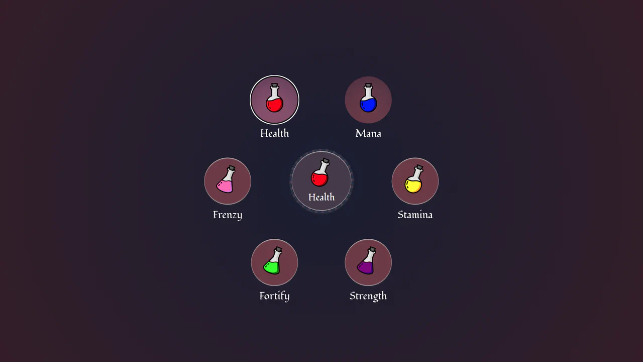
Circular Popover Potion Dropdown Menu
An experimental, zero-JavaScript custom select dropdown leveraging cutting-edge HTML customizable select specifications. When opened, the custom picker formats standard <option> tags into an interactive circular radial layout using native CSS Anchor Positioning, @starting-style entry transitions, and mathematical sibling-index() and sibling-count() functions. Includes gorgeous vector potion SVG assets mapped with variable custom properties.
Chrome 130+
Edge 130+
See the Pen Circular Popover Potion Dropdown Menu.
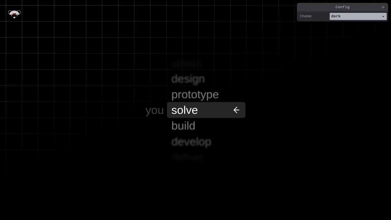
Scroll-Snapping Popover Select Dropdown Menu
An experimental custom select dropdown menu built on native HTML5 base-select specifications. The picker popover displays options in a vertically scroll-snapped viewport that fades and blurs adjacent values based on scroll proximity. A lightweight GSAP scrolling script automatically centers and aligns selected items in real time, while modern @starting-style manages discrete popover overlay entry transitions. (Requires: gsap.js, tweakpane.js)
Chrome 130+
Edge 130+See the Pen Scroll-Snapping Popover Select Dropdown Menu.

Mission Control Grid Exposé
This is a Mission Control Grid Exposé. It scales overlapping full-screen views into a unified spatial grid. Its function is to provide absolute structural context, replacing linear tab switching with a macro-level physical interface.
Chrome 114+
Edge 114+
Safari 17+
Firefox 125+See the Pen Mission Control Grid Exposé.

Anchored Glassmorphic Tab Indicator
This is an Anchored Glassmorphic Tab Indicator. It utilizes the cutting-edge CSS Anchor Positioning API to physically tether a floating visual highlight to the currently active or hovered navigation button. Its function is to provide highly fluid, magnetic feedback without relying on complex JavaScript bounding-box calculations.
Chrome 125+
Edge 125+
Firefox (partial)
Safari (partial)
See the Pen Anchored Glassmorphic Tab Indicator.

Cyberpunk Glitch Upgrade Modal
This is a Cyberpunk Glitch Upgrade Modal. It transforms a standard confirmation dialog into a highly stylized, cinematic interface. Its function is to provide explicit interaction boundaries using the native HTML Popover API, augmented with aggressive visual distortion (glitches) and integrated audio feedback for a deeply immersive user experience. (Requires: Tweakpane)
Chrome 114+
Edge 114+
Firefox 125+
Safari 17+See the Pen Cyberpunk Glitch Upgrade Modal.

Trigonometric Radial Popover Menu
This is a Trigonometric Radial Popover Menu. It replaces heavy JavaScript positioning arrays with native CSS mathematics and the HTML Popover API. Its function is to reveal secondary actions in a circular layout on demand, expanding the interactive surface area without permanently cluttering the interface.
Chrome 139+
Edge 139+See the Pen Trigonometric Radial Popover Menu.

Accessibility Contrast Controller Popover
The Accessibility Contrast Controller Popover is a cutting-edge implementation of user-centric accessibility settings. It provides a non-invasive, floating interface that allows users to adjust the global contrast of a web application in real-time. By leveraging the native Popover API and the new CSS Anchor Positioning specification, this component achieves a highly polished look and feel with minimal JavaScript for layout. (Requires: svelte-range-slider-pips)
Chrome 125+
Edge 125+
Safari 26+
Firefox 147+
See the Pen Accessibility Contrast Controller Popover.

Multiple Popovers with Anchor Positioning and @property
An advanced UI flow demonstrating the power of the native HTML Popover API for sequential dialogs, utilizing the toggle event and hidePopover() in Vanilla JS to create smooth, zero-dependency popover chaining with custom spring and fade CSS animations.

Responsive Pinned Sidebar Layout with Popover
A modern sidebar utilizing the View Transitions API for theme switching and the CSS popover attribute for efficient responsive handling, all controlled by a Tweakpane interface to live-adjust CSS variables for duration, blur, and translate effects.
See the Pen Responsive Pinned Sidebar Layout with Popover.

Popover Drawer UI
A demonstration of an adaptive drawer UI, driven entirely by modern CSS features like scroll-snap and animation-timeline: scroll(), with a close mechanism based on scrollsnapchange. It also includes VisualViewport handling logic for proper iOS behavior.
See the Pen Popover Drawer UI.
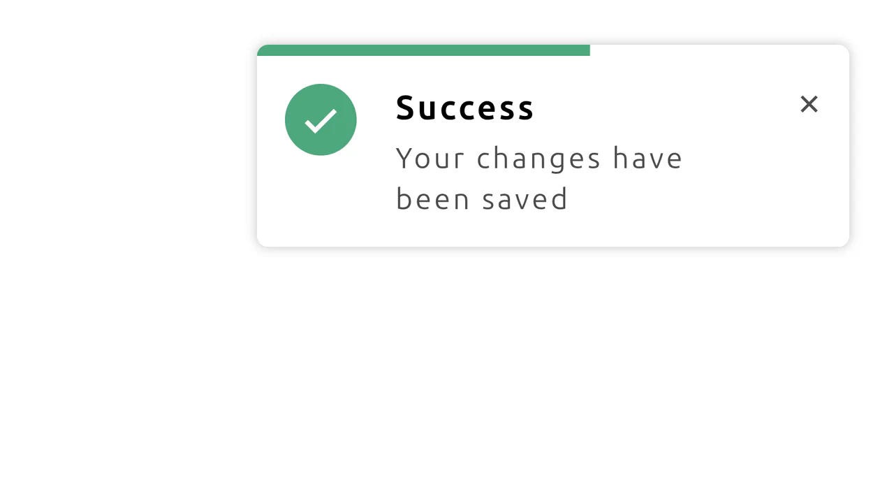
CSS Notification with Progress Animation
This demo shows how to build a dynamic notification using CSS-driven animations. It features a progress bar that shrinks over time and a hover state that pauses the countdown, all without any JavaScript.
See the Pen CSS Notification with Progress Animation.
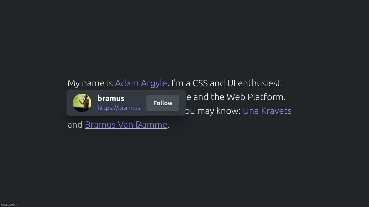
The demo uses the new CSS position-anchor with the popover attribute for native and flexible positioning of hover cards relative to text links. The code applies minimal Vanilla JS solely to invoke the native popover.showPopover() method, showcasing the shift to declarative UI.
CyberPopover 2025
A complex cyberpunk UI using the latest web APIs - native [popover] and View Transitions. Its intricate glitch animation and transition are controlled via JavaScript, while the clean, state-driven logic is built upon @layer and @starting-style.
See the Pen CyberPopover 2025.
A demonstration of advanced synchronization between the ResizeObserver API and the Popover API, where the Observer monitors the notification’s size change to automatically dismiss it once the height hits zero. It uses @starting-style and transition to create a smooth and controlled fade-out effect for the popover element.
AI Hero Chat Using the Popover API
An up-to-date Hero Section featuring an interactive chat implemented via the new Popover API. It showcases clean style organization using CSS @layer and leverages Open Props for modern variables and design.
See the Pen AI Hero Chat Using the Popover API.