150+ JavaScript Buttons (Page 2)
Examples

Animated Like Button with GSAP
This interactive like button uses gsap.timeline() to synchronize a dramatic count transition and a satisfying icon pulse with a large, fading ripple effect applied to the surrounding ring element.
See the Pen Animated Like Button with GSAP.

Turbulent Buttons with SVG Filters
A complex UI animation in SCSS and JS, where the Splitting.js library splits text into characters for per-character transform: translateY animation - this is combined with SVG filters animated via requestAnimationFrame for a comprehensive visual effect.
See the Pen Turbulent Buttons with SVG Filters.
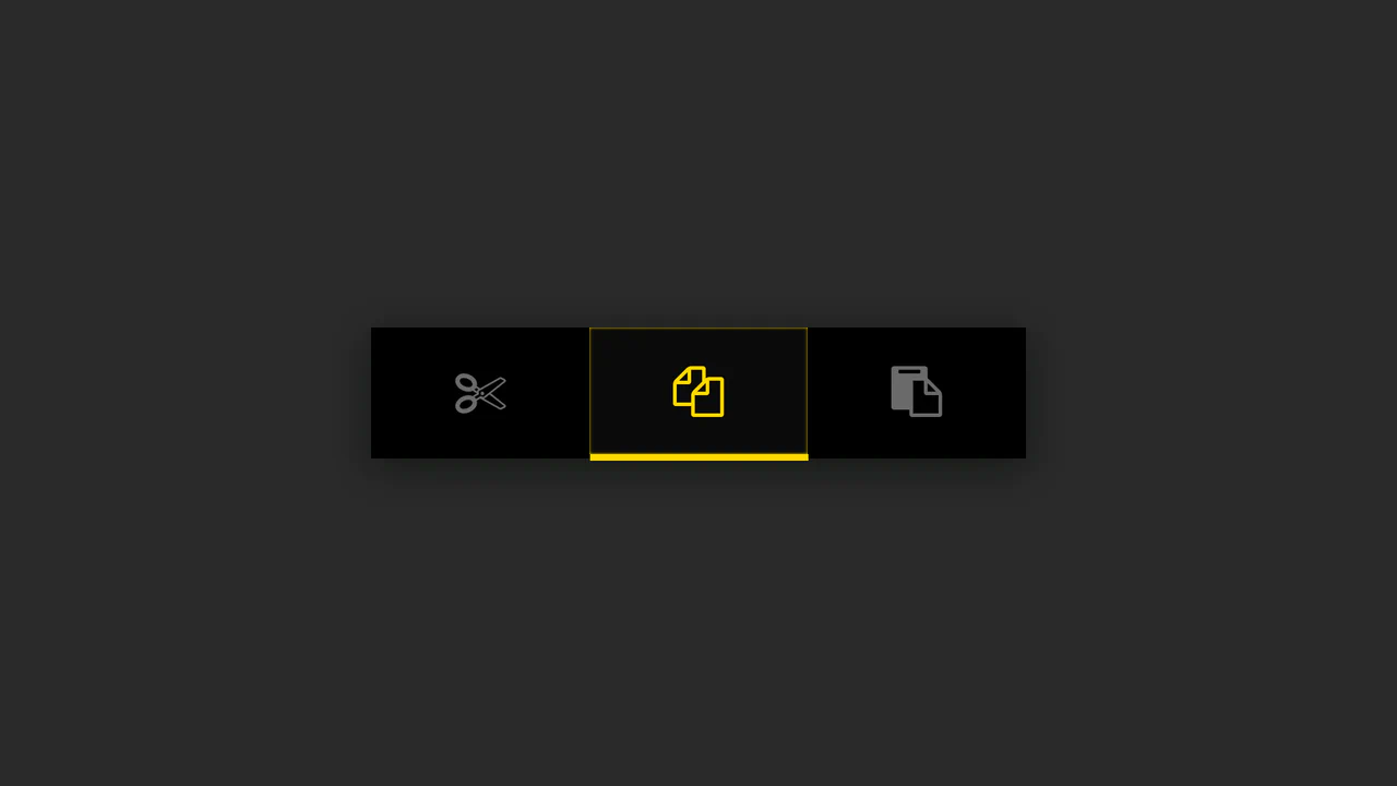
Button Group with Animated Indicator
A simple button group where the indicator’s position is calculated in JS based on the button’s data-num attribute - the offset is set via style.marginLeft, while the active state is animated using CSS.
See the Pen Button Group with Animated Indicator.
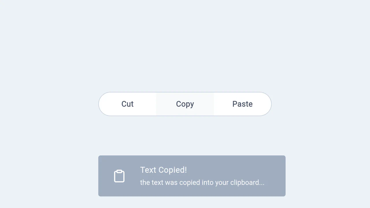
Multi-Button with Toast Notifications
Breaking down the full lifecycle of a toast notification in vanilla JS - from dynamically creating an element with createElement to removing it from the DOM with setTimeout after a CSS animation.
See the Pen Multi-Button with Toast Notifications.

Neumorphic Multi-Buttons with GSAP Tooltip
Interactive buttons with dual animation - GSAP handles the tooltip appearance, while a CSS class change on click triggers the SVG checkmark animation via stroke-dashoffset.
See the Pen Neumorphic Multi-Buttons with GSAP Tooltip.

Button-to-Modal Transition Animation with GSAP
Dynamic “button-to-modal” transition animation built with vanilla JavaScript and GSAP, featuring adaptive scaling calculation for correct display on all screen sizes.
See the Pen Button-to-Modal Transition Animation with GSAP.
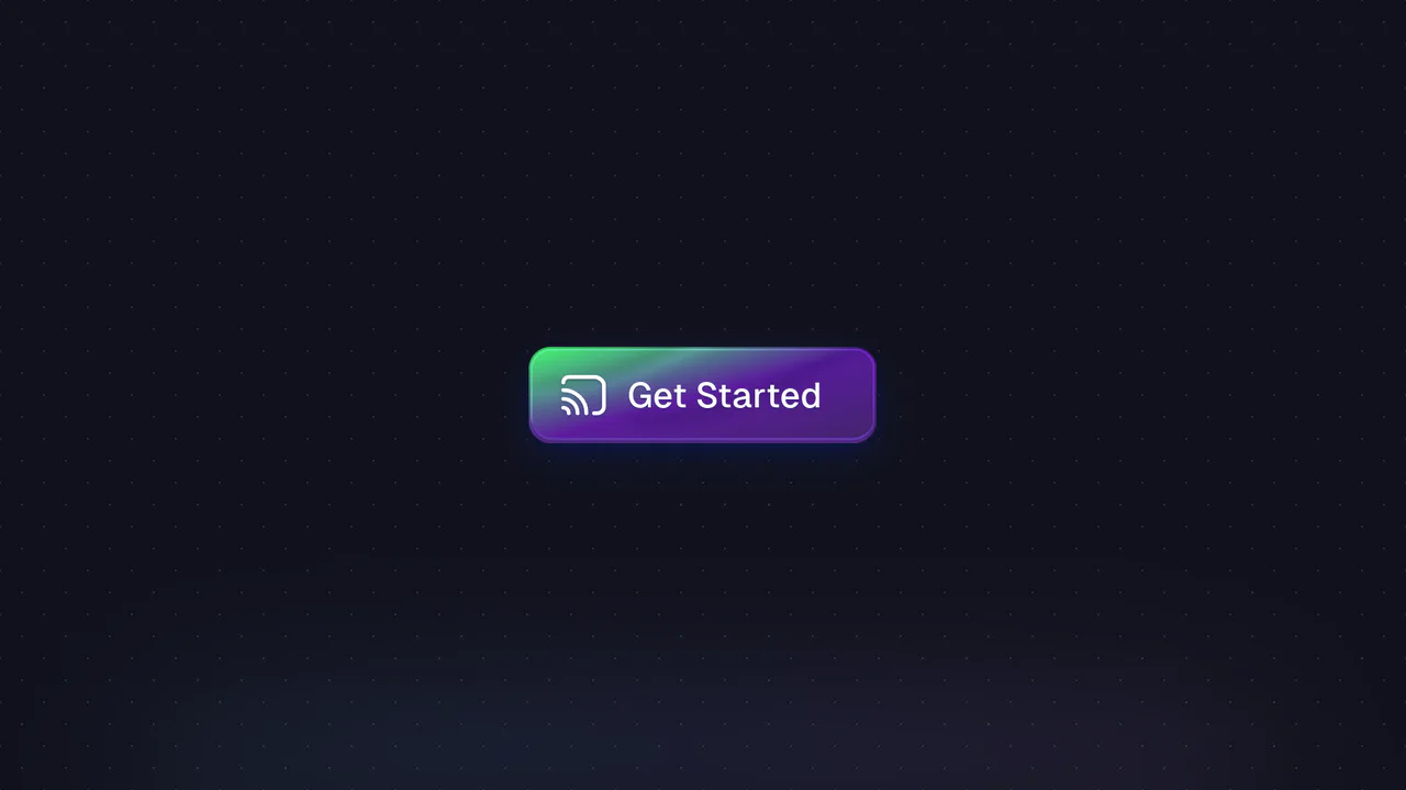
Button with Animated Gradient
Achieve a premium, vibrant glow and pulsating background with this component, which utilizes high-performance CSS animations and dynamic box-shadow effects, all orchestrated by TypeScript and the GSAP library.
See the Pen Button with Animated Gradient.
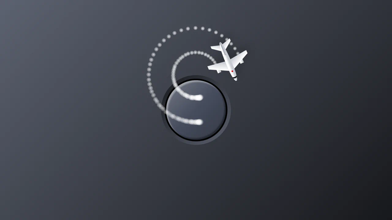
Airplane Mode Animation Toggle Switch
A modern toggle switch animation utilizing pure CSS :checked selector states to drive complex plane take-off/landing @keyframes, augmented by vanilla JavaScript’s Web Animations API (WAAPI) for dynamic smoke particle generation and cleanup.
See the Pen Airplane Mode Animation Toggle Switch.
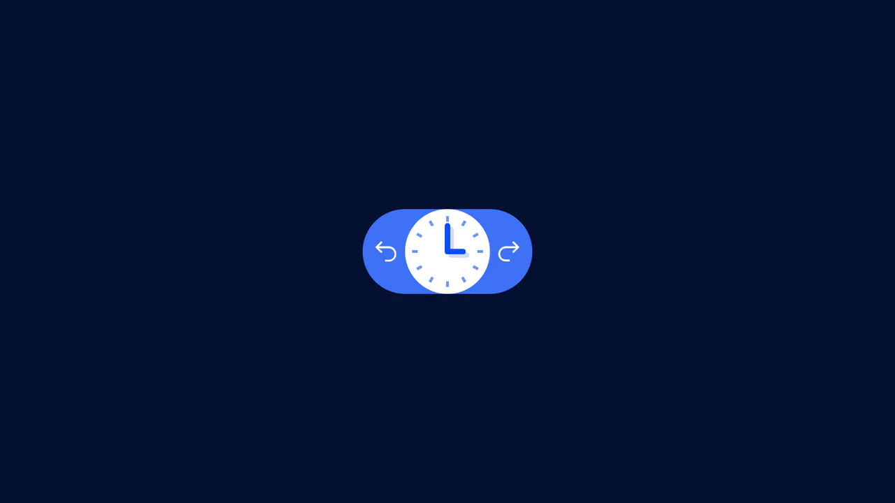
Undo/Redo With Active Clock Animation
A clean frontend implementation of an interactive button pair, where the history logic (Undo/Redo state) is managed by minimal Vanilla JS, and the rich clock rotation and dial animation is fully delegated to CSS transforms.
See the Pen Undo/Redo With Active Clock Animation.
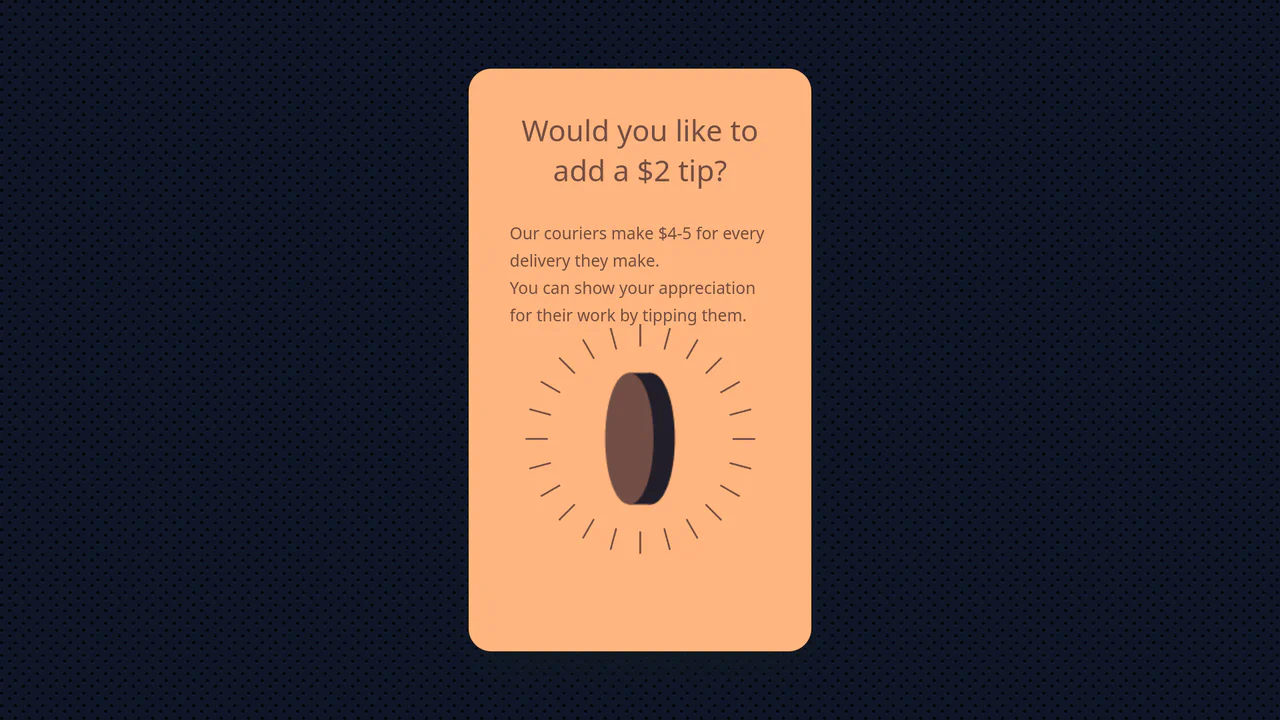
GSAP FLIP Transform Button to 3D Coin
Utilizing the powerful GSAP FLIP technique to flawlessly transform a 2D button into a highly detailed 3D object (a spinning coin) created with the lightweight Zdog library, ensuring a smooth transition between DOM and 3D graphics.
See the Pen GSAP FLIP Transform Button to 3D Coin.

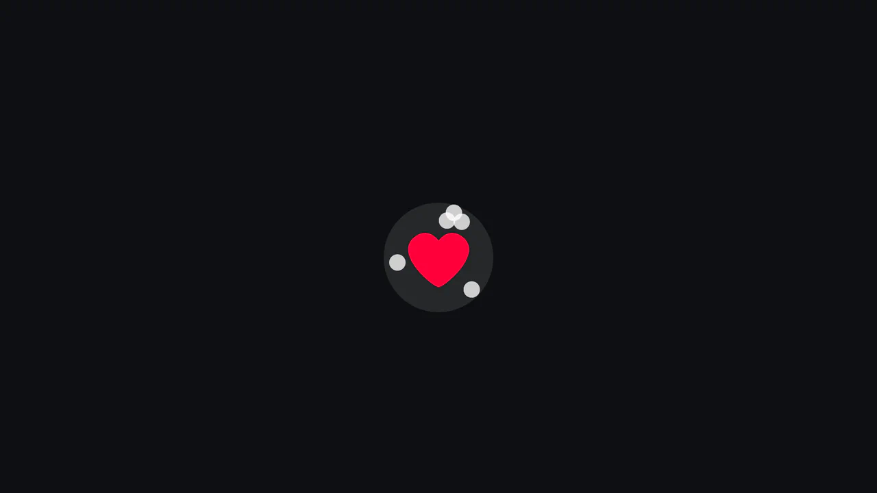
Insta-hearts ❤ (GSAP MotionPath)
This interactive demo leverages GSAP’s MotionPathPlugin to generate unique, randomized cubic Bézier paths on click, ensuring a fresh and highly organic animation sequence every time.
See the Pen Insta-hearts ❤ (GSAP MotionPath).
Heartless Confetti Button Effect
A clean implementation of the popular “confetti” effect for a button, using Vanilla JS to dynamically create/remove elements and set CSS variables, while the entire animation logic for movement and fading is handled by highly optimized CSS keyframes.
See the Pen Heartless Confetti Button Effect.
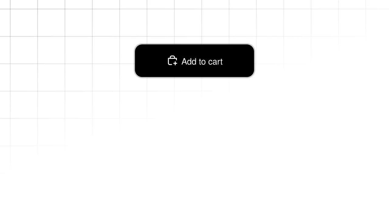
Add to Cart Button
A highly interactive prototype demonstrating advanced UX for an “Add to Cart” button: features complex SVG animation of the success state, utilizing CSS transitions for performance.
See the Pen Add to Cart Button.