10+ JavaScript Data Visualizations
Explore the deep end of JavaScript Data Visualization by focusing on native and custom rendering. This guide walks you through building everything from standard bar charts to complex network graphs and 3D models. You’ll master techniques for handling time-series and geospatial data using pure JavaScript, with a strong emphasis on extensibility - allowing you to create unique, fully customizable visualization components beyond the limits of standard library templates.
Examples
Container-Aware Plotly Chart
This is a Container-Aware Plotly Chart. It forces a data visualization component to respond strictly to its parent element’s dimensions rather than the global window size. Its function is to prevent layout breakages in complex dashboards where sidebars toggle or CSS Grid tracks resize dynamically without triggering a global window resize event. (Requires: plotly-js)
See the Pen Container-Aware Plotly Chart.
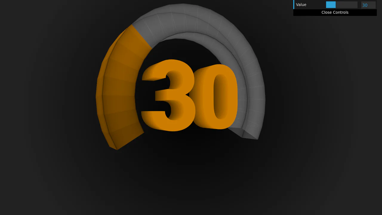
3D Rotating Value Dial
This is a 3D Rotating Value Dial. It visualizes continuous data through a spatial, cylindrical interface. Its function is to replace flat range indicators with a tactile, volumetric readout that dynamically shifts color hue based on value. (Requires: dat.gui)
See the Pen 3D Rotating Value Dial.

Dynamic Data-Driven Tag Cloud Component
This is a Dynamic Data-Driven Tag Cloud Component. It consumes an external JSON payload to generate interactive tags, proportionally scaling their font sizes based on their frequency of use. Its function is to visually prioritize popular categories, allowing users to intuitively navigate heavy content taxonomies without reading numbers.
See the Pen Dynamic Data-Driven Tag Cloud Component.
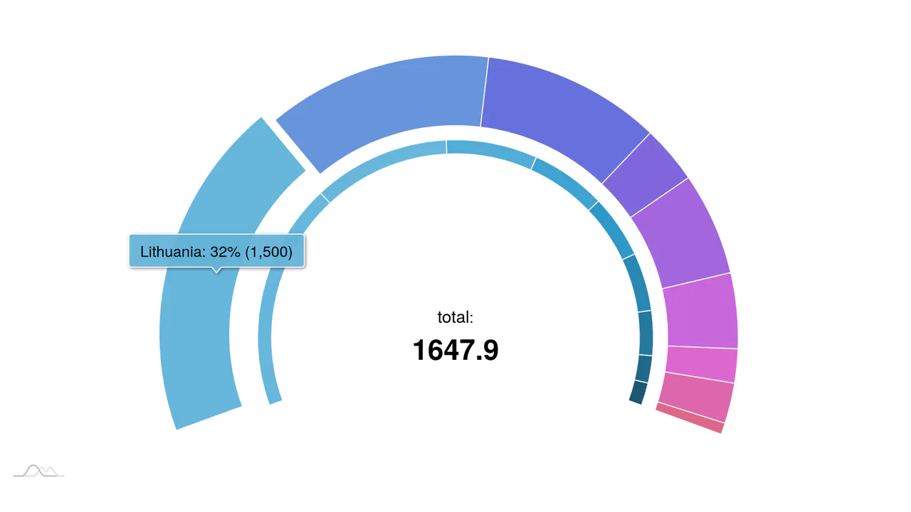
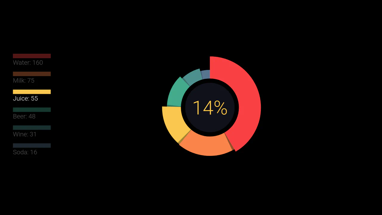
Nested Animated Doughnut Data Visualization
This component is a Nested Animated Doughnut Data Visualization built with the amCharts 4 framework. It renders two concentric data series within a single circular coordinate system. Its function is to provide a high-density comparison of related metrics, utilizing a central dynamic label to summarize the aggregate total. (Requires: amCharts 4)
See the Pen Nested Animated Doughnut Data Visualization.

Semicircular Animated Radar Gauge
This is a Semicircular Animated Radar Gauge built with the amCharts 4 engine. It distills complex metrics like Carbon and Energy into a high-contrast radial format that covers only 270 degrees of a circle. Its function is to provide an at-a-glance KPI status within professional data dashboards, replacing cluttered line charts with clean, weighted arcs. (Requires: amCharts 4)
See the Pen Semicircular Animated Radar Gauge.
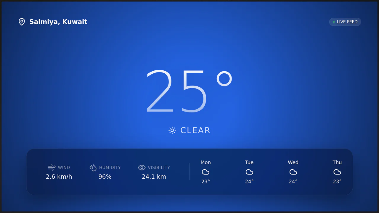
Oculus II: Immersive 3D Weather Station
Oculus II redefines the weather dashboard by blending real-time data with a cinematic 3D environment. Unlike static weather apps, it uses Three.js to render a living scene - drifting clouds, falling rain, or twinkling stars - that reacts to the mouse cursor with a subtle parallax effect. The UI floats above this world using glassmorphism, creating a sense of depth and modernity while providing live weather metrics from the Open-Meteo API. (Requires: Three.js, GSAP, Lucide Icons)
See the Pen Oculus II: Immersive 3D Weather Station.

Semantic Custom Progress Bar Kit
This Semantic Custom Progress Bar Kit offers a robust way to display data visualization using a “semantic-first” approach. Instead of writing empty div soup, you define your data using standard HTML5 <progress> tags. The accompanying JavaScript then “hydrates” these tags, converting them into four distinct, visually rich styles ranging from simple solids to complex gradients and striped patterns, perfect for dashboards or skill portfolios.
See the Pen Semantic Custom Progress Bar Kit.
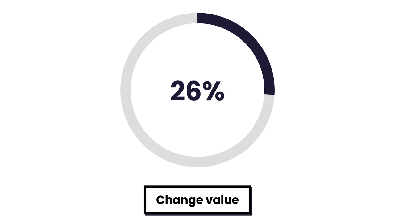
Simple SVG Circle Graph with Animation
A smooth radial progress animation where the SVG stroke fills the circumference based on a dynamically calculated offset.
See the Pen Simple SVG Circle Graph with Animation.

Incrementing Counter
A dynamic and engaging statistics block that creates a sense of activity and popularity through running numbers and background animation.
See the Pen Incrementing Counter.
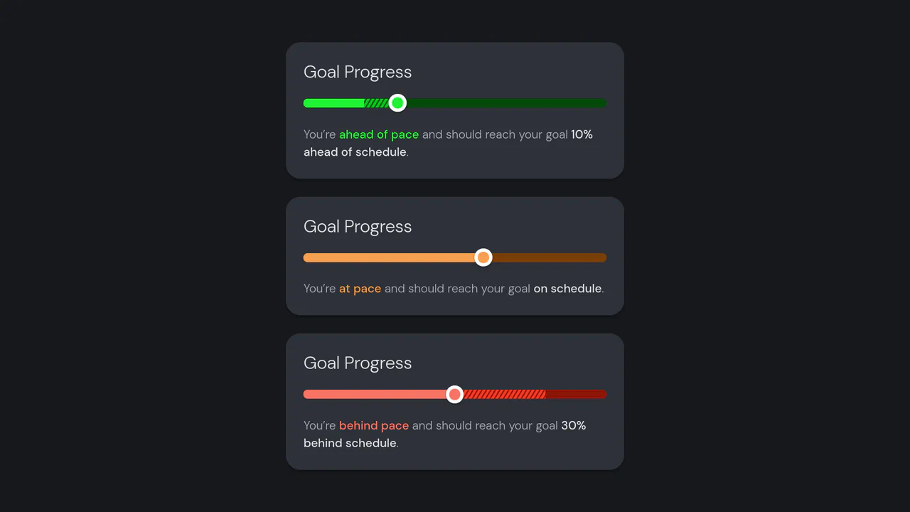
Goal Progress
A React-based goal tracker component that visually contrasts actual progress against a target pace using layered bars and dynamic status colors.
See the Pen Goal Progress.

Motion Blurred Number Counter
As the slider moves, the numbers change rapidly, blurring horizontally to create a sensation of high-speed motion (motion blur), reminiscent of an old speedometer or a slot machine counter.
See the Pen Motion Blurred Number Counter.

Serpentine Timeline Chart
This serpentine Gantt chart implementation leverages amCharts’ specialized SerpentineChart and CurveColumnSeries to visualize project timelines along a curved axis. JavaScript orchestrates multiple bullet types for event markers while CSS properties like strokeDasharray create the distinctive dashed guideline aesthetic, resulting in an elegant spiral timeline with interactive tooltips and smooth animations.
See the Pen Serpentine Timeline Chart.

Centennial Timeline with Google Sheets
A demonstration of the TimelineJS library - a ready-made solution for creating interactive timelines where all content is loaded dynamically from a public Google Sheet, separating data from presentation.
See the Pen Centennial Timeline with Google Sheets.
Animated D3.js Pie Chart with Elastic Easing
This dynamic D3.js pie chart utilizes a custom elastic easing and a rotate transform for the spectacular “spin-in” animation of each slice.
See the Pen Animated D3.js Pie Chart with Elastic Easing.
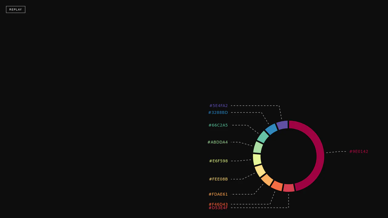
Animated Pie Chart (V2)
A demo showcasing an adaptive, unique “ring” pie chart design using SVG circles, where each segment is animated and colored from a predefined JavaScript array.
See the Pen Animated Pie Chart (V2).

Glitch Equalizer with Web Audio API and Canvas
This is a powerful demonstration of the Web Audio API and Canvas synchronization, where an AnalyserNode processes real-time audio data to dynamically drive complex visual glitch effects and an animated equalizer display.
See the Pen Glitch Equalizer with Web Audio API and Canvas.

Animated Periodic Table
This interactive demo uses pure JavaScript and D3.js to generate and animate a full Periodic Table via SVG, showcasing advanced techniques for data-driven element positioning and cyclical motion effects.
See the Pen Animated Periodic Table.

Thermometer with Animation
Elegant CSS showcase of an animated thermometer with dynamic temperature updates via JavaScript, supporting a dual Celsius/Fahrenheit scale and automatic Dark Mode theme.
See the Pen Thermometer with Animation.
D3 Line Marker Chart
A powerful D3.js line chart dynamically visualizes data aggregated from a nested JavaScript object, showcasing the use of reduce for data processing and scaleBand with scaleLinear for precise axis scaling.
See the Pen D3 Line Marker Chart.