110+ JavaScript Menu
JavaScript enhances navigation menus with animation, logic, and interactivity. This collection of JavaScript-powered menus includes dropdowns, slide-ins, mega menus, mobile nav toggles, and responsive animations that go beyond what CSS alone can offer.
Examples
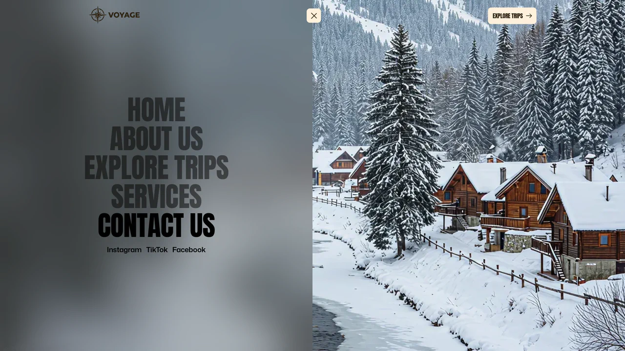
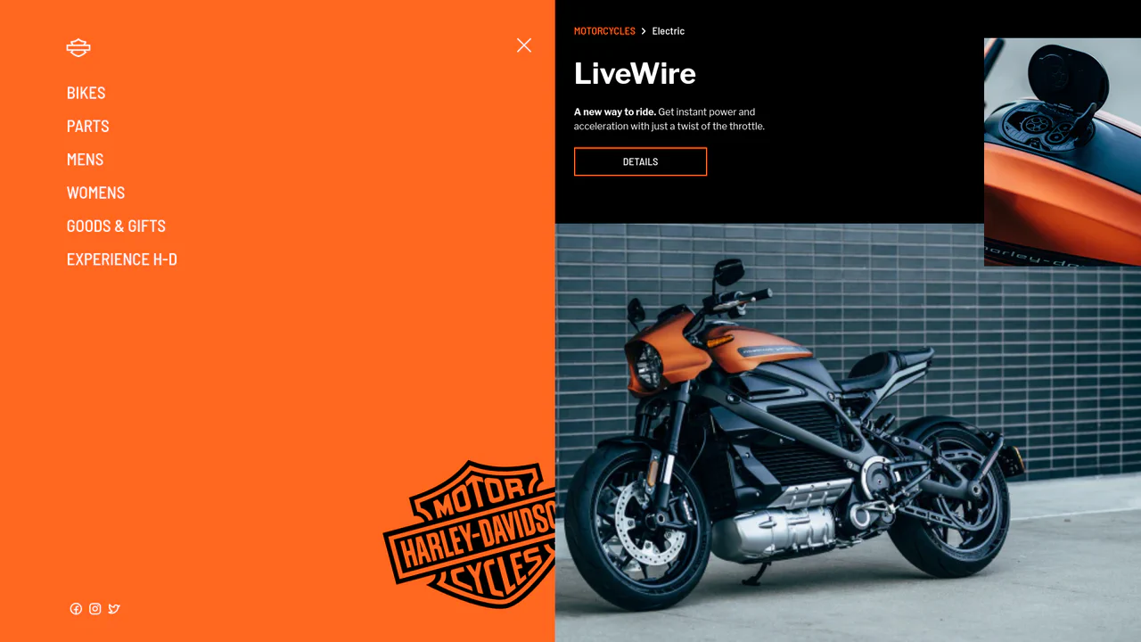
Full-Screen Perspective Travel Menu Overlay
An advanced full-screen navigation overlay. Toggling the menu scales, translates, and rotates the active page content into a stunning perspective viewport canvas while a polygon clip-path mask slides the overlay into view. Hovering over menu links triggers seamless background image crossfades and zooms, accompanied by staggered split-character text reveals. (Requires: gsap.js)
 Chrome 76+
 Edge 79+
 Firefox 70+
 Safari 9.1+
See the Pen Full-Screen Perspective Travel Menu Overlay.
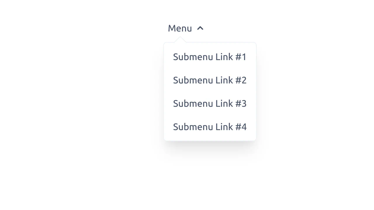
Scroll-Snapping Popover Select Dropdown Menu
An experimental custom select dropdown menu built on native HTML5 base-select specifications. The picker popover displays options in a vertically scroll-snapped viewport that fades and blurs adjacent values based on scroll proximity. A lightweight GSAP scrolling script automatically centers and aligns selected items in real time, while modern @starting-style manages discrete popover overlay entry transitions. (Requires: gsap.js, tweakpane.js)
Chrome 130+
Edge 130+
See the Pen Scroll-Snapping Popover Select Dropdown Menu.
Morphing Stripe-Style Dropdown Navigation
“Morphing Stripe-Style Dropdown Navigation” replicates the famous Stripe header effect. A single background element dynamically resizes and moves behind the active content. JavaScript calculates dimensions using getBoundingClientRect() and updates CSS properties to animate the panel. This approach keeps the DOM clean and ensures smooth transitions between menu sections.
Chrome 48+
Edge 15+
Firefox 48+
Safari 10+
See the Pen Morphing Stripe-Style Dropdown Navigation.

Circular Reveal Fullscreen Navigation Menu
Circular Reveal Fullscreen Navigation Menu leverages GSAP timelines to orchestrate a fluid canvas expansion by animating a CSS clip-path circle from 0px to 200%. Simultaneous staggered translations are applied to navigation links using a responsive elastic.out easing curve, creating a highly tactile, sequential entry. While the transition remains visually seamless on high-refresh-rate screens, full-screen masking with dynamic clip paths can impose substantial rendering overhead, demanding GPU-accelerated layer promotion via will-change: clip-path to maintain consistent frame rates. (Requires: gsap.js)
Chrome 112+
Edge 112+
Firefox 117+
Safari 16.5+
See the Pen Circular Reveal Fullscreen Navigation Menu.
Curtain Transition Navigation Menu
Curtain Transition Navigation Menu implements a lightweight state toggle via a data-nav attribute, shifting the entire <main> view up by 50% to reveal an absolutely-positioned bottom navigation drawer. Dynamic sizing features like clamp() and max() ensure responsive link layouts, while a sharp cubic-bezier(.13, .53, .38, .97) curve coordinates the simultaneous scaling and entry of image-rich navigation elements. While visually fluid, animating massive full-screen wrappers containing large Unsplash media can trigger costly rasterization overhead unless GPU compositing is actively hinted.
Chrome 88+
Edge 88+
Firefox 89+
Safari 15+
See the Pen Curtain Transition Navigation Menu.
Smooth GSAP Slide-Out Sidebar Navigation
This is a full-viewport e-commerce layout featuring a GSAP-powered off-canvas sidebar navigation. It resolves the conflict between showcasing high-density visual content and maintaining a complex navigation structure. The layout hides primary links off-screen, revealing them through a staggered, hardware-accelerated slide sequence only when requested. (Requires: gsap.js, cssruleplugin.js)
Chrome 80+
Edge 80+
Firefox 75+
Safari 13+
See the Pen Smooth GSAP Slide-Out Sidebar Navigation.
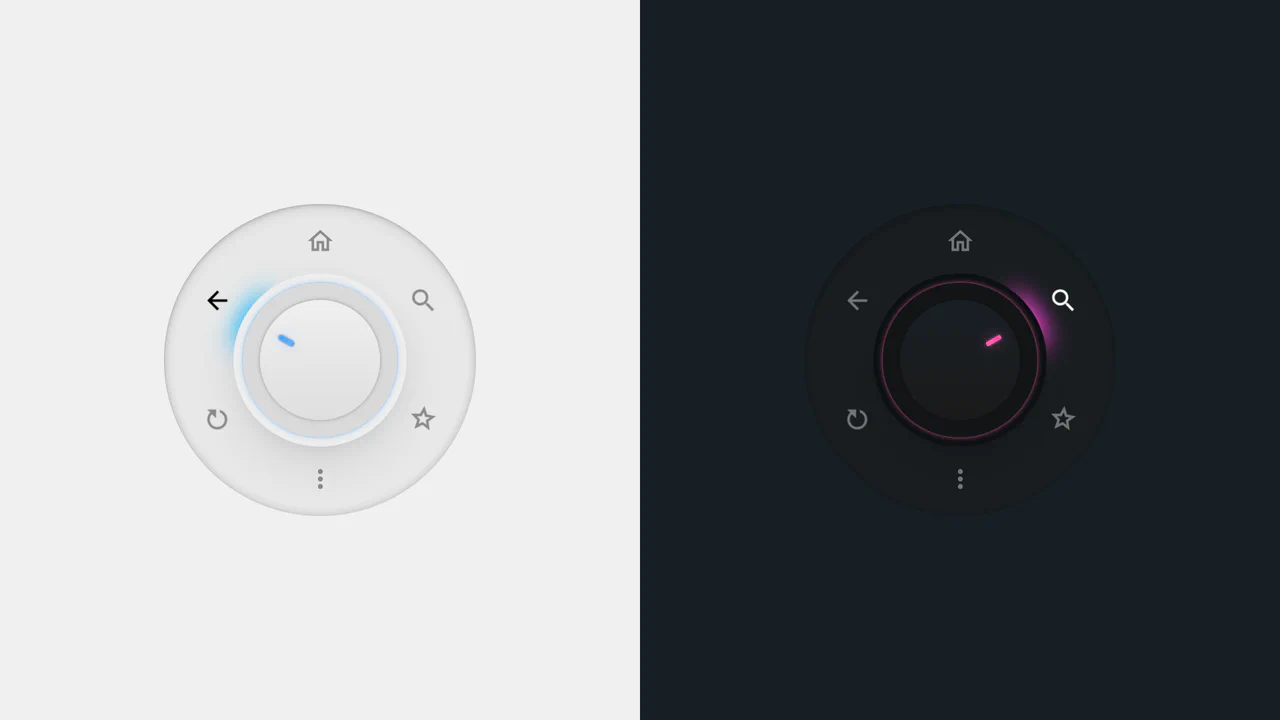
Radial Dial Control Menu
This is a Radial Dial Control Menu. It replaces traditional linear dropdowns with a rotary, hardware-inspired interface. Its function is to provide rapid, omnidirectional access to secondary actions, utilizing the user’s spatial memory and reducing cursor travel distance.
Chrome 115+
Edge 115+
Safari 16.4+
Firefox 128+
See the Pen Radial Dial Control Menu.
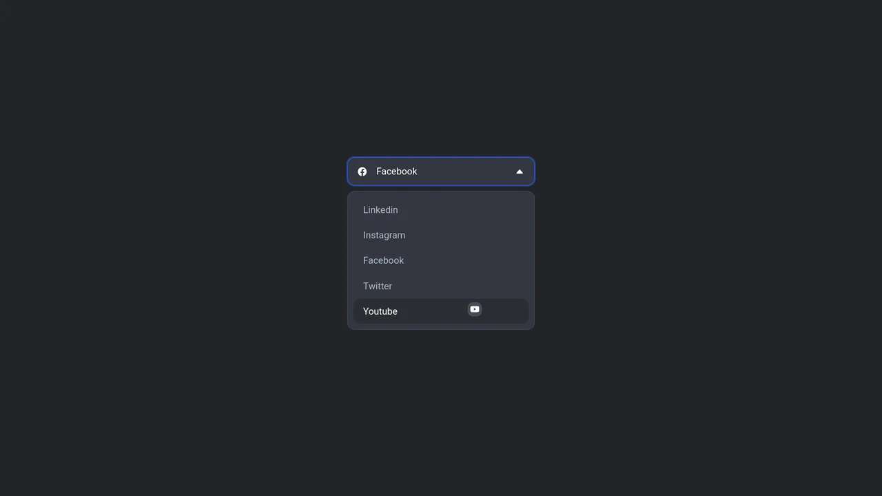
Floating Icon Select Dropdown
This is a Floating Icon Select Dropdown. It replaces the native OS <select> element with a spatial, hardware-accelerated interface. Its primary function is to provide immediate, physical feedback: as the user interacts with the list, a custom icon detaches from the layout and physically tracks the cursor’s coordinates.
Chrome 80+
Edge 80+
Firefox 75+
Safari 13+
See the Pen Floating Icon Select Dropdown.
Liquid Polygon Fullscreen Navigation Menu
This is a Liquid Polygon Fullscreen Navigation Menu. It utilizes an intricate CSS clip-path mask to create an organic, ink-bleed reveal effect over the viewport. Its function is to replace standard rigid slide-in menus with a spatial, fluid transition, immediately altering the user’s interface context.
Chrome 55+
Edge 79+
Firefox 54+
Safari 13.1+
See the Pen Liquid Polygon Fullscreen Navigation Menu.

Mission Control Grid Exposé
This is a Mission Control Grid Exposé. It scales overlapping full-screen views into a unified spatial grid. Its function is to provide absolute structural context, replacing linear tab switching with a macro-level physical interface.
Chrome 114+
Edge 114+
Safari 17+
Firefox 125+See the Pen Mission Control Grid Exposé.

Stacked Card Pull-Down Navigation
This is a Stacked Card Pull-Down Navigation. It transforms a standard mobile menu into a tactile, deck-like interface that cascades down from the viewport’s top edge. Its primary function is to provide an engaging, full-screen routing experience, replacing the traditional hamburger icon with an interactive, overlapping layer system that optimizes touch targets.
Chrome 86+
Edge 86+
Firefox 85+
Safari 14+
See the Pen Stacked Card Pull-Down Navigation.

Interactive Sidebar Tree Navigation
This is an Interactive Sidebar Tree Navigation. It acts as a custom Web Component (<sidebar-tree>) that generates and manages a complex, multi-level navigation structure from a JSON data object. Its primary function is to provide a highly accessible, keyboard-navigable document outline with built-in real-time search filtering and smooth expand/collapse animations. (Requires: Tweakpane, GSAP)
Chrome 80+
Edge 80+
Firefox 75+
Safari 13.1+See the Pen Interactive Sidebar Tree Navigation.

Auto-Generated Anchor Positioned TOC
This is an Auto-Generated Anchor Positioned TOC. It parses an article’s heading structure on the fly and constructs a sticky navigation menu. Its primary function is to replace heavy JavaScript scroll-spies (Intersection Observers) with native CSS Anchor Positioning and Scroll Targeting, moving an animated highlight alongside the active content section. (Requires: Tweakpane, GSAP)
Chrome 125+
Edge 125+See the Pen Auto-Generated Anchor Positioned TOC.

Glassmorphic Advanced Navigation System
This is a Glassmorphic Advanced Navigation System. It provides a central, floating control hub for single-page applications. Its function is to persistently guide the user across different content sections while maintaining a high-end, translucent aesthetic that adapts fluidly between desktop and mobile environments.
Chrome 76+
Edge 79+
Firefox 70+
Safari 14+
See the Pen Glassmorphic Advanced Navigation System.

Jello Animated Sliding Tab Navigation
This is a Jello Animated Sliding Tab Navigation. It provides top-level categorization and context-aware sub-menus in a single mobile-friendly component. The function is to visually anchor the user’s location within an app while dynamically adapting the global color theme to match the active context.
Chrome 60+
Edge 79+
Firefox 55+
Safari 11+See the Pen Jello Animated Sliding Tab Navigation.
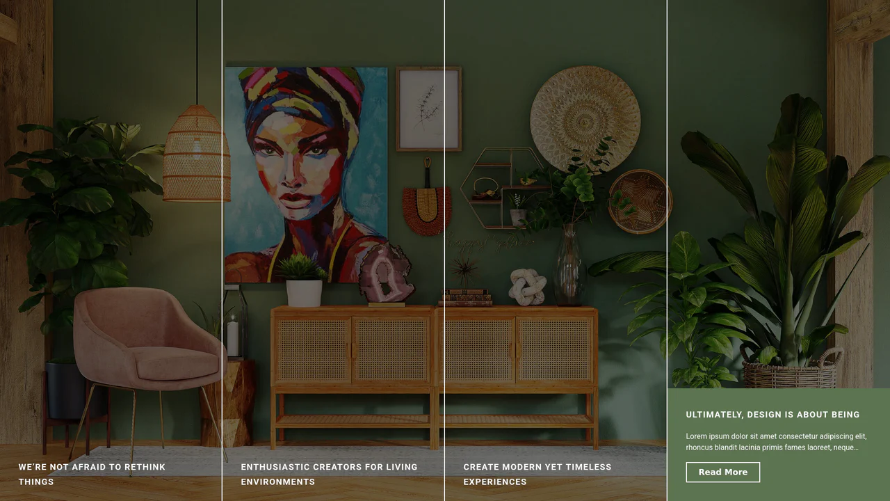
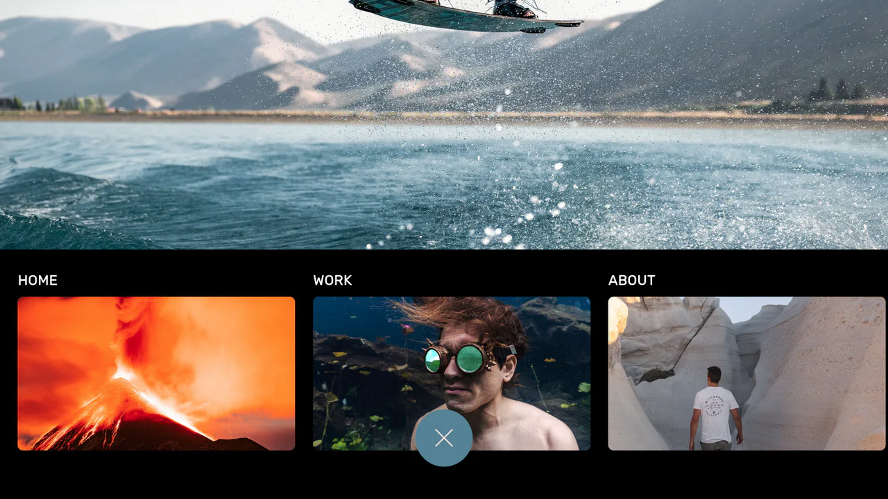
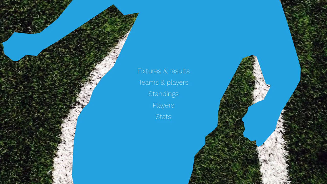
Expanding Split-Screen Grid Navigation
This Expanding Split-Screen Grid Navigation transforms standard menu items into an immersive, interactive gallery experience. It organizes content into a responsive grid where hovering over an item reveals a contextual background image, and clicking expands the section into a full-screen detailed view. This component is ideal for portfolios, featured article selections, or high-end agency landing pages where visual storytelling is key.
Chrome 45+
Edge 15+
Firefox 35+
Safari 9+
See the Pen Expanding Split-Screen Grid Navigation.

Staggered Panel Curtain Menu
The Staggered Panel Curtain Menu is a creative full-screen navigation concept that breaks the traditional “fade-in” mold. It uses a series of vertical panels that drop down at slightly different intervals, creating a sophisticated “curtain” reveal. This effect is achieved by combining the precision of GSAP with the flexibility of CSS clip-path and variable fonts, making it an ideal choice for high-end creative portfolios or modern agency websites. (Requires: GSAP)
Chrome 80+
Edge 80+
Firefox 75+
Safari 13.1+
See the Pen Staggered Panel Curtain Menu.

3D Tilt Mobile Navigation
This 3D Tilt Mobile Navigation concept adds a tactile, physical feel to mobile app menus. Unlike standard flat navigations, this component utilizes CSS perspective to “tilt” the entire menu bar towards the user’s touch point, simulating a floating surface. It pairs this effect with delightful SVG icon micro-interactions and a “fly-out” card transition for the content area, creating a highly polished, app-like experience on the web.
Chrome 86+
Edge 86+
Firefox 85+
Safari 15.4+See the Pen 3D Tilt Mobile Navigation.

Responsive Navigation Bar
A classic horizontal navbar on desktop that transforms into a neat hamburger button on mobile; clicking it triggers an icon animation and reveals a full-screen overlay menu.
See the Pen Responsive Navigation Bar.
Tailwind CSS Fly-out Menu with Vue.js
An elegant, interactive menu with soft animation that feels responsive and modern.
See the Pen Tailwind CSS Fly-out Menu with Vue.js.

Animated Navigation
An elegant and responsive menu that saves space when collapsed and provides a smooth, delightful interaction experience upon opening.
See the Pen Animated Navigation.

Elastic Portfolio Navigation with GSAP
An energetic, high-tech menu providing powerful visual feedback upon interaction, perfectly suited for cyberpunk or sci-fi themed websites.
See the Pen Elastic Portfolio Navigation with GSAP.

Magnetic Links
A sophisticated magnetic navigation menu that uses JavaScript to map mouse proximity to CSS variables, driving smooth translations via translate. It features a configurable “follow” effect where a background pseudo-element glides between items based on bounding box coordinates calculated on hover.
See the Pen Magnetic Links.

Glowing Tabs
A navigation menu leveraging CSS Houdini API to animate custom variables for smooth transitions. JavaScript calculates element geometry to drive a dynamic “glowing” background that slides between tabs, while CSS gradients and the :has() selector create a polished, depth-rich visual style.
See the Pen Glowing Tabs.
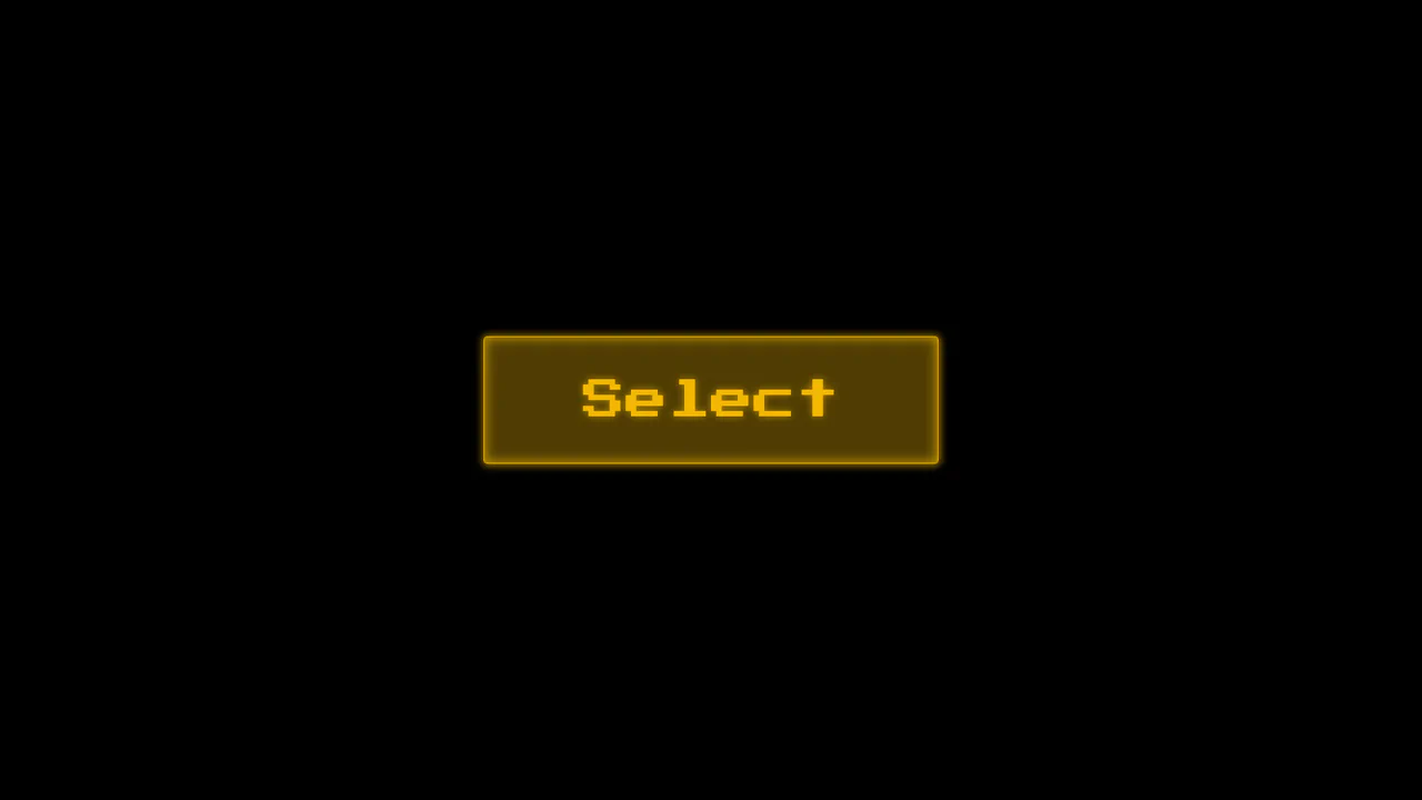
Choose Your Megafauna
A high-tech, atmospheric interface that immerses the user in a retro-futuristic environment, reminiscent of 80s arcade selection screens or cyberpunk movies.
See the Pen Choose Your Megafauna.

Huge Headers and Mega Menus
An immersive, cinematic landing page that captures user attention with smooth, complex animation and offers convenient navigation via a stylish fullscreen menu.
See the Pen Huge Headers and Mega Menus.

Complex Navigation
A fully responsive, accessible mega-menu designed for e-commerce, featuring multi-column dropdowns and a mobile-friendly hamburger toggle.
See the Pen Complex Navigation.

Cyber-Styled Sliding Tab Bar
A cyber-styled navigation bar featuring a sliding indicator driven by absolute positioning and coordinate mapping. JavaScript dynamically updates the style.left property via a switch statement, while CSS transition and drop-shadow render a smooth, neon-lit motion effect over the active SVG icons.
See the Pen Cyber-Styled Sliding Tab Bar.

Animated Menu Bar with Hamburger
A demonstration of a two-phase menu reveal animation - a fast transform: translateX shift and a slower width expansion are defined in a single transition property, creating a distinct visual effect.
See the Pen Animated Menu Bar with Hamburger.

Wriggly Squiggly Navigation
An animated underline effect for navigation where an SVG path segment smoothly “flows” from one item to another - on click, JS dynamically calculates and sets the stroke-dasharray for the SVG, creating the illusion of movement.
See the Pen Wriggly Squiggly Navigation.