60+ JavaScript Range Sliders
Range sliders allow users to select a value or range with precision and ease. This collection of JavaScript range sliders includes dual-handle sliders, live value updates, theming options, and smooth, responsive controls for pricing, filtering, or volume adjustments.
Examples
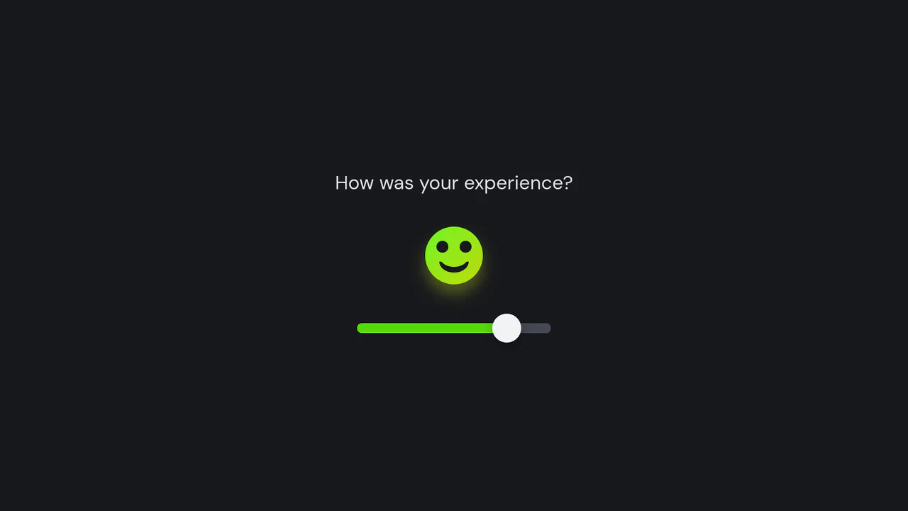
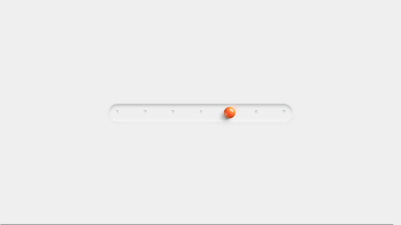
Interactive Keyframe-Scrubbing Face Rating Slider
This interactive rating slider features an animated face that morphs smoothly between various emotional states. Built with vanilla JS and CSS, the script maps the slider’s percentage value directly to negative animation-delay custom properties. This scrubs through paused keyframe animations to morph facial geometries, skew eyes via clip-path polygons, and cycle HSL gradient hues.
 Chrome 55+
 Edge 79+
 Firefox 54+
 Safari 9.1+
See the Pen Interactive Keyframe-Scrubbing Face Rating Slider.
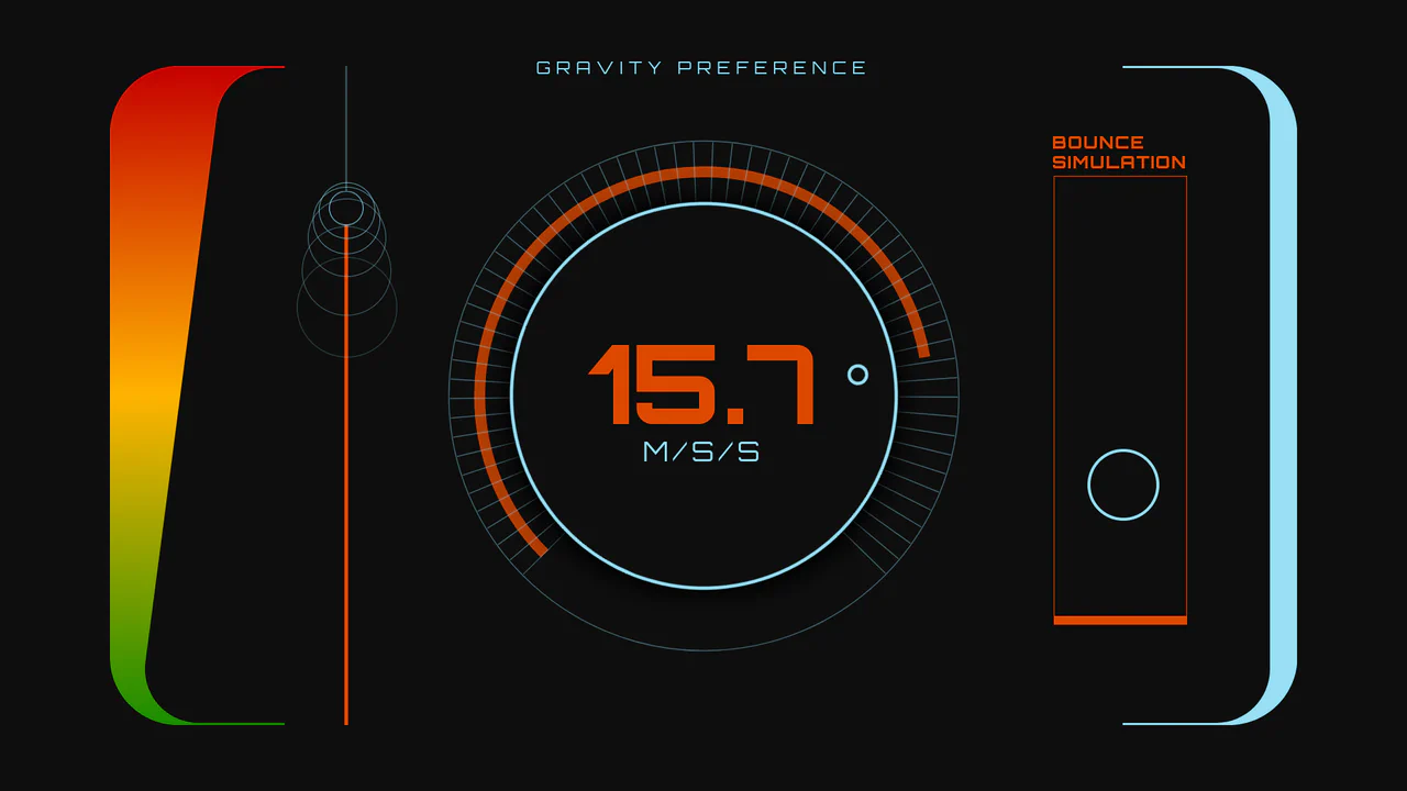
Sci-Fi Gravity Simulation Dashboard
An interactive sci-fi dashboard demonstrating variable physics and dynamic UI synchronization. Powered by GSAP and Draggable plugins, users can manipulate gravity parameters through either a rotary SVG dial or a vertical linear range slider. Adjusting the inputs scales the bouncing ball simulation’s trajectory height and speed in real-time, while simultaneously morphing variable font weights and HUD color gradients. (Requires: gsap.js, scroll-trigger.js, draggable.js)
Chrome 62+
Edge 79+
Firefox 63+
Safari 11.1+
See the Pen Sci-Fi Gravity Simulation Dashboard.
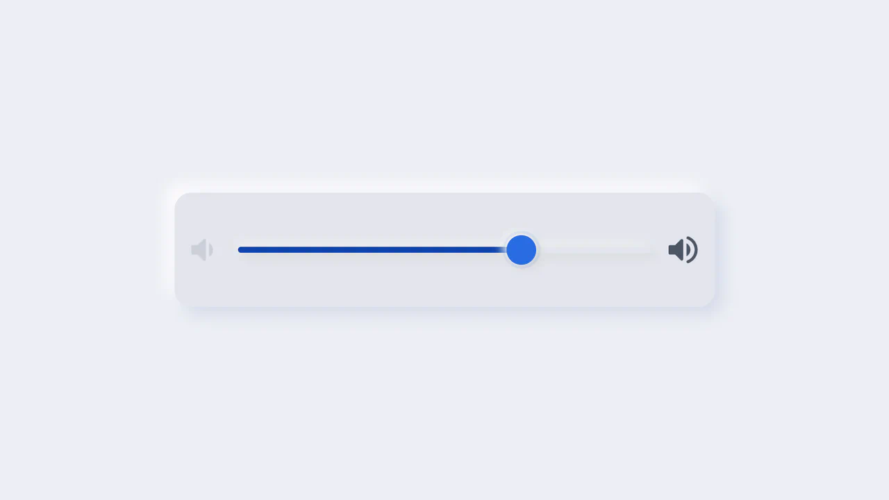
Neumorphic Volume Slider with Ripple Glow
An elegant neumorphic volume slider featuring an active thumb focus glow and directional icon highlights. Built with a single native range input and styled with modern CSS Custom Properties, it implements the Houdini @property API to transition colors smoothly across sliding states. Dragging shifts opacity focus to the corresponding volume icon based on directional vector calculations in pure CSS.
Chrome 85+
Edge 85+
Firefox 128+
Safari 16.4+
See the Pen Neumorphic Volume Slider with Ripple Glow.
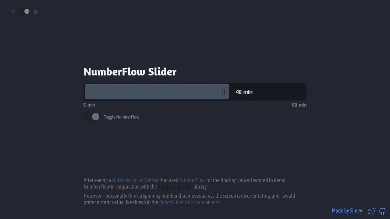
NumberFlow Floating Range Pips Slider
An interactive numeric range slider combining the Svelte Range Slider Pips library and the NumberFlow web component. Dragging the slider handle updates a floating badge indicator that slides horizontally, dynamically shifting its layout alignment to the left of the handle whenever it exceeds a 70% bar-width threshold. Includes a value-rolling automated intro animation. (Requires: svelte-range-slider-pips.js, number-flow.js)
Chrome 110+
Edge 110+
Firefox 120+
Safari 16.2+
See the Pen NumberFlow Floating Range Pips Slider.
Neumorphic 3D Range Slider
This is a Neumorphic 3D Range Slider. It replaces the default browser input track with a recessed tactile trench and a volumetric, glassmorphic sphere. Its function is to provide highly physical, stepped input selection, making data entry feel like interacting with premium hardware.
Chrome 88+
Edge 88+
Firefox 80+
Safari 14+
See the Pen Neumorphic 3D Range Slider.

Tilting Diamond Range Slider Effect
This is a Tilting Diamond Range Slider Effect. It tracks user input through a hidden native range element, overlaying a custom graphical interface. Its primary function is to inject physical inertia into a standard digital control. The tooltip mimics mass, lagging behind rapid movements and tilting in the direction of travel.
Chrome 80+
Edge 80+
Firefox 75+
Safari 13+
See the Pen Tilting Diamond Range Slider Effect.

Skeuomorphic Snowball Range Slider
This is a Skeuomorphic Snowball Range Slider. It re-imagines the standard HTML range input as a photorealistic physical object. Its function is to provide a highly tactile and playful interface where the slider’s thumb appears as a snowball, complete with a dynamic snow texture that seems to “roll” and cast realistic environmental shadows as it moves along its track.
Chrome 60+
Edge 79+
Firefox 55+
Safari 11+See the Pen Skeuomorphic Snowball Range Slider.

Cutout Gradient Track Range Slider
This is a Cutout Gradient Track Range Slider. It re-styles the native <input type="range"> element to create a unique visual illusion: the thumb appears to carve an invisible “gap” or “halo” into the track beneath it as it slides. Its function is to provide a highly stylized, modern form control that integrates seamlessly over complex photographic backgrounds without requiring heavy SVG masking or extra DOM nodes.
Chrome 60+
Edge 79+
Firefox 55+
Safari 11+See the Pen Cutout Gradient Track Range Slider.

Stacked Dual Handle Range Slider
This is a Stacked Dual Handle Range Slider. It re-engineers the standard <input type="range"> to support two independent handles for selecting a min/max range. Its function is to provide a high-fidelity input component for filter menus or settings panels, using a clever CSS stacking and clipping technique to color the area between the two thumbs.
Chrome 58+
Edge 79+
Firefox 78+
Safari 14+See the Pen Stacked Dual Handle Range Slider.

Dynamic Color-Extracting Media Player
This is a Dynamic Color-Extracting Media Player. It serves as a fully functional frontend music card component. Its primary function is to fetch real track data from the iTunes API, analyze the retrieved album artwork using the HTML Canvas API, and mathematically adjust its own UI color palette to perfectly complement the image.
Chrome 79+
Edge 79+
Firefox 75+
Safari 14+
See the Pen Dynamic Color-Extracting Media Player.

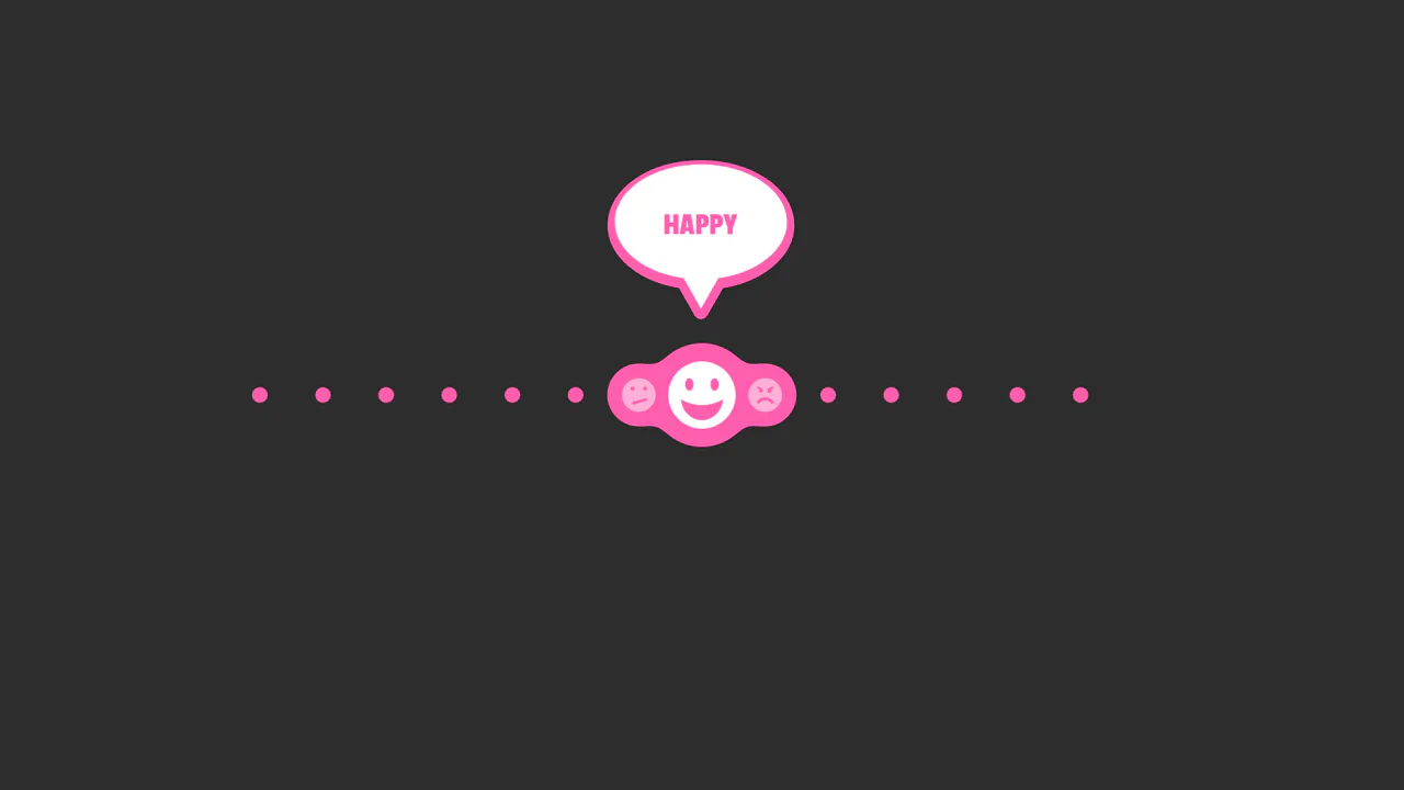
Interactive Emotional Feedback Slider
Forms are traditionally cold and utilitarian. This component challenges that norm by injecting emotional intelligence into the user interface. By mapping a range slider to animated character states, we transform a simple data input into a conversation. It turns the abstract concept of “satisfaction” into a relatable, human narrative, encouraging users to engage more deeply with the feedback process. (Requires: gsap)
Chrome 60+
Edge 79+
Firefox 60+
Safari 11+
See the Pen Interactive Emotional Feedback Slider.

Accessibility Contrast Controller Popover
The Accessibility Contrast Controller Popover is a cutting-edge implementation of user-centric accessibility settings. It provides a non-invasive, floating interface that allows users to adjust the global contrast of a web application in real-time. By leveraging the native Popover API and the new CSS Anchor Positioning specification, this component achieves a highly polished look and feel with minimal JavaScript for layout. (Requires: svelte-range-slider-pips)
Chrome 125+
Edge 125+
Safari 26+
Firefox 147+See the Pen Accessibility Contrast Controller Popover.
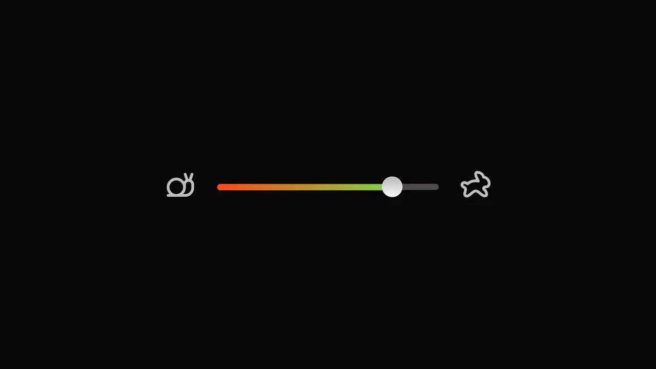
SVG Bubble Slider
An interactive reaction slider powered by GSAP Draggable and TimelineMax, featuring a ‘gooey’ effect achieved via SVG feGaussianBlur and feColorMatrix filters.
See the Pen SVG Bubble Slider.
An Odd Slider
A playful zigzag slider where the thumb bounces vertically between steps while maintaining an elastic SVG connection line, featuring soft snapping physics.
See the Pen An Odd Slider.
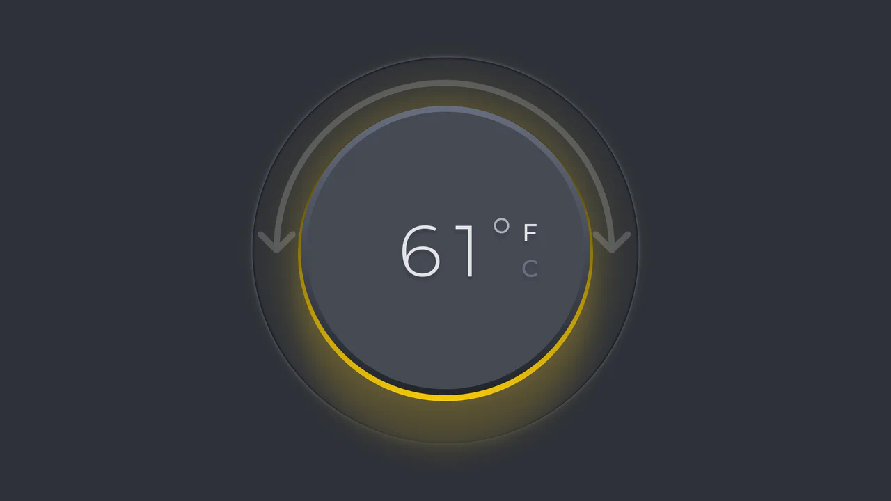
Minimalist Thermostat
An interactive skeuomorphic thermostat dial powered by GSAP Draggable. Rotating the dial dynamically updates the temperature value and ambient color hue, with full support for scale switching (C/F) and dark mode.
See the Pen Minimalist Thermostat.
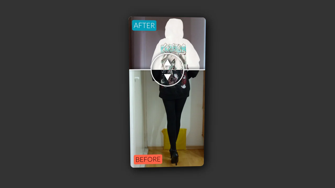
Vertical Original vs. Negative Card (Hover and Drag)
An interactive card that reveals a negative version of the image on hover, with a draggable slider to compare the two versions, utilizing CSS blend modes and 3D transforms.
See the Pen Vertical Original vs. Negative Card (Hover and Drag).

Motion Blurred Number Counter
As the slider moves, the numbers change rapidly, blurring horizontally to create a sensation of high-speed motion (motion blur), reminiscent of an old speedometer or a slot machine counter.
See the Pen Motion Blurred Number Counter.
Slider with Animated Icons
Smooth visual representation of the slider track fill using the CSS clip-path property and the --slider-percentage variable. The tooltip showing the current value is animated with GSAP, including a slight rotation to simulate “wobbling” during drag.
See the Pen Slider with Animated Icons.

CSS Knob Widget with Range Slider
A demonstration of the power of CSS and Sass - the knob is a standard range slider where the thumb is styled as a knob, and its transform: rotate is calculated based on the input’s value via CSS variables updated by JS.
See the Pen CSS Knob Widget with Range Slider.

Draggable Drink Water Slider with GSAP and SVG
An interactive SVG slider using GSAP Draggable, where the drag progress animates not only the filling of a bottle via an SVG mask but also creates a liquid sloshing effect using modifiers.
See the Pen Draggable Drink Water Slider with GSAP and SVG.

Custom Range Slider
Custom vertical range slider with a retro-futuristic design and a flickering display effect, achieved using a CSS transform on input[type
See the Pen Custom Range Slider.
Reusable Slider Web Component
Native element <custom-slider> implemented as a Web Component using Shadow DOM for complete style and logic encapsulation, ensuring code cleanliness, preventing conflicts, and guaranteeing reusability.
See the Pen Reusable Slider Web Component.

Advanced CSS Balance Sliders
The demo showcases an advanced technique for building UI elements where CSS variables dynamically control the slider’s appearance, and JS libraries like GSAP and Tweakpane are used for animation and interactive parameter tweaking. This highlights how powerful JavaScript can complement CSS to create complex animations.
See the Pen Advanced CSS Balance Sliders.
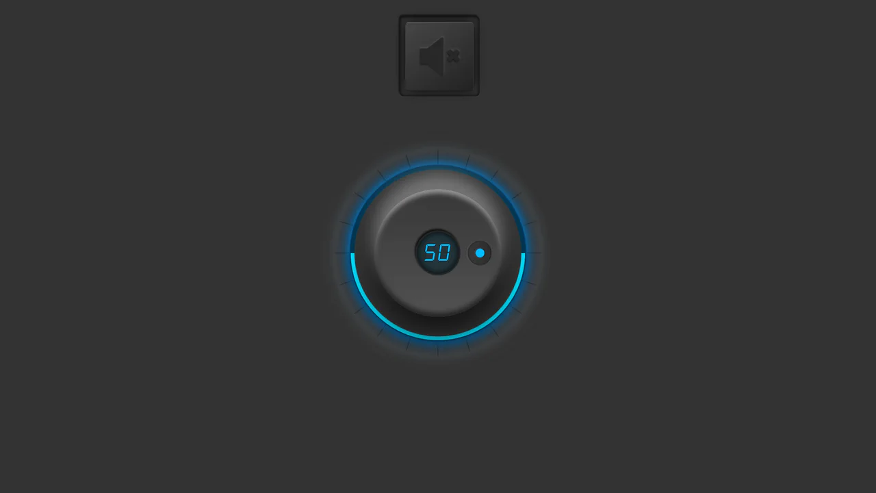
Synthetic Volume Knob
A unique UI element implementation where interactivity is achieved by handling mouse events (mousedown, mousemove) on a rotating knob. The visual design is created using CSS variables and pseudo-elements that dynamically update gradients and shadows, producing a glowing and three-dimensional effect upon user interaction.
See the Pen Synthetic Volume Knob.