
Frameless Blurred Background Image Effect in CSS
This is a Frameless Blurred Background Image Effect. It uses an innovative CSS technique to generate a soft, atmospheric background for an image by duplicating, stretching, and blurring the image itself. The function is to create a polished, “pro” look for profile pictures or product thumbnails without requiring image editing software or complex JavaScript canvas manipulations.
 Chrome 15+
 Edge 12+
 Firefox 15+
 Safari 6+
See the Pen Frameless Blurred Background Image Effect in CSS.

Scroll-Driven Sticky Parallax Header
This is a Scroll-Driven Sticky Parallax Header. It replaces static profile headers with a deeply integrated, cinematic scrolling experience. Its function is to transform a large hero image and avatar into a compact, sticky navigation bar, using native CSS animation-timeline: scroll() to orchestrate complex parallax, scaling, and fading effects without any JavaScript. (Requires: Open Props)
Chrome 115+
Edge 115+
See the Pen Scroll-Driven Sticky Parallax Header.

Scroll-Driven View Transitions
This is a Scroll-Driven View Transitions component. It simulates app-like, full-screen transitions between content sections using only native CSS properties. Its function is to replace traditional vertical scrolling with a more engaging, cinematic experience, where each scroll action triggers a complex animation (like a “melt”, slide, or zoom) rather than a simple positional change.
Chrome 115+
Edge 115+
See the Pen Scroll-Driven View Transitions.

Animated Fruity Product Showcase
This is an Animated Fruity Product Showcase. It acts as a high-impact hero section for a product landing page. Its function is to create a sense of dynamic energy through synchronized GSAP animations, where product imagery “falls” into view, titles update with staggered transitions, and ripple-wave effects surround the navigation buttons. (Requires: GSAP)
Chrome 60+
Edge 79+
Firefox 55+
Safari 11+
See the Pen Animated Fruity Product Showcase.

Clipping Quadrant Image Gallery
This is a Clipping Quadrant Image Gallery. It segments a full-screen display into four interactive quadrants, each housing a unique photograph. Upon clicking any segment, the component utilizes the clip-path property to instantly expand that specific quadrant to cover the entire viewport, transitioning from a mosaic-style grid into a singular, immersive view.
Chrome 55+
Edge 79+
Firefox 52+
Safari 11+
See the Pen Clipping Quadrant Image Gallery.
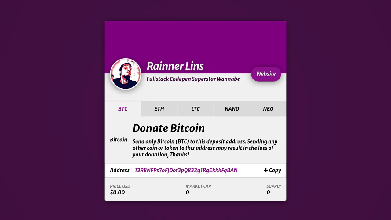
Crypto Donation Profile Card
This is a Vue Crypto Donation Profile Card. It consolidates multiple cryptocurrency wallet addresses into a single, scannable, and copyable interface. Its function is to streamline the donation process for content creators, automatically generating QR codes for specific wallets while fetching and displaying real-time market statistics for the selected coin. (Requires: Vue)
Chrome 58+
Edge 79+
Firefox 54+
Safari 10+
See the Pen Crypto Donation Profile Card.

Matcap Instanced Disco Geometry
This is a Matcap Instanced Disco Geometry demo. It renders multiple unique 3D geometries (Torus Knot, Icosahedron, Torus) using the WebGL Instanced Mesh technique. Instead of drawing individual planes for every mirror on the surface of the shape, it creates one InstancedMesh per object, mathematically orienting thousands of tiny reflective mirrors to mimic a faceted, crystal-like disco surface. (Requires: Three.js)
Chrome 60+
Edge 79+
Firefox 55+
Safari 11+
See the Pen Matcap Instanced Disco Geometry.

WebGL Generative Flower Cursor
This is a WebGL Generative Flower Cursor. It transforms the cursor into a botanical paintbrush, procedurally generating complex, blooming flower patterns across the screen in real-time. Its function is to provide an immersive, artistic interaction layer that allows users to “paint” generative digital gardens. (Requires: Three.js)
Chrome 60+
Edge 79+
Firefox 55+
Safari 11+See the Pen WebGL Generative Flower Cursor.

Animated Password Strength Guide
This is an Animated Password Strength Guide. It turns the mundane task of entering a password into an engaging, character-driven interaction. Its function is to provide real-time, checklist-based feedback on password complexity while visually representing the user’s progress through a stylized illustration that reacts to the input. (Requires: jQuery)
Chrome 60+
Edge 79+
Firefox 60+
Safari 13+
See the Pen Animated Password Strength Guide.

Animated Power-Up Button
This is an Animated Power-Up Button. It replaces standard interaction states with a visually rich, multi-layered animation sequence. Upon clicking, the button rotates, and a series of semi-transparent shadow layers stagger-in behind it, creating a “motion blur” or “power-up” trail effect. Its function is to provide highly stylized feedback for high-impact actions. (Requires: GSAP)
Chrome 60+
Edge 79+
Firefox 55+
Safari 11+
See the Pen Animated Power-Up Button.

Generative 3D Parallax Typography
This is a Generative 3D Parallax Typography component. It utilizes the css-doodle web component to automatically duplicate and stack text elements into a volumetric layout. Its function is to create a dynamic, mouse-reactive hero graphic without the need to write complex JavaScript event listeners or maintain heavy WebGL canvases. (Requires: css-doodle)
Chrome 61+
Edge 79+
Firefox 63+
Safari 10.1+
See the Pen Generative 3D Parallax Typography.
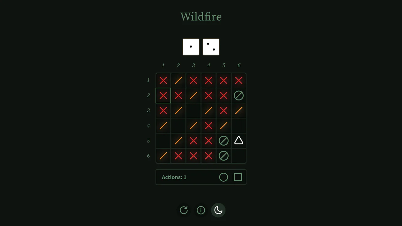
Interactive Board Game Prototype
This is an Interactive Board Game Prototype (“Wildfire”). It is a standalone, browser-based puzzle game where the player defends a “home” tile from procedurally generated “fire” tiles spreading across a 6x6 grid. It functions as an excellent study in grid mathematics, DOM-based state management, and turn-based game loops built entirely without canvas rendering or heavy game engine frameworks.
Chrome 60+
Safari 11+
Firefox 55+
Edge 79+
See the Pen Interactive Board Game Prototype.
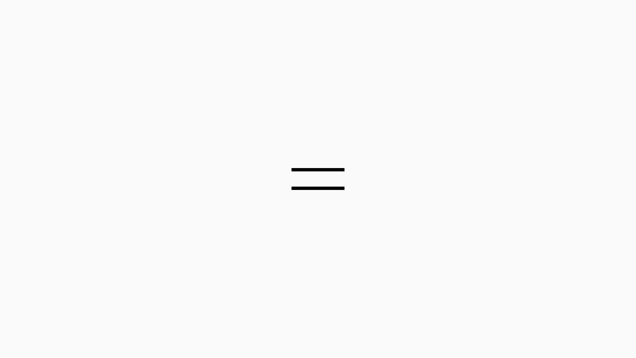
Sliding Line Hamburger Menu Animation
This is a Sliding Line Hamburger Menu Animation. It reinvents the standard three-bar toggle by using internal pseudo-element sliding instead of simple opacity changes. Its function is to provide a high-end, staggered interaction that signals navigation states with mechanical precision.
Chrome 26+
Edge 12+
Firefox 16+
Safari 7+
See the Pen Sliding Line Hamburger Menu Animation.

Adaptive Morphing Mouse Cursor Trailer
This is an Adaptive Morphing Mouse Cursor Trailer. It replaces or augments the native pointer with a fluid, high-fidelity visual follower that reacts to the underlying DOM content. Its function is to provide immediate, contextual feedback by scaling up and revealing descriptive icons when the user interacts with specific “interactable” elements. (Requires: FontAwesome)
Chrome 36+
Edge 12+
Firefox 48+
Safari 9+
See the Pen Adaptive Morphing Mouse Cursor Trailer.

Animated Fluid Grid Product Filter
This is an Animated Fluid Grid Product Filter. It structures a dynamic catalog where elements don’t just disappear but physically slide into their new positions. Its function is to solve the jarring layout shifts common in standard filtering by using the Web Animations API to interpolate container height and element coordinates simultaneously.
Chrome 75+
Edge 79+
Firefox 67+
Safari 13.1+
See the Pen Animated Fluid Grid Product Filter.

Cinematic Parallax Reactive Navigation Menu
This is a Cinematic Parallax Reactive Navigation Menu. It synchronizes large-scale typographical navigation with multi-layered background shifts. Its function is to transform a standard menu into a high-end atmospheric gateway for editorial or premium portfolio websites, using user interaction to drive the visual narrative.
Chrome 80+
Edge 80+
Firefox 75+
Safari 13.1+See the Pen Cinematic Parallax Reactive Navigation Menu.

Interactive Feather Reveal 404 Page
This is an Interactive Feather Reveal 404 Page. It utilizes the Canvas 2D API to transform a sterile error screen into a generative digital canvas. The component records user movement to stamp intricate feather-shaped paths that alternate between solid black fills and clipped fragments of external bird photography. (Requires: GSAP, Lodash)
Chrome 45+
Edge 12+
Firefox 31+
Safari 9+
See the Pen Interactive Feather Reveal 404 Page.

Interactive Glowing Grid Cards
This snippet presents Interactive Glowing Grid Cards. It transforms a static grid of content into an immersive, tactile interface by having a soft, localized glow follow the user’s cursor. This effect illuminates both the background of the hovered card and the borders of adjacent cards, providing continuous, spatial feedback that enhances the premium feel of a dark-mode dashboard or feature list.
Chrome 60+
Safari 11+
Firefox 55+
Edge 79+See the Pen Interactive Glowing Grid Cards.

GSAP Magic Hover Areas
This is a GSAP Magic Hover Areas component. It creates an animated, floating background layer that physically tracks the user’s cursor or keyboard focus across different interactive elements on the page. It adds a cohesive, fluid spatial awareness to standard list items and navigation menus. (Requires: GSAP, Lodash.js, VanillaTilt.js)
Chrome 49+
Safari 10+
Firefox 52+
Edge 79+
See the Pen GSAP Magic Hover Areas.

Hover-Reactive Parrot Character
This is a Pure CSS Hover-Reactive Parrot Character. It replaces static image files with a resolution-independent, mathematically constructed drawing using only HTML div elements and CSS styling. Its function is twofold: to demonstrate advanced CSS geometry and to provide a delightful micro-interaction where hovering over the character triggers a frantic, animated “talking” state complete with comic-style curse words.
Chrome 88+
Edge 88+
Firefox 84+
Safari 14+
See the Pen Hover-Reactive Parrot Character.

Neumorphic Drag Dial Thermostat
This is a Neumorphic Drag Dial Thermostat. It provides a tactile, skeuomorphic interface for setting numerical values (like temperature) through rotational dragging or keyboard input. The dial dynamically reveals cool-to-warm gradient colors based on the current value, enhancing the physical “feel” of a smart home control panel. (Requires: GSAP, Draggable)
Chrome 60+
Safari 11+
Firefox 55+
Edge 79+
See the Pen Neumorphic Drag Dial Thermostat.

React Circular Stat Dashboard
This is a React Circular Stat Dashboard. It replaces a standard linear or grid-based profile view with a dynamic, radial layout. Its function is to present a user’s avatar centrally while mathematically orbiting their related statistics and quotes around them, utilizing React state to handle smooth entering and exiting transitions between different profiles. (Requires: React, ReactDOM)
Chrome 80+
Safari 13.1+
Firefox 75+
Edge 80+
See the Pen React Circular Stat Dashboard.

Tilt Grid Content Reveal
This is a Tilt Grid Content Reveal. It transforms a standard masonry image gallery into a highly interactive, spatial experience. Its function is to provide an engaging browsing interface where hovering induces physical 3D tilt, and clicking smoothly expands the thumbnail into a full-screen presentation, completely immersing the user in the selected content. (Requires: GSAP, charming.js, masonry.js, imagesloaded.js)
Chrome 60+
Edge 79+
Firefox 55+
Safari 11+
See the Pen Tilt Grid Content Reveal.

Animated Star Toggle Switch
This is an Animated Star Toggle Switch. It replaces a standard HTML checkbox with a highly expressive, character-driven micro-interaction. Its function is to provide emotional feedback to a binary choice (like “favorite” or “bookmark”), launching the star into the air where it physically morphs between a sad, grey orb and a happy, bright yellow star. (Requires: GSAP)
Chrome 55+
Edge 79+
Firefox 54+
Safari 11+
See the Pen Animated Star Toggle Switch.

Interactive Radial Image Carousel
This is an Interactive Radial CSS Image Carousel. It arranges a deck of image cards into a curved, fan-like layout. Its function is to provide an engaging, space-saving gallery interface where hovering over a card gracefully shifts its neighbors away along a circular path, bringing the focused item into clear view without relying on JavaScript math.
Chrome 119+
Edge 119+
Firefox (partial)
Safari 26.2+
See the Pen Interactive Radial Image Carousel.

Popping Form Controls
This is a Popping Form Controls component. It replaces standard browser checkboxes and radio buttons with highly stylized, interactive versions. Its function is to provide delightful micro-interactions by triggering a localized, physics-based confetti burst whenever an input is successfully checked.
Chrome 80+
Edge 80+
Firefox 75+
Safari 13.1+See the Pen Popping Form Controls.

Shattering Image Gallery Transition
This is a Shattering Image Gallery Transition. It utilizes the WebGL API via Three.js to deconstruct 2D images into a matrix of 3D particles. Its function is to replace standard fade or slide slideshows with a highly cinematic, physics-based explosion effect, transitioning between photographs by blowing the current image apart to reveal the next one underneath. (Requires: ThreeJS, GSAP)
Chrome 60+
Edge 79+
Firefox 55+
Safari 11+
See the Pen Shattering Image Gallery Transition.

Skeuomorphic Reversi Radio Buttons
This is a Skeuomorphic Reversi Radio Button component. It overrides standard browser inputs to create a tactile, three-dimensional interaction mechanism. Its function is to replace flat state changes with physical motion, animating the selection exactly like a two-sided piece flipping over on a board.
Chrome 43+
Edge 12+
Firefox 16+
Safari 9+See the Pen Skeuomorphic Reversi Radio Buttons.

Auto-Generated Anchor Positioned TOC
This is an Auto-Generated Anchor Positioned TOC. It parses an article’s heading structure on the fly and constructs a sticky navigation menu. Its primary function is to replace heavy JavaScript scroll-spies (Intersection Observers) with native CSS Anchor Positioning and Scroll Targeting, moving an animated highlight alongside the active content section. (Requires: Tweakpane, GSAP)
Chrome 125+
Edge 125+See the Pen Auto-Generated Anchor Positioned TOC.

CSS Scroll-Driven Circular Typographic Scramble
This is a Scroll-Driven Circular Typographic Scramble. It utilizes experimental CSS animation-timeline to bind complex trigonometric and geometric transitions directly to the user’s scrollbar. Its function is to create a highly engaging, interactive hero section where chaotic, scattered letters perfectly align into a readable circular sentence as the user scrolls down.
Chrome 115+
Edge 115+See the Pen CSS Scroll-Driven Circular Typographic Scramble.