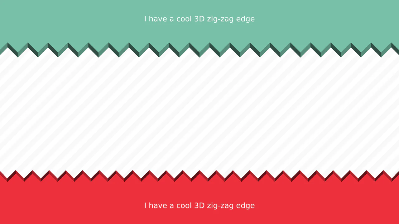
CSS-only section dividers featuring a 3D zig-zag paper-cut edge effect using conic gradients and masks.

3D Zig-Zag Edge CSS Dividers

3D Zig-Zag Edge CSS Dividers creates a paper-cut illusion using only CSS. It relies on conic-gradient applied to both the background (for shading) and -webkit-mask (for the jagged shape). CSS variables control the size and depth of the teeth. This approach requires zero extra DOM elements or SVG files, making it a highly optimized solution for section transitions.

Technologies:
HTML CSS
Difficulty: Intermediate
Browser Support (as of Jun 2026):
Chrome Chrome 69+ Edge Edge 79+ Firefox Firefox 83+ Safari Safari 12.1+
Features:
Variable Controlled Single Element 3D Illusion
Code by: Temani Afif Temani Afif
License: MIT
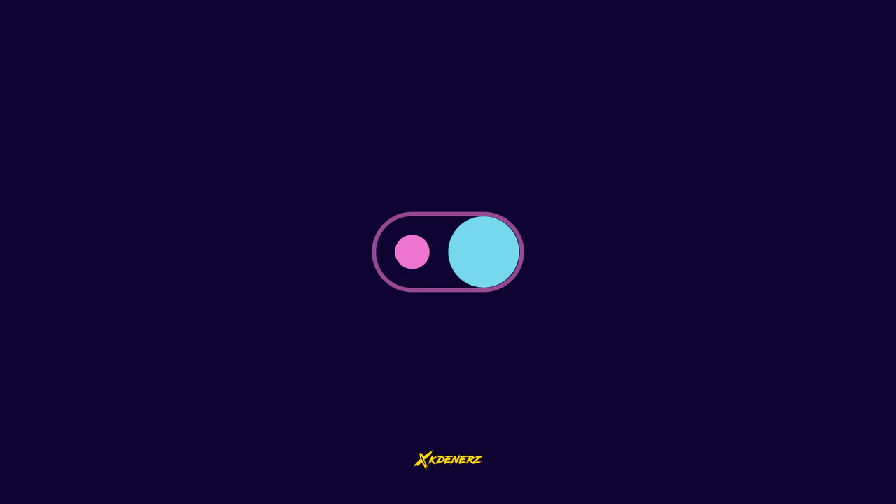
Liquid toggle switch using SVG feGaussianBlur filter and CSS keyframe animations to create a fluid, gooey snapping behavior.

Gooey Liquid SVG Filter Toggle Switch

Gooey Liquid SVG Filter Toggle Switch uses a classic SVG filter trick — combining a blur (feGaussianBlur) with a high-contrast color matrix (feColorMatrix) — to achieve a fluid, organic morphing effect. The sliding thumb dynamically deforms and stretches before snapping into place. Built with modern CSS custom properties and individual transform properties, it includes a simple JavaScript loop for continuous demonstration.

Technologies:
HTML CSS/SCSS
Difficulty: Intermediate
Browser Support (as of Jun 2026):
Chrome Chrome 111+ Edge Edge 111+ Firefox Firefox 113+ Safari Safari 16.2+
Features:
Gooey Liquid Effect SVG Filter Fluid Snapping
License: MIT
An interactive isometric 3D bedroom rendered with Three.js, utilizing baked textures, normal maps, and orbit controls.

Interactive 3D Baked Room Concept

Interactive 3D Baked Room Concept leverages Three.js to render a detailed, stylized isometric room. Instead of heavy real-time shadows, the design uses a baked texture mapping approach (bakedTexture, normalTexture, occlusionTexture) for highly optimized, realistic ambient occlusion. Standard OrbitControls allow smooth user navigation within restricted bounding limits, preventing camera clipping. (Requires: three.js)

Technologies:
HTML CSS/SCSS JavaScript
Difficulty: Advanced
Browser Support (as of Jun 2026):
Chrome Chrome 33+ Edge Edge 12+ Firefox Firefox 27+ Safari Safari 8+
Features:
Isometric 3D Room Baked Textures Orbit Controls
License: MIT
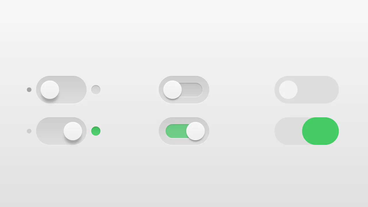
Realistic 3D toggle switches with inset shadows and sliding animations using pure CSS.

Realistic 3D CSS Toggle Switches

“Realistic 3D CSS Toggle Switches” showcase three distinct switch variations using the classic checkbox hack. Built entirely without JavaScript, they rely on CSS box-shadow and linear-gradient to create tactile, 3D inset depths. State changes are smoothly animated via transition on pseudo-elements. A lightweight, robust solution for adding polished micro-interactions to forms.

Technologies:
HTML CSS/SCSS
Difficulty: Beginner
Browser Support (as of Jun 2026):
Chrome Chrome 26+ Edge Edge 12+ Firefox Firefox 16+ Safari Safari 6.1+
Features:
Pure CSS Checkbox Hack Multiple Variations
Code by: Billy Billy
License: MIT
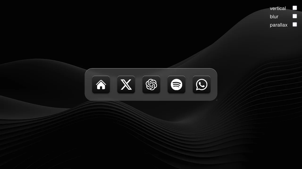
A highly interactive, responsive macOS/iOS style scroll-driven dock featuring app icons that scale, blur, or parallax as they scroll.

Scroll-Driven macOS iOS Dock Concept

Pure CSS Scroll-Driven macOS iOS Dock recreates Apple’s legendary dock using the native CSS Scroll-Driven Animations API. Icons dynamically scale, blur, and shift depth completely without JavaScript. Utilizing @supports (animation-timeline: scroll()), the layout safely handles horizontal and vertical snaps. A zero-dependency, ultra-lightweight demonstrator of modern CSS capabilities. (Requires: gsap.js, scroll-trigger.js)

Technologies:
HTML CSS JavaScript (Babel)
Difficulty: Advanced
Browser Support (as of Jun 2026):
Chrome Chrome 115+ Edge Edge 115+ Safari Safari 26+
Features:
Scroll-Driven Animation GSAP Fallback Dynamic Scaling
Code by: Jhey Jhey
License: MIT
Playful CSS-only bubble loader rising, bursting, and producing synchronized liquid droplets at radial rotation angles.

Whimsical CSS Bubble Preloader

Whimsical CSS Bubble Preloader is a pure CSS animation that simulates rising bubbles that pop and scatter tiny droplets. Using HTML layout without JavaScript, it relies entirely on staggered @keyframes delays, absolute positioning, and math-based rotations via :nth-child. Radial gradients generate realistic reflections, while drop-shadow adds depth. A smart choice for lightweight, playful interfaces, though the dense DOM structure for droplets might feel redundant for some.

Technologies:
HTML SCSS
Difficulty: Intermediate
Browser Support (as of Jun 2026):
Chrome Chrome 52+ Edge Edge 15+ Firefox Firefox 49+ Safari Safari 9.1+
Features:
Bubble Burst Effect Liquid Droplet Splash Responsive Scaling
Code by: Jon Kantner Jon Kantner
License: MIT
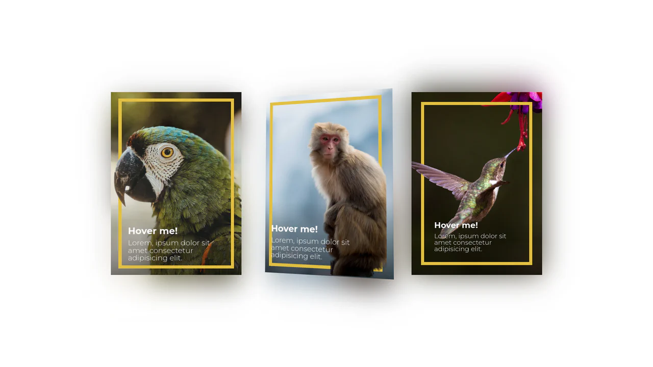
3D layered pop-out cards with mouse-tracking perspective, featuring a cutout foreground, background scene, and dynamic shadows.

3D Depth Parallax Pop-Out Cards

3D Depth Parallax Pop-Out Cards uses a mathematical approach combining value remapping and linear interpolation (lerp) to calculate fluid, lagged cursor coordinates inside a 60 FPS animation loop. This script alters custom CSS properties --rotateX and --rotateY, projecting individual layer transforms across multiple translated depths—namely a blurred .shadow, background scene, golden borders, and a foreground .cutout. While visually convincing, utilizing setInterval at a hardcoded 1000/60 rate can cause micro-stuttering on high-refresh-rate displays, making requestAnimationFrame a far more performant choice.

Technologies:
Pug SCSS JavaScript
Difficulty: Advanced
Browser Support (as of May 2026):
Chrome Chrome 88+ Edge Edge 88+ Firefox Firefox 89+ Safari Safari 15+
Features:
3D Perspective Cutout Pop-out Effect Linear Interpolation (Lerp)
Code by: Mubanga Mubanga
License: MIT
Trigonometric 3D rotating Star Wars theme toggle presenting a sliding lightsaber blade and a spinning Death Star thumb.

3D Star Wars Lightsaber Theme Toggle

3D Star Wars Lightsaber Theme Toggle relies on trigonometric CSS functions sin() and cos() to rotate vector elements along a 3D spherical path as the toggle slides. Custom numeric transitions are facilitated by redefining modern @property rules inside a @layer properties block, animating the --progress variable dynamically across state-driven keyframes. While providing a deeply thematic visual experience, performing continuous trigonometric transformations and animating complex CSS masks can trigger layout rasterization strain on standard devices, requiring GPU acceleration layers to preserve smooth 3D motion.

Technologies:
HTML SCSS JavaScript
Difficulty: Advanced
Browser Support (as of May 2026):
Chrome Chrome 111+ Edge Edge 111+ Firefox Firefox 128+ Safari Safari 16.4+
Features:
3D Rotation Trigonometric CSS
License: MIT
Vector clipboard icon with a slick paper ejection and checkmark drawing copy micro-interaction.

Animated Clipboard Copy Action Button

Animated Clipboard Copy Action Button leverages overlapping SVG path duplicates to simulate a seamless paper ejection sequence upon trigger. When the .copied class is appended via jQuery, the secondary page .page and a glowing checkmark .check are animated along a skewed gravity curve copiedPage while the checkmark simultaneously expands its stroke-dasharray to appear fully drawn. This micro-interaction utilizes hardware-accelerated transforms. (Requires: jquery.js)

Technologies:
SVG HTML Sass JavaScript
Difficulty: Intermediate
Browser Support (as of May 2026):
Chrome Chrome 49+ Edge Edge 16+ Firefox Firefox 55+ Safari Safari 11+
Features:
Paper Ejection Effect SVG Stroke Dash Animation Micro-Interaction
Code by: Andreas Storm Andreas Storm
License: MIT
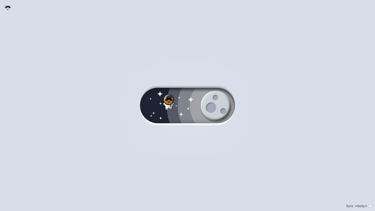
Playful vector theme toggle animating a pilot bear flying through clouds in light mode and transitioning into an astronaut bear floating in space in dark mode.

Bouncy Bear Theme Toggle Switch

Bouncy Bear Theme Toggle Switch relies on a clean, accessible HTML <button> to toggle an aria-pressed state, initiating a complex visual narrative that shifts between an aviator bear in light mode and an astronaut bear in dark mode. The animation utilizes modern CSS layout techniques including container-type queries, separate translate declarations, and a heavy-backwards cubic-bezier(.4,-0.3,.6,1.3) curve to achieve physical bounce. While structurally robust, the sheer volume of concurrently transitioning inline SVG paths and scaling stars can generate intensive layout recalculation spikes unless elements are actively isolated via hardware-promoted layers.

Technologies:
HTML CSS Babel
Difficulty: Advanced
Browser Support (as of May 2026):
Chrome Chrome 105+ Edge Edge 105+ Firefox Firefox 110+ Safari Safari 16+
Features:
Dynamic Theme Switch Complex SVG Animation Custom Cubic Bezier Easing
Code by: Jhey Jhey
License: MIT