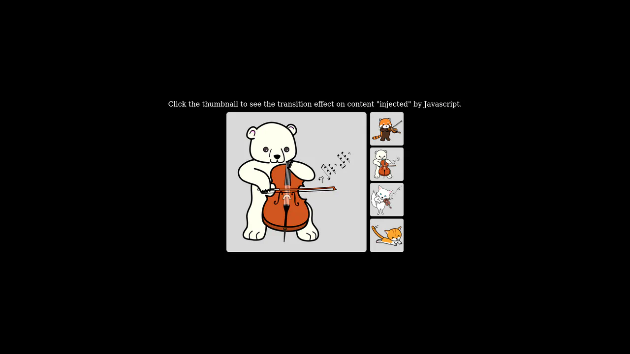
Thumbnail gallery layout demonstrating a seamless native cross-fade effect between images using the View Transitions API

Native Cross-Fade View Transition Gallery

This is a Native Cross-Fade View Transition Gallery. It updates a central image source triggered by thumbnail interactions. Its function is to smooth out abrupt visual DOM updates using the browser’s built-in rendering engine, entirely eliminating the need for external animation payloads or CSS opacity toggles.

Technologies:
HTML CSS JavaScript
Difficulty: Beginner
Browser Support (as of Apr 2026):
Chrome Chrome 111+ Edge Edge 111+ Firefox Firefox 131+ Safari Safari 18+
Features:
View Transitions Cross-Fade Event Delegation Feature Detection
Code by: Chen Hui Jing Chen Hui Jing
License: MIT
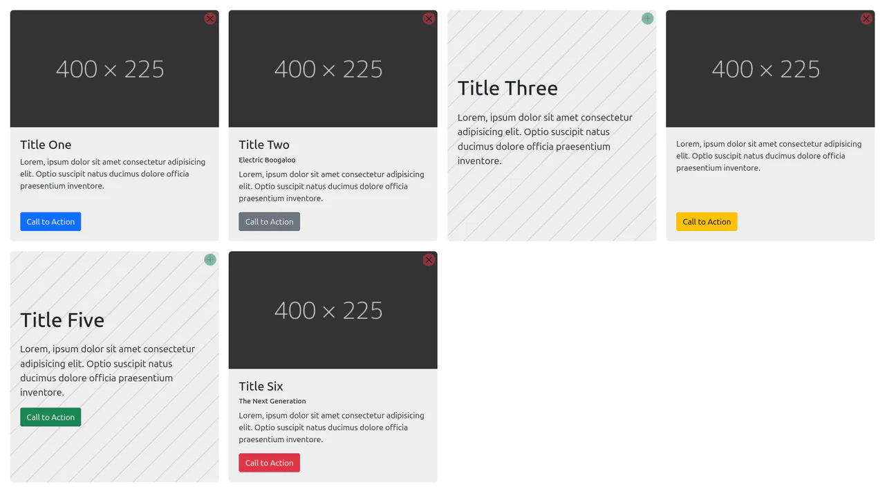
Grid of rectangular cards dynamically shifting layout, typography, and background patterns based on the presence or absence of an image

Content-Aware Cards

This is a Content-Aware Bootstrap Card. It uses the structural :has() pseudo-class to dynamically alter its internal layout, background, and typography based solely on the presence of an image node. Its function is to provide an adaptable, self-managing container that eliminates the need for redundant state-tracking classes in your JavaScript logic. (Requires: bootstrap)

Technologies:
HTML SCSS JavaScript
Difficulty: Intermediate
Browser Support (as of Apr 2026):
Chrome Chrome 105+ Edge Edge 105+ Firefox Firefox 121+ Safari Safari 15.4+
Features:
CSS :has() Dynamic Layout DOM Manipulation
Code by: Zach Handing Zach Handing
License: MIT

See the Pen Content-Aware Cards.

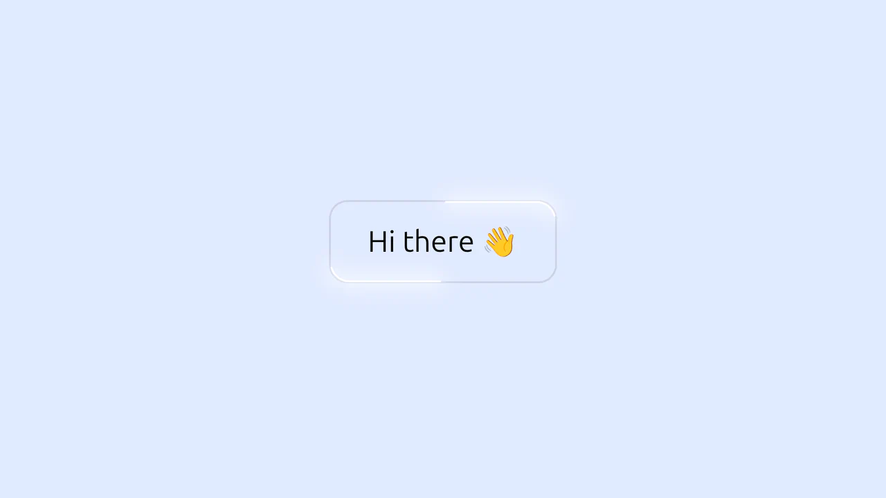
Interactive button with a moving neon SVG border trace effect around its rounded corners

Glowing Border Trace Button

This is a Glowing Border Trace Button. It utilizes embedded SVG rectangles to create a moving neon stroke along the perimeter upon interaction. Its function is to provide highly visible, tactile feedback for primary actions without disrupting the core layout geometry or triggering expensive repaints.

Technologies:
HTML SCSS JavaScript
Difficulty: Intermediate
Browser Support (as of Apr 2026):
Chrome Chrome 88+ Edge Edge 88+ Firefox Firefox 78+ Safari Safari 14+
Features:
SVG Tracing Dynamic Radius Focus States
Code by: Denis Gusev Denis Gusev
License: MIT
Loading...
<button class="button glow">
  Hi there 👋
  <svg class="glow-container">
    <rect pathLength="100" stroke-linecap="round" class="glow-blur"></rect>
    <rect pathLength="100" stroke-linecap="round" class="glow-line"></rect>
  </svg>
</button>
body {
  display: grid;
  place-content: center;
  gap: 2rem;
  min-height: 100lvh;
  background: #E1EAFF;
  font-family: system-ui;
}

.button {
  cursor: pointer;
  font-size: 2rem;
  font-family: inherit;
  font-weight: 400;
  color: #050908;
  background-color: transparent;
  padding: 0.75em 1.25em;
  border: 2px solid #ccd2e6;
  border-radius: 1.25rem;
}

.glow {
  --glow-line-color: #fff;
  --glow-line-thickness: 2px;
  --glow-line-length: 20;
  --glow-blur-color: #fff;
  --glow-blur-size: 10px;
  --animation-speed: 1200ms;
  --container-offset: 100px;
  position: relative;
}
.glow-container {
  pointer-events: none;
  position: absolute;
  inset: calc(var(--container-offset) / -2);
  width: calc(100% + var(--container-offset));
  height: calc(100% + var(--container-offset));
  opacity: 0;
}
.glow-blur, .glow-line {
  width: calc(100% - var(--container-offset));
  height: calc(100% - var(--container-offset));
  x: calc(var(--container-offset) / 2);
  y: calc(var(--container-offset) / 2);
  rx: 1.25rem;
  fill: transparent;
  stroke: black;
  stroke-width: 5px;
  stroke-dasharray: var(--glow-line-length) calc(50 - var(--glow-line-length));
}
.glow-line {
  stroke: var(--glow-line-color);
  stroke-width: var(--glow-line-thickness);
}
.glow-blur {
  filter: blur(var(--glow-blur-size));
  stroke: var(--glow-blur-color);
  stroke-width: var(--glow-blur-size);
}
.glow:is(:hover, :focus) .glow-blur, .glow:is(:hover, :focus) .glow-line {
  stroke-dashoffset: -80px;
  transition: stroke-dashoffset var(--animation-speed) ease-in, stroke-dasharray var(--animation-speed) ease-in;
}
.glow:is(:hover, :focus) .glow-container {
  animation: glow-visibility var(--animation-speed) ease-in;
}

@keyframes glow-visibility {
  0%, 100% {
    opacity: 0;
  }
  25%, 75% {
    opacity: 1;
  }
}
(function setGlowEffectRx() {
  const glowEffects = document.querySelectorAll('.glow');
  
  glowEffects.forEach(element => {
    const rx = getComputedStyle(element).borderRadius;
    const glowRects = element.querySelectorAll('rect');
    
    glowRects.forEach(rect => {
      rect.setAttribute('rx', rx);
    })
  })
})();
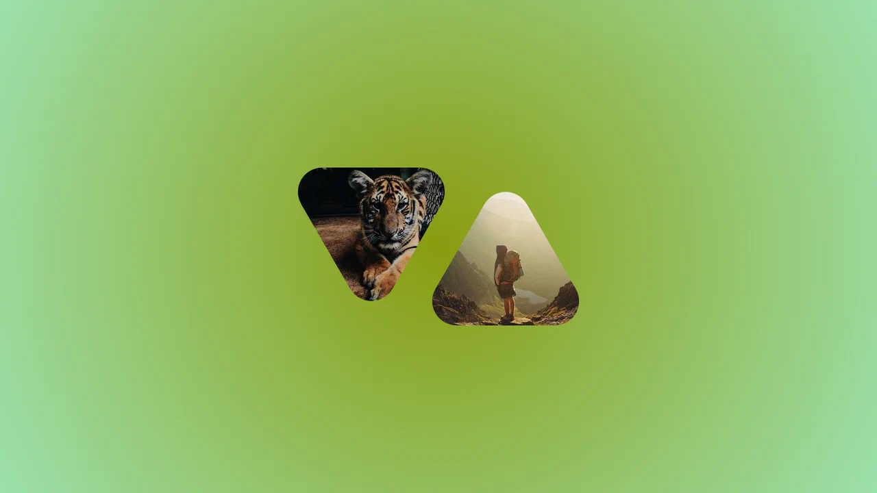
Two overlapped images masked into alternating rounded triangles, demonstrating CSS radius hover animations

Morphing Rounded Triangle Image Mask

This is a Morphing Rounded Triangle Image Mask. It relies on advanced CSS mathematics and masking to clip raster graphics into smooth, interlocking geometric shapes. Its function is to replace standard grid layouts with organic, tessellating image tiles that physically react to user interaction.

Technologies:
HTML CSS
Difficulty: Advanced
Browser Support (as of Apr 2026):
Chrome Chrome 111+ Edge Edge 111+ Firefox Firefox 117+ Safari Safari 16.4+
Features:
Radius Animation Math Functions CSS Masking
Code by: Temani Afif Temani Afif
License: MIT
Vertical scroll layout featuring high-resolution images with a smooth parallax mask offset effect

Smooth Parallax Image Scroll Gallery

This is a Smooth Parallax Image Scroll Gallery. It translates vertical scroll progression into independent Y-axis movement for masked images. Its function is to create a sense of depth and momentum, elevating standard vertical feeds into immersive visual narratives. (Requires: gsap-js, scroll-trigger-js, lenis-js)

Technologies:
HTML SCSS JavaScript
Difficulty: Intermediate
Browser Support (as of Apr 2026):
Chrome Chrome 108+ Edge Edge 108+ Firefox Firefox 101+ Safari Safari 15.4+
Features:
Smooth Scroll Scroll Tracking Parallax Offset
Code by: Denis Gusev Denis Gusev
License: MIT
Typography layout demonstrating a staggered line-by-line text scroll reveal effect driven by GSAP

Staggered Text Scroll Reveal

This is a Staggered Text Scroll Reveal. It parses structural typography into independent animated lines. Its function is to pace the reader’s attention, transforming static paragraphs into dynamic narrative elements triggered by viewport intersection. (Requires: gsap-js, scroll-trigger-js, lenis-js, split-type)

Technologies:
HTML SCSS JavaScript
Difficulty: Intermediate
Browser Support (as of Apr 2026):
Chrome Chrome 64+ Edge Edge 79+ Firefox Firefox 69+ Safari Safari 13.1+
Features:
Line Stagger Resize Observer Smooth Scroll
Code by: Denis Gusev Denis Gusev
License: MIT
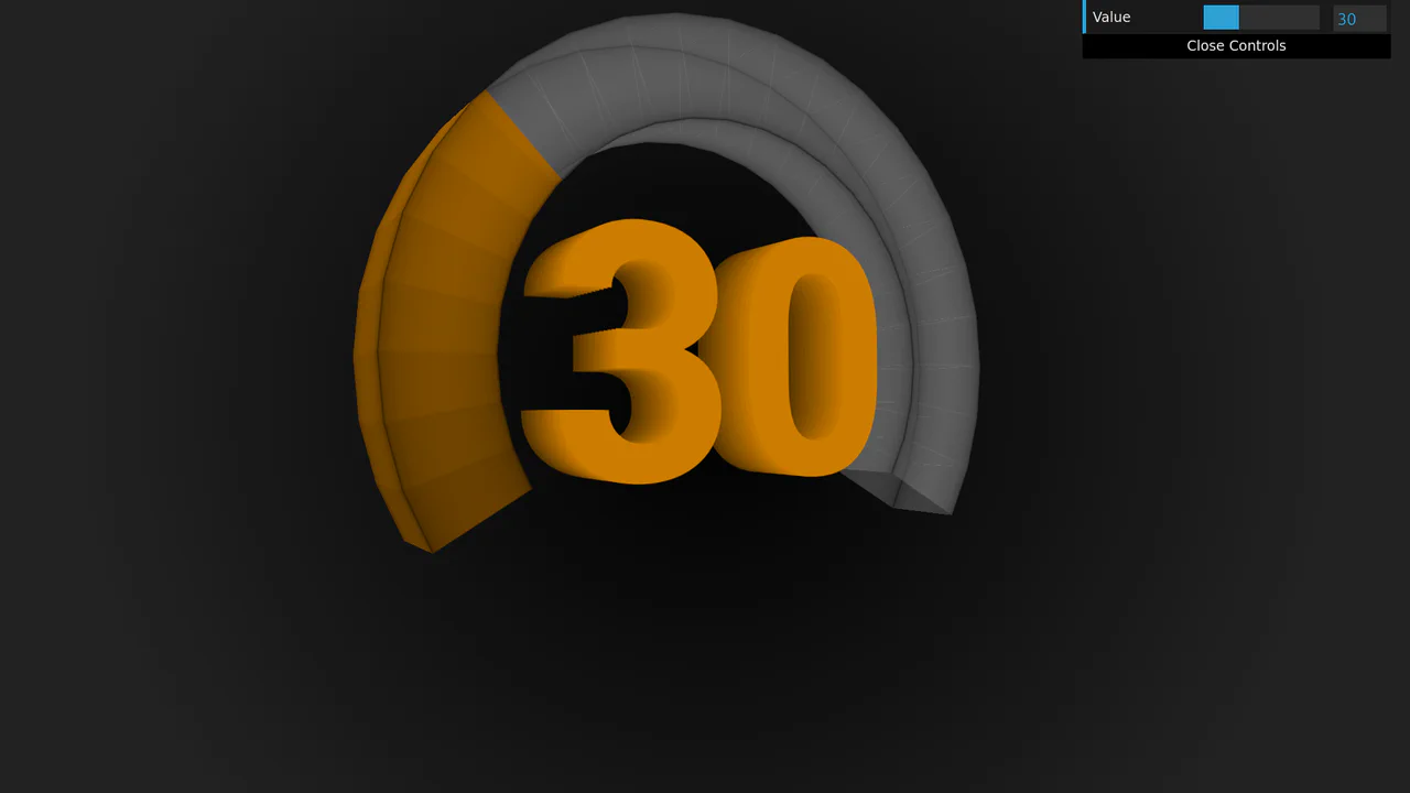
3D rotating dial counter with layered extruded typography and dynamic color hue shift using CSS

3D Rotating Value Dial

This is a 3D Rotating Value Dial. It visualizes continuous data through a spatial, cylindrical interface. Its function is to replace flat range indicators with a tactile, volumetric readout that dynamically shifts color hue based on value. (Requires: dat.gui)

Technologies:
HTML SCSS JavaScript
Difficulty: Advanced
Browser Support (as of Apr 2026):
Chrome Chrome 111+ Edge Edge 111+ Firefox Firefox 108+ Safari Safari 15.4+
Features:
Trigonometric Layout Layered Text Dynamic Color
Code by: Amit Sheen Amit Sheen
License: MIT

See the Pen 3D Rotating Value Dial.

Responsive navigation bar with a theme toggle button demonstrating a polygon slice view transition and CSS trigonometric hover effects

Polygon Sliced Theme Toggle Navbar

This is a Polygon Sliced Theme Toggle Navbar. It handles global light/dark mode switching and primary site navigation. Its function is to provide fluid, state-driven visual feedback using native browser APIs, eliminating abrupt visual jumps during context shifts. (Requires: normalize.css)

Technologies:
HTML CSS Babel
Difficulty: Advanced
Browser Support (as of Apr 2026):
Chrome Chrome 111+ Edge Edge 111+ Firefox Firefox 121+ Safari Safari 17.4+
Features:
View Transitions Trigonometric Hover State Management
Code by: Jhey Tompkins Jhey Tompkins
License: MIT
Video hero section with custom SVG polygon mask and layered stroke typography intersecting the media

Cinematic Masked Video Hero

This is a Cinematic Masked Video Hero. It layers solid and outlined typography over an SVG-clipped video element to create optical depth. Its function is to immediately capture attention on landing, breaking away from standard rectangular layouts through organic polygon masking and staggered motion. (Requires: gsap-js)

Technologies:
HTML CSS JavaScript
Difficulty: Advanced
Browser Support (as of Apr 2026):
Chrome Chrome 90+ Edge Edge 90+ Firefox Firefox 89+ Safari Safari 15+
Features:
SVG Masking Layered Text Custom Cursor Intro Loader
Code by: Paul Roger Paul Roger
License: MIT

See the Pen Cinematic Masked Video Hero.

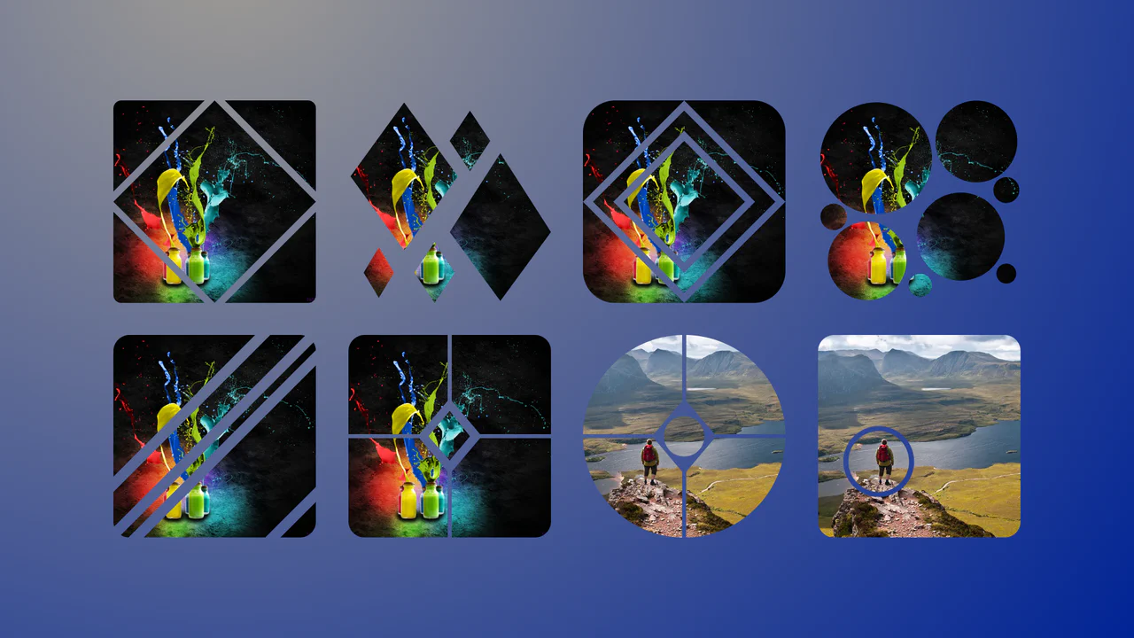
Grid gallery of raster images cut into intricate geometric shapes like diamonds and concentric circles using precise vector masking

Complex Geometric Image Masks

This is a collection of Complex Geometric Image Masks. It shapes standard rectangular images into precise, multi-part vector forms using a single HTML node. Its function is to break rigid grid layouts and introduce structural visual interest without requiring external SVG assets.

Technologies:
HTML CSS
Difficulty: Intermediate
Browser Support (as of Apr 2026):
Chrome Chrome 88+ Edge Edge 88+ Firefox Firefox 71+ Safari Safari 13.1+
Features:
Vector Masking Static Geometry
Code by: Chris Smith Chris Smith
License: MIT