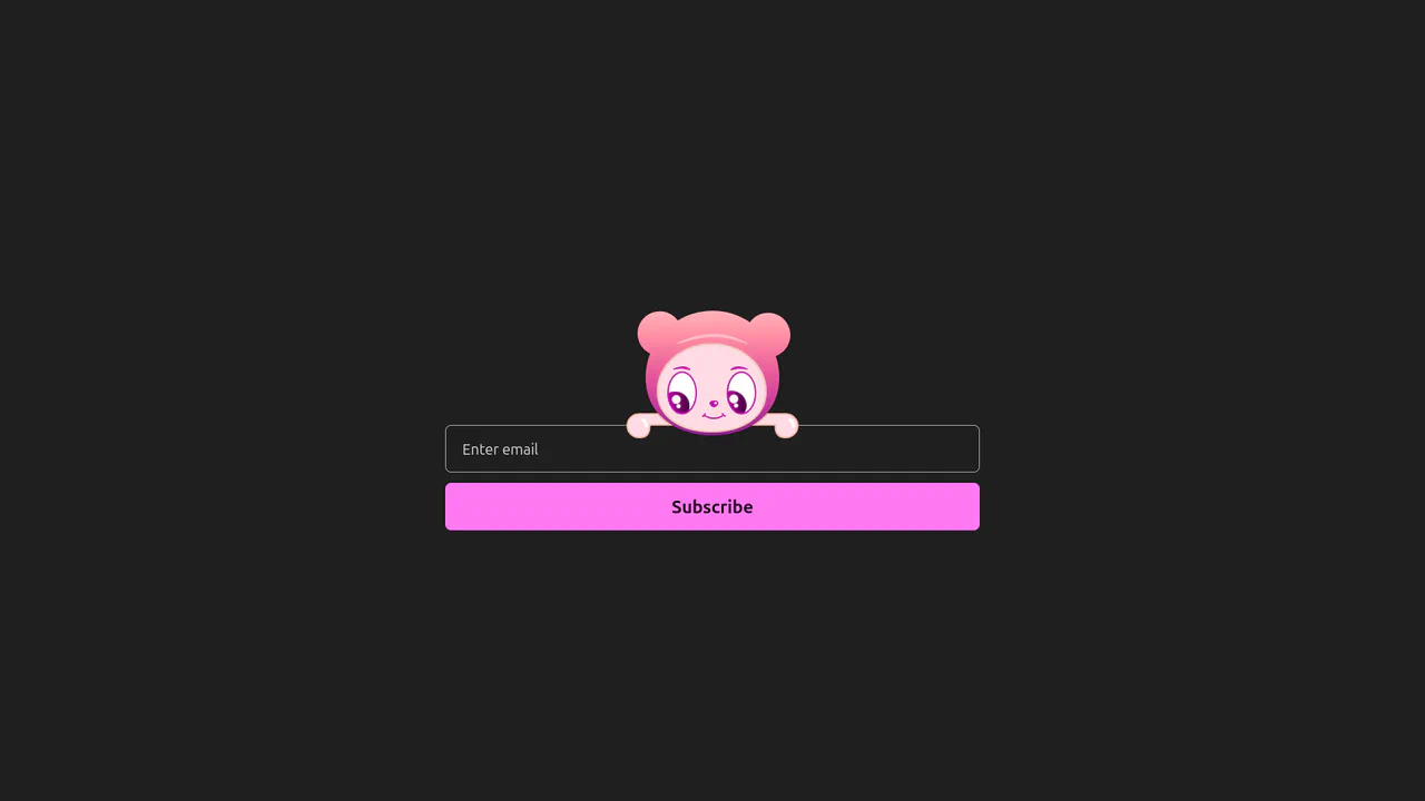
Interactive Eye-Tracking Subscription Form
An advanced interactive subscription form starring a playful cartoon character with dual eye-tracking modes. Pupils react in real time, following the pointer position or snapping directly to the input text caret inside the email field. Dragging the character horizontally triggers fluid physics, rubber-band borders, and elastic drag resets, while error states morph the SVG mouth. (Requires: canvas-confetti.js)
 Chrome 110+
 Edge 110+
 Firefox 110+
 Safari 16.2+
See the Pen Interactive Eye-Tracking Subscription Form.
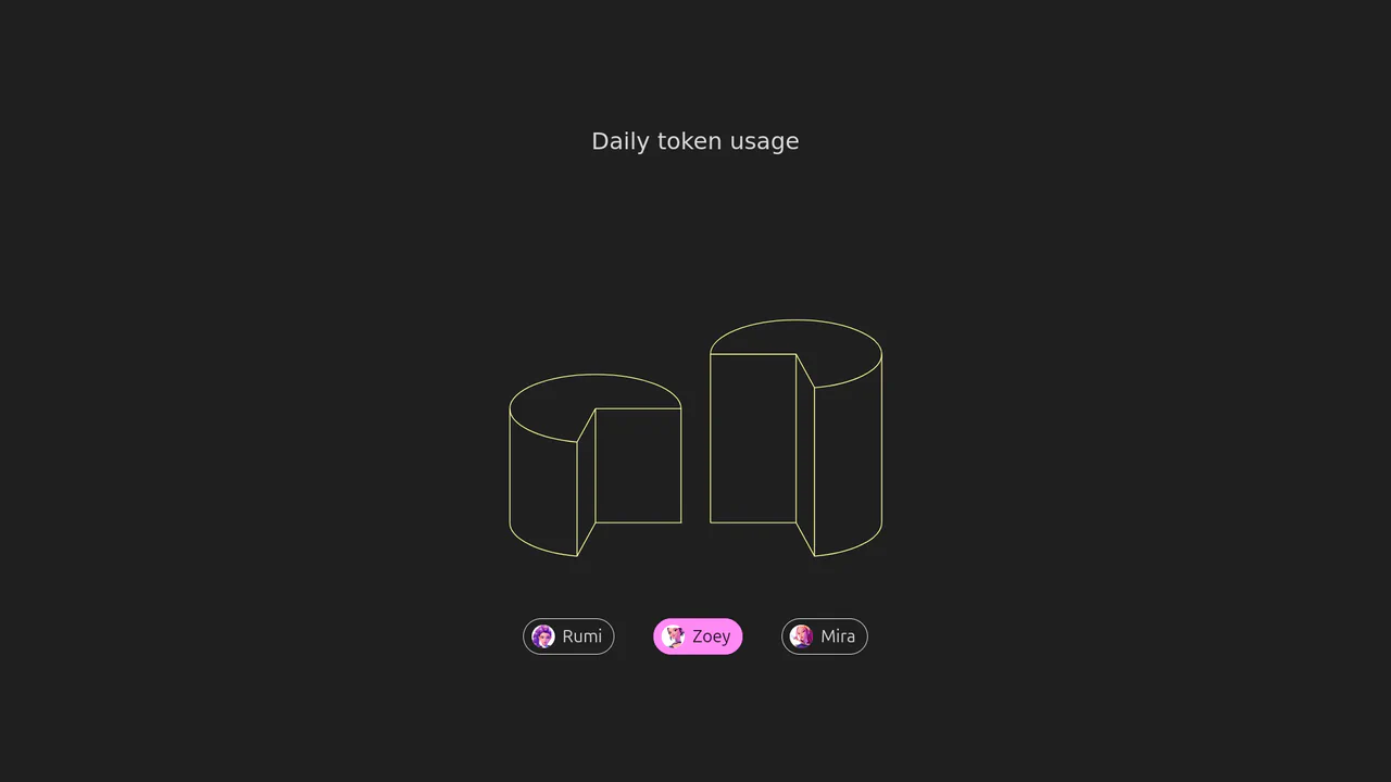
Isometric 3D SVG Morphing Chart
An interactive 3D isometric token usage chart powered by manual SVG path morphing. Instead of relying on heavy drawing libraries, a custom JavaScript interpolator parses matching vector commands and applies organic sine easing. Clicking the menu controls morphs the column heights and cylinder top caps synchronously, highlighted by vibrant rainbow keyframe animations.
Chrome 73+
Edge 79+
Firefox 67+
Safari 13+See the Pen Isometric 3D SVG Morphing Chart.
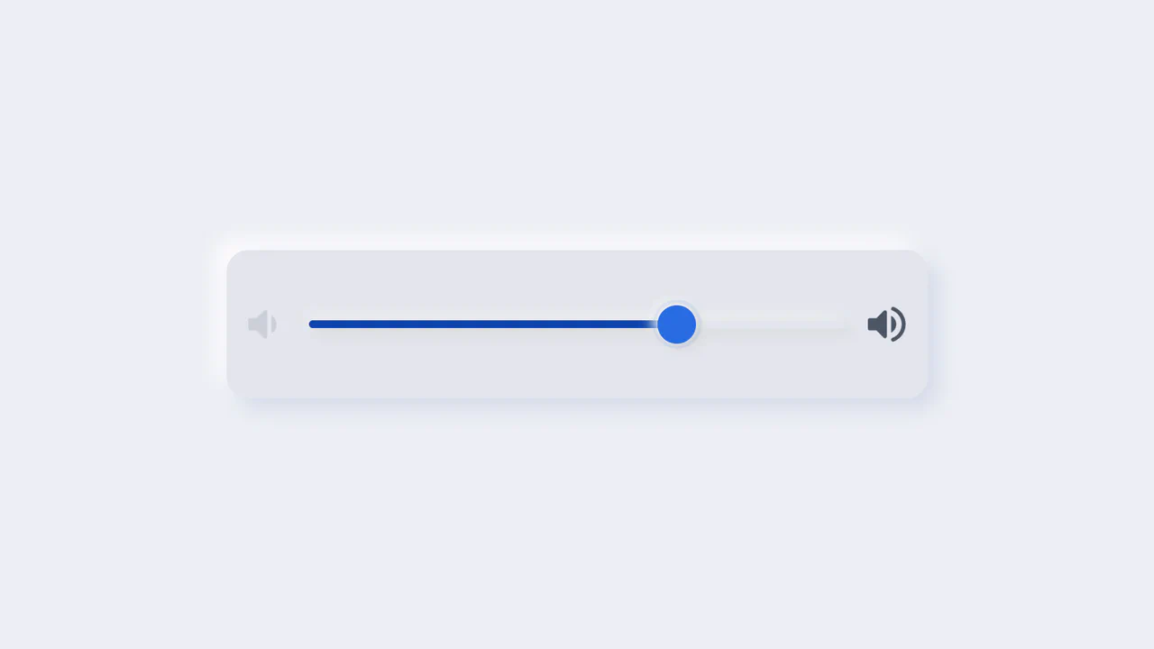
Neumorphic Volume Slider with Ripple Glow
An elegant neumorphic volume slider featuring an active thumb focus glow and directional icon highlights. Built with a single native range input and styled with modern CSS Custom Properties, it implements the Houdini @property API to transition colors smoothly across sliding states. Dragging shifts opacity focus to the corresponding volume icon based on directional vector calculations in pure CSS.
Chrome 85+
Edge 85+
Firefox 128+
Safari 16.4+
See the Pen Neumorphic Volume Slider with Ripple Glow.
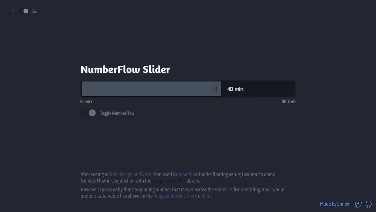
NumberFlow Floating Range Pips Slider
An interactive numeric range slider combining the Svelte Range Slider Pips library and the NumberFlow web component. Dragging the slider handle updates a floating badge indicator that slides horizontally, dynamically shifting its layout alignment to the left of the handle whenever it exceeds a 70% bar-width threshold. Includes a value-rolling automated intro animation. (Requires: svelte-range-slider-pips.js, number-flow.js)
Chrome 110+
Edge 110+
Firefox 120+
Safari 16.2+
See the Pen NumberFlow Floating Range Pips Slider.
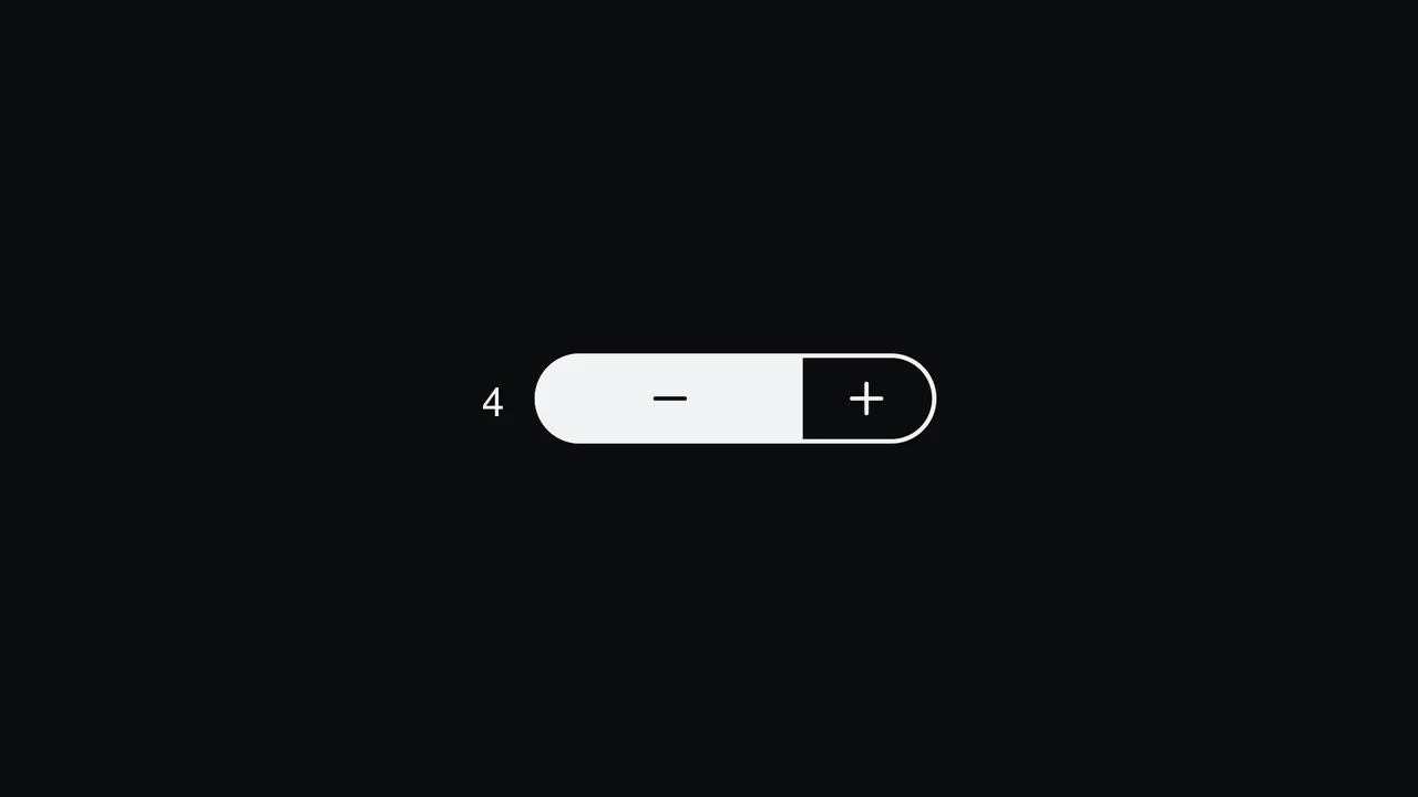
Pill Stepper Input with Sliding Fill
An elegant numeric stepper component styled as a cohesive rounded pill, built with React and SCSS. By translating the internal value into relative percentages, the control buttons, background fill, and icon symbols slide smoothly during interactions. Includes split focus-ring indicators built with the CSS :has() selector and native light-dark() modern theme support. (Requires: react.js, react.dom.js, lucide.react.js)
Chrome 110+
Edge 110+
Firefox 121+
Safari 16.2+
See the Pen Pill Stepper Input with Sliding Fill.
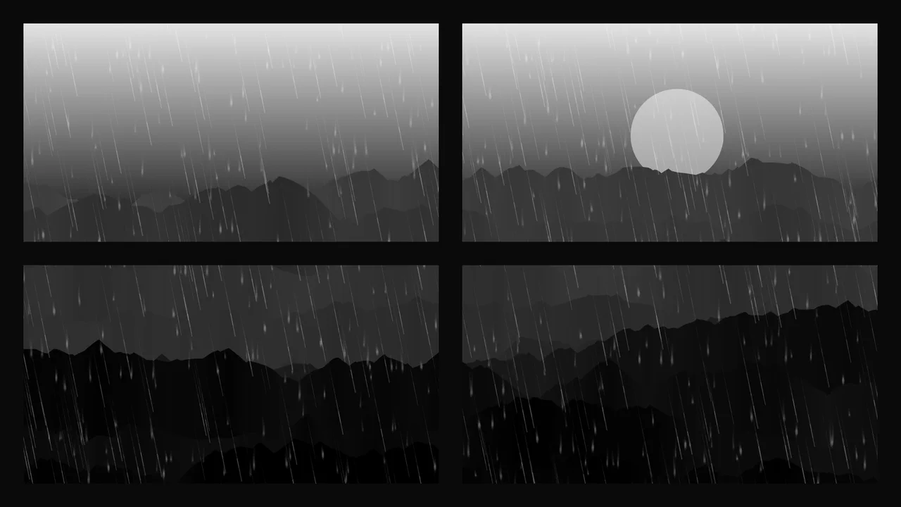
Procedural 2D Stormy Window Canvas
An advanced procedural 2D canvas simulation generating an atmospheric stormy night window scene. Combining multiple layered canvas contexts, the code programmatically draws mountain skylines, math-driven falling rain, running window drops, and recursive branching lightning. It utilizes screen blend-modes, composite operations, and a custom frame-rate time-delta smoothing loop.
Chrome 41+
Edge 79+
Firefox 32+
Safari 8+
See the Pen Procedural 2D Stormy Window Canvas.
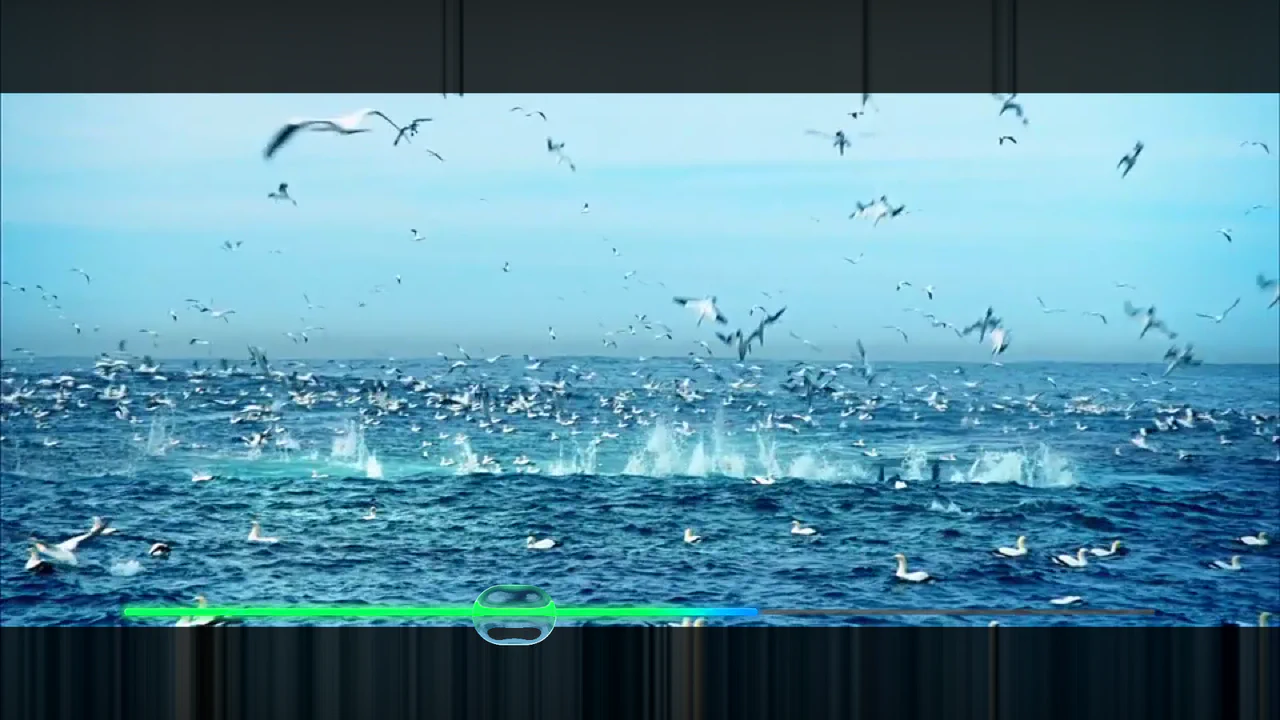
Refractive Glass Lens WebGL Video Player
An advanced WebGL video player constructed using REGL and custom GLSL fragment shaders. Moving the pointer renders an elongated faux-refractive glass lens that distorts the underlying video stream dynamically. Includes customized resolution scaling, an integrated cos-gradient rainbow progress timeline, and canvas-level click interception to control video playback and seeking. (Requires: regl.js)
Chrome 52+
Edge 15+
Firefox 49+
Safari 10+
See the Pen Refractive Glass Lens WebGL Video Player.
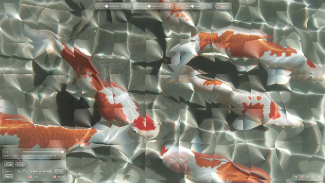
Refractive Stained Glass WebGL Filter
An advanced WebGL filter engine that transforms CORS-enabled images and videos into refractive stained glass structures. Operating on custom fragment shaders, the canvas allows users to toggle procedural cell geometries — including hexagon, triangle, and diamond tiles — while dynamically adjusting chromatic aberration offsets, drag-and-drop panning, spotlight coordinate tracking, and mathematical ripple distortions.
Chrome 76+
Edge 79+
Firefox 70+
Safari 13.1+
See the Pen Refractive Stained Glass WebGL Filter.
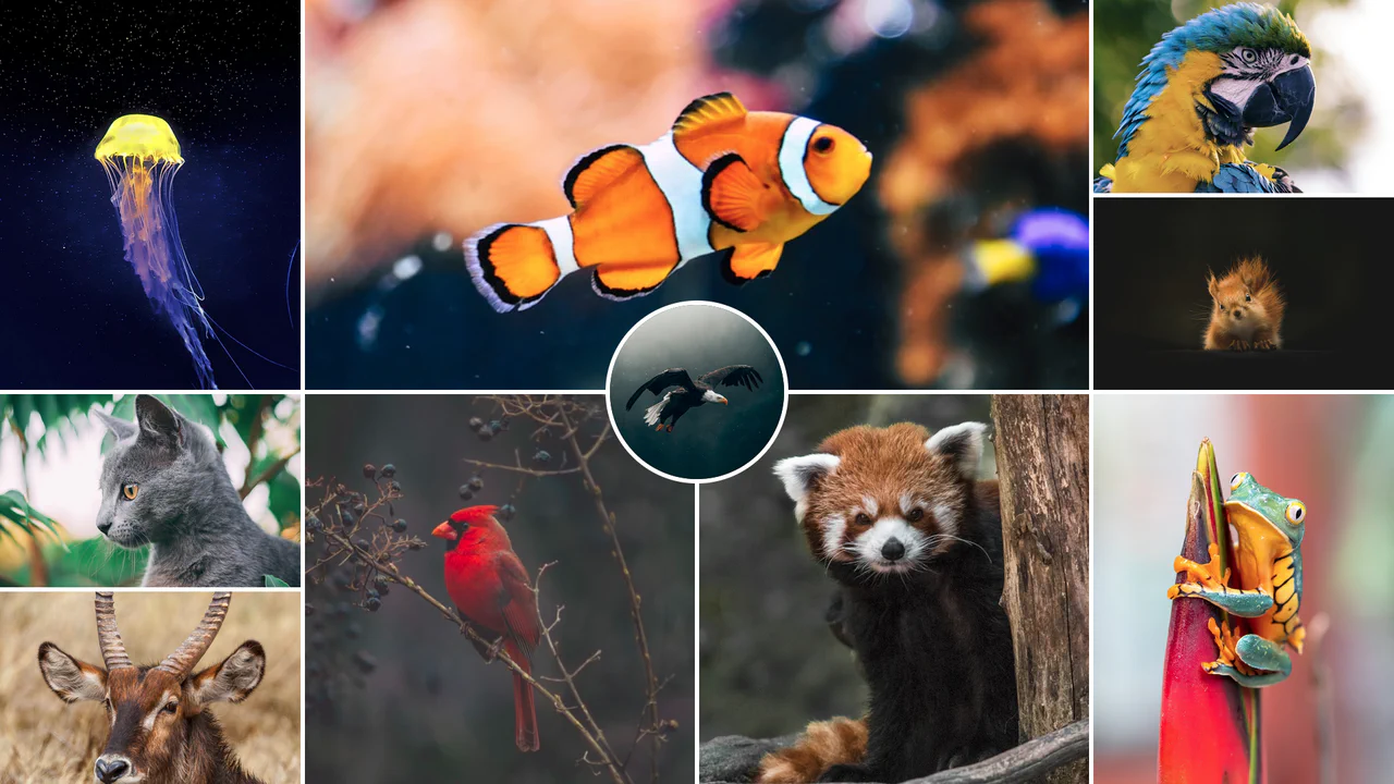
Responsive CSS Grid Mosaic Gallery
A zero-JavaScript responsive mosaic gallery built entirely on native CSS Grid. The grid system adapts dynamically through CSS Custom Variables and column-span mappings across responsive breakpoints, utilizing performance containment properties (contain: size) to prevent layout shifting. Features a centered, overlapping circular highlight portrait.
Chrome 57+
Edge 79+
Firefox 69+
Safari 15.4+See the Pen Responsive CSS Grid Mosaic Gallery.
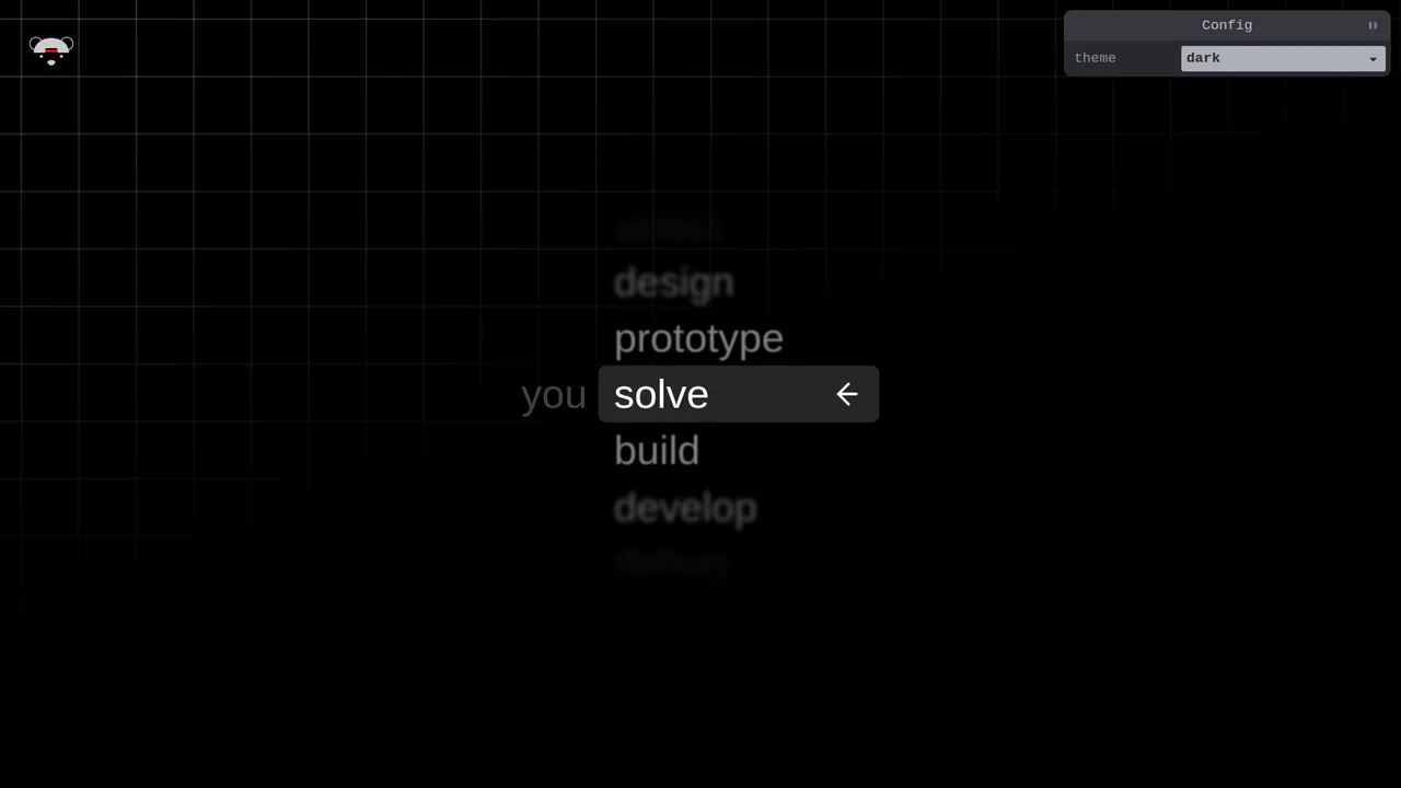
Scroll-Snapping Popover Select Dropdown Menu
An experimental custom select dropdown menu built on native HTML5 base-select specifications. The picker popover displays options in a vertically scroll-snapped viewport that fades and blurs adjacent values based on scroll proximity. A lightweight GSAP scrolling script automatically centers and aligns selected items in real time, while modern @starting-style manages discrete popover overlay entry transitions. (Requires: gsap.js, tweakpane.js)
Chrome 130+
Edge 130+
See the Pen Scroll-Snapping Popover Select Dropdown Menu.
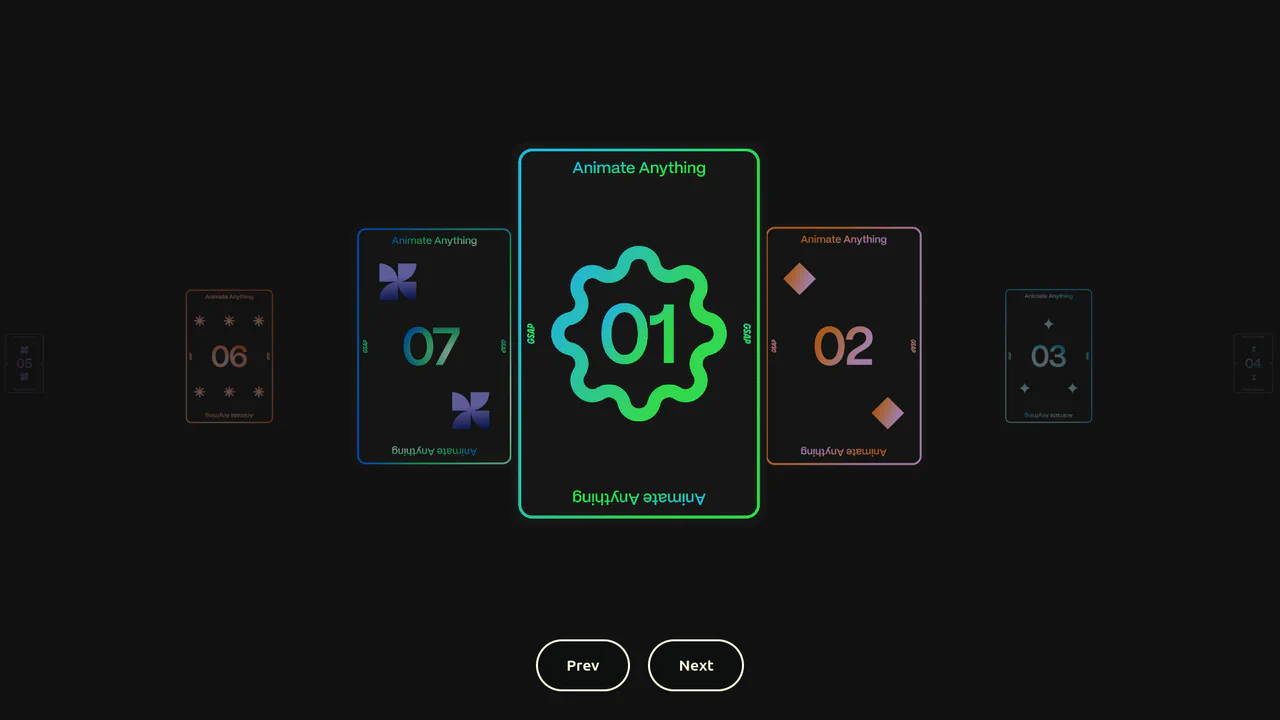
Seamless Infinite Scroll 3D Carousel
An advanced infinite loop carousel engineered with GSAP, ScrollTrigger, and Draggable. By binding a proxy playhead to window scrolls and pointer drag deltas, cards move smoothly across a custom scaling path. A specialized timeline looping mathematical function builds overlapping clones, ensuring a zero-gap continuous navigation experience. (Requires: gsap.js, scroll-trigger.js, draggable.js)
Chrome 49+
Edge 12+
Firefox 36+
Safari 9.1+
See the Pen Seamless Infinite Scroll 3D Carousel.
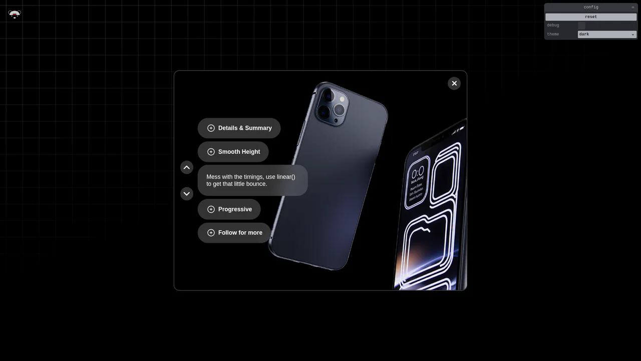
Smooth Accordion with Parallax Images
An advanced semantic accordion using native <details> elements synchronized with a parallax image gallery. Height transitions are made fluid through modern interpolate-size: allow-keywords and complex linear() bounce easings. JavaScript connects active toggles to external navigation buttons, aligning the active image block to match disclosure states. (Requires: gsap.js, tweakpane.js)
Chrome 129+
Edge 129+
Firefox 121+
Safari 17.2+See the Pen Smooth Accordion with Parallax Images.
Animated CSS Hamburger Menu Icon
Animated CSS Hamburger Menu Icon transforms a standard three-line menu into a close button. JavaScript toggles an active class, while CSS handles the heavy lifting. The middle line slides out using translateX, and the outer lines rotate 45 degrees via transform. Simultaneously, the background and icon colors invert. A clean, lightweight micro-interaction for mobile navigation headers.
Chrome 49+
Edge 15+
Firefox 31+
Safari 10+
See the Pen Animated CSS Hamburger Menu Icon.
Artillery Gorilla Canvas Retro Game
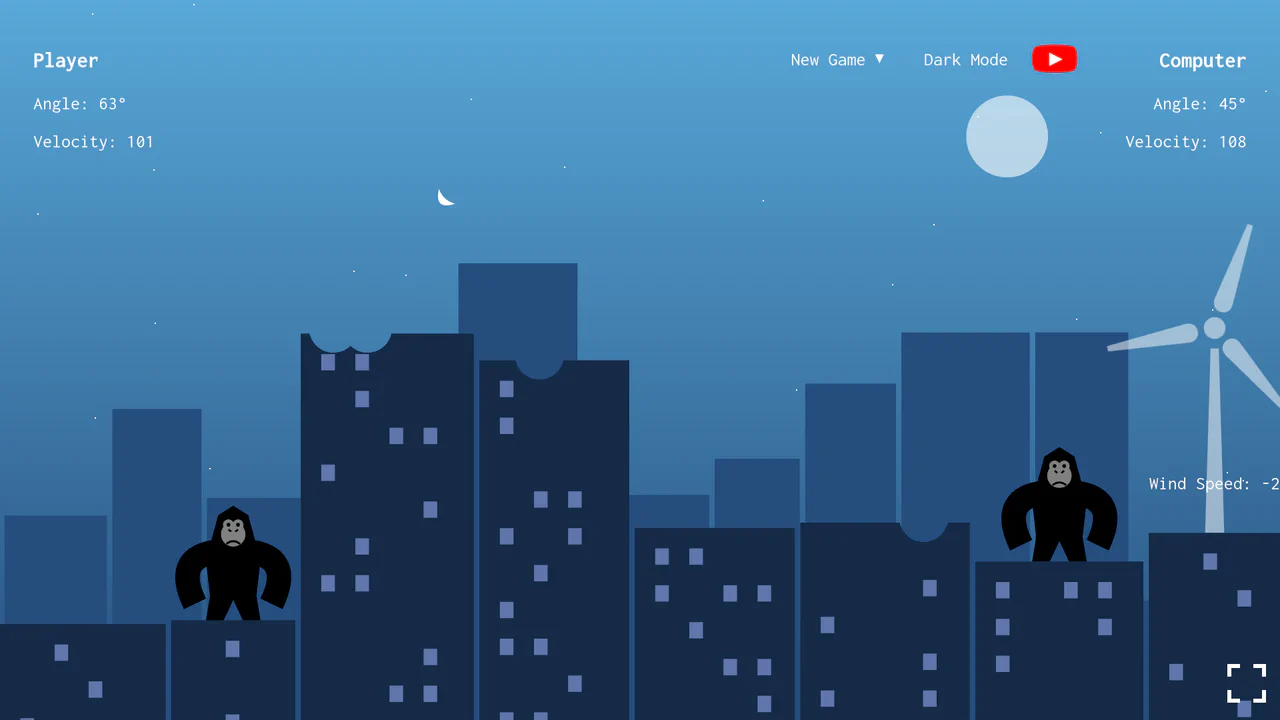
Artillery Gorilla Canvas Retro Game is a plain JavaScript clone of the MS-DOS classic, QBasic Gorillas. Two gorillas on city rooftops take turns throwing explosive bananas, with calculations factoring in gravity, adjustable angles, and wind speed shown via an animated SVG windmill. It features single-player AI simulation, local two-player, dark/light modes, and destructible building hitboxes.
Chrome 76+
Edge 79+
Firefox 67+
Safari 16.4+
See the Pen Artillery Gorilla Canvas Retro Game.
Direction-Aware CSS Box Shadow
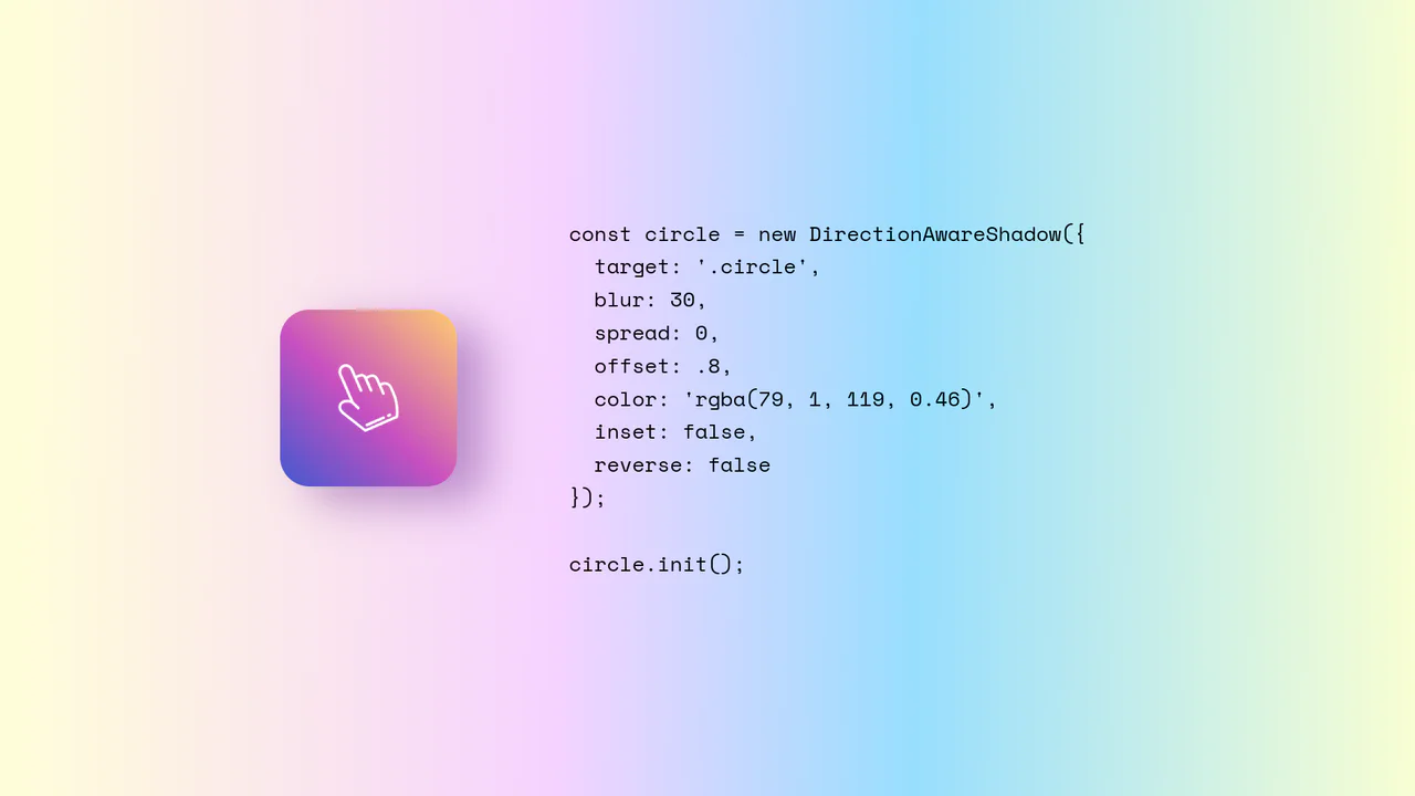
Direction-Aware CSS Box Shadow provides a reusable JavaScript class (DirectionAwareShadow) that calculates the mouse’s offsetX and offsetY relative to an element’s center. It then dynamically updates the element’s inline box-shadow property to cast a shadow in the opposite (or same) direction of the cursor. The class is highly configurable, allowing developers to easily adjust blur, spread, color, and offset intensity.
Chrome 4+
Edge 12+
Firefox 4+
Safari 3.1+
See the Pen Direction-Aware CSS Box Shadow.
Interactive CSS Tear Strip Animation
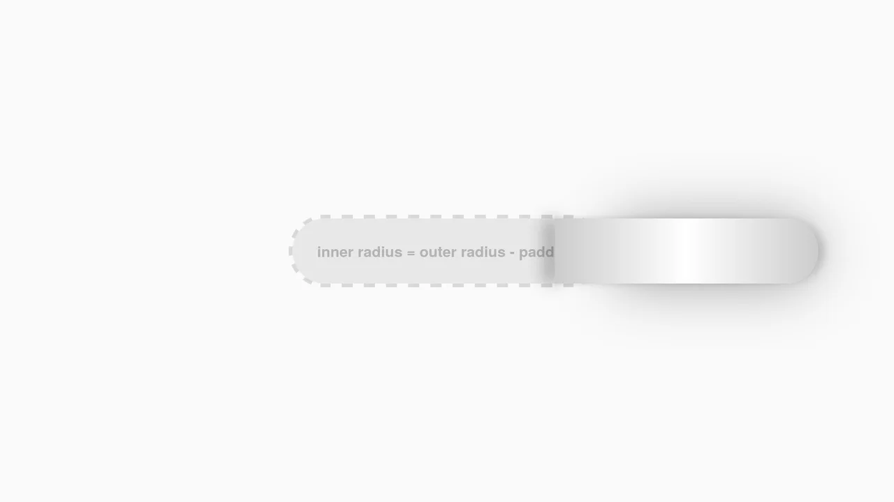
Interactive CSS Tear Strip Animation simulates the satisfying physical action of tearing open a cardboard package. It cleverly uses an invisible <input type="range"> linked to the CSS Scroll-Driven Animations API (animation-timeline: --thumb). As the user drags the slider, CSS variables dynamically update clip-path, box-shadow, and transform properties to reveal the content beneath while curling the torn strip. A JavaScript fallback ensures compatibility for browsers without native scroll-timeline support.
Chrome 115+
Edge 115+
Firefox 110+
Safari 16.4+See the Pen Interactive CSS Tear Strip Animation.
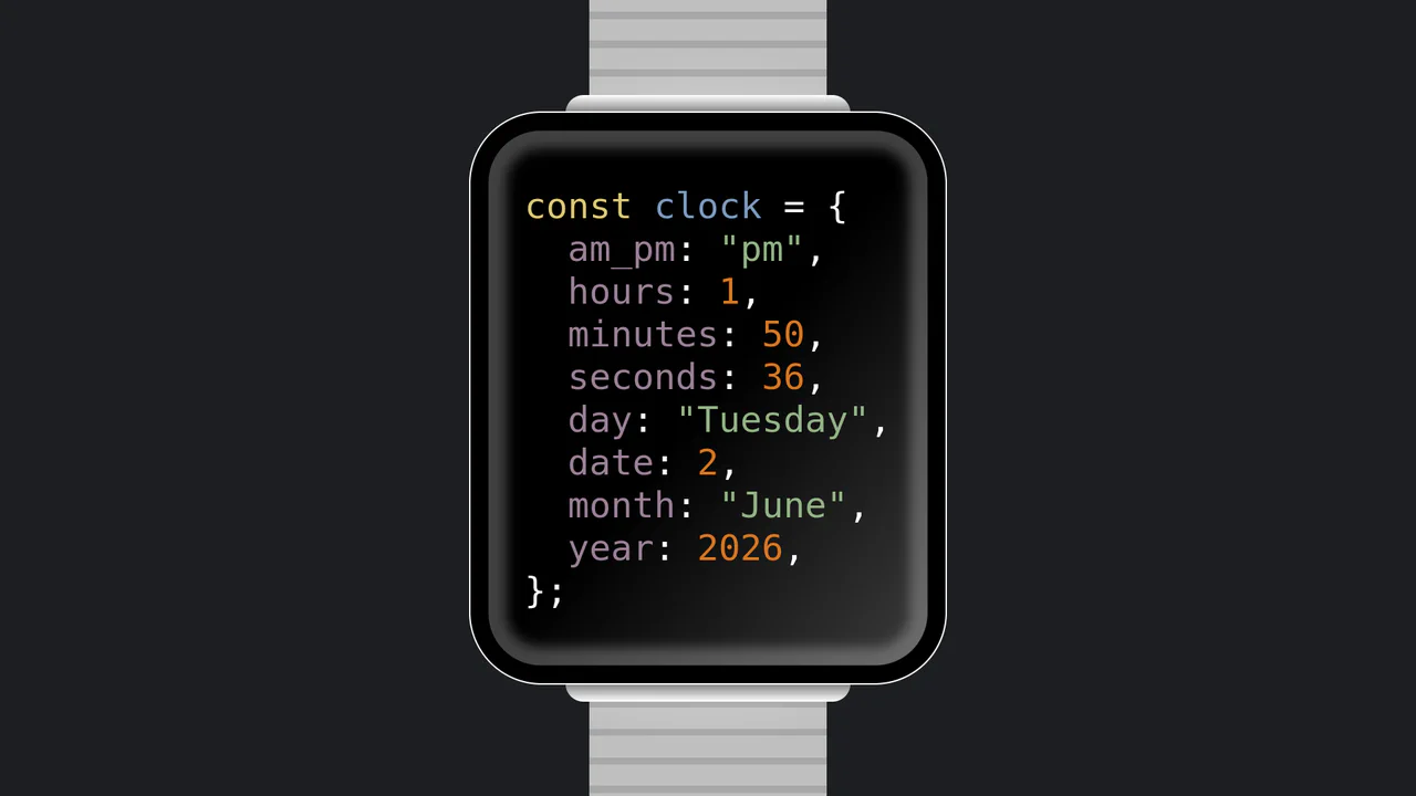
JavaScript Object Smartwatch Concept
JavaScript Object Smartwatch Concept turns a standard digital clock into a clever developer joke. The UI mimics an Apple Watch using pure CSS (box-shadow for the bezel, linear-gradient for the strap). Inside, JavaScript’s requestAnimationFrame continuously updates a formatted string, rendering the current time and date as a syntax-highlighted JS object. A fun, lightweight snippet for developer portfolios.
Chrome 4+
Edge 12+
Firefox 2+
Safari 3.1+
See the Pen JavaScript Object Smartwatch Concept.
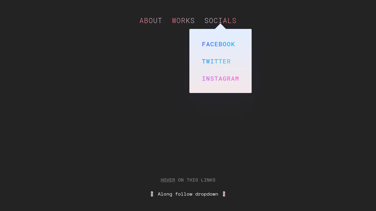
Morphing Stripe-Style Dropdown Navigation
“Morphing Stripe-Style Dropdown Navigation” replicates the famous Stripe header effect. A single background element dynamically resizes and moves behind the active content. JavaScript calculates dimensions using getBoundingClientRect() and updates CSS properties to animate the panel. This approach keeps the DOM clean and ensures smooth transitions between menu sections.
Chrome 48+
Edge 15+
Firefox 48+
Safari 10+
See the Pen Morphing Stripe-Style Dropdown Navigation.
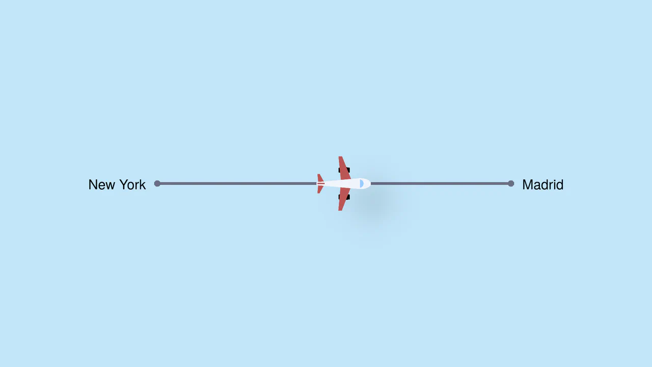
Pure CSS Trigonometric Flight Range Slider
Pure CSS Trigonometric Flight Range Slider uses CSS math functions like sin() and clamp() to dynamically scale a custom airplane thumb and cast realistic altitude shadows based on the input’s current percentage. It features a responsive container query that swaps the plane for a helicopter on narrow screens, and includes dedicated high-contrast mode styles for robust accessibility.
Chrome 111+
Edge 111+
Firefox 110+
Safari 16+
See the Pen Pure CSS Trigonometric Flight Range Slider.

Rollback Ball 3D Toggle Switch
Rollback Ball 3D Toggle Switch is a highly tactile, skeuomorphic switch concept. When clicked, a textured 3D ball realistically rolls across the track, cast-shadows shifting in unison. An ES6 JavaScript class dynamically reads the CSS animation duration, disables the input during the roll, and automatically resets the toggle state once the animation completes. A stellar example of interactive micro-design.
Chrome 55+
Edge 79+
Firefox 54+
Safari 10+See the Pen Rollback Ball 3D Toggle Switch.
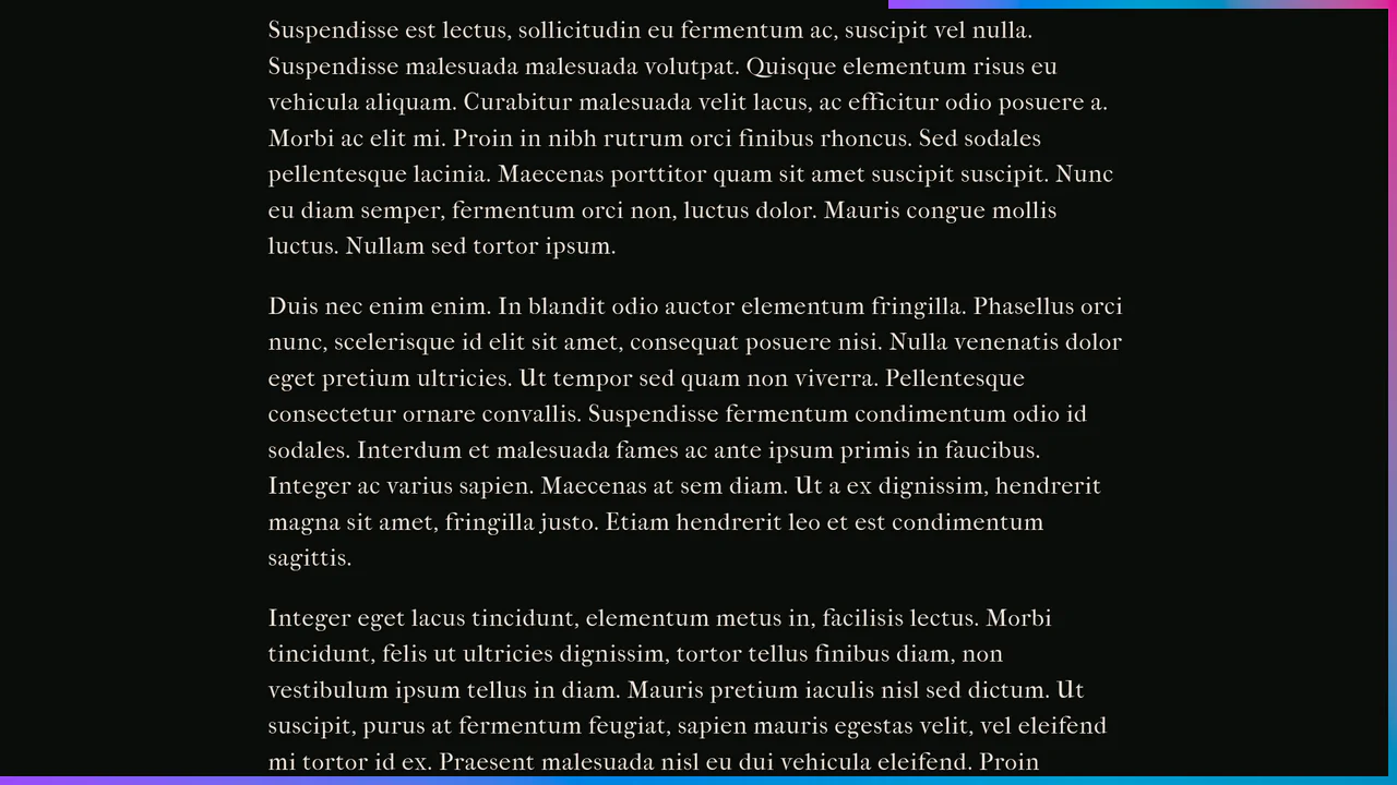
Scroll-Driven Crawling Border Frame
Scroll-Driven Crawling Border Frame draws a colorful frame around the viewport as the user scrolls. Utilizing native CSS Scroll-Driven Animations (animation-timeline: scroll()) and sequence keyframes, the borders of two fixed elements expand in height and width. The styling utilizes modern oklch() color math for a vibrant gradient. Clean, pure CSS decoration with no JS overhead.
Chrome 119+
Edge 119+
Firefox (with polyfill)
Safari (with polyfill)
See the Pen Scroll-Driven Crawling Border Frame.

Single Div Vintage TV CSS Illustration
Single Div Vintage TV CSS Illustration is a masterclass in CSS gradient art. Using only one div and its ::before/::after pseudo-elements, it renders a retro television set. The body, screen, antenna, and speaker grill are meticulously drawn using layered linear-gradient, radial-gradient, and repeating-linear-gradient. The mask-image property is cleverly used to carve out the control knobs. A brilliant example of pushing CSS drawing to its limits.
Chrome 53+
Edge 79+
Firefox 53+
Safari 15.4+
See the Pen Single Div Vintage TV CSS Illustration.
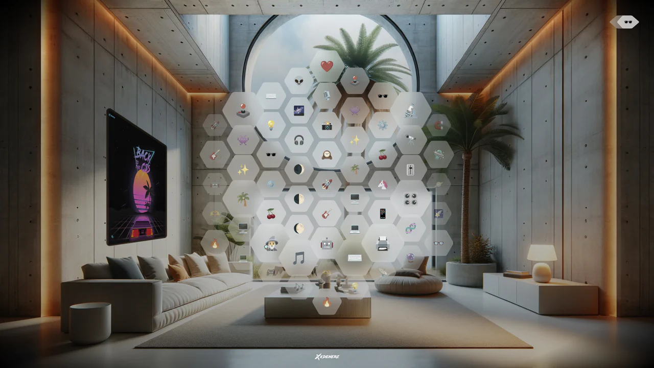
VisionOS Hexagonal App Grid Ripple
VisionOS Hexagonal App Grid Ripple recreates the spatial UI aesthetic of Apple VisionOS. It uses complex clip-path polygons to form the hexagons and backdrop-filter for the glassmorphism effect. The standout feature is the JavaScript-calculated ripple animation: on click, JS measures the distance from the target to every other hexagon, updating a CSS custom property (--ripple-factor) to stagger the CSS @keyframes delay radially.
Chrome 111+
Edge 111+
Firefox 113+
Safari 16.2+
See the Pen VisionOS Hexagonal App Grid Ripple.
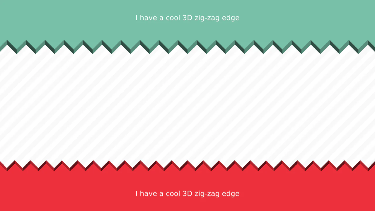
3D Zig-Zag Edge CSS Dividers
3D Zig-Zag Edge CSS Dividers creates a paper-cut illusion using only CSS. It relies on conic-gradient applied to both the background (for shading) and -webkit-mask (for the jagged shape). CSS variables control the size and depth of the teeth. This approach requires zero extra DOM elements or SVG files, making it a highly optimized solution for section transitions.
Chrome 69+
Edge 79+
Firefox 83+
Safari 12.1+
See the Pen 3D Zig-Zag Edge CSS Dividers.
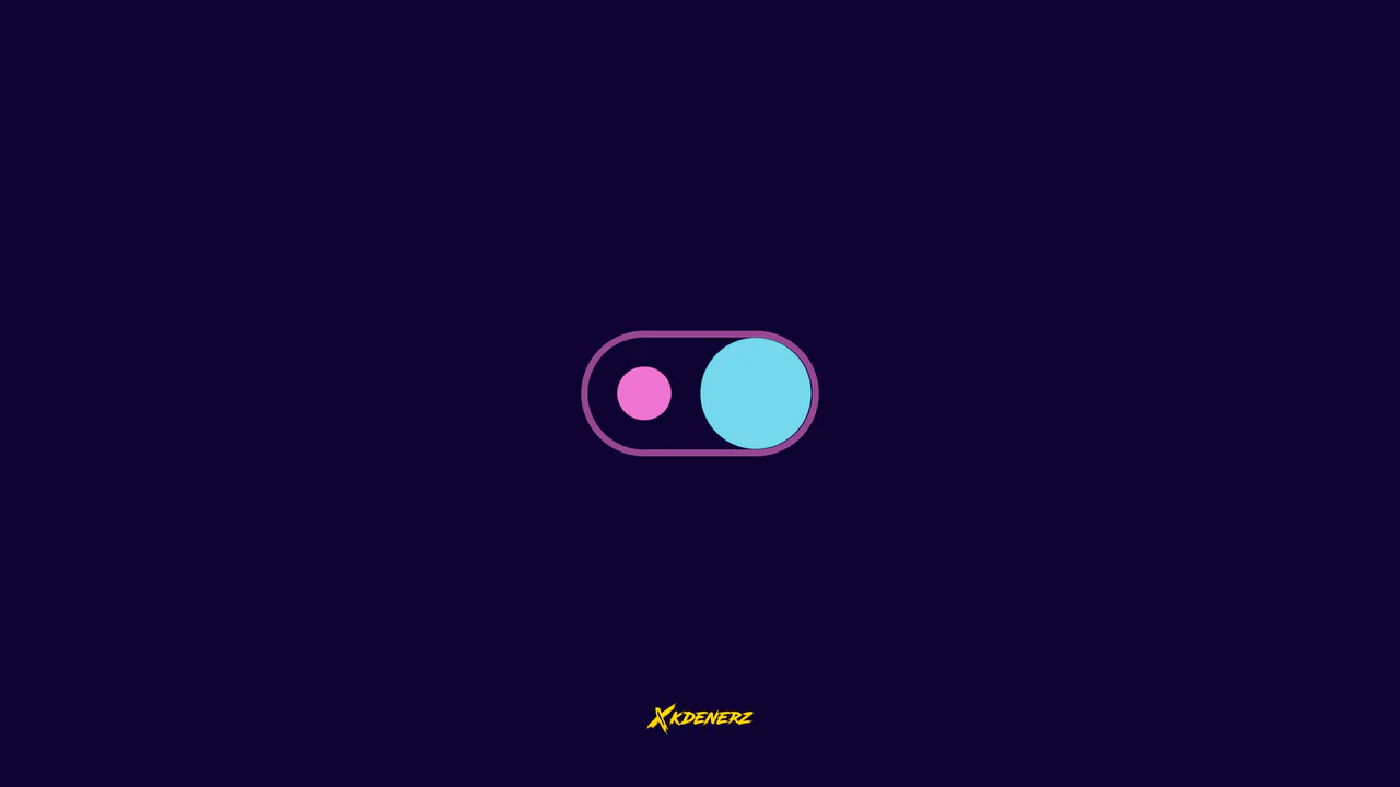
Gooey Liquid SVG Filter Toggle Switch
Gooey Liquid SVG Filter Toggle Switch uses a classic SVG filter trick — combining a blur (feGaussianBlur) with a high-contrast color matrix (feColorMatrix) — to achieve a fluid, organic morphing effect. The sliding thumb dynamically deforms and stretches before snapping into place. Built with modern CSS custom properties and individual transform properties, it includes a simple JavaScript loop for continuous demonstration.
Chrome 111+
Edge 111+
Firefox 113+
Safari 16.2+See the Pen Gooey Liquid SVG Filter Toggle Switch.
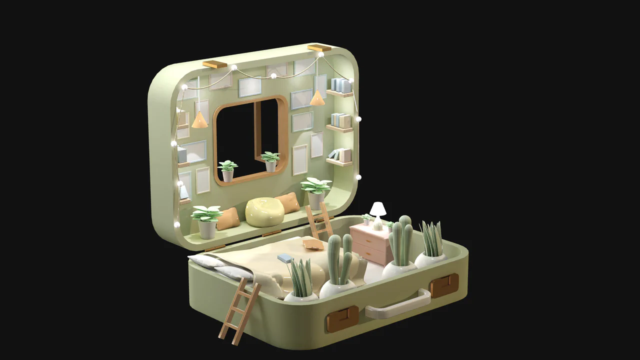
Interactive 3D Baked Room Concept
Interactive 3D Baked Room Concept leverages Three.js to render a detailed, stylized isometric room. Instead of heavy real-time shadows, the design uses a baked texture mapping approach (bakedTexture, normalTexture, occlusionTexture) for highly optimized, realistic ambient occlusion. Standard OrbitControls allow smooth user navigation within restricted bounding limits, preventing camera clipping. (Requires: three.js)
Chrome 33+
Edge 12+
Firefox 27+
Safari 8+
See the Pen Interactive 3D Baked Room Concept.
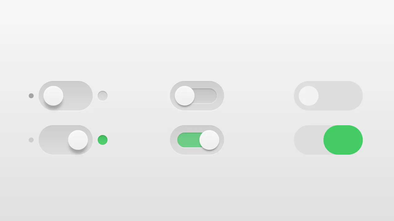
Realistic 3D CSS Toggle Switches
“Realistic 3D CSS Toggle Switches” showcase three distinct switch variations using the classic checkbox hack. Built entirely without JavaScript, they rely on CSS box-shadow and linear-gradient to create tactile, 3D inset depths. State changes are smoothly animated via transition on pseudo-elements. A lightweight, robust solution for adding polished micro-interactions to forms.
Chrome 26+
Edge 12+
Firefox 16+
Safari 6.1+
See the Pen Realistic 3D CSS Toggle Switches.
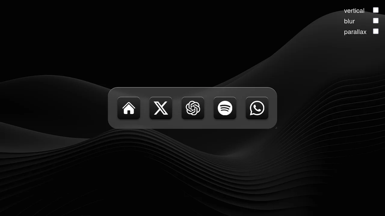
Scroll-Driven macOS iOS Dock Concept
Pure CSS Scroll-Driven macOS iOS Dock recreates Apple’s legendary dock using the native CSS Scroll-Driven Animations API. Icons dynamically scale, blur, and shift depth completely without JavaScript. Utilizing @supports (animation-timeline: scroll()), the layout safely handles horizontal and vertical snaps. A zero-dependency, ultra-lightweight demonstrator of modern CSS capabilities. (Requires: gsap.js, scroll-trigger.js)
Chrome 115+
Edge 115+
Safari 26+See the Pen Scroll-Driven macOS iOS Dock Concept.

Whimsical CSS Bubble Preloader
Whimsical CSS Bubble Preloader is a pure CSS animation that simulates rising bubbles that pop and scatter tiny droplets. Using HTML layout without JavaScript, it relies entirely on staggered @keyframes delays, absolute positioning, and math-based rotations via :nth-child. Radial gradients generate realistic reflections, while drop-shadow adds depth. A smart choice for lightweight, playful interfaces, though the dense DOM structure for droplets might feel redundant for some.
Chrome 52+
Edge 15+
Firefox 49+
Safari 9.1+See the Pen Whimsical CSS Bubble Preloader.
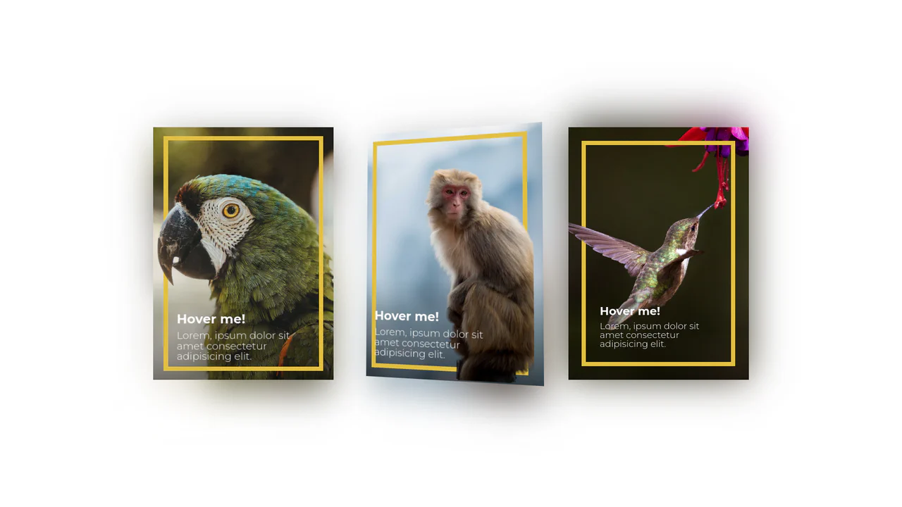
3D Depth Parallax Pop-Out Cards
3D Depth Parallax Pop-Out Cards uses a mathematical approach combining value remapping and linear interpolation (lerp) to calculate fluid, lagged cursor coordinates inside a 60 FPS animation loop. This script alters custom CSS properties --rotateX and --rotateY, projecting individual layer transforms across multiple translated depths—namely a blurred .shadow, background scene, golden borders, and a foreground .cutout. While visually convincing, utilizing setInterval at a hardcoded 1000/60 rate can cause micro-stuttering on high-refresh-rate displays, making requestAnimationFrame a far more performant choice.
Chrome 88+
Edge 88+
Firefox 89+
Safari 15+
See the Pen 3D Depth Parallax Pop-Out Cards.