
Mission Control Grid Exposé
This is a Mission Control Grid Exposé. It scales overlapping full-screen views into a unified spatial grid. Its function is to provide absolute structural context, replacing linear tab switching with a macro-level physical interface.
 Chrome 114+
 Edge 114+
 Safari 17+
 Firefox 125+
See the Pen Mission Control Grid Exposé.

Expanding View Transition Music Card
This is an Expanding View Transition Music Card. It morphs a compact artist profile header into a full-featured media player interface upon interaction. Its function is to reveal secondary controls and cover art contextually, eliminating the need for abrupt modal overlays or separate page navigation.
Chrome 112+
Edge 112+
Firefox 131+
Safari 18+
See the Pen Expanding View Transition Music Card.
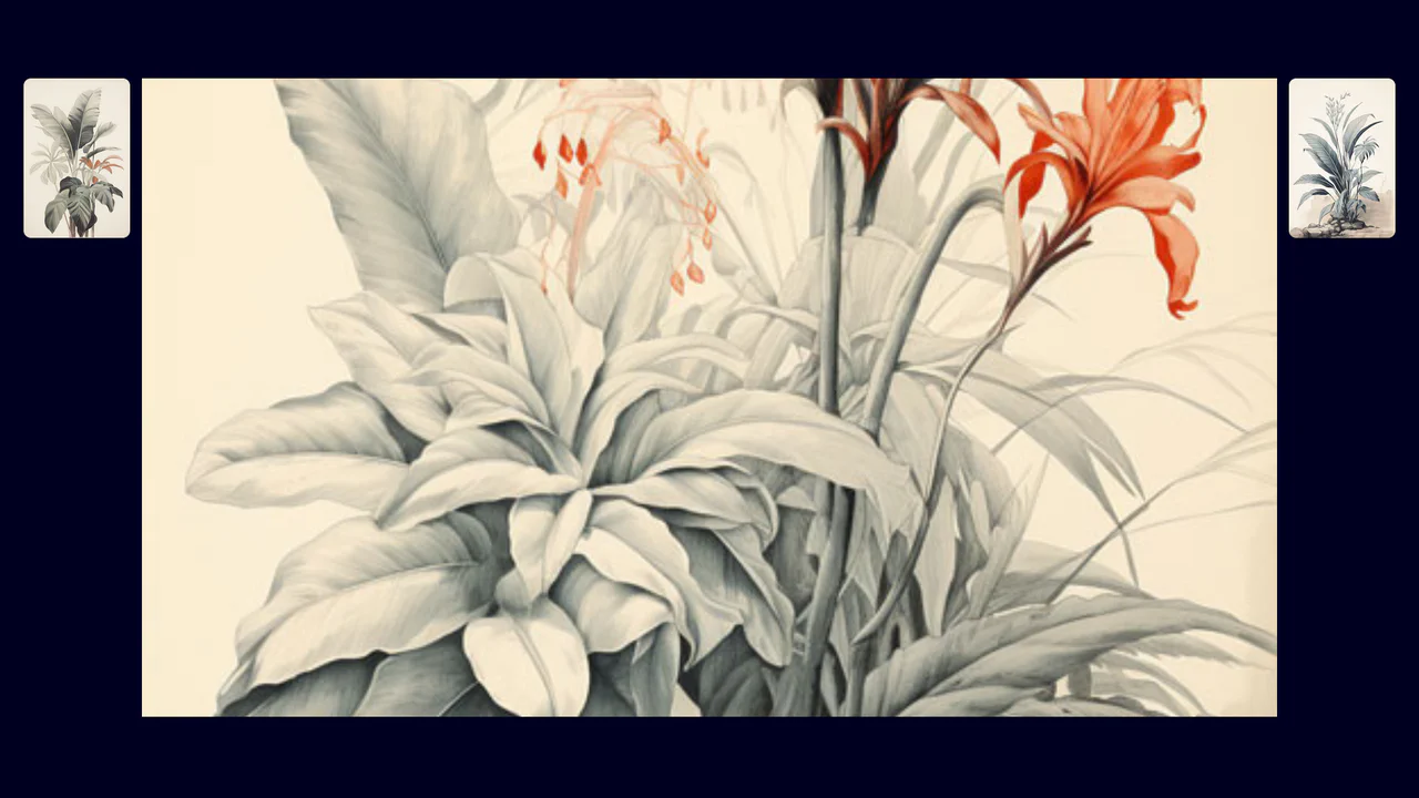
Fullscreen View Transition Gallery
This is a Fullscreen View Transition Gallery. It transforms standard grid images into a focused, screen-filling view upon interaction. Its function is to provide seamless, native visual continuity without relying on heavy third-party animation libraries or complex transform calculations.
Chrome 111+
Edge 111+
Firefox 131+
Safari 18+
See the Pen Fullscreen View Transition Gallery.
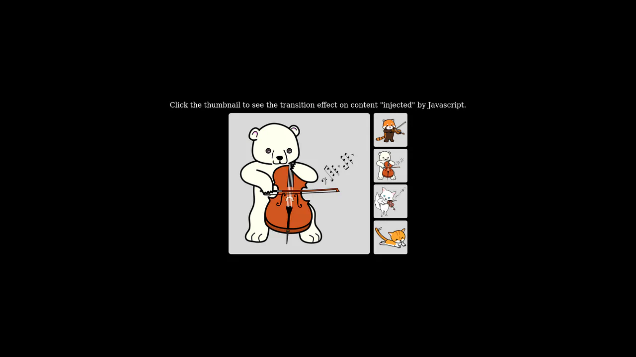
Native Cross-Fade View Transition Gallery
This is a Native Cross-Fade View Transition Gallery. It updates a central image source triggered by thumbnail interactions. Its function is to smooth out abrupt visual DOM updates using the browser’s built-in rendering engine, entirely eliminating the need for external animation payloads or CSS opacity toggles.
Chrome 111+
Edge 111+
Firefox 131+
Safari 18+
See the Pen Native Cross-Fade View Transition Gallery.
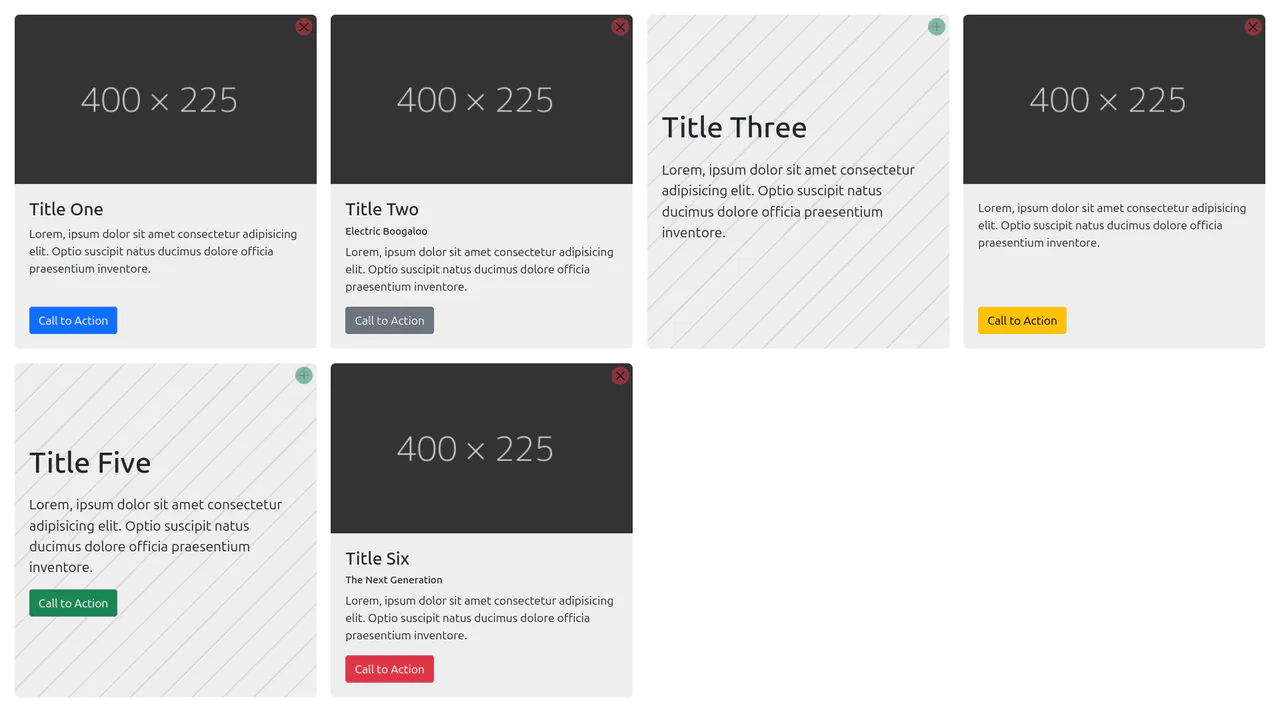
Content-Aware Cards
This is a Content-Aware Bootstrap Card. It uses the structural :has() pseudo-class to dynamically alter its internal layout, background, and typography based solely on the presence of an image node. Its function is to provide an adaptable, self-managing container that eliminates the need for redundant state-tracking classes in your JavaScript logic. (Requires: bootstrap)
Chrome 105+
Edge 105+
Firefox 121+
Safari 15.4+
See the Pen Content-Aware Cards.
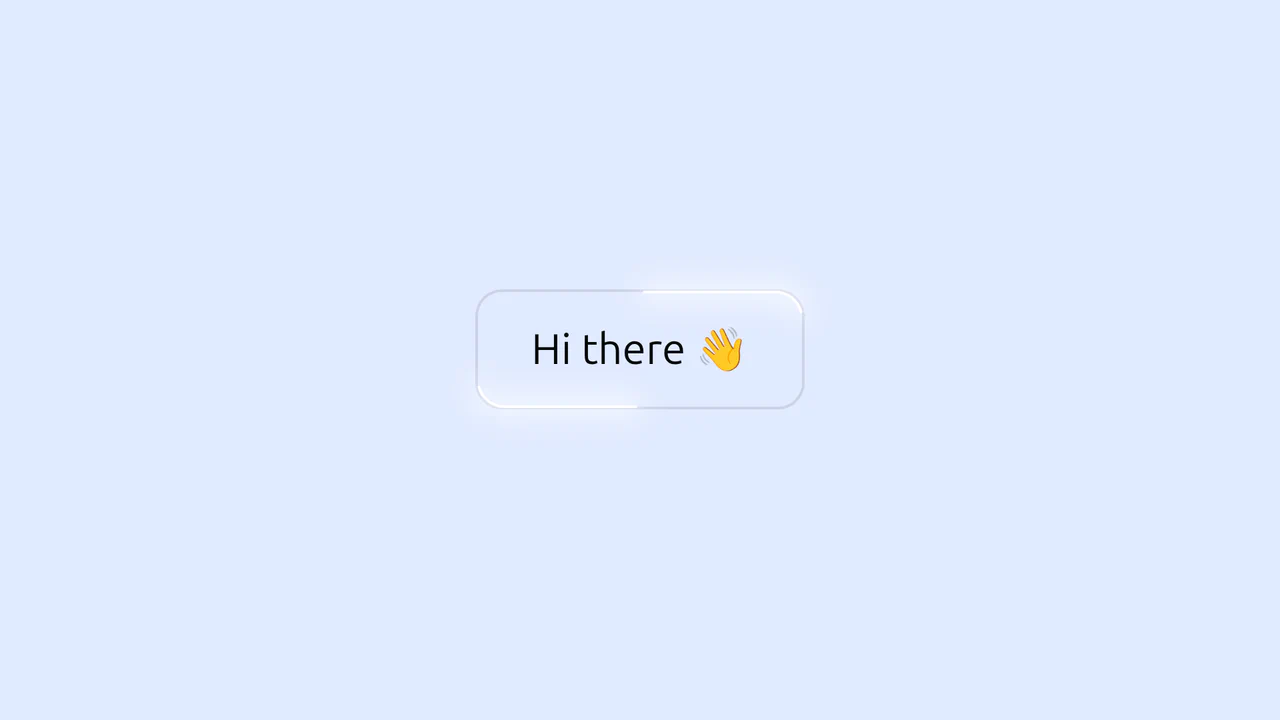
Glowing Border Trace Button
This is a Glowing Border Trace Button. It utilizes embedded SVG rectangles to create a moving neon stroke along the perimeter upon interaction. Its function is to provide highly visible, tactile feedback for primary actions without disrupting the core layout geometry or triggering expensive repaints.
Chrome 88+
Edge 88+
Firefox 78+
Safari 14+
<button class="button glow">
  Hi there 👋
  <svg class="glow-container">
    <rect pathLength="100" stroke-linecap="round" class="glow-blur"></rect>
    <rect pathLength="100" stroke-linecap="round" class="glow-line"></rect>
  </svg>
</button>
body {
  display: grid;
  place-content: center;
  gap: 2rem;
  min-height: 100lvh;
  background: #E1EAFF;
  font-family: system-ui;
}

.button {
  cursor: pointer;
  font-size: 2rem;
  font-family: inherit;
  font-weight: 400;
  color: #050908;
  background-color: transparent;
  padding: 0.75em 1.25em;
  border: 2px solid #ccd2e6;
  border-radius: 1.25rem;
}

.glow {
  --glow-line-color: #fff;
  --glow-line-thickness: 2px;
  --glow-line-length: 20;
  --glow-blur-color: #fff;
  --glow-blur-size: 10px;
  --animation-speed: 1200ms;
  --container-offset: 100px;
  position: relative;
}
.glow-container {
  pointer-events: none;
  position: absolute;
  inset: calc(var(--container-offset) / -2);
  width: calc(100% + var(--container-offset));
  height: calc(100% + var(--container-offset));
  opacity: 0;
}
.glow-blur, .glow-line {
  width: calc(100% - var(--container-offset));
  height: calc(100% - var(--container-offset));
  x: calc(var(--container-offset) / 2);
  y: calc(var(--container-offset) / 2);
  rx: 1.25rem;
  fill: transparent;
  stroke: black;
  stroke-width: 5px;
  stroke-dasharray: var(--glow-line-length) calc(50 - var(--glow-line-length));
}
.glow-line {
  stroke: var(--glow-line-color);
  stroke-width: var(--glow-line-thickness);
}
.glow-blur {
  filter: blur(var(--glow-blur-size));
  stroke: var(--glow-blur-color);
  stroke-width: var(--glow-blur-size);
}
.glow:is(:hover, :focus) .glow-blur, .glow:is(:hover, :focus) .glow-line {
  stroke-dashoffset: -80px;
  transition: stroke-dashoffset var(--animation-speed) ease-in, stroke-dasharray var(--animation-speed) ease-in;
}
.glow:is(:hover, :focus) .glow-container {
  animation: glow-visibility var(--animation-speed) ease-in;
}

@keyframes glow-visibility {
  0%, 100% {
    opacity: 0;
  }
  25%, 75% {
    opacity: 1;
  }
}
(function setGlowEffectRx() {
  const glowEffects = document.querySelectorAll('.glow');

  glowEffects.forEach(element => {
    const rx = getComputedStyle(element).borderRadius;
    const glowRects = element.querySelectorAll('rect');

    glowRects.forEach(rect => {
      rect.setAttribute('rx', rx);
    })
  })
})();
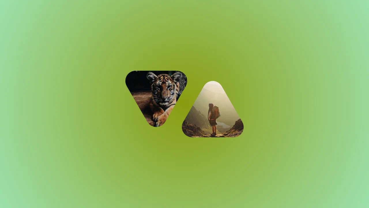
Morphing Rounded Triangle Image Mask
This is a Morphing Rounded Triangle Image Mask. It relies on advanced CSS mathematics and masking to clip raster graphics into smooth, interlocking geometric shapes. Its function is to replace standard grid layouts with organic, tessellating image tiles that physically react to user interaction.
Chrome 111+
Edge 111+
Firefox 117+
Safari 16.4+
See the Pen Morphing Rounded Triangle Image Mask.

Smooth Parallax Image Scroll Gallery
This is a Smooth Parallax Image Scroll Gallery. It translates vertical scroll progression into independent Y-axis movement for masked images. Its function is to create a sense of depth and momentum, elevating standard vertical feeds into immersive visual narratives. (Requires: gsap-js, scroll-trigger-js, lenis-js)
Chrome 108+
Edge 108+
Firefox 101+
Safari 15.4+See the Pen Smooth Parallax Image Scroll Gallery.
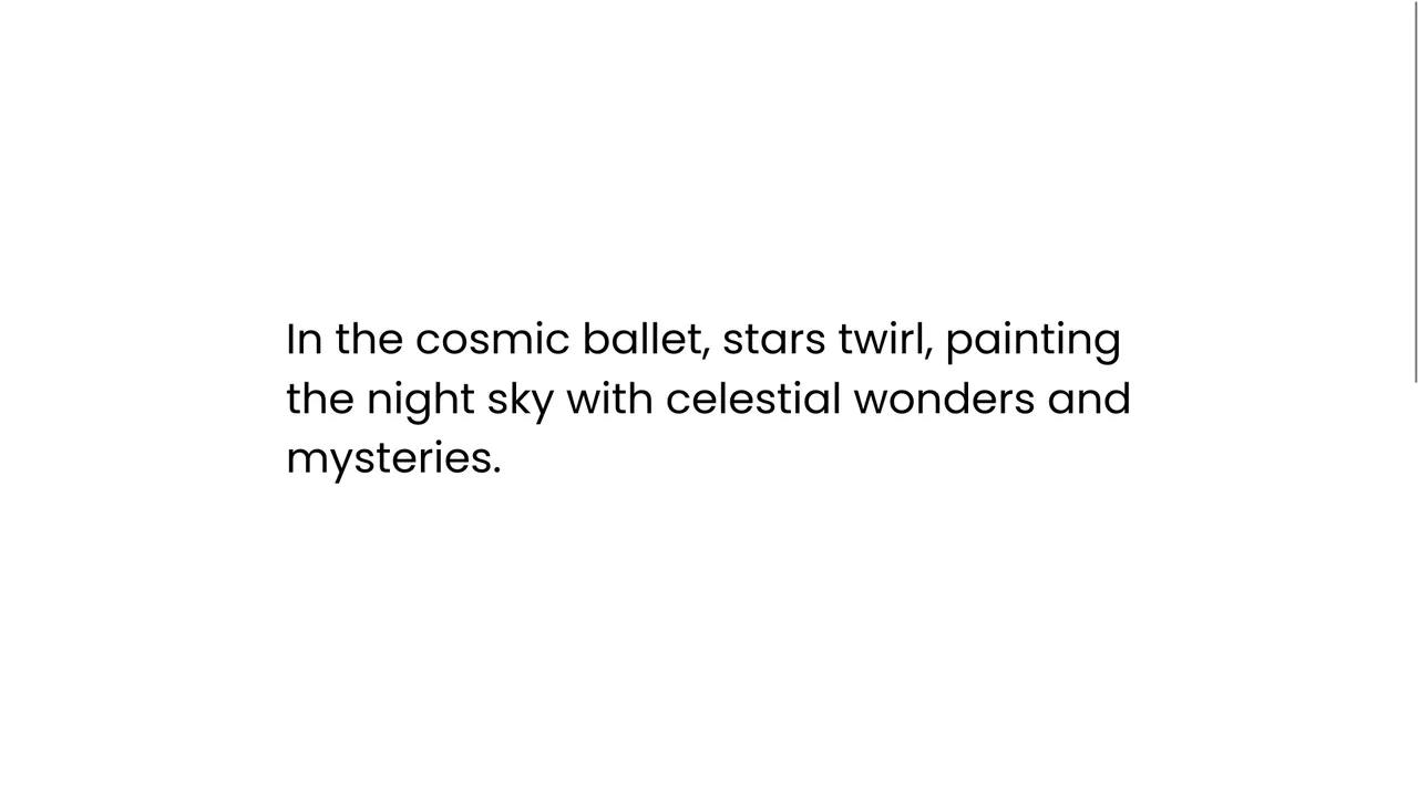
Staggered Text Scroll Reveal
This is a Staggered Text Scroll Reveal. It parses structural typography into independent animated lines. Its function is to pace the reader’s attention, transforming static paragraphs into dynamic narrative elements triggered by viewport intersection. (Requires: gsap-js, scroll-trigger-js, lenis-js, split-type)
Chrome 64+
Edge 79+
Firefox 69+
Safari 13.1+See the Pen Staggered Text Scroll Reveal.
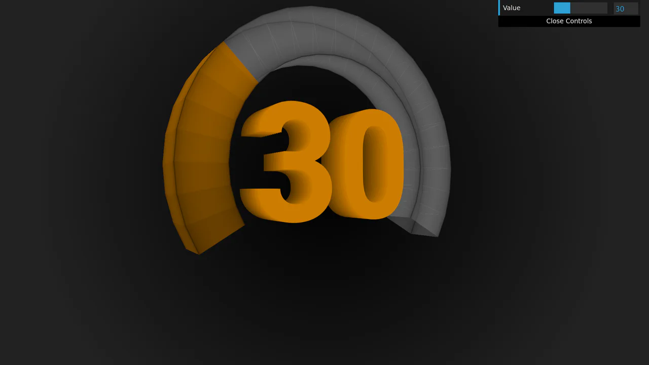
3D Rotating Value Dial
This is a 3D Rotating Value Dial. It visualizes continuous data through a spatial, cylindrical interface. Its function is to replace flat range indicators with a tactile, volumetric readout that dynamically shifts color hue based on value. (Requires: dat.gui)
Chrome 111+
Edge 111+
Firefox 108+
Safari 15.4+
See the Pen 3D Rotating Value Dial.

Polygon Sliced Theme Toggle Navbar
This is a Polygon Sliced Theme Toggle Navbar. It handles global light/dark mode switching and primary site navigation. Its function is to provide fluid, state-driven visual feedback using native browser APIs, eliminating abrupt visual jumps during context shifts. (Requires: normalize.css)
Chrome 111+
Edge 111+
Firefox 121+
Safari 17.4+See the Pen Polygon Sliced Theme Toggle Navbar.

Cinematic Masked Video Hero
This is a Cinematic Masked Video Hero. It layers solid and outlined typography over an SVG-clipped video element to create optical depth. Its function is to immediately capture attention on landing, breaking away from standard rectangular layouts through organic polygon masking and staggered motion. (Requires: gsap-js)
Chrome 90+
Edge 90+
Firefox 89+
Safari 15+
See the Pen Cinematic Masked Video Hero.
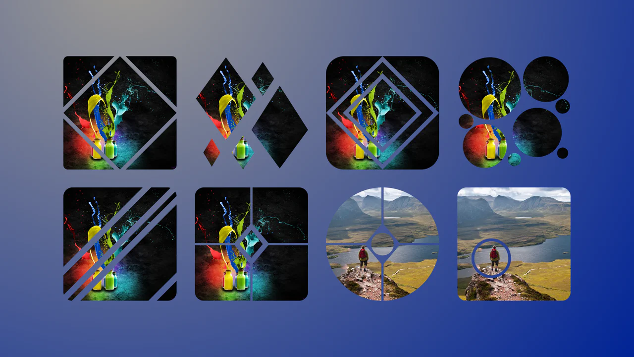
Complex Geometric Image Masks
This is a collection of Complex Geometric Image Masks. It shapes standard rectangular images into precise, multi-part vector forms using a single HTML node. Its function is to break rigid grid layouts and introduce structural visual interest without requiring external SVG assets.
Chrome 88+
Edge 88+
Firefox 71+
Safari 13.1+
See the Pen Complex Geometric Image Masks.

CSS Pixel Art Animation
This is a Pure CSS Pixel Art Animation. It renders a multi-frame character sequence (Guybrush Threepwood) using a single HTML <div>. Its function is to demonstrate extreme CSS capability and provide lightweight, scalable retro graphics without requiring external raster images or canvas rendering.
Chrome 26+
Edge 12+
Firefox 19+
Safari 6+
See the Pen CSS Pixel Art Animation.

Glowing Chasing Squares CSS Loader
This is a Glowing Chasing Squares CSS Loader. It visually communicates background system processes through continuous, cyclic motion. Its function is to reduce perceived wait times by providing a predictable, rhythmic focal point during data fetching.
Chrome 53+
Edge 79+
Firefox 35+
Safari 9+
See the Pen Glowing Chasing Squares CSS Loader.

Interactive Zoom SVG Comic Viewer
This is an Interactive Zoom SVG Comic Viewer. It dynamically scales and spotlights individual comic panels within a massive, high-resolution raster image. Its function is to translate the physical experience of reading a comic book into a guided, cinematic digital flow, focusing user attention without losing the context of the page. (Requires: Gsap.js, Rx.js)
Chrome 49+
Edge 79+
Firefox 51+
Safari 10+
See the Pen Interactive Zoom SVG Comic Viewer.
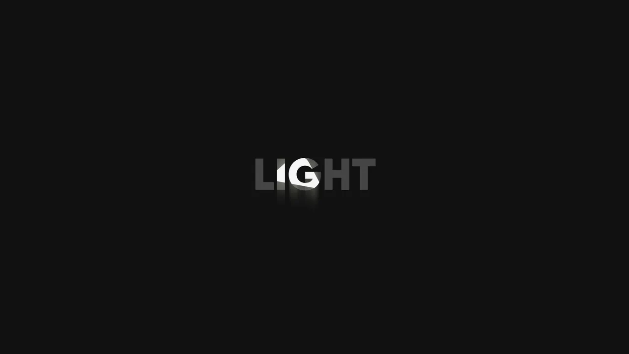
Swinging Spotlight Text Reveal
This is a Swinging Spotlight Text Reveal. It uses a virtual pendulum mask to selectively illuminate static vector letters as it passes over them. Its function is to direct user focus and add a tactile, environmental lighting effect to primary typographic elements. (Requires: gsap-js)
Chrome 49+
Edge 79+
Firefox 51+
Safari 10+
See the Pen Swinging Spotlight Text Reveal.

Interactive 3D Floating Product Cards
This is an Interactive 3D Floating Product Card. It uses CSS spatial transforms to separate internal elements into distinct Z-axis layers upon interaction. Its function is to elevate standard e-commerce grid displays into tactile, physics-based focal points. (Requires: VanillaTilt.js)
Chrome 53+
Edge 79+
Firefox 53+
Safari 15.4+
See the Pen Interactive 3D Floating Product Cards.

Interactive Clip-Path Image Comparison
This is an Interactive Clip-Path Image Comparison. It juxtaposes two states of a single subject using a fluid, pointer-driven mask. Its function is to provide immediate, tangible proof of transformation (before/after), replacing static side-by-side galleries with a unified exploratory experience.
Chrome 75+
Edge 79+
Firefox 71+
Safari 13+
See the Pen Interactive Clip-Path Image Comparison.

Interactive Drag-and-Drop Jigsaw Puzzle
This is an Interactive Drag-and-Drop Jigsaw Puzzle. It dissects a single raster image into an interlocking grid of movable pieces without relying on a single line of JavaScript. Its function is to gamify visual content, converting passive image consumption into a tactile, logic-driven interaction.
Chrome 84+
Edge 84+
Firefox 90+
Safari 15.4+See the Pen Interactive Drag-and-Drop Jigsaw Puzzle.

Sliding Theme Toggle Sidebar Menu
This is a Sliding Theme Toggle Sidebar Menu. It integrates an interactive light/dark mode switch directly into a scrollable navigation panel. Its function is to provide centralized control over the application’s visual environment while maintaining immediate access to primary routing options.
Chrome 59+
Edge 79+
Firefox 52+
Safari 10.1+
See the Pen Sliding Theme Toggle Sidebar Menu.

Stacked Card Pull-Down Navigation
This is a Stacked Card Pull-Down Navigation. It transforms a standard mobile menu into a tactile, deck-like interface that cascades down from the viewport’s top edge. Its primary function is to provide an engaging, full-screen routing experience, replacing the traditional hamburger icon with an interactive, overlapping layer system that optimizes touch targets.
Chrome 86+
Edge 86+
Firefox 85+
Safari 14+
See the Pen Stacked Card Pull-Down Navigation.

Asymmetric SVG Mask Grid Gallery
This is an Asymmetric SVG Mask Grid Gallery. It builds a complex, interlocking masonry-style mosaic using CSS Grid areas, applying organic SVG masks to each thumbnail. Its primary function is to break free from rigid, boxy layouts, offering a highly stylized, interactive photo showcase complete with a native JavaScript lightbox modal.
Chrome 120+
Edge 120+
Firefox 53+
Safari 15.4+
See the Pen Asymmetric SVG Mask Grid Gallery.

Editorial Grid Magazine Layout
This is an Editorial CSS Grid Magazine Layout. It translates the overlapping, asymmetrical structures of print media into the browser. Its function is to break rigid top-to-bottom reading patterns, utilizing layered images and multi-column typography to construct visual tension and content hierarchy without relying on JavaScript.
Chrome 57+
Edge 16+
Firefox 52+
Safari 10.1+
See the Pen Editorial Grid Magazine Layout.

Responsive Grid Restaurant Menu Layout
This is a Responsive Grid Restaurant Menu Layout. It structures dense textual information using fluid CSS grid columns and semantic HTML definition lists. Its function is to organize complex data into a highly readable, adaptable format, removing the need for rigid breakpoints and ensuring absolute clarity across all devices.
Chrome 76+
Edge 79+
Firefox 103+
Safari 10.1+See the Pen Responsive Grid Restaurant Menu Layout.

Reveal Animated Hero Slider
This is a Reveal Animated Hero Slider. It cycles through prominent featured content using synchronized transitions. Its function is to capture user attention instantly, employing staggered typography reveals and a sweeping geometric mask to introduce new visual assets without jarring cuts.
Chrome 64+
Edge 79+
Firefox 67+
Safari 12+
See the Pen Reveal Animated Hero Slider.

SVG Perimeter Progress Upload Button
This is an SVG Perimeter Progress Upload Button. It merges the primary action trigger and progress indicator into a single UI component. Its function is to conserve screen real estate while providing continuous, high-fidelity visual feedback during asynchronous file transfers.
Chrome 60+
Edge 79+
Firefox 55+
Safari 11+See the Pen SVG Perimeter Progress Upload Button.

Dynamic Data-Driven Tag Cloud Component
This is a Dynamic Data-Driven Tag Cloud Component. It consumes an external JSON payload to generate interactive tags, proportionally scaling their font sizes based on their frequency of use. Its function is to visually prioritize popular categories, allowing users to intuitively navigate heavy content taxonomies without reading numbers.
Chrome 42+
Edge 14+
Firefox 39+
Safari 10.1+
See the Pen Dynamic Data-Driven Tag Cloud Component.

Grid Lightbox Gallery Effect
This is a CSS Grid Lightbox Gallery Effect. It structures an asymmetric image grid that expands individual photos into a full-screen, blurred overlay upon interaction. Its primary function is to focus user attention on a single visual asset while maintaining the context of the underlying page through transparency.
Chrome 76+
Edge 79+
Firefox 103+
Safari 13+
See the Pen Grid Lightbox Gallery Effect.

Interactive Canvas Particle Image Effect
This is an Interactive Canvas Particle Image Effect. It reconstructs standard raster images using thousands of autonomous floating particles. Its function is to create a highly tactile visual experience that reacts to cursor proximity, morphing colors based on hidden alternate image data to remove the static barrier between user and interface. (Requires: GSAP)
Chrome 80+
Edge 80+
Firefox 75+
Safari 13+
See the Pen Interactive Canvas Particle Image Effect.