
Responsive Fluid Photo Gallery Grid
This is a Responsive Fluid Photo Gallery Grid. It organizes varied aspect-ratio images into justified rows without cropping essential content. Its primary function is to optimize visual space, ensuring edge-to-edge alignment while deferring offscreen asset loading for strict performance control. (Requires: lazysizes, object-fit-images)
 Chrome 80+
 Edge 80+
 Firefox 75+
 Safari 13+
See the Pen Responsive Fluid Photo Gallery Grid.

Tilting Diamond Range Slider Effect
This is a Tilting Diamond Range Slider Effect. It tracks user input through a hidden native range element, overlaying a custom graphical interface. Its primary function is to inject physical inertia into a standard digital control. The tooltip mimics mass, lagging behind rapid movements and tilting in the direction of travel.
Chrome 80+
Edge 80+
Firefox 75+
Safari 13+
See the Pen Tilting Diamond Range Slider Effect.

Draggable Image Track Parallax
This is a Draggable Image Track Parallax component. It replaces standard scrollbars with a custom, click-and-drag horizontal interface. Its function is to provide a highly kinetic, app-like browsing experience for image galleries, featuring an internal parallax effect where the images pan slightly inside their frames as the entire track moves.
Chrome 60+
Edge 79+
Firefox 55+
Safari 11+
See the Pen Draggable Image Track Parallax.

Interactive Physics-Based Dot Grid
This is an Interactive Physics-Based Dot Grid. It transforms a static matrix of circular DOM elements into a reactive, liquid-like surface. Its function is to provide an engaging, high-end visual toy or background element where the dots elastically pull toward the user’s cursor on hover, and dramatically explode outward with gravity-based physics upon clicking. (Requires: GSAP, Physics2DPlugin)
Chrome 60+
Edge 79+
Firefox 55+
Safari 11+
See the Pen Interactive Physics-Based Dot Grid.

Interactive Sidebar Tree Navigation
This is an Interactive Sidebar Tree Navigation. It acts as a custom Web Component (<sidebar-tree>) that generates and manages a complex, multi-level navigation structure from a JSON data object. Its primary function is to provide a highly accessible, keyboard-navigable document outline with built-in real-time search filtering and smooth expand/collapse animations. (Requires: Tweakpane, GSAP)
Chrome 80+
Edge 80+
Firefox 75+
Safari 13.1+
See the Pen Interactive Sidebar Tree Navigation.
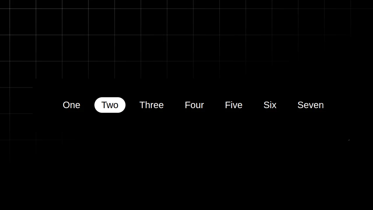
Resizing Tab Bar with Anchor Positioning
This is a Resizing Tab Bar with Anchor Positioning. It demonstrates a modern approach to building a horizontally scrollable navigation menu with a sliding “active” indicator. Its function is to provide a highly fluid, decoupled visual highlighter that perfectly tracks the currently selected tab — even when the container is resized or scrolled — without relying on heavy JavaScript coordinate calculations. (Requires: Normalize.css)
Chrome 125+
Edge 125+See the Pen Resizing Tab Bar with Anchor Positioning.
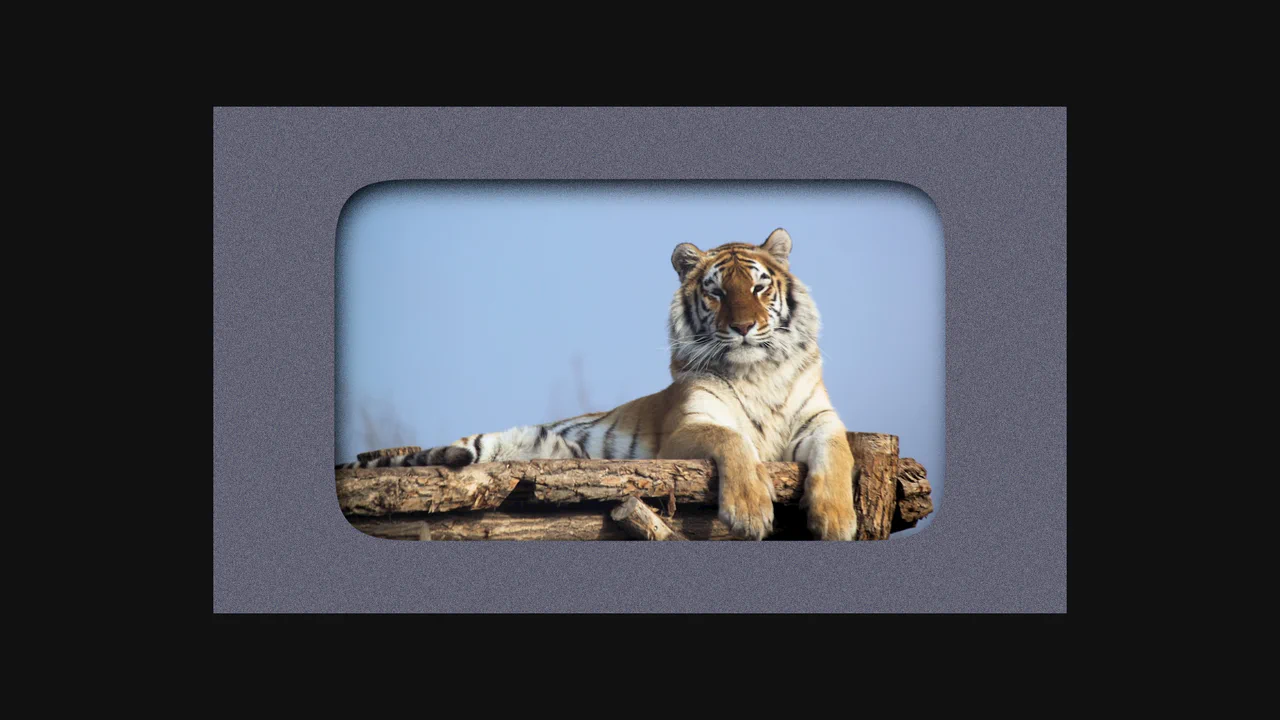
SVG Filter Noise Mask & Squircle Layout
This is an SVG Filter Noise Mask & Squircle Layout. It demonstrates the profound visual impact of chaining SVG <filter> primitives onto standard HTML elements. Its function is to transform a pristine photograph and a flat background into a gritty, atmospheric, cyberpunk-style composition using native browser rendering math instead of pre-processed images in Photoshop.
Chrome 60+
Edge 79+
Firefox 55+
Safari 11+
See the Pen SVG Filter Noise Mask & Squircle Layout.

Dynamic Neon Glow Range Slider
This is a Dynamic Neon Glow Range Slider. It re-imagines a standard HTML range input as a high-fidelity, skeuomorphic control with interactive lighting. Its function is to provide an immersive user experience where the slider’s track illuminates with a neon glow that intensifies, and its drop shadow physically shifts, based on the thumb’s position.
Chrome 111+
Edge 111+
Firefox 113+
Safari 16.4+
See the Pen Dynamic Neon Glow Range Slider.

Neon Glow Toggle Switch
This is a Neon Glow Toggle Switch. It replaces a standard HTML checkbox with a highly tactile, skeuomorphic control. Its function is to provide satisfying visual feedback for state changes, utilizing a “filling” neon border and a sliding, textured handle to make binary selections feel like engaging physical hardware.
Chrome 85+
Edge 85+
Firefox 128+
Safari 16.4+See the Pen Neon Glow Toggle Switch.

Odometer Number Counter
This is an Odometer Number Counter. It visualizes numerical changes (such as MRR, follower counts, or revenue) using a mechanical rolling effect. Its function is to provide a highly configurable, tactile alternative to instant number swapping, bringing physical momentum to digital dashboards. (Requires: React, ReactDOM, dat.gui)
Chrome 90+
Edge 90+
Firefox 88+
Safari 15+See the Pen Odometer Number Counter.

Scroll-Driven Glowing Slider
This is a Scroll-Driven Glowing Slider. It completely restyles a standard <input type="range"> into a high-fidelity, glowing interface component. Its primary function is to demonstrate how experimental CSS features (animation-timeline: scroll()) can link native input states directly to complex visual changes — like a dynamically resizing, blurred glowing track — without relying on heavy JavaScript event listeners. (Requires: Tweakpane, Normalize.css)
Chrome 115+
Edge 115+See the Pen Scroll-Driven Glowing Slider.

Skeuomorphic Snowball Range Slider
This is a Skeuomorphic Snowball Range Slider. It re-imagines the standard HTML range input as a photorealistic physical object. Its function is to provide a highly tactile and playful interface where the slider’s thumb appears as a snowball, complete with a dynamic snow texture that seems to “roll” and cast realistic environmental shadows as it moves along its track.
Chrome 60+
Edge 79+
Firefox 55+
Safari 11+
See the Pen Skeuomorphic Snowball Range Slider.

Cutout Gradient Track Range Slider
This is a Cutout Gradient Track Range Slider. It re-styles the native <input type="range"> element to create a unique visual illusion: the thumb appears to carve an invisible “gap” or “halo” into the track beneath it as it slides. Its function is to provide a highly stylized, modern form control that integrates seamlessly over complex photographic backgrounds without requiring heavy SVG masking or extra DOM nodes.
Chrome 60+
Edge 79+
Firefox 55+
Safari 11+See the Pen Cutout Gradient Track Range Slider.

Dynamic Diagonal Layouts
This is a Dynamic CSS Diagonal Layouts component. It demonstrates how to create striking, angled section dividers without relying on bulky SVG backgrounds or brittle magic numbers. Its function is to provide a mathematically precise, responsive framework for creating non-rectangular web layouts using modern CSS trigonometric functions (tan()) and pseudo-elements.
Chrome 111+
Edge 111+
Firefox 108+
Safari 15.4+
See the Pen Dynamic Diagonal Layouts.

Dynamic Variable Multi-Theme Dashboard
This is a Dynamic Variable Multi-Theme Dashboard. It orchestrates entire UI shifts by remapping root-level CSS custom properties to predefined theme palettes. Its function is to provide a seamless visual state manager for applications requiring multiple aesthetic environments without reloading the DOM.
Chrome 88+
Edge 88+
Firefox 84+
Safari 14.1+
See the Pen Dynamic Variable Multi-Theme Dashboard.

Generative Glitch Cube Art
This is Generative Glitch Cube Art. It is a piece of procedural digital art created entirely with CSS. Its function is to demonstrate how complex, three-dimensional geometry and dynamic lighting effects can be simulated without JavaScript or SVG, relying solely on multi-layered conic-gradient backgrounds and CSS custom property animation.
Chrome 85+
Edge 85+
Safari 16.4+
Firefox 128+
See the Pen Generative Glitch Cube Art.

Mouse-Reactive Iridescent Button
This is a Mouse-Reactive Iridescent Button. It uses a sophisticated layering of CSS conic gradients and JavaScript pointer tracking to create a button with a vibrant, shimmering border that physically follows the user’s cursor. Its function is to provide a high-end, tactile micro-interaction that makes a standard call-to-action feel like a premium, light-sensitive object.
Chrome 122+
Edge 122+
Firefox 128+
Safari 16.4+
<main>
  <div class="container">
    <div>
      <button>
        <div class="inner">
          Cancel <span>Esc</span>
        </div>
      </button>
      <button>
        <div class="inner">
          Enjoy <span>Shift</span>
        </div>
      </button>
    </div>
  </div>

  <div class="container" data-theme="dark">
    <div>
      <button>
        <div class="inner">
          Cancel <span>Esc</span>
        </div>
      </button>
      <button>
        <div class="inner">
          Enjoy <span>Shift</span>
        </div>
      </button>
    </div>
  </div>
</main>

<div id="info-box" data-info-chrome="Rendering in Chrome" data-info-safari="Rendering in Safari" data-info-firefox="Rendering in Firefox" data-presentation-width="70vw" data-presentation-height="70vh" data-inspiration="https://twitter.com/avstorm/status/1646204829826445312?s=20" data-hidden-onload="true"></div>
@charset "UTF-8";
@import url("https://fonts.googleapis.com/css2?family=Inter:wght@400;500;600&display=swap");
@layer properties {
  @property --button-shadow-opacity {
    syntax: "<number>";
    inherits: true;
    initial-value: 0;
  }
  @property --button-shadow-spread {
    syntax: "<number>";
    inherits: true;
    initial-value: 0;
  }
  @property --button-bg-opacity {
    syntax: "<number>";
    inherits: true;
    initial-value: 0;
  }
  @property --button-after-opacity {
    syntax: "<number>";
    inherits: true;
    initial-value: 0;
  }
  @property --coord-y {
    syntax: "<number>";
    inherits: true;
    initial-value: 0;
  }
  @property --coord-x {
    syntax: "<number>";
    inherits: true;
    initial-value: 0;
  }
}
:root {
  --debug: 0;
  --context-bg: hsl(0deg 0% 99%);
  --bg-container: hsl(0deg 0% 96%);
  --bg-button: hsl(179deg 7% 97%);
  --color-button: hsl(359deg 1% 35%);
  --button-shadow-opacity: 0;
  --button-shadow-spread: 0;
  --button-bg-opacity: 0;
  --button-after-opacity: 0;
  --btn-border-color: transparent;
  --btn-border-size: 0;
  --btn-inner-shadow: 1;
  --container-border-color: rgb(0 0 0 / 8%);
  --container-box-shadow-color: rgb(0 0 0 / 12%);
  --timing: .3s;
  --transitions:
    --coord-y .075s linear,
    --coord-x .075s linear,
    --button-shadow-opacity var(--timing) ease,
    --button-shadow-spread var(--timing) ease,
    --button-bg-opacity var(--timing) ease,
    --button-after-opacity var(--timing) ease,
    opacity var(--timing) ease,
    box-shadow var(--timing) ease,
    background-image var(--timing) ease;
}

*,
*:before,
*:after {
  box-sizing: border-box;
  -webkit-font-smoothing: antialiased;
  -moz-osx-font-smoothing: grayscale;
  outline: calc(var(--debug) * 1px) dotted hsl(calc(var(--debug) * 10 * 1deg), 60%, 60%);
}

html,
body,
main {
  width: 100%;
  height: 100%;
  margin: 0;
  padding: 0;
}

body {
  background: var(--context-bg);
  font-family: "Inter", sans-serif;
}

main {
  --col: 2;
  --row: 1;
  display: grid;
  place-items: center;
  grid-template-columns: repeat(var(--col), 1fr);
  grid-template-rows: repeat(var(--row), 1fr);
}
@media (max-width: 720px) {
  main {
    --col: 1;
    --row: 2;
  }
}
main .container {
  width: 100%;
  height: 100%;
  display: flex;
  justify-content: center;
  align-items: center;
  background: var(--context-bg);
  transform: scale(1);
}
main .container > div {
  background: var(--bg-container);
  padding: 2em;
  border: 1px solid var(--container-border-color);
  border-radius: 0.9em;
  box-shadow: 0 6px 12px -6px var(--container-box-shadow-color);
  display: flex;
  grid-gap: 16px;
}
main button {
  all: unset;
  --coord-y: 0;
  --coord-x: 0;
  --color-red: color(display-p3 0.95 0.06 0.02 / var(--button-bg-opacity));
  --color-orange: color(display-p3 0.97 0.61 0.07 / var(--button-bg-opacity));
  --color-olive: color(display-p3 0.83 0.87 0.04 / var(--button-bg-opacity));
  --color-lime: color(display-p3 0.31 0.89 0.05 / var(--button-bg-opacity));
  --color-teal: color(display-p3 0.12 0.88 0.88 / var(--button-bg-opacity));
  --color-tealer: color(display-p3 0.15 0.8 0.93 / var(--button-bg-opacity));
  --color-blue: color(display-p3 0.14 0.47 0.99 / var(--button-bg-opacity));
  --color-purple: color(display-p3 0.38 0.14 0.99 / var(--button-bg-opacity));
  --color-purpler: color(display-p3 0.73 0.04 0.94 / var(--button-bg-opacity));
  --color-pink: color(display-p3 0.93 0.03 0.85 / var(--button-bg-opacity));
  cursor: pointer;
  color: var(--color-button);
  border-radius: 0.8em;
  font-weight: 600;
  box-shadow: 0 8px calc(var(--button-shadow-spread) * 1px) -8px rgb(0 0 0/calc(var(--button-shadow-opacity) * 1%));
  border: 1px solid var(--btn-border-color);
  display: flex;
  align-items: center;
  justify-content: center;
  position: relative;
  overflow: hidden;
  background-color: rgba(0, 0, 0, 0.06);
  background-image: conic-gradient(from 180deg, var(--color-red) 0%, var(--color-orange) 10%, var(--color-olive) 20%, var(--color-lime) 30%, var(--color-teal) 40%, var(--color-tealer) 50%, var(--color-blue) 60%, var(--color-purple) 70%, var(--color-purpler) 80%, var(--color-pink) 90%, var(--color-red) 100%);
  background-size: calc(100% + 2px);
  background-position: -1px -1px;
  transition: var(--transitions);
}
@supports not (color: color(display-p3 0.93 0.03 0.85)) {
  main button {
    --color-red: hsl(3 93% 48% / var(--button-bg-opacity));
    --color-orange: hsl(26 91% 52% / var(--button-bg-opacity));
    --color-olive: hsl(65 89% 46% / var(--button-bg-opacity));
    --color-lime: hsl(122 86% 48% / var(--button-bg-opacity));
    --color-teal: hsl(181 78% 50% / var(--button-bg-opacity));
    --color-tealer: hsl(193 76% 53% / var(--button-bg-opacity));
    --color-blue: hsl(219 95% 56% / var(--button-bg-opacity));
    --color-purple: hsl(269 95% 56% / var(--button-bg-opacity));
    --color-purpler: hsl(292 93% 47% / var(--button-bg-opacity));
    --color-pink: hsl(327 96% 47% / var(--button-bg-opacity));
  }
}
main button .inner {
  padding: 0.55em 0.85em;
  background: var(--bg-button);
  border-radius: 0.7em;
  display: flex;
  align-items: center;
  justify-content: center;
  grid-gap: 12px;
  box-shadow: inset 0 calc(var(--btn-inner-shadow)*2px) calc(var(--btn-inner-shadow)*1px) rgba(255, 255, 255, 0.9), inset 0 calc(var(--btn-inner-shadow)*-2px) calc(var(--btn-inner-shadow)*3px) rgba(0, 0, 0, 0.03);
}
main button:before, main button:after {
  pointer-events: none;
  border-radius: 0.8em;
  content: "";
  display: block;
  position: absolute;
  width: 100%;
  height: 100%;
  transition: var(--transitions);
  background-image: conic-gradient(from 180deg, var(--color-red) 0%, var(--color-orange) 10%, var(--color-olive) 20%, var(--color-lime) 30%, var(--color-teal) 40%, var(--color-tealer) 50%, var(--color-blue) 60%, var(--color-purple) 70%, var(--color-purpler) 80%, var(--color-pink) 90%, var(--color-red) 100%);
}
main button:before {
  z-index: -1;
  filter: saturate(1.2);
  display: none;
}
main button:after {
  filter: saturate(2) blur(5px);
  transform: translate(calc(calc(var(--coord-x)/1.5) * 1px), calc(calc(var(--coord-y)/1.5) * -1px));
  width: 180%;
  height: 180%;
  opacity: calc(var(--button-after-opacity)/3);
}
main button span {
  pointer-events: none;
  font-size: 0.85em;
  padding: 4px;
  border: 1px solid rgba(0, 0, 0, 0.1);
  border-radius: 6px;
  font-weight: 400;
}
main button:hover {
  --button-shadow-opacity: 16;
  --button-shadow-spread: 16;
  --button-after-opacity: 0.7;
  --button-bg-opacity: 0.15;
  transition: var(--transitions);
}
main button:hover:active {
  --button-shadow-opacity: 26;
  --button-shadow-spread: 26;
  --button-after-opacity: 0.9;
  --button-bg-opacity: 0.25;
}
main button:not(:hover) {
  --button-shadow-opacity: 0;
  --button-shadow-spread: 0;
  --coord-y: 0;
  --coord-x: 0;
  --button-bg-opacity: 0;
}
main [data-theme=dark] {
  --context-bg: hsl(0deg 0% 8%);
  --bg-container: hsl(0deg 0% 10%);
  --bg-button: var(--bg-container);
  --color-button: hsl(0deg 0% 66%);
  --btn-border-color: rgb(255 255 255 / 5%);
  --btn-inner-shadow: 1;
  --btn-border-size: 1;
  --container-border-color: rgb(255 255 255 / 8%);
  --container-box-shadow-color: rgb(0 0 0 / 80%);
}
main [data-theme=dark] button:hover {
  --button-after-opacity: 0.5;
  --button-bg-opacity: 0.18;
}
main [data-theme=dark] button:hover:active {
  --button-after-opacity: 0.75;
  --button-bg-opacity: 0.22;
}
main [data-theme=dark] button .inner {
  box-shadow: inset 0 calc(var(--btn-inner-shadow)*2px) calc(var(--btn-inner-shadow)*3px) rgba(255, 255, 255, 0.01), inset 0 calc(var(--btn-inner-shadow)*-2px) calc(var(--btn-inner-shadow)*3px) rgba(0, 0, 0, 0.25);
}
main [data-theme=dark] button span {
  border: 1px solid rgba(255, 255, 255, 0.1);
}
function getCursorPosition(element, event) {
  const rect = element.getBoundingClientRect();
  const centerX = rect.left + rect.width / 2;
  const centerY = rect.top + rect.height / 2;
  const x = event.clientX - centerX;
  const y = centerY - event.clientY;
  return { x, y };
}

const buttons = document.querySelectorAll("button");
[...buttons].map((button) => {
  button.addEventListener("pointermove", (event) => {
    const { x, y } = getCursorPosition(event.target, event);
    button.style.setProperty("--coord-x", x);
    button.style.setProperty("--coord-y", y);
  });
  button.addEventListener("pointerleave", (event) => {
    button.style.setProperty("--coord-x", 0);
    button.style.setProperty("--coord-y", 0);
  });
});

Skeuomorphic Egg Toggle Switch
This is a Skeuomorphic Egg Toggle Switch. It transforms a standard binary input into a playful, highly tactile 3D object resembling an egg sliding in a frying pan. Its function is to inject personality and physical weight into a micro-interaction, replacing flat state changes with an immersive, multi-layered physics simulation entirely rendered in CSS.
Chrome 105+
Edge 105+
Firefox 121+
Safari 15.4+See the Pen Skeuomorphic Egg Toggle Switch.

Bursting Animated SVG Star Rating
The Bursting Animated SVG Star Rating is an explosive feedback component for user reviews. It replaces standard instantaneous state changes with a multi-layered animation sequence consisting of a ring expansion, radial line “sparks,” and an elastic fill. Its function is to provide high-fidelity tactile validation for user input within forms.
Chrome 80+
Edge 80+
Firefox 63+
Safari 13.1+See the Pen Bursting Animated SVG Star Rating.

Circular Variable Font Loading Spinner
This is a Circular Variable Font Loading Spinner. It arranges individual characters into a radial path, creating a sophisticated typographic loop. Its function is to serve as a high-fidelity alternative to standard SVG or icon-based loaders, utilizing the weight-axis of variable fonts to simulate organic growth and motion.
Chrome 92+
Edge 92+
Firefox 90+
Safari 15.4+
See the Pen Circular Variable Font Loading Spinner.

Interactive Vertical Parallax Cursor Navigation
This is an Interactive Vertical Parallax Cursor Navigation. It combines large-scale typography with a dynamic image-reveal system. Its function is to provide an immersive, tactile menu experience for high-end creative portfolios, where the user’s cursor physically “steers” the list and uncovers visual content linked to each item.
Chrome 80+
Edge 80+
Firefox 75+
Safari 13.1+
See the Pen Interactive Vertical Parallax Cursor Navigation.

Layered Dynamic Card Swiper
This is a Layered Dynamic Card Swiper. It replaces linear carousels with a 3D-stacked deck logic. Its function is to provide a high-fidelity interaction for decision-based interfaces (like discovery or voting), utilizing data attributes to trigger complex spatial transitions between card groups.
Chrome 88+
Edge 88+
Firefox 89+
Safari 15+See the Pen Layered Dynamic Card Swiper.

Mouse-Reactive Floating Image Gallery
This is a Mouse-Reactive Floating Image Gallery. It places an oversized grid of visual assets behind the viewport, hidden by the overflow. Its function is to provide an immersive, explorative navigation experience where the user’s cursor physically steers the scene across a scattered landscape of content.
Chrome 36+
Edge 12+
Firefox 48+
Safari 9+See the Pen Mouse-Reactive Floating Image Gallery.

Slingshot Elastic Stretch Toggle
The Slingshot Elastic Stretch Toggle is an experimental UI switch that utilizes exaggerated spatial movement to signal state changes. It replaces the standard sliding thumb with a “dual-handle” system that appears to shoot across the viewport using a high-velocity slingshot effect. Its function is to provide an high-energy alternative to traditional toggles, making a simple boolean selection feel like a physical, kinetic event.
Chrome 86+
Edge 86+
Firefox 85+
Safari 15.4+See the Pen Slingshot Elastic Stretch Toggle.

Staggered Animated Hamburger Toggle Button
The Staggered Animated Hamburger Toggle Button is a highly refined navigation trigger. It utilizes aria-pressed states to drive complex, multi-stage CSS transitions. Its function is to provide an accessible, tactile entry point for menus, using staggered motion to visually explain the transformation from a “hamburger” to a “close” icon.
Chrome 99+
Edge 99+
Firefox 97+
Safari 15.4+See the Pen Staggered Animated Hamburger Toggle Button.

SVG Path Zuma Marble Shooter
This is an SVG Path Zuma Marble Shooter. It replicates the classic ball-matching arcade mechanic using a combination of SVG geometric data and a custom DOM-based rendering engine. Its function is to provide a complete, interactive game loop where players fire colored marbles to create matches of three or more along a complex, winding track defined by an invisible SVG path.
Chrome 60+
Edge 79+
Firefox 55+
Safari 11+
See the Pen SVG Path Zuma Marble Shooter.

Animated SVG Penrose Triangle Loader
This is an Animated SVG Penrose Triangle Loader. It combines the impossible geometry of the Penrose triangle with a continuous circular spinner to create a hypnotic, high-fidelity loading animation. Its function is to provide a visually stunning and technically impressive waiting state for applications, using SVG filters and GSAP to add depth and motion. (Requires: GSAP)
Chrome 60+
Edge 79+
Firefox 55+
Safari 11+
See the Pen Animated SVG Penrose Triangle Loader.

PixiJS Procedural GLSL Flame
This is a PixiJS Procedural GLSL Flame. It generates a hyper-realistic, endlessly animating flame entirely through mathematical functions inside a fragment shader. Its function is to provide a high-performance visual effect without relying on video files or sprite sheets, using procedural noise to simulate the chaotic turbulence of a real fire. (Requires: PixiJS)
Chrome 60+
Edge 79+
Firefox 55+
Safari 11+
See the Pen PixiJS Procedural GLSL Flame.

Skeuomorphic Retro Casio F-91W Watch
This is a Skeuomorphic Retro Casio F-91W Watch. It is a hyper-realistic, digital-first recreation of the iconic 1989 timepiece. Its function is to demonstrate the power of modern CSS and vanilla JavaScript for high-fidelity modeling, combining 3D depth illusions, custom fonts, and a live clock to create a fully interactive desktop widget.
Chrome 60+
Edge 79+
Firefox 55+
Safari 11+
See the Pen Skeuomorphic Retro Casio F-91W Watch.

Stacked Dual Handle Range Slider
This is a Stacked Dual Handle Range Slider. It re-engineers the standard <input type="range"> to support two independent handles for selecting a min/max range. Its function is to provide a high-fidelity input component for filter menus or settings panels, using a clever CSS stacking and clipping technique to color the area between the two thumbs.
Chrome 58+
Edge 79+
Firefox 78+
Safari 14+See the Pen Stacked Dual Handle Range Slider.