
Tinder-style Swipeable Card Stack
This is a Tinder-style Swipeable Card Stack. It replicates the iconic “swipe-left, swipe-right” user interface for decision-making. Its function is to provide a mobile-first, gesture-driven method for navigating through a collection of items (in this case, recipe cards), where each card is physically dragged and dismissed to reveal the next one in the stack. (Requires: Hammer.js)
 Chrome 60+
 Edge 79+
 Firefox 55+
 Safari 11+
See the Pen Tinder-style Swipeable Card Stack.

Twisted Wave GLSL Image Gallery
This is a Twisted Wave GLSL Image Gallery. It’s a high-performance, full-screen WebGL experience that uses custom shaders to create sophisticated visual effects. Its function is to transform a standard image carousel into a cinematic journey with two distinct interactions: a localized sine-wave distortion on mouse hover and a global radial blur that intensifies with the speed of the scroll. (Requires: Three.js, GSAP, Locomotive Scroll, Maku.js, imagesLoaded)
Chrome 60+
Edge 79+
Firefox 55+
Safari 11+
See the Pen Twisted Wave GLSL Image Gallery.

Animated Striking Checkbox
This is an Animated Striking Checkbox. It transforms a standard checkbox into a highly expressive UI element that physically becomes the strikethrough line for its associated label. Its function is to provide satisfying, immediate feedback for to-do list items, visually linking the action of checking a box to the result of striking out the text.
Chrome 60+
Edge 79+
Firefox 55+
Safari 11+
See the Pen Animated Striking Checkbox.

FLIP Animated Responsive Grid Switcher
This is an Animated FLIP Grid Switcher. It bridges the gap between two distinct visual states — Card and List — by mathematically calculating the delta of motion. The component ensures that interface elements do not simply “jump” during a layout change but glide organically into their new coordinates, maintaining spatial continuity for the user.
Chrome 60+
Edge 79+
Firefox 55+
Safari 11+
See the Pen FLIP Animated Responsive Grid Switcher.

GSAP ScrollTrigger List Expansion
This snippet showcases a GSAP ScrollTrigger List Expansion effect. It mimics the native iOS “Notification Center” or “Wallet” card stack behavior. Its function is to condense a long list of items into a compact, layered visual stack, and then fluidly expand them into full, scrollable cards as the user scrolls down the container, creating a highly tactile mobile UI experience. (Requires: GSAP, ScrollTrigger)
Chrome 80+
Edge 80+
Firefox 75+
Safari 13.1+
See the Pen GSAP ScrollTrigger List Expansion.

Interactive Morphing Task List Item
This Interactive Morphing Task List Item is a high-fidelity productivity component. It combines path interpolation with auditory feedback to validate user actions. Its function is to elevate simple “to-do” lists into rewarding, tactile experiences through state-driven motion. (Requires: GSAP, MorphSVGPlugin)
See the Pen Interactive Morphing Task List Item.

Cinematic Zoom Blur Image Gallery
This is a Cinematic Zoom Blur Image Gallery. It utilizes custom GLSL fragment shaders and Three.js to create a high-fidelity transition between image textures. Its function is to provide an immersive navigational layer for visual portfolios, where spatial depth and radial blur replace standard linear crossfades. (Requires: Three.js, GSAP)
Chrome 60+
Edge 79+
Firefox 55+
Safari 11+
See the Pen Cinematic Zoom Blur Image Gallery.

Gradient Vertical Scroll Progress Bar
This is a Gradient Vertical Scroll Progress Bar. It maps the user’s vertical position to a visual meter along the right edge of the viewport. Its function is to provide an unobtrusive sense of reading progress without cluttering the main content area.
Chrome 61+
Edge 17+
Firefox 64+
Safari 11+
See the Pen Gradient Vertical Scroll Progress Bar.

Minimalist Canvas Animated Particle Background
The Minimalist Canvas Animated Particle Background is an ambient UI element that generates a field of drifting geometric shapes. It serves as a non-intrusive aesthetic layer for headers or landing pages, providing depth through motion. The system alternates between “bubbles” and spinning “lines” to create a technical yet organic atmosphere. (Requires: Lodash)
Chrome 36+
Edge 12+
Firefox 31+
Safari 9+
See the Pen Minimalist Canvas Animated Particle Background.
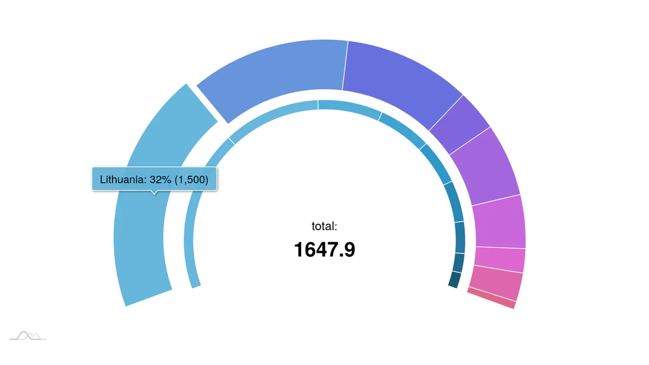
Nested Animated Doughnut Data Visualization
This component is a Nested Animated Doughnut Data Visualization built with the amCharts 4 framework. It renders two concentric data series within a single circular coordinate system. Its function is to provide a high-density comparison of related metrics, utilizing a central dynamic label to summarize the aggregate total. (Requires: amCharts 4)
Chrome 60+
Edge 79+
Firefox 55+
Safari 11+
See the Pen Nested Animated Doughnut Data Visualization.

Scroll-Driven Jigsaw Puzzle Assembler
This is a Scroll-Driven Jigsaw Puzzle Assembler. It utilizes SVG patterns and CSS variables to deconstruct a single image into interactive, interlocking pieces. Its function is to provide a cinematic content reveal where scrolling physically assembles the visual asset from a scattered state into a coherent whole.
Chrome 80+
Edge 80+
Firefox 75+
Safari 13.1+
See the Pen Scroll-Driven Jigsaw Puzzle Assembler.

Semicircular Animated Radar Gauge
This is a Semicircular Animated Radar Gauge built with the amCharts 4 engine. It distills complex metrics like Carbon and Energy into a high-contrast radial format that covers only 270 degrees of a circle. Its function is to provide an at-a-glance KPI status within professional data dashboards, replacing cluttered line charts with clean, weighted arcs. (Requires: amCharts 4)
Chrome 60+
Edge 79+
Firefox 55+
Safari 11+
See the Pen Semicircular Animated Radar Gauge.

Skeuomorphic 3D Elastic Toggle Switch
This is a Skeuomorphic 3D Elastic Toggle Switch. It utilizes multi-layered shadowing and complex keyframe sequences to mimic a physical sliding component embedded in a technical grid. Its function is to transform a standard checkbox into a high-fidelity micro-interaction that emphasizes physical mass and momentum.
Chrome 43+
Edge 12+
Firefox 16+
Safari 9+See the Pen Skeuomorphic 3D Elastic Toggle Switch.

Skeuomorphic Lunar Desk Calendar
The Skeuomorphic Lunar Desk Calendar is a digital recreation of the traditional “Hardware Store Calendar”. It bridges the gap between physical paper textures and dynamic digital logic, providing users with both Gregorian and Lunar dates. Its function is to serve as a high-fidelity desktop widget that celebrates heritage design through modern CSS geometry.
Chrome 80+
Edge 80+
Firefox 75+
Safari 13.5+
See the Pen Skeuomorphic Lunar Desk Calendar.

Interactive 3D Flip Book Gallery
This is an Interactive 3D Flip Book Gallery. It simulates a physical book structure where each element acts as a double-sided page. Its function is to showcase images through spatial depth, replacing standard flat carousels with a tactile flipping mechanic.
Chrome 85+
Edge 85+
Safari 16.4+
Firefox 128+
See the Pen Interactive 3D Flip Book Gallery.

Minimalist Grid Editorial Layout
This is a Minimalist Grid Editorial Layout built for digital publishing. It translates traditional Swiss print design into a responsive web format using CSS Grid. The layout utilizes asymmetric columns and deliberate negative space to establish a clear hierarchy for long-form reading.
Chrome 88+
Edge 88+
Firefox 85+
Safari 14.1+
See the Pen Minimalist Grid Editorial Layout.

Modern Container Query Product Cards
This snippet showcases Modern Container Query Product Cards. It represents the bleeding edge of CSS architecture, utilizing @scope, @layer, and @property to create highly encapsulated, fluid components. Its function is to provide a robust e-commerce card layout that automatically adjusts its internal styling and grid distribution based on the physical size of its container, not the viewport. (Requires: kiso.css)
Chrome 118+
Edge 118+
Firefox 128+
Safari 17.4+
See the Pen Modern Container Query Product Cards.

Neon Vaporwave Pong Game
This is a Neon Vaporwave Pong Game (“CODEPONG 26”). It is a complete, browser-based arcade game rendered via the HTML5 Canvas 2D API. Its function is to provide a highly polished, playable experience that demonstrates advanced frontend techniques, including a custom physics engine, an adaptive AI opponent that gets harder as the game progresses, and programmatic audio synthesis for sound effects. (Requires: FontAwesome)
Chrome 60+
Edge 79+
Firefox 55+
Safari 11+
See the Pen Neon Vaporwave Pong Game.

Optical Illusion CSS Background Pattern
This is an Optical Illusion CSS Background Pattern. It generates a complex, interlocking geometric tessellation using only mathematical gradient overlays. Its function is to provide a visually striking, lightweight background texture without requiring external image assets.
Chrome 69+
Edge 79+
Firefox 83+
Safari 12.1+
See the Pen Optical Illusion CSS Background Pattern.

Pulsing Circle Optical Illusion
This is a Pulsing Circle Optical Illusion. It generates a static, high-contrast geometric pattern that exploits peripheral vision to create a false sense of motion. Its function is to serve as a lightweight, visually arresting background or artistic centerpiece using only a handful of CSS properties and zero JavaScript.
Chrome 69+
Edge 79+
Firefox 83+
Safari 12.1+See the Pen Pulsing Circle Optical Illusion.

Stepping Feet Optical Illusion
This is the Stepping Feet Optical Illusion. It demonstrates how high-contrast patterns interfere with human motion perception. Two colored blocks move at identical, constant speeds, yet appear to stagger and “step” like feet. A hover interaction removes the background grid to expose the mathematical reality of their parallel movement.
Chrome 105+
Edge 105+
Firefox 121+
Safari 16.4+See the Pen Stepping Feet Optical Illusion.

Animated Border Drawing Button
This is an Animated Border Drawing Button. It transforms a standard call-to-action into a multi-stage micro-interaction. Upon hovering over the button, the component triggers a sequential animation where four corner dots appear, followed by four dashed border lines that “draw” themselves around the button’s perimeter, creating a high-end, futuristic feel.
Chrome 105+
Edge 105+
Firefox 121+
Safari 15.4+
<div class="btn-wrapper">
  <div class="line horizontal top"></div>
  <div class="line vertical right"></div>
  <div class="line horizontal bottom"></div>
  <div class="line vertical left"></div>

  <div class="dot top left"></div>
  <div class="dot top right"></div>
  <div class="dot bottom right"></div>
  <div class="dot bottom left"></div>

  <button class="btn">
    <span class="btn-text">start designing</span>
    <svg class="btn-svg" viewBox="0 0 24 24" xmlns="http://www.w3.org/2000/svg">
      <path
        d="M17.6744 11.4075L15.7691 17.1233C15.7072 17.309 15.5586 17.4529 15.3709 17.5087L3.69348 20.9803C3.22819 21.1186 2.79978 20.676 2.95328 20.2155L6.74467 8.84131C6.79981 8.67588 6.92419 8.54263 7.08543 8.47624L12.472 6.25822C12.696 6.166 12.9535 6.21749 13.1248 6.38876L17.5294 10.7935C17.6901 10.9542 17.7463 11.1919 17.6744 11.4075Z"
      ></path>
      <path d="M3.2959 20.6016L9.65986 14.2376"></path>
      <path
        d="M17.7917 11.0557L20.6202 8.22724C21.4012 7.44619 21.4012 6.17986 20.6202 5.39881L18.4989 3.27749C17.7178 2.49645 16.4515 2.49645 15.6704 3.27749L12.842 6.10592"
      ></path>
      <path
        d="M11.7814 12.1163C11.1956 11.5305 10.2458 11.5305 9.66004 12.1163C9.07426 12.7021 9.07426 13.6519 9.66004 14.2376C10.2458 14.8234 11.1956 14.8234 11.7814 14.2376C12.3671 13.6519 12.3671 12.7021 11.7814 12.1163Z"
      ></path>
    </svg>
  </button>
</div>
body {
  background: #fff;
  display: flex;
  align-items: center;
  justify-content: center;
  height: 100vh;
  margin: 0;
  padding: 0;
}

/* From Uiverse.io by dexter-st */
.btn-wrapper {
  --dot-size: 6px;
  --line-weight: 1px;
  --line-distance: 0.9rem 1.1rem;
  --animation-speed: 0.35s;
  --dot-color: #666;
  --line-color: #999;

  position: relative;
  display: flex;
  justify-content: center;
  align-items: center;
  width: auto;
  height: auto;
  padding: var(--line-distance);
  background-color: #0000;
  transition: background-color 0.3s ease-in-out;
  user-select: none;
}

.btn-wrapper:has(.btn:hover) {
  animation: backround-color-change calc(var(--animation-speed) * 4) ease-in-out
    forwards;
}
@keyframes backround-color-change {
  80% {
    background-color: #0000;
  }
  100% {
    background-color: #e5ff0055;
  }
}

.btn {
  position: relative;
  display: flex;
  justify-content: center;
  align-items: center;
  padding: 0.8rem 1.25rem;
  background-color: #e5ff00;
  background-image: linear-gradient(#0000, #0004);
  border: none;

  color: #0008;
  font-family: "Inter", sans-serif;
  font-size: 1rem;
  font-weight: 600;
  text-transform: capitalize;

  border-radius: 30% / 200%;
  cursor: pointer;

  box-shadow:
    0 0 0px 1px #0003,
    0px 1px 1px rgba(3, 7, 18, 0.02),
    0px 5px 4px rgba(3, 7, 18, 0.04),
    0px 12px 9px rgba(3, 7, 18, 0.06),
    0px 20px 15px rgba(3, 7, 18, 0.08),
    0px 32px 24px rgba(3, 7, 18, 0.1);

  transition:
    background-color 0.2s ease-in-out,
    transform 0.2s ease-in-out,
    box-shadow 0.2s ease-in-out,
    border-radius 0.3s ease-in-out,
    border-color 0.2s ease-in-out;
}

.btn:hover {
  background-color: #fff;
  transform: scale(1.05);
  border-radius: 10% / 200%;
}
.btn:active {
  background-color: #e5ff00;
  transform: scale(0.98);
  border-radius: 20% / 200%;
}

.btn-svg {
  margin-left: 0.5rem;
  height: 24px;
  stroke-width: 1;
  stroke-linecap: round;
  stroke-linejoin: round;
  stroke: #0007;
  fill: #fffa;
  transition: all 0.3s ease-in-out;
}

.btn:hover .btn-svg {
  stroke: #0008;
  fill: #e5ff00;
}
.btn:active .btn-svg {
  stroke: #0009;
  fill: #f1ff76;
}

/* Dots */
.dot {
  position: absolute;
  width: var(--dot-size);
  aspect-ratio: 1;
  border-radius: 50%;
  background-color: var(--dot-color);
  transition: all 0.3s ease-in-out;
  opacity: 0;
}

.btn-wrapper:has(.btn:hover) .dot.top.left {
  top: 50%;
  left: 20%;
  animation: move-top-left var(--animation-speed) ease-in-out forwards;
}
@keyframes move-top-left {
  90% {
    opacity: 0.6;
  }
  100% {
    top: calc(var(--dot-size) * -0.5);
    left: calc(var(--dot-size) * -0.5);
    opacity: 1;
  }
}
.btn-wrapper:has(.btn:hover) .dot.top.right {
  top: 50%;
  right: 20%;
  animation: move-top-right var(--animation-speed) ease-in-out forwards;
  animation-delay: calc(var(--animation-speed) * 0.6);
}
@keyframes move-top-right {
  80% {
    opacity: 0.6;
  }
  100% {
    top: calc(var(--dot-size) * -0.5);
    right: calc(var(--dot-size) * -0.5);
    opacity: 1;
  }
}
.btn-wrapper:has(.btn:hover) .dot.bottom.right {
  bottom: 50%;
  right: 20%;
  animation: move-bottom-right var(--animation-speed) ease-in-out forwards;
  animation-delay: calc(var(--animation-speed) * 1.2);
}
@keyframes move-bottom-right {
  80% {
    opacity: 0.6;
  }
  100% {
    bottom: calc(var(--dot-size) * -0.5);
    right: calc(var(--dot-size) * -0.5);
    opacity: 1;
  }
}
.btn-wrapper:has(.btn:hover) .dot.bottom.left {
  bottom: 50%;
  left: 20%;
  animation: move-bottom-left var(--animation-speed) ease-in-out forwards;
  animation-delay: calc(var(--animation-speed) * 1.8);
}
@keyframes move-bottom-left {
  80% {
    opacity: 0.6;
  }
  100% {
    bottom: calc(var(--dot-size) * -0.5);
    left: calc(var(--dot-size) * -0.5);
    opacity: 1;
  }
}

/* Lines */
.line {
  position: absolute;
  transition: all 0.3s ease-in-out;
}
.line.horizontal {
  height: var(--line-weight);
  width: 100%;
  background-image: repeating-linear-gradient(
    90deg,
    #0000 0 calc(var(--line-weight) * 2),
    var(--line-color) calc(var(--line-weight) * 2) calc(var(--line-weight) * 4)
  );
}
.line.top {
  top: calc(var(--line-weight) * -0.5);
}
.line.bottom {
  bottom: calc(var(--line-weight) * -0.5);
}
.line.vertical {
  width: var(--line-weight);
  height: 100%;
  background-image: repeating-linear-gradient(
    0deg,
    #0000 0 calc(var(--line-weight) * 2),
    var(--line-color) calc(var(--line-weight) * 2) calc(var(--line-weight) * 4)
  );
}
.line.left {
  left: calc(var(--line-weight) * -0.5);
}
.line.right {
  right: calc(var(--line-weight) * -0.5);
}

.line.top {
  transform-origin: top left;
  transform: rotate(5deg) scaleX(0);
}
.btn-wrapper:has(.btn:hover) .line.top {
  animation: draw-top var(--animation-speed) ease-in-out forwards;
  animation-delay: calc(var(--animation-speed) * 0.8);
}
@keyframes draw-top {
  100% {
    transform: rotate(0deg) scaleX(1);
  }
}
.line.bottom {
  transform-origin: bottom right;
  transform: rotate(5deg) scaleX(0);
}
.btn-wrapper:has(.btn:hover) .line.bottom {
  animation: draw-bottom var(--animation-speed) ease-in-out forwards;
  animation-delay: calc(var(--animation-speed) * 2);
}
@keyframes draw-bottom {
  100% {
    transform: rotate(0deg) scaleX(1);
  }
}

.line.left {
  transform-origin: bottom left;
  transform: rotate(0deg) scaleY(0);
}
.btn-wrapper:has(.btn:hover) .line.left {
  animation: draw-left var(--animation-speed) ease-in-out forwards;
  animation-delay: calc(var(--animation-speed) * 2.4);
}
@keyframes draw-left {
  100% {
    transform: rotate(0deg) scaleY(1);
  }
}

.line.right {
  transform-origin: top right;
  transform: rotate(5deg) scaleY(0);
}
.btn-wrapper:has(.btn:hover) .line.right {
  animation: draw-right var(--animation-speed) ease-in-out forwards;
  animation-delay: calc(var(--animation-speed) * 1.4);
}
@keyframes draw-right {
  100% {
    transform: rotate(0deg) scaleY(1);
  }
}

DotLottie Interactive Sparkle Header
This is a DotLottie Interactive Sparkle Header. It blends high-performance character-level typography effects with the modern DotLottie animation format. Its function is to create a delightful, “juicy” hero interaction: when a user hovers over the title, the letters individually react with a staggered lift-and-tilt motion, while a complex Lottie sparkle animation plays in the background. (Requires: @lottiefiles/dotlottie-web)
Chrome 80+
Edge 80+
Firefox 75+
Safari 13+
See the Pen DotLottie Interactive Sparkle Header.

Iridescent 3D Neumorphic Button
This is an Iridescent 3D Neumorphic Button. It pushes CSS styling to the limit, using stacked gradients, oklch color spaces, and advanced blend modes to create a button that feels like a piece of polished, translucent hardware. Its function is to serve as a high-fidelity “Hero” element, delivering a tactile, light-responsive experience that feels alive under the cursor.
Chrome 105+
Edge 105+
Firefox 121+
Safari 15.4+
<main id="app">
<button class="iridescent">
Refract
<span class="drop-shadow"></span>
</button>
</main>
<aside>
<p>Resize browser to scale button</p>
<hr>
<p>Based on / Inspired by <strong>Wojciech Zieliński</strong>'s
<a href="https://x.com/zielinskiwoj/status/1956001707533509011" target="_blank">Tweet</a> &
<a href="https://x.com/zielinskiwoj/status/1955291261327315098" target="_blank">This one, too</a></p>
</aside>
<!-- social icons -->
<a class="social-icon codepen" href="https://codepen.io/simeydotme" title="view my codepens">
Made by Simey
</a>
<a class="social-icon twitter" href="https://twitter.com/simeydotme">
<svg viewBox="0 0 24 24">
<path stroke="none" d="M0 0h24v24H0z" fill="none"></path>
<path d="M22 4.01c-1 .49 -1.98 .689 -3 .99c-1.121 -1.265 -2.783 -1.335 -4.38 -.737s-2.643 2.06 -2.62 3.737v1c-3.245 .083 -6.135 -1.395 -8 -4c0 0 -4.182 7.433 4 11c-1.872 1.247 -3.739 2.088 -6 2c3.308 1.803 6.913 2.423 10.034 1.517c3.58 -1.04 6.522 -3.723 7.651 -7.742a13.84 13.84 0 0 0 .497 -3.753c-.002 -.249 1.51 -2.772 1.818 -4.013z"></path>
</svg>
</a>
<a class="social-icon github" href="https://github.com/simeydotme">
<svg viewBox="0 0 24 24">
<path stroke="none" d="M0 0h24v24H0z" fill="none"></path>
<path d="M9 19c-4.3 1.4 -4.3 -2.5 -6 -3m12 5v-3.5c0 -1 .1 -1.4 -.5 -2c2.8 -.3 5.5 -1.4 5.5 -6a4.6 4.6 0 0 0 -1.3 -3.2a4.2 4.2 0 0 0 -.1 -3.2s-1.1 -.3 -3.5 1.3a12.3 12.3 0 0 0 -6.2 0c-2.4 -1.6 -3.5 -1.3 -3.5 -1.3a4.2 4.2 0 0 0 -.1 3.2a4.6 4.6 0 0 0 -1.3 3.2c0 4.6 2.7 5.7 5.5 6c-.6 .6 -.6 1.2 -.5 2v3.5"></path>
</svg>
</a>
<svg class="arrow" xmlns="http://www.w3.org/2000/svg" viewBox="0 0 320 512">
<path d="M0 55.2L0 426c0 12.2 9.9 22 22 22c6.3 0 12.4-2.7 16.6-7.5L121.2 346l58.1 116.3c7.9 15.8 27.1 22.2 42.9 14.3s22.2-27.1 14.3-42.9L179.8 320l118.1 0c12.2 0 22.1-9.9 22.1-22.1c0-6.3-2.7-12.3-7.4-16.5L38.6 37.9C34.3 34.1 28.9 32 23.2 32C10.4 32 0 42.4 0 55.2z"/>
</svg>
@import url(https://fonts.bunny.net/css?family=amaranth:400,400i,700,700i|asap-condensed:200,300i,400,400i,600,700,900|m-plus-1-code:400,500,600,700);

:root {
  --h: 222;
  --s: 20%;
  --l: 22%;

  --canvas: var(--h);
  --bg: hsl(var(--canvas), 15%, 22%);
  --fg: hsl(var(--canvas), 39%, 95%);
  --link-light: hsl(var(--canvas), 95%, 60%);
  --link-dark: hsl(var(--canvas), 95%, 70%);
  --link-light-hover: hsl(150, 80%, 45%);
  --link-dark-hover: hsl(150, 95%, 70%);
  --link: light-dark( var(--link-light), var(--link-dark) );
  --linkh: light-dark( var(--link-light-hover), var(--link-dark-hover) );
  --wgt: 200;

  --light: hsl(var(--h), var(--s), 95%);
  --dark: hsl(var(--h), var(--s), 20%);
  --tint: hsl(160, 85%, 60%);
  --tint2: hsl(200, 85%, 60%);
  --pads: 16px;
  --cols: 1fr;
  --radius: 16px;

  --bor: hsl(var(--h), var(--s), 85%);
  --labels: hsl(var(--h), var(--s), 55%);
  --b: hsla(var(--h), var(--s), 100%, 1);
  --svg: var(--fg);

  --thumb-shadow:
      0px 1px 0px rgba(17,17,26,0),
      0px 2px 2px rgba(17,17,26,0),
      0px 4px 4px rgba(17,17,26,0);

  --thumb-shadow-on:
      0px 1px 0px rgba(17,17,26,0.2),
      0px 2px 6px rgba(17,17,26,0.2),
      0px 4px 12px rgba(17,17,26,0.2);

  --spring: linear(
    0, 0.009, 0.035 2.1%, 0.142 4.6%, 0.283 6.9%, 0.726 13.3%, 0.941 17.2%, 1.02,
    1.08, 1.124, 1.153 24.9%, 1.163, 1.167, 1.165, 1.157 30.7%, 1.132 33.7%,
    1.051 40.7%, 1.017 44.2%, 0.99, 0.975 52.2%, 0.972 55.2%, 0.974 58.5%,
    0.996 71.5%, 1.003, 1.005 85.7%, 1
  );

  --bounce: linear(0, 0.199 14.6%, 0.37 23.8%, 0.591 32.2%, 0.999 44.7%, 0.793 52.7%,
    0.745 56.1%, 0.728 59.5%, 0.74 62.5%, 0.778 65.7%, 0.999 77.4%, 0.956 81.3%, 0.943
    84.9%, 0.951 88%, 0.993 95.5%, 1);

}

#app {
  display: grid;
  grid-template-columns: var(--cols);
  gap: var(--pads);
  min-height: 100%;
}

body {
  padding: calc(var(--pads) * 1.5);
  font-family: 'Asap Condensed', sans-serif;
  font-weight: 400;
  font-size: 1rem;
  color: var(--fg);
  background-color: #171820;
  background-image: linear-gradient(
    180deg,
    hsl(var(--h), var(--s), 8%),
    hsl(var(--h), var(--s), 14%)
  );
  background-size: cover;
}

body,
html {
  min-height: 100%;
}

* {
  box-sizing: border-box;
}

form,
.form,
.light {
  --bg: var(--light);
  --fg: var(--dark);
}

form,
.form {
  color: var(--fg);
  background-color: var(--bg);
  min-width: 100%;
  width: 100%;
  padding: calc(var(--pads) * 0.5) calc(var(--pads) * 1.5) calc(var(--pads) * 1);
  border-radius: var(--radius);
  box-shadow: 0 2px 3px hsla(var(--h), var(--s), 8%, 50%);
}

.dark {

  color-scheme: dark!important;

  --bor: hsl(var(--h), var(--s), 35%);
  --bg: var(--dark);
  --fg: var(--light);
  --labels: hsl(var(--h), var(--s), 65%);
  --b: hsla(var(--h), var(--s), 12%, 1);
  --tint: hsl(260, 85%, 60%);
  --tint2: hsl(300, 85%, 60%);
}

fieldset {
  min-width: 100%;
  width: 100%;
  border: 1px solid var(--bor);
  border-radius: calc(var(--radius) / 2);
  padding: var(--pads) calc(var(--pads) * 1.5);
  margin-block: var(--pads);
}

legend {
  font-size: 0.875rem;
  text-transform: uppercase;
  letter-spacing: 1px;
  padding: 0 2em;
  transform: translateX(-1em);
}

label {
  display: block;
  width: -webkit-max-content;
  width: -moz-max-content;
  width: max-content;
  font-size: 0.875rem;
  text-transform: uppercase;
  -webkit-margin-start: 0;
  margin-inline-start: 0;
  -webkit-margin-after: 0.5em;
  margin-block-end: 0.5em;
  color: var(--labels);
  transition: all 0.5s ease;
}

.field:focus-within label {
  color: var(--fg);
}

.field {
  margin-block: 2.5em;
  container-type: inline-size;
}

.field:nth-of-type(1) {
  -webkit-margin-before: 1em;
  margin-block-start: 1em;
}

.field:nth-last-of-type(1) {
  -webkit-margin-after: 1em;
  margin-block-end: 1em;
}

input,
select,
button,
textarea {
  font-family: inherit;
  color: var(--fg);
  background: var(--b);
  padding: 0.875em;
  border-radius: calc(var(--radius) / 2);
  border: 1px solid transparent;
  outline: 1px solid transparent;
  accent-color: var(--tint2);
  box-shadow: 0 3px 2px -3px var(--bor);
  transition: border 0.3s ease-in, outline 0.6s ease-in, box-shadow 0.6s ease-in;
}
input,
select,
textarea {
  width: clamp(50%, 20em, 100%);
}
input:focus,
select:focus,
button:focus,
textarea:focus {
  border-color: var(--tint);
  outline-color: var(--tint2);
  transition: border 0.6s ease-out, outline 0.3s ease-out,
    box-shadow 0.3s ease-out;
}
input::-moz-placeholder,
select::-moz-placeholder,
button::-moz-placeholder,
textarea::-moz-placeholder {
  opacity: 0.33;
  font-style: italic;
}
input:-ms-input-placeholder,
select:-ms-input-placeholder,
button:-ms-input-placeholder,
textarea:-ms-input-placeholder {
  opacity: 0.33;
  font-style: italic;
}
input::-moz-placeholder, select::-moz-placeholder, button::-moz-placeholder, textarea::-moz-placeholder {
  opacity: 0.33;
  font-style: italic;
}
input:-ms-input-placeholder, select:-ms-input-placeholder, button:-ms-input-placeholder, textarea:-ms-input-placeholder {
  opacity: 0.33;
  font-style: italic;
}
input::placeholder,
select::placeholder,
button::placeholder,
textarea::placeholder {
  opacity: 0.33;
  font-style: italic;
}

textarea {
  width: 100%;
  min-height: 10em;
  resize: vertical;
  display: block;
}

select {
  -webkit-appearance: none;
     -moz-appearance: none;
          appearance: none;
  background-image: url('data:image/svg+xml; utf8, <svg width="16px" height="16px" viewBox="0 0 16 16" xmlns="http://www.w3.org/2000/svg"><path fill-rule="evenodd" d="M12.2929,5.292875 C12.6834,4.902375 13.3166,4.902375 13.7071,5.292875 C14.0976,5.683375 14.0976,6.316555 13.7071,6.707085 L8.70711,11.707085 C8.31658,12.097605 7.68342,12.097605 7.29289,11.707085 L2.29289,6.707085 C1.90237,6.316555 1.90237,5.683375 2.29289,5.292875 C2.68342,4.902375 3.31658,4.902375 3.70711,5.292875 L8,9.585765 L12.2929,5.292875 Z"  style="fill: hsl(222,20%,40%);"/></svg>');
  background-size: 1em;
  background-position: calc(100% - 1em) 50%;
  background-repeat: no-repeat;
}
.dark select {
  background-image: url('data:image/svg+xml; utf8, <svg width="16px" height="16px" viewBox="0 0 16 16" xmlns="http://www.w3.org/2000/svg"><path fill-rule="evenodd" d="M12.2929,5.292875 C12.6834,4.902375 13.3166,4.902375 13.7071,5.292875 C14.0976,5.683375 14.0976,6.316555 13.7071,6.707085 L8.70711,11.707085 C8.31658,12.097605 7.68342,12.097605 7.29289,11.707085 L2.29289,6.707085 C1.90237,6.316555 1.90237,5.683375 2.29289,5.292875 C2.68342,4.902375 3.31658,4.902375 3.70711,5.292875 L8,9.585765 L12.2929,5.292875 Z"  style="fill: hsl(222,20%,70%);"/></svg>');
}

input[type="radio"],
input[type="checkbox"] {
  display: inline-flex;
  align-items: center;
  justify-content: center;
  min-width: 0;
  width: calc(1em + 8px);
  height: calc(1em + 8px);
  outline: none;
  -webkit-appearance: none;
  -moz-appearance: none;
  appearance: none;
  border-radius: 100%;
}
input[type="radio"],
input[type="radio"]:after,
input[type="checkbox"] {
  transition: all 0.4s ease-in;
  background-clip: padding-box;
}
input[type="radio"]:focus,
input[type="radio"]:focus:after,
input[type="checkbox"]:focus {
  transition: all 0.3s ease-out, scale 0.5s var(--spring);
}
input[type="radio"]:after,
input[type="checkbox"]:after {
  content: "";
  width: calc(100% - 8px);
  height: calc(100% - 8px);
  background: transparent;
  border-radius: 100%;
  opacity: 0.9;
  scale: 0.2;
}
input[type="radio"]:checked:after,
input[type="checkbox"]:checked:after {
  background: var(--fg);
  scale: 1;
}
input[type="radio"]:focus,
input[type="checkbox"]:focus {
  background-color: var(--tint);
  background-image: linear-gradient( to bottom right, transparent, var(--tint2) 150% );
}
input[type="radio"]:focus:after,
input[type="checkbox"]:focus:after {
  opacity: 1;
}
input[type="radio"] + label,
input[type="checkbox"] + label,
label:has( + input[type="checkbox"].toggle.dual ) {
  text-transform: none;
  display: inline-flex;
  align-items: center;
  padding: 0 0.25em;
  -webkit-user-select: none;
     -moz-user-select: none;
      -ms-user-select: none;
          user-select: none;
  transition: color 0.25s ease-out;
}
input[type="radio"]:checked + label,
input[type="checkbox"]:checked + label,
label:has( + input[type="checkbox"]:not(:checked).toggle.dual ) {
  font-weight: 600;
  color: var(--fg);
}
input[type="radio"] + label svg,
input[type="checkbox"] + label svg,
label:has( + input[type="checkbox"].toggle.dual ) svg {
  height: 20px;
  stroke-width: 1.5px;
  stroke: currentColor;
}
input[type="radio"]:checked + label svg,
input[type="checkbox"]:checked + label svg,
label:has( + input[type="checkbox"]:not(:checked).toggle.dual ) svg {
  stroke-width: 2px;
}

input[type="radio"],
input[type="checkbox"],
input[type="radio"] + label,
input[type="checkbox"] + label,
label:has( + input[type="checkbox"].toggle.dual ) {
  &:hover {
    color: var(--fg);
    + label {
      color: var(--fg);
    }
  }
}

input[type="checkbox"] {
  border-radius: 5px;
}
input[type="checkbox"]:after,
input[type="checkbox"]:focus:after {
  opacity: 0;
  translate: 0% -100%;
  scale: 1;
}
input[type="checkbox"]:after {
  transition: opacity 0.2s ease-in, translate 0.4s ease-in;
}
input[type="checkbox"]:checked:after {
  opacity: 1;
  translate: 0% 0%;
  transition: opacity 0.15s ease-out 0.1s, translate 0.4s var(--bounce);
}
input[type="checkbox"]:after,
input[type="checkbox"]:checked:after {
  background-color: transparent;
  background-image: url('data:image/svg+xml; utf8, <svg width="16px" height="16px" viewBox="0 0 16 16" xmlns="http://www.w3.org/2000/svg"><path fill-rule="evenodd" d="M13.7071,4.29289 C14.0976,4.68342 14.0976,5.31658 13.7071,5.70711 L7.70711,11.7071 C7.31658,12.0976 6.68342,12.0976 6.29289,11.7071 L3.29289,8.70711 C2.90237,8.31658 2.90237,7.68342 3.29289,7.29289 C3.68342,6.90237 4.31658,6.90237 4.70711,7.29289 L7,9.58579 L12.2929,4.29289 C12.6834,3.90237 13.3166,3.90237 13.7071,4.29289 Z"  style="fill: hsl(222,20%,40%);"/></svg>');
  background-size: 1.2em;
  background-position: center;
}
.dark input[type="checkbox"]:after,
.dark input[type="checkbox"]:checked:after {
  background-image: url('data:image/svg+xml; utf8, <svg width="16px" height="16px" viewBox="0 0 16 16" xmlns="http://www.w3.org/2000/svg"><path fill-rule="evenodd" d="M13.7071,4.29289 C14.0976,4.68342 14.0976,5.31658 13.7071,5.70711 L7.70711,11.7071 C7.31658,12.0976 6.68342,12.0976 6.29289,11.7071 L3.29289,8.70711 C2.90237,8.31658 2.90237,7.68342 3.29289,7.29289 C3.68342,6.90237 4.31658,6.90237 4.70711,7.29289 L7,9.58579 L12.2929,4.29289 C12.6834,3.90237 13.3166,3.90237 13.7071,4.29289 Z"  style="fill: hsl(222,20%,95%);"/></svg>');
}

input[type="checkbox"].toggle {
  --aspect: 1.75;
  --ratio: var(--aspect)/1;
  --gap: 3px;

	cursor: pointer;
	text-indent: -9999px;
  width: auto;
  height: calc(1em + var(--gap) * 4);
  aspect-ratio: var(--ratio);
	display: block;
	border-radius: calc(1em + var(--gap) * 4);
	position: relative;
  padding: 0;
  background: var(--b);
}
input[type="checkbox"].toggle:after {
  content: "";
  width: auto;
  height: calc(100% - var(--gap) * 2);
  aspect-ratio: 1;
  border-radius: 99vw;
  position: absolute;
  inset: 0;
  right: auto;
  background: var(--fg);
  translate: var(--gap) var(--gap);
  transition: translate 0.5s var(--spring), scale 0.5s var(--spring), aspect-ratio 0.5s var(--spring);
  opacity: 0.9;
  scale: 0.8 0.8;
  transform-origin: left center;
  will-change: transform, translate, scale, opacity, aspect-ratio, transform-origin;
}
input[type="checkbox"].toggle.dual:after {
  aspect-ratio: 1;
}
input[type="checkbox"].toggle:active {
  &:after {
    aspect-ratio: 1.15;
  }
  &:checked:after {
    aspect-ratio: 1.2;
    transform-origin: right center;
  }
}
input[type=checkbox].toggle:where(:not(:checked)) {
  background: color-mix(in hsl, transparent, var(--b) 50%);
}
input[type=checkbox].toggle:where(:not(:checked):hover) {
  background:  var(--b);
}
input[type=checkbox].toggle:focus {
  background: color-mix(in hsl, var(--tint), var(--bg) 80%);
}
input[type=checkbox].toggle:checked:focus,
input[type=checkbox].toggle.dual:focus {
  background: var(--tint);
}
input[type=checkbox].toggle.dual:checked:focus {
  background: var(--tint2);
  border-color: var(--tint2);
}
input[type=checkbox].toggle:checked:after {
  translate: calc((1em + var(--gap) * 4) * var(--aspect) - (100% + var(--gap) + 1px) ) var(--gap);
  opacity: 0.99;
  scale: 1;
}

.range {
  display: flex;
  justify-content: space-between;
  align-items: center;
  margin-block: 1em;
}
.range label {
  margin: 0;
  min-width: -webkit-max-content;
  min-width: -moz-max-content;
  min-width: max-content;
  text-transform: none;
  font-size: 0.75em;
}
.range:first-child {
  text-align: right;
}
.range:last-child {
  text-align: left;
}

input[type="range"] {
  --pad: calc(var(--pads) / 4);
  -webkit-appearance: none;
  -moz-appearance: none;
  appearance: none;
  width: calc(100% - 1em);
  height: calc(1em + var(--pad) * 2);
  background: var(--b);
  border: none;
  outline: none;
  padding: 0 var(--pad);
  border-radius: 1em;
  &:not(:first-child) {
    -webkit-margin-start: 0.5em;
            margin-inline-start: 0.5em;
  }
  &:not(:last-child) {
    -webkit-margin-end: 0.5em;
            margin-inline-end: 0.5em;
  }
}
input[type="range"],
input[type="range"]* {
  transition: all 0.5s ease;
}

input[type="range"]::-webkit-slider-runnable-track {
  background: linear-gradient(90deg, var(--tint) -25%, var(--tint2) 125%);
  display: block;
  width: calc(100% + var(--pad) * 2);
  height: calc(1em + var(--pad) * 2);
  border-radius: 1em;
  margin-inline: calc(var(--pad) * -1);
  -webkit-transition: opacity 0.5s ease-in, background 0.5s ease-in;
  transition: opacity 0.5s ease-in, background 0.5s ease-in;
  opacity: 0;
  will-change: opacity, background;
  background: var(--b);
  padding: 0.25em var(--pad);
  opacity: 1;
}

input[type="range"]::-moz-range-track {
  background: linear-gradient(90deg, var(--tint) -25%, var(--tint2) 125%);
  display: block;
  width: calc(100% + var(--pad) * 2);
  height: calc(1em + var(--pad) * 2);
  border-radius: 1em;
  margin-inline: calc(var(--pad) * -1);
  -moz-transition: opacity 0.5s ease-in, background 0.5s ease-in;
  transition: opacity 0.5s ease-in, background 0.5s ease-in;
  opacity: 0;
  will-change: opacity, background;
}

input[type="range"]::-ms-track {
  background: linear-gradient(90deg, var(--tint) -25%, var(--tint2) 125%);
  display: block;
  width: calc(100% + var(--pad) * 2);
  height: calc(1em + var(--pad) * 2);
  border-radius: 1em;
  margin-inline: calc(var(--pad) * -1);
  -ms-transition: opacity 0.5s ease-in, background 0.5s ease-in;
  transition: opacity 0.5s ease-in, background 0.5s ease-in;
  opacity: 0;
  will-change: opacity, background;
}

input[type="range"]::-webkit-slider-thumb {
  -webkit-appearance: none;
  appearance: none;
  width: 1em;
  height: 1em;
  border: none;
  outline: none;
  background: var(--fg);
  border-radius: 1em;
  transform: translate3d(0, 0, 0);
  -webkit-transition: 0.5s all var(--spring);
  transition: 0.5s all var(--spring);
  box-shadow: var(--thumb-shadow);
}
input[type="range"]:hover::-webkit-slider-thumb {
  scale: 1.33;
  -webkit-transition: 0.2s all ease;
  transition: 0.2s all ease;
}
input[type="range"]:focus::-webkit-slider-thumb {
  scale: 2;
  -webkit-transition: 0.33s all var(--spring);
  transition: 0.33s all var(--spring);
  box-shadow: var(--thumb-shadow-on);
}

input[type="range"]::-moz-range-thumb {
  -moz-appearance: none;
  appearance: none;
  width: 1em;
  height: 1em;
  border: none;
  outline: none;
  background: var(--fg);
  border-radius: 1em;
  transform: translate3d(0, 0, 0);
  -moz-transition: 0.5s all var(--spring);
  transition: 0.5s all var(--spring);
  box-shadow: var(--thumb-shadow);
}
input[type="range"]:hover::-moz-range-thumb {
  scale: 1.33;
  -moz-transition: 0.2s all ease;
  transition: 0.2s all ease;
}
input[type="range"]:focus::-moz-range-thumb {
  scale: 2;
  -moz-transition: 0.33s all var(--spring);
  transition: 0.33s all var(--spring);
  box-shadow: var(--thumb-shadow-on);
}


input[type="range"]::-ms-thumb {
  appearance: none;
  width: 1em;
  height: 1em;
  border: none;
  outline: none;
  background: var(--fg);
  border-radius: 1em;
  transform: translate3d(0, 0, 0);
  -ms-transition: 0.5s all var(--spring);
  transition: 0.5s all var(--spring);
  box-shadow: var(--thumb-shadow);
}
input[type="range"]:hover::-ms-thumb {
  scale: 1.33;
  -ms-transition: 0.2s all ease;
  transition: 0.2s all ease;
}
input[type="range"]:focus::-ms-thumb {
  scale: 2;
  -ms-transition: 0.33s all var(--spring);
  transition: 0.33s all var(--spring);
  box-shadow: var(--thumb-shadow-on);
}

input[type="range"]:focus::-webkit-slider-runnable-track {
  -webkit-transition: background 0.5s ease-out;
  transition: background 0.5s ease-out;
  background: linear-gradient(90deg, var(--tint) -25%, var(--tint2) 125%);
  opacity: 1;
}

input[type="range"]:focus::-moz-range-track {
  -moz-transition: opacity 0.5s ease-out;
  transition: opacity 0.5s ease-out;
  opacity: 1;
}

input[type="range"]:focus::-ms-track {
  -ms-transition: opacity 0.5s ease-out;
  transition: opacity 0.5s ease-out;
  opacity: 1;
}

input[type="color"] {
  -webkit-appearance: none;
  -moz-appearance: none;
  appearance: none;
  max-width: 4em;
  display: flex;
  align-items: center;
  justify-content: center;
  height: 2.5em;
  padding: 5px;
  border-radius: 10em;
}

input[type="color"]::-webkit-color-swatch {
  border: none;
  border-radius: inherit;
  display: block;
}

input[type="color"]::-webkit-color-swatch-wrapper {
  padding: 0;
  border-radius: inherit;
}

input[type="color"]::-moz-color-swatch {
  border: none;
  border-radius: inherit;
  display: block;
}

input[type="color"]::-moz-color-swatch-wrapper {
  padding: 0;
  border-radius: inherit;
}

.buttons {
  display: flex;
  justify-content: flex-end;
  gap: 0.5em;
}

button {
  display: flex;
  align-items: center;
  gap: 0.5em;
  background: hsl(var(--h), var(--s), 90%);
  text-transform: uppercase;
  padding-inline: 2em;
  box-shadow: inset 0 0 0 1px transparent;
  transition: all 0.3s ease;
}
.dark button {
  background: hsl(var(--h), var(--s), 15%);
}
button:hover {
  opacity: 0.8;
  box-shadow: inset 0 0 0 1px var(--fg);
}
button[type="submit"] {
  --svg: var(--bg);
  background: var(--fg);
  color: var(--bg);
  font-weight: 600;
}

button svg {
  fill: var(--svg);
  height: 1em;
  width: auto;
}

.group {
  display: grid;
  grid-template-columns: repeat(var(--group-cols, 1), auto 1fr);
  align-items: center;
  margin-block: 0;
  width: -webkit-max-content;
  width: -moz-max-content;
  width: max-content;
}

.group.flex {
  display: flex;
  align-items: center;
}

.group:has(.toggle.dual) {
  grid-template-columns: -webkit-max-content auto -webkit-max-content;
  grid-template-columns: max-content auto max-content;
}

.group input + label,
.group:has( input[type="checkbox"].toggle.dual ) label {
  display: inline-flex;
  gap: 0.5em;
  padding: 0.5em 0.66em;
  margin-block: 0;
  -webkit-margin-end: 2em;
          margin-inline-end: 2em;
}

.group:has( input[type="checkbox"].toggle.dual ) label {
  margin-inline: 0;
}

@container (width > 300px) {
  .group {
    --group-cols: 2;
  }
}
@container (width > 600px) {
  .group {
    --group-cols: 4;
  }
}


/* general style */

a {
  color: var(--link);
  text-decoration: none;
  font-weight: 450;
  transition: all 0.3s ease;
}
a:hover,
a:focus,
a:active {
  color: var(--linkh);
}

h1,h2 {
    font-family: 'Amaranth', sans-serif;
    text-shadow: 0 0.5px 1.5px color-mix(in oklch, var(--fg), var(--bg) 66%);
}
h2 {
    font-weight: 200;
    font-style: italic;
    color: color-mix(in oklch, var(--fg) 60%, var(--bg));
}
h1 span {
    font-style: italic;
    color: color-mix(in oklch, var(--fg) 60%, var(--bg));
}
code, pre {
    font-family: 'M PLUS 1 Code', monospace;
}
code {
    display: inline-block;
    padding-inline: 0.4em;
    border-radius: 0.2em;
    background: light-dark( hsl( from var(--fg) h 25% 85% / 50%), hsl( from var(--fg) h 25% 15% / 50%) );
    color: color-mix( in oklch, var(--fg), hsl( from var(--tint) h 100% 50%) 50% );
    font-size: 0.875em;
}
hr {
  background: none;
  border: none;
  border-bottom: 1px solid var(--bor);
  margin-block: 1em;
}


/* https://gist.github.com/ffoodd/000b59f431e3e64e4ce1a24d5bb36034 */

.sr-only,
.sr-only-focusable:not(:focus, :focus-within) {
	border: 0 !important;
	-webkit-clip-path: inset(50%) !important;
	        clip-path: inset(50%) !important; /* 2 */
	height: 1px !important;
	margin: -1px !important;
	overflow: hidden !important;
	padding: 0 !important;
	width: 1px !important;
	white-space: nowrap !important; /* 3 */
}

.sr-only:not(caption),
.sr-only-focusable:not(caption):not(:focus, :focus-within) {
	position: absolute !important;
}

.sr-only *,
.sr-only-focusable:not(:focus, :focus-within) * {
	overflow: hidden !important;
}


/* social */

.social-icon {
  stroke-width: 1.25;
  stroke: currentColor;
  fill: transparent;
  background: transparent;
  stroke-linecap: round;
  stroke-linejoin: round;
  position: fixed;
  bottom: 10px;
  right: 10px;
  width: 24px;
  height: 24px;
  z-index: 10;
  -webkit-animation: iconsLoad 10s ease both 5s;
          animation: iconsLoad 10s ease both 5s;
}
.social-icon path {
  fill: none;
}
.social-icon.twitter {
  right: 40px;
  -webkit-animation-delay: 4s;
          animation-delay: 4s;
}
.social-icon.codepen {
  bottom: 10px;
  right: 80px;
  width: -webkit-max-content;
  width: -moz-max-content;
  width: max-content;
  -webkit-animation-delay: 3s;
          animation-delay: 3s;
}
@-webkit-keyframes iconsLoad {
  from {
    opacity: 0;
    transform: translateY(-20px);
  }
  to {
    opacity: 1;
    transform: translateY(0px);
  }
}
@keyframes iconsLoad {
  from {
    opacity: 0;
    transform: translateY(-20px);
  }
  to {
    opacity: 1;
    transform: translateY(0px);
  }
}


/* theme-toggle */

:root {
  color-scheme: light dark;
}

:root:has(body.themed):not(:has(#theme-toggle:checked)) {
    color-scheme: light;
}
:root:has(body.themed):has(#theme-toggle:checked) {
    color-scheme: dark;
}

.theme-toggle {
    position: fixed;
    top: 1em;
    left: 0;
    transition: scale 0.2s var(--cubic), opacity 0.2s var(--cubic);
    &:not(:hover, :focus-within) {
        scale: 0.66;
        opacity: 0.5;
    }
  & > input {
    margin: 0.2em;
  }
}

:root {
    --bg: #f7f8fa;
    --bg2: #ebf2fa;
    --fg: #2f5380;
    --link: hsl(var(--canvas), 95%, 60%);
    --linkh: hsl(150, 90%, 50%);
    --cubic: cubic-bezier(0.65, 0, 0.35, 1);
    --cubic-in: cubic-bezier(0.32, 0, 0.67, 0);
    --cubic-out: cubic-bezier(0.33, 1, 0.68, 1);
}

button.iridescent {
    font-size: clamp(32px, 6vw, 64px);
    font-family: "Amaranth", sans-serif;
    text-transform: none;
    color: #818e9e;
    min-width: 8em;
    height: 3em;
    line-height: 1;
    display: inline-grid;
    justify-content: center;
    align-items: center;
    position: relative;
    padding: 0.5em 1.5em;
    outline: max(2px, calc(var(--brdr) * 0.75)) solid transparent;
    outline-offset: max(2px, var(--brdr));

    border-radius: 99vw;
    transition: all 0.33s var(--cubic-out);

    --brdr: 0.15em;
    border: max(2px, var(--brdr)) solid transparent;

    background:
        linear-gradient( to bottom,
            oklch(0.95 0.01 257),
            oklch(0.92 0.0175 257 / 80%) 33%,
            oklch(0.99 0.01 257 / 80%)) padding-box,
        linear-gradient( 165deg,
            oklch(0.94 0.025 257 / 80%) 25%,
            oklch(0.99 0.01 257 / 80%)) border-box;

    --inset-shadow:
        inset 0 0 0 0 oklch(1 0.02 257 / 0),
        inset -0.35em -0.35em 0.25em -0.25em oklch(0.99 0.02 257),
        inset -0.33em -1em 0.75em -0.75em oklch(0.99 0.01 257);

    --outer-shadow:
        oklch(0.35 0.1 257 / 0.12) 0px max(4px, 0.3em) 0.3em 0px,
        oklch(0.35 0.1 257 / 0.12) 0px max(2px, 0.18em) 0.18em 0px,
        oklch(0.35 0.1 257 / 0.1) 0px max(1px, 0.05em) max(2px, 0.05em) 0px;

    box-shadow: var(--inset-shadow), var(--outer-shadow);

    &:has(.drop-shadow) {
        box-shadow: var(--inset-shadow);
    }

    &::before,
    &::after,
    & .drop-shadow,
    & .drop-shadow::after,
    & .drop-shadow::before {
        content: "";
        position: absolute;
        inset: min(-2px, calc(var(--brdr) * -1));
        border-radius: inherit;
        pointer-events: none;
        transition: all 0.6s var(--cubic-in);
    }

    &:hover,
    &.shine {
        &::before,
        &::after,
        & .drop-shadow,
        & .drop-shadow::after,
        & .drop-shadow::before {
            transition-duration: 0.3s;
            transition-timing-function: var(--cubic-out);
        }
    }

    &::after {
        opacity: 0.3;
        background: transparent;
        box-shadow:
            inset 0 -0.3em 2px 1px oklch(0.99 0.01 257),
            inset 0 -0.3em 0.25em oklch(0.99 0.01 257),
            inset 0 -0.3em 0.5em oklch(0.99 0.01 257),
            inset 0 -0.3em 0.75em oklch(0.99 0.01 257),
            inset 0 -0.3em 1em oklch(0.99 0.01 257);
        mix-blend-mode: lighten;
        z-index: 2;
    }

    & .drop-shadow {
        box-shadow: var(--outer-shadow);
        z-index: -2;
    }

    &::before,
    & .drop-shadow::after {
        opacity: 0;
        translate: 1.1em 0em;
        scale: 0.8;
        background: linear-gradient(
            98deg in oklab,
            oklch(0.8 0.1348 355.91) -5%,
            oklch(0.8 0.2 280) ,
            oklch(0.98 0.22 200) 160%
        );
        -webkit-mask: linear-gradient(166deg, transparent 60%, black);
                mask: linear-gradient(166deg, transparent 60%, black);
        filter:  blur(5px) brightness(1) contrast(1.3);
        box-shadow:
            inset 0 max(-2px, calc(var(--brdr) * -1)) 0 min(2px, var(--brdr)) oklch(0.99 0.01 257 / 20%),
            inset 0 -0.25em 0.25em 0.125em oklch(0.99 0.01 257 / 40%);
        z-index: 3;
    }

    & .drop-shadow::after {
        opacity: 0;
        translate: -0.25em 1.2em;
        filter:  blur(8px) brightness(1.2) contrast(1.05);
        mix-blend-mode: lighten;
        background-position: center;

        -webkit-mask: radial-gradient(
            closest-side,
            hsl(0, 0%, 100%) 0%,
            hsla(0, 0%, 100%, 0.987) 8.1%,
            hsla(0, 0%, 100%, 0.951) 15.5%,
            hsla(0, 0%, 100%, 0.896) 22.5%,
            hsla(0, 0%, 100%, 0.825) 29%,
            hsla(0, 0%, 100%, 0.741) 35.3%,
            hsla(0, 0%, 100%, 0.648) 41.2%,
            hsla(0, 0%, 100%, 0.55) 47.1%,
            hsla(0, 0%, 100%, 0.45) 52.9%,
            hsla(0, 0%, 100%, 0.352) 58.8%,
            hsla(0, 0%, 100%, 0.259) 64.7%,
            hsla(0, 0%, 100%, 0.175) 71%,
            hsla(0, 0%, 100%, 0.104) 77.5%,
            hsla(0, 0%, 100%, 0.049) 84.5%,
            hsla(0, 0%, 100%, 0.013) 91.9%,
            hsla(0, 0%, 100%, 0) 100%
        );

                mask: radial-gradient(
            closest-side,
            hsl(0, 0%, 100%) 0%,
            hsla(0, 0%, 100%, 0.987) 8.1%,
            hsla(0, 0%, 100%, 0.951) 15.5%,
            hsla(0, 0%, 100%, 0.896) 22.5%,
            hsla(0, 0%, 100%, 0.825) 29%,
            hsla(0, 0%, 100%, 0.741) 35.3%,
            hsla(0, 0%, 100%, 0.648) 41.2%,
            hsla(0, 0%, 100%, 0.55) 47.1%,
            hsla(0, 0%, 100%, 0.45) 52.9%,
            hsla(0, 0%, 100%, 0.352) 58.8%,
            hsla(0, 0%, 100%, 0.259) 64.7%,
            hsla(0, 0%, 100%, 0.175) 71%,
            hsla(0, 0%, 100%, 0.104) 77.5%,
            hsla(0, 0%, 100%, 0.049) 84.5%,
            hsla(0, 0%, 100%, 0.013) 91.9%,
            hsla(0, 0%, 100%, 0) 100%
        );
        z-index: -2;
    }

    & .drop-shadow::before {
        opacity: 1;
        translate: 1.2em 1.1em;
        scale: 1.5 0.8;
        background: red;
        background: oklch(0.98 0.03 257);

        -webkit-mask: radial-gradient(
            closest-side,
            hsl(0, 0%, 100%) 0%,
            hsla(0, 0%, 100%, 0.987) 8.1%,
            hsla(0, 0%, 100%, 0.951) 15.5%,
            hsla(0, 0%, 100%, 0.896) 22.5%,
            hsla(0, 0%, 100%, 0.825) 29%,
            hsla(0, 0%, 100%, 0.741) 35.3%,
            hsla(0, 0%, 100%, 0.648) 41.2%,
            hsla(0, 0%, 100%, 0.55) 47.1%,
            hsla(0, 0%, 100%, 0.45) 52.9%,
            hsla(0, 0%, 100%, 0.352) 58.8%,
            hsla(0, 0%, 100%, 0.259) 64.7%,
            hsla(0, 0%, 100%, 0.175) 71%,
            hsla(0, 0%, 100%, 0.104) 77.5%,
            hsla(0, 0%, 100%, 0.049) 84.5%,
            hsla(0, 0%, 100%, 0.013) 91.9%,
            hsla(0, 0%, 100%, 0) 100%
        );

                mask: radial-gradient(
            closest-side,
            hsl(0, 0%, 100%) 0%,
            hsla(0, 0%, 100%, 0.987) 8.1%,
            hsla(0, 0%, 100%, 0.951) 15.5%,
            hsla(0, 0%, 100%, 0.896) 22.5%,
            hsla(0, 0%, 100%, 0.825) 29%,
            hsla(0, 0%, 100%, 0.741) 35.3%,
            hsla(0, 0%, 100%, 0.648) 41.2%,
            hsla(0, 0%, 100%, 0.55) 47.1%,
            hsla(0, 0%, 100%, 0.45) 52.9%,
            hsla(0, 0%, 100%, 0.352) 58.8%,
            hsla(0, 0%, 100%, 0.259) 64.7%,
            hsla(0, 0%, 100%, 0.175) 71%,
            hsla(0, 0%, 100%, 0.104) 77.5%,
            hsla(0, 0%, 100%, 0.049) 84.5%,
            hsla(0, 0%, 100%, 0.013) 91.9%,
            hsla(0, 0%, 100%, 0) 100%
        );
        z-index: -1;
    }

    &:hover,
    &.shine,
    &:focus-visible {
        opacity: 1;
        color: #3c5a80;
        box-shadow: var(--inset-shadow), var(--outer-shadow);
        &:has(.drop-shadow) {
            box-shadow: var(--inset-shadow);
        }

        &::after,
        &::before,
        & .drop-shadow::after {
            opacity: 0.8;
        }
        &::before {
            opacity: 0.6;
            translate: 0em;
            scale: 1;
        }
        & .drop-shadow::after {
            opacity: 0.65;
            translate: 0.33em 1.2em;
            scale: 1.3 0.66;
        }
    }

    &:focus-visible {
        border-color: oklch(0.99 0.01 257 / 70%);
        outline-color: oklch(0.3 0.12 257 / 50%);
    }

    &:active {
        transition: all 0.1s var(--cubic-out);
        translate: 0 max(1px, 0.05em);

        border-color: oklch(0.99 0.01 257 / 70%);

        --outer-shadow:
            oklch(0.35 0.1 257 / 0.12) 0px max(2px, 0.15em) 0.15em 0px,
            oklch(0.35 0.1 257 / 0.12) 0px max(1px, 0.09em) 0.09em 0px,
            oklch(0.35 0.1 257 / 0.1) 0px max(0.5px, 0.025em) max(1px, 0.025em) 0px;

        --inset-shadow:
            inset 0 0.25em 0.66em 0em oklch(1 0.02 257 / 0.66),
            inset -0.35em -0.35em 0.25em -0.25em oklch(0.99 0.02 257),
            inset -0.33em -1em 0.75em -0.75em oklch(0.99 0.01 257);
    }

    &:active::after {
        transition: all 0.1s var(--cubic-out);
        opacity: 1;
    }
}

body, html, #app {
    display: grid;
    min-height: 100%;
    place-content: center;
}
body {
    background:
        radial-gradient(hsl(220 10% 50% / 0.2) 1px, transparent 0px),
        linear-gradient(160deg, var(--bg), var(--bg2));
    background-repeat: repeat, no-repeat;
    background-size: 30px 30px, cover;
}

#app + aside {
    text-align: center;
    margin-top: 4em;
    padding: 1em;
    -webkit-backdrop-filter: blur( 2px );
            backdrop-filter: blur( 2px );
    text-wrap: pretty;
}

.arrow {
  position: absolute;
  left: 54%;
  top: 50%;
  fill: white;
  color: white;
  width: 40px;
  height: 40px;
  stroke: black;
  stroke-width: 20;
  translate: 20px 20px;
  filter: invert(1) drop-shadow(0 2px 3px rgba(0,0,0,0.25)) drop-shadow(0 4px 8px rgba(0,0,0,0.15));
  -webkit-animation: arrow 4s ease both;
          animation: arrow 4s ease both;
  z-index: 99;
}

@-webkit-keyframes arrow {
  0%, 10% {
    opacity: 0;
    translate: 130px 50px;
  }
  33%, 75% {
    translate: 32px -23px;
    opacity: 1;
  }
  100% {
    translate: 300px -190px;
    opacity: 0;
  }
}

@keyframes arrow {
  0%, 10% {
    opacity: 0;
    translate: 130px 50px;
  }
  33%, 75% {
    translate: 32px -23px;
    opacity: 1;
  }
  100% {
    translate: 300px -190px;
    opacity: 0;
  }
}
const btn = document.querySelector('.iridescent');
setTimeout(() => {
  btn.classList.add('shine');
}, 500);
setTimeout(() => {
  btn.classList.remove('shine');
}, 3000);

Lenis Smooth Scroll & GSAP Page
This is a Lenis Smooth Scroll & GSAP Page. It transforms a standard one-page website into a high-end, cinematic scrolling experience. Its function is to provide an exceptionally fluid and responsive interface by replacing native “jumpy” browser scrolling with the physics-based smoothness of Lenis, while using GSAP’s ScrollTrigger to orchestrate a series of staggered animations that reveal content as the user navigates down the page. (Requires: GSAP, Lenis, ScrollTrigger)
Chrome 80+
Edge 80+
Firefox 75+
Safari 13.1+
See the Pen Lenis Smooth Scroll & GSAP Page.

Lenis Smooth Scroll Cinematic Experience
This is a Lenis Smooth Scroll Cinematic Experience. It transforms a standard single-page portfolio or narrative website into an immersive, high-end digital journey. Its primary function is to replace jarring browser scrolling with the fluid, physics-based motion of Lenis, while using GSAP’s ScrollTrigger plugin to orchestrate a complex sequence of cinematic animations, including a “film roll” header, an expanding video player, and a dramatic footer reveal. (Requires: Lenis, GSAP, ScrollTrigger)
Chrome 80+
Edge 80+
Firefox 75+
Safari 14.1+See the Pen Lenis Smooth Scroll Cinematic Experience.

Responsive Two-Column Timeline
This is a Responsive Two-Column Timeline. It transforms list-based historical data into a structured, alternating visual path. Its function is to allow users to navigate chronological content with ease, using a centralized vertical bar to guide the eye while images and text blocks oscillate between left and right columns.
Chrome 80+
Edge 80+
Firefox 75+
Safari 13+
See the Pen Responsive Two-Column Timeline.

3D Interactive MacBook Model
This is a 3D Interactive MacBook Model. It utilizes Three.js to load, texture, and animate a high-fidelity .glb model of a laptop. Its function is to create a premium, cinematic product showcase, replacing static hero images with a fully interactive WebGL scene that animates through a complex opening and booting-up sequence. (Requires: Three.js, GSAP, lil-gui)
Chrome 60+
Edge 79+
Firefox 55+
Safari 11+
See the Pen 3D Interactive MacBook Model.

CSS :has() Character Select Screen
This is a CSS :has() Character Select Screen. It replicates the classic user interface of a fighting game’s selection menu, using modern CSS to handle all state logic. Its function is to demonstrate how the :has() pseudo-class can completely replace JavaScript for managing visibility in a selection-based UI, triggering changes in the main content area based on the state of a radio button group. (Requires: Vue)
Chrome 105+
Edge 105+
Firefox 121+
Safari 15.4+
See the Pen CSS :has() Character Select Screen.

CSS :has() Notification Toggle
This is a CSS :has() Notification Toggle. It provides a fully functional, state-aware UI switch for settings panels without a single line of JavaScript. Its function is to allow the user to toggle a binary state (notifications on/off) and have the entire UI — including icons, labels, and descriptive text — update instantly based purely on the state of a hidden checkbox.
Chrome 105+
Edge 105+
Firefox 121+
Safari 15.4+
See the Pen CSS :has() Notification Toggle.