10+ React Buttons
Build interactive UIs with this collection of React button components. Featuring animated effects, custom styles, and reusable logic, these examples showcase how React enhances button behavior and design for dynamic web applications.
Examples
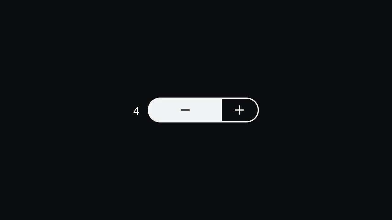
Pill Stepper Input with Sliding Fill
An elegant numeric stepper component styled as a cohesive rounded pill, built with React and SCSS. By translating the internal value into relative percentages, the control buttons, background fill, and icon symbols slide smoothly during interactions. Includes split focus-ring indicators built with the CSS :has() selector and native light-dark() modern theme support. (Requires: react.js, react.dom.js, lucide.react.js)
 Chrome 110+
 Edge 110+
 Firefox 121+
 Safari 16.2+
See the Pen Pill Stepper Input with Sliding Fill.
Mouse-Tracking Linear Shine Button
This Mouse-Tracking Linear Shine Button adds a high-end, tactile feel to your UI. Unlike standard hover effects that simply swap colors, this component tracks the user’s cursor position to drag a realistic light reflection across the button’s surface. Built with React and Tailwind CSS, it utilizes reactive CSS variables to control gradient positions, creating a dynamic lighting effect that feels physical and responsive. (Requires: React, React DOM, Tailwind CSS)
Chrome 49+
Edge 79+
Firefox 32+
Safari 8+
See the Pen Mouse-Tracking Linear Shine Button.

Progress Button Microinteractions with ReactJS
This React progress bar button leverages GSAP to create a seamless, multi-step animation, from shape morphing to a full progress fill and a final checkmark reveal.
See the Pen Progress Button Microinteractions with ReactJS.

Animated Like Button with Counter
An animated like button with a counter, where GSAP manages the dynamics and React handles the logic and UI rendering.
See the Pen Animated Like Button with Counter.

Animated React Toggle Like Button
Learn how to create an animated “like” button using a custom React useToggle hook for state management, along with CSS variables for seamless icon and counter transitions.
See the Pen Animated React Toggle Like Button.

Confetti Button with UI Feedback
A simple implementation of a button with a satisfying UI feedback as a confetti explosion. This example showcases the onClick hook in React 18 and animation customization via an external library.
See the Pen Confetti Button with UI Feedback.

Directionally Aware CSS Buttons with React
A showcase of a complex micro-interaction with a “directional” animation, where the button’s color change and transformation depend on which side the cursor enters the element.
See the Pen Directionally Aware CSS Buttons with React.

Fancy Exploding Button with GSAP
See how React and GSAP combine to create an impressive “exploding” button effect, driven by component state and dynamic CSS transformations.
See the Pen Fancy Exploding Button with GSAP.
Pure CSS Dial Button
A demonstration of a complex interactive UI where React logic handles button generation, while CSS variables and pseudo-selectors manage the circular animation and “dial-out” menu effect.
See the Pen Pure CSS Dial Button.

React Magnetic Button with Staggering Text
Learn how to create a “magnetic” button that attracts the cursor using GSAP and React Hooks for mouse tracking and smooth animations. A great example of UI/UX interaction.
See the Pen React Magnetic Button with Staggering Text.

React Upload Button Concept
A showcase of complex CSS animation using Sass loops for precise positioning and keyframing of child elements, all controlled by the component logic in React.
See the Pen React Upload Button Concept.

Social Share Button with React Spring
A dynamic React component with multi-level, state-driven animation. This demo shows how react-spring provides seamless transitions between states, creating a functional and impressive button.
See the Pen Social Share Button with React Spring.