20+ React Card Components
Create sleek, interactive layouts with these React card components. From animated flips and hover reveals to fully dynamic, data-driven cards, this collection showcases reusable UI elements perfect for showcasing products, profiles, blog posts, and more — all styled for responsive design and performance.
Examples

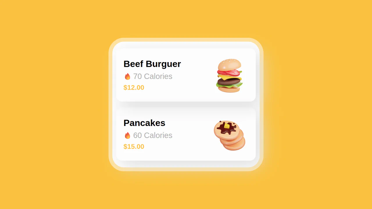
React Filterable Image Gallery
This React Filterable Image Gallery is a clean, component-based solution for organizing visual content. Unlike simple “show/hide” scripts, it uses React’s state management to handle complex multi-criteria filtering. Users can toggle multiple categories (e.g., “Food” AND “Plants”) simultaneously, or reset everything with an “All” button. The UI is polished with pastel colors and smooth hover animations. (Requires: React, ReactDOM)
 Chrome 80+
 Edge 80+
 Safari 13+
 Firefox 75+
See the Pen React Filterable Image Gallery.

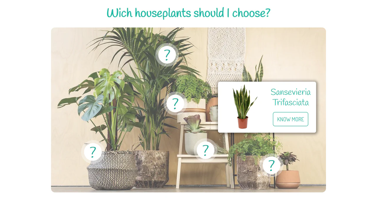
Expandable News Card Widget
This Expandable News Card Widget demonstrates a classic pattern for managing content density in UI design. By default, it presents a single “Headline” state to save screen space. Upon interaction, it smoothly transitions into an “Expanded” state, revealing a scrollable list of news items. It utilizes React state to handle the logic and CSS transitions for the visual effect. (Requires: React, react-dom)
Chrome 100+
Edge 100+
Safari 14+
Firefox 90+
See the Pen Expandable News Card Widget.

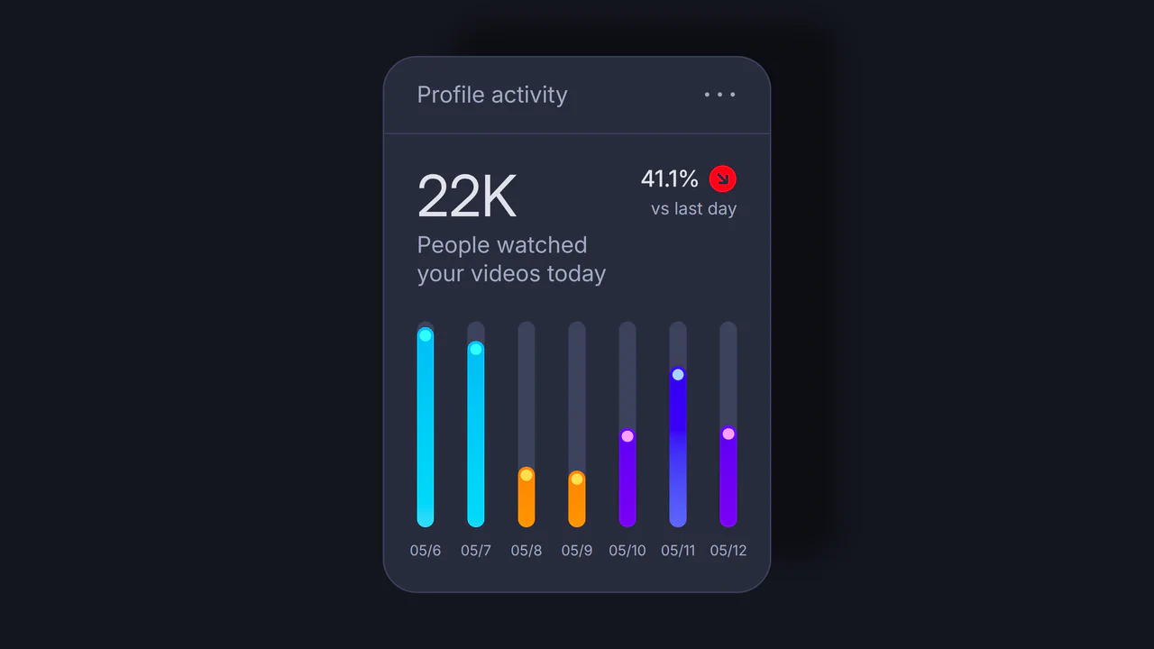
Event Cards
A cutting-edge, high-fidelity mobile UI component simulating stacked event cards. The complex physics and fluid motion are powered by React Spring and React Use Gesture, which control the stacking via synchronized translate3d and scale interpolations. Crucially, clicking a card triggers a calculated, large-scale transformational transition to a fullscreen modal, achieving a seamless, native iOS-like user experience.
See the Pen Event Cards.

Little Gallery
A stacked “fan-style” gallery built with React, leveraging CSS sibling selectors to trigger complex 3D transforms on hover. Each card in the stack reacts dynamically: the hovered item scales up, while subsequent items shift and rotate, creating a fluid, cascading reveal effect without JavaScript animations.
See the Pen Little Gallery.

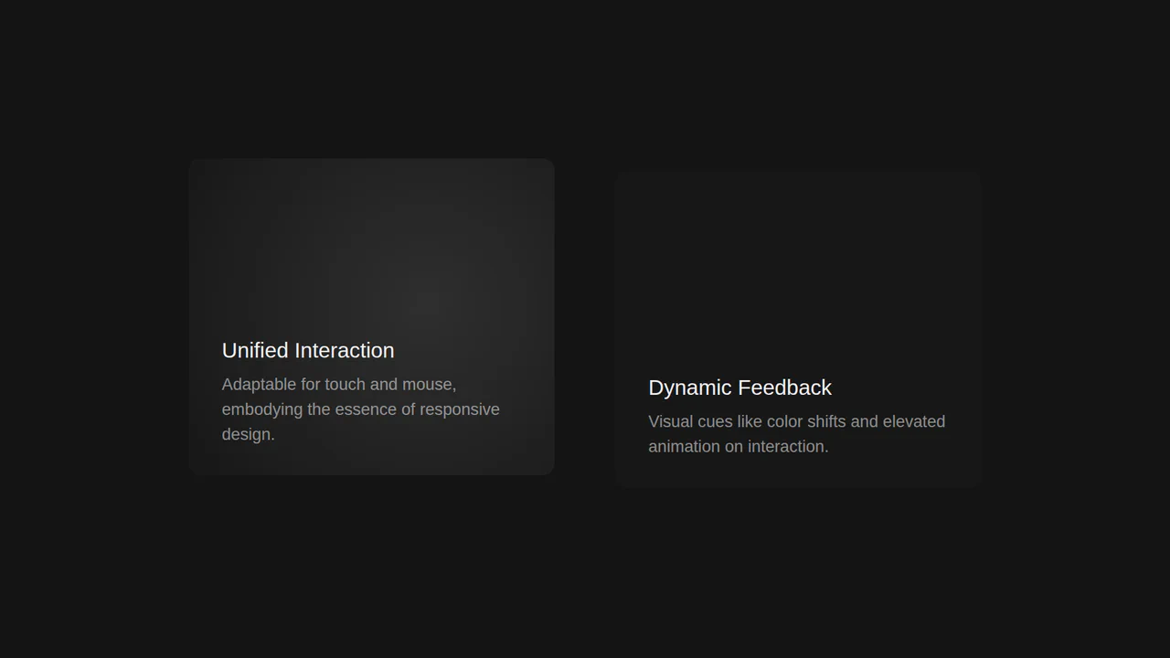
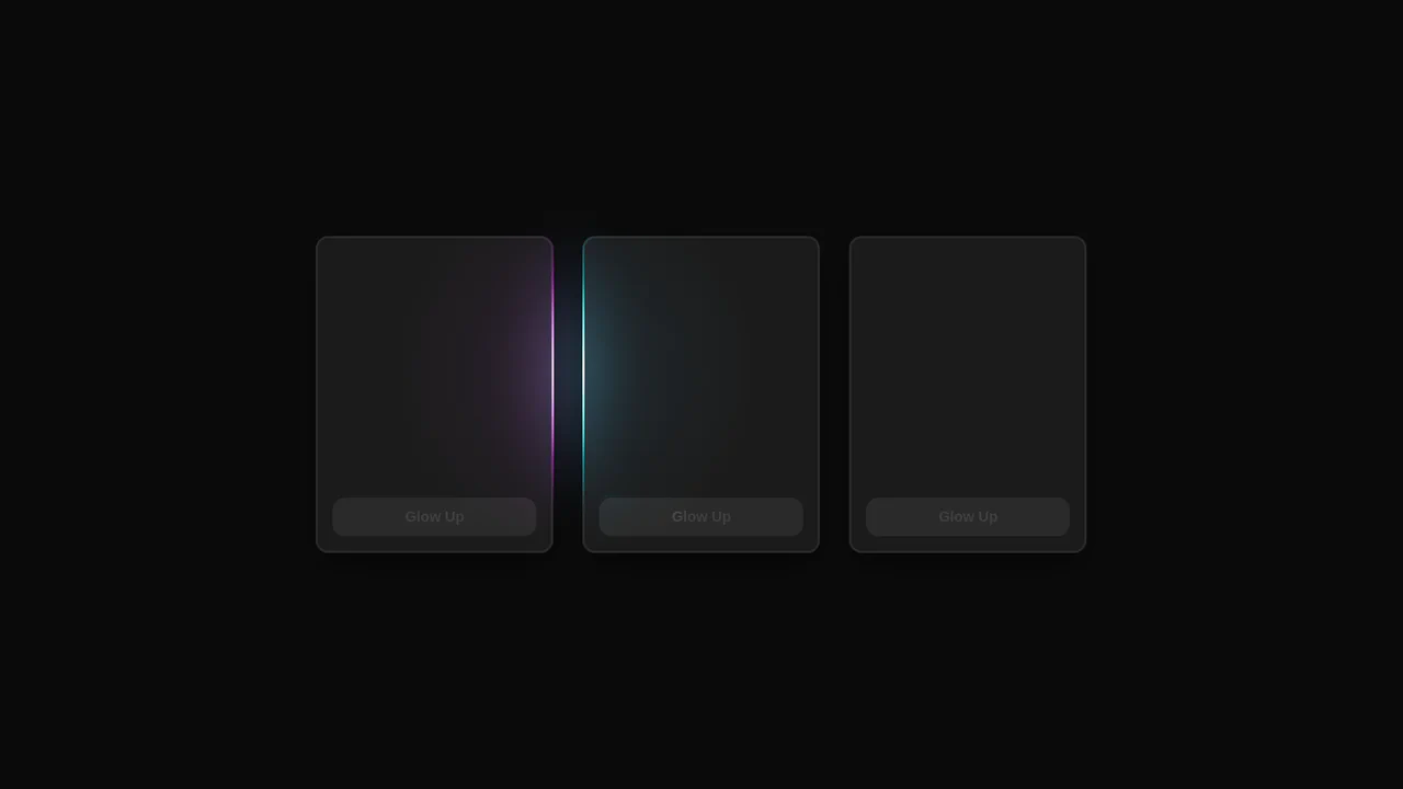
Interactive Card Glow Effect
A modular React card component where a single pointermove listener updates CSS variables, powering a customizable, multi-layer glow and spotlight effect.
See the Pen Interactive Card Glow Effect.
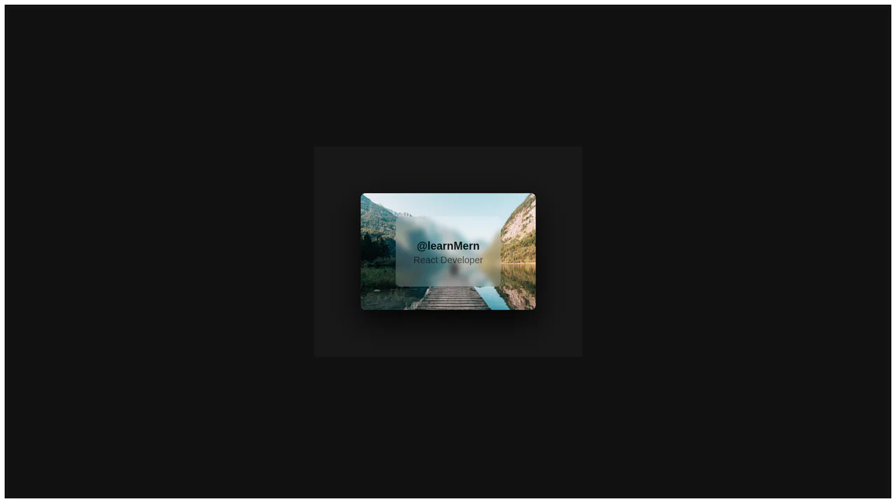
Interactive Desktop and Mobile Card Component
A highly interactive demo that uses React state to drive a dynamic light effect based on the mouse cursor’s position, with comprehensive event handling for seamless touch and mobile support.
See the Pen Interactive Desktop and Mobile Card Component.
Premium Custom Parallax Interactive Cards
Built in React, this card uses a responsive state-driven parallax effect, leveraging event listeners to smoothly update the image’s backgroundPosition based on user interaction and scroll.
See the Pen Premium Custom Parallax Interactive Cards.
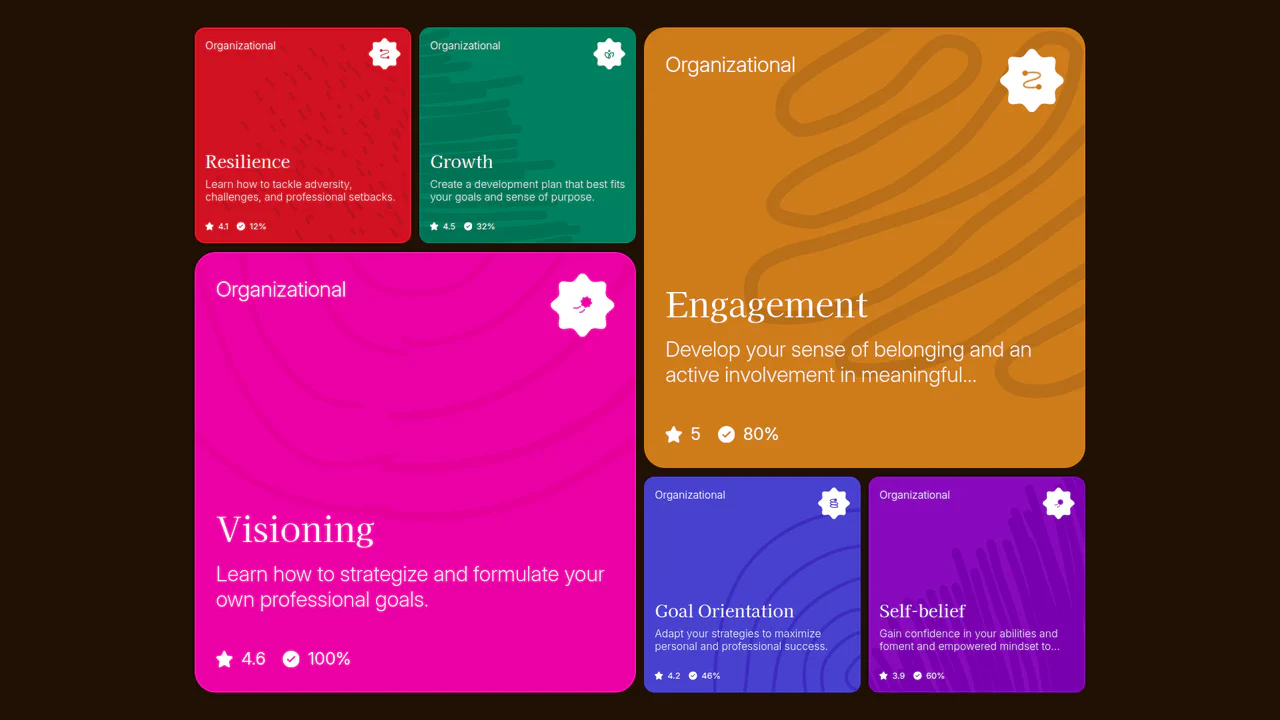
Product Card with React Native
This data-driven UI generates a dynamic list of product cards from a JavaScript object, showing a simple but powerful method for rendering content with a reusable ProductCard component.
See the Pen Product Card with React Native.
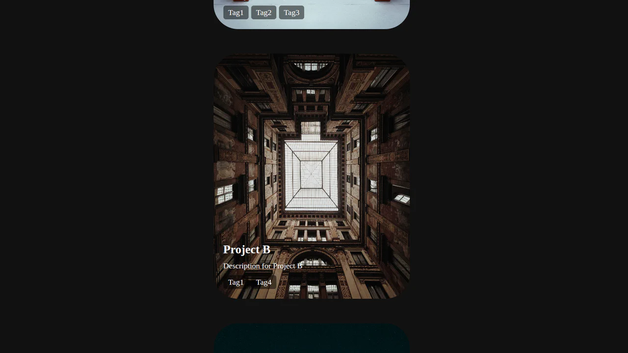
React Floating Cards
A clean, component-based React application that maps a data array to an interactive image. It uses CSS for absolute positioning and hover effects to create a visually engaging and responsive UI.
See the Pen React Floating Cards.
React Minimal Glow Cards
This React demo showcases a custom usePointerGlow hook that leverages CSS variables to create a stunning, synchronized glow effect that follows the user’s cursor across multiple interactive elements.
See the Pen React Minimal Glow Cards.

React Minimalist Card
A modern React example that combines state management with component composition, using onClick events to programmatically update the UI and deliver asynchronous feedback through a custom alert library.
See the Pen React Minimalist Card.

React Router Tabs Card
This interactive card demonstrates client-side routing by rendering different components and their unique styles based on the URL hash, all managed with react-router-dom.
See the Pen React Router Tabs Card.

Styled Components Product Card
This demo utilizes CSS-in-JS with styled-components to build a modular product card. It efficiently demonstrates how a component’s internal state can dynamically re-render its structure and styles for an enhanced user experience.
See the Pen Styled Components Product Card.
Styled Components Product Card Glass
A modern React component that creates a “glassmorphism” effect by combining backdrop-filter with a 3D transform on hover, all powered by styled-components for a clean, modular structure.
See the Pen Styled Components Product Card Glass.

Styled Components Product Card Slide
A modern React app that leverages styled-components to create a reusable product card with a slick hover-based 3D transition, showcasing the power of CSS-in-JS for dynamic styling.
See the Pen Styled Components Product Card Slide.

React Bio Cards with Hover Transition
This component, built with a React class, demonstrates an approach to UI construction using reusable cards that receive data via props, while dynamic hover effects are entirely implemented using CSS transforms and pseudo-classes.
See the Pen React Bio Cards with Hover Transition.

Animated Card Transitions with React and GSAP FLIP
An interactive React gallery where clicking a card triggers an impressive fly-out effect. This is accomplished with GSAP Flip, which automatically calculates the start and end states of the element to ensure a flawless and smooth transition.
See the Pen Animated Card Transitions with React and GSAP FLIP.

Stack Prototype with React and GSAP
The demo showcases a “card stack” UI effect where items can be navigated with buttons or by dragging with the mouse. It’s powered by React for state management and GSAP Draggable for the drag-and-drop logic and animation.
See the Pen Stack Prototype with React and GSAP.

React Framer Motion Card Animation
A demo showcasing dynamic, smooth animations powered by React and the Framer Motion library, illustrating how to easily create an interactive and lively UI with minimal code.
See the Pen React Framer Motion Card Animation.