10+ React Checkboxes
This collection of demos provides a clear guide to building and styling React checkbox components. You’ll explore essential technical concepts like managing state with useState, handling complex scenarios such as indeterminate states for tree-like structures, and ensuring accessibility. The examples demonstrate how to move beyond standard browser elements to create custom, interactive, and visually appealing checkboxes.
Examples

Useless Checkbox with React and GSAP
A demonstration of the powerful React and GSAP integration: logic based on random limits determines the animation path and the dynamic alteration of SVG elements upon checkbox interaction.
See the Pen Useless Checkbox with React and GSAP.
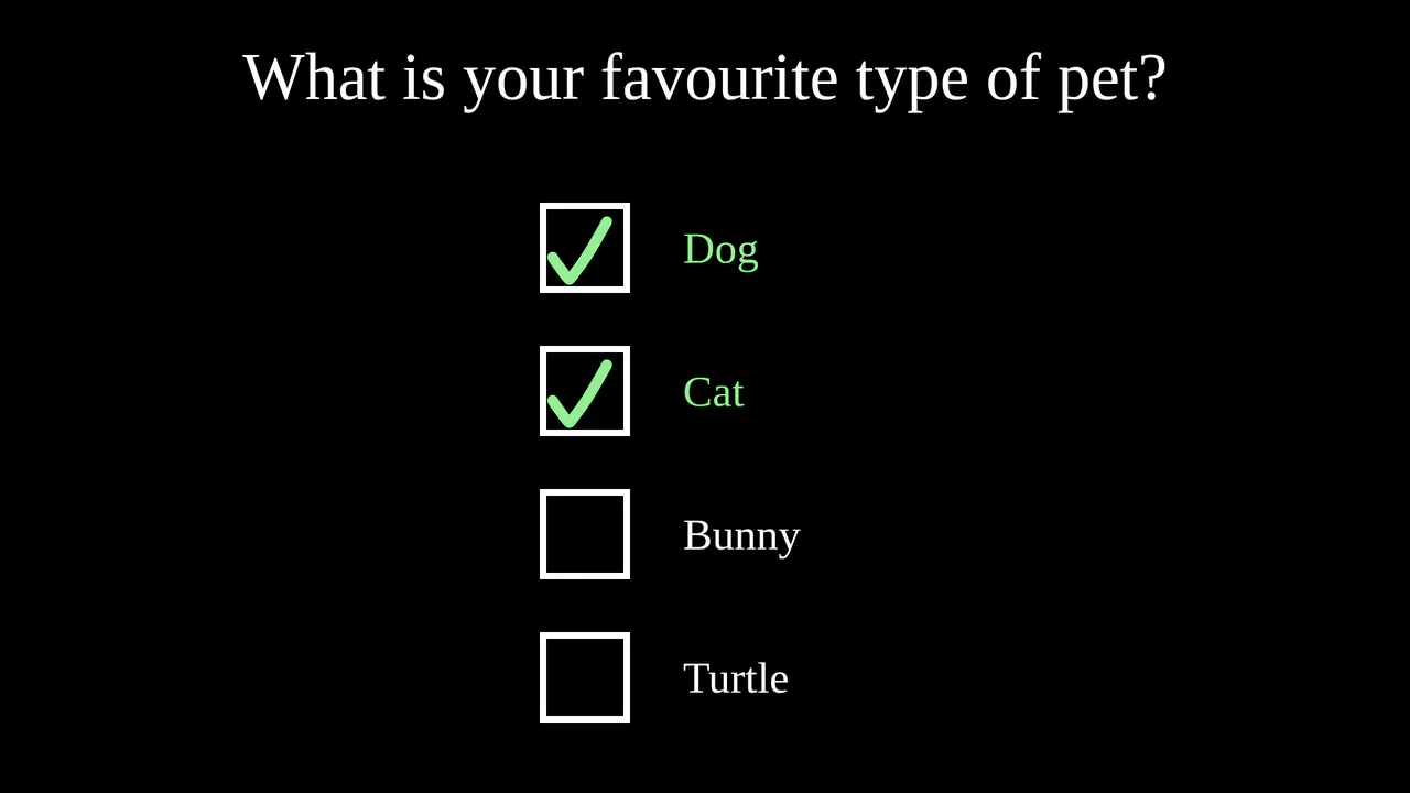
React Checkbox and Radio Button Component
A practical demo of creating a versatile component that can operate in two modes: “checkbox” and “radio button,” controlled by a single parameter. The implementation features dynamic SVG animation and state management via simple logic for adding or removing items from an array.
See the Pen React Checkbox and Radio Button Component.

React Checkbox Multi-Select
This demo showcases the creation of a custom checkbox-based multi-select dropdown using the Selectly library in React. It illustrates how to manage the selected options state and display the chosen values within the dropdown trigger.
See the Pen React Checkbox Multi-Select.

React Checkboxes with Animations
This demo shows how to create a versatile checkbox component in React using class components and React Transition Group for smooth animations. The component supports multiple types (check, cross, filled circle), custom colors, backgrounds, and label positions, making it highly flexible and reusable.
See the Pen React Checkboxes with Animations.
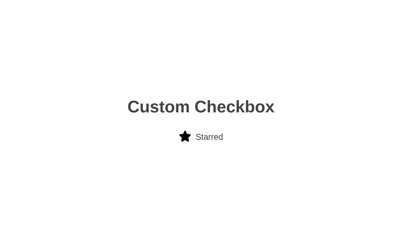
React Custom Checkbox
This demo illustrates how to create a custom checkbox component using React and SCSS. It hides the native input element and uses the :checked + label CSS selector to control the visual state, allowing for the use of custom icons or images.
See the Pen React Custom Checkbox.
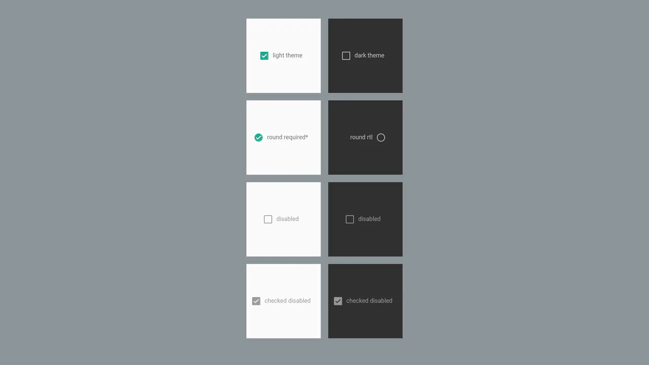
React Material Design Checkbox
This example features a versatile and highly customizable React checkbox component. Its technical highlights include using CSS variables for dynamic styling, SVG for high-quality icon rendering, and built-in support for RTL layout for multilingual interfaces.
See the Pen React Material Design Checkbox.

React Simple Checkbox
This example demonstrates how to create a visually striking checkbox using a combination of React and CSS variables for dynamic styling. It uses a hidden input and controls its visual state with classes and pseudo-elements, ensuring smooth transitions.
See the Pen React Simple Checkbox.

React Tile Checkboxes
This demo shows how to create a stylish and accessible checkbox component using React. Instead of standard UI elements, it uses a custom input and label with full CSS control over :checked and :disabled states.
See the Pen React Tile Checkboxes.
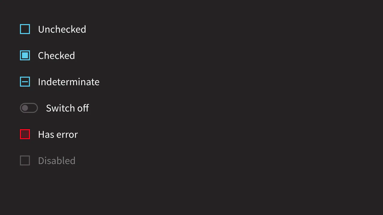
ReactJS Checkbox Component with Custom CSS
This example features a custom checkbox component with a focus on extended functionality. The main highlight is the support for an indeterminate state, which is implemented by directly accessing the DOM element (ref) within React lifecycle methods.
See the Pen ReactJS Checkbox Component with Custom CSS.

Stateful React Checkbox Component
The demo showcases a modern, minimalist checkbox. Its main features are declarative state management via props (checked, disabled) and visual customization using pure CSS, including the use of Material Icons for the checkmark. This makes the component quick to create and adapt for various needs.
See the Pen Stateful React Checkbox Component.