10+ React Hover Effects
Add dynamic feedback and visual flair to your components with these React hover effect examples. This collection features smooth transitions, scaling, fading, background shifts, and other interactive behaviors triggered by hover — all implemented using modern React techniques.
Examples

React Filterable Image Gallery
This React Filterable Image Gallery is a clean, component-based solution for organizing visual content. Unlike simple “show/hide” scripts, it uses React’s state management to handle complex multi-criteria filtering. Users can toggle multiple categories (e.g., “Food” AND “Plants”) simultaneously, or reset everything with an “All” button. The UI is polished with pastel colors and smooth hover animations. (Requires: React, ReactDOM)
 Chrome 80+
 Edge 80+
 Safari 13+
 Firefox 75+
See the Pen React Filterable Image Gallery.

Little Gallery
A stacked “fan-style” gallery built with React, leveraging CSS sibling selectors to trigger complex 3D transforms on hover. Each card in the stack reacts dynamically: the hovered item scales up, while subsequent items shift and rotate, creating a fluid, cascading reveal effect without JavaScript animations.
See the Pen Little Gallery.

Gallery Hover Effect in React
Interactive postcard gallery that randomizes position, rotation and z-index on hover, using pure React hooks and CSS 3D transforms for a lively, physics-like layout.
See the Pen Gallery Hover Effect in React.
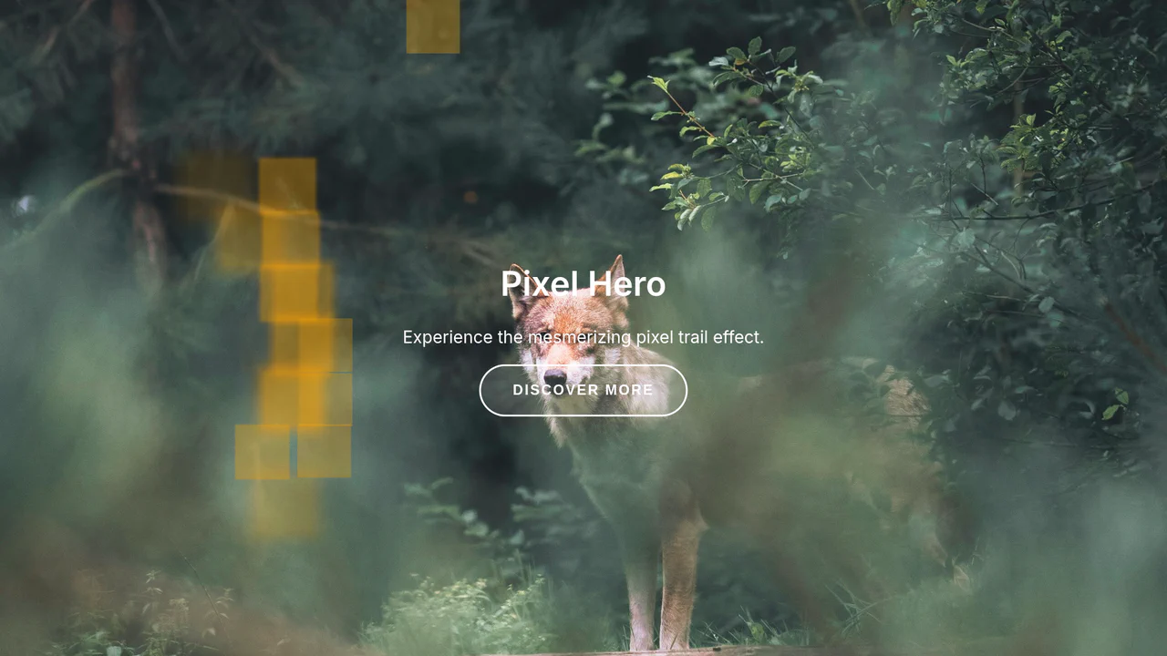
Interactive Liquid Pixel Canvas Component in React
A full-screen React demo that generates a dense grid of 50px squares, each turning into a glowing, moving trail when the mouse passes over them. The trail color cycles through a palette on single clicks.
See the Pen Interactive Liquid Pixel Canvas Component in React.

React TypeScript Hover Effects
Compact demo of state-driven hover effects in React, combining JSX, SCSS mixins and CSS transitions for a polished, responsive UI snippet.
See the Pen React TypeScript Hover Effects.
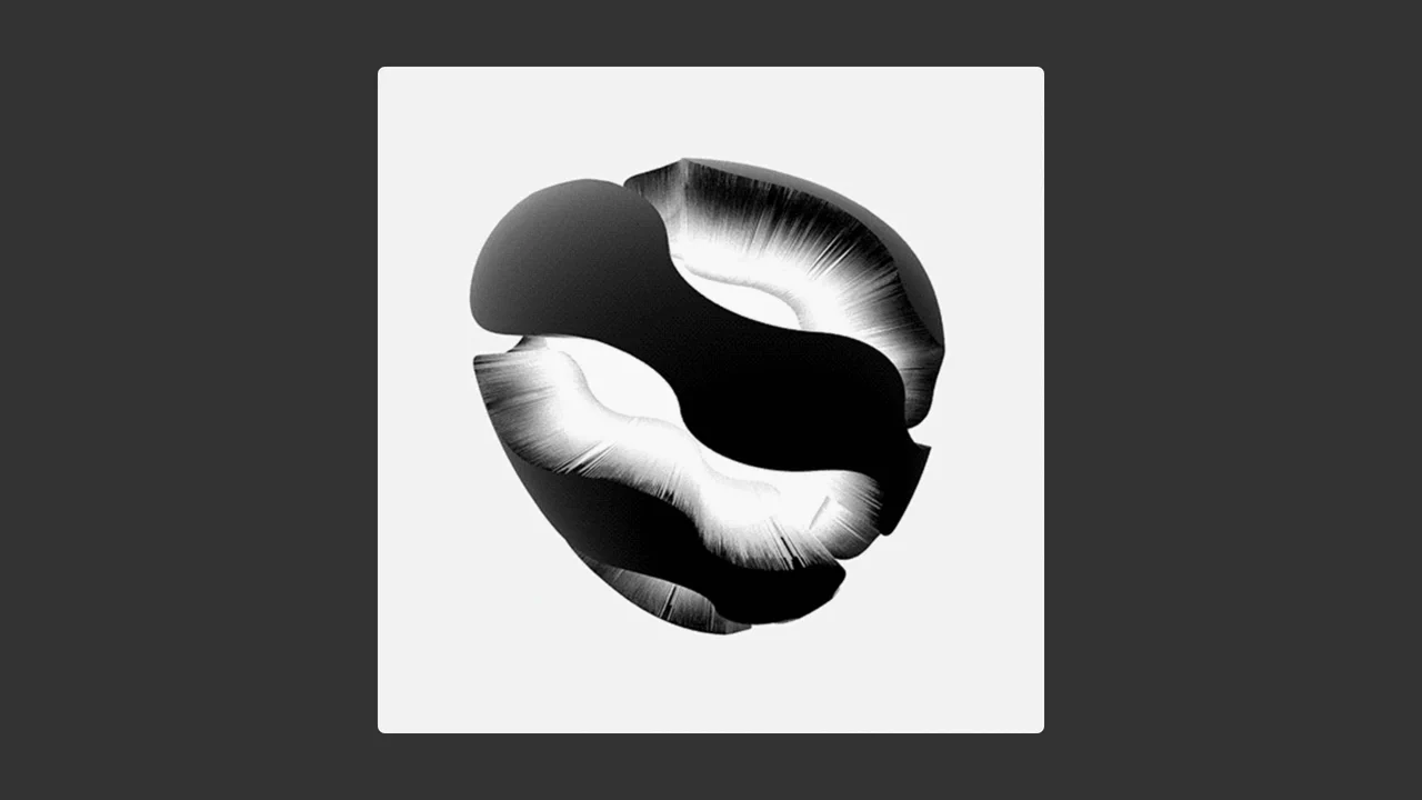
Scrubbable GIF Component in React
A canvas-based GIF scrubber that preloads 20 frames, maps mouse → frame index with a linear mapper, and loops three times for seamless replay. Uses a tiny custom hook for mounting and another for unified mouse/touch tracking, keeping the component pure and performant.
See the Pen Scrubbable GIF Component in React.

Spotlight Hover Effect in React with TypeScript
Interactive icon cards use --mouse-x/--mouse-y variables to position two layered gradients, giving a depth-enhancing glow that follows the pointer, while the icon smoothly enlarges on hover. No external libraries — pure React + CSS.
See the Pen Spotlight Hover Effect in React with TypeScript.
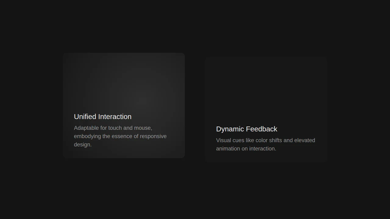
Interactive Desktop and Mobile Card Component
A highly interactive demo that uses React state to drive a dynamic light effect based on the mouse cursor’s position, with comprehensive event handling for seamless touch and mobile support.
See the Pen Interactive Desktop and Mobile Card Component.

Interactive React Canvas Hero Image with GSAP and jQuery Integration
The demo showcases an advanced cursor-reactive animation built with React and GSAP. It utilizes HTML5 Canvas to display an an image broken into multiple fragments that spread out and scale as the cursor approaches, creating a unique visual effect.

Spotlight Effect with React and Framer Motion
This component demonstrates how to create a “Spotlight” effect that follows the cursor using React and Framer Motion. It leverages AnimatePresence for smooth entry/exit animations and dynamically updates CSS variables for the radial gradient.
See the Pen Spotlight Effect with React and Framer Motion.
