6 React Modal Windows
The core feature is using React Portals to render the modal outside the component’s DOM hierarchy, which is crucial for correct display and avoiding z-index conflicts. Modern demos must showcase reusable logic via custom hooks (useModal) for managing open/close state. Focus trapping and Escape key dismissal are mandatory technicalities to ensure proper Accessibility (A11y) compliance, resulting in clean code and a great UX.
Examples
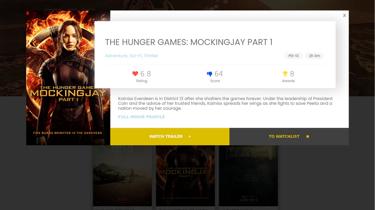
React IMDB Website Clone with Modals
A feature-rich UI template demonstrating the integration of external components - namely a configurable vertical autoplay carousel (react-slick) and a powerful, dedicated React Modal component for detailed movie views.
See the Pen React IMDB Website Clone with Modals.
React Modal Animation: Card to Fullscreen Transition
A technical showcase of creating a complex “card-to-fullscreen” transition in React, utilizing refs to capture the initial element’s size/position, performing state-based 3D transformations (translate3d), and managing asynchronous open/close logic with explicit state tracking.
See the Pen React Modal Animation: Card to Fullscreen Transition.
React Modal Button Animation with Pure CSS Transitions
This demo showcases a visually striking modal: the opening/closing effect is achieved entirely through pure CSS transitions and aggressive scaling, managed by toggling a single class based on the React state.
React Modal Component with Morph Button Animation
Beyond the custom morphing animation, the component manages crucial window events by binding and unbinding listeners in lifecycle methods, handling resize events to keep the modal centered and closing via click outside.
See the Pen React Modal Component with Morph Button Animation.
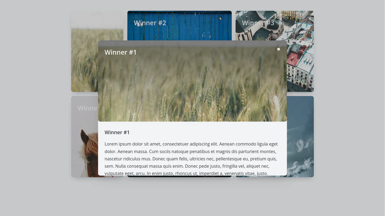
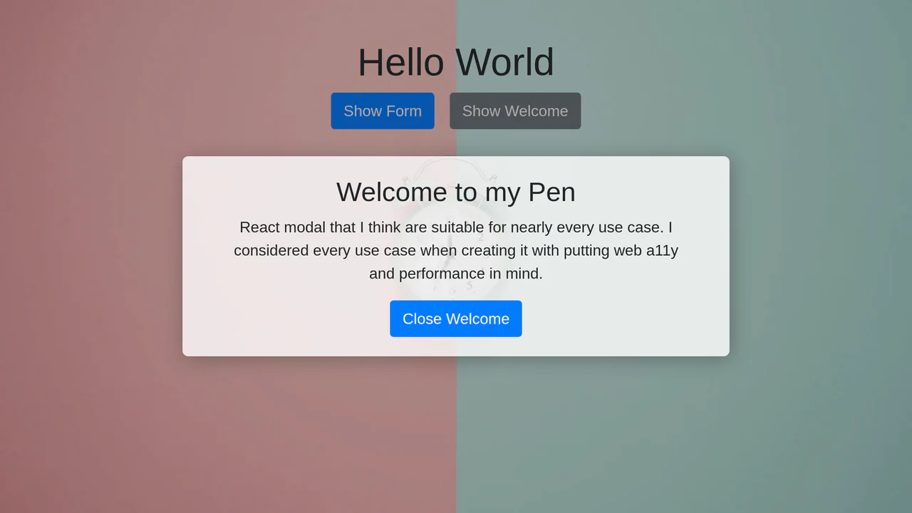
React Modal Component with Portals (Example #5)
See how to use React Portals to construct dynamic modals that render outside the main app root, solving z-index issues and cleanly separating UI structure. The Modal wrapper efficiently manages its own lifecycle in an external DOM node.
See the Pen React Modal Component with Portals (Example #5).
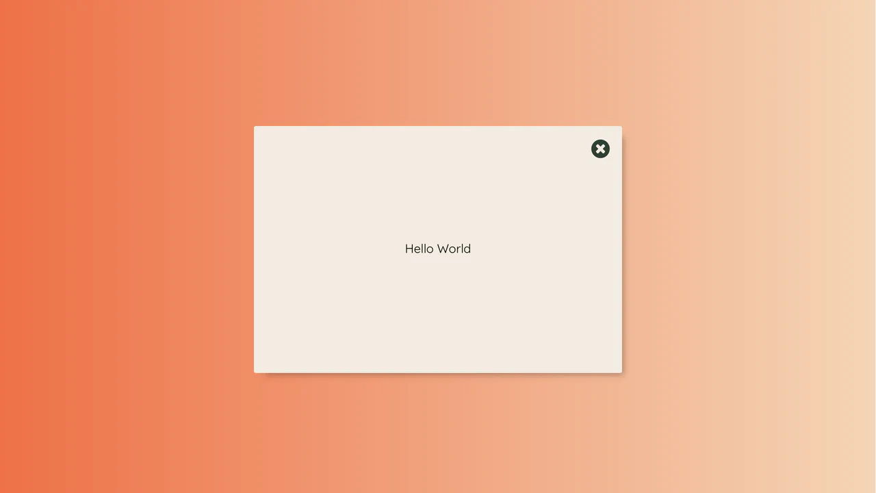
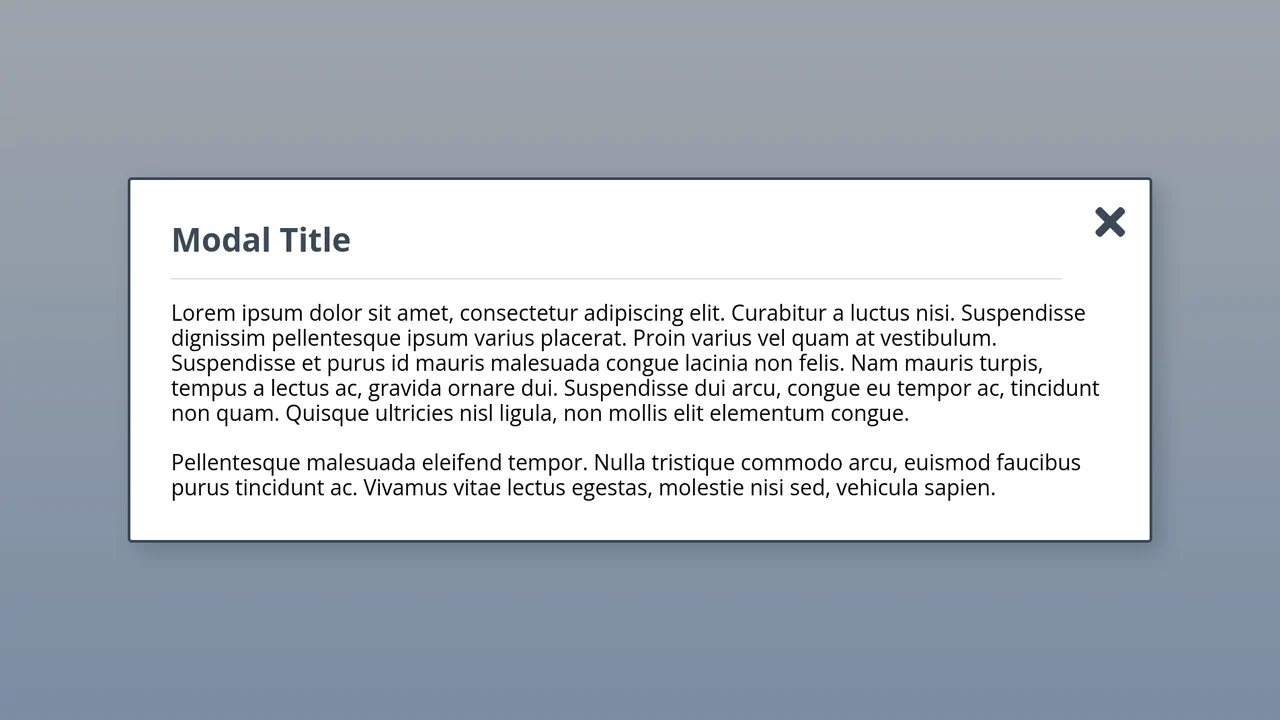
The Perfect Accessible React Modal / Dialog
This is the ultimate accessible React modal, utilizing Portals for clean DOM separation and implementing a robust focus trap logic via onkeydown to ensure seamless keyboard navigation (A11Y).
See the Pen The Perfect Accessible React Modal / Dialog.